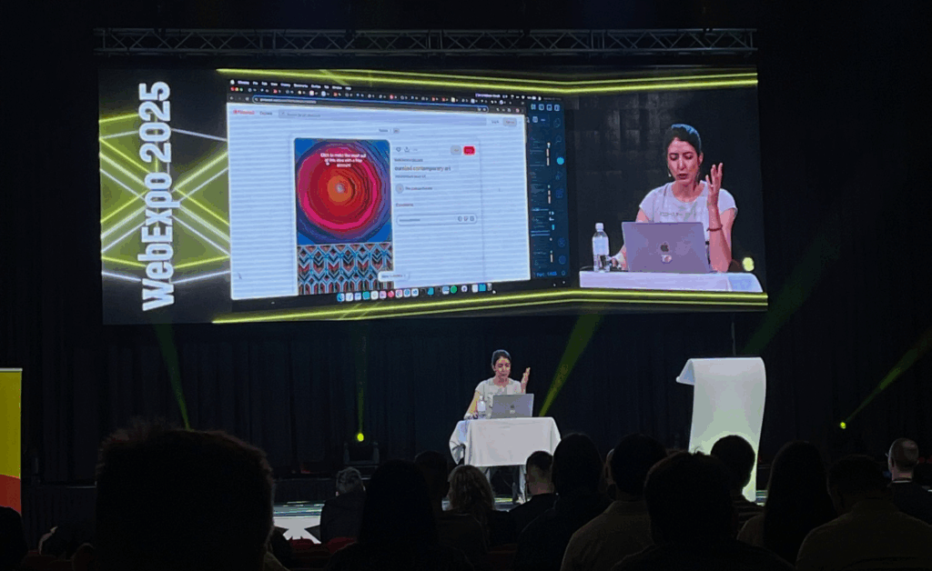
This blogpost will be a reflection inspired by Nadieh Bremers’ WebExpo 2025 talk Creating an effective & beautiful data visualisation from scratch with d3.js. Bremer demonstrates how visual interfaces can be designed to convey information clearly and emotionally. She outlines a design process that begins with understanding the data’s story and ends with polishing details such as visual hierarchy, color, and interaction. Her approach emphasizes that visuals should not only communicate facts but also evoke engagement and a sense of discovery. I rewatched the digital documentation of her talk to recap the content of her presentation.
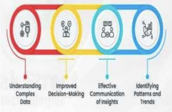
Bremer presents visualization as a communication medium, where design choices directly impact user comprehension and emotional experience. Clarity reduces frustration, while appealing design increases motivation to explore. This perspective positions data visualization as a critical component of user experience, not merely a decorative or aesthetic layer.
Learning about new technologies for data visualization
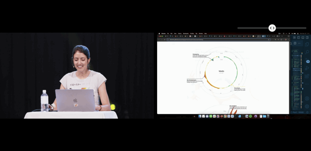
When I encountered Nadieh Bremers work, I was already familiar with data visualization, but mostly through print media and a little experience with Processing. Designing layouts for magazines or static posters taught me how much data visuals can influence perception and guide a narrative. Around that time we went to WebExpo, I got into JS coding but wasn’t aware of the posibilities to use it for data visualization. Her projects demonstrated what I had been missing in print -> interactivity and adaptivity.
Why adaptive data visualization matters for a good user experience
During my deeper dive into adaptive data visualization literature, I explored a research paper focusing on real-time decision support in complex systems. It argues that static dashboards are no longer enough to support organizations facing rapidly changing data environments. Instead, visualizations must adapt to:
- Incoming data streams
- User interactions
- Context shifts
- Multivariate complexity
Adaptive systems combine machine learning, real-time processing, and flexible visualization layers to support faster and more informed decision-making. This means that the visualization is not just displaying data, it is interpreting and reacting to it. The paper specifically highlights D3.js as one of the technologies capable of creating these highly flexible and dynamic interfaces. Unlike pre-built dashboards, D3 allows developers to adapt interactions, transitions, and representations directly to user needs and situational changes.
In my earlier blog posts I wrote about affective computing. Combining the gained knowled I came to a conclusion: If a system can visually adapt based not only on the dataset, but also on the emotional state of the user, could generate a better user experience?
Sources:
https://slideslive.com/39043157/creating-an-effective-beautiful-data-visualisation-from-scratch