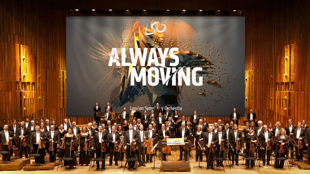
In 2017, the London Symphony Orchestra (LSO) introduced a new visual identity for its 2017/18 season. Instead of using typical images of musicians or instruments, they decided to do something much more experimental. The LSO turned to motion capture technology to create a visual language that reflects the energy, emotion, and dynamism of music itself. This collaboration, executed with the creative agency Design Bridge, used motion capture to turn music and conducting into abstract moving visuals. I found this project really interesting because it mixes classical music with digital art and motion design in. a way you don’t see very often or at least I haven’t. The whole idea was started by Sir Simon Rattle who was the LSO’s Music Director at that time. His conducting movements were recorded with twelve Vicon cameras at 120 frames per second. This helped to create a very detailed motion data that digital artist Tobias Gremmler later was able to transformed into abstract animations like abstract forms, which visually embodied the rhythm, intensity, and flow of the music. Form this data the team also created two typefaces. One of the looked more soft and flowing for a more gentle gesture approach. And the other was sharper and more angular for stronger movements. Both these typefaces worked together with the animations and the still images with this creating a full visual identity that was later on used everywhere. (The Partners Unveil Identity for LSO Formed by Tracking the Conductor’s Movement, 2017)
Abstract Forms and Motion
The abstract shapes generated from the motion capture are not random. Each shape is based on Sir Simon Rattle’s actual movements while conducting. However, the visualizations do not echo his motion. They turn his gestures into swirling vortex-like structures that suggest the textures and materials of an orchestra: wood, brass, smoke, and string. These organic, kinetic forms function as an “abstract score,” where lines, loops, and flowing wires communicate rhythm, energy, and dynamics in a visual language that parallels musical notation. Color and texture also play a big role. The animations use gradients, light flows, and semi-transparent textures to evoke elements of the orchestral soundscape. Air, vibration, resonance, and the interplay of instruments. Everything is always moving which reflects how music itself is never static. Here I really liked how the project manages to translate the feeling of music into a visual experience.
Impact and Significance
This approach positions the LSO as both a guardian of tradition and a forward-looking, innovative institution. By showing the conductors gestures in such an artistic way the visuals create a more emotional and personal connection to the music. In an industry where orchestral brands often remain conservative and predictable, the LSO’s identity stands out for its bold, kinetic abstraction. The combination of the custom typefaces and the abstract animations also helps with recognition. It shows that classical music can work with technology and contemporary design without losing its identity.
Relevance to Motion Design
For motion design, this project is a great example of how movement can be turned into something abstract but still meaningful. It shows how motion graphics can build a whole brand identity and not just act as decoration. Because every visual element comes directly from the conductor’s movements and the music, the design feels very connected to the source. It proves that abstract shapes can still tell a story and carry emotion.
Even if the project is really strong, there are some challenges. The abstract visuals might not make sense to all viewers. People who don’t know much about design or conducting might think the shapes are just pretty graphics without understanding the idea behind them. Another issue is the budget. Motion capture is expensive and needs advanced equipment, which means smaller orchestras probably couldn’t do something similar. However I was still very fascinated by this approach and project itself and the way it was executed.
Bibliography:
The Partners unveil identity for LSO formed by tracking the conductor’s movement. (2017, January 20). https://www.itsnicethat.com/news/the-partners-lso-identity-motion-capture-200117
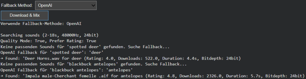
Intelligent Sound Fallback Systems – Enhancing Audio Generation with AI-Powered Semantic Recovery
After refining Image Extender’s sound layering and spectral processing engine, this week’s development shifted focus to one of the system’s most practical yet creatively crucial challenges: ensuring that the generation process never fails silently. In previous iterations, when a detected visual object had no directly corresponding sound file in the Freesound database, the result was often an incomplete or muted soundscape. The goal of this phase was to build an intelligent fallback architecture—one capable of preserving meaning and continuity even in the absence of perfect data.
Closing the Gap Between Visual Recognition and Audio Availability
During testing, it became clear that visual recognition is often more detailed and specific than what current sound libraries can support. Object detection models might identify entities like “Golden Retriever,” “Ceramic Cup,” or “Lighthouse,” but audio datasets tend to contain more general or differently labeled entries. This mismatch created a semantic gap between what the system understands and what it can express acoustically.
The newly introduced fallback framework bridges this gap, allowing Image Extender to adapt gracefully. Instead of stopping when a sound is missing, the system now follows a set of intelligent recovery paths that preserve the intent and tone of the visual analysis while maintaining creative consistency. The result is a more resilient, contextually aware sonic generation process—one that doesn’t just survive missing data, but thrives within it.
Dual Strategy: Structured Hierarchies and AI-Powered Adaptation
Two complementary fallback strategies were introduced this week: one grounded in structured logic, and another driven by semantic intelligence.
The CSV-based fallback system builds on the ontology work from the previous phase. Using the tag_hierarchy.csv file, each sound tag is part of a parent–child chain, creating predictable fallback paths. For example, if “tiger” fails, the system ascends to “jungle,” and then “nature.” This rule-based approach guarantees reliability and zero additional computational cost, making it ideal for large-scale batch operations or offline workflows.
In contrast, the AI-powered semantic fallback uses GPT-based reasoning to dynamically generate alternative tags. When the CSV offers no viable route, the model proposes conceptually similar or thematically related categories. A specific bird species might lead to the broader concept of “bird sounds,” or an abstract object like “smartphone” could redirect to “digital notification” or “button click.” This layer of intelligence brings flexibility to unfamiliar or novel recognition results, extending the system’s creative reach beyond its predefined hierarchies.
User-Controlled Adaptation
Recognizing that different projects require different balances between cost, control, and creativity, the fallback mode is now user-configurable. Through a simple dropdown menu, users can switch between CSV Mode and AI Mode.
CSV Mode favors consistency, predictability, and cost-efficiency—perfect for common, well-defined categories.
AI Mode prioritizes adaptability and creative expansion, ideal for complex visual inputs or unique scenes.
This configurability not only empowers users but also represents a deeper design philosophy: that AI systems should be tools for choice, not fixed solutions.
Toward Adaptive and Resilient Multimodal Systems
This week’s progress marks a pivotal evolution from static, database-bound sound generation to a hybrid model that merges structured logic with adaptive intelligence. The dual fallback system doesn’t just fill gaps, it embodies the philosophy of resilient multimodal AI, where structure and adaptability coexist in balance.
The CSV hierarchy ensures reliability, grounding the system in defined categories, while the AI layer provides flexibility and creativity, ensuring the output remains expressive even when the data isn’t. Together, they form a powerful, future-proof foundation for Image Extender’s ongoing mission: transforming visual perception into sound not as a mechanical translation, but as a living, interpretive process.
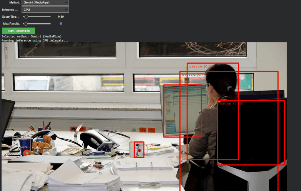
Following the foundational phase of last week, where the OpenAI API Image Analyzer established a structured evaluation framework for multimodal image analysis, the project has now reached a significant new milestone. The second release integrates both OpenAI’s GPT-4.1-based vision models and Google’s Gemini (MediaPipe) inference pipeline into a unified, adaptive system inside the Image Extender environment.
Unified Recognition Interface
In The current version, the recognition logic has been completely refactored to support runtime model switching. A dropdown-based control in Google Colab enables instant selection between:
Gemini (MediaPipe) – for efficient, on-device object detection and panning estimation
OpenAI (GPT-4.1 / GPT-4.1-mini) – for high-level semantic and compositional interpretation
Non-relevant parameters such as score threshold or delegate type dynamically hide when OpenAI mode is active, keeping the interface clean and focused. Switching back to Gemini restores all MediaPipe-related controls. This creates a smooth dual-inference workflow where both engines can operate independently yet share the same image context and visualization logic.
Architecture Overview
The system is divided into two self-contained modules:
Image Upload Block – handles external image input and maintains a global IMAGE_FILE reference for both inference paths.
Recognition Block – manages model selection, executes inference, parses structured outputs, and handles visualization.
This modular split keeps the code reusable, reduces side effects between branches, and simplifies later expansion toward GUI-based or cloud-integrated applications.
OpenAI Integration
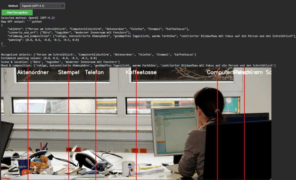
The OpenAI branch extends directly from Last week but now operates within the full environment. It converts uploaded images into Base64 and sends a multimodal request to gpt-4.1 or gpt-4.1-mini. The model returns a structured Python dictionary, typically using the following schema:
{
“objects”: […],
“scene_and_location”: […],
“mood_and_composition”: […],
“panning”: […]
}
A multi-stage parser (AST → JSON → fallback) ensures robustness even when GPT responses contain formatting artifacts.
Prompt Refinement
During development, testing revealed that the English prompt version initially returned empty dictionaries. Investigation showed that overly strict phrasing (“exclusively as a Python dictionary”) caused the model to suppress uncertain outputs. By softening this instruction to allow “reasonable guesses” and explicitly forbidding empty fields, the API responses became consistent and semantically rich.
Debugging the Visualization
A subtle logic bug was discovered in the visualization layer: The post-processing code still referenced German dictionary keys (“objekte”, “szenerie_und_ort”, “stimmung_und_komposition”) from Last week. Since the new English prompt returned English keys (“objects”, “scene_and_location”, etc.), these lookups produced empty lists, which in turn broke the overlay rendering loop. After harmonizing key references to support both language variants, the visualization resumed normal operation.
Cross-Model Visualization and Validation
A unified visualization layer now overlays results from either model directly onto the source image. In OpenAI mode, the “panning” values from GPT’s response are projected as vertical lines with object labels. This provides immediate visual confirmation that the model’s spatial reasoning aligns with the actual object layout, an important diagnostic step for evaluating AI-based perception accuracy.
Outcome and Next Steps
The project now represents a dual-model visual intelligence system, capable of using symbolic AI interpretation (OpenAI) and local pixel-based detection (Gemini).
Next steps
The upcoming development cycle will focus on connecting the openAI API layer directly with the Image Extender’s audio search and fallback system.
– The Emotional Vision Behind Surfboard Sonification
Surfing is more than just a sport. For many surfers, it is a ritual, a form of meditation, and an experience of deep emotional release. There is a unique silence that exists out on the water. It is not the absence of sound but the presence of something else: a sense of connection, stillness, and immersion. This is where the idea for “Surfboard Sonification” was born. It began not with technology, but with a feeling. A moment on the water when the world quiets, and the only thing left is motion and sensation.
The project started with a simple question: how can one translate the feeling of surfing into sound? What if we could make that feeling audible? What if we could tell the story of a wave, not through pictures or words, but through vibrations, resonance, and sonic movement?
My inspiration came from both my personal experiences as a surfer and from sound art and acoustic ecology. I was particularly drawn to the work of marine biologist Wallace J. Nichols and his theory of the “Blue Mind.” According to Nichols, being in or near water has a scientifically measurable impact on our mental state. It relaxes us, improves focus, and connects us to something larger than ourselves. It made me wonder: can we create soundscapes that replicate or amplify that feeling?
In addition to Nichols’ research, I studied the sound design approaches of artists like Chris Watson and Jana Winderen, who work with natural sound recordings to create immersive environments. I also looked at data-driven artists such as Ryoji Ikeda, who transform abstract numerical inputs into rich, minimalist sonic works.
The goal of Surfboard Sonification was to merge these worlds. I wanted to use real sensor data and field recordings to tell a story. I did not want to rely on synthesizers or artificial sound effects. I wanted to use the board itself as an instrument. Every crackle, vibration, and movement would be captured and turned into music—not just any music, but one that feels like surfing.
The emotional journey of a surf session is dynamic. You begin on the beach, often overstimulated by the environment. There is tension, anticipation, the chaos of wind, people, and crashing waves. Then, as you paddle out, things change. The noise recedes. You become attuned to your body and the water. You wait, breathe, and listen. When the wave comes and you stand up, everything disappears. It’s just you and the ocean. And then it’s over, and a sense of calm returns.
This narrative arc became the structure of the sonic composition I set out to create. Beginning in noise and ending in stillness. Moving from overstimulation to focus. From red mind to blue mind.
To achieve this, I knew I needed to design a system that could collect as much authentic data as possible. This meant embedding sensors into a real surfboard without affecting its function. It meant using microphones that could capture the real vibrations of the board. It meant synchronizing video, sound, and movement into one coherent timeline.
This was not just an artistic experiment. It was also a technical challenge, an engineering project, and a sound design exploration. Each part of the system had to be carefully selected and tested. The hardware had to survive saltwater, sun, and impact. The software had to process large amounts of motion data and translate it into sound in real time or through post-processing.
And at the heart of all this was one simple but powerful principle, spoken to me once by a surf teacher in Sri Lanka:
“You are only a good surfer if you catch a wave with your eyes closed.”
That phrase stayed with me. It encapsulates the essence of surfing. Surfing is not about seeing; it’s about sensing. Feeling. Listening. This project was my way of honoring that philosophy—by creating a system that lets us catch a wave with our ears.
This blog series will walk through every step of that journey. From emotional concept to hardware integration, from dry-land simulation to ocean deployment. You will learn how motion data becomes music. How a surfboard becomes a speaker. And how the ocean becomes an orchestra.
In the next post, I will dive into the technical setup: the sensors, microphones, recorders, and housing that make it all possible. I will describe the engineering process behind building a waterproof, surfable, sound-recording device—and what it took to embed that into a real surfboard without compromising performance.
But for now, I invite you to close your eyes. Imagine paddling out past the break. The sound of your breath, the splash of water, the silence between waves. This is the world of Surfboard Sonification. And this is just the beginning.
References
Nichols, W. J. (2014). Blue Mind. Little, Brown Spark.
Have fun with this Video to find out what my actual Prototype is.
Reflection
This project began with a vague idea to visualize CO₂ emissions — and slowly took shape through cables, sensors, and a healthy amount of trial and error. Using a potentiometer and a proximity sensor, I built a simple system to scroll through time and trigger animated data based on presence. The inspiration came from NFC tags and a wizard VR game (yes, really), both built on the idea of placing something physical to trigger something digital. That concept stuck with me and led to this interactive desk setup. I refined the visuals, made the particles feel more alive. I really want to point out how important it is to ideate and keep testing your ideas, because there will always be changes in your plans or something won’t work etc. Let’s go on summer vacation now 😎
In the current digital era, Customer Experience has evolved with multichannel support, chatbots, self-care, and virtual assistants to reduce customer effort, driving the development of Customer Relationship Management tools. However, while significant investments have focused on empowering AI-assisted agents, the role of managers has been largely underserved.
I’m designing a solution to empower the “Augmented Manager”, equipping leaders with advanced tools and analytics to optimize real-time-onsite–remote-team performances and deliver outstanding results in an increasingly complex, tech-driven customer experience ecosystem.
Beside.you is a Software As A Service (SaaS) solution, is developed to simplify decision-making and boost efficiency for managers.
By solving the biggest business challenges, with intuitive functionalities simplifying Steering, Performance management, and resources’ Growth, it is shaping a future whereall business tools work seamlessly together, unlocking unmatched operational excellence for organizations everywhere.
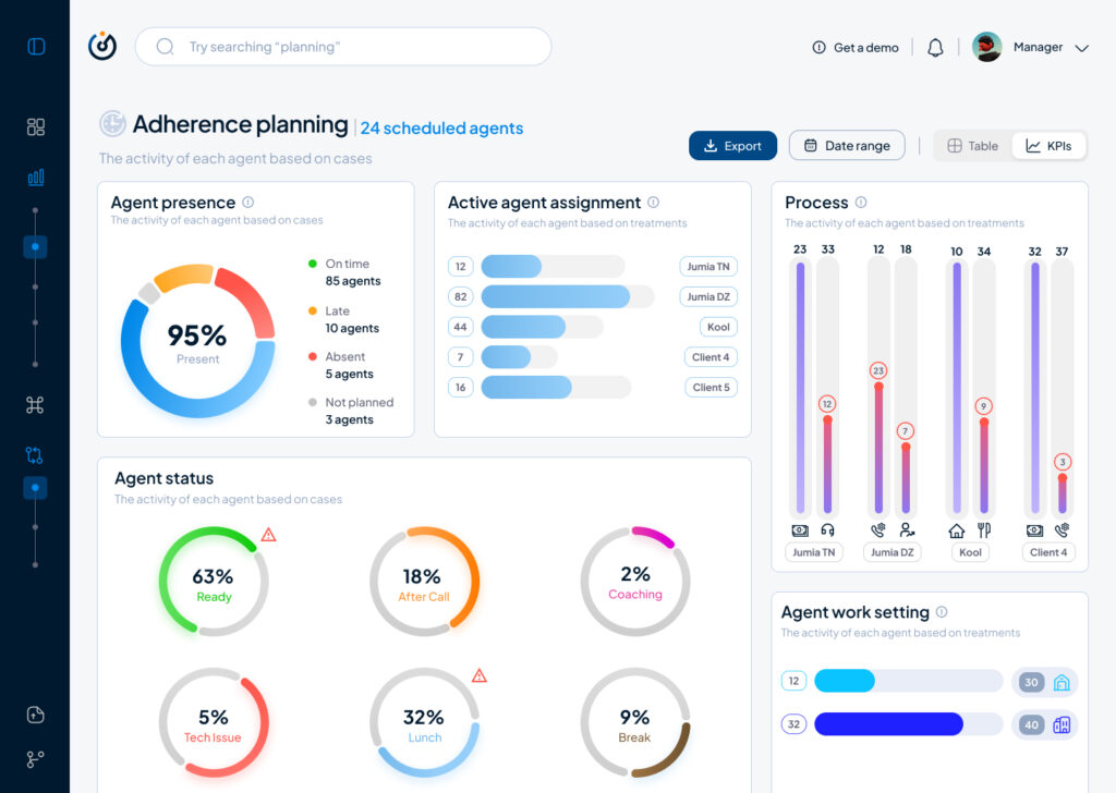
This small demo showcases some parts of the product experience that is offered beginning with Steering on its macro micro levels:
As part of my SaaS project, one of the user interfaces that had to be done is the Steering dashboard but it required a lot of back and fourth of feedback, iterations and meetings to finally come to a great enough version in terms of functionality and business but as a product designer and using Lean UX as a methodolgy , at some stage I had to do an iteration test.
Macro and Steering are the fundamentals of what consists this interface, they serve the business internally as much as they serve it externally with clients and prospects.
Macro: refers to the holistic overview of an insights dashboard and its part of the macro-micro dynamic that I’m using as a system thinking for the whole project.
Steering: provides a real-time view of every KPI needed to make better decisions and steer the business towards a better course.
This testing/iteration process shows the first level of a user interface that required little user interview, user feedback and zero iteration but it served as a good foundation and a stepping stone to a later version that will pave the way to the “final” iteration.
The first version was even called ‘Adherence Planning’ which was an innacurate term of what we are trying to achieve and also because it defined only one aspect of the whole dashboard.
It had the basic insights that we want to show without much output but it was limited, inefficient and not value driven on a business level.
So after much stakeholder’s feedback we iterated that version to a much effective version that visualised the data in a much more functional manner and I did that through designing the work force performance gauge chart, rearranging the cards to suit the data monitoring priority, tweaked the charts and their colors on a UI level for more effective anomaly identification, streamlied the data visualisation with proper alerts identification and finally made the 3 dots ‘kebab’ compartment the drawer where every additional setting is hidden, and here is where I arrived:
The Steering Dashboard is now much more structured and serves the decision making business goal on a decent level, every KPI can be checked and monitored in real time along with checking the business performance in terms of profit and loss through the “Work force performance” gauge.
What I learned
A disruptive data vizualisation product can never be done, but through proper UI UX design, testing, iterating and coming up with the optimal solutions, it can reach a certain level of efficient structure that will propel it to achieve some of the business goals that were far further in the roadmap of the product experience and all of the above can only be done through collaboration and proper communication within a team.
All and all, I’m just getting started and i’m thrilled to work more on the refinement of both my skills and everything that I get involved in
At the current stage of the project, before engaging with real-time biofeedback sensors or integrating hardware systems, I deliberately chose to begin with a simulation-based exploration using publicly available physiological datasets. This decision was grounded in both practical and conceptual motivations. On one hand, working with curated datasets provides a stable, low-risk environment to test hypotheses, establish workflows, and identify relevant signal characteristics. On the other hand, it also offered an opportunity to engage critically with the structure, semantics, and limitations of real-world psychophysiological recordings—particularly in the context of trauma-related conditions.
My personal interest in trauma physiology, shaped by lived experience during the war in Ukraine, has influenced the conceptual direction of this work. I was particularly drawn to understanding how conditions such as post-traumatic stress disorder (PTSD) might leave measurable traces in the body—traces that could be explored not only scientifically, but also sonically and artistically. This interest was further informed by reading The Body Keeps the Score by Bessel van der Kolk, which inspired me to look for empirical signals that reflect internal states which often remain inaccessible through language alone.
With this perspective in mind, I selected a large dataset focused on stress-induced myocardial ischemia as a starting point. Although the dataset was not originally designed to study PTSD, it includes a diverse group of participants—among them individuals diagnosed with PTSD, as well as others with complex comorbidities such as coronary artery disease and anxiety-related disorders. The richness of this cohort, combined with the inclusion of multiple biosignals (ECG, respiration, blood pressure), makes it a promising foundation for exploratory analyses.
Rather than seeking definitive conclusions at this point, my aim is to uncover what is possible—to understand which physiological patterns may hold relevance for trauma detection, and how they might be interpreted or transformed into expressive modalities such as sound or movement. This stage of the project is therefore best described as investigative and generative: it is about opening up space for experimentation and reflection, rather than narrowing toward specific outcomes.
Data Preparation and Extraction of Clinical Metadata from JSON Records
To efficiently identify suitable subjects for simulation, I first downloaded a complete index of data file links provided by the repository. Using a regular expression-based filtering mechanism implemented in Python, I programmatically extracted only those links pointing to disease-related JSON records for individual subjects (i.e., files following the pattern sub_XXX_disease.json). This was performed using a custom script (see downloaded_disease_files.py) which reads the full list of URLs from a text file and downloads the filtered subset into a local directory. A total of 119 such JSON records were retrieved.
Following acquisition, a second Python script (summary.py) was used to parse each JSON file and consolidate its contents into a single structured table. Each JSON file contained binary and categorical information corresponding to specific diagnostic criteria, including presence of PTSD, angina, stress-induced ischemia, pharmacological responses, and psychological traits (e.g., anxiety and depression scale scores, Type D personality indicators).
The script extracted all available key-value pairs and added a subject_id field derived from the filename. These entries were stored in a pandas DataFrame and exported to a CSV file (patients_disease_table.csv). The resulting table forms the basis for all subsequent filtering and selection of patient profiles for simulation.
This pipeline enabled me to rapidly triage a heterogeneous dataset by transforming a decentralized JSON structure into a unified tabular format suitable for further querying, visualization, and real-time signal emulation.
Group Selection and Dataset Subsetting
In order to meaningfully simulate and compare physiological responses, I manually selected a subset of subjects from the larger dataset and organized them into four distinct groups based on diagnostic profiles derived from the structured disease table:
Healthy group: Subjects with no recorded psychological or cardiovascular abnormalities.
Mental health group: Subjects presenting only with psychological traits such as elevated anxiety, depressive symptoms, or Type D personality, but without ischemic or cardiac diagnoses.
PTSD group: Subjects with a verified PTSD diagnosis, often accompanied by anxiety traits and non-obstructive angina, but without broader comorbidities.
Clinically sick group: Subjects with extensive multi-morbidity, showing positive indicators across most of the diagnostic criteria including ischemia, psychological disorders, and cardiovascular dysfunctions.
This manual classification enabled targeted downloading of signal data for only those subjects who are of particular interest to the ongoing research.
A custom Python script was then used to selectively retrieve only the relevant signal files—namely, 500 Hz ECG recordings from three phases (rest, stress, recovery) and the corresponding clinical complaint JSON files. The script filters a list of raw download links by matching both the subject ID and filename patterns. Each file is downloaded into a separate folder named after its respective group, thereby preserving the classification structure for downstream analysis and simulation.
Preprocessing of Raw ECG Signal Files
Upon downloading the raw signal files for the selected subjects, several structural and formatting issues became immediately apparent. These challenges rendered the original data format unsuitable for direct use in real-time simulation or further analysis. Specifically:
Scientific Notation Format All signal values were encoded in scientific notation (e.g., 3.2641e+02), requiring transformation into standard integer format suitable for time-domain processing and sonification.
Flattened and Fragmented Data Each file contained a single long sequence of values with no clear delimiters or column headers. In some cases, the formatting introduced line breaks within numbers, further complicating parsing and extraction.
Twelve-Lead ECG in a Single File The signal for all 12 ECG leads was stored in a single continuous stream, without metadata or segmentation markers. The only known constraint was that the total length of the signal was always divisible by 12, implying equal-length segments per lead.
Separated Recording Phases Data for each subject was distributed across three files, each corresponding to one of the experimental phases: rest, stress, and recovery. For the purposes of this project—particularly real-time emulation and comparative analysis—I required a single, merged file per lead containing the full time course across all three conditions.
Solution: Custom Parsing and Lead Separation Script
To address these challenges, I developed a two-stage Python script to convert the raw .csv files into a structured and usable format:
Step 1: Parsing and Lead Extraction The script recursively traverses the directory tree to identify ECG files by filename patterns. For each file:
The ECG phase (rest, stress, or recover) is inferred from the filename.
The subject ID is extracted using regular expressions.
All scientific-notation numbers are matched and converted into integers. Unrealistically large values (above 10,000) are filtered out to prevent corruption.
The signal is split into 12 equally sized segments, corresponding to the 12 ECG leads. Each lead is saved as a separate .csv file inside a folder structure organized by subject and phase.
Step 2: Lead-Wise Concatenation Across Phases Once individual leads for each phase were saved, the script proceeds to merge the rest, stress, and recovery segments for each lead:
For every subject, it locates the three corresponding files for each lead.
These files are concatenated vertically (along the time axis) to form a continuous signal.
The resulting merged signals are saved in a dedicated combined folder per subject, with filenames that indicate the lead number and sampling rate.
This conversion pipeline transforms non-tabular raw data into standardized time series inputs suitable for further processing, visualization, or real-time simulation.
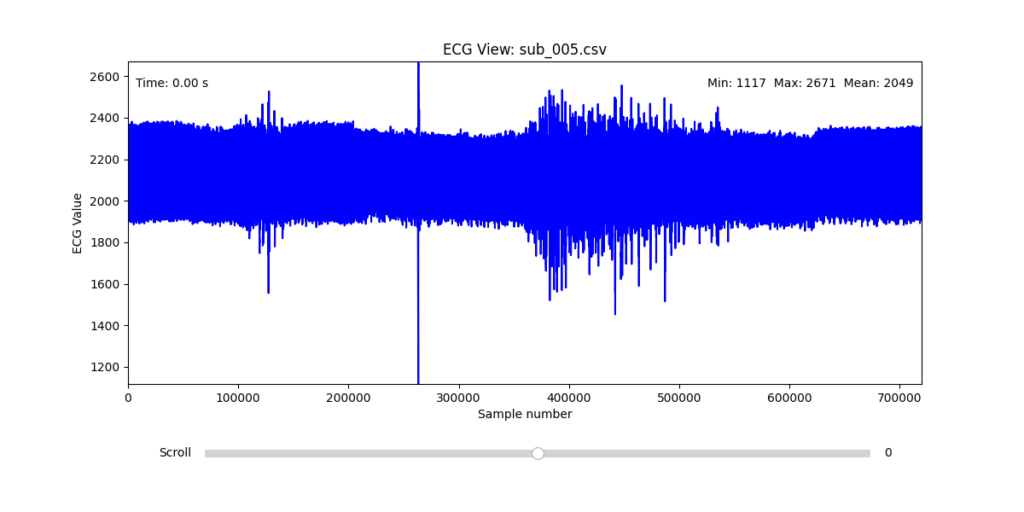
Manual Signal Inspection and Selection of Representative Subjects
While the data transformation pipeline produced technically readable ECG signals, closer inspection revealed a range of physiological artifacts likely introduced during the original data acquisition process. These irregularities included signal clipping, baseline drift, and abrupt discontinuities. In many cases, such artifacts can be attributed not to software or conversion errors, but to common physiological and mechanical factors—such as subject movement, poor electrode contact, skin conductivity variation due to perspiration, or unstable placement of leads during the recording.
These artifacts are highly relevant from a performative and conceptual standpoint. Movement-induced noise and instability in bodily measurements reflect the lived, embodied realities of trauma, and they may eventually be used as expressive material within the performance itself. However, for the purpose of initial analysis and especially heart rate variability (HRV) extraction, such disruptions compromise signal clarity and algorithmic robustness.
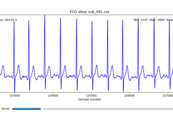
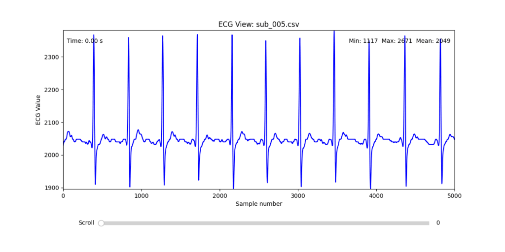
To navigate this complexity, I conducted a manual review of the ECG signals for all 16 selected subjects. Each of the 12 leads per subject was visually examined across the three experimental phases (rest, stress, and recovery). From this process, I identified one subject from each group (healthy, mental health, PTSD, and clinically sick) whose signals displayed the least amount of distortion and were most suitable for initial HRV-focused simulation.
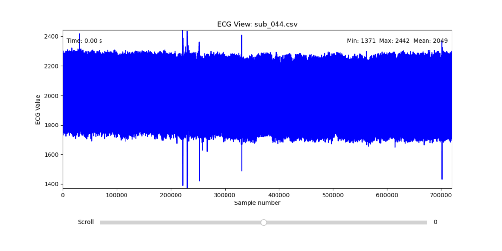
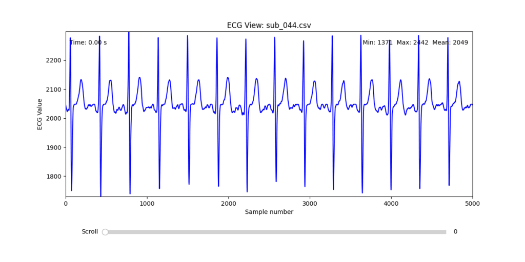
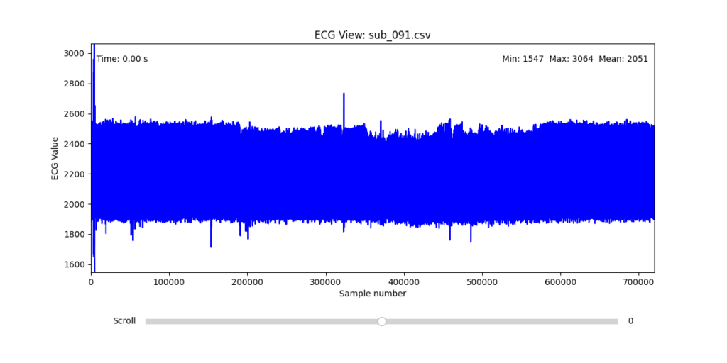
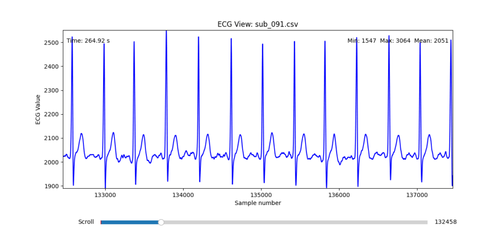
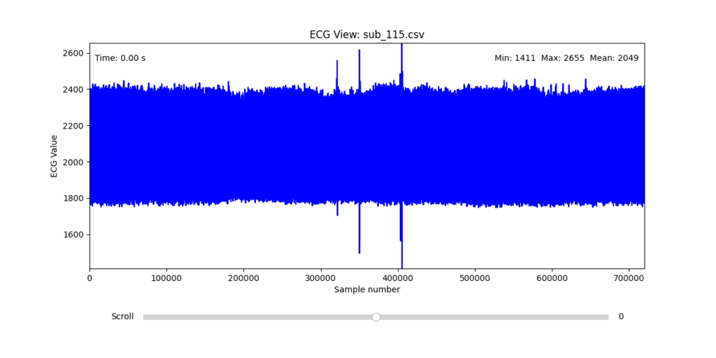
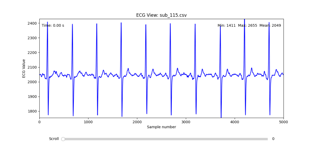
Diagnostic Visualization Tool
To facilitate and streamline this selection process, I implemented a simple interactive visualization tool in Python. This utility allows for scrollable navigation through long ECG recordings, with a resizable window and basic summary statistics (min, max, mean values). It was essential for rapidly identifying where signal corruption occurred and assessing lead quality in a non-automated but highly effective way.
This tool enabled both quantitative assessment and intuitive engagement with the data, providing a necessary bridge between raw measurement and informed experimental design.
Selection of Final Subjects and Optimal ECG Leads
Following visual inspection of all 12 ECG leads across the 16 initially shortlisted subjects, I selected one representative from each diagnostic group whose recordings exhibited the highest signal quality and least interference. The selection was based on manual analysis using the custom-built scrollable ECG viewer, with particular attention given to the clarity and prominence of QRS complexes—a critical factor for accurate heart rate variability (HRV) analysis. The final subjects are: 005, 044, 091, 115:
These signals will serve as the primary input for all upcoming simulation and sonification stages. While artifacts remain an inherent part of physiological measurement—especially in ambulatory or emotionally charged conditions—this selection aims to provide a clean analytical baseline from which to explore more experimental, expressive interpretations in later phases.
References:
Van der Kolk, Bessel A. 2014. The Body Keeps the Score: Brain, Mind, and Body in the Healing of Trauma. New York: Viking.
At this year’s WebExpo in Prague, one of the talks that stood out most to me was Nadieh Bremer’s session titled “Creating an Effective & Beautiful Data Visualisation from Scratch.” With no prior experience using d3.js, I didn’t quite know what to expect. I was mainly curious about how data visualisation could be approached from a design perspective. But what Nadieh shared was much more than a technical intro, it felt like a live deep dive into creative thinking, problem-solving, and visual storytelling.
What set this talk apart was its format. Rather than giving a traditional slide-based talk, Nadieh did a live coding session. She started with a completely empty browser window and built the data visualisation from the ground up using d3.js. This format made the talk feel refreshingly honest and grounded. It was engaging to watch her work through the logic in real time – narrating each decision as she went, pointing out potential issues, and offering insight into how she solves problems as they arise. This transparency made the whole process feel approachable, even though I was unfamiliar with the tool.
What I appreciated most was how she balanced the technical with the creative. It wasn’t just about writing functional code; it was about shaping something visually appealing and meaningful. Nadieh showed how, with a bit of imagination, SVG can be used in unconventional and expressive ways. The result wasn’t a generic bar chart or pie graph – it was a visually rich and thoughtfully composed visualisation that clearly communicated the underlying data while also looking beautiful.
Her message about simplification really resonated with me. I often struggle with the tendency to include too much information in my designs, believing that more content adds value. Nadieh’s approach showed the opposite: that complexity can be made understandable through clarity, and that thoughtful visual design can make even dense data feel intuitive. She emphasized that effective data visualisation doesn’t just display information – it tells a story. And when done well, it can communicate more with less.
Beyond the content, I also want to mention how well-structured and calm her presentation style was. Live coding can be stressful to watch (and probably to do), but she created a relaxed atmosphere that made it easy to follow along. Even when something didn’t work immediately, she explained why and showed how to fix it – normalizing the trial-and-error nature of coding.
Overall, this talk was a highlight of WebExpo for me. It was both inspiring and informative, offering practical insights into a tool I hadn’t encountered before. It made me want to experiment with data visualisation myself and gave me a clearer sense of how design can play a crucial role in making complex information understandable, and even beautiful.
Clutter and confusion are not attributes of data—they are shortcomings of design. – Edward Tufte
Michael Friendly defines data visualization as “information which has been abstracted in some schematic form, including attributes or variables for the units of information.” In other words, it is a coherent way to visually communicate quantitative content. Depending on its attributes, the data may be represented in many different ways, such as a line graph, bar chart, pie chart, scatter plot, or map.
It’s important for product designers to adhere to data visualization best practices and determine the best way to present a data set visually. Data visualizations should be useful, visually appealing and never misleading. Especially when working with very large data sets, developing a cohesive format is vital to creating visualizations that are both useful and aesthetic.
Principles
Define a Clear Purpose
Data visualization should answer vital strategic questions, provide real value, and help solve real problems. It can be used to track performance, monitor customer behavior, and measure effectiveness of processes, for instance. Taking time at the outset of a data visualization project to clearly define the purpose and priorities will make the end result more useful and prevent wasting time creating visuals that are unnecessary.
Know the Audience
A data visualization is useless if not designed to communicate clearly with the target audience. It should be compatible with the audience’s expertise and allow viewers to view and process data easily and quickly. Take into account how familiar the audience is with the basic principles being presented by the data, as well as whether they’re likely to have a background in STEM fields, where charts and graphs are more likely to be viewed on a regular basis.
Visual Features to Show the Data Properly
There are so many different types of charts. Deciding what type is best for visualizing the data being presented is an art unto itself. The right chart will not only make the data easier to understand, but also present it in the most accurate light. To make the right choice, consider what type of data you need to convey, and to whom it is being conveyed.
Make Data Visualization Inclusive
Color is used extensively as a way to represent and differentiate information. According to a recent study conducted by Salesforce, it is also a key factor in user decisions.
They analyzed how people responded to different color combinations used in charts, assuming that they would have stronger preferences for palettes that had subtle color variations since it would be more aesthetically appealing.
However, they found that while appealing, subtle palettes made the charts more difficult to analyze and gain insights. That entirely defeats the purpose of creating a visualization to display data.
The font choice can affect the legibility of text, enhancing or detracting from the intended meaning. Because of this, it’s better to avoid display fonts and stick to more basic serif or sans serif typefaces.
Conclusion
Good data visualization should communicate a data set clearly and effectively by using graphics. The best visualizations make it easy to comprehend data at a glance. They take complex information and break it down in a way that makes it simple for the target audience to understand and on which to base their decisions.
As Edward R. Tufte pointed out, “the essential test of design is how well it assists the understanding of the content, not how stylish it is.” Data visualizations, especially, should adhere to this idea. The goal is to enhance the data through design, not draw attention to the design itself.
Keeping these data visualization best practices in mind simplifies the process of designing infographics that are genuinely useful to their audience.