Over the past week I dove into sketching my very first EV charging station interface, on paper, low-fi style. My goal? A clean, intuitive flow that anyone, whether standing or in a wheelchair, can use without a hitch.
1. First Sketches: Facing the Screen
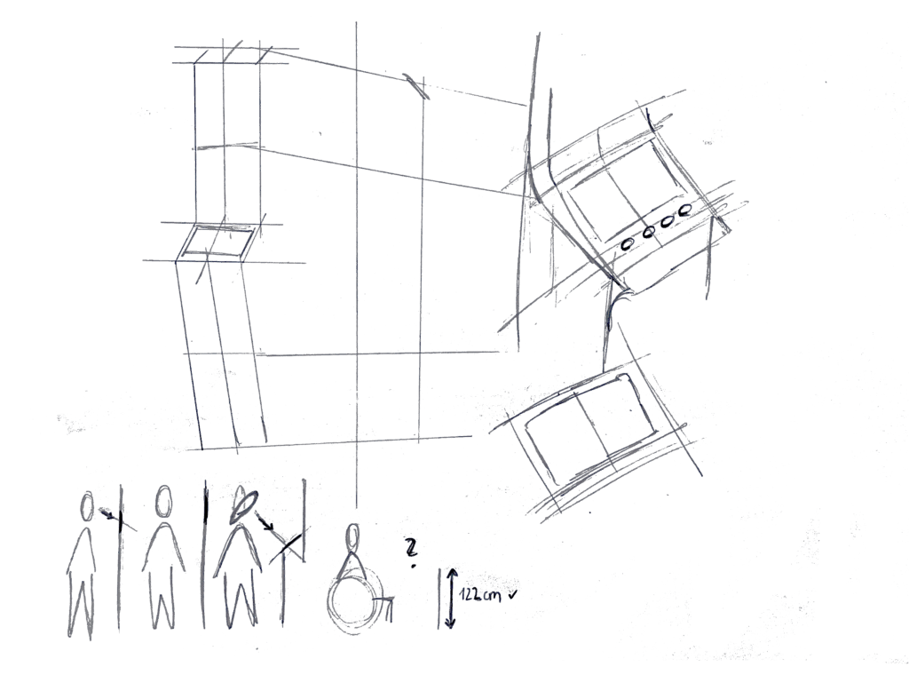
I started by thinking about how the display sits in real life. Based on some research I’d gathered (https://www.sciencedirect.com/science/article/abs/pii/S0169814197000875), I initially tilted the screen at about 45° for comfortable reach and visibility. Drawing a single-column station with that slanted display felt natural…until I grabbed a ruler and realized wheelchair users would struggle to see or reach it. Back to the sketchbook.
2. Measuring for Everyone
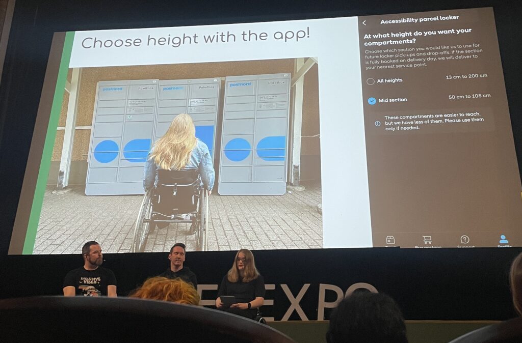
Next, I looked up anthropometric data: average standing height (around 1.63 m for women) and wheelchair eye level (about 1.30 m). That research told me the top of the screen should sit at roughly 1.60 m, with the row of buttons falling around 1.20 m. Everyone’s arm and line-of-sight reach now fall squarely within easy range.


3. Second Sketches: Flat & Accessible
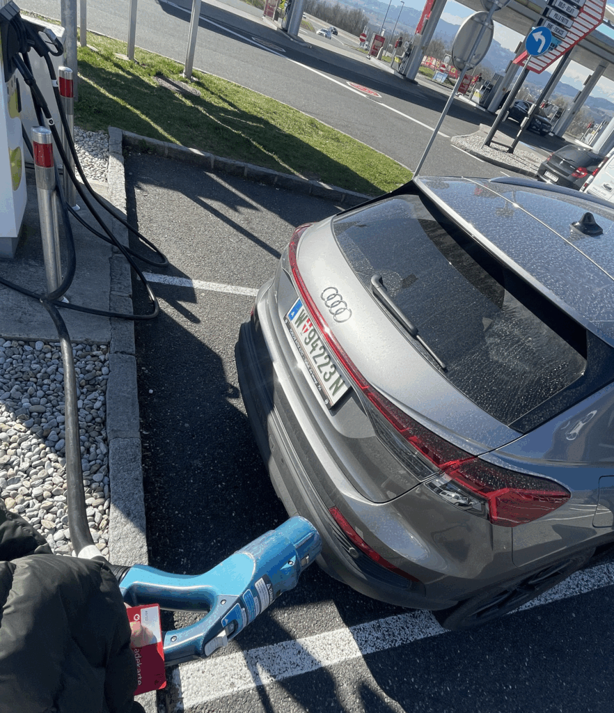
Armed with those new dimensions, I redrew the station. This time the screen is perfectly vertical, no tilt, so a seated user can see the full interface. On each side: charging cables loop neatly above the column. From past frustration I know that having the cable hang above the car inlet gives you full freedom of movement, if it came from below, you’d scrape against bumpers or crouch awkwardly. The cable’s plug snaps in and out with minimal force and a clear click, avoiding any wrestling match.

4. Interaction Storyboard
- Welcome Screen (140 cm high): A crisp display text and 4 sturdy physical buttons. Underneath, the payment pad glows green when it’s your turn to tap.
- Scan Step: Three payment methods—bank card tap, RFID charge card, or QR code scan. A left-arrow “Back” button stays red until you choose.
- Plug Step: You pull the cable from its cradle, align it to your car’s port, and push in. A simple animated diagram on screen guides you.
- Confirmation Lights: With each successful step—scan, plug, start—an LED ring pulses green. If something’s off, it flashes yellow for “check connection.”
- Charging Dashboard: Once juice is flowing, you see real-time kWh delivered, state-of-charge %, and an estimated “Time Remaining.” A big “End Session” button waits for you.

5. Beyond the Screen: Real-World Accessibility
A few extra thoughts, courtesy of accessibility best practices:
- Pathway Design: The route from parking spot to station needs a gentle ramp or smooth, level surface (no hidden curbs)
- Color & Contrast: Color-blind or low-vision users need high-contrast icons and optional haptic or audio cues. Long-press “Touch to Speech” could read aloud on-screen labels.
- Height Considerations: Remember: 130 cm eye height for wheelchair users vs. 163 cm average standing height. Buttons and screens must accommodate both.
- Future-Proofing: As self-driving cars roll in, drivers that are visually impaired should also be able to interact with the Charging Station
What’s next? I will turn my sketches from the last post into more mid-to-heigh-fidelity wireframes, then run two rounds of user tests. I’ll watch them scan, tap, and plug in. Their real-time reactions will guide the next iteration: adjusting button sizes, tweaking the cable loop, or even adding voice prompts.
Every scribble, every measurement, and every user test brings me closer to a charging experience that’s not just functional, but truly inclusive, so that plugging in your EV feels as natural as unlocking your phone. Stay tuned for my prototype reveal in the video and my reflection and learnings of this project.