Blog 3: Current problems in EV Charging (Focus on User Experience and Accessibility)

On my current research and hands on experience with Chargers, I noticed that public charging infrastructure hasn’t caught up in terms of user experience and inclusivity. In this post i just want to dive little bit deeper and for that I did a small desk research. Here’s what’s going wrong:

Inconsistent User Interfaces & Unclear Feedback

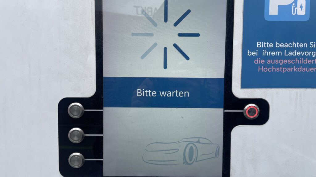
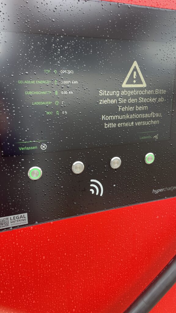
  • Every station looks and acts differently. Menus vary wildly, icons are confusing and messaging like “Error 47” doesn’t explain much. Users often struggle to initiate charging or interpret unclear statuses
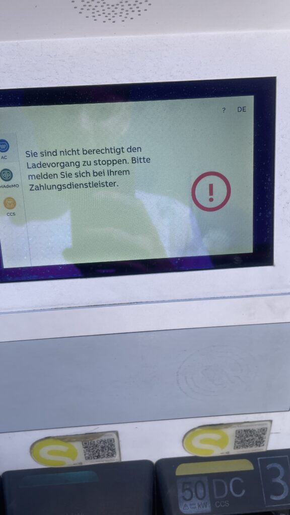
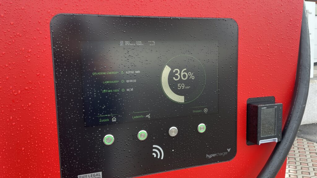
  • No real-time clarity. Displays frequently fail to show clear information like charging progress or estimated time remaining—making users feel uncertain and anxious

Accessibility Design Gaps

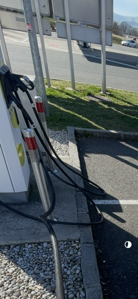
  • Physical barriers: No ramps or extra-wide spaces for wheelchair users. Many stations have high-mounted screens and stiff, heavy cables that require extra strength to operate .
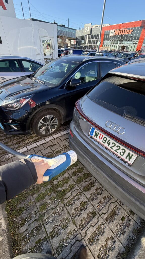
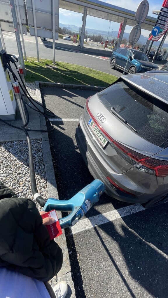
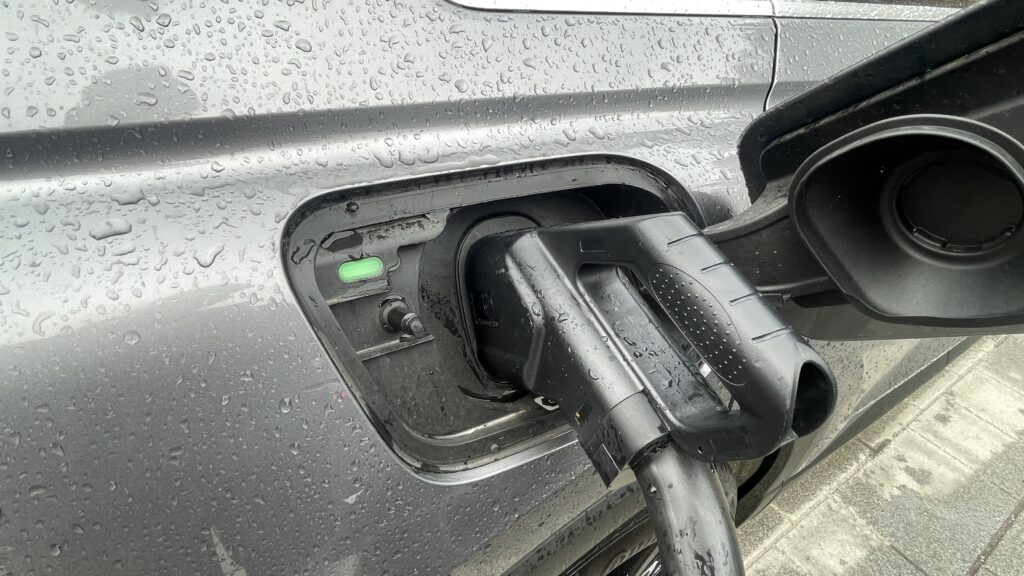
  • Cable issues: CCS and other fast-charging cables are weighty and inflexible due to cooling needs. They’re often too short or too long making them hard to plug in for many users.
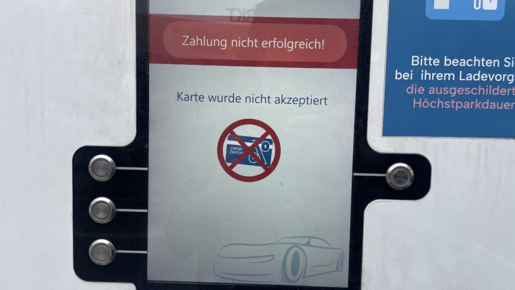
Own Image Documentation

Environmental & Spatial Constraints

  • Tight, unprotected spaces: Narrow bays, poor lighting, lack of shelter, all uncomfortable design choices, especially in bad weather or for vulnerable users
  • No tactile or audio support: Stations rarely include braille, haptic feedback, or voice prompts, ignoring users with visual or dexterity issues

Technical Unreliability & App Dependency

  • High failure rates: About 27% of public fast chargers are out of commission at any given time -> broken screens, failed connectors, or payment system glitches
  • App-only access: Many chargers demand app use for payment or activation, making usability dependent on the quality of the app and user connectivity
  • Multiple apps, multiple frustrations: Switching between brand-specific apps for each station is a constant headache for EV drivers

So why it is important to think of

  1. Creates anxiety & frustration
    Unpredictable errors and poor guidance lead to “range anxiety” and erode trust in the EV charging system.
  2. Excludes vulnerable users
    People with disabilities, seniors, or those less tech-savvy often find stations unusable, limiting EV adoption.
  3. Undermines wider EV adoption
    If charging remains cumbersome, many potential EV drivers will stick to fossil fuels, slowing sustainable transport progress.

What needs to Change

To make EV charging intuitive and inclusive there are some steps to consider:

  • Standardized UI elements: Clear steps like “Plug in, Tap to Start, Charging…” with robust feedback via visual, auditory, and haptic cues.
  • Inclusive hardware design: Adjustable screen heights, lighter cables (or cable reels), tactile buttons, braille labels, and wide, ramp-equipped bays.
  • Safety & comfort enhancements: Covered, well-lit stations with seats or resting areas especially important for longer charging waits.
  • Reliable offline access: Card readers plus app options, chargers that work even without mobile signal
  • Unified interfaces across networks: Consistent flows and minimal apps, drivers shouldn’t have to learn a new system at every station

Next Step: Rapid Prototyping

With these insights, my next step is to build or sketch something quick and to test it and iterate of course. With this i mean low-cost prototypes, sketches, cardboard interfaces, or simple physical models to validate ideas, also thinking about lego prototype:

  • trying out a height-adjustable screen mock-up with clear call-to-action buttons.
  • maybe simulating cable-handling ergonomics with also light feedback threw makey makey
  • Test feedback designs (LED, sound, or haptics).
  • Role-play station use in cramped or wheelchair-accessible scenarios.

These hands-on prototypes will reveal what truly makes charging intuitive and comfortable giving valuable, user-driven data before moving to high-fidelity design.

Clifford, J., Savargaonkar, M., Rumsey, P., Quinn, C., Varghese, B., & Smart, J. (2024). Understanding EV Charging Pain Points through Deep Learning Analysis. Idaho National Laboratory. SSRN. https://ssrn.com/abstract=5031126

https://www.evaglobal.com/news/accessible-charging-for-all-a-solutions-approach#:~:text=In%20a%20public%20charging%20environment,critical%20for%20public%20charging%20infrastructure

https://kempower.com/user-experience-ev-charger-design

What I learned as the Core Principles for Designing Better Quantitative Content

Clutter and confusion are not attributes of data—they are shortcomings of design. – Edward Tufte

Michael Friendly defines data visualization as “information which has been abstracted in some schematic form, including attributes or variables for the units of information.” In other words, it is a coherent way to visually communicate quantitative content. Depending on its attributes, the data may be represented in many different ways, such as a line graph, bar chart, pie chart, scatter plot, or map.

It’s important for product designers to adhere to data visualization best practices and determine the best way to present a data set visually. Data visualizations should be useful, visually appealing and never misleading. Especially when working with very large data sets, developing a cohesive format is vital to creating visualizations that are both useful and aesthetic.

Principles

Define a Clear Purpose


Data visualization should answer vital strategic questions, provide real value, and help solve real problems. It can be used to track performance, monitor customer behavior, and measure effectiveness of processes, for instance. Taking time at the outset of a data visualization project to clearly define the purpose and priorities will make the end result more useful and prevent wasting time creating visuals that are unnecessary.

Know the Audience


A data visualization is useless if not designed to communicate clearly with the target audience. It should be compatible with the audience’s expertise and allow viewers to view and process data easily and quickly. Take into account how familiar the audience is with the basic principles being presented by the data, as well as whether they’re likely to have a background in STEM fields, where charts and graphs are more likely to be viewed on a regular basis.

Visual Features to Show the Data Properly


There are so many different types of charts. Deciding what type is best for visualizing the data being presented is an art unto itself. The right chart will not only make the data easier to understand, but also present it in the most accurate light. To make the right choice, consider what type of data you need to convey, and to whom it is being conveyed.

Make Data Visualization Inclusive


Color is used extensively as a way to represent and differentiate information. According to a recent study conducted by Salesforce, it is also a key factor in user decisions.

They analyzed how people responded to different color combinations used in charts, assuming that they would have stronger preferences for palettes that had subtle color variations since it would be more aesthetically appealing.

However, they found that while appealing, subtle palettes made the charts more difficult to analyze and gain insights. That entirely defeats the purpose of creating a visualization to display data.

The font choice can affect the legibility of text, enhancing or detracting from the intended meaning. Because of this, it’s better to avoid display fonts and stick to more basic serif or sans serif typefaces.

Conclusion

Good data visualization should communicate a data set clearly and effectively by using graphics. The best visualizations make it easy to comprehend data at a glance. They take complex information and break it down in a way that makes it simple for the target audience to understand and on which to base their decisions.

As Edward R. Tufte pointed out, “the essential test of design is how well it assists the understanding of the content, not how stylish it is.” Data visualizations, especially, should adhere to this idea. The goal is to enhance the data through design, not draw attention to the design itself.

Keeping these data visualization best practices in mind simplifies the process of designing infographics that are genuinely useful to their audience.

WebExpo Conference: Accessibility in Everyday Interfaces (A Talk That Changed My Perspective for my further process for EV Charging)

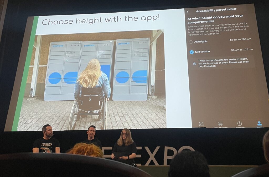
On the first day of the WebExpo I attended a talk on accessibility that really made me stop and think not just about design in general, but specifically about my own research topic on EV charging stations. The session started by showing the common issues people with disabilities face in daily life when interacting with digital interfaces. Then the presenters (including three people with real-life impairments) gave us a deep look into their world.

One of the speakers was visually impaired and had only 1% vision. Another was in a wheelchair and one had a chronic condition like diabetes. Hearing them speak about their everyday struggles with things that most of us take for granted, like picking up a package from a pick up post station or using a touchscreen, was eye opening. It made me realize how exclusive some of our current designs still are.

One key problem they highlighted was the rise of touchscreenonly interfaces. These don’t give any tactile feedback and are often completely inaccessible to blind users. As a solution, they showed us a great concept: when a user holds their finger longer on the screen, a voice (through text-to-speech) reads aloud what the button does. This gives blind or visually impaired users the confidence to use touch interfaces, especially when there are no physical buttons or guidance cues.

They mentioned the use of the Web Speech API, which made the solution sound very practical and implementable. What I found really interesting was how this solution could relate to my own research on EV charging stations. Right now, many charging stations already have touch displays. But what happens if a blind passenger, maybe not the driver, wants to start the charging process? Or what if we think further into the future, where self-driving cars are common, and blind or wheelchair users are traveling alone?

This made me realize: accessibility shouldn’t be an “extra”, t should be part of the core design, especially for public infrastructure. I was also thinking about the aspect that probably sometimes stakeholders or companies don’t believe accessibility is needed because they assume disabled people are not part of their target audience. This is a dangerous assumption. Everyone deserves access.

Furthermore about the text to speech interface I asked myself: “How do visually impaired people even know that a product has a long-press text-to-speech function?” I need to write the speaker about this because they didn’t mention it.

The talk has truly influenced how I think about my EV charging station prototype. I now feel it’s essential to at least consider how someone with limited sight, or physical ability, might interact with the interface. Whether that means adding text-to-speech, or voice control, or rethinking the flow entirely, accessibility should be part of the process.

I’m also planning to write to the speaker to ask some follow-up questions. It’s clear to me now: accessible UX is not just nice to have, it’s a necessity for a more inclusive future.

Explore II: Image Extender – Image sonification tool for immersive perception of sounds from images and new creation possiblities

The Image Extender project bridges accessibility and creativity, offering an innovative way to perceive visual data through sound. With its dual-purpose approach, the tool has the potential to redefine auditory experiences for diverse audiences, pushing the boundaries of technology and human perception.

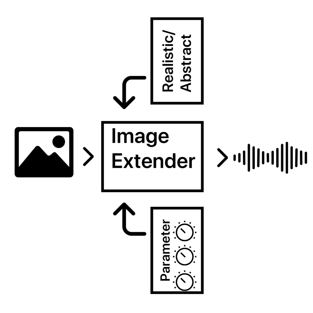
The project is designed as a dual-purpose tool for immersive perception and creative sound design. By leveraging AI-based image recognition and sonification algorithms, the tool will transform visual data into auditory experiences. This innovative approach is intended for:

1. Visually Impaired Individuals
2. Artists and Designers

The tool will focus on translating colors, textures, shapes, and spatial arrangements into structured soundscapes, ensuring clarity and creativity for diverse users.

  • Core Functionality: Translating image data into sound using sonification frameworks and AI algorithms.
  • Target Audiences: Visually impaired users and creative professionals.
  • Platforms: Initially desktop applications with planned mobile deployment for on-the-go accessibility.
  • User Experience: A customizable interface to balance complexity, accessibility, and creativity.

Working Hypotheses and Requirements

  • Hypotheses:
    1. Cross-modal sonification enhances understanding and creativity in visual-to-auditory transformations.
    2. Intuitive soundscapes improve accessibility for visually impaired users compared to traditional methods.
  • Requirements:
    • Develop an intuitive sonification framework adaptable to various images.
    • Integrate customizable settings to prevent sensory overload.
    • Ensure compatibility across platforms (desktop and mobile).

    Subtasks

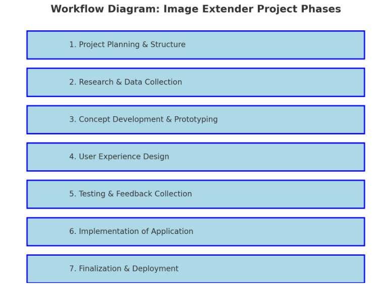
    1. Project Planning & Structure

    • Define Scope and Goals: Clarify key deliverables and objectives for both visually impaired users and artists/designers.
    • Research Methods: Identify research approaches (e.g., user interviews, surveys, literature review).
    • Project Timeline and Milestones: Establish a phased timeline including prototyping, testing, and final implementation.
    • Identify Dependencies: List libraries, frameworks, and tools needed (Python, Pure Data, Max/MSP, OSC, etc.).

    2. Research & Data Collection

    • Sonification Techniques: Research existing sonification methods and metaphors for cross-modal (sight-to-sound) mapping and research different other approaches that can also blend in the overall sonification strategy.
    • Image Recognition Algorithms: Investigate AI image recognition models (e.g., OpenCV, TensorFlow, PyTorch).
    • Psychoacoustics & Perceptual Mapping: Review how different sound frequencies, intensities, and spatialization affect perception.
    • Existing Tools & References: Study tools like Melobytes, VOSIS, and BeMyEyes to understand features, limitations, and user feedback.
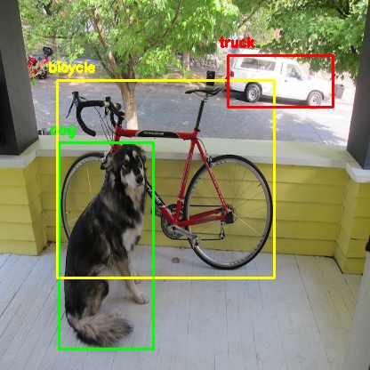
    object detection from python yolo library

    3. Concept Development & Prototyping

    • Develop Sonification Mapping Framework: Define rules for mapping visual elements (color, shape, texture) to sound parameters (pitch, timbre, rhythm).
    • Simple Prototype: Create a basic prototype that integrates:
      • AI content recognition (Python + image processing libraries).
      • Sound generation (Pure Data or Max/MSP).
      • Communication via OSC (e.g., using Wekinator).
    • Create or collect Sample Soundscapes: Generate initial soundscapes for different types of images (e.g., landscapes, portraits, abstract visuals).
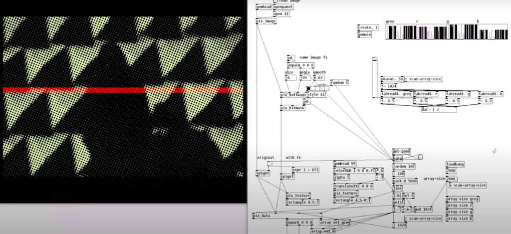
    example of puredata with rem library (image to sound in pure data by Artiom
    Constantinov)

    4. User Experience Design

    • UI/UX Design for Desktop:
      • Design intuitive interface for uploading images and adjusting sonification parameters.
      • Mock up controls for adjusting sound complexity, intensity, and spatialization.
    • Accessibility Features:
      • Ensure screen reader compatibility.
      • Develop customizable presets for different levels of user experience (basic vs. advanced).
    • Mobile Optimization Plan:
      • Plan for responsive design and functionality for smartphones.

    5. Testing & Feedback Collection

    • Create Testing Scenarios:
      • Develop a set of diverse images (varying in content, color, and complexity).
    • Usability Testing with Visually Impaired Users:
      • Gather feedback on the clarity, intuitiveness, and sensory experience of the sonifications.
      • Identify areas of overstimulation or confusion.
    • Feedback from Artists/Designers:
      • Assess the creative flexibility and utility of the tool for sound design.
    • Iterate Based on Feedback:
      • Refine sonification mappings and interface based on user input.

    6. Implementation of Standalone Application

    • Develop Core Application:
      • Integrate image recognition with sonification engine.
      • Implement adjustable parameters for sound generation.
    • Error Handling & Performance Optimization:
      • Ensure efficient processing for high-resolution images.
      • Handle edge cases for unexpected or low-quality inputs.
    • Cross-Platform Compatibility:
      • Ensure compatibility with Windows, macOS, and plan for future mobile deployment.

    7. Finalization & Deployment

    • Finalize Feature Set:
      • Balance between accessibility and creative flexibility.
      • Ensure the sonification language is both consistent and adaptable.
    • Documentation & Tutorials:
      • Create user guides for visually impaired users and artists.
      • Provide tutorials for customizing sonification settings.
    • Deployment:
      • Package as a standalone desktop application.
      • Plan for mobile release (potentially a future phase).

    Technological Basis Subtasks:

    1. Programming: Develop core image recognition and processing modules in Python.
    2. Sonification Engine: Create audio synthesis patches in Pure Data/Max/MSP.
    3. Integration: Implement OSC communication between Python and the sound engine.
    4. UI Development: Design and code the user interface for accessibility and usability.
    5. Testing Automation: Create scripts for automating image-sonification tests.

    Possible academic foundations for further research and work:

    Chatterjee, Oindrila, and Shantanu Chakrabartty. “Using Growth Transform Dynamical Systems for Spatio-Temporal Data Sonification.” arXiv preprint, 2021.

    Chion, Michel. Audio-Vision. New York: Columbia University Press, 1994.

    Görne, Tobias. Sound Design. Munich: Hanser, 2017.

    Hermann, Thomas, Andy Hunt, and John G. Neuhoff, eds. The Sonification Handbook. Berlin: Logos Publishing House, 2011.

    Schick, Adolf. Schallwirkung aus psychologischer Sicht. Stuttgart: Klett-Cotta, 1979.

    Sigal, Erich. “Akustik: Schall und seine Eigenschaften.” Accessed January 21, 2025. mu-sig.de.

    Spence, Charles. “Crossmodal Correspondences: A Tutorial Review.” Attention, Perception, Psychophysics, 2011.

    Ziemer, Tim. Psychoacoustic Music Sound Field Synthesis. Cham: Springer International Publishing, 2020.

    Ziemer, Tim, Nuttawut Nuchprayoon, and Holger Schultheis. “Psychoacoustic Sonification as User Interface for Human-Machine Interaction.” International Journal of Informatics Society, 2020.

    Ziemer, Tim, and Holger Schultheis. “Three Orthogonal Dimensions for Psychoacoustic Sonification.” Acta Acustica United with Acustica, 2020.

    Explore I: Image Extender – Image sonification tool for immersive perception of sounds from images and new creation possiblities

    The project would be a program that uses either AI-content recognition or a specific sonification algorithm by using equivalent of the perception of sight (cross-model metaphors).

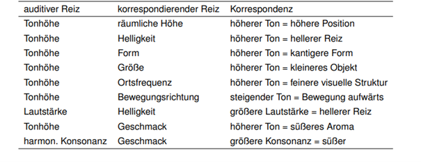
    examples of cross modal metaphors (Görne, 2017, S.53)

    This approach could serve two main audiences:

    1. Visually Impaired Individuals:
    The tool would provide an alternative to traditional audio descriptions, aiming instead to deliver a sonic experience that evokes the ambiance, spatial depth, or mood of an image. Instead of giving direct descriptive feedback, it would use non-verbal soundscapes to create an “impression” of the scene, engaging the listener’s perception intuitively. Therefore, the aspect of a strict sonification language might be a good approach. Maybe even better than just displaying the sounds of the images. Or maybe a mixture of both.

    2. Artists and Designers:
    The tool could generate unique audio samples for creative applications, such as sound design for interactive installations, brand audio identities, or cinematic soundscapes. By enabling the synthesis of sound based on visual data, the tool could become a versatile instrument for experimental media artists.

    Purpose

    The core purpose would be the mixture of both purposes before, a tool that supports and helps creating in the same suite.

    The dual purpose of accessibility and creativity is central to the project’s design philosophy, but balancing these objectives poses a challenge. While the tool should serve as a robust aid for visually impaired users, it also needs to function as a practical and flexible sound design instrument.

    The final product can then be used by people who benefit from the added perception they get of images and screens and for artists or designers as a tool.

    Primary Goal

    A primary goal is to establish a sonification language that is intuitive, consistent, and adaptable to a variety of images and scenes. This “language” would ideally be flexible enough for creative expression yet structured enough to provide clarity for visually impaired users. Using a dynamic, adaptable set of rules tied to image data, the tool would be able to translate colors, textures, shapes, and contrasts into specific sounds.

    To make the tool accessible and enjoyable, careful attention needs to be paid to the balance of sound complexity. Testing with visually impaired individuals will be essential for calibrating the audio to avoid overwhelming or confusing sensory experiences. Adjustable parameters could allow users to tailor sound intensity, frequency, and spatialization, giving them control while preserving the underlying sonification framework. It’s important to focus on realistic an achievable goal first.

    • planning on the methods (structure)
    • research and data collection
    • simple prototyping of key concept
    • testing phases
    • implementation in an standalone application
    • ui design and mobile optimization

    The prototype will evolve in stages, with usability testing playing a key role in refining functionality. Early feedback from visually impaired testers will be invaluable in shaping how soundscapes are structured and controlled. Incorporating adjustable settings will likely be necessary to allow users to customize their experience and avoid potential overstimulation. However, this customization could complicate the design if the aim is to develop a consistent sonification language. Testing will help to balance these needs

    Initial development will target desktop environments, with plans to expand to smartphones. A mobile-friendly interface would allow users to access sonification on the go, making it easier to engage with images and scenes from any device.

    In general, it could lead to a different perception of sound in connection with images or visuals.

    Needed components

    Technological Basis:

    Programming Language & IDE:
    The primary development of the image recognition could be done in Python, which offers strong libraries for image processing, machine learning, and integration with sound engines. Also wekinator could be a good start for the communication via OSC for example.

    Sonification Tools:
    Pure Data or Max/MSP are ideal choices for creating the audio processing and synthesis framework, as they enable fine-tuned audio manipulation. These platforms can map visual data inputs (like color or shape) to sound parameters (such as pitch, timbre, or rhythm).

    Testing Resources:
    A set of test images and videos will be required to refine the tool’s translations across various visual scenarios.

    Existing Inspirations and References:

    – Melobytes: Software that converts images to music, highlighting the potential for creative auditory representations of visuals.

    – VOSIS: A synthesizer that filters visual data based on grayscale values, demonstrating how sound synthesis can be based on visual texture.

    – image-sonification.vercel.app: A platform that creates audio loops from RGB values, showing how color data can be translated into sound.

    – BeMyEyes: An app that provides auditory descriptions for visually impaired users, emphasizing the importance of accessibility in technology design.

    Academic Foundations:

    Literature on sonification, psychoacoustics, and synthesis will support the development of the program. These fields will help inform how sound can effectively communicate complex information without overwhelming the listener.

    References / Source

    Görne, Tobias. Sound Design. Munich: Hanser, 2017.

    #09 Multisensory Accessibility: Expanding Inclusive Design Through Sensory Substitution

    As digital environments become increasingly immersive, multisensory design is transforming the way we interact with data, technology, and the world around us. However, ensuring these experiences are accessible to all remains a challenge. Traditional accessibility efforts have largely focused on visual-centric approaches, often excluding those who rely more on auditory, tactile, or cross-modal interactions.

    A promising solution lies in sensory substitution techniques, which translate one sensory input into another. These techniques, often used in assistive technologies, have the potential to move beyond niche applications and become mainstream tools that enhance accessibility for everyone.


    Beyond Visual-First Interfaces: Rethinking Multisensory Accessibility

    Most digital interfaces prioritise visual information—charts, text, and images dominate how we consume data. However, not everyone experiences the world through sight. A more inclusive design approach considers:

    • Sonification for Blind and Visually Impaired Users: Mapping data trends to sound (pitch rising for higher values) enables auditory pattern recognition.
    • Haptic Feedback for Deaf and Hard-of-Hearing Users: Vibrations and force feedback provide real-time alerts and spatial awareness.
    • Multisensory Adaptation for Neurodivergent Users: Some individuals process information better when it’s presented in multiple overlapping modalities, such as visual cues paired with subtle audio reinforcement.

    Rather than designing separate assistive solutions, multisensory experiences should be natively inclusive, allowing users to select the sensory mode that best suits them.


    Sensory Substitution: A Bridge to Universal Access

    Sensory substitution devices (SSDs) replace information from one sensory modality with another, making data accessible in novel ways. For example:

    • Visual-to-Auditory Substitution: Devices like The vOICe convert camera images into real-time soundscapes, allowing users to “hear” shapes and motion.
    • Visual-to-Tactile Interfaces: Systems like BrainPort translate images into electrical pulses felt on the tongue, enabling spatial navigation for the visually impaired.
    • Cross-Modal Mapping in Mainstream Design: Everyday interfaces can integrate these concepts—imagine a navigation app that offers both vibration-based and sound-based guidance, allowing all users to choose their preferred sensory format.

    Despite their proven effectiveness, SSDs have not yet seen widespread adoption. A key challenge is that they are often designed only as assistive devices, rather than as features that could benefit all users in various contexts.


    Real-World Applications of Inclusive Multisensory Design

    By embedding sensory substitution and multisensory feedback into mainstream products, we unlock new ways of engaging with technology:

    • Tactile Data Exploration: Raised surfaces, interactive touchpads, or vibration-based data encoding allow users to physically experience data trends.
    • Multisensory VR & AR Experiences: Augmented and virtual reality environments can become more accessible by incorporating soundscapes, haptic responses, and cross-modal cues that extend beyond sight.
    • Flexible Accessibility in Public Spaces: Interactive kiosks and wayfinding systems should support dynamic mode-switching, allowing users to receive information through visual, auditory, or tactile outputs based on their needs.

    Designing for Multisensory Accessibility

    To create truly inclusive multisensory experiences, designers must:

    1. Prioritize Sensory Adaptability – Allow users to customize how they receive information (toggling between visual, auditory, and tactile cues).
    2. Focus on Cross-Modal Integration – Ensure sensory inputs reinforce each other rather than competing (subtle haptic cues guiding users toward an audio source).
    3. Adopt a Universal Design Perspective – Move away from “assistive add-ons” and instead create mainstream products that naturally support diverse sensory abilities.

    By making multisensory design accessible to all, we enhance usability for disabled users while also creating richer, more engaging experiences for everyone. Instead of viewing accessibility as an afterthought, it should be the foundation of future technology.

    References

    T. Lloyd-Esenkaya, V. Lloyd-Esenkaya, E. O’Neill, et al., “Multisensory inclusive design with sensory substitution,” Cognitive Research, vol. 5, no. 37, 2020, doi: 10.1186/s41235-020-00240-7.

    M. Leung, “A look toward the future: The power of creating accessible multisensory experiences,” Accessibility.com, Feb. 19, 2024. [Online]. Available: https://www.accessibility.com/blog/a-look-toward-the-future-the-power-of-creating-accessible-multisensory-experiences. [Accessed: Jan. 31, 2025].

    1.6. Breaking Barriers: Accessibility in Museums

    Museums worldwide are reimagining how they serve their diverse audiences by prioritizing accessibility. By embracing innovative strategies and tools, these cultural institutions aim to create inclusive experiences for all visitors, regardless of physical, sensory, or cognitive abilities. Accessibility efforts range from digital tools to tactile engagement and universal design principles, setting new standards for inclusivity in the cultural sector.

    Universal Design and Feedback

    Universal Design (UD) principles, which aim to accommodate the broadest range of users, underscore the importance of accessibility from the ground up. Equally important is leveraging visitor feedback to continually improve accessibility measures. As demonstrated by museums adopting systemic approaches to organizational change, accessibility is not just an addition but a core value [7][8].

    Tactile Accessibility

    Integrating tactile images and braille descriptions caters to visually impaired visitors, enriching their museum experience [2]. 

    At The Met, the program “Seeing Through Drawing” invites blind and partially sighted visitors to engage with artworks through touch and guided drawing exercises. This innovative approach fosters a deeper connection to the art, combining sensory exploration with creative expression [9].

    Visual Accessibility

    Deaf culture inclusion is another critical focus. Leading museums have embraced year-round initiatives like American Sign Language (ASL) tours and partnerships with Deaf communities to enhance accessibility [3]. Sign language tours and captioned videos are examples of how museums create a more inclusive experience for visitors with hearing impairments.

    The Rijksmuseum offers a Family Tour in International Sign for families with deaf children or parents, providing an interactive exploration of Dutch art and history. The tour includes hands-on activities like drawing and modeling. [10]

    Linguistic Accessibility

    Providing multilingual materials and offering live translations or captions can ensure that non-native speakers and those with hearing impairments can fully engage with exhibits [1]. 

    Accessibility for Neurodiverse Audiences

    Innovative designs addressing neurodiverse audiences exemplify creative solutions. Quiet zones, sensory maps, and clear, readable fonts are small yet impactful changes that foster inclusivity [5][6]. By offering sensory-friendly events and thoughtfully designed exhibits, museums can create more welcoming environments for individuals with neurodiverse needs.

    Digital Accessibility

    Improving digital accessibility—such as creating user-friendly websites and interactive apps—ensures virtual engagement for remote or disabled visitors [4]. 

    Conclusion

    This aligns with global efforts to make cultural institutions inclusive, ensuring everyone can enjoy and learn from shared histories and stories. By adopting these strategies, museums not only enhance engagement but also affirm their role as welcoming spaces for all individuals, irrespective of their abilities.

    References

    [1] American Alliance of Museums, “4 Ideas to Create Linguistic Accessibility at Museums,” Apr. 28, 2023. [Online]. Available: https://www.aam-us.org/2023/04/28/4-ideas-to-create-linguistic-accessibility-at-museums/

    [2] MuseumNext, “Tactile Images in Museums: Enhancing Accessibility and Engagement,” [Online]. Available: https://www.museumnext.com/article/tactile-images-in-museums-enhancing-accessibility-and-engagement/

    [3] American Alliance of Museums, “Celebrating Deaf Culture: How 5 Leading Museums Approach Accessibility and ASL Year-Round,” May 17, 2024. [Online]. Available: https://www.aam-us.org/2024/05/17/celebrating-deaf-culture-how-5-leading-museums-approach-accessibility-and-asl-year-round/

    [4] MuseumNext, “Improving Digital Accessibility for Museum Visitors,” [Online]. Available: https://www.museumnext.com/article/improving-digital-accessibility-for-museum-visitors/

    [5] MuseumNext, “How Can Museums Increase Accessibility for Neurodiverse Audiences?,” [Online]. Available: https://www.museumnext.com/article/how-can-museums-increase-accessibility-for-neurodiverse-audiences/

    [6] MuseumNext, “How Can Museums Increase Accessibility for Dyslexic Visitors?,” [Online]. Available: https://www.museumnext.com/article/how-can-museums-increase-accessibility-for-dyslexic-visitors/

    [7] American Alliance of Museums, “Tips for Creating Accessible Museums: Universal Design and Universal Design for Learning,” Nov. 27, 2023. [Online]. Available: https://www.aam-us.org/2023/11/27/tips-for-creating-accessible-museums-universal-design-and-universal-design-for-learning/

    [8] M. C. Ciaccheri, “Museum Accessibility by Design: A Systemic Approach to Organizational Change,” Medium, [Online]. Available: https://medium.com/@mchiara.ciaccheri/museum-accessibility-by-design-a-systemic-approach-to-organizational-change-f47f7b23105b [

    9] The Metropolitan Museum of Art, “Accessibility at The Met,” [Online]. Available: https://www.metmuseum.org/learn/accessibility

    [10] Rijksmuseum, “Accessibility,” [Online]. Available: https://www.rijksmuseum.nl/en/whats-on?filter=accessibility

    #01 Multisensory Data Visualisation

    Introduction to Multisensory Data Visualisation

    Multisensory data visualization refers to the use of multiple sensory modalities—such as sight, hearing, and touch—to represent complex data sets in more intuitive and accessible ways. While conventional visualization techniques rely on graphs, charts, and maps, these predominantly visual methods can become overwhelming or fail to convey subtle patterns, especially when dealing with high-dimensional or time-sensitive data. Beyond auditory cues (e.g., sonification), incorporating tactile feedback (e.g., haptic vibrations) and other sensory channels has the potential to significantly enhance data interpretation by distributing cognitive load and addressing diverse user needs.


    Background and Inspiration

    During my bachelor and bachelor project, I initially explored and dealt with “traditional” forms of data representation, which led me to examine various approaches to accessibility in design. This exploration was further enriched by the talk “Lessons Learned From Our Accessibility-First Approach to Data Visualisation” by Kent Eisenhuth from the Usability Congress in Graz. There I first consiously encountered signification of data and was instantly intrigued.


    Why Consider a Multisensory Approach?

    1. Reduced Cognitive Overload
      Representing data through multiple senses can distribute the processing demands across different sensory channels. For instance, tactile cues (such as haptic vibrations) and auditory cues (such as high or low sounds) can indicate threshold crossings or significant deviations in data, relieving some of the burden placed solely on visual elements.
    2. Enhanced Engagement and Emotional Resonance
      Research indicates that incorporating different sensory modalities—particularly auditory and tactile—may intensify user engagement. Whether through auditory signals highlighting sudden shifts or vibrations indicating key events, users often develop deeper cognitive and emotional connections when more than one sense is involved.
    3. Expanded Accessibility
      For users with visual impairments, sonification and tactile feedback can serve as vital tools for understanding data trends and outliers. Similarly, for users with hearing impairments, strategic use of visual and tactile elements can ensure equal access to critical insights. A truly multisensory system can be configured to accommodate a broad range of abilities.
    4. Detection of Subtle or Transient Patterns
      Time-sensitive or multi-dimensional data (e.g., financial fluctuations, climate patterns, or sensor readings) can be challenging to track visually. By adding non-visual modalities, patterns that might be overlooked in a purely visual chart can become more apparent through changes in pitch, rhythm, or tactile pulses.

    Next Steps

    My next steps will focus on gathering and analyzing data on how combining visual, auditory, and potentially tactile elements can influence user comprehension, retention, and emotional engagement with complex information. This research will involve reviewing existing literature, examining various sensory-mapping strategies, and identifying critical factors (e.g., cognitive load, accessibility requirements, and user preferences) that shape effective multisensory data representations. Comparative studies and expert interviews may inform which modalities are most beneficial for certain data types or user groups. These insights will guide the theoretical framework for understanding multisensory design principles, culminating in recommendations for inclusive and impactful data visualization practices.


    Keywords for my Research

    AI generated list of keywords to help me in my research.

    1. Sonification
    2. Tactile Feedback / Haptic Interfaces
    3. Data Accessibility
    4. Inclusive Design
    5. Universal Design
    6. Cognitive Load
    7. Sensory Mapping
    8. Multimodal Interaction
    9. Cross-Modal Perception
    10. User Experience (UX) Testing
    11. Threshold Detection
    12. Emotional Resonance
    13. Accessibility Guidelines (e.g., WCAG)
    14. Alt Text and Descriptive Metadata
    15. Adaptive/Assistive Technologies
    16. Perceptual Illusions in Multisensory Design
    17. Pattern Recognition in Data
    18. Interaction Design Principles
    19. Context-Aware Computing
    20. Sensory Substitution

    Literature

    T. Hogan and E. Hornecker, “Towards a Design Space for Multisensory Data Representation,” Interacting with Computers, vol. 29, no. 2, pp. 147–167, Mar. 2017, doi: 10.1093/iwc/iww015.

    S. Tak and L. Toet, “Towards Interactive Multisensory Data Representations,” in Proceedings of the International Conference on Computer Graphics Theory and Applications and International Conference on Information Visualization Theory and Applications (IVAPP-2013), 2013, pp. 558–561. doi: 10.5220/0004346405580561.

    A. Storto, “Using Data Visualisations in a Participatory Approach to Multilingualism: ‘I Feel What You Don’t Feel’,” 2024. doi: 10.2307/jj.20558241.11.