Why we can see stories in shapes 

The deeper I get into motion design and abstract shapes, I come to realise that the story doesn’t only come from what I make, it also comes from how our brains react to it. And nothing shows this better than an old but also very classic animation by Fritz Heider and Marianne Simmel from 1944. It’s a short film, only a few minutes long, with two triangles and a circle moving around a box. But somehow multiple people see something different, something like a story unfolding: a bully, a victim, someone trying to help, or someone chasing and someone escaping. Even though these “characters” are only shapes. However, these are shapes that move and are associated with a deeper meaning. This simple but groundbreaking film opened up a whole field of research about how we perceive movement, intention, and emotions. Thus, it is still very relevant today when it comes to working with abstract visuals.

Heider and Simmel originally planned to understand how people make sense of events with no obvious meaning. Instead of showing real people or animals, they chose these abstract geometric shapes. And still the results were able to show so much more. “The abstract geometric figures […] are not only experienced abstractly, but are perceived and described as acting persons; their movements have causes, and the persons seem to be striving towards goals. In the perception of the events, motives and intentions are thus attributed to the persons.” (Lück, 2006). People didn’t say the big triangle moved to the left but said things like “he attacked and tried to escape.”

However, our brain does this automatically; it has a tendency to see intention, goals, and emotion in simple movement. We are built to understand behaviour even when the “behaviour” is just two triangles bumping into each other. In one of the previous blog entries I wrote about a study that had one of its results turn out that movement might not always change the aesthetic response to simple shapes. However, neuroscientist David Eagleman explains that the brain is constantly predicting and filling in meaning based on movement (Eagleman, 2015). When something is moving with a certain rhythm, speed, or direction, our brain automatically tries to guess why it’s doing this. It assigns a purpose even if there is none.

This means that even the most abstract motion becomes understandable because the brain prefers a meaningful interpretation over a neutral one. We are wired to detect motives and patterns in things that surround us, so any form that shows even a hint of intentional movement lets the brain treat it as social information. This also adds an emotional layer, meaning that a movement that looks purposeful feels alive, whereas a movement that interrupts a pattern feels threatening. For me this explains why abstraction can still feel emotional; the emotion does not need to be shown, it emerges through the way our brain processes movement.

This also explains why the animation of Heider and Simmel works so well. These are not only shapes that move, it’s how they are moving. A fast or jerky motion here feels aggressive, however a slow and more hesitant one feels shy or scared. A circle that is spinning in place might feel more playful, but a triangle that is “blocking” a doorway feels dominant. Even when shapes look the same, the way that they behave creates emotions and narrative. Another point that becomes clear when reading about the experiment is how quickly our brain starts to create reasons behind movement. Even though the shapes themselves have no inner life, people automatically describe them as if they do: “the big triangle is jealous, the small triangle tries to protect the circle” (Lück, 2006). Here it is clearly pointed out that these interpretations appear even without any contextual cuelücs. This highlights that humans are not passive observers but actively generate explanations.

What is very interesting is that the article shows that newer replications of the Heider and Simmel experiment don’t always show the exact same results as in 1944. Apparently, people today sometimes interpret the shapes more abstractly or more “animation-like.” This can be due to the use of digital media, games, and minimalist graphics. However, in almost every study a strong part of the audience does give meaning to the shapes. They don’t really stay neutral, because they turn movement into motivation. This does raise the question of how abstract something can be and still feel emotional?

Bibliography

Eagleman, D. (2015). The Brain: The Story of You (First American edition). Pantheon Books.

Lück, H. E. (2006). Die Heider-Simmel-Studie (1944) in neueren Replikationen. Gruppendynamik Und Organisationsberatung37(2), 185–196.

London Symphony Orchestra: Abstraction and Motion in Branding

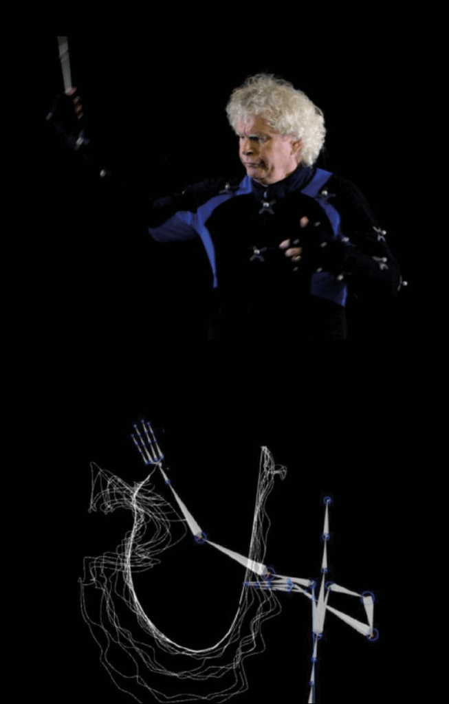
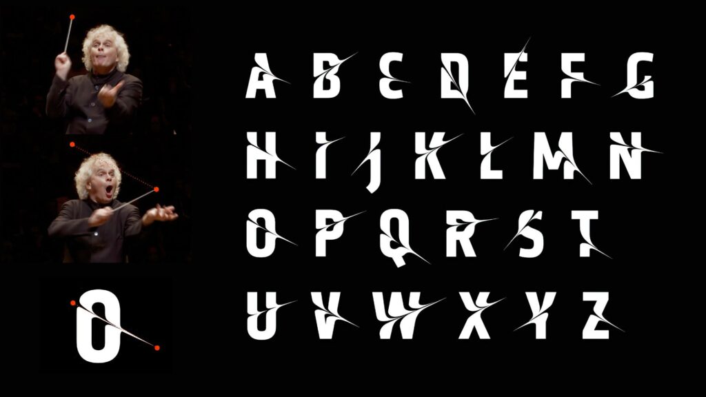
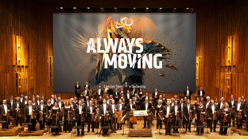
In 2017, the London Symphony Orchestra (LSO) introduced a new visual identity for its 2017/18 season. Instead of using typical images of musicians or instruments, they decided to do something much more experimental. The LSO turned to motion capture technology to create a visual language that reflects the energy, emotion, and dynamism of music itself. This collaboration, executed with the creative agency Design Bridge, used motion capture to turn music and conducting into abstract moving visuals. I found this project really interesting because it mixes classical music with digital art and motion design in. a way you don’t see very often or at least I haven’t. The whole idea was started by Sir Simon Rattle who was the LSO’s Music Director at that time. His conducting movements were recorded with twelve Vicon cameras at 120 frames per second. This helped to create a very detailed motion data that digital artist Tobias Gremmler later was able to transformed into abstract animations like abstract forms, which visually embodied the rhythm, intensity, and flow of the music. Form this data the team also created two typefaces. One of the looked more soft and flowing for a more gentle gesture approach. And the other was sharper and more angular for stronger movements. Both these typefaces worked together with the animations and the still images with this creating a full visual identity that was later on used everywhere. (The Partners Unveil Identity for LSO Formed by Tracking the Conductor’s Movement, 2017)

Abstract Forms and Motion

The abstract shapes generated from the motion capture are not random. Each shape is based on Sir Simon Rattle’s actual movements while conducting. However, the visualizations do not echo his motion. They turn his gestures into swirling vortex-like structures that suggest the textures and materials of an orchestra: wood, brass, smoke, and string. These organic, kinetic forms function as an “abstract score,” where lines, loops, and flowing wires communicate rhythm, energy, and dynamics in a visual language that parallels musical notation. Color and texture also play a big role. The animations use gradients, light flows, and semi-transparent textures to evoke elements of the orchestral soundscape. Air, vibration, resonance, and the interplay of instruments. Everything is always moving which reflects how music itself is never static. Here I really liked how the project manages to translate the feeling of music into a visual experience.

Impact and Significance

This approach positions the LSO as both a guardian of tradition and a forward-looking, innovative institution. By showing the conductors gestures in such an artistic way the visuals create a more emotional and personal connection to the music. In an industry where orchestral brands often remain conservative and predictable, the LSO’s identity stands out for its bold, kinetic abstraction. The combination of the custom typefaces and the abstract animations also helps with recognition. It shows that classical music can work with technology and contemporary design without losing its identity. 

Relevance to Motion Design

For motion design, this project is a great example of how movement can be turned into something abstract but still meaningful. It shows how motion graphics can build a whole brand identity and not just act as decoration. Because every visual element comes directly from the conductor’s movements and the music, the design feels very connected to the source. It proves that abstract shapes can still tell a story and carry emotion.

Even if the project is really strong, there are some challenges. The abstract visuals might not make sense to all viewers. People who don’t know much about design or conducting might think the shapes are just pretty graphics without understanding the idea behind them. Another issue is the budget. Motion capture is expensive and needs advanced equipment, which means smaller orchestras probably couldn’t do something similar. However I was still very fascinated by this approach and project itself and the way it was executed. 

Bibliography:

The Partners unveil identity for LSO formed by tracking the conductor’s movement. (2017, January 20). https://www.itsnicethat.com/news/the-partners-lso-identity-motion-capture-200117

Understanding Aesthetic Variables

The paper “Abstract Shape Aesthetics: Contour, Complexity, Motion, and Individual Variability” (Soranzo et al., 2024) as mentioned in the previous blogpost, breaks aesthetics down into three key variables: contour, complexity, and movement. These variables help researchers understand how we respond to very simple, abstract shapes that carry no specific meaning for us. What I do like about this kind of approach is that there is a separation between aesthetics into its different parts. The focus will now lie on what these different variables mean but also how the study measured them and what these results say about the foundation of visual preference.

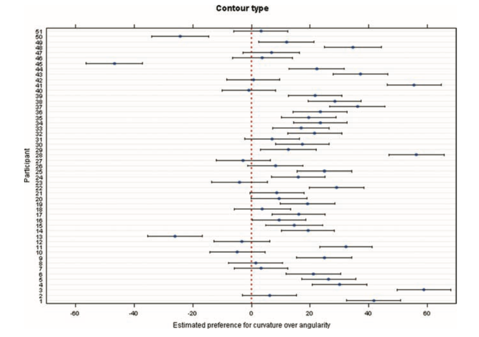
One of the first variables is contour. Where the shape edges, curved versus angular. In our daily life, we tend to already associate curved things with softness, smoothness, or safety, and angular things with sharpness or tension. The study confirms this pattern: participants preferred curved shapes over angular ones. This matches earlier research mentioned in the paper, which also found a strong preference for curved contours. The exact reason remains debated. Some theories suggest angular shapes trigger avoidance responses because they can signal danger. Others propose that curved shapes feel more natural to us, connecting to shapes we encounter in the environment.

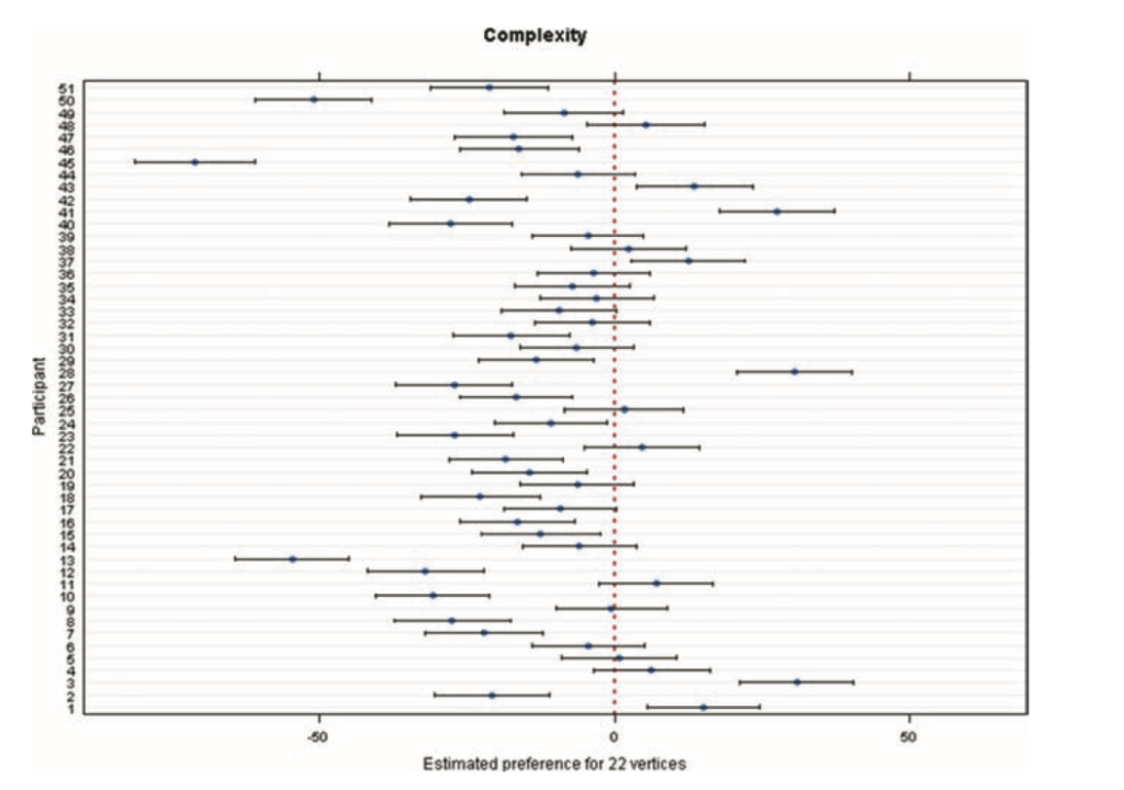
The second variable, complexity, turned out to be more surprising. The study defines complexity through the number of vertices: six for simple shapes, 22 for complex ones. Complexity is already a controversial topic in aesthetic research. Some theories argue that complexity increases interest, while others suggest simplicity is more appealing because it requires less cognitive effort. In this study, participants clearly preferred simpler shapes. The authors describe this as an effect of simplicity. However, they also acknowledge that previous studies have found more mixed or even opposite patterns, depending on how complexity was defined from the beginning. This suggests complexity is not a single variable but a cluster of different visual features. For example, the paper “Visual Complexity: A Review” (Donderi, 2006) highlights that visual complexity which has been studied across many domains. It looks at how judgments of complexity relate to multiple factors such as amount of detail, predictability, symmetry, and perceptual load. One of Donderi’s key points in his work is that our perception of complexity is very tightly linked to its predictability. Images or shapes that have a more clear and regular pattern, like symmetrical shapes, often feel less complex. On the other hand, unpredictable shapes or compositions feel more complex to us because our visual system cannot easily understand or “compress” them into simple rules. This claim is also supported by the idea that our brain constantly tries to reduce incoming information into simple structures. However, when that is not possible, we perceive it as complex.

The third variable, movement, examined whether rotation or expansion would change how people rated the shapes. The interesting part is that movement did not affect aesthetic ratings. There were also no individual differences. This stands in contrast to contour and complexity, where people varied a lot. But for movement, the participants agreed that it didn’t have a special effect on them. This might mean movement simply does not influence aesthetic judgments for this type of shape. Or it might mean that the study design removed all the expressive value that movement normally carries. My main takeaway is that movement is not a universal aesthetic enhancer. When a shape is abstract and meaningless, adding rotation or expansion does not automatically make it more beautiful. Aesthetic impact depends on context and on the meaning we attach to motion.

Overall the reseach shows that aesthetic judgment are shaped by basic visual features like contour, complexity and movement. Even if movement does not play such a major role for abstract shapes. Simplicity, predictability and visual structure do have a great influence on beauty more that it might have been expected. 

Bibliography

Donderi, D. C. (2006). Visual Complexity: A Review. Psychological Bulletin132(1), 73–97.

Soranzo, A., Bertacchini, F., & Bertamini, M. (2024). Abstract Shape Aesthetics: Contour, Complexity, Motion, and Individual Variability. Art & Perception12(3), 240–263. https://doi.org/10.1163/22134913-bja10057

What Abstract Shapes Teach Us

When we talk about aesthetics, most people immediately think of art, design, or familiar objects. Things that we recognize and know. Things that carry memories and meaning. That’s why it feels almost strange to learn that an entire field of research focuses on the opposite: abstract, meaningless shapes. No symbolism and. No cultural context. 

In Abstract Shape Aesthetics: Contour, Complexity, Motion, and Individual Variability (Soranzo et al., 2024), the authors highlight why such stripped-down stimuli are so powerful. They write that studying shapes “devoid of meaning or familiarity” helps us understand how visual perception can work and how we experience art on a basic level. To me, this hints at something fundamental, that we might not need cultural knowledge to experience beauty. Some aesthetic responses might be built into how our visual system works.

Abstract Shapes as a Window Into “Raw” Perception

Abstract shapes let researches look at how we react to visuals before meaning steps in. For example, the moment we recognize a face, an animal, or a symbol, our brains automatically activate memories, emotions, and cultural knowledge. That’s also why psychologists often try to remove context, to find out what features alone can trigger an aesthetic preference.

This study took that idea and looked at it more closely. The researchers used abstract, meaningless shapes presented on a computer screen, ensuring that nothing could be interpreted as a known object. This creates a laboratory-like condition: a clean space where only visual properties matter.

And even when shapes have no meaning they can still influence us: 

  • Curves often feel soft, friendly, or organic
  • Angles can feel sharp, dynamic, or even threatening
  • Simple shapes can feel calm or elegant
  • Complex shapes can feel chaotic or energetic
  • Motion — expansion, rotation — can feel looming, playful, or mechanical

We respond emotionally to form long before meaning steps in.

A Long Tradition: Fechner and the Quest to Measure Aesthetics

What I find fascinating is this very modern study can be connected to something very old. Already in 1876, Gustav Fechner believed that aesthetics could be studied scientifically and that the best way to do this was through neutral stimuli. Here the authors explicitly link their work to Fechner’s idea that studies of beauty should start with simple, context-free shapes.

This does leave me torn. On one hand, it’s exciting to think that beauty isn’t purely subjective. On the other hand, I love the messy, emotional, culturally shaped side of aesthetics. Beauty is not only “perception”; it’s also memory, narrative, and identity.

New Insights: Individual Differences Matter

One of the most interesting results becomes visible when looking at individuals instead of a whole group of averages. The overall trends were very clear: 

  • People preferred curved over angular shapes
  • Simple over complex shapes
  • And within this experiment movement didn’t create a strong preference 

But when researches looked at each individual the results changed. Especially when contour type and complexity interacted the preferences varied a lot from person to person. This reminds us that even the most basic perceptual preferences are not universal. Even before meaning enters the picture, humans differ.

The study shows that many of our aesthetic responses may be deeply rooted in the visual system itself. Abstract shapes make these foundations visible. But for me, abstract shapes standing alone are not fully satisfying. They reveal mechanisms, not emotions. Perception, not meaning. Preference, not experience. However what I can take away form this is that abstract shapes help us understand how we process beauty, but only context explains why something truly touches us.

Bibliography:

Soranzo, A., Bertacchini, F., & Bertamini, M. (2024). Abstract Shape Aesthetics: Contour, Complexity, Motion, and Individual Variability. Art & Perception12(3), 240–263. https://doi.org/10.1163/22134913-bja10057