Design trends in mainstream and luxury branding have evolved over time, but some parallels between today and the 1980s reveal how both eras reflect broader cultural and technological shifts. By comparing the two periods, we can see how each balances bold consumerism and aspirational exclusivity while adapting to contemporary needs.
1. Bold Visuals and Maximalism
- 1980s:
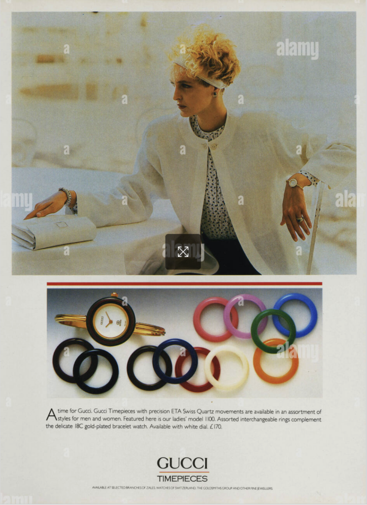
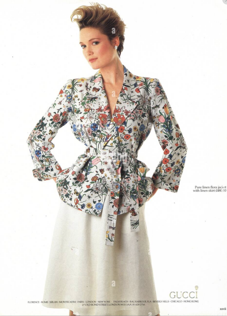
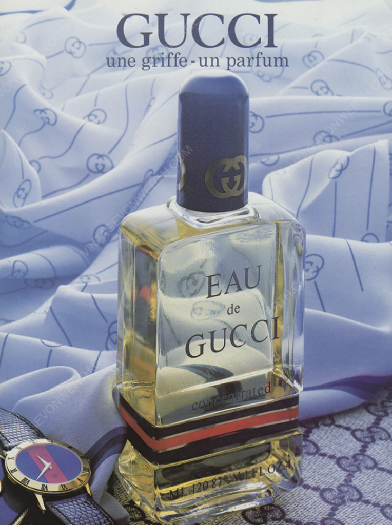
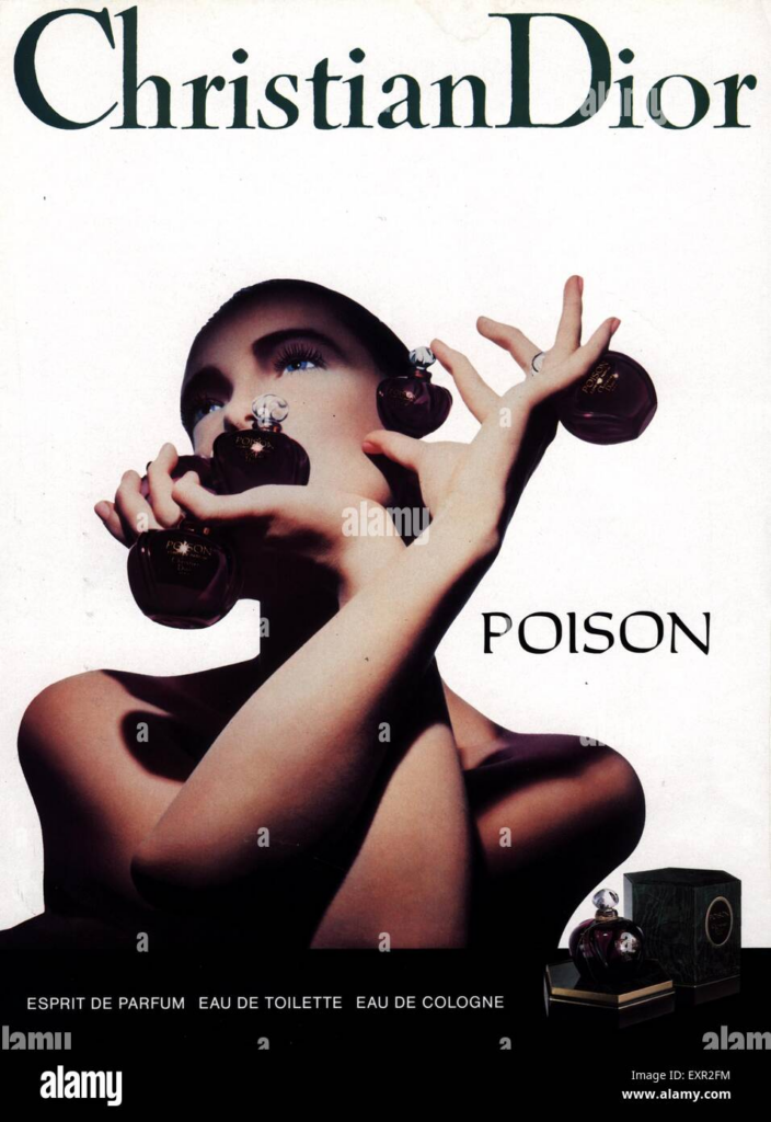
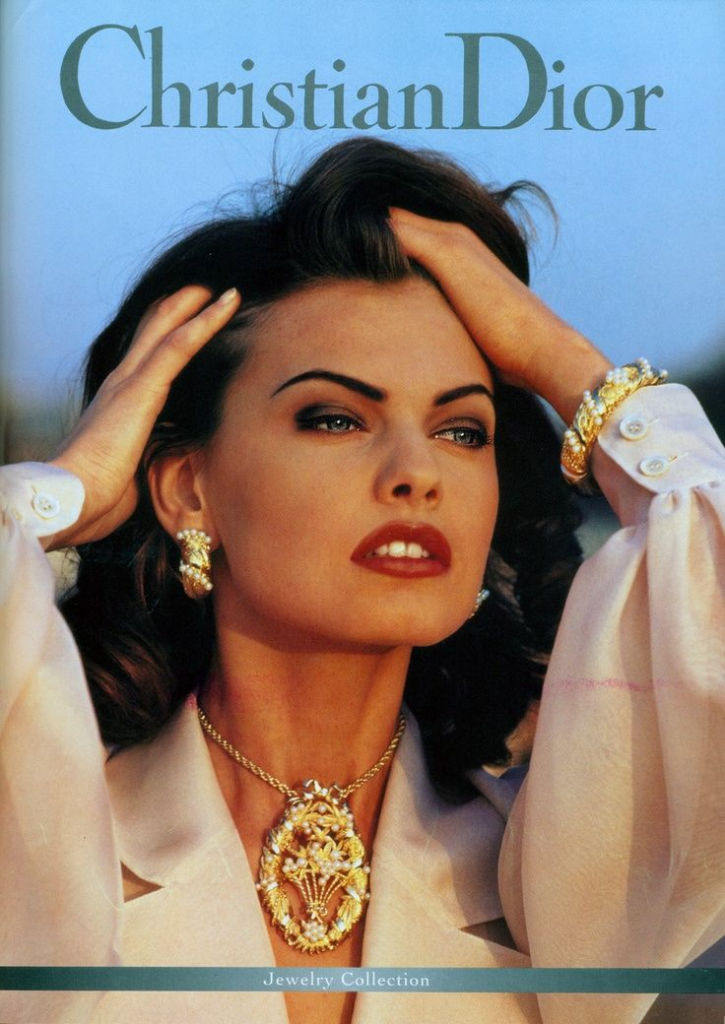
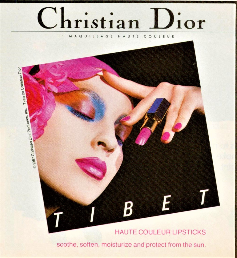
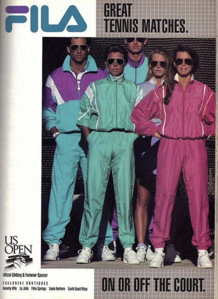
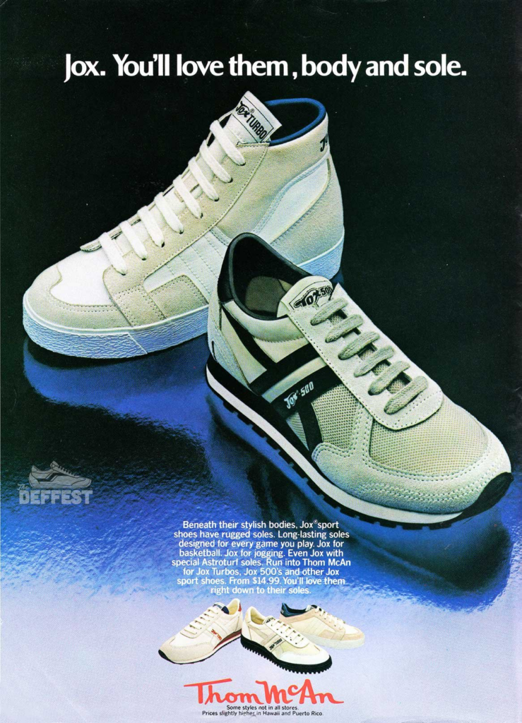
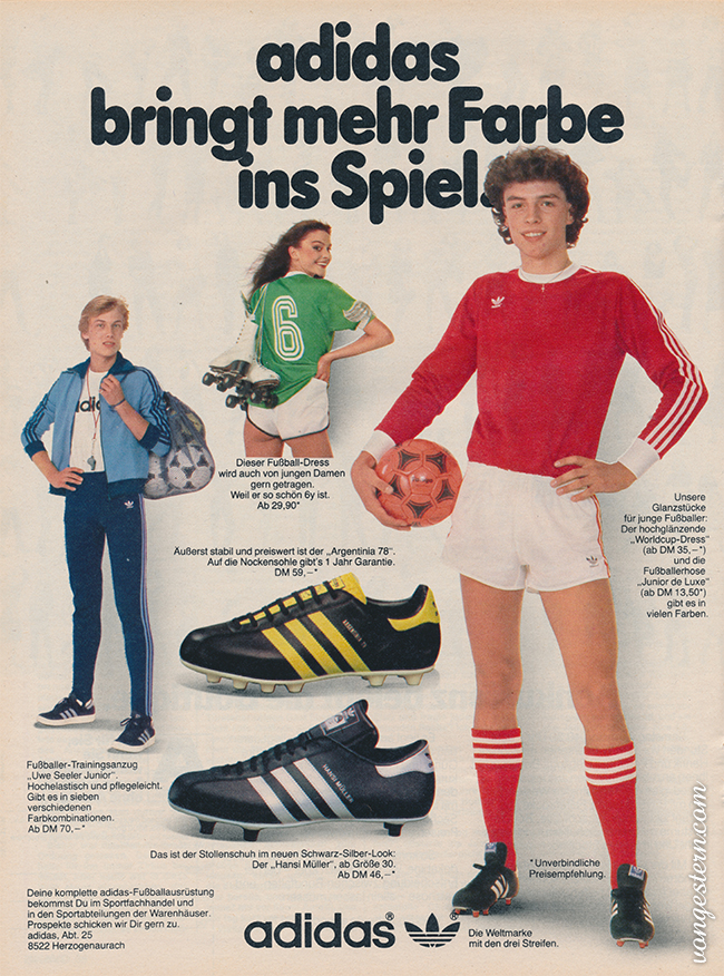
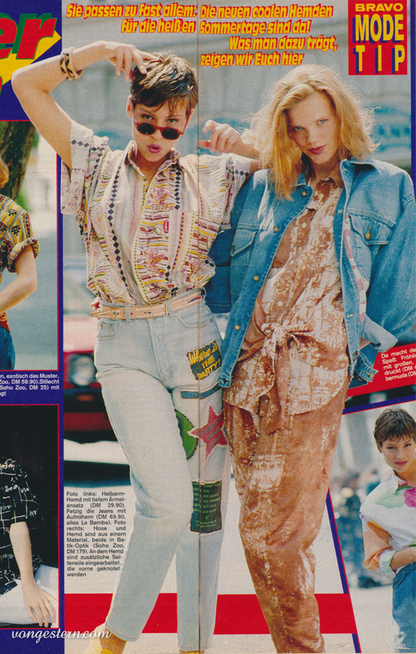
Mainstream media in the 1980s embraced bold, loud, and maximalist designs, with bright neon colors, dynamic compositions, and oversized typography. Luxury brands like Gucci and Dior, while more restrained, also leaned into bold aesthetics through dramatic photography, vibrant colors, and heavily styled shoots that exuded confidence and glamour. - Today:
Maximalism has returned in both mainstream and luxury design, particularly in Gen Z-driven trends and luxury rebrands that seek to stand out in a crowded marketplace.- Mainstream: Brands like TikTok, Spotify, and fast-fashion giants embrace bright, colorful, and eye-catching graphics. Packaging and ads often use clashing patterns, gradients, and dynamic motion graphics reminiscent of 1980s pop culture.
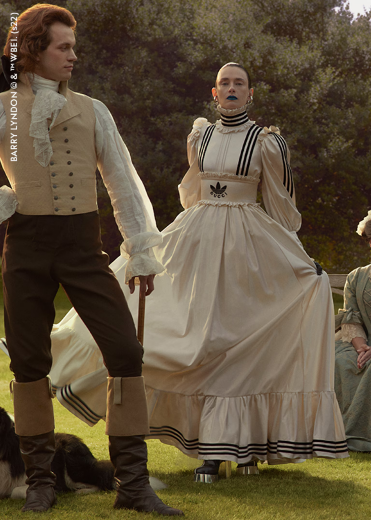
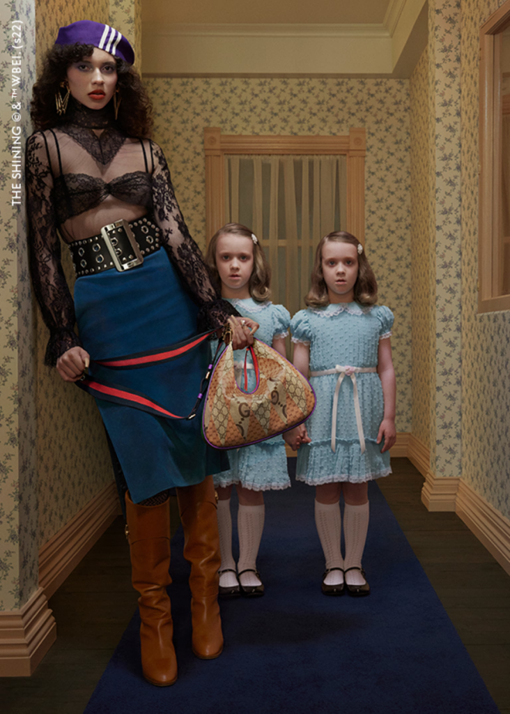
- Luxury: Gucci and Balenciaga, for instance, use a similar maximalist approach, blending modern digital art with retro references. Gucci’s Exquisite campaign, for example, draws inspiration from cinematic surrealism while staying bold and playful.
Parallels: Both eras leverage maximalism to reflect cultural energy and technological progress, using boldness to attract attention and define an aspirational mood.
2. Nostalgia as a Central Theme
- 1980s:
Both mainstream and luxury design in the 1980s often referenced past decades. For instance:- Mainstream advertising leaned on a nostalgic connection to Americana or mid-century optimism (e.g., Coca-Cola campaigns like Have a Coke and a Smile).
- Luxury brands borrowed from classic Hollywood glamour and timeless European fashion.
- Today:
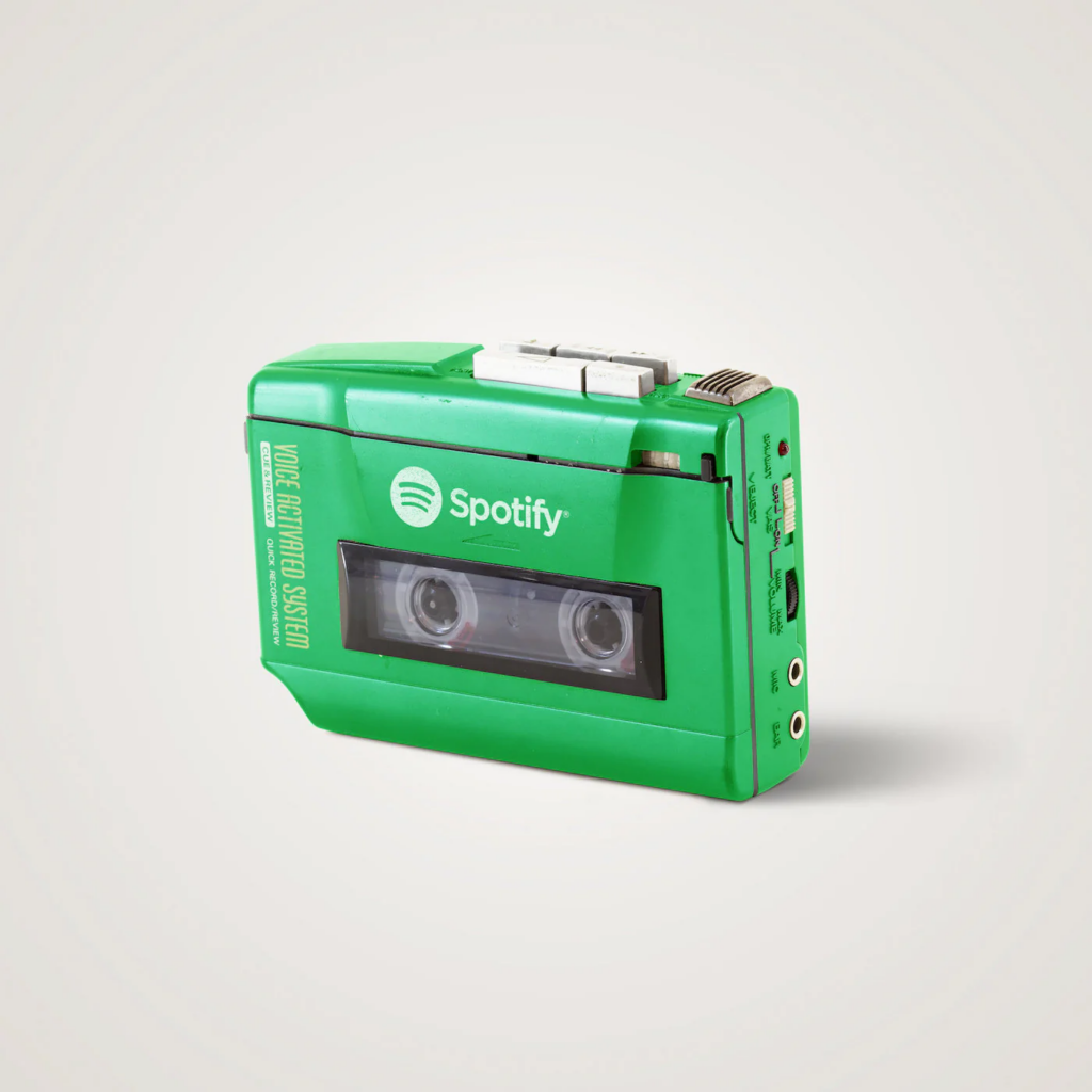
Nostalgia remains a key driver, with both sectors reinterpreting past aesthetics for modern audiences:- Mainstream: Retro influences from the 1980s, 1990s, and early 2000s dominate branding, particularly in music, fashion, and social media. Brands like Nike and Adidas revive retro sneaker lines, and products often include retro filters and vintage-inspired logos.
- Luxury: High-fashion brands also engage with nostalgia. Dior reissues its classic Saddle Bag, and Gucci collaborates with heritage brands or revives archival patterns.
Parallels: Nostalgia is a timeless marketing tool, used in both eras to evoke emotion, build brand loyalty, and balance modernity with familiarity.
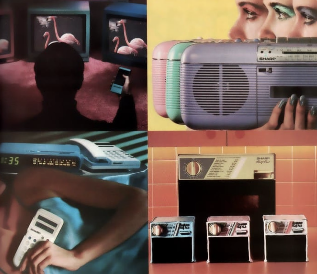
3. Technology-Driven Design Innovations
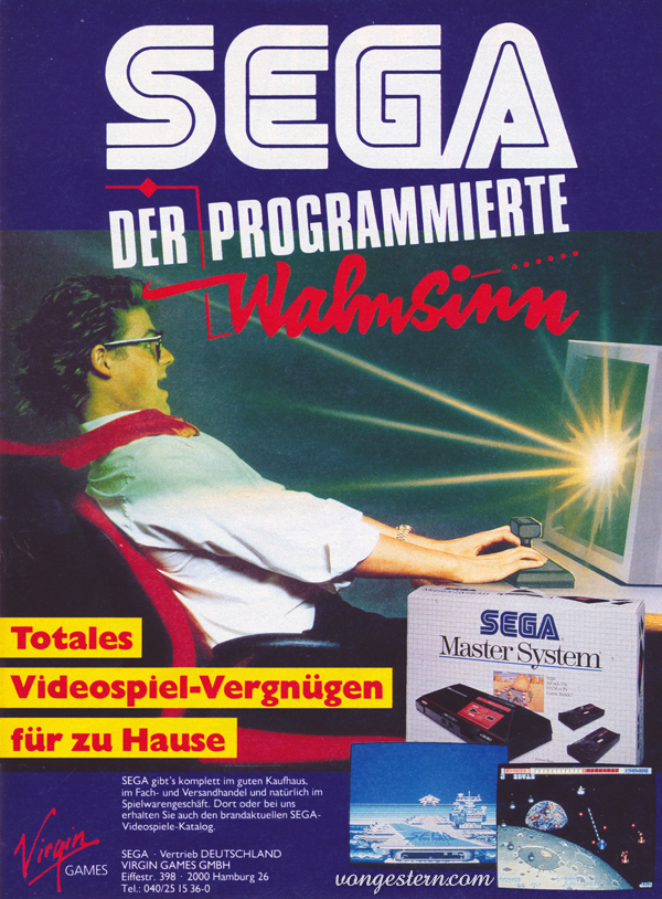
- 1980s:
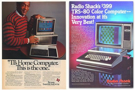
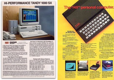
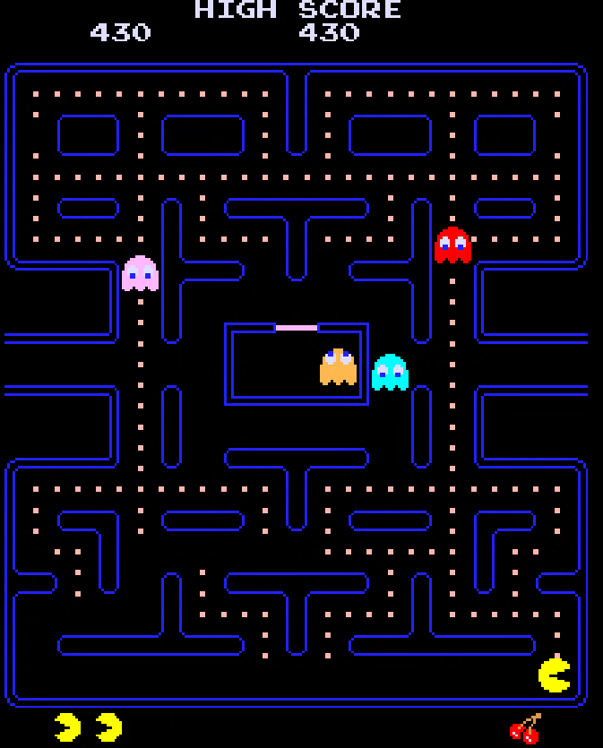
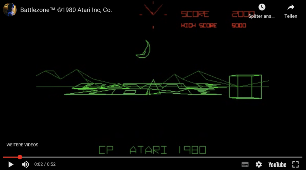
The advent of personal computers, video games, and VHS gave rise to futuristic and tech-driven designs.- Mainstream ads often mimicked digital aesthetics (e.g., grid patterns, pixelated effects, or neon lighting inspired by sci-fi).
- Luxury brands subtly embraced this tech-forward aesthetic by experimenting with photography, metallics, and abstract visuals.
- Today:
The rise of digital technology and social media has amplified tech-inspired designs in both realms:- Mainstream: Brands create dynamic, interactive campaigns that live on digital platforms. Motion design, AR filters, and AI-generated visuals dominate social media.
- Luxury: High-end brands integrate digital innovation with exclusivity, using NFTs (Gucci Vault NFTs), virtual fashion collections, and immersive shopping experiences.
Parallels: Both eras are defined by their adoption of cutting-edge technology in visual design and storytelling, with mainstream brands democratizing tech while luxury brands make it exclusive and aspirational.
4. Consumerism, Inclusivity vs. Exclusivity
- 1980s:
- Mainstream: Advertising celebrated mass consumerism, often showing diverse audiences enjoying relatable products. However, the approach could sometimes be shallow, focusing more on universality than true representation.
- Luxury: Exclusivity was a hallmark of 1980s luxury branding. Gucci and Dior emphasized unattainability, using elite settings, models, and dramatic styling to distance themselves from mainstream culture.
- Today:
- Mainstream: Inclusivity is central to modern branding, with campaigns that celebrate diversity, gender fluidity, and authenticity. Brands like Dove (Real Beauty) and Target focus on representing broader audiences.
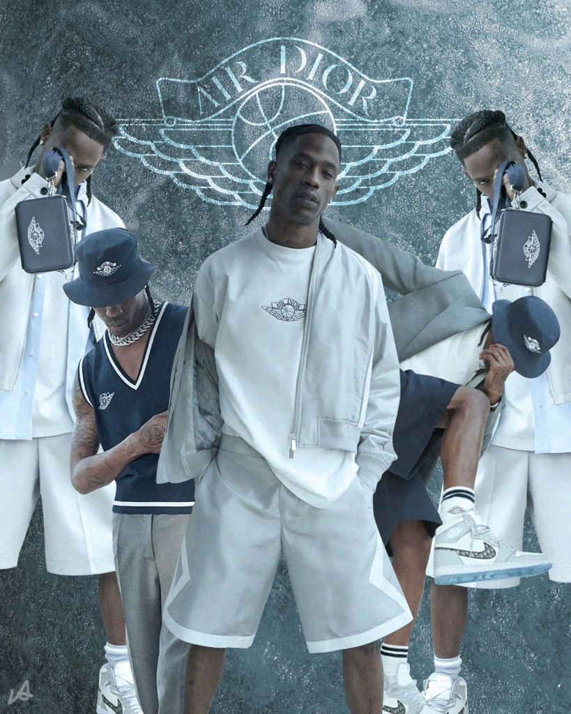
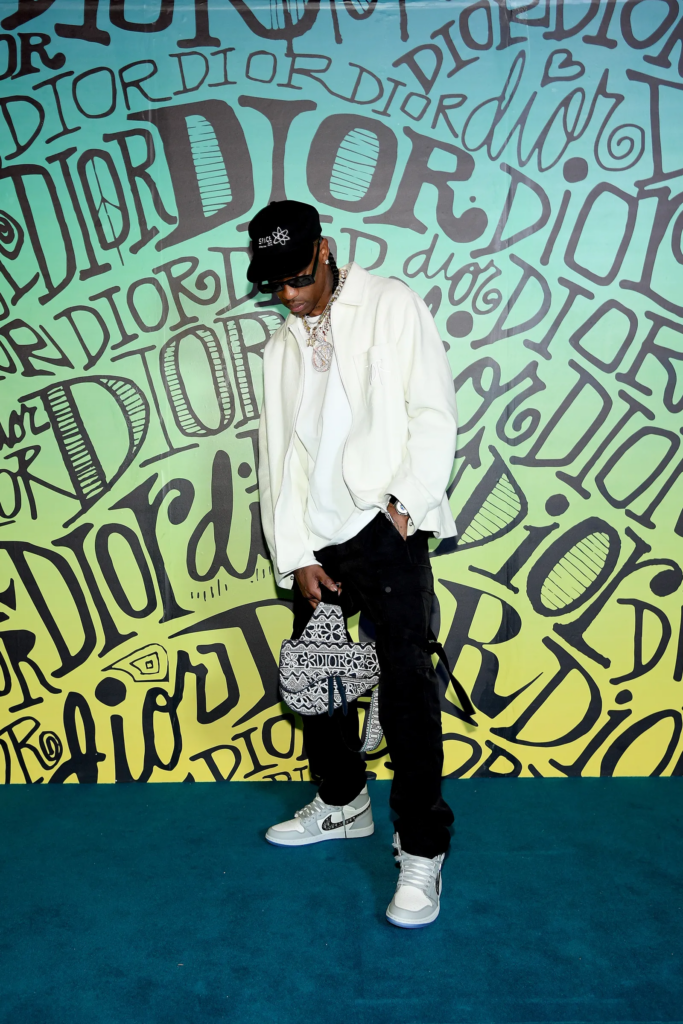
- Luxury: While exclusivity remains a key pillar, many luxury brands now strive for cultural relevance by collaborating with mainstream artists or embracing social causes (e.g., Dior x Travis Scott or Gucci x Adidas).
Parallels: Both eras play on aspirational values, but while the 1980s reinforced exclusivity, today’s inclusivity efforts blur the lines between mainstream and luxury.
5. Typography Trends
- 1980s:
Typography was bold and experimental across both sectors.- Mainstream design used big, impactful display fonts (e.g., Futura Extra Bold, Broadway) with a focus on readability and energy.
- Luxury brands opted for elegant, geometric sans-serifs like Helvetica and Garamond, emphasizing timeless sophistication.
- Today:
Typography in both mainstream and luxury design has become more fluid and playful.- Mainstream: Brands experiment with type that bends, warps, or interacts with visuals (e.g., wavy and stretched fonts popular on Instagram).
- Luxury: High-fashion campaigns mix modern sans-serifs with bold serif typefaces, creating contrast while maintaining elegance (e.g., Balmain or Prada using bold serif headers).
Parallels: Typography in both eras reflects cultural energy—bold and daring for the mainstream, refined yet experimental for luxury.
6. Celebrity and Cultural Influences
- 1980s:
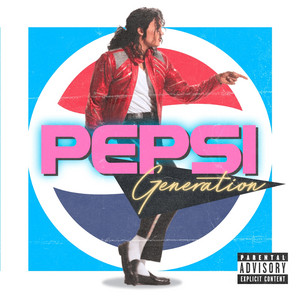
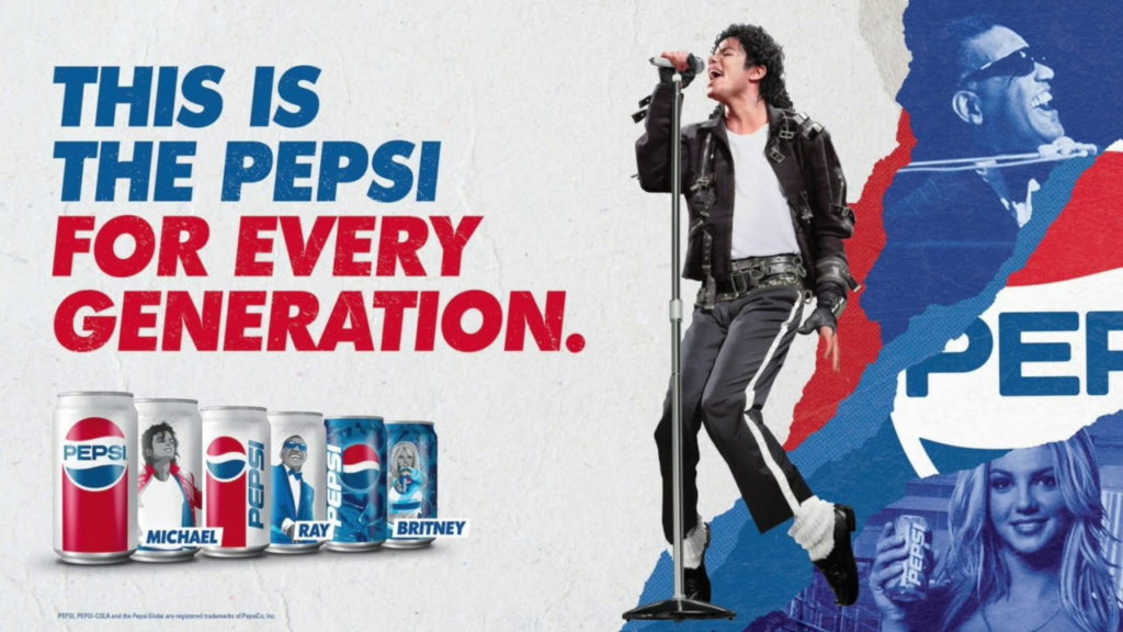
Celebrity endorsements were significant in both luxury and mainstream ads.- Mainstream: Michael Jackson for Pepsi or Arnold Schwarzenegger for bodybuilding products.
- Luxury: Supermodels like Naomi Campbell and Claudia Schiffer defined high-fashion campaigns.
- Today:
Celebrity endorsements remain critical but have shifted to include digital influencers.- Mainstream: Social media stars like TikTok influencers, often drive campaigns for major brands.
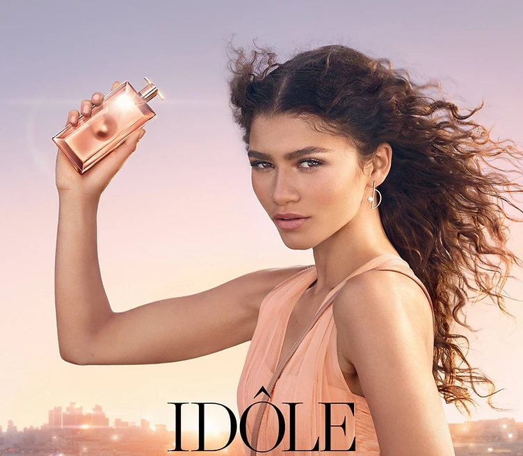
- Luxury: Brands now collaborate with a mix of celebrities and cultural icons like Zendaya (Dior), ASAP Rocky (Gucci), or Blackpink’s Lisa (Celine).
Parallels: Both eras use cultural icons to bridge brand identity with popular culture, but today’s influencers provide more direct engagement with audiences.
Conclusion
Both the 1980s and today showcase a dynamic interplay between mainstream and luxury design, shaped by cultural trends, technological innovation, and shifting consumer expectations. While the 1980s emphasized a clearer divide—mainstream was loud and accessible, luxury was elite and aspirational—today’s design world often blurs those boundaries, with luxury embracing elements of mainstream appeal and vice versa. This fusion reflects a more interconnected and globalized design ethos, where exclusivity and accessibility coexist more seamlessly than ever before.
Resources
- https://www.gucci.com/us/en/st/stories/article/exquisite-gucci-campaign?srsltid=AfmBOor5ejoumkfsZb0DkyEa5I-Wp943xH7OqwLEGEvNUoSnV7SSlKiN
- https://www.gucci.com/us/en/st/stories/article/exquisite-fashion-show-details
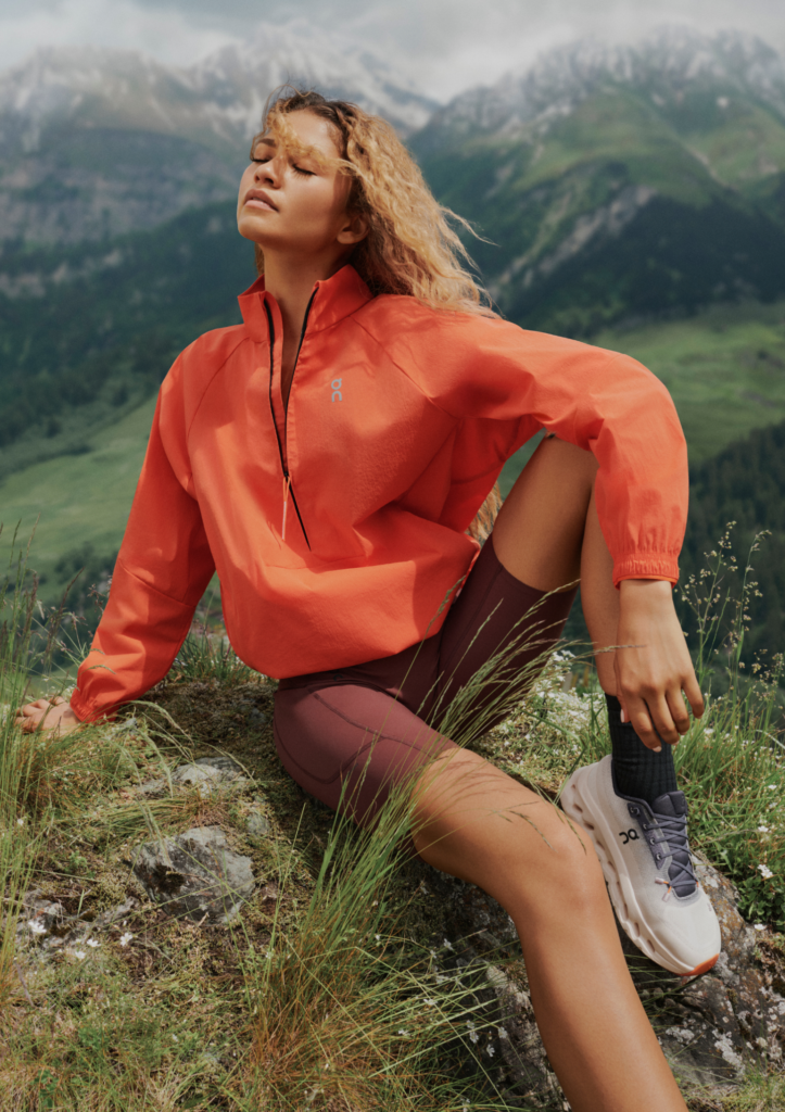
- https://www.on.com/de-at/collection/zendaya
- https://www.vogue.com/vogueworld/article/travis-scott-air-jordan-dior-1-new-collaboration-mens-fall-2020-menswear-miami-runway-show