2.10. Reflection & What Comes Next

It started with a clear goal: to understand how event branding works — or doesn’t. Through blog posts and field research, I explored not just the visual systems behind events, but the real-world presence (or absence) of those identities.

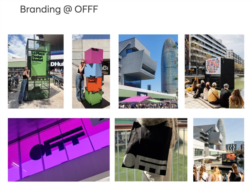
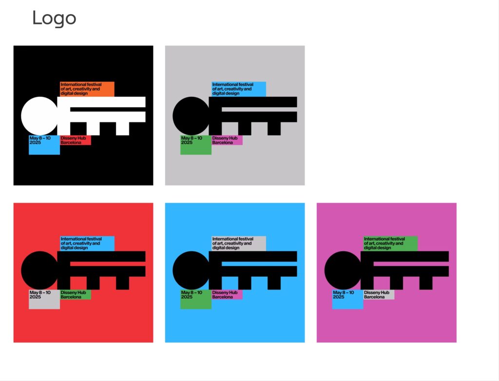
Over the course of this semester, I moved from research into hands-on exploration — starting with OFFF Barcelona as a real-life case study. I examined OFFF’s bold digital identity and anticipated how it might translate into physical space. However, once on-site, I was met with an unexpected lack of branding presence, which sparked deeper reflection on the essentials of event design. I compared expectations with reality and defined what strong event branding should deliver. OMR Hamburg served as a powerful contrast, showing how branding can be executed to perfection across every touchpoint. Then, through my volunteer experience at UEFA EURO 2024, I gained firsthand insight into branding at a massive scale— structured, consistent, and nationwide standardized. Finally, I converted all these experiences into key takeaways for what truly matters in event branding.

A Personal Takeaway

Despite some disappointment with OFFF’s branding, the trip to Barcelona itself — and OFFF with all its incredible speakers and creative energy — was a huge inspiration. It offered more than just material for my master’s thesis. It gave me input for my design practice, thinking, and direction, also for my personal future.

Throughout the semester, I realized that branding — in all its complexity — is something I genuinely enjoy working on. Not just as a system of logos and color palettes, but as a way to shape experience, identity, and emotion.

It became increasingly clear to me: I want branding to be a core part of my master’s thesis. Whether it’s a cultural project, a sports concept, or something (yet) completely unknown — I want to dive deep, create with intention, and explore how identity can be brought to life across all mediums.

Struggles

Still, I can’t help but admit: I’m not sure if I went in the right direction.
Maybe I took a wrong turn along the way, or I focused too much on case studies and not enough on personal experimentation. Or Maybe it needs to be more sports-related as that was my initial idea and this thesis is something i really want to identify with. Perhaps it will be something more cultural.
I’m not even sure what exactly is bothering me — only that I’m not as convinced anymore as I was earlier in the process. And that’s probably okay, but I might need some time to figure out the WHY.

Future Perspectives

The next chapter begins soon: an Erasmus semester in Detroit. I’m looking forward to immersing myself in a new city, new culture, and a completely different creative scene.

I am hoping that this experience will unlock fresh energy, new inspiration, and a clear(er) vision for my thesis. Something that combines what I’ve learned so far — with something that challenges me even more and lets me identify myself with the project. Let’s see what comes next.


“There are three responses to a piece of design: Yes, No, and WOW! Wow is the one to aim for.”
Milton Glaser

2.9 What really matters in event design

After experiencing three very different types of events — OFFF Barcelona, OMR Hamburg, and UEFA EURO 2024—I’ve come to realize that good event branding isn’t about how much you do, but what you do, and how consistently you do it.

In an earlier blog post, I outlined my expectations for what a well-branded event should include. That list covered the basics—things like:

  • Logo usage
  • Color palette
  • Typography
  • Icons or pictograms
  • Wayfinding and signage
  • Presence across media: online, print, merchandise, outdoor
  • Marketing campaign with public visibility

Those expectations were shaped by design theory — but only through actual observation and comparison did I begin to understand what’s really essential.

What matters most ?

Here’s a list of what I now believe are the non-negotiables for consistent, meaningful event branding:


1. Visibility in Public Space

If the audience can’t see it, it doesn’t exist.
Whether it’s a creative festival or a football tournament — people need to know what is happening.
Public touchpoints like posters, digital ads, public transport branding or banners are essential for awareness and anticipation.


2. A Clear, Flexible Visual Identity

Consistency ≠ uniformity.
Events don’t need thousands of visual elements — they need a core set (logo, colors, type) that’s flexible enough to adapt across platforms and materials while remaining recognizably the same.


3. A Functional Signage System

Good design doesn’t just decorate — it leads (literally).
Signage is more than arrows and toilet signs: it’s how people feel welcomed, oriented, and included. Typography, iconography, and layout should work together to guide and not create confusion or worse: let people get lost.


4. Seamless Integration On- and Off-Site

The experience should start before the visitor enters the venue.
What you promise online should be fulfilled on site. The transition from digital to real-life branding should feel seamless — whether it’s from an Instagram ad to a welcome banner, or from a ticketing app to the venue’s entrance.


5. Emotional Identity

Branding should also make you feel something.
Beyond rules and systems, a strong event identity tells a story. OMR feels bold and energetic. EURO 2024 felt international and structured. OFFF should have felt playful and immersive — but it didn’t translate physically. Emotional tone is part of the branding.


6. Presence

A “perfect” appearance means nothing if it’s not visible.
It’s better to have a simple identity used everywhere than a stunning visual concept applied in just a few places. Presence and visibility weighs more than perfection.


Conclusion: Branding Is Experience

Event branding isn’t just a graphic design project. It’s about orchestrating experience. It connects people with space, builds anticipation, offers orientation, and shapes memory. Whether you have a big budget like UEFA or a small(er) target audience like OFFF — what matters is that you show out, stay consistent, and design with the purpose to be positively remembered.

2.8 Another Branding experience on an even bigger stage — UEFA EURO 2024

After reflecting on events like OFFF and OMR, I had the chance to witness branding at an entirely different scale: the UEFA EURO 2024 in Germany. This isn’t just another event — it’s one of the biggest sporting moments in Europe, and arguably one of the largest global stages for event branding and communication.

What sets the EURO apart is not just its scale, but the level of precision, planning, and professionalism behind every branded element. From the moment the host country was announced (back in 2018), everything started to take shape — because an event of this magnitude requires at least four years of preparation. And it shows.

Branding from A to Z

From fan zones to ticketing apps, from the uniforms of security staff to the media center signage — every detail was branded. The identity was everywhere and impossible to oversee:

  • City branding at train stations, airports, public transport, and streets
  • Clear signage systems in every stadium and public viewing area
  • Digital consistency across social media, streaming platforms, and ticket portals
  • Printed materials, volunteer uniforms, accreditation badges, media kits, merchandise, you name it
  • Barricades, fencing, and crowd guidance systems were branded to match the visual system
  • City-specific iconography that was visible across the whole city

The color palette, iconography, and typography were not just beautiful coordinated — they were functional, scalable, and consistent across every use case, screen size, and material.
The whole system was carefully crafted to maintain unity while allowing flexibility for city-specific adaptations.

Behind the Scenes: Volunteering at the Media Center

Working as a volunteer in the media center in Munich gave me valuable insight into the operational side of branding. The level of professionalism was striking — nothing was left to chance.

  • Volunteers received detailed brand and behavior guidelines
  • Strict specifications defined what could and could not be done visually or verbally
  • Every zone had purpose-built branded elements — even internal documents, staff areas, and press materials followed the visual identity
  • Coordinated communication ensured that everything — from lanyards to LED screens — aligned with the event identity

It was a masterclass in event branding and implementation, where every participant knew their role, every material matched the identity and nothing felt improvised. The responsible creative agency and UEFA’s brand team achieved an execution that felt effortless — but was clearly the result of intense planning and top-level design systems.

What I take from that:

EURO 2024 proved what’s possible when design, branding, and operations work hand in hand over a long period of time. Of course, the budget is on a completely different level than most cultural or design festivals — but what makes it so impressive is not just the money behind it, but the clarity and consistency of the creative vision.

Compared to OFFF or OMR UEFA takes branding to the systematic maximum. It’s not just visible — it’s invisible in its effectiveness, deeply embedded in every aspect of the visitor experience and lasting in the mind of everyone who will think of this tournament in the future.

2.7 The better OFFF – OMR Festival Hamburg

After reflecting on the visual absence of OFFF Barcelona, one event kept coming to mind—one that actually did everything right: OMR (Online Marketing Rockstars) in Hamburg.

I first visited OMR in 2019, and the scale of its presence was hard to miss. By the time I returned in 2022 and 2023 to work behind the scenes, I fully understood just how carefully everything had been planned. OMR wasn’t just an event — it was a full takeover of the city. There was pretty much no one across the town (or maybe even the country — and some say over the marketing scene) that had not heard about the event and also online (mostly LinkedIn & Instagram) everyone was talking about it. Over the time it had even become meme material, which is in my opinion one of the best ways for user generated content (“There is no such thing as bad publicity”, or something in that way, you get the point).

OMR did exactly what I expected to see at OFFF:

  • Marketing started early – long before the event itself, you could already spot teaser campaigns and announcements throughout the city.
  • Visual identity everywhere – not just in digital channels, but across all physical spaces in Hamburg.
  • Advertisements in public transport – Buses, S-Bahns, screens, stickers — OMR literally moved through the city.
  • Billboards around town – from large-scale prints to local neighborhood placements, the branding was omnipresent.
  • Flyers at “Spätis” – even at late-night kiosks and small shops, you’d find OMR materials.
  • Newspaper ads – traditional media wasn’t forgotten, either. There were full-page ads and features in major newspapers and magazines.
  • City-wide awareness – unlike OFFF, people in Hamburg knew what was going on. There was buzz, recognition, and visibility. Maybe not everyone liked it, but everyone knew it.
  • Marketing campaigns within the city — Sponsors and partners of the OMR also took part in promoting the event and contributed to increased awareness


Once you entered the venue, the experience was just bright. The signage, staff clothing, branded items, stages, and screens all followed a consistent and bold visual system. Some might say it was a sensory overload, but everything aligned with the campaign that had been building up in the city for weeks or even months.


In short:
OMR executed exactly the kind of conceptual, immersive, and recognizable identity that I hoped to see at OFFF. It proves that a strong event brand doesn’t stop at a good logo or cool poster—it extends into the urban space, builds anticipation, and creates a complete, memorable experience.

That is why for me, OMR stands as a prime example of how to do it right—and an important reference point for future executions.

2.6 OFFF case study – Expectations vs. Reality

After weeks of researching OFFF’s visual identity, building a moodboard, and imagining how the event would unfold in physical space, it’s time to reflect — and compare research vs. reality.


What the Research Suggested:

Online, OFFF presents itself as a bold, experimental, and playful event brand. There’s no traditional logo system — instead, each edition is characterized by strong 3D visuals, vibrant color palettes, and heavy typography. The branding feels loud, energetic, and unmistakably creative.
I expected to see this identity echoed across the full event experience:

  • A strong presence in the city
  • Clear and expressive signage systems
  • Consistent use of typography, color, icons
  • Immersive on-site branding that matches their digital appearance
  • A clear visual narrative guiding the visitor through the city from street to stage


What I Actually Found:

The reality was quite different. While the talks and atmosphere inside were inspiring, the event design itself was surprisingly minimal — more or less invisible.

  • No public awareness: Locals hadn’t heard of OFFF, and there was no visible promotion in public transport, at newsstands, or around the city.
  • Venue branding was weak: No banners, no pictograms, and very little signage—just a few arrows with no visual identity.
  • No immersive experience: Outside the venue, there was nothing indicating a design event of this scale was happening.
  • Only one touchpoint: The OFFF tote bag was the only clear design element made visible to attendees.


Key Takeaways:

The gap between digital expectation and physical execution couldn’t have been wider. The boldness of OFFF’s online identity did not carry over into the real world. For a festival that positions itself as a leader in creative direction and contemporary design, the lack of physical consistency was shocking.

2.5 OFFF case study – experience/ discovery

After weeks of research and building up high expectations, my visit to OFFF Barcelona turned out quite differently than imagined—especially from a design perspective.

After my arrival in the city, I was surprised to discover that many locals didn’t even know what OFFF was. Taxi drivers, hotel staff, and even people near the venue hadn’t heard of the festival, let alone knew where it was taking place. There were no posters, billboards, or any kind of out-of-home advertising in public spaces or transit stations. Even at newspaper stands, no sign of the event — no coverage, no ads, nothing.

When we reached the venue the day before, I expected to see a strong, immersive visual identity, already promoting tomorrow’s event— but it just wasn’t there. There was no banner at the entrance, no large-format visuals, no color-coded areas, no vibrant signage like I had anticipated from their online presence. Just a few arrows here and there to guide people, and even those lacked any kind of pictogram or branding. No icons. No system.

And also with the start of the event, the only branded element that stood out were the OFFF tote bags given to visitors — perhaps the one visible touchpoint that tied back to the festival’s identity, cause you could always spot a “fellow designer” when you went for a stroll through the city. A few small logos could be spotted if you paid close attention, but overall, the visual consistency and presence were minimal.

Maybe what what I remember most: just 10 meters outside the venue, you were back in “normal” Barcelona. If you didn’t already know about OFFF, you never would have guessed that a major design event was happening just around the corner — even with some big design and art universities just around the corner(!).

For a festival that positions itself at the heart of contemporary creativity, the lack of physical branding and atmosphere was … kind of underwhelming. As a designer that was very keen on seeing how consistent design is realized on such a big stage, this difference between the strong online identity and the nearly invisible physical presence was not only unexpected. It was also an important lesson. A strong event identity doesn’t just live online — it has to be experienced.
And maybe (just maybe) the OFF organizers should think about hiring one of the guys talking about how awesome their designs are at their festival, to make their appearance just nearly as good, as the designs shown there.

Evidence for (not) presence of the visual identity around the event

2.4 OFFF case study – What I expect

Before heading to Barcelona, I started to imagine what the event design of OFFF might look like on-site— especially after diving into their online identity. My goal was to observe how consistently this visual language would translate into the physical space.

What I expected to see:

A wellexecuted event design system should go far beyond just a good logo. I was looking for a coherent visual experience, where all elements come together to form a strong, consistent identity.

These were my key focus areas:

1. Core Design Elements in Use

  • Logo: How is it applied? On its own, or always in combination with info? Monochrome or full color?
  • Color Palette: Are the bold color combinations from the digital world carried over into the physical space?
  • Typography: Does the heavy, sans serif type carry through across all materials?
  • Icons & Pictograms: Are there custom icons or illustration styles supporting navigation or content?

2. Signage System & Wayfinding

A strong event identity should extend to the navigation system. I was expecting to see:

  • Color-coded zones or areas
  • Clear visual hierarchy in signage
  • Consistent use of typography and iconography
  • Materials and formats that reflect the festival’s tone

3. Areas of Application

Online Media

  • Homepage, social media posts, event teasers
  • Mail signatures, online banners, and ticketing visuals

Offline Media

  • Printed flyers, magazines, posters
  • Editorial layouts and environmental graphics

Merchandise

  • Stickers, T-shirts, bags, fabric applications
  • Possibly limited-edition printed artwork or zines

Outdoor & On-site

  • Banners, signage, stage backdrops
  • Screens and projection visuals
  • Entryways, queues, and branded spaces like lounges or food areas

Beyond the Basics

I was also curious whether the branding would extend to:

  • Staff uniforms or lanyards
  • Digital screens and transitions between talks
  • Printed programs or daily schedules
  • Sponsorship visuals and how they’re integrated into the identity

OFFF positions itself as a leading creative festival—so I was expecting not just consistency, but also experimental flair: bold decisions, playful twists, and maybe even moments of surprise where the identity breaks its own rules in clever ways. The visit would be the perfect opportunity to test whether OFFF can deliver a true best-practice example of immersive event branding.

2.3 OFFF case study – Online presence

PREVIOUS DESIGNS
Before heading to Barcelona, I took a deep dive into OFFF’s online appearance — past and present. Interestingly, in previos years there was no fixed logo in the classic sense. Instead, each edition is represented through bold, playful artworks and posters, often leaning heavily into 3D renderings and vibrant compositions. Typography has become increasingly heavier in weight over the years, giving the overall visual language a strong presence that goes with the time.


LOGO
The current word mark is no exception — its chunky silhouette almost reminds me of a key or solid block. It usually appears in color, depending on the context and contrast needed. One thing I noticed: OFFF rarely shows the logo by itself—it’s almost always paired with event details, always building the connection between the identity and the experience.


COLOR
When it comes to color, OFFF doesn’t shy away. Bold and high-contrast combinations dominate the visuals: greens, blues, violets, reds, oranges — often set against black, white, or soft greys.
It’s loud, but intentional.


TYPOGRAPHY
Typography plays a big role too. Always sans serif, always Medium or Bold. Text is placed in colored blocks or directly on color backgrounds, always with strong contrast. White is reserved for whitespace or the logo — never for body text.


WEBSITE
The website itself reflects this clarity: minimal in imagery, focused on mood-setting visuals that match the color palette. The layout is responsive, switching from a 4–5 column grid on desktop to 1–2 columns on mobile. It’s clean, well-structured, and puts color and typography at the center of the user experience continuing the corporate color scheme.


SUMMARY
OFFF presents itself with a bold and expressive visual identity that breaks away from traditional branding rules. Instead of relying on a fixed logo, the festival embraces strong typography and vibrant colors. The overall design is playful yet structured — minimal in layout, maximal in expression. It’s an identity that adapts, surprises, and stays visually powerful and is a solid foundation for a strong design language on site in Barcelona.

2.2 First Briefing ProWork Experiment // Semester 2 preview

After a kick-off meeting with Didi Mosbacher, I’ve officially started into the second Semester with transitioning into the experimental phase of my project. Reflecting on the insights gained during the first semester and the research phase, I began to explore how event design can be approached more practically. Instead of just theorizing, the plan was to work with a “real-life example”—something that brings theory to life.

Since we had already planned to go there, the OFFF Festival in Barcelona presented the perfect opportunity. It allows me to dive deep into a live event experience: observing, documenting, and soaking in every detail on site.

My goal is to understand what event design really needs — or doesn’t need — by analyzing best practices from first-hand experience.

The first step in this journey: analyzing OFFF’s online appearance to understand how their digital identity aligns with their on-site presence.

2.1 Summary Semester 1 // Evolution of Graphic Design Review

Overview Logo Evolution 1980s – 2020s


1980s – Postmodernism and Abundance

Design Traits: Bright neon colors, geometric shapes, cluttered patterns
Influences: Pop culture, Memphis style, commercialization
Impact on Events: Bold, colorful logos (e.g., 1984 LA Olympics)

1990s – Minimalism and Digital Pioneering Work

Design Traits: Clean lines, vector graphics, early digital design
Influences: Rise of the internet, software like Photoshop & Illustrator
Impact on Events: Simpler, cross-media logos (e.g., FIFA, early COP branding)

2000s – Brand Identity and Globalization

Design Traits: Flexible, consistent branding, early flat design
Influences: Global market demands, focus on sustainability
Impact on Events: Unified branding for global events, emphasis on eco-consciousness

2010s – Flat Design and Digital Mobility

Design Traits: Flat, clear, mobile-optimized, responsive logos
Influences: Material Design, digital-first approach
Impact on Events: Interactive, media-adaptive designs (e.g., Olympics, World Expos)

2020s – Sustainability, Diversity

Design Traits: Organic shapes, inclusive visuals, dynamic logos
Influences: Sustainability, diversity, emotional connection
Impact on Events: Logos reflect global awareness and inclusion (e.g., COP, Expos, MTV becomes more subdued)