LS Impulse #4 TED Talk – A brief history of rhyme

For this impulse, I watched  the TED talk A Brief History of Rhyme by Baba Brinkman — a rap artist known for creating concept albums based on unexpected themes such as The Canterbury Tales or Charles Darwin’s theory of evolution. His approach blends performance, historical research, and linguistic analysis, making the talk an unusual mix between literature lecture, hip-hop seminar and even a small comedy show, he then proceeded to explain his unusual approach:

Brinkman began by explaining the evolution of rhyme from its simplest forms, for example the classic “car, far, star” or “house”, “mouse” type of end rhym towards more complex structures like as mosaic and multi-syllable rhymes. What I actually found fascinating was how he connected contemporary rap techniques to much older literary traditions. He did a lot of research and pointed out that The Canterbury Tales already experimented with rhythmic and rhymed structures, and that 17th-century works like Hudibras used extended multisyllabic rhymes that would later influence comedic verse. Even Don Juan from 1819 contains rhyme patterns that, according to Brinkman, resemble what we today associate with classic hip-hop rhyme schemes: “Oh ye lords of ladies intellectual; / Inform us truly, have they not henpeck’d you all.”

One of his key points was that multisyllabic rhyme traditionally appeared in humorous contexts. Historically, these rhyme patterns were used to create irony or satire rather than emotional depth. The only exception Brinkman found was a moment in Lord of the Rings where such rhyme structures appear in a serious, almost solemn tone which is a rare example where polysyllabic rhyme escapes its comic roots. He argued that modern rap has pushed this evolution further, showing that complex rhyme structures can carry serious emotional meaning. Tracks like “I Ain’t No Joke” by Rakim demonstrate that rappers use rhyme not only for performance but for vulnerability and identity but they  often feel the need to defend the genre against accusations of “not being serious.”

Brinkman also contrasted rap with contemporary poetry. While poets have mainly or often moved away from rhyme in favour of expression or free verse, hip-hop has kept rhyme alive by constantly reinventing its structure. According to Brinkman, rap is one of the last art forms where formal rhyme is still being innovated. The talk concluded with Brinkman performing a freestyle using increasingly complex multisyllabic rhymes based on the phrase “broken glass,” which made the linguistic theory suddenly very concrete and audible.

Ok but what does this have to do with communication design?

This talk sparked a new line of thinking for me: how does rhyme function visually? If rhyme in language is based on repetition, rhythm, and pattern recognition, could similar mechanisms exist in visual communication? And if so, how complex can these visual “rhymes” become before they lose recognisability? Brinkman’s distinction between simple end rhymes and mosaic/multisyllabic rhymes made me wonder whether design also has equivalents from clean, obvious visual parallels to more layered, subtle echoes in form, colour, structures or spatial rhythm.

For communication design, this raises questions about how humans perceive repetition, pattern, and variation and how these can influence emotional response or memorability. The talk made me realise that rhyme is fundamentally a cognitive tool that guides attention, builds expectation, and creates satisfaction when the pattern resolves. This is therefore extremely relevant for visual research.

Relevance for my potential Master’s thesis

I have already been thinking about researching how rhyme structures influence the recognition of visuals and this talk strengthened that idea. Brinkman’s historical framing showed that rhymes communicate not only through sound, but through structure. This makes it even more interesting to explore whether “visual rhymes” could work in a similar way:
– Are simple repetitions (the visual equivalent of “car–far–star”) more memorable?
– Can complex, multi-layered visual parallels function like multisyllabic rhymes?
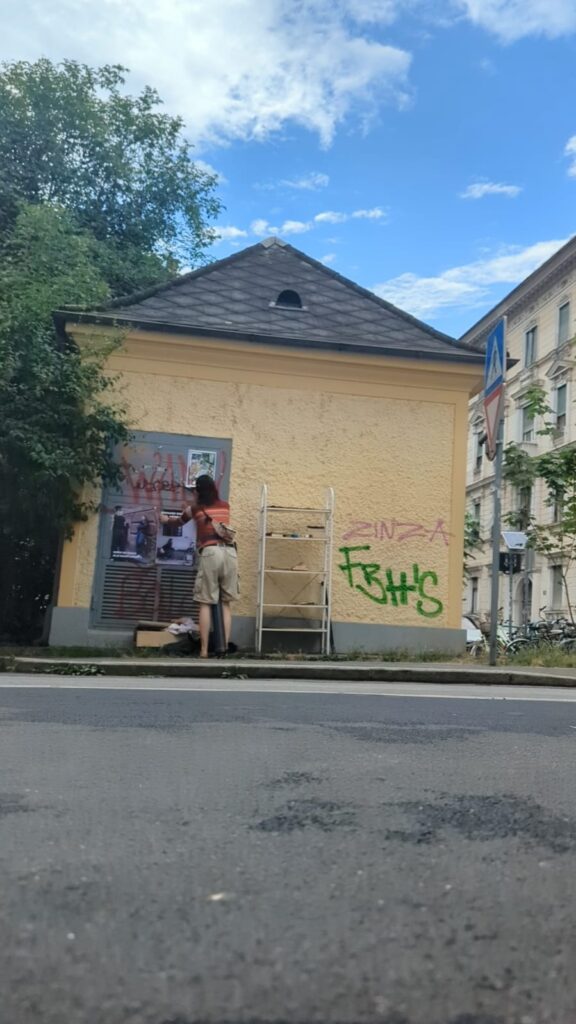
– Could this influence how people engage with activist or feminist visual communication?

For a Master’s topic that connects design, maybe activism, and perception, exploring rhyme as a cross-modal phenomenon  from sound to image  could be an interesting direction and I feel like it could be fun researching this topic.

Links

Ted Talk https://www.youtube.com/watch?v=8t4F83aHAXU

Baba Brinkmann https://bababrinkman.com/

LS Impulse #3 Demokratie, heast!

By now, we have all been to this exhibition probably, but I wanted to mention it for my research as well since I went there a couple of times already and I think the exhibition is presented in a really nice way on different levels: It is visually appealing, interactive and has a good size to not be overflowed with information or feeling like there is something missing.

The exhibition focuses on one central question: How do we want to shape our society in the future? It highlights that democracy sometimes feels very static and abstract, but  it is something we practice every day, in big political institutions like the townhall, but also in very immediate contexts: workplaces, schools, families, and communities. The exhibition combines historical material about democratisation in Graz with current debates around participation, civil rights, social responsibility, and the fragility of democratic systems. What I found particularly meaningful is the idea that democracy is in constant movement. It requires reflection, dialogue, and sometimes the willingness to question our own assumptions.

The exhibition uses varied media to create this sense of movement and participation. The spaces are visually designed to invite curiosity rather than lecture the visitor. Instead of overwhelming explanations, each room opens a small question, theme, or personal story. The interactivity is also woven into the exhibition in a subtle but effective way through sticky dots, opinion walls, small surveys, and participatory prompts. Visitors are encouraged to position themselves, literally and metaphorically, and to see how diverse or fragmented collective opinions can be. It becomes clear that democracy is not only about “being loud” but also about observing and understanding how different perspectives coexist.

From a communication design perspective, this was one of the strongest aspects. The way the exhibition was structured felt democratic in itself: open, accessible, and balanced between information and personal engagement. The visual design was friendly and non-intimidating, with a tone that felt approachable but not superficial. This made it possible to deal with political content without creating emotional overload or polarization, something that is difficult to achieve in contemporary political communication, which tends to be highly charged or simplified. Also, when I spoke to the curator she also mentioned that they got criticized for putting in their own political views even though they tried to be as neutral as possible. This also reminded me that anything (regarding design in this case) can be unpolitical and I will always send some kind of message.

The exhibition also made me think about how communication design can contribute to democratic processes. Visual tools, spatial cues, and interactive elements can help people express opinions, reflect on their biases, or understand complex issues. The use of stickers, participatory questions, and tangible interaction points reminded me how design can facilitate dialogue rather than merely transmit information. In my own work regarding activism, protest, or subtle feminist interventions these ideas feel very relevant. Designing spaces for conversation rather than statements might be the wording and also a direction worth exploring.

How is this an impulse for my potential master’s topic?

This exhibition made me reflect again on the relationship between design and participation. A possible direction for my future research could involve exploring how communication design can create environments for democratic engagement in public space,  activist contexts, or through gamified interaction. It also connects to some of my earlier ideas around subtle protest and spatial behaviour: how can design help people understand power structures through experience rather than explanation?

Alternatively, this impulse could be relevant for my interest in globalisation and the communication of complex systems. Democracies depend on clarity, accessibility, and inclusivity; and design plays a huge role in how accessible political knowledge or decision-making feels.

In the context of my developing research identity, Demokratie, heast! serves as a reminder that design is never neutral. It mediates understanding, shapes participation, and creates frameworks for dialogue. Maybe my master project can explore how communication design can act as a facilitator of reflection and collective thinking through visuals, spatial, interactive and emotional design.

Links:

https://www.grazmuseum.at/ausstellung/demokratie-heast/

LS3 #1 Mastertopic who?

Starting this semester, I find myself in a strange in-between space: I know I’m supposed to move toward a Master’s topic, but instead of clarity I mostly feel a kind of conceptual restlessness. Every idea I touch opens up into three more. I’m interested in too many things, pulled in several directions at once, e.g. visual culture, politics, public space, feminism, design as a form of intervention rather than decoration.
So choosing just one topic feels way to definite, not sure if anyone is also struggling with this as well.

But three potential directions keep returning to me. They are not fully formed, but they feel like possible starting points or loose constellations of thoughts:


1. Design Homogenization & the Global Aesthetic

One theme I keep circling around is the increasing sameness of contemporary design. Cities, ads, apps, brands or anything branded really -> everything is starting to look suspiciously uniform. Global companies rely on neutral sans-serifs, minimal palettes, clean universality. Instagram trends travel faster than local cultures can react.

This makes me wonder:

  • What gets lost when visual culture becomes globally streamlined?
  • How do local identities survive within systems that reward sameness?
  • And what does “authenticity” even mean when aesthetics circulate so fast?

This topic pulls me in because it sits between design, culture, and the politics of globalization and because I feel this tension personally every time I walk through a city and can’t tell where I am anymore.


2. Posters as Social Touchpoints

A second direction came to me by being showered with content about the pudding mit gabel events or the look-a like contests that all started because of some “badly” designed poster. Therefore, I’ve realized that posters don’t just communicate but they connect. They create tiny moments like someone stops, someone smiles, someone takes a photo, someone feels seen or irritated or even big moments like big events and community buildings. These different interactions fascinate me.

I’m curious about:

  • How analogue media can trigger social encounters
  • What kinds of posters invite participation or emotional response
  • Why physical touchpoints feel increasingly valuable in an overstimulated digital world

This approach would let me stay close to the city as a living laboratory, observing how design behaves “in the wild,” and how people respond to different visuals and what they will act upon.


3. Visual Protest & Everyday Feminist Interventions

The third direction ties into my long-standing interest in feminist protest. Not the big marches or iconic placards, but the small gestures – subtle, low-budget interventions that slip into daily life: stickers, posters in odd corners, tiny disruptions that shift the energy of a space. Basically what I have been researching for the past two semesters as well. I’ve been noticing how powerful these micro-protests can be, especially in gendered environments where a lot remains unspoken.

Some questions that orbit this theme:

  • How does subtle visual resistance reshape public space?
  • Which aesthetics make feminist protest feel urgent, playful, or subversive?
  • What happens when protest becomes intimate rather than spectacular?

This line of thinking feels personal, political, and directly connected to the work I’ve been doing over the past months.

And Now?

Now I just have to decide… If anyone is reading these blogposts, I’d love to hear some opinions :)) (Actually might not even chose between these three ideas, even during writing this post, I got a few more ideas)

LS Impulse #2 CoSa

In the beginning of November, we visited the CoSa Museum in the Joanneumsviertel Graz with the whole study program to get inspiration for our own gamification approach. But I would like to use it as a topic for one of my Impulse posts as well as I found the different approach for a museum very interesting and even within the exhibition there were some interesting differences.

I saw two of the exhibitions, there are way more, but it takes a while to even go through one of them. The first exhibition was about finances – the history of it, how to handle it and how our world is managed by it. The exhibition started by handing each visitor a small card that could be used for quizzes throughout all the rooms that would save your points etc. Therefore, visitors would be more interested and hooked to actually go through all the rooms and do the tasks to – then in the end – do a checkout and get a receipt with your score. I think the Concept and approach was interesting and a good idea, on me it did not work at all, because the reward in the end was not enough fore me; for a friend on the other hand it worked really well, and she really wanted to do all the tasks because it was enough for her to gather a very high score. I found this observation very interesting, because it showed how different our rewardsystems in our brain work and how that plays with our motivation for a (rather dry) topic. Another reason why I did not like the exhibition that much was the fact that it was all just pretended gamification. What do I mean with that? One game was for example to steer a containership from Europe to South America (on a screen obviously) But after 2 seconds it was clear that you didn’t actually do anything for the movement and the controller were just fake for you to think that you have an impact on the game. And basically all of the games were like that, and I lost interest very fast and almost did not finish any of those games. Of course, you have to keep in mind that the normal target group for the exhibition is children or young people that are still in school, but I would guess that they are even less concentrated or have the attention for a non-working game.

The second exhibition was way more interesting, it was not specifically about one topic but covered things like optical illusions, illness and lab diagnoses, AI content or how a car is built. And from the second I stepped into the room; I immediately understood that this is actually gamified and not like the other exhibition. Even the rooms were designed in a way more intuitive and natural way, it was more chaotic but then way more interesting to discover the different areas of it. Even though there were no reward systems or anything that would hook you until the end. And it was very touch and do- based, a lot of buttons, cranks or shadows to play with. They built and actual hospital room were you could get “blood” from the patients and analyse them in the lab next to it – and also be wrong about things. I think thats actually a main and important factor about gamification – that you can fail or lose and have to try again. Therefore it feels more important and interesting.

Connecetion to communication design:

The visit made me think about how strongly spatial communication influences user experience and engagement. The first exhibition felt extremely flat because the space was designed in a very sterile, minimal and almost liminal way, it had clean colours and no real sense of discovery. It communicated education rather than interaction, and because of that, even the attempts at gamification felt forced. The second exhibition in comparison used space almost like a narrative tool. It allowed visitors to explore, wander, and follow their own curiosity. For communication design, this highlights how important the design of an experience is: gamification is not only about scores or tasks but about creating an atmosphere that encourages participation. Gamification depends on emotional involvement, and emotional involvement depends heavily on how a space (off or online) is constructed.

It also raised the question of how communication designers can intentionally build environments that support learning, experimentation and play without feeling manipulative or superficial. Good gamification is a form of communication design, and it works best when it creates meaning not just motivation.

How can I use this for a potential master topic?

One idea I had is to connect this experience to my thoughts around design and globalization, especially how information is communicated across cultures, languages, or contexts. Gamification could be a meethod to make complex global systems, such as supply chains, political structures or gendered spaces more understandable through interaction and embodied experience. Another direction could be to explore how gamification can support or challenge feminist or activist communication. For example: How can playful interaction be used to reveal power structures? Or how can spatial or digital gamification become a tool for subtle protest?

Links:

CoSa Joanneumsviertel Graz
How Gamification Motivates
Social Interactions and the Dynamics of Protest Movements

LS Impulse #1 Schulter an Schulter

Last week on November 12th, I watched the documentary movie Schulter an Schulter (“Shoulder to Shoulder”) as part of the Crossroads Festival in Graz. The film brings together five long-term Antifa activists who, for the first time, speak openly about the backgrounds, motivations, and practices of an unusually organized and professional movement that confronted the growing neo-Nazi scene in reunified Germany after 1989. After the movie, activists from Graz also openly spoke about their experiences with antifa and activism.

I found the movie very interesting as the history of antifa is shown in a very clear and understandable way through archival material, personal recollections and reflective interviews by five activists from Germany. Also, the documentary traces how antifascist activism evolved from spontaneous street protests into structured networks of resistance. It portrays not only the confrontations with far-right groups but also the internal debates, emotional strain, and solidarity among activists who dedicated decades of their lives to anti-fascist work.

What fascinated me most is how Schulter an Schulter positions activism as both a historical and emotional practice, something that operates within and beyond visible protest actions. The film exposes how collective resistance requires organization, communication, and strategy, all forms of design in themselves. This connection between activism and design deeply resonates with my current research interests, especially around how protest is communicated, visualized, and mediated.

As a communication designer, I found the film relevant in two key ways.
First, it shows the power of narrative framing: how a movement is represented over time strongly shapes its public perception. The Antifa movement in Germany has long been reduced to stereotypes – often portrayed as radical, chaotic, or violent – yet this documentary humanizes it, showing the strategic, ethical, and emotional labor behind it. This reminds me that design, too, carries responsibility for framing social and political struggles.
Second, the film’s aesthetic approach relying on authenticity, honesty, and long-term perspective rather than shock or spectacle aligns with my growing interest in subtle, reflective forms of protest communication.

In relation to my potential master’s research, Schulter an Schulter raises important questions:
How can design contribute to the documentation and visibility of activist movements without simplifying them? What role does visual communication play in shaping public understanding of resistance?
And how can we as designers, engage with political memory,  especially movements that are often marginalized or misrepresented?

The film also left me reflecting on the infrastructures of protest: flyers, posters, coded communication systems, and collective symbols that circulated among activists. Many of these tools are examples of grassroots communication design created under pressure, with urgency and purpose. I’m inspired to explore how these visual and material artifacts of resistance could inform contemporary design practice, especially in feminist and activist contexts.

Finaly, Schulter an Schulter was not only a historical documentary but also an impulse to think about design as a form of resistance  through slogans or aesthetics as well as how we construct narratives and meaning.

Links:

Crossroads Festival Graz

Schulter an Schulter – Antifa Film

Weil der Staat versagte

Kritische Bewertung einer Masterarbeit – Design und Sein

Titel: Design und Sein – Was ist (gutes) Design? – Zwischen Funktionalität und Ästhetik

Autorin: Kira Junker

Technische Hochschule Ostwestfalen-Lippe

Studiengang Medienproduktion

Jahr: 2025

Link: https://share.google/I1VDqRyrS1o26Pho1

Allgemeiner Überblick

Die Masterarbeit “Design und Sein” beschäftigt sich mit der Hinterfragung von den Fargen “Was ist Design?” und “Was ist eigentlich gutes Design?” und die kritische Auseinandersetzung mit gängigen und idealisierten Designprinzipien.

Gestaltungshöhe

Das Werkstück bedient sich an einem klaren Farbschema und zwei Schriftarten, welches ich durch das gesamte Buch ziehen. Es ist simpel aber effektiv. Außerdem wurde das Werkstück basierend auf der eigenen recherchierten theoretischen Grundlage und schafft daher eine gute balance zwischen Aesthetik und Funktionalität bzw Struktur.

Innovationsgrad

Ich finde den Ansatz sehr spannend, ein Thema zu wählen, zu dem es ja einerseits schon sehr viel Literatur und Recherche zu gibt, diese dann aber sehr kritisch und hinterfragend beäugt wird. Direkt am Anfang wird erwähnt, welche Literatur Inspiration für die Masterarbeit waren und ich finde dass die Masterarbeit sich nicht sehr stark von der Thematik abhebt, sondern sehr ähnlich wie jene aufgebaut ist. Daher kann man argumentieren, dass die Fragestellung nicht viel Innovation aufzeigt, dei Autorin aber dennoch viel eigene Recherche und ein Werstück erstellt hat.

Selbstständigkeit

Die Autorin versucht selbstständig einen eineitlichen Weg für Design zu finden bzw den gängigen zu hinterfragen und bezieht sich dabei auf verschiedene philosophische Ansätze. Andererseits, wie schon gesagt, finde ich dass bei der Fragestellung mehr auf Selbstständigkeit hätte geachtet werden können um dem ganzen eine eigene Handschrift zu geben.

Für das Werkstück hat die Autorin ein gängiges modell genutzt um Zielgruppen zu analysieren und damit drei Personas erstellt, welche sehr passend sind und die selbstständigkeit dieser Analyse zeigen.

Gliederung und Struktur

Es gibt kein Abstract oder eine typische Einleitung, sondern es wird mit der Motivation der Autorin gestartet. Außerdem wurde die Arbeit in zwei Hauptteile unterstrukturiert, Inhalt A (Recherche und Theoriebezug hin zu einem Fazit) und Inhalt B (Beschreibung und Entwicklung des Werkstücks “Design & Sein: Eine philosophische Reise). Auch eine klare Fragestellung oder Hypothese gibt es nicht, was mich etwas irritiert hat.

Kommunikationsgrad

Die Arbeit ist sehr leicht verständlich geschrieben und auch strukturell Leicht verständlich gemacht. Ich finde es teils etwas schwer, von Kapitel zu kapitel zu folgen, da es keine klaren Übergange oder Erklärungen gibt.

Umfang der Arbeit

Die Autorin zitiert sehr viele Theories und Meinungen, aber nur kurz erklärt und angestoßen, mir fehlt da etwas die Tiefe, mit der das gesammelte Wissen dann irgendwie interpretiert und analysiert werden könnte.

Orthographie, Sorgfalt und Genauigkeit

Die Masterarbeit ist genau und sorgfältig, es gibt keine erkennbaren Rechtschreibfehler, Sprache ist zwar Leicht verständlich und trotzdem ausreichend und passend für eine Masterarbeit. Das layout und die verschiedenen Kapitel sind klar und verständlich gestaltet und gut zu verfolgen.

Literatur

Das Literaturverzeichnis ist relative klein, die Autorin hat dort nur 24 Quellen aufgelistet, welche aber fast ausschließlich Fachliteratur oder Bücher sind.

Beurteilung des Werkstücks

Durch das Fehlen einer zentralen Fragestellung, ist mir der Sinn des Werkstücks nicht ganz klar. Laut der Autorin ist das Buch eine “visuelle und inhaltliche Reflexion über die Disziplin Design”. Das Buch ist gestalterisch schön und passend, es ist angepasst an eine analysierte Zielgruppe und fasst die Erkenntnisse der Arbeit zusammen. Insgesamt also ein gutes Werkstück.

Meine persönliche Gesamtbewertung

Mir gefällt an der Masterarbeit besonders, dass sie Design nicht nur functional  sondern auch philosophisch betrachtet und versucht eine Brücke zwischen Ästhetik, Theorie und Funktionalität zu schlagen. Die Gestaltung ist ruhig, klar und konsequent, was gut zur Thematik passt.

Inhaltlich hätte ich mir jedoch eine klarere Fragestellung und eine tiefere kritische Auseinandersetzung mit der vorhandenen Literatur gewünscht. Gerade bei einem Thema, das so breit diskutiert ist, wäre eine stärkere persönliche Position oder ein experimentellerer Ansatz spannend gewesen.

Insgesamt hinterlässt die Arbeit aber einen sehr positiven Eindruck. Sie ist sorgfältig, verständlich und gestalterisch überzeugend geschrieben und man merkt, dass viel Reflexion, Interesse und Neugier am Thema eingeflossen sind.

Note: 2

LS EX #10 So what now?

As this exploration semester comes to an end, I find myself thinking about what comes next especially in terms of the master thesis. And I keep returning to the same internal conflict or questions i ask myself
How do I choose a topic that I really care about, without feeling like I’m doing it a disservice through design or focussing too much on the topic rather than the communication design aspect.

As in my bachelor thesis I had a topic I really did not care about a lot, it is important to me to find something like this that really interests me, but yeah, where do I find the link to design, or the loophole so to say. I think thats my main question with finding a good topic for myself.

Working on gendered space felt meaningful but I also felt like touching and important issue only on the surface level. But it is something I think about and experience constantly, how people perceived as female navigate public space, how protest can happen in subtle ways, how design can be used not to decorate, but to disturb. But the deeper I got into it, the more I felt exactly this pressure:
Am I doing this topic justice? Is a poster enough? Is communication design the right tool—or does it risk flattening the complexity of what I want to say?

I don’t have a clear answer yet. I know I might want to continue exploring feminist protest forms, everyday power dynamics, and how public space can be questioned or reclaimed. But I also want to become more confident in how I design for these themes and how to find a tone, a form, a system that doesn’t simplify the issue, but opens it up.

Maybe the thesis can be a space to investigate exactly this tension of not just what I want to say, but how I want to say it. And maybe how the act of designing can already part of the message.

So next steps: Research, research, research ! in any form, even if its just observing the outdoors and what other people created. Maybe experiment with formats beyond posters, spatial interventions, digital layers, collaborative elements. Something that lets me both explore the topic and the medium.

Looking forward to the moment I have found something!

Over and out, enjoy your summer, Lina

LS EX #9 Lets be realistic

After putting up the posters, I was curious to see what would happen next. Would people scan the QR code? Would someone find the project on Instagram? Would there be messages, comments, questions, anything?

Spoiler: not really.

I had imagined that once the posters were in the public space, they might trigger a second layer of interaction, maybe something that moves the project beyond the physical and into the digital. The QR code was meant to be that bridge. But in reality, that bridge was barely crossed. A few scans here and there, no noticeable Instagram engagement. Mostly silence.

To be fair, it makes sense. People don’t usually stop and scan QR codes in the street, especially if they’re not immediately clear or inviting. And while the posters were visually striking, they weren’t screaming for attention in the way commercial advertising does. I didn’t want them to. But it also meant they stayed within that subtle space which was too quiet maybe, for interaction.

This isn’t a bad thing, it is a learning.

Visibility doesn’t equal engagement. Just because something is seen doesn’t mean it sparks action. And just because someone walks past a poster doesn’t mean they’ll take out their phone, scan a code, and follow the project. It requires more: more friction, more curiosity, more clarity or maybe even more provocation. If I would do it again, I would rethink the QR strategy entirely. Make it more present, more tempting. Maybe even confusing or funny enough to trigger a response. The posters asked questions, but the QR code didn’t. It was just there, passively waiting.

The experiment still feels valuable. It reminded me that communication design doesn’t end with the object. It continues or fails in how people relate to that object and thats actually the really hard thing to find out. And how much effort we expect from an audience that is actually just trying to get from A to B.

LS EX #8 Putting them out in the wild

I put up the posters in areas close to my home, places I walk by often and that are pretty central. The idea was to stay in proximity so I could later observe reactions, but also to choose spots where I knew the posters wouldn’t be removed immediately. Somewhere visible, but stable and often next to other posters.

The actual act of putting them up felt surprisingly awkward. It was just me, the posters, and a roll of tape. Even though it was legal and harmless, I felt hyper-aware of being watched. I caught myself thinking: What if someone asks me what I’m doing? What if they think the posters are badly designed or too shallow? What if they just don’t take it seriously? Or if I even like my own project? If it is worth to be put up in the streets
That inner voice was unexpected. I believe in the project, but standing there with tape in my hand made me suddenly doubt everything.

Reactions in the moment were minimal. No direct confrontations or dramatic responses. Still, there were subtle moments of people slowing down a little, looking for a second longer than usual. One or two seemed to take in the message, even if briefly. Of course, part of me was hoping for a stronger reaction. Maybe someone engaging with it critically, or even aggressively. something that I could point to as “impact.” But that’s rarely how it goes.

Looking back, I think the strength of these posters might lie in exactly that random space inbetween: creating small interruptions. A moment of irritation. A tiny nudge. Not a confrontation, but a small question to ask oneself; just enough to make someone think about it, even if only for a second and maybe that’s enough for now.

LS EX #7 Insta Page

As part of my ongoing Gendered Space project, I recently created a small Instagram page:
@gendered_space_project

The idea behind it was simple, I wanted a space to share fragments of the work, especially the posters and the short phrases that emerged from interviews, observations, and everyday moments. But in practice, putting this work online felt more complex than expected.

The posters deal with how people, especially those perceived as female, navigate public space and how they make themselves visible or invisible. And posting them on social media felt like a continuation of that question: how much space do I allow myself to take up online?

Even though this is part of the research, I found myself hesitating. I overthought what to post, how to phrase things, whether something might be “too much” or “too direct.” There was a sense of vulnerability, a little bit the kind you feel when you say something out loud that you’ve always just quietly thought. And that hesitation is exactly what the project is about.

This tension between wanting to say something and being afraid of saying too much again shows so much of gendered behavior. We learn to be polite, subtle and to make room for others. And those rules don’t stop when you open Instagram.

So the Instagram page is part of the research and exploring itself. On it, I’m sharing picgures/ photos of the posters and short phrases like: “Machst du dich kleiner als du bist?” “Das schickt sich nicht.” “Nimm es doch als Kompliment.”

These are not simply slogans, they’re real sentences I’ve heard or collected during my conversations. They capture the ways in which people are told to behave. I pulled these sentences out of context and place them into public space physically and digitally and I’m actually curious to see what happens. Will people recognize themselves? Will they respond or ignore?

The posters will be installed soon in semi-public places, each one with a QR code leading to the Instagram page.This will help me collect actual real life feedback from real life. I’m not expecting viral reactions, as it is not a big project of course but I’m looking for small, meaningful responses. Or even silence which is a response too.

Creating this account turned out to be another small act of “taking space.” Not loud but honest and part of the process.