#21 Being a Freelance Illustrator

As I’ve been thinking about maybe working as a freelance illustrator one day, I thought it could be helpful and interesting to write down what I have to know and be aware of. I love drawing and creating visuals, but I also know that being freelance can be really hard and frustrating. It’s basically running your own small company.

It’s Not Just Drawing (Sadly)

The first thing I need to understand: freelance illustration is not only about being creative.

I would have to:

  • find my own clients
  • manage my time
  • handle money and taxes
  • organize contracts
  • promote myself

So it’s freedom, yes. But also a lot of responsibility.


Do I Need to Register Anything?

If I want to do this properly, I would need to register as self-employed. That usually means informing the tax office and getting a tax number. I’d also need to think about health insurance and maybe social security options for artists.

Taxes and Invoices

If I want to work as a freelancer, I would need to handle some basic tax and bookkeeping tasks (scary part):.

  1. Write proper invoices

Every project needs a correct invoice with all required information (my details, client details, tax number, description of the service, price, etc.). It’s important to nummerice them, it’s not allowed to change this number later!

2. Track income and expenses

I would need to document all the money I earn and all business-related costs, such as software, equipment, materials, or subscriptions.

3. Save receipts and documents

All invoices and receipts must be stored carefully in case the tax office asks for proof.

4. Set aside money for taxes

Since no employer deducts taxes for me, I would need to regularly save a percentage of my income for income tax (and possibly VAT).

Overall, it’s mostly about staying organized, keeping everything documented, and planning ahead financially so taxes don’t become a surprise (maybe it’s not as scary as I expected).

It’s all about the Money

This is something I really need to think about. At the beginning, I probably wouldn’t earn much. So I would need:

  • some savings (maybe 3–6 months of living costs)
  • or a part-time job
  • or very low monthly expenses

Because clients don’t just appear overnight. Building a name takes time. That’s why we came to…

How Would I Get Clients?

This is probably the biggest question. Some ideas:

  • Posting my work regularly on Instagram or other platforms
  • Sharing my process, not only finished images
  • Connecting with other creatives
  • Sending my portfolio to magazines or agencies

I think consistency would be more important than being perfect.

The Pricing

When I think about different pricing models as a future freelance illustrator, I would structure them clearly like this:

1. Hourly Rate

I charge for the exact time I work on a project. This is simple and transparent, especially at the beginning. However, it doesn’t always reflect the real value of the artwork and can limit my income as I become faster.

2. Project-Based Pricing

I offer one fixed price for the entire project. This usually includes concept, sketches, final artwork, and a defined number of revisions. It feels more professional and gives both me and the client clear expectations.

3. Usage-Based Pricing

On top of the creative work, I charge depending on how the illustration will be used — for example, social media, print, advertising, packaging, how long it will be used, and how large the audience is. The bigger the reach and the longer the usage, the higher the fee.

4. Package Pricing

For branding projects or long-term collaborations, I could offer bundled services (e.g., multiple illustrations for a set price). This creates structure and can make bigger projects more attractive for clients.

Ideally, I would combine project-based pricing with usage fees, so my work is valued not only by time spent but also by impact and visibility.

Summarising in the End: How would I start?

If I really decide to try this, I would probably:

  1. Build a strong portfolio.
  2. Save some money.
  3. Register as self-employed.
  4. Start small maybe alongside a part-time job.
  5. Slowly build an online presence.
  6. Learn about pricing and contracts.

People, who‘ve gone through

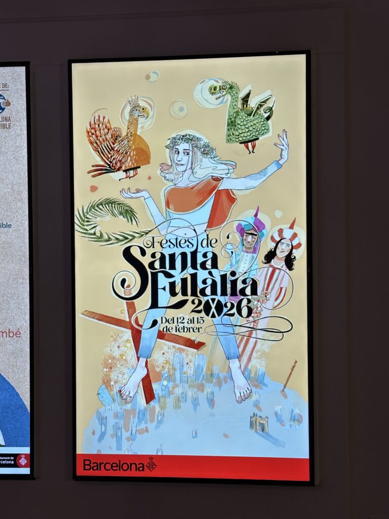
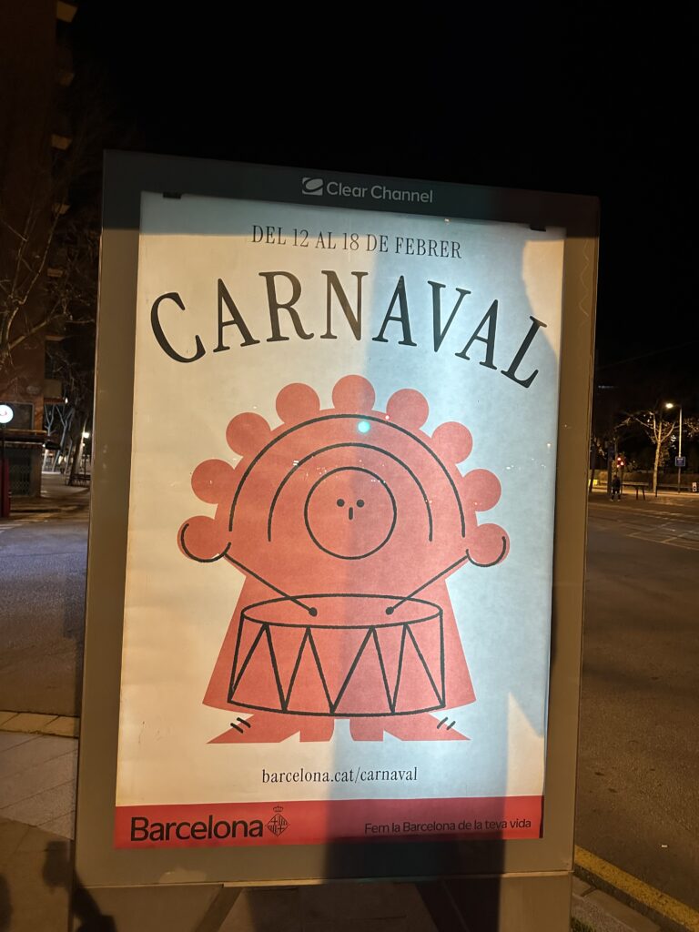
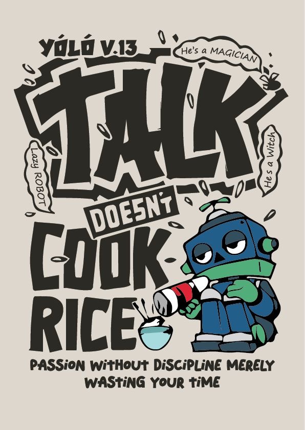
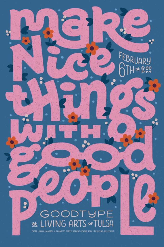
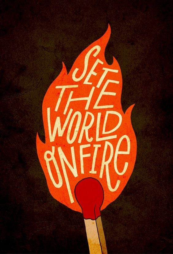
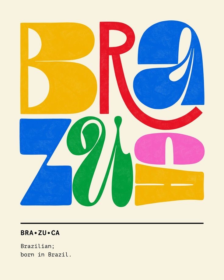
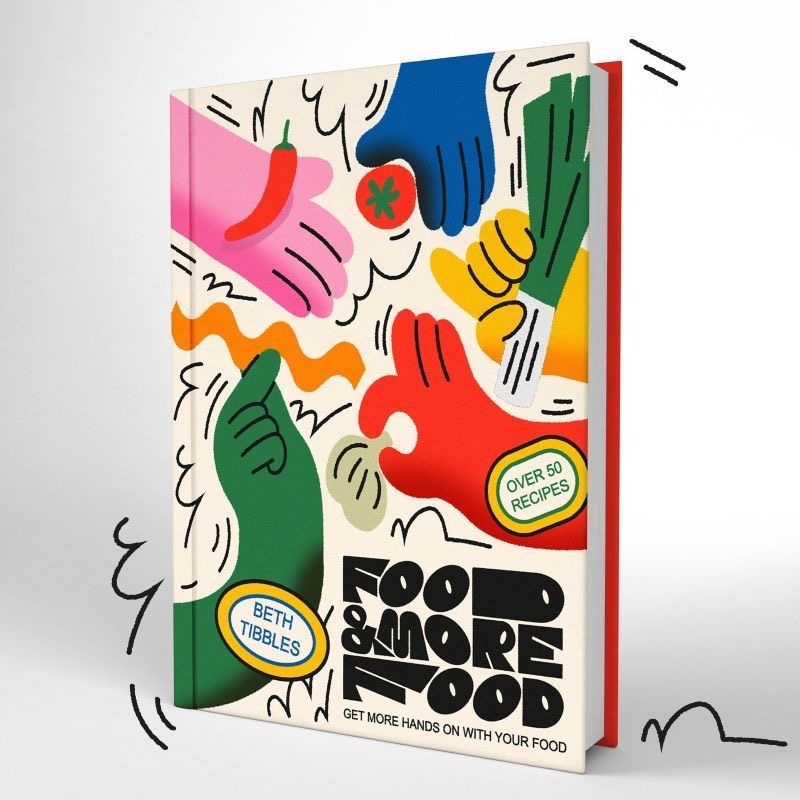
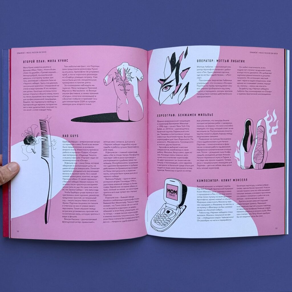
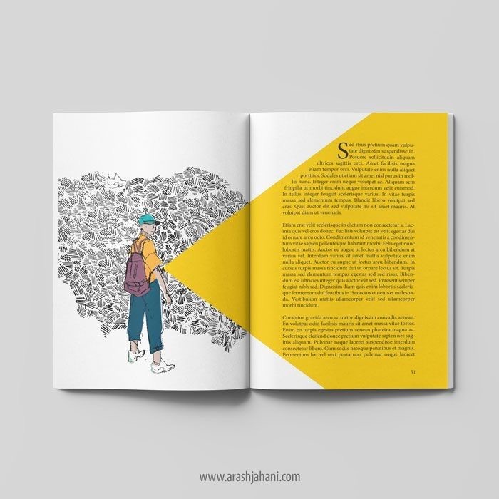
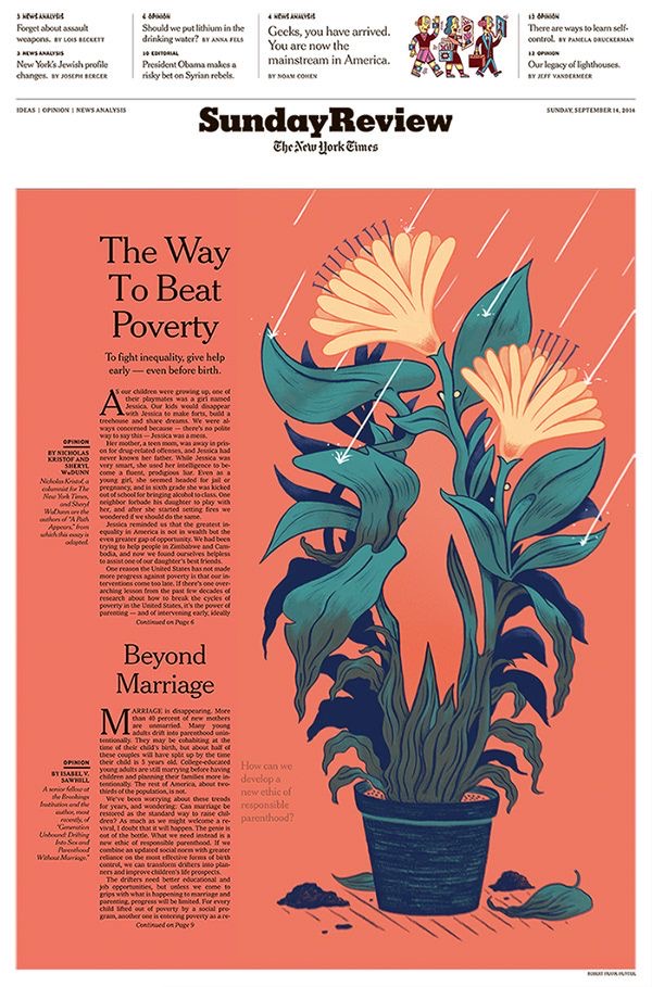
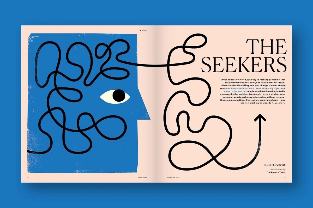
And at the end of this blogpost I want you to show a few examples of freelance illustrators. I love their work and maybe theirs is something that inspires you as well.
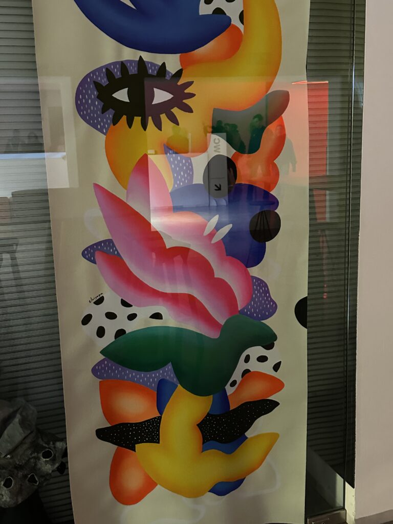
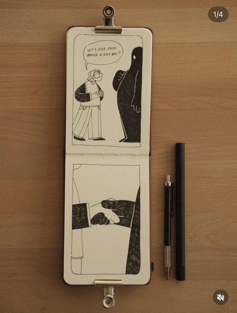
Julia Vanderbos

Julia van der Bos is a freelance illustrator originally from Russia, now based in Groningen in the Netherlands, who creates warm, inviting illustrations for diffrent projects, and works with clients worldwide.

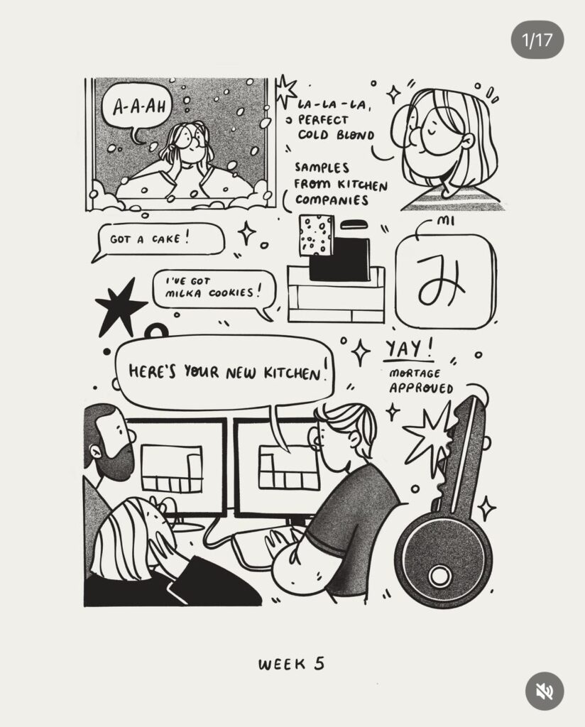
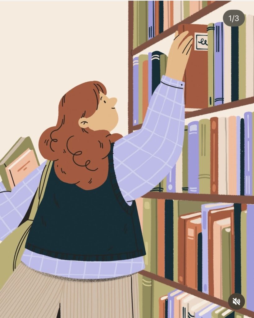
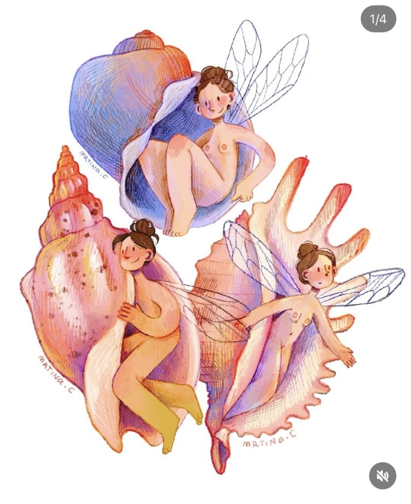
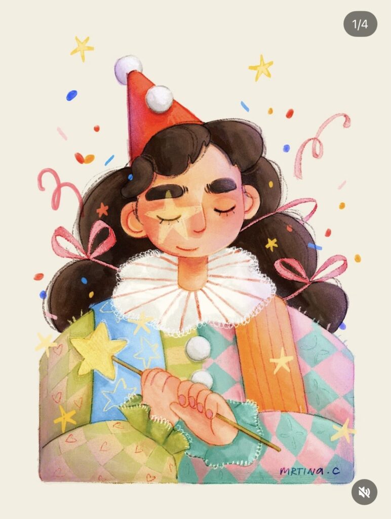
Mrtina Illustrations (her illustrator Name, not a typing error)

Martina is a Santa Fe (Argentinia) based illustrator who creates dreamy, character‑filled digital art, posts her creative process and finished pieces on Instagram, and sometimes takes requests or commissioned drawings from her followers (mainly active on instagram).

Impuls #9 Gaudi Museum Figueres

During my trip through northern Spain (the same journey I already wrote about in my last two blog posts) I also stopped in Figueres. Before going there, I honestly didn’t know much about the city. But then I found out that it is the birthplace of Salvador Dalí. (Many people mix up the names, but Gaudí was actually from Reus, while Dalí was born in Figueres.) So of course, visiting the famous museum dedicated to him was a must.

About Salvador Dalí

Salvador Dalí was one of the most important artists of Surrealism. He was born in 1904 and became known for his dreamlike, sometimes bizarre paintings. One of his most famous works is The Persistence of Memory with the melting clocks (an image almost everyone has seen before).

Dalí had a very unique personality. He was not only an artist but also a master of self-promotion. He loved attention, dressed extravagantly, and was known for his dramatic mustache. Throughout his life, he worked not only as a painter but also as a sculptor, writer, filmmaker, and designer. He even collaborated with filmmakers like Walt Disney.

He often described himself as a genius (and truly believed it). His art was strongly influenced by dreams, psychology, religion, and science. Whether you admire him or not, he definitely left a strong mark on the art world.

The Dalí Museum in Figueres

The Teatre-Museu Dalí is probably one of the most unique (in which way ever) museums I have ever visited. It was actually designed by Dalí himself and opened in 1974. The building already looks surreal from the outside with giant eggs on the roof and unusual sculptures decorating the facade.

For Dali the egg stood for birth, creation, hope and new life. It represents something fragile on the outside but full of potential on the inside, often connected to themes of rebirth. Besides eggs, Dali frequently used other symbols in his work: melting clocks (time and relativity), ants (decay and death), crutches (human weakness), drawers in bodies (hidden thoughts and the subconscious), and elephants with long, thin legs (fragility and instability).

Inside, the museum feels like stepping directly into Dalí’s (weird) mind. The rooms are dramatic, playful, and sometimes confusing. There are large-scale paintings, installations, optical illusions, sculptures, and strange objects. Some artworks are impressive in size and technique, others feel intentionally provocative.

What I didn’t expect was that there were also works by other artists exhibited. One of them was Antoni Pitxot. Pitxot was a Catalan painter and a close friend of Dali. His works often show surreal, rocky landscapes made of human-like stone figures. He was inspired by the natural rock formations of the Costa Brava and transformed them into imaginative compositions. I really liked his paintings, they felt detailed, thoughtful, and somehow calmer than Dalis dramatic works.

My Personal Impression

To be honest, I expected more from the museum. Some parts felt a bit chaotic, and I sometimes missed deeper explanations or background information about certain works. I found some pieces very interesting and inspiring, but others felt overly theatrical or even a bit exaggerated.

I have never been Dalis biggest fan. While I respect his creativity and boldness, I often find his art very kitschy and pseudo-artsy. The building itself is very nice but the interior and what he used for his art was a bit low quality sometimes. Walking through the exhibition, I also had the impression that he must have been not a nice person, very self-centered, maybe even a bit delusional in how highly he thought of himself. Of course, that larger-than-life ego was also part of his artistic identity.

Still, I cannot say that I didn’t enjoy the visit. The museum is an experience. A few paintings inspired me. I also like his “just do it” attitude, his courage to create without worrying about rules or expectations. That mindset is something I find motivating as a creative person myself.

And surprisingly, I really liked the works of Antoni Pitxot. They added another layer to the visit and showed a different side of surrealism.

In the end, the Dalí Museum left me with mixed feelings: critical, curious, and inspired at the same time. But thats fine, because that’s exactly what art is supposed to do.

Impuls #8 Street Illustration in Spain

On my one-week trip through northern Spain, I discovered something I didn’t expect: I started looking for illustrations everywhere. What began as a small observation quickly turned into a little personal mission. In every city, every village, every tiny street, I kept my eyes open for art.

Our first stop was Barcelona (where we visited the Llum festival as well). It’s such a vibrant, creative city, and you can feel an artsy energy. I thought it would be really nice to search for random illustrations in the city and write about them here. I think it’s pretty cool to get inspirations from different countries. What really caught my attention were the illustrated posters and advertisements. Many of them used illustration instead of photography and I wanted to search for inspirations. The style was often very bold and graphic: strong colors, clear shapes, very eye-catching.

Another thing I loved: so many garage doors were painted or covered in graffiti. Even when the shops were closed, the streets still felt alive because the metal shutters became huge canvases. Some were wild and chaotic, others were detailed and carefully designed. It made simple streets feel like open-air galleries.

I found a few book covers, I also found really cute.

After Barcelona, we went hiking along the Costa Brava. Along the way, we passed through small coastal towns like Cadaqués. The Costa Brava is strongly connected to Salavador Dali, who was born in Figueres and spent a lot of time in Cadaqués. There’s even a famous painting where he captured the harbor of Cadaqués. You can really feel that artistic history in the town. Cadaqués is small, white, and full of charm and art is everywhere.

Many illustrations are inspired by the sea like fish, boats, waves, sunsets. Even small utility boxes and electrical cabinets are painted. Instead of being ugly grey objects, they become tiny artworks. I loved that so much. It shows how art can transform even the most ordinary things.

What I love most about these small street artworks is how they bring life into everyday spaces. They make you slow down and searching for them was really fun. It made me more aware of my surroundings. This kind of art make a simple walk or usually ugly street more interesting and inspired me.

Here are a few more artworks and illustrations I found randomly on my journey through Spain:

Impuls #7 Llum Barcelona

I traveled to Barcelona to see the Llum Festival (among other things). I was curious about it and the art. Even though the festival is mainly focused on media art and light installations, I still found a lot of inspiration there. It showed me new ways of thinking about space, atmosphere, and how art can change the feeling of a city at night.

The Llum Festival is an annual light and media art festival that takes place in Barcelona, mainly in the Poblenou area. For a few nights, streets, buildings, and public spaces are transformed by light installations, projections, and digital artworks created by artists, designers, and architecture schools. Many of the works play with technology, movement, sound, and interaction. It’s very similar to Klanglicht in Graz.

In this article, I want to capture the moments and installations that stayed with me the most. These were the pieces that caught my attention, sparked ideas, or simply made me stop and look for a little longer.

The Rhythmen of the Ocean

One of my absolute favorite installations at the Llum Festival was “The Rhythm of the Ocean” by the visual studio Desilence, paired with music by composer Suzanne Ciani. This piece stood out immediately because it used a big open space in a powerful way, making the message feel immersive and meaningful. I really liked the flowing visuals and sound that moved like waves around you, it was very magical. It felt like you were inside the ocean and reminded me of Atlantis.

What I liked most was that the installation wasn’t only visually impressive, but also meaningful. Toward the end, text was projected that explained how much waste ends up in the ocean every day and how this pollution affects our environment. By using such a big surface and clear text at the end, the artists made sure the message couldn’t be ignored. For me, this combination of scale, movement, and environmental awareness is what made this installation one of my favorites at the festival.

Mantra Intervention

Another installation I really enjoyed was “Mantra Intervention” by the creative duo STUDIO MO:YA (designers Roland Mariacher and Werner Huber) presented as part of the Llum Festival’s main programme. And you might remember their names, because Moya is based in Graz and also participated at Klanglicht. And to be honest, they were definitely one of the best installations at the festival.

It was an interactive and generative piece that immediately drew me in because it let visitors participate with the art. At one screen, people could change the colours themselves, and brightly rectangles would pulse and lighten up to the rhythm of the music. What made it especially fascinating was watching how the piece constantly recalculated and evolved in real time, so no two moments looked the same, it was always shifting. This mix of interaction, generative visuals, and live rhythm made Mantra Intervention one of the most memorable parts of my visit. 

Bulla

Another installation that I really liked was “Bulla” by Lola Solanilla. This piece was set up in the Àgora Berta Cáceres in Parc de les Glòries (next to Off- Area if you remember). Walking into it felt almost like stepping into a mystical, magical world. The work was made up of almost 4,000 luminous spheres (Golfballs on rods) suspended over a large area, creating a soft, dreamlike landscape of light that you could walk around. 

What I liked most about “Bulla” was the vibe it had this unreal, almost enchanted atmosphere that made the space feel a bit mysterious. The play of light and shadows, and how the spheres floated above the ground, made it feel like you were in some kind of glowing cosmic field.

The whispering Mountains

Another piece I really liked at the Llum Festival was “The Whispering Mountains” by ENESS. This installation used inflatable sculptures spread out in the Parc del Centre del Poblenou, and the whole vibe felt really cool and magical. Walking among and through these soft, glowing shapes gave the space a kind of playful, other‑worldly feeling. 

I especially enjoyed this installation because it felt alive, the shapes and light looked almost like friendly creatures with eyes blinking and subtle movements that gave them emotion. This cute, expressive quality made the artwork feel personal and engaging, not just a static display of light. For me, that artistic approach was one of the reasons “The Whispering Mountains” stood out as one of the best installations at the festival.

Final Thoughts

Overall, I found the Llum Festival very beautiful and interesting. Even as a Communication Designer, it was a great source of input and inspiration. The professional installations were impressive and really cool. But to be honest, compared with Klanglicht, I had expected a bit more from Barcelona. (After all, it’s a huge city with a strong design background). While there were some truly amazing pieces, there were also many installations by students that sometimes felt rushed or not fully thought out (not just student installation felt like this). I also noticed that some works might have been even more striking if it had been darker overall, but the city itself is already quite brightly lit at night, which limited the effect in some areas.

Still, despite these small points, I’m really glad I went. All in all, it was a very beautiful and inspiring experience, and it gave me plenty to think about and reflect on creatively.

#20 Overlays: Wabi Sabi

For the CMSI exhibition Overlays, my fellow student and friend (shoutout to my girl) Elisabeth Seiler and I decided to create our own shared exhibition piece. We wanted to contribute something together, something personal, instead of working alone. Our goal was to develop a project that fits the exhibition but also represents our work and style.

Working with CRT TVs

Very early on, we knew we wanted to work with old CRT televisions (Röhrenfernseher). They matched the 2000s aesthetic of the exhibition perfectly, and we loved the idea of using a special and slightly unusual output device. Showing animations on an old TV feels very different from showing them on modern screens. The imperfections of the image give it a lot of character and charm.

Ideas and Inspiration

At the beginning, we spent a lot of time brainstorming. We created moodboards, collected visual inspiration, and talked about different themes and ideas for what we could show on the TVs. One thing was clear from the start: we wanted to show animated content. Take a look at one part of our moodboard:

Finding the Theme: Wabi-Sabi

After many discussions, we decided on the theme Wabi-Sabi.
Wabi-Sabi is a Japanese concept that focuses on the beauty of imperfection, transience, and incompleteness. It encourages us to accept flaws, cracks, and signs of aging as something meaningful instead of something negative. Things don’t have to be perfect to be beautiful. This idea fit our project and the old televisions very well. We researched a lot in the history and artsytle of WabiSabi as well. Here you can see how it usually looks like and what we used as inspirations for our projects:

The Technical Setup

Next, we focused on the technical side. Old CRT TVs can still be used as output devices, but you need some extra equipment. We used:

  • a CRT TV with Scart or Cinch input
  • an HDMI to Scart/Cinch adapter
  • a laptop or media player to play the animations

The modern video signal is converted so the old TV can display it. The image quality is lower, but that was exactly what we wanted. The blur, flickering, and color distortion are part of the aesthetic. We were lucky to get the TVs for free from an old hotel, which no longer needed them. This also fit the Wabi-Sabi idea of reusing old objects and giving them new meaning. It took as some time (and a lot of nerves) bit in the end we manged it.

Creating the Animations

Once everything was set up, we started animating. Lizzy and I each created our own animation, both based on the same theme but in our individual styles.

I chose to create an illustrated animation in my own visual style and storytelling approach. I wanted to communicate Wabi-Sabi in a poetic and emotional way. In my animation, two animals talk to each other: a fox and a mouse. The message is subtle and hidden between the lines. The fox explains to the mouse why it’s okay to feel broken sometimes, and why imperfections are not something to be ashamed of. I created the illustrations in Procreate and animated everything later in After Effects.

Final Thoughts

Our exhibition piece was not just about the final result, but about the process itself. Working together, combining old technology with animation, and exploring a meaningful theme was a very valuable experience for both of us. In the end, everything came together naturally: old screens, new stories, and beauty in imperfection. Happy us!

Impuls #6 From Cinderella and Aladdin

A few weeks ago, I re-watched the original The Beauty and the Beast (1991), not just scrolling through it while doing other things, but really watching. I remember being hit by how soft, warm, and calming the visuals felt especially compared to so many modern animations in current films that feel loud, polished, and fast. That experience got me thinking: why does the old Disney style feel so nostalgic and relaxing? Why don’t many modern films have that same vibe? And is there anything artists and designers today can take from it?

The Hand-Drawn World of Old Disney

Old Disney films, from Snow White to The Lion King, were all made (as you probably know) with hand-drawn animation. Artists drew every movement frame by frame on paper or transparent cels (Folienanimation), and painters filled them with soft colors. This is a slow, human, organic process you cant find so often today anymore.

That means also that tiny things you might not consciously notice like slight line wobble, uneven strokes, or the way color blends into the background are all part of what makes these films feel so alive. There’s a texture you just can’t get when everything is generated by computer. In fact, people who make animation today will often point out that the human touch in hand-drawn frames, as the tiny imperfections and personal style, is what gives old animations their emotional depth.

Why That Style Feels Nostalgic and Calming

There are a few reasons this style resonates so strongly:

  • The organic lines don’t look perfect so they feel familiar and warm instead of cold and to clean.
  • Colors were hand-chosen, often softer pastel and watercolor-like, giving scenes a painted, storybook mood.
  • The movement has a rhythm. It isn’t trying to be hyperrealistic.
  • And, of course, a lot of our nostalgia comes from having grown up with those films (including the Bambi-Trauma). They’re tied to memories, comfort, and childhood.

Why Modern Films Often Don’t Have That Same Vibe

Animation has changed quickly over the last years. Most films use computer generated imagery (CGI). CGI is amazing you can make richly detailed worlds and effects that were impossible before. But part of its nature is smooth precision. Every line, shadow, and object is mathematically perfect. That makes visuals feel almost polished but it also removes some of that personal, tactile quality.

And because CGI pipelines are expensive and fast-moving, studios rely on visual formulas: shiny surfaces, dramatic lighting, fast camera moves. That’s great for spectacle, but it can lose the calm and handmade feel that older animations naturally had.

Not Really Lost

Still, the old way definitely isn’t completly gone. Some studios and creators today are building on that traditional art style:

  • Studio Ghibli has kept hand-drawn animation alive in feature films like Spirited Away, where backgrounds feel like watercolors and every gesture seems intentional.
  • Cartoon Saloon, an Irish studio behind films like Wolfwalkers, mixes hand-drawn linework with modern tools in a way that feels alive and expressive.
  • Even Disney themself sometimes experiment with hybrid styles. Disney’s short Paperman used technology to blend hand-drawn lines with CGI to capture that old look in a new way.

So the trend isn’t really returning exactly to old Disney, it’s more like artists are rediscovering why the old look works emotionally and trying to bring that feeling into new tools and technologies.

What We Can Learn From It

If you love that slow, warm, nostalgic, hand-crafted feeling (as me), there’s a lot you can take into your own work even if you use digital tools:

  • Let your lines have personality instead of perfect precision.
  • Think about color like a painter: mood first, brightness and lighting second.
  • Study how classic animations pace movement, not every shot needs motion or drama, sometimes a quiet moment says more.
  • Don’t be afraid to slow down your visual rhythm to create calm and space on the page or screen.

Personal Reflection

For me, watching The Beauty and the Beast again was a reminder that art doesn’t have to be fast, flashy or damn loud to be meaningful. That old Disney style has a soul something that makes you pause, breathe, and just be present. It’s not just nostalgia talking (I promise); there’s real craft in every frame, and that craft still has a place in modern creativity and design. In our times where everything is so loud and fast, I am sure these values are getting more and more important. Even if we never go back to drawing every frame by hand in blockbuster movies, the essence of that style can still influence how we make art today – and maybe that’s the real magic.

Sources

https://www.adobe.com/de/creativecloud/animation/discover/cel-animation.html

https://www.movingstonedigital.com/hand-drawn-animation/

https://time.com/6081937/spirited-away-changed-animation-studio-ghibli

https://disneyanimation.com

Serie: Sketchbook – Disney (PS: check out my Impuls Post #1 to hear more about that)

#19 Illustrative Typography

After writing my previous article about illustration and typography, I came across some incredible examples of illustrated typography, and I wanted to dive deeper into the topic. I’ve tried illustrating letters myself a few times, and it can be so much fun, but also a bit frustrating.

Illustrated typography is exactly that mix of challenge and play. It’s where type stops being just text and becomes part of an image, a visual expression, or even a little scene on its own. I wanted to explore why it works, how it’s used today, and how illustrators and designers can experiment with it.

What Is Illustrated Typography?

Illustrated typography is any lettering that’s been decorated, drawn, or visually enhanced. It’s not just choosing a cool font, it’s making each letter part of an image. This can be hand-drawn, digitally illustrated, painted, or even animated.

Illustrated typography comes in many forms:

  • Hand-lettering, like carefully drawn quotes or posters.
  • Fonts with illustration elements, where each letter has a small decoration or design.
  • Mixed media, combining watercolor, collage, or 3D textures.
  • Motion typography, where letters move, change, or transform on screen.

In all of these, the key is that the letters themselves are part of the visual story, not just a container for words.

Why It Works

Illustrated typography does something regular text can’t.

  • Gives personality: A font might feel serious or playful, but illustrated letters feel alive
  • Draws attention: On a poster, cover, or social media post, it instantly stands out.
  • Adds emotion: Letters can look happy, dramatic, soft, or chaotic, and it’s all felt before the reader finishes the sentence.
  • Blends text and image: In some designs, letters become part of a bigger illustration, turning a word into a small scene.

Basically, it makes words feel like art, not just information.

Examples and Inspiration

There are tons of places where illustrated typography is used and make sense:

  • Magazines and Editorial
  • Advertising and Posters
  • Social Media (check out @goodtype )
  • Motion Design

Trends and the Future

Illustrated typography is having a bit of a renaissance. People are moving away from purely digital fonts that feel cold and uniform. Hand-made letters, texture, and playful designs are back in style. Social media encourages it too the more visual, the more shareable. And with animation tools, letters can now move, giving illustration and typography a new, lively life online. It’s a trend that works in branding, editorial design, posters, and online content. And it’s fun because it combines two things designers and illustrators love: words and pictures.

Tips for Trying It By Myself

If you want to play with illustrated typography, here are some simple tips I wrote down for myself:

  1. Think about balance: Letters should complement your illustration, not compete with it.
  2. Keep it readable: Even if it’s decorative, people still need to understand the words.
  3. Experiment with texture and color: Small details, shadows, or watercolor effects make letters feel alive.
  4. Start small: Try a quote, a social media post, or a poster (don’t feel like you need a book cover right away.)
  5. Mix hand and digital: Scan sketches and refine them digitally, or add digital textures to hand-lettering.

Final Thoughts

Illustrated typography shows that letters don’t have to be boring. They can tell a story, set a mood, or just make you pause and smile. From my own experience trying it, it can be frustrating at times, but that’s part of the fun and part of why it’s so rewarding. Whether you’re an illustrator, a designer, or someone who loves creative visuals, experimenting with letters as art is a playful way to mix illustration and design. I’m a fan.


Sources

https://www.rmcad.edu/blog/illustrative-typography-merging-text-and-image/

https://bluelavaart.com/art-education/illustrative-typography

https://www.rmcad.edu/blog/typography-meets-illustration-integrating-lettering-into-visual-art/

https://beckyhtaylor.wordpress.com/2012/11/18/illustrative-typography/

https://www.instagram.com/goodtype

Impuls #5 Steal like an Artist

I discovered the book Steal Like an Artist by Austin Kleon through an Illustrator-Influencer on Instagram. Later, I found the audiobook version on YouTube. Because I am very interested in creative thinking and inspiration, I decided to listen to it and found the content very intresting and helpful. In this blogpost, I summarize the main ideas of the book and what creative people can take from it.

Nothing Is Truly Original

One of the main ideas of the book is simple: Nothing is completely original.

Every creative work is influenced by other ideas, images, books, films, or people. Creativity does not mean creating something from nothing. It means taking existing ideas and turning them into something new This thought can be very freeing for creatives. You don’t have to wait for a perfect idea you can start by building on what already exists.

Choose Your Influences Carefully

Austin Kleon explains that creative people are collectors. But it is important to choose good influences. What you read, watch, and listen to shape your work. If you surround yourself with inspiring content, your own ideas will grow stronger.

Copy to Learn, Not to Steal

The book encourages copying as a learning tool. By copying the work of artists you admire, you can understand how they think and work. It is important to learn from many different people, not just one. Your mistakes and personal changes while copying will slowly become your own style.

Start Before You Feel Ready

Many creatives wait until they feel confident or “good enough.” Kleon’s message is clear: start anyway. You discover your style by working, not by waiting. Feeling unsure is part of the creative process.

Use Your Hands

Another key idea is to work away from screens sometimes. Drawing, writing, cutting, or sketching by hand can help ideas flow more naturally. Thinking often comes after doing, not before.

Conclusion: What I Took Away From This Book

Steal Like an Artist made me feel more relaxed about being creative. It shows that feeling unsure, stuck, or not good enough is completely normal especially when you care about what you make and create. If you struggle with self-doubt or perfectionism, this book can really help. It reminds you that you don’t have to be perfect to start. You don’t need a big, original idea right away. You are allowed to learn from others, try things out, and make mistakes along the way. One of the most helpful ideas for me was to stop waiting until I feel “ready.” Creativity doesn’t work like that. You become more confident by doing the work, not by thinking about it forever. Overall, the book encourages a softer, more playful approach to creativity. Just start, stay curious, and trust that even messy, imperfect work is part of the process.

And at the end of this post, a pretty nice quote from T.S.Eliot which summs it up in a poetic way:

Immature poets imitate;
mature poets steal;
bad poets deface what they take,
and good poets make it into something better or at least something different.

The good poet welds his theft into a whole of feeling
which is unique, utterly different from that from which it was torn.

#18 Editorial Illustration and Type

When you open a magazine or read a long online article, you rarely think about it consciously, but illustration and typography are constantly having an impact on eachother. Sometimes text clearly takes the lead, sometimes an illustration. That made me wonder: in editorial design, who is actually leading: illustration or type? And does one really have to follow the other and how can they be combined perfectly?

Typography

Typography is often one of those things you only notice when something feels off. When it works, it stays in the background and lets you focus on the content. But without you realizing it, typography decides how you move through a text where your eyes slow down, where they jump ahead, and whether reading feels easy or exhausting.

In editorial design, type is like a quiet guide. Headlines pull you in, subheadings help you orient yourself, and body text carries you through the story. Spacing, line length, and alignment create natural pauses, almost like breathing spaces between thoughts. When typography is done well, it doesn’t ask for attention. It simply works. And even though it feels functional, it’s never neutral, every typeface has a mood and carry emotions. Its job is to support the content and make reading feel natural. Because of that, it often ends up leading the experience without ever feeling dominant.

How Typography Shapes the Reading Flow

You can really feel the impact of typography when you compare two texts with the same content but different layouts. Imagine a long article set in a very small font, with tight line spacing and long line lengths. Even if the writing is good, reading it feels tiring. Your eyes struggle to find the next line, and you lose focus quickly.

Now imagine the same text with more generous spacing, a slightly larger font, and clear breaks between paragraphs. Suddenly, the article feels lighter. You move through it more slowly and comfortably. You’re more likely to keep reading, not because the text changed, but because the typography respects your attention.

This means typography can encourage readers to slow down, to stay longer with a thought, or to skim when that makes sense. And that rhythm strongly influences how illustrations are perceived, too. An illustration placed in a well-paced layout feels like a moment of rest, not a distraction.

Illustration

Compared to typography Illustration is rarely invisible. Even when it’s subtle, it adds emotion, personality and interpretation. An editorial illustration doesn’t just show something, it comments on the text and is able to change the context.

Especially in essays, cultural topics or opinion pieces, illustration can open the door emotionally. It can simplify complex ideas, add irony, or create a mood that words alone struggle to convey. In that sense, illustration often leads on a more emotional level, even if typography still structures the page. Unlike photography, illustration allows for abstraction. It doesn’t need to explain everything. Sometimes it just sets a feeling and that feeling stays with the reader longer than the text itself.

When Typography Clearly Leads

There are many situations where typography should be in charge. Long reads, investigative articles, academic or journalistic content all heavily on clarity and readability. In these cases, illustration usually plays a supporting role.

The image might appear at the beginning or between sections, offering a pause or a visual metaphor, but it doesn’t interrupt the flow. Here, illustration follows typography, not because it’s less important, but because the text needs space to breathe. Here you see a few examples where typography is leading clearly:

When Illustration Takes the Lead

Then there are moments when illustration is the main entry point. Think of magazine covers, opening spreads, or essays built around a strong idea or mood. In those cases, illustration often pulls the reader in first, while typography steps back and becomes quieter. Type becomes simpler, calmer, sometimes even neutral just enough to support the image without competing with it. When done well, this kind of layout feels generous. It gives the illustration room to speak and trusts the reader to slow down. Here are a few examples for this:

It’s All About The Balance

The most interesting editorial design doesn’t feel like a hierarchy at all. It feels like a dialogue. Illustration and typography react to each other. One leads for a moment, then steps back. The other responds. Problems usually appear when both try to dominate at the same time like loud type paired with expressive illustration. Or when neither has a clear role, leaving the layout flat and forgettable.

What We Can Learn From This

For illustrators, it helps to think beyond the single image. How does the illustration live on the page? What does the typography already say and what doesn’t it say yet?

For designers, illustration shouldn’t be treated as decoration added at the end. It’s part of the storytelling. When illustration and type are developed with mutual respect, the result feels intentional, calm, and confident.

Final Thoughts

So who leads, and who follows? The honest answer is: it changes and depends. The best editorial layouts don’t force a winner. They create space for collaboration. When illustration and typography trust each other, the reader feels it and it feels natural.

Sources

https://fiveable.me/editorial-design/unit-4

https://www.numberanalytics.com/blog/impact-of-typography-in-editorial-design

https://page-online.de/typografie/fonts-im-editorial-design-die-besten-tipps-und-trends/

https://www.abbycook.co.uk/blog/what-is-an-editorial-illustrator?srsltid=AfmBOooJNcO_xj8mkirvqoQ2twpDKeqNYRG4AumZIDsbPptKVIx4pIce

#17 Rights to Illustration

What Illustrators Need to Know About Copyright, Usage, and Licensing

Since I spent a lot of time working with AI in my last articles, I felt the urge to dive into the topic of usage rights, licensing, and copyright for my own illustrations. I think this subject is really important, but I know very little about it. That’s also why I’ve been hesitant to share my art online. I’m afraid of my work being copied or used without my permission.

So I decided to finally get more into the topic properly. As an Illustrator or Designer you care a lot about your style and ideas. But when it comes to the legal side of work, I often feel unsure. Copyright and licenses have always felt confusing, and I’ve heard stories about artists getting into trouble because they didn’t set clear rules. That’s why I want to understand the basics of copyright, licensing, and how I can protect my work.

Who owns an illustration?

In Germany, illustrations are protected by copyright as soon as they are created. You don’t need to register your work somewhere. The law states that the person who creates the illustration is the author and therefore the copyright holder. This applies even if the illustration was made for a client, unless a specific agreement says otherwise. The relevant legal basis is Section 7 of the German Copyright Act (Urheberrechtsgesetz, UrhG), which defines the author as the creator of the work.

This automatic protection is one of the reasons copyright is so important for illustrators. It means that your work already has value the moment it exists.

Copyright vs. usage rights

A common misunderstanding is that selling an illustration means giving up all rights. This is not true.

Important distinction:

Copyright stays with the illustrator

Usage rights (licenses) can be granted to others

Even if an illustration is paid for, the client does not automatically own the rights to use it freely. Copyright remains with the illustrator, while usage rights can be granted to others. Usage rights define how an illustration can be used, where it can be used, and for how long. If the agreement is unclear, the client might assume they can use the illustration in many ways, while the illustrator never intended that.

This is why it is so important to separate the payment for creating the illustration from the payment for the usage rights.

What usage rights include

Usage rights are basically a license. They define:

  • the type of use (editorial, advertising, social media, print, etc.)
  • the duration (one year, five years, unlimited)
  • the territory (Germany, Europe, worldwide)
  • exclusivity (exclusive or non-exclusive)

If these points are not defined, misunderstandings are almost guaranteed. For example, an illustration made for a magazine article does not automatically include the right to use the same illustration for advertising or merchandise.

Commissioned work: who may use the illustration?

Commissioned work is a common situation where things get messy. Even when a client pays for an illustration, they do not automatically get full rights. If no agreement exists, the client can only use the illustration for the purpose it was created for.

If the client wants additional usage (for example, social media, advertising, or merchandise), the illustrator should grant a separate license or update the contract. That is why written agreements are so important.

What About Copyright Notice and Attribution?

Illustrators have the right to be named as the author of their work.

This means:

  • The illustrator’s name should be mentioned when the work is use
  • Credit should be given unless explicitly waived

Online Use and Social Media (Lucky us)

Publishing illustrations online does not mean giving up rights. (But: Illustrators and Designers should always check platform terms and conditions carefully.)

Important points:

  • Uploading work does not make it public domain
  • Social media platforms receive limited platform licenses only
  • Third parties may not reuse illustrations without permission

And finally: How Can We Protect Our Work?

Although copyright exists automatically, illustrators should actively protect their work.

Practical measures include:

  • Written contracts and license agreements
  • Clear communication about usage
  • Keeping original files and sketches
  • Watermarks or low-resolution previews (when appropriate)
  • Documenting creation dates


In case of misuse, the illustrator can claim:

  • Removal of the work
  • Compensation
  • Credit as the author

Licensing Modells

There are different licensing models that you can use depending on the project.

  • Buyout licenses: extensive usage rights are granted for a higher fee (copyright usually remains with the illustrator unless explicitly transferred).
  • Exclusive licenses: only one client can use the illustration.
  • Non-exclusive licenses: you can license the same illustration to multiple clients.
  • Time-limited licenses: the license is valid only for a specific period.


Sources
https://www.gesetze-im-internet.de/index.html

https://grandmatter.com/work/usage-licenses-explained

https://illustratoren-organisation.de/fuer-mitglieder/rechte-kennen/