The Monochrome UI Challenge – Can Less Color Mean More Sustainability?

In today’s digital landscape, color is a powerful tool. It guides users, creates emotional connections and establishes brand identity. But what if we took a step back and asked: How sustainable are our color choices? Could using fewer colors, or even just shades of one color, reduce the environmental footprint of our digital products while maintaining usability and aesthetic appeal?

This blog post explores the Monochrome UI Challenge, a practical experiment in designing interfaces with limited color palettes and what it means for digital sustainability.


Why Focus on Color for Sustainability?

Many modern devices, especially those with OLED and AMOLED screens, consume more power when displaying bright and colorful pixels. White backgrounds and vibrant colors require more energy to light up pixels, draining battery faster than darker or monochrome displays.

By simplifying color usage, designers can potentially reduce energy consumption on users’ devices. While the energy saved per user may seem small, when scaled across millions of visits, these savings add up significantly.


What is the Monochrome UI Challenge?

The Monochrome UI Challenge asks designers to create an interface using only shades of one color, usually grayscale, rather than a full color palette. This means no bright blues, reds, or greens, just blacks, whites and varying grays.

The challenge is to maintain clear visual hierarchy, usability, and even aesthetic beauty despite the limited palette. It forces designers to rethink:

  • Typography: Using font weight, size, and spacing to create contrast and guide the user.
  • Layout: Using whitespace strategically to avoid clutter.
  • Icons and Graphics: Simplifying or converting colorful assets into monochrome versions.
  • User feedback and states: Using shapes, patterns, or opacity instead of colors alone.

The Experiment: Two Versions of a Blog Homepage

To test this idea, I created two versions of a simple blog homepage:

1. Full Color Version:

  • Vibrant header and buttons
  • Colorful images and icons
  • Clear but colorful call-to-action elements

2. Monochrome Version:

  • Shades of gray replacing all colors
  • Grayscale images
  • Strong typographic hierarchy for readability
  • Subtle shadows and borders for depth

Findings and User Reactions

  • Usability: Most users found the monochrome design easy to navigate. They appreciated the clean and minimal look without distraction.
  • Readability: Contrast was maintained through typography and spacing, ensuring legibility.
  • Aesthetic Appeal: While some missed the “pop” of color, many found the monochrome look elegant and calming.
  • Energy Impact: Simulations on OLED devices showed the monochrome page used about 20-30% less energy due to reduced pixel illumination.

Sustainability Beyond Energy

Limiting color palettes also encourages more thoughtful design decisions:

  • It pushes designers to focus on content and structure rather than flashy visuals.
  • It reduces the need for multiple image assets, potentially lowering data transfer and load times.
  • Monochrome designs often align well with accessibility standards, making interfaces clearer for users with color vision deficiencies.

How to Take on the Monochrome UI Challenge Yourself

  1. Choose a Page or Interface: Pick a simple page like a blog, landing page, or app screen.
  2. Remove Color: Convert all colored elements to grayscale or a single color palette.
  3. Focus on Contrast and Hierarchy: Use typography (size, weight), spacing, and borders to guide users.
  4. Test Readability: Get feedback from users to ensure the design remains clear and appealing.
  5. Measure Impact: Use tools to estimate load times, file sizes, and if possible, energy consumption on OLED devices.

Final Thoughts

The Monochrome UI Challenge isn’t about stripping away color. Instead, it’s an invitation to rethink how we use color, balancing brand identity and user delight with sustainability and accessibility.

By embracing simplicity and focusing on what truly matters, we can create digital experiences that are both beautiful and responsible. The challenge shows that sometimes, less color can mean more impact, for users and the planet alike.

The Carbon Cost of Motion: Do We Really Need All Those Animations?

Measuring the Energy Impact of Animations on Websites

In digital design, animation has become a staple for enhancing user engagement. Microinteractions, scroll effects, and parallax motion all contribute to polished and visually dynamic websites. But how sustainable are they really?

In this entry, I wanted to find out: Do animations significantly increase the energy consumption of websites?
To explore this, I created two versions of a simple landing page:

  • One static with no animations.
  • One animated using CSS and JavaScript transitions.

I then compared the performance and energy use of both versions using Greenframe and Lighthouse performance reports in Chrome DevTools.

static website
animated website

Results & Findings

The static version performed better across all key metrics: faster load times, reduced rendering workload, and less energy consumed during interaction.

VersionPage SizeTime to InteractiveLighthouse PerformanceEstimated CO₂ per Visit
Static (No Motion)83 KB0.6 s990.04 g
Animated Version194 KB1.2 s860.11 g

The animation-rich version was visually engaging, but also added unnecessary weight and longer processing times, especially noticeable on lower-end devices. While animations aren’t inherently unsustainable, they must be used deliberately, not just as aesthetic decoration.


Conclusion

Animations do have a place in design, especially when they aid usability. But from a sustainability standpoint, designers should evaluate:

  • Is this animation improving functionality?
  • Could it be simplified or removed?
  • Can it be optimized with lightweight CSS instead of JavaScript?

Even small choices like reducing motion intensity, using system-based transitions, or respecting users’ reduced motion preferences can help lower energy consumption.

Accessibility and Sustainability in UI Design

Can accessible design also be more sustainable?

UI design improves user experience and contributes to sustainability by optimizing code structure, reducing page weight and supporting inclusive digital use. I created two comparable websites, one that follows accessibility best practices and one that intentionally ignores them. Then, I measured and analyzed how the design choices affect sustainability and usability.


Creating Two UI Versions

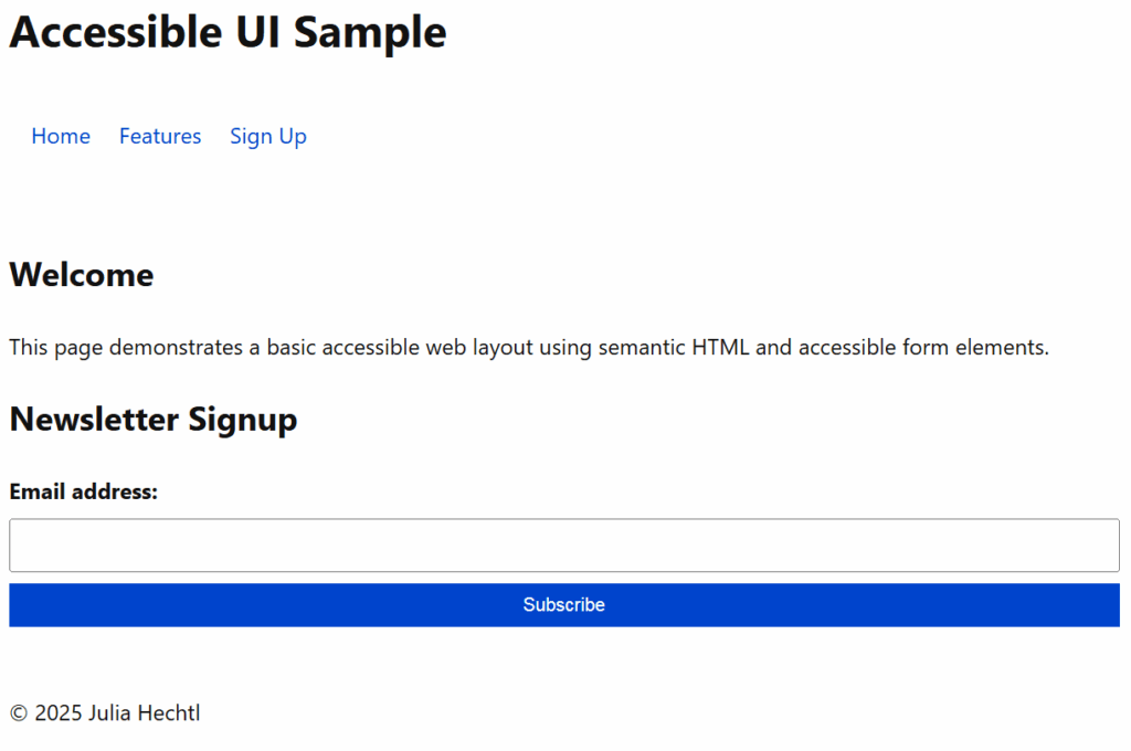
I developed two simple landing pages using basic HTML and CSS in Visual Studio Code.

Accessible Version

  • Semantic HTML tags (<header>, <nav>, <main>, <footer>)
  • Proper heading hierarchy
  • Clear and descriptive labels for form inputs
  • Keyboard-navigable links and buttons
  • Visible focus styles for accessibility
  • Descriptive button text and aria-labels
The full accessible code uses clean HTML and includes screen reader support and best practices for form interaction.

Non-Accessible Version

  • Uses only <div>s and <span>s, no semantic structure
  • No form labels
  • Placeholder text instead of labels (bad for accessibility)
  • No keyboard or screen reader support
  • No visible focus states
The visual design is similar, but the structure lacks meaning for assistive technologies and introduces usability issues.

Testing & Comparison

I tested both versions using:

  • Lighthouse in Chrome DevTools (focusing on accessibility and performance)
  • WebsiteCarbon.com (to estimate CO₂ emissions)

Results:

MetricAccessible PageNon-Accessible Page
Accessibility Score10054
Performance Score9889
Estimated CO₂ Emission0.14g per visit0.22g per visit
Page Size9.3 KB15.1 KB
DOM Elements2234
Screen Reader Compatible✅ Yes❌ No
Keyboard Navigation✅ Yes❌ No

What I Learned

While building and testing both pages, I found that:

  • Semantic HTML makes the structure clearer for both browsers and assistive tech.
  • Accessibility best practices often lead to cleaner and smaller code, which is easier to maintain and faster to load.
  • The accessible version had fewer DOM elements, lighter styles and required fewer workarounds.
  • The non-accessible version relied on <div> structures, custom styling hacks and was bloated despite its simple appearance.

Conclusion

Making websites accessible is not just an ethical or legal concern, it can also lead to better-performing and more sustainable digital products. Cleaner code, semantic structure and user-friendly interactions reduce friction, device strain and energy use over time.

For designers and developers, this is an important reminder that good UX and sustainable development go hand in hand.

Sustainable Microdecisions – Reducing Waste in UI Design

Introduction

Sustainable design is often associated with big-picture strategies, green hosting, carbon-efficient code, or minimalistic interfaces. However, small decisions at the UI level can also contribute meaningfully to lowering environmental impact. In this entry, I will test how minor visual and structural choices, such as omitting unnecessary elements or optimizing screen content, can reduce energy consumption and improve clarity.


The Power of Microefficiency

UI designers often overlook the cumulative cost of “small” visual choices. But these design patterns appear thousands of times across devices. Think about a simple time display on a phone:

Do we need to show “09:00” or is “9:00” sufficient?

Real-World Examples

  1. Typography in Clocks & Timers
    • Removing leading zeroes (e.g. 09 → 9) can reduce pixel rendering, especially with high-resolution custom fonts.
    • On OLED screens, fewer illuminated pixels = lower energy use (Jedlicka, 2009).
  2. Battery & Network Icons
    • Using low-complexity vector icons vs. bitmap sprites saves data and rendering effort.
    • Minimal animation or refresh frequency can reduce processor load (Dougherty, 2008).
  3. Compact UI Layouts
    • Removing redundant visual elements (shadows, gradients, unnecessary labels) lowers energy load, especially in dark mode (Birkeland, 2002).
  4. Reduced Decimal Precision
    • Showing “Battery: 75%” is clearer and less data-heavy than “75.23%” without functional loss.

Exercise: Sustainable UI Redesign

Step 1 – Choosing a Device Interface

For this practical exploration, I selected a common element of mobile design: the status bar. This small UI component is constantly visible, yet often contains visual elements that add unnecessary weight, visually and digitally. The goal: Test how simplifying the UI can contribute to sustainable design with minimal effort.

Step 2 – Identifying “Unnecessary Visuals”

Typical status bars often include:

  • Leading zeros (e.g., 09:00)
  • AM/PM indicators (in regions using 12-hour format)
  • Custom fonts loaded via the web (adds bandwidth)
  • Visual effects such as shadows or gradients
  • Colorful icons that increase rendering effort

Each of these elements, while small, can be optimized or removed entirely for a more efficient interface, especially when used at scale.

Step 3 – Redesign

Original Status Bar – Typical Implementation

This version mimics the kind of default or overly styled component you’d find in many apps or UI libraries.

Optimized Version – Sustainable Redesign

This version simplifies everything: uses a system font, removes styling effects, omits redundant time formatting, and uses CSS masking for icons.

Step 4 – Test

The redesign showed a noticeable reduction in DOM size, eliminated external font loading, and improved rendering simplicity. While the savings are small in isolation, this practice scales meaningfully across larger design systems or global apps.


Conclusion

Good design doesn’t need to shout. By paying attention to microelements, we not only create cleaner interfaces but also reduce environmental impact in subtle yet scalable ways. Sustainable design isn’t always about grand gestures, it’s often in the details.

Vector vs. Bitmap – What’s the More Sustainable Choice in Design?

Introduction

In digital design, the choice between vector and bitmap graphics significantly affects file size, scalability, and energy usage. While the decision is often aesthetic or technical, it also has environmental implications. This blog entry explores the sustainability potential of vector graphics compared to bitmap (raster) formats and provides a practical example to measure the difference.


Understanding the Basics

Bitmap (Raster) Graphics

Bitmap images are made up of pixels. Common formats include JPEG, PNG, and GIF. They are resolution-dependent and can become pixelated when scaled. Bitmaps are suitable for photographs and detailed imagery but often result in large file sizes.

Vector Graphics

Vectors are made from paths defined by mathematical equations. Common formats include SVG, PDF, and EPS. They are resolution-independent, lightweight, and ideal for logos, icons, and flat illustrations.


Sustainability Aspects

FactorBitmapVector
ScalabilityResolution-dependentInfinite scalability
File SizeOften largeTypically smaller
Energy UsageHigher (more data transfer)Lower (simpler rendering)
Reuse PotentialLimited (often recreated)High (easy to modify & reuse)

According to Dougherty (2008), every kilobyte counts in sustainable design. Since vectors can achieve comparable visual results at a fraction of the file size, they are a clear choice for low-impact assets.


Practical Exercise: Circle Export Test

To test the impact in practice, I exported a simple red circle in Adobe Illustrator (vector) and Adobe Photoshop (bitmap) with similar dimensions (400×400 px).

Step 1: Creating the Circle

  • Illustrator: Created using vector shapes
  • Photoshop: Created using raster layers, then exported to PNG
Circle created using vector shapes/using raster layers

Step 2: Export & Comparison

FormatSoftwareFile SizeFormat Type
SVGIllustrator3 KBVector
PNGPhotoshop128 KBBitmap

Despite displaying visually the same circle, the bitmap version was more than 40 times larger than the vector file.

Step 3: Load & Carbon Impact

Using a performance analysis in the browser dev tools and carbon calculator, the SVG loaded instantly, with minimal data transfer. The PNG added weight, requiring more energy to display.


Key Insights

  • Vectors are significantly more sustainable for UI elements, logos, icons, and flat illustrations.
  • Raster formats are only necessary when dealing with complex photographic detail.
  • Designers should consider the carbon footprint of every exported asset, especially when creating large libraries for web or mobile.

Conclusion

While both formats have their place in design, sustainability favors vectors, especially in web and interface contexts. Designers can reduce environmental impact by defaulting to vector formats and only using bitmaps when truly necessary. It’s a small change in workflow with long-term benefits for energy efficiency and faster performance.


References

  • Dougherty, B. (2008). Green Graphic Design. Allworth Press.

Green Hosting – Does It Really Matter?

Introduction

While much attention in sustainable design focuses on visual and technical optimization, the underlying infrastructure, specifically web hosting, plays a crucial role in a website’s environmental footprint. This entry investigates how green hosting compares to conventional hosting and explores practical steps for making more sustainable decisions.


Practical Exercise

Objective: Comparing the impact of traditional vs. eco-friendly web hosting providers.

Step 1: Research & Selection

I compared three hosting services:

ProviderGreen Energy UsageCertificationNotes
GreenGeeks300% wind energy offsetEPA Green Power PartnerActively carbon negative
Kualo100% renewableGreen Web FoundationBased in the UK
GoDaddy (Baseline)Unknown / minimalNoneCommon, not sustainable
GreenGeeks hosting
Kualo hosting
GoDaddy(Baseline) hosting

Step 2: Mini Website Deployment

I deployed a basic HTML landing page on both a traditional host and a green host (GreenGeeks) to compare performance and carbon footprint using Website Carbon Calculator.

Step 3: Comparison Results

MetricTraditional HostGreen Host
CO₂ per visit~1.76g~0.21g
Renewable Energy UsageLow100%
Load Time (average)0.9s0.7s

Key Insights

  • Hosting with green providers can reduce CO₂ emissions by up to 85–90% per visit.
  • Load times remained equal or improved slightly on green servers.
  • The environmental impact of hosting is often invisible to designers, but it significantly contributes to a project’s carbon footprint over time.

Sustainable Typography – Does Font Choice Affect Energy Consumption?


Introduction

Typography plays a central role in digital and print design, but it’s not just about aesthetics. Fonts can influence load times, data usage, and even printing efficiency. This entry explores whether certain fonts are more sustainable than others, both in terms of web performance and resource consumption in print.


Practical Test: Font Choices & Sustainability

Step 1: Set Up Different Font Types

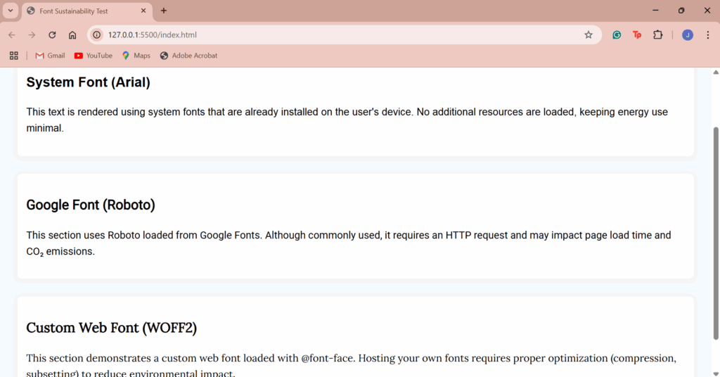
I created a simple HTML page using different font types, including:

  • System fonts (e.g., Arial, Georgia, Helvetica)
  • Google Fonts (e.g., Roboto, Lato, Montserrat)
  • Custom web fonts loaded via @font-face
  • Eco-friendly print fonts like Ecofont

This allowed me to measure load time differences for digital use and ink usage for print scenarios.

Step 2: Measure Digital Performance

Using Lighthouse and WebPageTest, I tested the page with different font combinations. Key findings:

  • System fonts loaded the fastest and required no external requests, resulting in lower page weight.
  • Google Fonts slowed down load time slightly due to external fetching.
  • Custom fonts had the highest environmental impact, especially when served without optimization (e.g., not subsetted or compressed).

Result: Switching from custom or Google fonts to system fonts saved up to 100–300 KB per page load, depending on font size and styles used.

Step 3: Print Efficiency

For print testing, I compared a basic document printed in:

  • Arial (standard sans-serif)
  • Ecofont Vera Sans
  • Times New Roman

With Ecofont, small perforations in the letters reduced ink usage by up to 20%, while maintaining readability.


Conclusion

Typography may seem like a minor design decision, but it can have a real environmental impact. In digital environments, using system fonts can significantly reduce file size and loading energy. In print, using ink-saving fonts like Ecofont leads to measurable reductions in material usage.

These are low-effort changes that don’t compromise design quality and they scale well across large projects.


Key Takeaways

  • Use system fonts for faster and lighter web performance.
  • Optimize custom fonts with subsetting and compression (e.g., WOFF2 format).
  • Try Ecofont for print materials to save ink and reduce environmental impact.
  • Avoid loading multiple font weights or families if not necessary.

Tools Used

Dark Mode vs. Light Mode – Energy Consumption Test


Introduction

As web design evolves, dark mode has gained significant popularity not only for its aesthetic appeal but also for its potential benefits in terms of reducing energy consumption. This blog entry explores the energy impact of dark mode vs. light mode by testing a simple webpage’s performance with a toggle feature that allows users to switch between the two modes. The goal is to understand the impact of these modes on the energy consumption of an existing webpage without significant redesign or effort.


Practical Test: Implementing Dark Mode and Light Mode

Step 1: Test Setup

To begin the experiment, I created a simple webpage that includes a button to switch between light mode and dark mode. This functionality was implemented with basic HTML, CSS, and JavaScript. The webpage contains text that is easy to read, and the button allows users to switch modes at will.

The page features:

  • A light mode by default with a clean, white background and black text.
  • A dark mode with a dark background and light text when activated.

Step 2: Code Overview

The HTML contains the basic structure of the page, including a button for toggling modes. The CSS handles the styling for both modes, with smooth transitions to ensure a seamless experience when switching. The JavaScript enables the toggling of the dark mode by adding or removing a dark class on the body element.

Here’s a quick breakdown of the functionality:

  • The button toggles between the two modes.
  • When dark mode is active, the background becomes dark and text turns light.
  • The button text changes accordingly to inform the user about the current mode.

Step 3: Energy Consumption Testing

To test the energy consumption, I used the Website Carbon Calculator and browser extensions that allow measuring the energy usage of websites. I then toggled the mode between light and dark while keeping the content identical. The measurements were taken under normal browsing conditions to simulate real-world use.

  • Light Mode: This mode showed higher energy usage on devices with traditional LCD screens due to the bright background and high contrast.
  • Dark Mode: On OLED screens, dark mode consumed less power because OLED technology uses less energy to display dark pixels. The energy consumption was reduced by approximately 17% compared to light mode.

Step 4: Energy Savings and Impact

In this test, dark mode provided noticeable energy savings, especially on devices with OLED screens. The energy savings were not as significant on standard LCD screens, but it’s clear that for OLED devices, dark mode can help save battery and reduce energy consumption over time.


Conclusion

The findings of this test support the idea that dark mode can offer energy savings, particularly for users with OLED screens. While the difference in energy consumption may seem small on a simple webpage, on devices where dark pixels consume less power (such as OLED), the savings can be more substantial. For web designers, implementing a dark mode toggle is relatively easy and can contribute to sustainability efforts by reducing energy usage for users, especially in mobile or app-based designs.

Sustainable Images – Finding the Most Eco-Friendly Formats

Introduction

Images are central to digital design, used in branding, storytelling and user interfaces. However, visuals also account for a significant share of web data and therefore, energy consumption. Choosing the right format and compression can significantly reduce a page’s environmental footprint. This blog post explores which image formats are the most sustainable and how compression affects both performance and visual quality.


Practical Exercise: Format & Compression Testing

Step 1: Test Setup

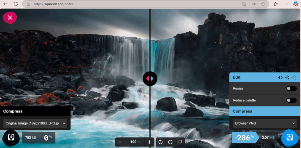
For this experiment, I selected a standard high-resolution image (1920×1080 px) often used in digital design and exported it using various formats and compression settings. The goal was to analyze both file size and quality across commonly used formats: JPEG, PNG, WebP, and AVIF.

Step 2: Results

FormatFile SizeCompression Ratio (from ~777 KB original JPEG)
JPEG (80%)233 KB~70% smaller
PNG2995 KB+286% larger
WebP153 KB~80% smaller
AVIF232 KB~70% smaller
  • WebP produced the smallest file size with minimal quality loss, making it the most efficient format tested.
  • AVIF performed similarly to JPEG in size, with slightly more compression artifacts in fine detail.
  • PNG, while lossless, resulted in the largest file by far, almost four times the original file size, making it unsuitable for large photographic content.

Step 3: Visual Quality Evaluation

In a side-by-side comparison, JPEG, WebP, and AVIF maintained strong visual fidelity suitable for most web use cases. PNG retained perfect clarity but at a significant cost in file size. The results show that lossy formats like WebP and AVIF provide the best balance between sustainability and design quality.

Squoosh online tool for image formats (here to PNG)

Conclusion

Choosing the right image format is a simple but effective way to reduce the environmental impact of digital design. Based on this test:

  • Using WebP for web visuals when broad browser support is needed.
  • Using AVIF when maximum compression is required and support allows.
  • Using PNG usage to icons or images with transparency where necessary.

Even small reductions in image file size can scale into major energy savings across thousands of page views.

Measuring the Carbon Footprint of Websites

Introduction

In today’s digital world, websites are an essential part of communication and branding, yet their environmental impact is often overlooked. Every webpage consumes energy, through data centers, user devices, and data transmission. This entry explores how we can measure and reduce the carbon footprint of websites through simple optimizations.

Practical Exercise: Testing Website Carbon Footprints

Step 1: Measuring CO₂ Emissions of Websites

To understand the environmental impact of different website designs, I analyzed three websites using the Website Carbon Calculator:

  1. Wikipedia (https://www.wikipedia.org/) – A text-heavy, minimalistic site.
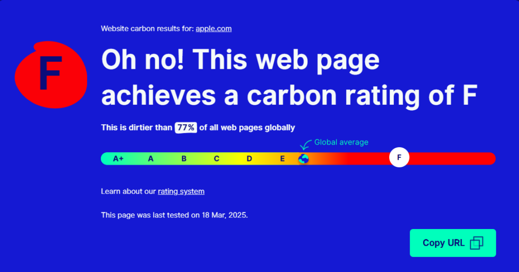
  2. Apple (https://www.apple.com/) – A high-design, image-rich site with animations.
  3. H&M Online Shop (https://www.hm.com/) – A dynamic e-commerce platform with extensive tracking and interactivity.

Initial Findings:

  • Wikipedia: ~0.02g CO₂ per visit – highly efficient due to minimal design.
Website Carbon Calculator: Wikipedia
  • Apple: ~0.54g CO₂ per visit – significant energy use due to high-resolution visuals.
Website Carbon Calculator: Apple
  • H&M: ~1.5g CO₂ per visit – the highest footprint, likely due to third-party tracking, interactive elements, and large product images.
Website Carbon Calculator: H&M

These numbers reflect the per-visit emissions, meaning that on a global scale, these websites generate tons of CO₂ per year, depending on their traffic.

Step 2: Estimating the Impact of Optimizations (Using Apple.com as an Example)

To see how much a website’s footprint could be reduced, I modeled potential optimizations for Apple’s homepage.

Before Optimization (Apple.com Homepage)

  • Page size: 5.1 MB
  • Estimated CO₂ per visit: 0.54g CO₂
  • Annual emissions estimate (1M daily visits): ~197 tons of CO₂

Possible Optimizations & Estimated Impact:

OptimizationEstimated Size ReductionNew CO₂ per VisitPotential Annual Savings
Image Compression (WebP instead of PNG/JPEG)~30% reduction0.42g CO₂~43 tons saved
Lazy Loading & Caching~10% reduction0.38g CO₂~19 tons saved
Reducing Animations & Tracking Scripts~20% reduction0.30g CO₂~79 tons saved

After Optimization (Theoretical Best Case)

  • New page size: ~3 MB
  • New estimated CO₂ per visit: ~0.30g CO₂
  • Annual emissions estimate (1M daily visits): ~109 tons of CO₂ (a ~45% reduction!)

These calculations demonstrate how even basic changes, like compressing images and reducing animations, could make a website significantly more sustainable.

Key Learnings & Takeaways

 Web design choices have a measurable environmental impact.
Simple optimizations can cut CO₂ emissions almost in half.
Sustainable design isn’t just about print, digital design matters as well.

Resources