How K-Pop Album Package Design Choices Influence the Fandom

Unlike traditional music releases, K-pop albums are multifaceted packages that function as collectible artifacts, fostering a unique relationship between artists and fans. This post examines how K-pop album package design choices influence the fandom, shaping their behaviors, emotional connections, and communal activities, with a specific focus on how gender representation and androgyny are reflected in album designs.

The Emotional Connection Between Fans and Album Design

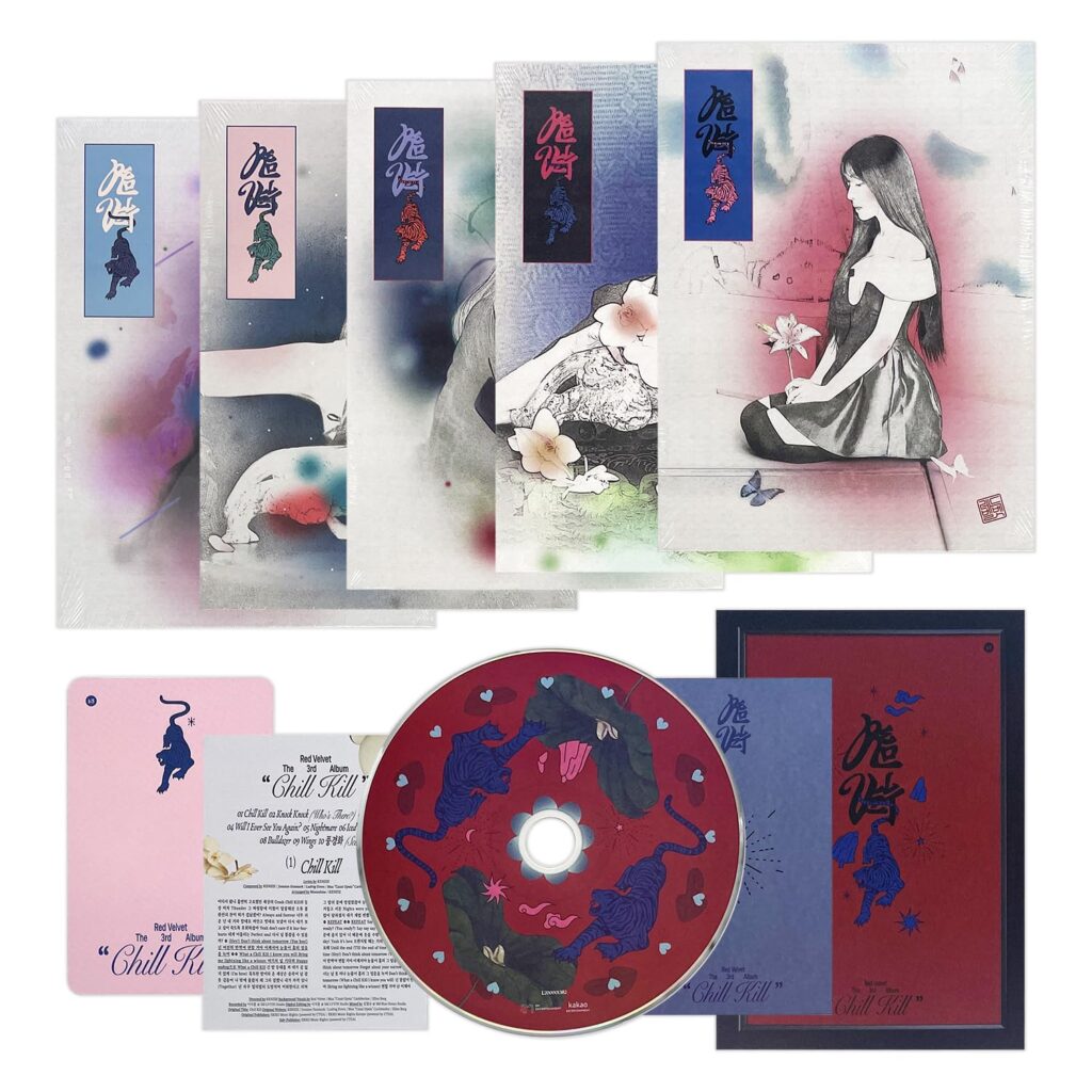
K-pop album packaging serves as a physical extension of the music and concepts artists wish to convey. Each album is designed to evoke emotions through meticulous attention to aesthetic details. Photobooks, for instance, immerse fans in the artistic vision of the album. When fans see their favorite idols embodying a theme imagery deepens their connection to both the music and the artist.

Additionally, elements like handwritten notes from the members, personal messages, or exclusive artwork create a sense of intimacy. These touches reinforce the parasocial relationship that many fans feel with their favorite idols, turning the album into more than just a product. For fans, owning an album becomes a way of preserving a cherished emotional experience.

Androgyny and Gender Representation in Album Design

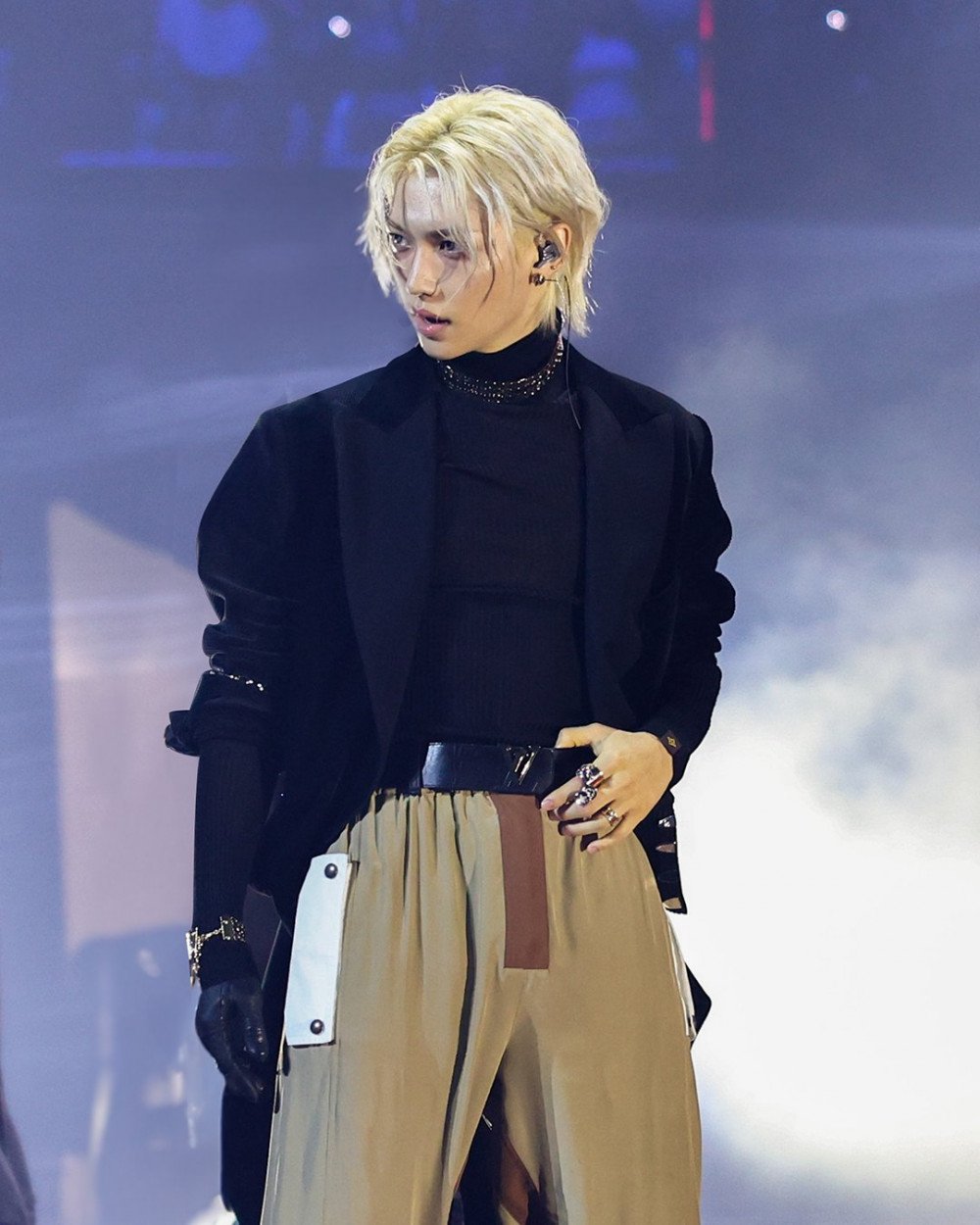
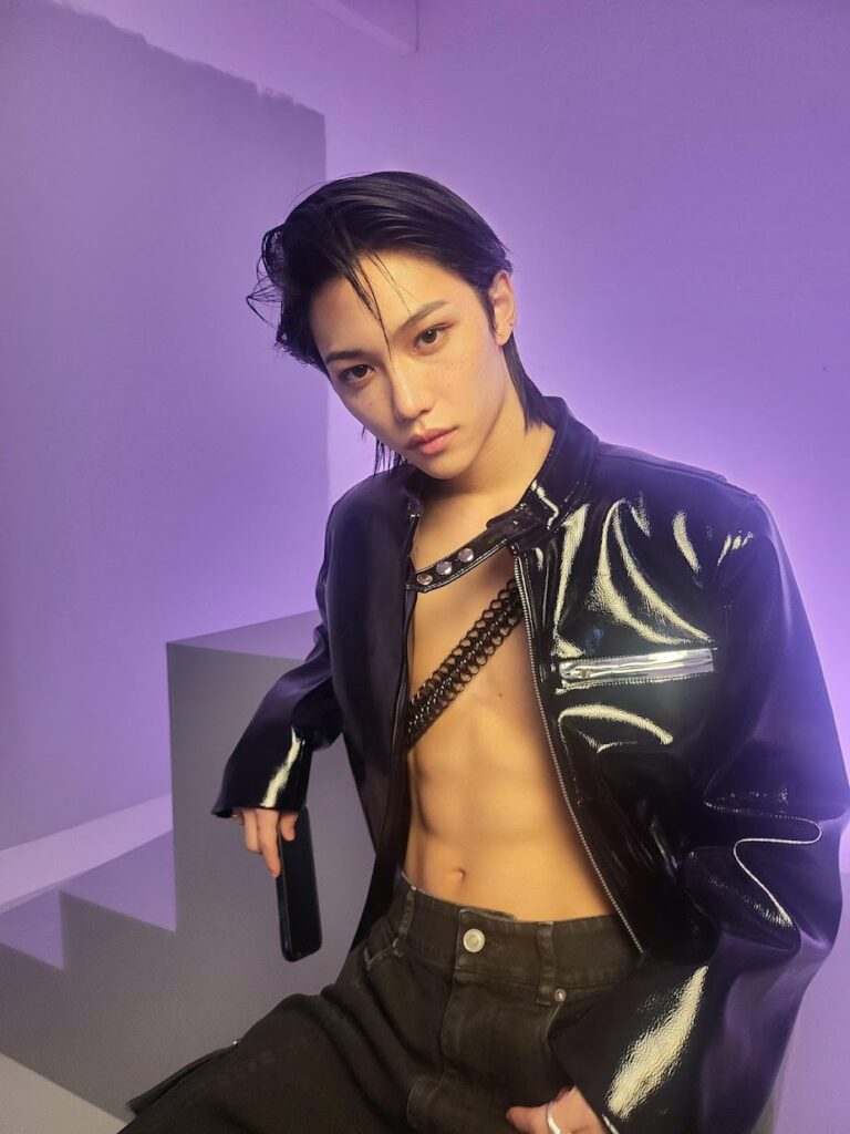
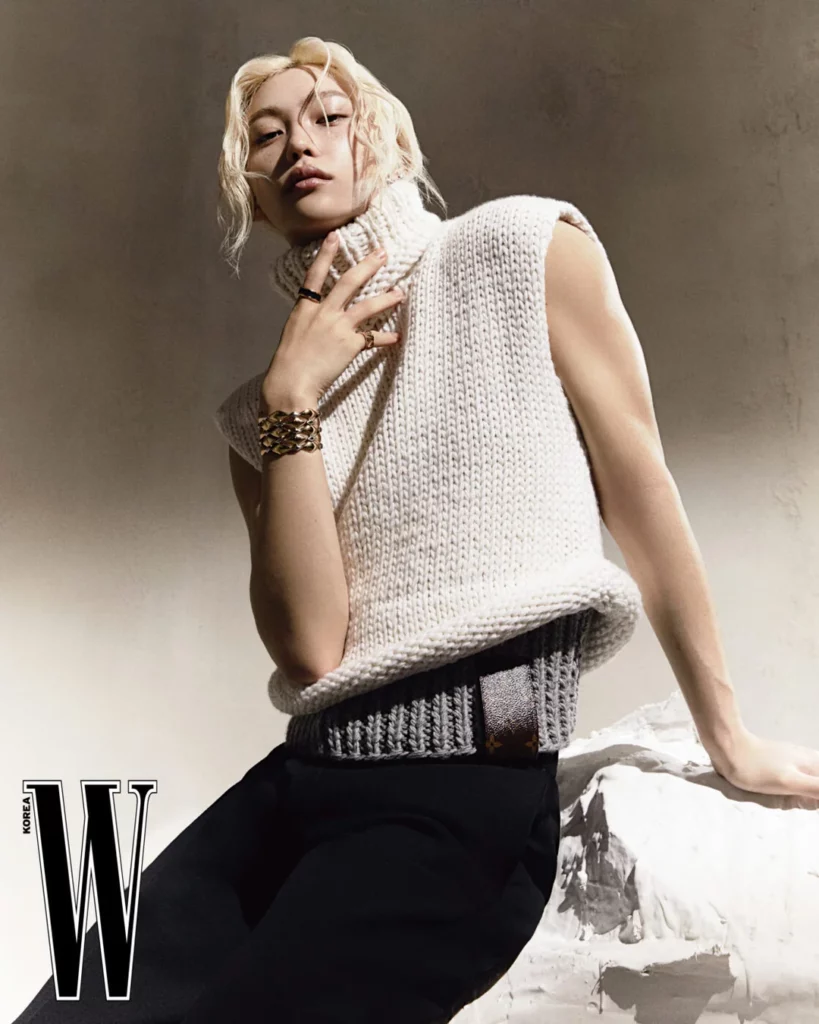
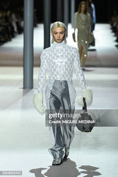
One of the defining features of K-pop is its embrace of androgyny and fluid gender representation, which is often reflected in album designs. 

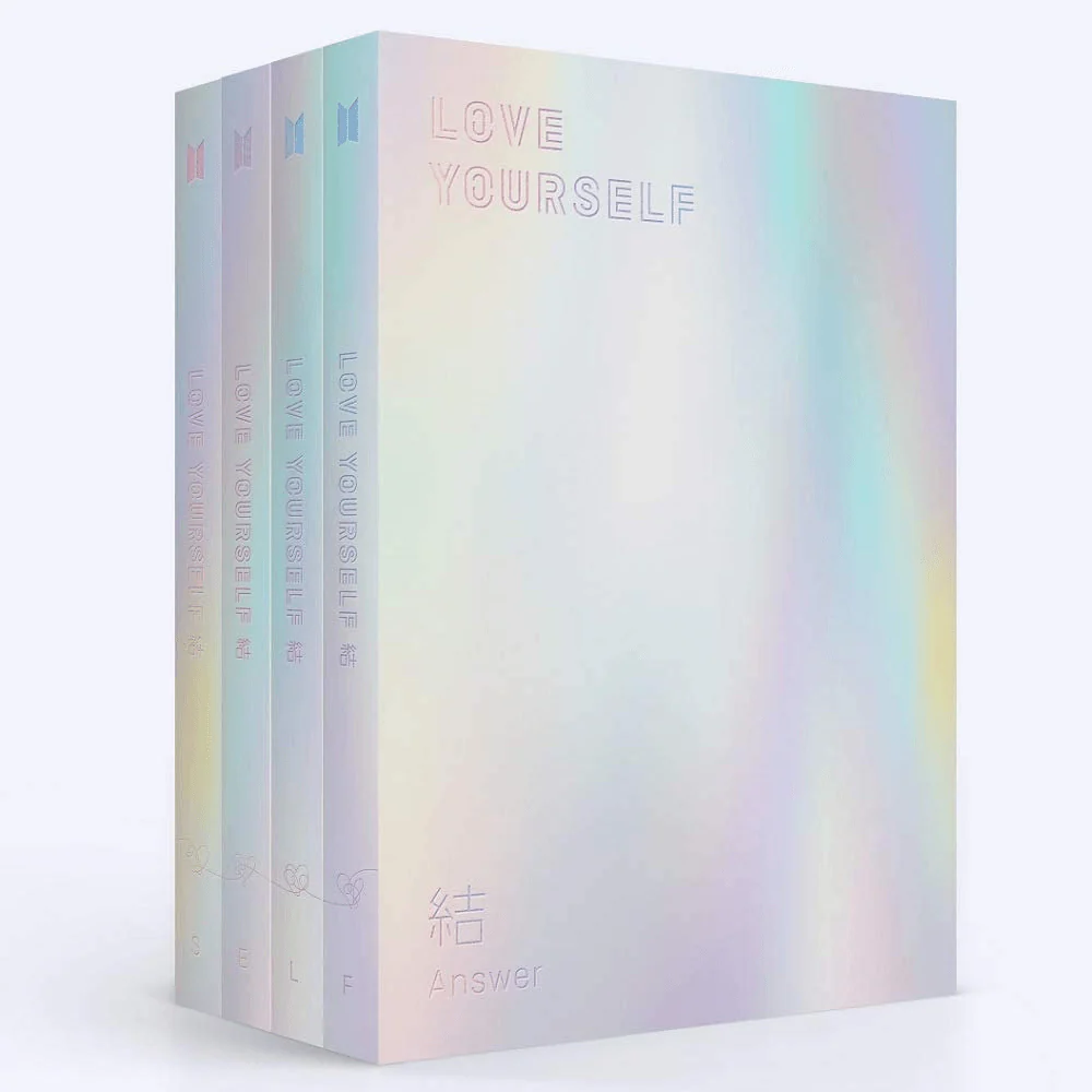
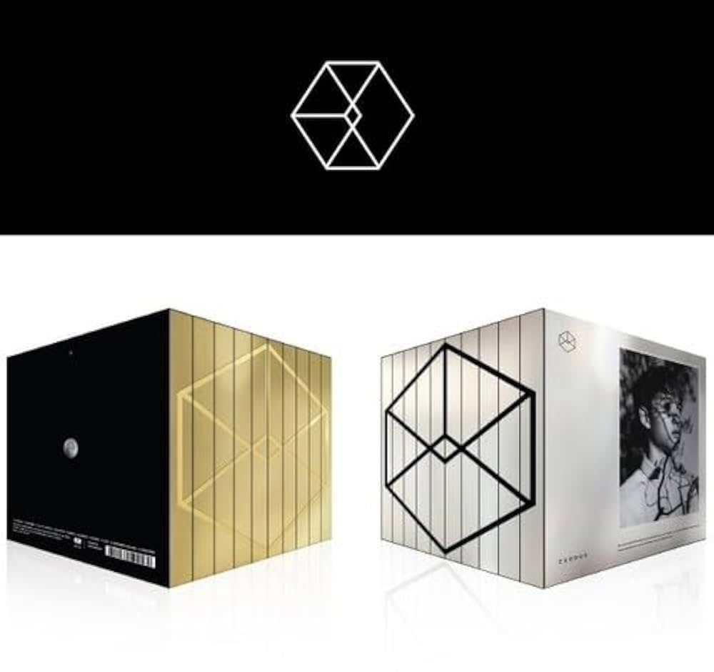
For instance, album designs often feature concepts that highlight duality or fluidity. BTS’s Love Yourself: the album employed soft pastel colors and delicate floral motifs, traditionally associated with femininity, while contrasting these elements with bold typography and minimalist layouts. Similarly, Taemin’s Never Gonna Dance Again album showcased dark, moody imagery combined with flowing fabrics and ethereal lighting, embodying both strength and vulnerability.

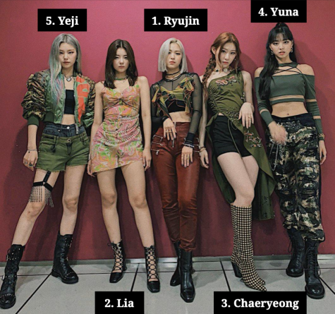
Photobooks included in K-pop albums frequently portray idols in gender-neutral or androgynous styles, using fashion, makeup, and poses that challenge binary expectations. Fans may interpret these visual choices as empowering, as they encourage broader discussions about gender fluidity and redefine beauty standards within the fandom.

Collectability and Fan Behavior

One of the defining aspects of K-pop album design is the inclusion of random and limited-edition elements. Photocards, a staple of K-pop albums, are typically distributed randomly within each package. Fans often buy multiple copies of an album to collect all photocards associated with a group, driving sales and fostering a sense of exclusivity. This practice transforms album purchasing into a gamification.

The Role of Design in Creating Fandom Rituals

K-pop album designs often encourage rituals that strengthen fan loyalty. Packaging that incorporates puzzles, hidden messages, or other interactive elements transforms album unboxing into an event. Fans share their unboxing experiences online, posting photos and videos that spread excitement and build anticipation within the fandom.

Coming back to to LOONA’s pre-debut albums which incorporated lore-based visuals and Easter eggs, encouraging fans to speculate and theorize about the group’s overarching narrative. Such design choices foster a participatory culture, where fans actively engage with and contribute to the artist’s storytelling.

Moreover, pre-order incentives like posters, postcards, or bonus photocards turn the act of purchasing an album into a collective event. Fans often coordinate mass-buying projects to boost their favorite group’s album sales on charts, demonstrating how packaging incentives and fandom goals intertwine.

Cultural and Social Significance

Album designs often integrate cultural motifs that resonate with fans on a deeper level. By incorporating traditional Korean elements such as hanbok-inspired visuals, calligraphy, or folklore references, K-pop groups introduce global fans to Korean culture. This not only strengthens fans’ appreciation for the group but also fosters cultural exchange.

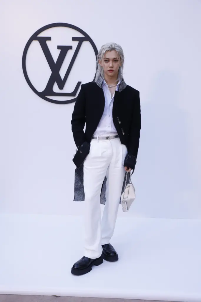
At the same time, the embrace of androgyny in design choices reflects broader societal shifts. Idols like G-Dragon and Hyunjin have become style icons for their gender-defying fashion, and their album visuals mirror this ethos. By celebrating non-conformity and fluid aesthetics, K-pop album designs provide fans with a sense of liberation and representation that they may not find in other cultural spaces.

Economic Implications and Industry Influence

The elaborate design of K-pop albums has also set a precedent in the global music industry, influencing how other artists approach physical releases. Western artists like Taylor Swift and Olivia Rodrigo have incorporated photobooks and collectible elements into their albums, borrowing from the K-pop playbook.

For fans, these design choices blur the line between consumption and participation. Purchasing an album is not just a transaction; it is an investment in the group’s success. Fans view their purchases as contributions to album sales, chart performance, and overall recognition, fueling their dedication to the fandom.

Conclusion

K-pop album package design choices have a profound influence on fandom dynamics, shaping emotional connections, fostering community interactions, and encouraging creative expression. By integrating artistic, cultural, and interactive elements, these designs elevate the fan experience, transforming albums into more than just music carriers. Furthermore, the industry’s embrace of androgyny and fluid gender representation in album packaging reflects its progressive ethos, resonating deeply with fans and setting a new standard for inclusivity in popular culture. As K-pop continues to grow globally, its innovative approach to album packaging will undoubtedly leave a lasting legacy on the music industry and its audiences.

References

Choi, Y., & Kim, D. (2018). Fan Culture and Collectibles: The Impact of Photocards on K-Pop Album Sales. Journal of Media and Cultural Studies, 5(3), 101-119.

Jung, M. (2022). K-Pop’s Global Aesthetic: How Album Packaging Shapes Cultural Perception. Global Pop Music Review, 3(4), 33-50.

Kim, J. (2020). Visual Storytelling in K-Pop: Aesthetic Trends in Album Design. Korean Journal of Popular Music Studies, 14(2), 45-67.

Park, S. (2019). The Role of Physical Albums in the Digital Era: K-Pop as a Case Study. International Journal of Music Business, 11(3), 22-34.

Lee, H. (2021). Sustainability in K-Pop Packaging: Addressing Environmental Concerns. Design and Culture Journal, 8(1), 78-95.

K-pop Album package design 

The physical packaging of K-pop albums stands out as an art form in its own right, serving as a tangible manifestation of the artist’s concept and an immersive experience for fans. In the following the distinctiveness, significance, and creative evolution of K-pop album design will be explored.

Distinctive Features of K-pop Album Packaging

Unlike standard CD or digital album releases in Western markets, K-pop albums are often created with extraordinary attention to detail. A typical K-pop album package is not just a plastic case with a disc but an elaborate collection of items that reflect the album’s theme. These may include:

Photobooks: High-quality photo spreads featuring the artists in thematic visuals linked to the album’s concept.

Photocards: Collectible cards featuring individual or group member photos, often designed to encourage fans to trade and collect different versions.

Posters: Folded or rolled posters that add a visual centerpiece to the package.

Custom Inserts: Stickers, lyric booklets, postcards, or even unique items like puzzle pieces, bookmarks, or tattoos.

Innovative Packaging Formats: Ranging from box sets and slipcases to hardcover book-style albums or even packages resembling novels, treasure chests, or other creative formats.

This holistic approach to packaging elevates the album to a collectible artifact, making it a desirable item for fans and enhancing the emotional connection to the music and the artist.

The Role of Concept and Narrative

K-pop album packaging is deeply tied to the concept and narrative of the album itself. Each release is typically centered around a theme, whether it is fantasy, nostalgia, rebellion, or romance. Designers collaborate closely with artists, agencies, and creative directors to ensure that the visuals align with the music and storytelling.

For example, BTS’s Love Yourself series employed a design aesthetic across multiple releases, using soft pastel hues, intricate floral motifs, and elegant typography to convey themes of self-love and growth. On the other hand, EXO’s EXODUS album used sleek metallic designs and dual-language photobooks to reflect their futuristic and cosmopolitan concept.

Fan Engagement and Interactivity

A critical component of K-pop album packaging is its ability to foster fan engagement. By including random elements such as photocards, albums create an interactive experience. Fans are encouraged to trade photocards of their favorite group members or purchase multiple versions of an album to collect all designs. Limited-edition or pre-order bonuses further enhance the sense of exclusivity and excitement.

Moreover, the design often integrates Easter eggs or hidden messages, rewarding fans who pay close attention. Albums like LOONA’s pre-debut releases featured intricate lore embedded in their design, encouraging fans to piece together a larger narrative over time.

Trends and Innovations

The evolution of K-pop album design continues to push boundaries. Recent trends include:

Sustainability: Groups like MAMAMOO have incorporated eco-friendly packaging, reducing plastic use and opting for recyclable materials.

Augmented Reality (AR) Integration: Albums like ATEEZ’s Treasure series have included AR features, allowing fans to unlock digital content by scanning items in the album.

DIY and Personalization: Some albums include customizable elements, like blank pages for fans to write on or stickers for decorating.

Luxury Appeal: Special editions featuring premium materials, such as embossed leather, holographic effects, or metal accents, elevate the albums to luxury collectibles.

Challenges in Album Design

While K-pop album packaging is celebrated, it is not without challenges. The cost of producing elaborate designs can be high, particularly for smaller or rookie groups with limited budgets. Additionally, concerns about environmental sustainability are increasingly pressing as the industry continues to produce vast quantities of physical goods. Striking a balance between creativity, affordability, and eco-consciousness is a challenge that the industry must address.

Conclusion

K-pop album package design is a testament to the industry’s innovation, blending music, art, and culture into a cohesive and immersive experience. As K-pop continues to expand globally, its album designs not only captivate fans but also set new benchmarks for creativity in the music industry. By embracing sustainability and technological advancements, the future of K-pop album packaging promises to remain as dynamic and influential as the music it represents.

References

Kim, J. (2020). Visual Storytelling in K-Pop: Aesthetic Trends in Album Design. Korean Journal of Popular Music Studies, 14(2), 45-67.

Park, S. (2019). The Role of Physical Albums in the Digital Era: K-Pop as a Case Study. International Journal of Music Business, 11(3), 22-34.

Lee, H. (2021). Sustainability in K-Pop Packaging: Addressing Environmental Concerns. Design and Culture Journal, 8(1), 78-95.

Choi, Y., & Kim, D. (2018). Fan Culture and Collectibles: The Impact of Photocards on K-Pop Album Sales. Journal of Media and Cultural Studies, 5(3), 101-119.

Jung, M. (2022). K-Pop’s Global Aesthetic: How Album Packaging Shapes Cultural Perception. Global Pop Music Review, 3(4), 33-50.

https://www.korea.net/NewsFocus/HonoraryReporters/view?articleId=235526
https://fliphtml5.com/hcflr/srxc/basic
https://lup.lub.lu.se/luur/download?func=downloadFile&recordOId=9015386&fileOId=9019459
https://fliphtml5.com/hcflr/srxc/basic/51-62
https://www.aodr.org/xml/33127/33127.pdf

Androgynous Styling in Kpop Boy Groups

Challenging traditional notions of masculinity, androgynous fashion in K-pop merges elements of both feminine and masculine aesthetics, creating a unique visual language that transcends conventional boundaries. In the following, the origins, cultural significance, and impact of androgynous styling within K-pop boy groups will be explored, examining how it reflects broader societal shifts and contributes to the genre’s global appeal.

Historical Context

The roots of androgyny in fashion can be traced back to various cultural movements, from the glam rock era of the 1970s to the gender-fluid styles of the 1980s and 1990s. However, in South Korea, traditional cultural norms have long emphasized distinct gender roles, with conservative attitudes toward masculinity. K-pop boy groups began to disrupt these conventions in the late 1990s and early 2000s. Groups such as H.O.T. and Shinhwa incorporated softer, more delicate styling into their wardrobes, signaling the beginning of a shift. As K-pop evolved, the second and third generations of boy groups—TVXQ, BIGBANG, and SHINee—pushed the boundaries further, incorporating bold makeup, unisex clothing, and experimental hairstyles into their aesthetics. This set the stage for the current wave of androgynous fashion in fourth-generation K-pop groups.

Defining Androgynous Styling in K-pop

Androgynous styling in K-pop is characterized by a blending of traditionally masculine and feminine elements. This can include clothing, makeup, hairstyles, and overall appearance. Male idols often wear clothes traditionally associated with femininity, such as skirts, lace, and pastel colors, paired with sharper, tailored pieces to create a balance. Accessories like chokers, earrings, and nail polish are frequently used to accentuate this aesthetic.

One key aspect of androgynous styling is the use of makeup. Many K-pop boy group members regularly wear eyeliner, eyeshadow, and lip tint, enhancing their features in ways that blur gender lines. Hairstyles—ranging from long, flowing locks to brightly colored dye jobs—further contribute to the androgynous image. Groups such as BTS, Stray Kids, and TXT have embraced these elements, presenting themselves as versatile figures who defy conventional gender expectations.

Examples

BTS: As one of the most prominent K-pop groups globally, BTS has incorporated androgynous elements into their style. From their “Boy With Luv” era pastel suits to their gender-neutral Louis Vuitton ensembles, BTS exemplifies how androgynous fashion can enhance artistic storytelling.

ATEEZ: Known for their theatrical concepts, ATEEZ often blends masculine and feminine elements to reflect the duality of their music. In their performance of “Answer,” the members wore ruffled blouses and intricate jewelry, juxtaposed with sharp blazers and combat boots.

Stray Kids: Stray Kids’ recent fashion choices highlight an experimental approach to androgyny. Members like Hyunjin and Felix have become style icons, frequently sporting makeup, crop tops, skirts, and elaborate accessories that challenge gender norms.

Conclusion

Androgynous styling in K-pop boy groups is more than just a fashion trend; it is a cultural statement that challenges societal norms and expands the boundaries of self-expression. By blending masculine and feminine elements, K-pop idols create a dynamic visual language that resonates with fans across the globe. As the genre continues to grow in influence, its embrace of androgyny offers a powerful commentary on the fluidity of identity and the evolving nature of gender in contemporary society. K-pop’s fearless approach to fashion not only redefines masculinity but also paves the way for a more inclusive and diverse cultural landscape.

Herman, T. (2020). “How BTS Redefined Masculinity in K-pop”. Billboard.

Kim, H. J. (2021). “Stage Performance and Fashion: ATEEZ’s Androgynous Aesthetic”. Korea JoongAng Daily.

Park, S. (2022). “The Rise of Androgyny in Fourth-Generation K-pop”. The Korea Herald.

http://posturemag.com/online/is-kpop-as-queer-as-it-appears-to-be-androgynous-fashion-fan-service-and-boy-love-in-korean-pop-culture/

https://www.tatlerasia.com/lifestyle/entertainment/gender-neutral-androgynous-fashion-kpop

https://www.google.com/url?sa=t&source=web&rct=j&opi=89978449&url=https://ijmmu.com/index.php/ijmmu/article/download/6437/5207&ved=2ahUKEwiIlYr9-v-KAxWXExAIHfMXCWoQFnoECBMQAQ&usg=AOvVaw0WSB_USObgMFCiw8zT11W_

https://www.scmp.com/magazines/style/celebrity/article/3091754/k-pops-lgbt-and-androgynous-idols-amber-liu-and-nuests
https://www.koreaherald.com/article/1771827
https://stuyspec.com/article/androgynous-fashion-and-the-appeal-of-mark-tuan
https://digitalcommons.denison.edu/cgi/viewcontent.cgi?article=1099&context=studentscholarship
https://www.diva-portal.org/smash/record.jsf?pid=diva2%3A1341295&dswid=3597

Gender in Design & Styling

Design reflects the socio-cultural norms and values of the time. Whether in fashion, architecture, product development, or digital interfaces, gender has historically played a significant role in shaping the outcomes of design processes. However, the evolving discourse on gender inclusivity and diversity challenges traditional norms, influencing designers to adopt more unbiased approaches. 

Gender Bias in Historical Design

Historically, design has often maintained gender stereotypes. Products and spaces have been made to fit binary and patriarchal perceptions of gender. For example:

  1. Fashion: Women’s clothing has emphasized beauty and conformity, while men’s attire prioritizes functionality and authority. This contrast reinforces gendered expectations about appearance and roles (Crane, 2000).
  2. Architecture: Public and private spaces have frequently been designed to serve to men’s needs and interests. Historically, offices and urban spaces were conceptualized with male users in mind, often marginalizing women’s experiences (Spain, 1992).
  3. Product Design: Consumer goods, such as razors, toys, and electronics, have been marketed through gendered aesthetics, like pink for women and blue for men, further establishing binary perceptions (Pinker, 2002).

The Shift Towards Inclusivity

In recent decades, the design world has increasingly embraced gender inclusivity, reflecting broader societal shifts. Several initiatives and movements have played pivotal roles:

  1. Unisex and Androgynous Fashion: Brands like Rad Hourani and Telfar champion unisex clothing lines, rejecting binary norms. This trend allows individuals to express themselves without adhering to traditional gender roles (Steele, 2018).
  2. Inclusive Architecture: Architects now focus on creating spaces that accommodate diverse users. For instance, gender-neutral bathrooms and lactation rooms in workplaces recognize the needs of non-binary and female users (Anthony, 2001).
  3. Tech and Digital Design: In user interface (UI) and user experience (UX) design, inclusive practices include diverse avatars, non-binary gender options, and features that avoid gender assumptions (Schlesinger et al., 2017).
  4. Grassroots Movements: Feminist and LGBTQ+ advocacy has amplified the importance of inclusivity in design, influencing industries to adopt more equitable practices (Ahmed, 2012).

Remaining Challenges

Despite progress, gender inclusivity in design is far from universal. Challenges include:

  • Resistance to Change: Traditionalists often view inclusivity efforts as unnecessary or politically motivated (Huppatz, 2015).
  • Intersectionality: Designers frequently overlook how gender intersects with race, class, ability, and other identities, resulting in partial inclusivity (Crenshaw, 1989).
  • Tokenism: Some efforts toward inclusivity are superficial, failing to address systemic issues (Powell, 2020).

Gendered Design in K-Pop

K-pop offers a fascinating lens through which to examine gender in design. 

  1. Challenging Norms Through Androgyny: Many K-pop idols, such as G-Dragon and Taemin, blur traditional gender lines in their fashion and performances. They adopt fluid aesthetics that challenge the binary notions of masculinity and femininity, inspiring fans and designers worldwide to embrace non-conformity (Epstein & Turnbull, 2014).
  2. Fashion as a Tool for Expression: K-pop stylists use bold and innovative designs to create personas that defy stereotypes. Male idols often wear makeup, jewelry, and clothing traditionally associated with women, while female idols experiment with powerful and androgynous looks (Kim, 2016).
  3. Fan Engagement and Gender Representation: K-pop’s interactive culture encourages fans to explore their identities. Music videos, album art, and merchandise design often incorporate inclusive and aspirational elements that resonate with diverse audiences (Oh, 2019).
  4. Critiques of Exploitation: Despite its progressive image, K-pop faces criticism for commodifying gender fluidity without fully addressing the societal issues surrounding gender equality. Some argue that while idols’ appearances challenge norms, their tightly controlled public personas perpetuate traditional hierarchies (Lie, 2015).

Conclusion

Gender in design is a multifaceted and evolving field. While historical biases have long shaped the landscape, contemporary movements and industries like K-pop demonstrate the potential for design to challenge stereotypes and foster inclusivity. However, true progress requires not only aesthetic changes but also systemic efforts to undo oppressive structures. By critically examining and addressing these complexities, the design world can create spaces, products, and experiences that authentically represent and empower all individuals, regardless of gender.

References

Ahmed, S. (2012). On Being Included: Racism and Diversity in Institutional Life. Duke University Press.

Anthony, K. H. (2001). Designing for Diversity: Gender, Race, and Ethnicity in the Architectural Profession. University of Illinois Press.

Crane, D. (2000). Fashion and Its Social Agendas: Class, Gender, and Identity in Clothing. University of Chicago Press.

Crenshaw, K. (1989). “Demarginalizing the Intersection of Race and Sex: A Black Feminist Critique of Antidiscrimination Doctrine, Feminist Theory and Antiracist Politics.” University of Chicago Legal Forum, 1989(1), Article 8.

Epstein, S., & Turnbull, J. (2014). “Girls’ Generation? Gender, (Dis)Empowerment, and K-pop.” Journal of Asian Studies, 73(1), 141-164.

Huppatz, D. J. (2015). “Revisiting Gender and Architecture in Theory and Practice.” Architectural Theory Review, 20(2), 144-158.

Kim, Y. (2016). “Idols of Development: The Globalization of K-pop and the Gender Politics of the Male Idol.” Media International Australia, 161(1), 122-130.

Lie, J. (2015). K-pop: Popular Music, Cultural Amnesia, and Economic Innovation in South Korea. University of California Press.

Oh, C. (2019). “Queering Hallyu: K-pop, Gender Nonconformity, and Global Fandom.” The Korean Wave: Korean Popular Culture in Global Context, edited by Youna Kim, Routledge.

Pinker, S. (2002). The Blank Slate: The Modern Denial of Human Nature. Penguin Books.

Powell, R. (2020). “Tokenism in Design: Moving Beyond Representation to Real Change.” Design Issues, 36(3), 67-78.

Schlesinger, A., Edwards, W. K., & Grinter, R. E. (2017). “Intersectional HCI: Engaging Identity through Gender, Race, and Class.” CHI Conference on Human Factors in Computing Systems Proceedings, 5412-5427.

Spain, D. (1992). Gendered Spaces. University of North Carolina Press.

Steele, V. (2018). Paris Fashion: A Cultural History. Bloomsbury Publishing.

https://events.forum-holzbau.com/pdf/meran10_Brandes.pdf
https://www.tandfonline.com/doi/abs/10.1080/13527266.2014.918050
https://www.taylorfrancis.com/books/mono/10.4324/9781315254593/gender-design-marketing-gloria-moss
https://www.jstor.org/stable/1511881
https://dl.acm.org/doi/abs/10.1145/3290605.3300283

Styling as a branding tool in K-Pop

At the core of K-Pop’s global success is its ability to create visually appealing, easily recognizable, and memorable identities for its idols and groups. K-Pop styling is carefully planned and coordinated, being an important tool for communicating with the audience. Each comeback, performance, and music video is an opportunity to reinforce the group’s image, update its concept, and reach new audiences through new aesthetics.

Styling is, therefore, the cornerstone of K-Pop branding, as it allows groups to position themselves within the landscape, serve specific target markets, and set their identity in an increasingly globalized entertainment industry.

Fashion as Personal Branding and Group Cohesion

While K-Pop groups often have a cohesive group identity, each member is also encouraged to develop their own individual fashion persona. This balance between individuality and group cohesion is key to the overall success of K-Pop, as fans become emotionally invested not only in the group as a whole but also in the unique characteristics of individual members.

For example, in the case of ITZY, each member has a unique fashion style that mirrors her individual personality and role within the group. Yeji often opts for bold, edgy outfits that reflect her fierce, confident persona, while Lia’s wardrobe leans more towards soft, elegant styles that highlight her graceful and calm nature. This contrast in their styles allows fans to connect with each member on a deeper level, while the group’s overall aesthetic remains unified and dynamic.

ITZY:

left to right: Yeji, Lia, Ryunjin, Chaeryeong, Yuna

In addition to personal branding, fashion in K-Pop also serves to reinforce the group’s concept. The iconic “power” concept of groups like (G)I-DLE and Twice is reinforced through strong, bold fashion choices—such as leather jackets, studs, and sharp silhouettes—that visually communicate the group’s strength and independence.

(G)I-DLE:

Twice:

Fashion, therefore, becomes a tool for both individual expression and collective identity, creating a balanced narrative that supports both the music and the group’s image.

The Role of Fashion in Fan Culture and Merchandise

K-Pop fans, known for their passionate support, often emulate the fashion choices of their favorite idols, buying merchandise and clothing items associated with the group. This consumer behavior plays a significant role in the dissemination of K-Pop’s visual identity.

For instance, the popularization of certain trends can often be traced back to K-Pop styling. Items such as oversized hoodies, chunky sneakers, and brightly colored hair became popular worldwide after being featured in K-Pop music videos and performances. The rise of “K-Pop fashion” can be attributed to the influence of idols who are often seen wearing streetwear, designer pieces, or collaboration items with well-known fashion houses. Groups like *TWICE* and *Stray Kids* have contributed to making specific trends mainstream, while their fans, known as “K-Pop stans,” frequently purchase merchandise or emulate the style of their favorite idols.

Stray Kids Fashion Inspo:

Twice Fashion Inspo:

Furthermore, K-Pop’s styling is often inclusive, with a wide range of looks—spanning from hyper-feminine to androgynous, from hip-hop to avant-garde fashion—allowing fans of all gender identities and cultural backgrounds to find a connection to their favorite groups. K-Pop idols, with their diverse styling, encourage self-expression and empower fans to embrace their own individuality. 

In this way, K-Pop styling also functions as a tool of identity creation, both for the artists and for their followers. Fans view their favorite idols as representatives of certain ideals, and styling becomes a visual shorthand for these ideals—be it youthfulness, power, luxury, or rebellion.

Conclusion

K-Pop styling is far more than a tool for aesthetics—it is a multifaceted branding mechanism that helps define the identity of both the artists and the industry. Through careful and strategic styling, K-Pop groups are able to create distinct personas, connect with diverse audiences, and influence global fashion trends. Fashion, makeup, and hair in K-Pop are integral to creating memorable, iconic images that resonate with fans and allow groups to maintain relevance in the fast-paced entertainment industry. 

In a globalized entertainment landscape where image is everything, K-Pop has mastered the art of styling as a branding tool, proving that visual identity is just as essential as music in building a lasting, influential global presence.

Sources:

Han, S. (2019). Branding K-Pop: The Art of Creating Global Identities. Journal of Global Pop Culture, 7(2), 134-146.

Kim, Y. (2020). Fashion in K-Pop: Identity, Influence, and Global Appeal. Seoul University Press.

Lee, M. (2021). Styling K-Pop: A Study on Fashion’s Role in K-Pop Branding 

Kim, Y. (2020). Fashion and K-Pop: The Role of Style in the Globalization of Korean Pop Culture. Seoul University Press.

Jung, E. (2018). The Visual Aesthetics of K-Pop: Fashion, Identity, and Global Influence. Asian Media Studies Journal, 12(3), 45-59.

Lee, M. (2019). K-Pop and Fashion: The Intersection of Music, Art, and Style. K-Pop Industry Review, 8(4), 78-91.

Nam, J. (2021). Fan Culture and Fashion: How K-Pop Influences the Global Fashion Landscape. Global Pop Culture Studies, 16(2), 112-130.

https://www.voguecollege.com/articles/the-power-of-fashion-how-k-pop-incorporates-fashion-to-create-visual-identity

https://medium.com/free-code-camp/what-k-pop-can-teach-us-about-design-6253a85f469c

Gender in K-pop boy group’s Visuality and Styling in the realm of communication design

– Stray Kids Felix as an Example

The practice of gender fluidity in K-pop boy groups is not just a product of individual styling, it is also a carefully created communicative strategy that challenges traditional gender norms and appeals to a global audience. In the following, it will be explored how K-pop boy groups, with a particular example of Stray Kids’ member Felix, use design principles to communicate and perform gender fluidity. By analyzing Felix’s styling, visuals, and public persona, it will be demonstrated how communication design—through fashion, visuals, and branding—functions as a key tool in creating and discussing fluid representations of gender.

The Role of Communication Design in K-Pop

In K-pop, design elements such as costumes, choreography, stage settings, music videos, and promotional materials work together to construct specific identities and narratives for each idol and group. These elements are carefully designed to communicate not only the group’s music but also their personas, values, and messages to their audience.

When it comes to gender fluidity, K-pop groups like Stray Kids use visual and stylistic choices to send subtle and overt messages about the fluidity of gender expression. This can be seen in the blending of traditionally masculine and feminine aesthetics.

Felix of Stray Kids: Visual Communication of Gender Fluidity

Felix’s role within Stray Kids offers a compelling example of how gender fluidity in K-pop is shaped. His styling, makeup, and stage presence are strategically constructed to convey an image that transcends conventional gender roles. 

Stray Kids Felix:

1. Fashion as Semiotic Communication

Fashion in K-pop is more than just a form of self-expression: it is a communicative tool designed to signal specific messages to the audience. In Felix’s case, his fashion choices blend masculinity with femininity, challenging the norms of male idol styling. By wearing flowing fabrics, skirts, makeup, long hair, and accessories typically associated with femininity, Felix’s image communicates gender fluidity while maintaining a sense of power and assertiveness – especially through his remarkable deep voice. 

Design Semiotics: Felix’s fashion choices, like wearing pastel-colored shirts or fancy details, can be read as signifiers of gentleness, tenderness, or vulnerability. In contrast, more structured clothing, dark colors, and sharp cuts signify strength, confidence, and control. 

Color Palette: Color plays a significant role in gendered communication. In the K-pop industry, colors like pink or lavender are often considered feminine, while black or deep red might be linked to masculinity. Felix’s wardrobe often mixes these contrasting colors—such as pairing pink with darker shades—which reinforces the message that masculinity and femininity are not opposing categories but can coexist in a single individual.

Felix traditionally more feminine representing:

Felix mixing traditionally more feminine AND masculine elements:

Felix traditionally more masculine representing:

2. The Branding and Visual Identity of Stray Kids

Beyond Felix’s individual styling, Stray Kids as a group employs visual design strategies to create a collective identity that embraces gender fluidity. In their music videos, promotional materials, and live performances, the group often uses androgynous aesthetics—unisex outfits, bold makeup, and fluid expressions of masculinity and femininity. The overall visual identity of Stray Kids communicates a message that aligns with inclusivity, where gender is not an obstacle but a space for creative expression.

Branding and Marketability: The visual branding of Stray Kids has been designed to appeal to a diverse global fanbase that includes individuals across the gender spectrum. Branding is not just about selling products but also about promoting an identity that resonates emotionally with consumers. Stray Kids’ embracing of fluid gender representations can be seen as a conscious effort to cultivate a brand that values self-expression, individualism, and inclusivity, which are key themes in the global conversations surrounding gender today.

The Impact of Visual Design on K-Pop Audiences

The design choices made by K-pop groups like Stray Kids have profound implications for their audience. By challenging traditional gender norms through styling, performance, and media presentation, K-pop idols create a visual language that communicates new possibilities for gender expression. This language speaks not only to fans within South Korea but also to a global audience, where conversations around gender fluidity are becoming more mainstream.

Conclusion

The visual and performative strategies employed by K-pop boy groups, particularly Felix of Stray Kids, highlight the important role of communication design in reshaping societal norms around gender. Using fashion, color, choreography, and branding, Felix embodies a fluid approach to gender identity, communicating new possibilities for self-expression and challenging the traditional boundaries of masculinity and femininity. By integrating gender fluidity into their visual strategies, K-pop groups provide both an aesthetic and a social commentary, promoting a global dialogue about the fluidity of gender in contemporary society. In this way, visuality not only shapes the public image of K-pop idols but also contributes to broader cultural and societal shifts towards more inclusive representations of gender.

Sources:

https://www.koreatimes.co.kr/www/art/2024/11/398_312285.html

https://research.library.fordham.edu/cgi/viewcontent.cgi?article=1106&context=international_senior

https://www.tatlerasia.com/lifestyle/entertainment/gender-neutral-androgynous-fashion-kpop

https://www.tandfonline.com/doi/abs/10.1080/14680777.2021.2006259

Kwon, H. J. (2017). K-Pop and the Globalization of Korean Popular Culture. Journal of Asian Studies, 76(2), 323-348.

Kang, H. (2020). The Androgynous Aesthetic in K-Pop: Gender Fluidity and Identities in the Performances of Korean Pop Stars. Media, Culture & Society, 42(6), 978-994.

Cho, H. (2021). Transcending Gender: The Visual and Performative Strategies of K-Pop Boy Groups. Asian Journal of Communication, 31(5), 513-531.

Choi, S. (2019). Fashion and Identity in K-Pop: The Role of Style in the Construction of Masculine Identities. Fashion Theory, 23(4), 489-514.

Song, J. (2022). Gender Fluidity in K-Pop: The Case of Stray Kids Felix. Global Music and Gender Studies, 8(3), 142-159.

Visual branding in Kpop 

The K-pop industry is deeply rooted in visuality and design. The carefully decided visual elements, from album covers and music videos to stage outfits and choreography, play a central role in the global appeal of K-pop. In the following, it is explored how visuality and design shape the branding of K-pop, with an emphasis on the construction of identity, the role of fashion, and the impact of media aesthetics in creating a consistent and powerful image.

The Role of Visual Identity in K-pop

At the core of K-pop branding is the creation of a unique visual identity for each idol or group. This visual identity includes not only the appearance of the idols but also the overall aesthetic that is used to represent the group’s concept. K-pop groups are known for reinventing themselves with each album or comeback, adopting new concepts, fashion styles, and visual themes that keep their brand new and engaging. 

For example, the girl group BLACKPINK has consistently maintained a dual visual identity: “black” represents their fierce and edgy side, and “pink” reflects a softer, more glamorous side. This contrast is mirrored in their fashion, music videos, and promotional content, allowing fans to easily recognize their brand (Kang, 2020). 

Album Design and Conceptual Imagery

Album covers, photo books, and promotional materials are crucial tools for establishing a group’s visual identity. K-pop agencies invest heavily in creating concept-driven album designs that reflect the group’s narrative and style. Each album release becomes an opportunity to express the group’s evolving image through design, often including specific colors, textures, and motifs that align with the concept of the music.

For instance, Red Velvet’s album designs often emphasize the contrast between the “red” (bold, energetic) and “velvet” (soft, elegant) sides of their concept. The album covers use a combination of strong, eye-catching colors and luxurious textures to reflect these contrasting themes.

Music Videos as Visual Branding Tools

Music videos are perhaps the most significant platform for K-pop artists to showcase their visual branding. The high-budget, cinematic quality of K-pop videos sets them apart from Western music videos, with intricate choreography, extravagant set designs, and dramatic costume changes that emphasize the group’s identity. According to Lee (2021), K-pop music videos function not only as promotional tools but as full-fledged artistic expressions that integrate visual storytelling with sound, offering fans an immersive experience.

The music video for BTS’s “Blood Sweat & Tears” is a prime example of how visual aesthetics can enhance the branding of a group. The video is filled with complex symbolism, artistic references, and surreal imagery that connect with the group’s ongoing narrative about personal growth, struggle, and self-awareness. The careful selection of colors, lighting, and set design communicates deeper emotional and philosophical messages, adding layers to the group’s image that resonate with global audiences.

Fashion and Styling as a Branding Strategy

Fashion plays a pivotal role in K-pop branding, as idols are often seen as style icons whose outfits become instant trends. Designers and stylists work with K-pop agencies to create signature looks for idols that align with the group’s concept and image. These fashion choices are not simply about clothing—they are an extension of the group’s brand and identity.

For instance, Stray Kids have been known for their bold and experimental style choices that reflect their energetic, youthful, and at times rebellious identity. Stray Kids’ wardrobe is often a mix of streetwear, high fashion, and industrial elements, conveying their raw, authentic image.

The members’ individual styles also contribute to the group’s overall branding. Each member has a distinct fashion sense, ranging from minimalist and sleek (Bang Chan’s leather jackets and fitted outfits) to more daring and bold looks (Hyunjin’s experimental streetwear styles). These personalized fashion choices add a layer of individuality to their collective identity, allowing fans to connect with the group on a deeper level.

Choreography and Stage Design as Visual Branding

K-pop idols are known for their highly synchronized, visually stunning dance routines that not only demonstrate their talent but also reinforce the group’s identity. The performance of these choreographies, combined with the visual elements of lighting, set design, and camera work, creates a cohesive aesthetic that is memorable for audiences.

For example, ITZY’s choreography is designed to reflect empowerment and confidence, aligning with their brand identity as a girl group that encourages self-expression and independence.

The Interplay of Visuality and Narrative in K-pop Branding

Creating a Cohesive Visual Storyline

In K-pop, the visual elements are often tightly interwoven with the group’s narrative and concept. Each album cycle tells a story, and this narrative is conveyed through the design elements—whether through the progression of album concepts, the symbolism in music videos, or the evolution of fashion styles. K-pop agencies carefully concept this narrative, ensuring that every visual detail serves a purpose and enhances the group’s overarching theme.

Engaging Fans through Visual Content

In K-pop, fans are deeply invested in the visual branding of their favorite idols, often forming strong emotional connections to the aesthetic choices that define each group. The use of fan-centric visual content, such as teaser images, behind-the-scenes footage, and concept photos, keeps fans engaged and involved in the branding process. This content provides fans with a sense of exclusivity, making them feel like they are part of the group’s visual journey.

Moreover, the growing importance of social media platforms like Instagram, Twitter, and Weverse allows fans to engage directly with the group’s visual identity. Fans frequently interact with idol photos, share concept images, and even create their own fan art based on the group’s aesthetics. This fan-driven content not only strengthens the group’s branding but also fosters a sense of community and belonging.

Conclusion

Visuality and design are at the heart of K-pop branding. From album art and music videos to fashion and stage design, every visual element serves to create a distinct identity for K-pop groups that resonates with fans worldwide. 

Ultimately, K-pop’s mastery of visual branding has transformed it into a multi-sensory experience, where music, fashion, and visual design work together to create an immersive and unforgettable global phenomenon.

Sources

Kang, H. (2020). *Fan-driven Marketing and K-pop: The Role of Fans in Shaping Identities and Brands*. Asian Journal of Communication, 30(4), 435-450.

Kim, Y. (2019). *Fashion as Branding: The Role of Style in K-pop’s Global Appeal*. Fashion Theory, 23(2), 227-247.

Lee, J. (2021). *Music Videos as Visual Branding Tools in K-pop*. Journal of Media and Communication Studies, 23(1), 15-27.

https://go.gale.com/ps/i.do?id=GALE%7CA612721664&sid=googleScholar&v=2.1&it=r&linkaccess=abs&issn=01908286&p=AONE&sw=w&userGroupName=anon%7E7dc12d28&aty=open-web-entry

https://www.warc.com/newsandopinion/opinion/inside-culture-what-brands-can-learn-from-k-pop-marketing-about-how-to-create-cultural-capital/en-gb/6724

https://www.hatch.sg/post/bts-branding-success

Visual Branding in Graphic Design

Visual branding is the process of using visual elements to communicate the identity, values, and message of a brand. It’s the strategic use of logos, typography, color schemes, and other graphic elements to create a cohesive and recognizable brand image. A strong visual brand identity helps to stand out, and build customer loyalty, and recognizability.

Key Components of Visual Branding in Graphic Design

1. Logo Design  

   A logo is the central visual element that represents the brand’s identity. It must be memorable, simple, and scalable to work across various platforms and sizes. The logo should encapsulate the essence of the brand, whether through abstract symbols or text-based designs (Wordmark or Lettermark). 

2. Typography  

   Typography involves the choice of typefaces to represent the brand’s personality. Consistent use of typography helps establish brand recognition and maintain visual coherence.

3. Color Palette  

   Colors evoke emotions and influence perceptions. Each color can represent different meanings. A brand’s color palette typically includes primary, secondary, and neutral colors, each chosen to convey a particular feeling or message. Consistency in color usage helps to reinforce brand identity.

4. Imagery and Graphics 

   The types of images, illustrations, and graphic styles used by a brand contribute to its overall tone and message. High-quality, consistent imagery that aligns with the brand’s values is key for creating a lasting impression.

5. Brand Guidelines  

   A visual branding guideline or manual is a document that ensures all design elements are used consistently across different mediums. It includes rules for logo usage, typography, color codes, and other visual standards, providing a reference to maintain brand integrity across marketing materials and digital platforms.

Importance of Visual Branding in Graphic Design

Brand Recognition: Effective visual branding enables customers to easily identify the brand. Consistency in design leads to stronger brand recall.

Differentiation: A unique visual identity helps a company stand out from competitors in a crowded marketplace.

Emotional Connection: Visual elements like color and imagery can evoke emotions, fostering a stronger bond between the brand and its audience.

Trust and Credibility: Consistent and professional visual branding builds trust with consumers, reinforcing the brand’s reliability.

Sources:

Wheeler, A. (2017). Designing Brand Identity: An Essential Guide for the Whole Branding Team (5th ed.). Wiley.  

Henderson, P. W., & Cote, J. A. (1998). “Guidelines for Selecting or Modifying Logos.” Journal of Marketing, 62(2), 14-30.  

Aaker, D. A. (1996). Building Strong Brands. Free Press.

 https://aquila.usm.edu/cgi/viewcontent.cgi?article=1161&context=honors_theses

Brand Identity Theories

Before diving into the aspects of visual branding, and the world of K-Pop, I decided to first explore the general theories of brand identity.

Brand Identity Theories by Wally Olins and David Airey

Branding and identity theory have seen significant evolution in recent decades, with influential persons like Wally Olins and David Airey shaping present understandings of how brands are built, communicated, and maintained. 

Both Olins and Airey emphasize that brand identity is far more than a logo or a tagline, it is a complex, strategic process that involves visual, verbal, and emotional elements to create lasting connections with consumers. While their approaches differ in certain aspects, both theorists highlight the dynamic and interdisciplinary nature of brand identity.

Wally Olins

Wally Olins, a British branding expert, is widely regarded as a foundational figure in corporate identity and brand management. In his seminal work “Corporate Identity: Making Business Strategy Visible Through Design” (1989), Olins introduced the concept of “corporate identity” as the total expression of an organization’s personality. He argued that brand identity extends beyond design elements like logos and colors; it encompasses an organization’s ethos, values, and business strategy. For Olins, brand identity is a key strategic asset that shapes an organization’s culture, reputation, and success.

Olins identified several core components of brand identity, which he categorized into visual, verbal, and experiential elements. He believed that for a brand to succeed, these components must be carefully integrated and consistently communicated across all touchpoints, from advertising to internal communications. 

Visual Identity: Olins emphasized the importance of design in shaping brand perception. Visual elements such as logos, typography, and color schemes serve as the first point of contact with consumers and are crucial for establishing a strong, immediate connection. 

Verbal Identity: In addition to visual elements, Olins also stressed the importance of a brand’s language and messaging. The verbal identity—comprising the brand name, tagline, tone of voice, and messaging—must align with the company’s core values and mission, creating a consistent narrative across all communications.

Experiential Identity: Olins recognized that the brand experience extends beyond what consumers see and hear. It includes every interaction a consumer has with the brand, from product usage to customer service. A cohesive and consistent brand experience across all touchpoints, according to Olins, is essential for building trust and emotional engagement with customers.

David Airey

David Airey, a designer and branding expert, has made significant contributions to modern branding theory, particularly in the territory of logo design and brand communication. In his book “Logo Design Love”, Airey emphasizes that branding is not limited to a company’s visual identity but encompasses the entire experience and perception a customer has of the brand. Like Olins, Airey views branding as a dynamic process that involves not just design but also strategic thinking, research, and communication. For Airey, branding is about building emotional connections and offering a clear, consistent message to consumers.

One of Airey’s key contributions is his focus on the logo as the cornerstone of brand identity. He argues that a logo is more than just a design: it is a visual shorthand for the brand’s values and personality. Airey places a high value on brand consistency, stressing that a logo must be used consistently across all touchpoints to reinforce the brand’s identity and ensure recognition.

Unlike earlier theories that saw brand identity as fixed, Airey argues that a brand must be flexible and adapt to changing market conditions and consumer expectations. 

Logo and Visual Identity: Airey’s approach to visual identity builds on Olins’ ideas, emphasizing the importance of logos as a key tool for brand recognition. However, Airey adds a dimension of versatility, noting that a logo must be adaptable to various contexts and remain effective across different platforms. This flexibility ensures that the brand maintains coherence, regardless of where or how it is encountered.

Emotional and Strategic Branding: Airey places particular emphasis on the emotional aspects of branding. He believes that brands should not only communicate functional benefits but also create emotional connections with consumers. This emotional resonance is what creates loyalty and advocacy. 

Research and Strategy: Airey argues that effective branding begins with research—an understanding of the market, the competition, and the target audience. This research-driven approach informs the creation of a brand identity that is both distinctive and meaningful. Moreover, Airey advocates for collaboration between designers, marketers, and business leaders, recognizing that branding requires input from diverse stakeholders to ensure success.

The Shared Idea

While Olins and Airey have individual emphases in their work, both share a broad, strategic view of brand identity. Olins, with his focus on consistency and integration, and Airey, with his emphasis on emotional engagement and research-driven strategy, converge on the idea that brand identity is not static but evolves. Both theorists stress the importance of coherence across all touchpoints—visual, verbal, and experiential—and highlight the need for brands to resonate emotionally with consumers.

Sources:

Branding and identity Theory by Wally Olins: https://books.google.at/books?hl=de&lr=&id=01bGDwAAQBAJ&oi=fnd&pg=PT190&dq=branding+and+identity+theory+wally+olins&ots=5nlYtfx-dj&sig=CuhCg50qvQubtbvkuyVw5CTrglU#v=onepage&q=branding%20and%20identity%20theory%20wally%20olins&f=false

Branding and identity Theory by David Airey: https://books.google.at/books?hl=de&lr=&id=Tg2IDwAAQBAJ&oi=fnd&pg=PP1&dq=branding+and+identity+theory+david+airey&ots=ck8NMFCgIi&sig=TFDXvBqhgvFES6gg1RIHuwqbkKU#v=onepage&q=branding%20and%20identity%20theory%20david%20airey&f=false

Visual Femininity in K-pop Boy Groups: Branding, Styling, and Gender Perception

The research aim is to investigate the use of typically feminine visual elements, such as makeup, styling, and fashion within, specifically, K-pop boy groups, and to explore how these elements contribute to their identity, brand image, and fanbase reception. Further, I’d like to explore how these stylings challenge traditional gender norms and create brand identities. Lastly, the research possibly proposes a design prototype for a K-pop boy group, examining how different visual and stylistic choices influence brand perception. 

Motivation

The motivation behind this thesis comes from my interest in the intersection of gender identity, branding, and fan culture, particularly within the focus of K-Pop. In a world where beauty, fashion, and personal expression are increasingly fluid, I would like to explore how gender identity influences the branding of K-Pop idols and how fanbases respond to it. 

While in many Western cultures, fluidity between the genders is often seen as subversive or even “negative” when associated with male-identifying individuals, K-Pop has created a space where this fluidity is celebrated. In K-Pop, the boundaries between masculinity and femininity are often blurred, allowing for a broader and more inclusive definition of identity. I am particularly interested in how K-Pop’s unique approach to styling—its embrace of makeup, fashion, and androgynous looks—has captured the attention of a global audience and challenged conventional gender norms.

This thesis will explore the power of gender expression in shaping branding strategies, particularly in how K-Pop artists use beauty and fashion to construct public personas that resonate with their fanbases. 

Lastly, this project combines my interests in beauty, fashion, and gender theory with my interest for K-Pop music and culture. As a final step, I am excited to propose a prototype for a boy group that captures these gender-fluid expressions, both as a theoretical model and a potential blueprint for future branding in the music industry. 

Some of the key research questions could be

  • How do K-pop boy groups use typically feminine visual elements (such as makeup, fashion, and hairstyles) to construct their brand identity?
  • How does this styling affect the way male idols are perceived by fans and the public?
  • What role do these stylistic choices play in shaping the broader K-pop industry’s marketing and branding strategies?
  • How can a prototype boy group styling be developed to explore the nuances of femininity in male K-pop identities and their reception by diverse fanbases?

Practical Angle

The practical component could involve creating a visual identity for a prototype boy group that showcases different stylistic directions and their potential impact on brand perception. Considering for example styling variations, brand persona development, and fan engagement.

Importance of the thesis

The thesis will contribute to both design studies and cultural studies by addressing the role of gender and visual design in the construct of K-Pop boy group brands. Also, valuable insights into how design, specifically fashion and styling, play a central role in the globalization of K-Pop and its fandom culture. The outcome could be used in the fashion and styling industry working in the entertainment industry, in K-Pop marketing, rethinking the branding of their idol groups, but also in gender and media studies, discussing the evolving role of gender in popular culture and how gender fluidity is navigated in global media. 

Stray Kids Felix as an example for gender fluidity

Sources

Gender Theory by Judith Butler: https://www.cla.purdue.edu/academic/english/theory/genderandsex/modules/butlergendersex.html

Gender Theory by Bell Hooks: https://vc.bridgew.edu/jiws/vol21/iss1/3/

Branding and identity Theory by Wally Olins: https://books.google.at/books?hl=de&lr=&id=01bGDwAAQBAJ&oi=fnd&pg=PT190&dq=branding+and+identity+theory+wally+olins&ots=5nlYtfx-dj&sig=CuhCg50qvQubtbvkuyVw5CTrglU#v=onepage&q=branding%20and%20identity%20theory%20wally%20olins&f=false

Branding and identity Theory by David Airey: https://books.google.at/books?hl=de&lr=&id=Tg2IDwAAQBAJ&oi=fnd&pg=PP1&dq=branding+and+identity+theory+david+airey&ots=ck8NMFCgIi&sig=TFDXvBqhgvFES6gg1RIHuwqbkKU#v=onepage&q=branding%20and%20identity%20theory%20david%20airey&f=false

How boy groups across the world are changing masculinity https://digitalcommons.tacoma.uw.edu/cgi/viewcontent.cgi?article=1097&context=access

K-Pop Styling – Masculine vs Feminine Imagery as shown by 2021 music videos https://d101vc9winf8ln.cloudfront.net/documents/44555/original/2021_K-Pop_Styling–Masculine_and_Feminine_Imagery_as_Shown_by_Wardrobe_and_Makeup.pdf?1665463087

Toward a Gendered Aesthetics of K-Pop

https://www.researchgate.net/publication/300934678_Toward_a_Gendered_Aesthetics_of_K-Pop

the Gendered construction of K-Pop female idol groups in documentaries: a gender analysis 

http://www.diva-portal.org/smash/get/diva2:1871844/FULLTEXT01.pdf

How gender shapes music: a comparison within K-Pop

https://research.library.fordham.edu/cgi/viewcontent.cgi?article=1106&context=international_senior