Blog 1: Lo-Fi Prototyping & Speed-Dating Reflections: Designing an Elevator for a 1000-Story Building

Introduction: A Thought Experiment in UX Design

How would you design an elevator interface for a 1000-story building? While this scenario may seem surreal, it presents an exciting challenge in user experience design. Inspired by a Google interview question, I decided to explore this concept and create a lo-fi prototype. The goal was to think through the navigation experience in such an extreme case, considering how users would interact with the system efficiently and intuitively.

Defining the Context & Target Users

To make this concept work, I first established some basic assumptions:

  • The building serves both residential and office purposes, potentially housing thousands of people
  • Multiple elevators exist, but each one needs a way to direct users efficiently
  • The elevators operate using a restricted access system where only authorized individuals can reach specific floors

The target users would include:

  • Residents – People living in the building
  • Employees – People working in office spaces
  • Visitors – Guests visiting residents or businesses
  • Security Persons – Ensuring safety and restricted access where necessary

The Prototype: Navigating this big Skyscraper

My prototype focused on the elevator interface, aiming to make navigation simple despite the overwhelming number of floors. In that 20 Minute Prototype Session was included:

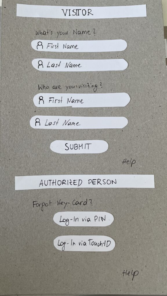
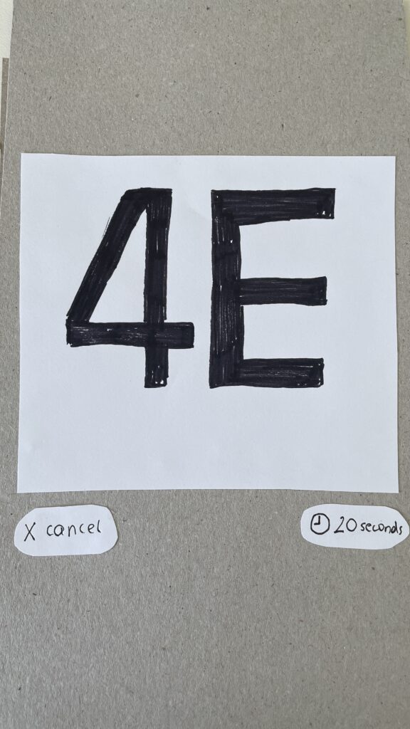
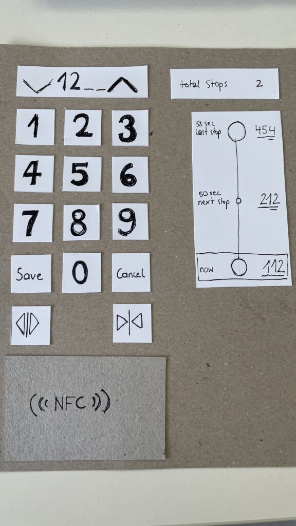
  1. Entry Screen – Users authenticate using an NFC card, PIN, or biometric login to verify access / Guests login via their name and the name of the host
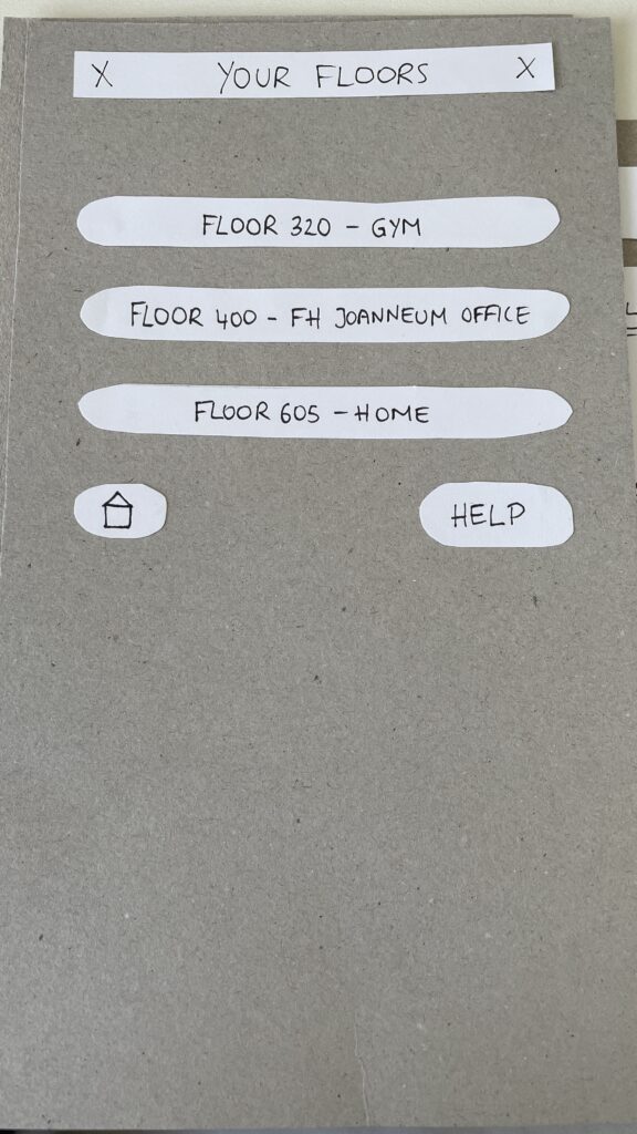
  2. Floor Selection – A personalized interface displaying only authorized floors to reduce cognitive overload
  3. Elevator Assignment – Users are directed to a specific elevator to optimize efficiency
  4. In-Elevator Controls – A secondary screen inside the elevator allows floor changes or emergency actions, ensuring flexibility mid-ride
Entry Screen
Floor Selection
Elevator Assignment
In-Elevator Controlls

Speed-Dating Prototype Discussion: Key Takeaways

The Speed-Dating session provided invaluable feedback from different perspectives. Here are some key insights:

1. Initial Reactions – What Problem Am I Solving?

  • Many participants struggled to recognize the interface as an elevator control system
  • Some assumed it was a hotel check-in or a security login screen
  • The concept of restricted floor access confused some users

2. Feature Suggestions – What Would You Add?

  • Instead of buttons labeled Save and Cancel, participants suggested clearer icons like a checkmark and a [X]
  • Emergency contact options were missing and should be easily accessible
  • Accessibility concerns arose, suggesting the need for a tactile number pad and Braille support

3. If My Prototype Had a Dating Profile…

  • The elevator system would market itself as “Your fastest and most efficient ride to success” or “Seamless mobility, one floor at a time.”
  • While the system served everyday users, i think the real customers would be building developers looking to optimize user flow in high-rise buildings

4. Future Vision – What Would Make This TED-Worthy?

  • While no 1000-story buildings exist today, high-rise architecture continues to evolve
  • Future cities may require advanced wayfinding systems, making this prototype a glimpse into possible urban design challenges

5. Unexpected Feedback – What Surprised Me?

  • The first login screen was misleading, making users think they were logging into a website rather than an elevator
  • Participants felt that unauthorized users could bypass security by following someone into restricted floors
  • The experience was unusual since most people are accustomed to standard button-based elevator panels

Final Thoughts & Next Steps

Exploring this extreme scenario was a fun and thought-provoking design exercise. However, given its impracticality, I won’t continue developing this prototype. Instead, I want to shift my focus to real-world mobility and wayfinding challenges, potentially designing solutions for navigation in large public spaces like airports, malls, or grocery stores.

This experience has reinforced how UX design is about clarity, accessibility, and user expectations. Designing for mobility is not just about efficiency, it’s about making interactions intuitive and seamless.

In the next blog post, I will explore potential project directions that build upon the learnings from this prototype.

How Attention and Vision shape User Experiences

Design is more than aesthetics, it’s about creating experiences that align with how the human brain processes information. As designers, understanding how attention works and how visual and cognitive mechanisms interact is crucial to crafting meaningful interfaces. In this Blog I want to explore how the brain, working memory, and the eye’s unique structure, including the fovea and peripheral vision, influence how users perceive and engage with design.

The Brain and Attention: A Limited Resource

Human attention is a finite resource, closely tied to our working memory. Working memory acts as a mental workspace, holding information temporarily while we focus on tasks. However, its capacity is limited to around 5–7 unrelated concepts at a time.

While the brain processes an astounding 11 million bits of sensory data per second, it can only consciously handle about 50 bits. This bottleneck forces the brain to prioritize information, directing attention based on personal goals and relevance. This selective focus explains why, in moments of distraction – such as when interrupted mid-task – information in working memory is often lost.

In interface design, this limitation underscores the need for clarity and prioritization. Overloading users with information can lead to cognitive fatigue and poor retention. Simplicity is key to holding attention and enhancing usability.

Vision: The Fovea and Peripheral Guidance

The human eye is a gateway to the brain, but it doesn’t work uniformly. A tiny part of the retina, the fovea, plays a disproportionately large role in how we perceive detail. The fovea, only about 1.5 mm wide, provides high-resolution vision and transmits data directly to the brain without compression. Although it makes up just 1% of the retina, the brain dedicates nearly 50% of its visual processing resources to it.

This narrow field of focus contrasts sharply with our peripheral vision, which is low in resolution but highly sensitive to motion. Peripheral vision serves as a guide, directing the fovea to areas of interest. While peripheral vision fills in missing details based on memory and expectations, it can also deceive us, creating the illusion of seeing everything clearly.

For designers, this means users don’t view interfaces as a whole but scan them, focusing on points of contrast or motion. Ensuring key information is compact, visually distinct, and aligned with user goals is essential.

Design Principles Inspired by Attention and Vision

To optimize user experiences, design should account for the brain’s and eye’s processing limits. Here are a few key strategies:

  1. Proximity and Grouping:
    Leverage the Gestalt principle of proximity to group related elements. For example, error messages should appear near input fields to prevent users from missing them during task-focused interactions.
  1. Contrast and Motion:
    Highlight essential elements, such as call-to-action (CTA) buttons, using bold colors or subtle animations. These visual cues draw the eye and reinforce the hierarchy of information.
  1. Simplification:
    Reduce cognitive load by presenting only the most relevant information at any given moment. Clear navigation and uncluttered layouts help users process information efficiently.

Inattentional Blindness: The Pitfall of Irrelevance

Despite our brain’s remarkable ability to process sensory data, it is inherently goal-driven. Information that doesn’t align with our objectives is often filtered out, a phenomenon known as inattentional blindness. This explains why users may overlook critical details in a design unless they are highlighted with visual cues.

For instance, when users focus on completing a task – like filling out a form – they may miss an unrelated error message placed elsewhere on the page. Designers can overcome this by ensuring all relevant information is integrated within the user’s current focus area.

Looking Deeper into the Science

The science behind these findings is supported by cognitive psychology and neuroscience. Books like Designing with the Mind in Mind by Jeff Johnson provide in-depth insights into how our brain, memory, and sensory systems influence design. Other resources, such as Don’t Make Me Think by Steve Krug and The Distracted Mind by Adam Gazzaley and Larry D. Rosen, further explore the challenges of designing in an era of constant distraction.

Conclusion

By understanding how attention, vision, and memory shape user behavior, designers can create interfaces that are not only functional but also deeply intuitive. Every pixel and interaction should respect the limits of the human brain while leveraging its strengths. In doing so, we can craft experiences that feel natural, effortless, and memorable – ultimately enhancing how users connect with the products we create.

Sources

Johnson, Jeff. Designing with the Mind in Mind.

Krug, Steve. Don’t Make Me Think: A Common Sense Approach to Web Usability.

Gazzaley, Adam, and Larry D. Rosen. The Distracted Mind: Ancient Brains in a High-Tech World.

Various academic sources on cognitive psychology and attention systems.

https://uxplanet.org/designing-for-human-attention-ac0abe3d657d

The Attention Economy

The Attention Economy: Designing for a Limited Resource

In the modern digital landscape, attention has become one of the most sought-after resources. The term “attention economy” refers to the economic principle where human attention is treated as a scarce and valuable product. In an age of information overload, countless platforms, apps, and advertisements compete to capture and hold our focus.

This concept, first popularized by economist and psychologist Herbert A. Simon (source at the end if you are interested), explains that an abundance of information creates a corresponding scarcity of attention. As our cognitive capacity remains finite, the demand for attention outpaces its availability. For businesses, capturing this resource often translates directly into revenue, as more time spent engaging with a product or service typically leads to higher advertising revenue, data collection, and user loyalty.

However, this relentless pursuit of attention poses challenges – not just for users but also for designers tasked with creating meaningful and ethical experiences.

How the Attention Economy Shapes Digital Experiences

The attention economy fundamentally shapes the way platforms and apps are designed. Features like infinite scrolling, autoplay videos, push notifications, and personalized recommendations are engineered to keep users engaged. Social media platforms such as Instagram, TikTok, and YouTube are particularly adept at exploiting these mechanisms. By using algorithms that surface highly relevant or emotionally charged content, they encourage users to spend hours scrolling, swiping, and clicking.

While these strategies are effective in increasing user engagement, they often lead to unintended consequences, such as:

  • Cognitive Overload: Constant exposure to information fragments makes it harder for users to focus or prioritize tasks.
  • Decreased Well-Being: Excessive engagement with digital platforms has been linked to anxiety, stress, and reduced mental health.
  • Erosion of Trust: Practices like dark patterns (e.g., deliberately misleading interfaces) undermine user confidence in technology.

The attention economy doesn’t just impact individual users – it influences society at large. Shortened attention spans, reduced capacity for deep work, and addictive behaviors are just a few of the cultural shifts driven by this phenomenon.

The Ethical Challenges of Competing for Attention

Designing within the attention economy comes with a significant ethical dilemma: Should businesses prioritize engagement at all costs, or should they take responsibility for the long-term impact of their designs on users?

Many platforms measure success using metrics like screen time, click-through rates, and daily active users. These KPIs encourage designs that exploit cognitive biases, such as:

  • The Zeigarnik Effect: Users feel compelled to complete tasks or consume unfinished content, such as an autoplay series or a “you’re almost there” progress bar.
  • FOMO (Fear of Missing Out): Platforms use notifications and alerts to create urgency, ensuring users return frequently to avoid missing updates or promotions.
  • Variable Rewards: Like a slot machine, apps randomize rewards (e.g., likes, comments, or surprises) to keep users hooked.

Designing Responsibly in the Attention Economy

Ethical design offers an alternative to the exploitative practices often associated with the attention economy. By focusing on user empowerment and long-term value, designers can create experiences that respect attention rather than monopolize it.

1. Reduce Cognitive Overload
Simplifying interfaces and prioritizing information helps users navigate digital spaces without becoming overwhelmed. For example, clear navigation menus and focused calls-to-action guide users effectively, reducing unnecessary distractions.

2. Encourage Mindful Engagement
Instead of maximizing screen time, platforms can promote conscious usage. Features like YouTube’s “Take a Break” reminders or Instagram’s “You’re All Caught Up” notification show how small interventions can nudge users toward healthier habits.

3. Avoid Dark Patterns
Transparency in design builds trust. For instance, making it easy to unsubscribe from a service or turn off notifications respects users’ autonomy, fostering loyalty over time.

4. Redefine Success Metrics
Moving away from engagement-focused KPIs toward metrics like user satisfaction, retention based on value, or task completion rates can help align business goals with ethical practices.

5. Design for Disengagement
Ironically, designing ways for users to log off or take breaks can create a more positive user experience. When users feel that a product respects their time, they are more likely to return willingly.

The Future of the Attention Economy

As awareness of the attention economy grows, users are becoming more discerning about how they spend their time online. This shift presents an opportunity for designers and businesses to rethink their approach. Emerging trends, such as digital wellness tools, context-aware systems, and AI-driven personalization, offer the potential to create user experiences that align with ethical standards.

The future of the attention economy doesn’t have to be about exploitation. By respecting the finite nature of human focus, designers can build systems that prioritize user well-being, fostering trust, satisfaction, and sustainable engagement.

Sources


Herbert A. Simon. Designing Organizations for an Information-Rich World (1971)

Nir Eyal.Hooked: How to Build Habit-Forming Products (2014)

Tristan Harris and the Center for Humane Technology: https://www.humanetech.com/

Sweller, J. (1988). Cognitive Load During Problem Solving: Effects on Learning. Cognitive Science, 12(2)

Daniel Kahneman. Thinking, Fast and Slow (2011)

https://medium.com/@Tathagat8889/attention-economy-designing-for-users-in-a-world-of-constant-distractions-30bda1160538#:~:text=The%20Future%20of%20Attention%2DAware,but%20also%20meaningful%20and%20mindful.

https://www.nngroup.com/articles/attention-economy

Small Details, Big Impact: How Microinteractions Keep Users Engaged

Those small, subtle animations or responses embedded in user interfaces are quietly revolutionizing digital design. These seemingly minor details can make or break an experience by holding user focus and adding delight, particularly when catering to short attention spans.

Let’s take a look into what microinteractions are, their role in maintaining user engagement, and how to implement them effectively.

What Are Microinteractions?

Microinteractions are small, contained product moments designed to accomplish a single task or provide feedback. Think of the “like” button on Instagram, the loading animation on YouTube, or the vibration your phone makes when toggling between modes.

They might seem insignificant, but their power lies in their ability to provide feedback, enhance usability, and inject personality into digital products.

Role in UX Design:

  • Feedback: Inform users that an action has been completed successfully (a checkmark when a form is submitted)
  • Guidance: Show users what to do next or highlight key features (animated tooltips)
  • Engagement: Create moments of delight to keep users intrigued

How Microinteractions Hold User Focus

Microinteractions work particularly well for short attention spans because they provide:

  1. Instant Feedback: Users are reassured their action has been registered. For example, a thumbs-up animation confirms a “like”
  2. Seamless Transitions: Animations such as loading skeleton screens (which mimic the layout of the actual content) make waiting feel shorter than traditional spinners
  3. Engagement Through Playfulness: A well-placed animation can surprise and delight users, creating positive reinforcement to keep interacting

Best Practices for Microinteractions in Short Attention Spans

  1. Keep It Subtle: Avoid overloading the interface with animations, they should enhance, not distract.
  2. Prioritize Speed: Ensure microinteractions are fast and efficient, aligning with the limited patience of today’s users
  3. Make Them Functional: Delightful design is essential, but utility should remain the priority.
  4. Test and Iterate: Regularly test microinteractions to ensure they’re intuitive and effective for your audience


Literature:

https://medium.com/@aemd2donchev/enhancing-user-engagement-with-advanced-micro-interactions-a-deep-dive-into-an-essential-web-d9040772f235

https://ruttl.com/blog/enhancing-user-engagement-and-satisfaction

https://uxdesign.cc/micro-interactions-why-when-and-how-to-use-them-to-boost-the-ux-17094b3baaa0

https://www.interaction-design.org/literature/article/micro-interactions-ux?srsltid=AfmBOoqKKY1EVplgrHsOAcIs2V444EiTtmizTwvCjw6biE0720ujLp3i

https://www.nngroup.com/articles/microinteractions

Demographic Differences: Crafting Engagment for Diverse Users with Short Attention Spans

The way users engage with digital interfaces isn’t just shaped by their fleeting focus – it’s also influenced by demographic factors such as age, gender, income, education, and cultural background. Designing for short attention spans requires not only an understanding of cognitive psychology but also a keen awareness of the diverse needs and preferences of different user groups.

This blog explores the impact of demographics on UI/UX design, offering strategies for creating inclusive and effective digital experiences tailored to varied audiences.

1. Age: Designing for Generational Differences

Young Users (Gen Z and Millennials):
These groups are digital natives accustomed to fast interactions, intuitive designs, and visually engaging content. Platforms like TikTok and Instagram exemplify their preference for micro-content and gamified elements.

  • Key Strategy: Use dynamic visuals, animations, and bite-sized content. Gamification features such as badges and rewards can extend engagement without overwhelming users.

Older Adults (Baby Boomers and Seniors):
Older users often require simpler interfaces with clear navigation and larger touch targets. They value functionality over novelty and are less likely to experiment with unfamiliar features.

  • Key Strategy: Prioritize readability with larger fonts, high contrast, and intuitive design patterns. Avoid clutter, and include guided onboarding for new users.

2. Gender: Preferences in Visual and Functional Design

Gender differences can subtly influence design preferences. For example, studies show that women often prefer clean, visually appealing layouts, while men may lean toward functionality and performance-driven interfaces.

  • Key Strategy: Conduct gender-inclusive research and testing. Avoid stereotypical design choices (color-coding pink and blue), and focus on accessibility and usability for all genders.

3. Income Level: Accessibility and Aspirational Design

Users from different income brackets approach digital products with varied expectations and constraints. Lower-income users may prioritize functionality and affordability, while higher-income users might seek premium aesthetics and advanced features.

  • Key Strategy: For budget-conscious users, focus on essential features and avoid unnecessary complexity. For higher-income audiences, invest in polished visuals and personalized experiences.

4. Education: Designing for Diverse Knowledge Levels

Education shapes how users interact with interfaces, especially in terms of content comprehension and task complexity. Highly educated users may appreciate advanced tools and in-depth information, while less educated users benefit from straightforward language and guided interactions.

  • Key Strategy: Incorporate progressive disclosure, where advanced options are hidden until needed. Use plain language and visual aids to ensure clarity across all education levels.

5. Cultural Background: Localization and Cross-Cultural Design

Culture significantly influences how users process information and engage with digital products. Western users often favor minimalist aesthetics and fast-paced interactions, while Eastern users may appreciate rich, information-dense layouts.

  • Key Strategy: Localize your design for different regions by adapting color schemes, typography, and information density to match cultural expectations.

Literature:

Cross Cultural Design by Senongo Akpem

Cross Cultural Design – Nielsen Norman Group:
https://www.nngroup.com/articles/crosscultural-design

https://digital.gov/topics/usability

Age Groups:

Cognitive Load and the Hook Model by Nir Eyal

What is Cognitive Load?

Cognitive load refers to the amount of mental effort required to process and interact with information. It’s rooted in cognitive psychology and is often categorized into three types:

  1. Intrinsic Load: The inherent complexity of the task itself. For example, learning advanced physics naturally requires more effort than reading a children’s book.
  2. Extraneous Load: Unnecessary complexity introduced by poor design, such as cluttered layouts or unclear instructions. This is where designers have the most control.
  3. Germane Load: The effort devoted to learning or understanding something meaningful, which is essential for building knowledge and skills.

In UI/UX design, minimizing extraneous load while optimizing germane load is key to creating intuitive and enjoyable experiences.

The Psychological Foundation of Cognitive Load

The concept is deeply tied to working memory, a limited resource that processes and holds information temporarily. According to Miller’s Law, humans can hold about 7 (plus or minus 2) items in their working memory at a time. When users are presented with overly complex interfaces, their working memory becomes overwhelmed, leading to frustration and disengagement.

Strategies to Reduce Cognitive Load in Design
Designers can make tasks easier by focusing on these principles:

  1. Simplify Navigation
    • Using clear pathways and avoid hidden menus
    • Example: Amazon’s one-click purchasing reduces decision fatigue
  2. Employ Progressive Disclosure
    • Show information only when users need it. For instance, a sign-up form that breaks into multiple steps feels less overwhelming than one with all fields displayed at once
  3. Leverage Visual Hierarchy
    • Use size, color, and spacing to guide focus. Bold headings, contrasting buttons, and whitespace can help users prioritize key actions
  4. Chunking Information
    • Break content into digestible pieces, similar to paragraphs in a book
    • Example: Spotify organizes songs into playlists, making it easier for users to find their favorites


The Hook Model: Turning Attention into Habits

Once cognitive load is minimized, designers can focus on engaging users more deeply through Nir Eyal’s Hook Model. This four-step process transforms interactions into habits:

  1. Trigger
    • External: Notifications, reminders, or prompts (e.g., a Duolingo streak notification).
    • Internal: Emotional cues like boredom or loneliness, which lead users to open an app instinctively.
  2. Action
    • Simplify actions to reduce friction. A swipe on Tinder or a tap on Instagram’s heart icon feels effortless.
  3. Variable Reward
    • Unpredictability enhances engagement. For example, social media likes or gaming loot boxes keep users coming back.
  4. Investment
    • Encourage users to invest time or effort, making them more likely to return. Examples include creating Pinterest boards or uploading photos to Google Photos.

Literature:

Cogitive Load:
https://www.barefootteflteacher.com/p/what-is-cognitive-load-theory

https://www.interaction-design.org/literature/topics/cognitive-load?srsltid=AfmBOorxdSOspYzd9iiUNoqJMX98LoCbl-tSMbZI7iAFoIc9BH2h2D69

Hooked: How to Build Habit-Forming Products by Nir Eyal

Miller’s Law:
https://medium.com/design-bootcamp/simplifying-complexity-demystifying-millers-law-in-ux-design-7-2-49db4fa8346a#:~:text=Miller’s%20law%20states%20that%20the,human%20memory%20and%20cognitive%20processing.

Hook:
https://inappstory.com/blog/mobile-native-hooks-and-triggers

The Power of Visual Hierarchy in Capturing Attention

In a world of fleeting attention spans, visual design is not just a supporting player – it’s the lead actor in guiding user focus. Whether it’s a landing page, an app interface or an online form, the way information is visually presented can make or break user engagement. Let’s explore how visual hierarchy helps capture attention and simplify user interaction.

Why Visual Hierarchy Matters

Visual hierarchy is the arrangement of elements in a way that suggests importance and guides the viewer’s eye. Steve Krug, in his book “Don’t Make Me Think“, emphasizes that users scan web pages, they don’t read them. This means designers must make the most crucial elements stand out immediately, leading users seamlessly through a page or app.

For short attention spans, clarity is key. A cluttered or confusing interface demands too much cognitive load, causing users to disengage. By establishing a clear hierarchy, you can reduce mental effort and keep users focused on what matters.

Techniques for Effective Visual Design

Here are actionable techniques to create visual designs that capture and hold attention:

  1. Typography: Use font sizes and weights to differentiate headings, subheadings, and body text. A bold headline grabs attention, while smaller, lighter text provides supporting details.
  2. Color Contrast: Colors are powerful cues. High contrast between text and background improves readability, while accent colors draw attention to CTAs.
  3. Spacing: Adequate whitespace (or negative space) helps declutter layouts, giving users visual breathing room.
  4. Iconography and Imagery: Icons and images act as visual shortcuts, instantly conveying meaning. However, ensure they align with the context and don’t overwhelm the design.
  5. Consistent Alignment: Align elements cleanly to establish order and predictability, making navigation intuitive.

Examples: Good vs. Bad Visual Hierarchy

Good Example: Apple’s website showcases excellent visual hierarchy, using bold headlines, simple imagery, and plenty of whitespace to guide attention to its products.

Bad Example: Overloaded landing pages with flashing banners, competing colors, and tiny fonts (think early 2000s design) overwhelm users and make key information hard to find.

A Human-Centered Approach
Ultimately, good visual design isn’t just about aesthetics – it’s about empathy. Understanding how users perceive and process information ensures that your designs meet their needs while respecting their attention.

Literature:

Don’t Make Me Think” by Steve Krug

Dark Patterns in Attention Design

Is grabbing user attention always ethical?

In the race to capture user attention, some designs cross a critical ethical line. These manipulative tactics, often referred to as dark patterns, exploit human psychology to benefit businesses at the expense of users. Let’s dive into examples where engagement becomes exploitation and why designers must tread carefully when wielding the power of attention design.

The Netflix Gamification Experiment

Netflix once tested a feature that gamified TV watching for kids. By introducing “patches” as rewards for every show or movie watched, they encouraged children to binge content. The more they watched, the more patches they earned—a clever yet ethically questionable move. Critics argued this design preyed on children’s psychology, fostering addictive behavior under the guise of fun. After backlash, Netflix scrapped the idea.

Why It Matters:
This is a clear example of using gamification not to enhance experiences, but to trap users into spending more time on the platform.

Social Media’s Infinite Scroll

Social media platforms like Instagram and TikTok use the infinite scroll feature to keep users endlessly consuming content. This design taps into a psychological phenomenon known as the “novelty-seeking” bias – the constant pursuit of something new. As a result, users often spend hours scrolling without realizing it.

Why It Matters:
While it boosts engagement metrics, infinite scroll often leaves users feeling drained and unproductive, raising questions about its long-term impact on mental health.

E-Commerce and Fake Scarcity

Online retailers frequently use fake scarcity tactics like “Only 2 items left in stock!” or countdown timers during sales. These practices create a sense of urgency, manipulating users into making impulsive purchases out of fear of missing out.

Why It Matters:
While effective for increasing sales, such tactics can lead to buyer’s remorse and erode trust in the platform.

Mobile Game Microtransactions

Many mobile games use dark patterns to encourage spending. For instance, games often use loot boxes – randomized rewards players pay for without knowing what they’ll get. This taps into the psychology of gambling, exploiting players desires for rare or valuable items.

Why It Matters:
Loot boxes have been criticized for targeting vulnerable groups, particularly children, and leading to financial exploitation.

Positive Examples: Ethical Attention Design

Not all attention-focused designs are manipulative. Companies like Nintendo and Apple are taking steps to address attention ethics:

Nintendo: The company included built-in reminders in its consoles to encourage players to take breaks, especially in family-oriented games like Animal Crossing. (don’t know if they’re still doing it)

Apple Screen Time: iPhone’s Screen Time feature provides detailed insights into how users spend their time, empowering them to set limits and make informed decisions about their digital habits.

These examples show how design can promote healthier interactions with technology, respecting user autonomy while fostering engagement.

As designers, we hold significant influence over how people interact with technology. Let’s use it responsibly.

Literature:

Talk by Victor Yocco (UX Burlington 2019)
https://www.youtube.com/watch?v=6WBS6YYMAcE

Infinite Scroll:
https://uxdesign.cc/why-the-infinite-scroll-is-so-addictive-9928367019c5

Netflix Patch:
https://www.digitaltrends.com/movies/netflix-tests-patches-for-kids/

Good source about types of scarcity:
https://uxdesign.cc/5-types-of-scarcity-how-to-influence-anyone-using-these-7f309d328dbb

can also recommend “the social Dilemma” on Netflix

Scenarios and Use Cases

How Short Attention Spans Impact Everyday Interactions

Picture this: You’re on a flight, settling into your seat, and the safety instructions start. In the past but still even today at short flights or cheap ones without a screen, flight attendants stand in the aisle demonstrating seatbelt use and emergency exits. Most passengers barely pay attention in this case. Now, airlines like Air New Zealand or Qatar Airlines play high-quality safety videos featuring celebrities, humor or even movie themes to capture your focus. It’s no longer just about compliance – it’s about engagement.

This is just one of many situations where attention makes all the difference. Let’s explore real-world use cases where shortened attention spans have reshaped how information is delivered and understood.

Scenario 1: Safety in Airplanes

In-flight safety instructions are crucial, yet passengers often ignore them. Airlines responded by turning mandatory safety briefings into mini-movies. Using famous actors, creative storytelling, and even animation, they transform what could be monotonous into something entertaining.

Use Case Example:
Qatar’s safety video has featured Kevin Hart. By tapping into comedy and acting, they ensure passengers actually pay attention – potentially saving lives in an emergency.

Scenario 2: Manuals

Instruction manuals have a bad reputation for being overwhelming and full of technical language. With shrinking attention spans, fewer people want to wade through dense text to figure out how to assemble furniture or install snow chains.

Use Case Example:
IKEA’s picture-based assembly instructions are a brilliant response to this challenge. By using simple visuals and step-by-step illustrations, they eliminate the need for lengthy explanations, making the process faster and frustration-free. Similarly, many car manufacturers now include video tutorials for tasks like attaching snow chains, further reducing cognitive load.

Scenario 3: Learning in the Digital Age

Attention challenges aren’t limited to entertainment or shopping, they’re reshaping education too. Microlearning apps like Duolingo and Blinkist are thriving because they align with modern attention spans, breaking complex topics into bite-sized lessons that fit into busy lives.

Use Case Example:
Duolingo uses gamification to keep users engaged, with short exercises, streaks, and rewards. Each lesson is designed to feel achievable, ensuring users stay motivated without feeling overwhelmed.

Why These Scenarios Matter

Each of these examples highlights how attention plays a critical role in real-life situations. From life-saving instructions to everyday usability, the ability to capture and guide attention isn’t just nice to have, it’s essential. Designers and creators must embrace these evolving behaviors to communicate effectively and create better experiences.

Stay tuned for the next post, where we’ll dive deeper into the ethical dilemmas of designing for attention.

Literature:

Safety Video with Basketball Team:

Flight attendant performs funny safety routine:
https://www.youtube.com/watch?app=desktop&v=JEyp2p-bzcU&t=65s

Qatar Airways with actors like a comedy movie:
https://www.youtube.com/watch?v=SNtlxmtH3ZA

IKEA:
https://www.ikea.com/

Duolingo:
https://www.researchgate.net/figure/duolingos-gamification-elements_fig1_351746804

What is Attention and why is it shrinking?

As humanity shifts more into the digital universe where the chances of distraction increase by the minute, understanding the science of attention is already a requirement. Attention is not a simple mental process that can be neglected, rather, it is the basic framework that we use to move, engage with and comprehend any given digital experience. For instance, designers need to have a sound understanding of attention so as to estimate the boundaries are designing user-interfaces that are friendly, engaging, and effective.

Types of Attention and Their Design Relevance

In psychology, attention has been subdivided into many forms and the following two are applicable in design:

Transient Attention

This is our brain’s quick concentration on anything for a micro duration, for example, how one would look at a notification for contact.

Relevance in Design: Many products define their features as impression creation. In such cases, content designers need to have simple and distinct content which is easy for users to focus on.

Sustained Attention

This means the ability of someone to concentrate with little or no distraction for a long period of time.

Relevance in Design: For elements that require more time like reading an article or filling forms. The standard interface design needs to be directly proportional to the time spent on navigating through several elements within that interface.

In the current attention economy, both of these types are under a lot of distress as users start adapting to new fast-moving platforms such as tiktok and instagram among others.

The Decrease of Attention in the Digital Era (Study Analysis)

Microsoft (2015), in a study that is much cited and discussed, claims that the average human attention span reduced from twelve seconds in the year 2000 to eight seconds. Not every individual agrees with these numbers, but what is unquestionable is the fact that we are getting worse at concentrating on a single thing. It is apparent that this regression is attributable to a number of interrelated factors:

Overconsumption: We are overfeeded with content from different devices and different mediums.

Desire of Immediate Satisfaction: There is a strong desire to interact with the app immediately providing quick reward as is the case with TikTok.

Cognitive Overload: There are too many alternatives or sources of stimulation which in turn causes our brains to evolve and opt for the quicker, more superficial engagement instead of deep thinking.

This requires, on the one hand, attention that needs to be drawn to the product, but on the other, there is the need to minimize user confusion.

Psychological Frameworks In Design

Cognitive Load: Psychologist John Sweller concept describes the information processing burden of an individual. Interfaces that are too busy or complex can quickly exhaust users, leading to frustration and drop-off.
Design Tip: Trim interfaces down and extract major functional purposes. Avoid any unnecessary interference.

Selective Attention: Our brains filter out irrelevant stimuli to focus on what’s important. Design Tip: Apply and yes even exploit the basic principles of design which are contrast, hierarchy and space to the users attention.

Attention Span Metrics: Working memory is always situational. For instance:
Social Media: Attention grabbing takes 1-3 seconds.
Reading: A user scans through content with a view of determining whether that worth reading or not.

The same set of principles affirms the need to design interfaces adapted to the short-lived focus of users as well as those supporting longer attention span when necessary.

Consequences for Designers

A profound grasp of attention is far more than an intellectual activity, it determines the success or failure of a digital product. Considering the fact that users are flooded with a range of stimuli, designers should understand that attention is a scarce commodity. This is a necessary consideration and failure to take it into account can result in:

User Drop-Off: Interfaces that fail to capture or sustain attention lose users quickly, often before they even engage meaningfully with the product.

Missed Opportunities: Any pertinent information, an urgent request or advertise, or some other valuable content may be missed provided it does not correspond to the user’s attention span.

Cognitive Overwhelm: If a person is exposed to overly intricate designs they will most probably become fatigued and that will lower their satisfaction and degree of convenience.

No one is saying that all the attention can be focused on the design, understanding the psychology users will be using to view and interact with the offered products is equally important, to put it into one’s design, all of these factors make the correct understanding of interaction between the elements and devising of possible problems a vital issue.

Literature:

Department of Education; Sweller, John: Cognitive Load Theory in Practice.

Microsoft Attention Span Research (2015):
chrome-extension://efaidnbmnnnibpcajpcglclefindmkaj/https://dl.motamem.org/microsoft-attention-spans-research-report.pdf

Smashing Magazine:
https://www.smashingmagazine.com/2020/09/designing-for-attention/

PMC:
https://pmc.ncbi.nlm.nih.gov/articles/PMC3882082

Interaction Design Foundation:
https://www.interaction-design.org/literature/topics/cognitive-load?srsltid=AfmBOorxdSOspYzd9iiUNoqJMX98LoCbl-tSMbZI7iAFoIc9BH2h2D69