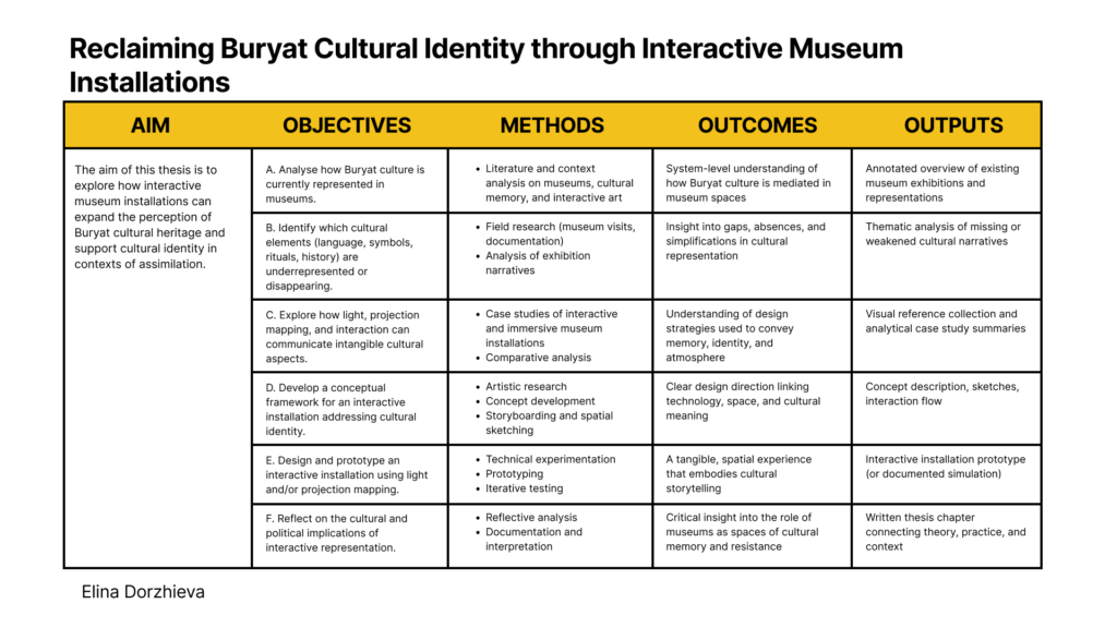
As part of the final phase of our program, we had the opportunity to participate in individual intensive coaching sessions. I met with Mr. Horst Hörtner to discuss my master’s thesis direction, and the conversation turned out to be far more impactful than I expected.
First of all, he is an incredibly sharp and engaged person to talk to. From the beginning, he showed genuine interest in my topic, asked precise questions, and quickly understood the core of what I am trying to explore.
What mattered most to me, however, was the sense of validation I took away from the session.
Up to this point, I had been quite unsure about my topic. I knew it was personally important, but I kept questioning whether it was relevant enough, clear enough, or strong enough in a broader research context. Hearing an experienced expert from the field emphasize that the topic is both timely and necessary was honestly very motivating. It shifted something in my mindset, from hesitation toward commitment.
One of the key dilemmas I brought into the conversation was about audience.
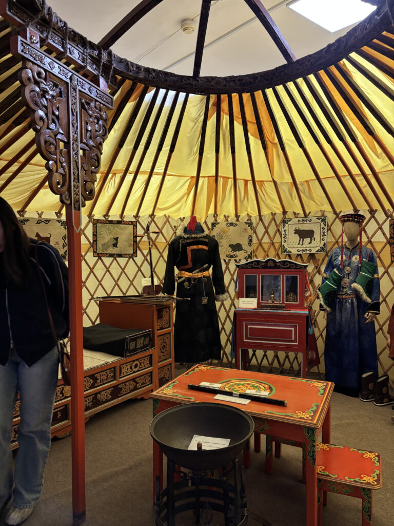
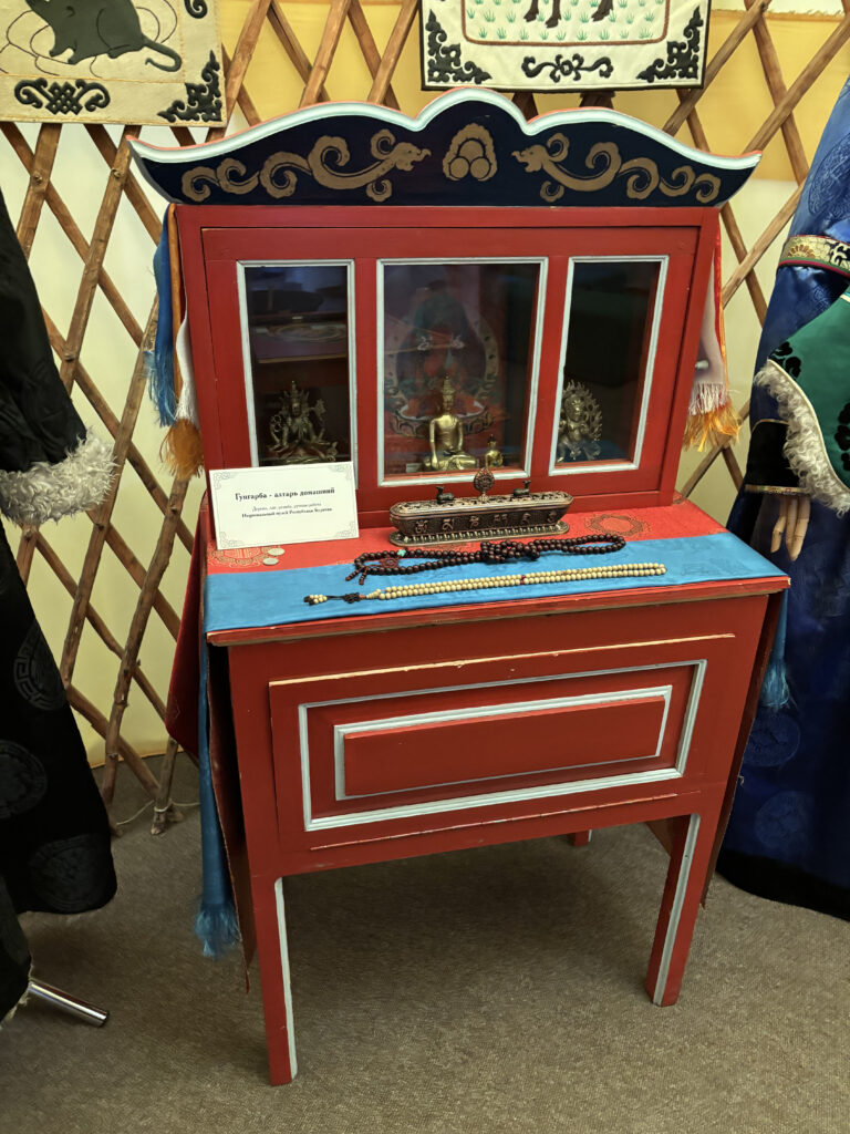
My project deals with Buryat–Mongolian cultural context, but I am developing it within a Western academic and exhibition environment. I was struggling with how to make the installation understandable for two very different audiences:
- Buryat–Mongolian visitors, who carry the cultural background
- Western visitors, who may encounter this context for the first time
I was trying to design for both at once, and the more I tried, the more complicated the project felt.
Mr. Hörtner’s response was surprisingly direct and, in a way, liberating.
He advised me to stop designing primarily for the Western audience.
His point was clear: the people most affected by the cultural questions I am addressing are the primary audience. They are the ones who need to fully understand the message and context. Western audiences, he noted, can access background information if needed but they do not have to be the central design reference point.
This reframing removed a significant amount of pressure. Instead of diluting the work to make it universally digestible, I can focus on making it culturally grounded and precise.
Another moment that stayed with me was when he repeatedly thanked me for my bravery. I did not fully expect that reaction. But it served as an important reminder: working with cultural identity especially from a minority perspective is not something to minimize or soften.
If anything, it requires clarity, confidence, and visibility.
I left the session feeling more focused and, importantly, more permitted to stand firmly behind my topic. The conversation did not magically solve every design challenge ahead, but it gave me something equally valuable: direction and reassurance that the work I am doing has weight.