just a fun quick video of me making my prototype
Author: cornelia.wysoudil
#15 Building a pocket sized tactile flood map
Three cups of coffee, an A4 sheet of foam board, and a stack of scavenged textures later, I finally have a first physical model of flood risk in the Tulln area. It is rough, flimsy in places, and already shedding, but it’s also the most concrete (and tactile!) expression of my idea so far.
Choosing “A4” over “A-Lot”
I promised myself to work small this time. An ~A4 footprint forces ruthless simplification:
- Only the Danube’s immediate floodplain.
- No elevation gain because there is almost none in that area.
- 2 flood scenario (HQ 30 & HQ 100).
That constraint kept the materials list tight and the cutting tolerable with a hobby knife.
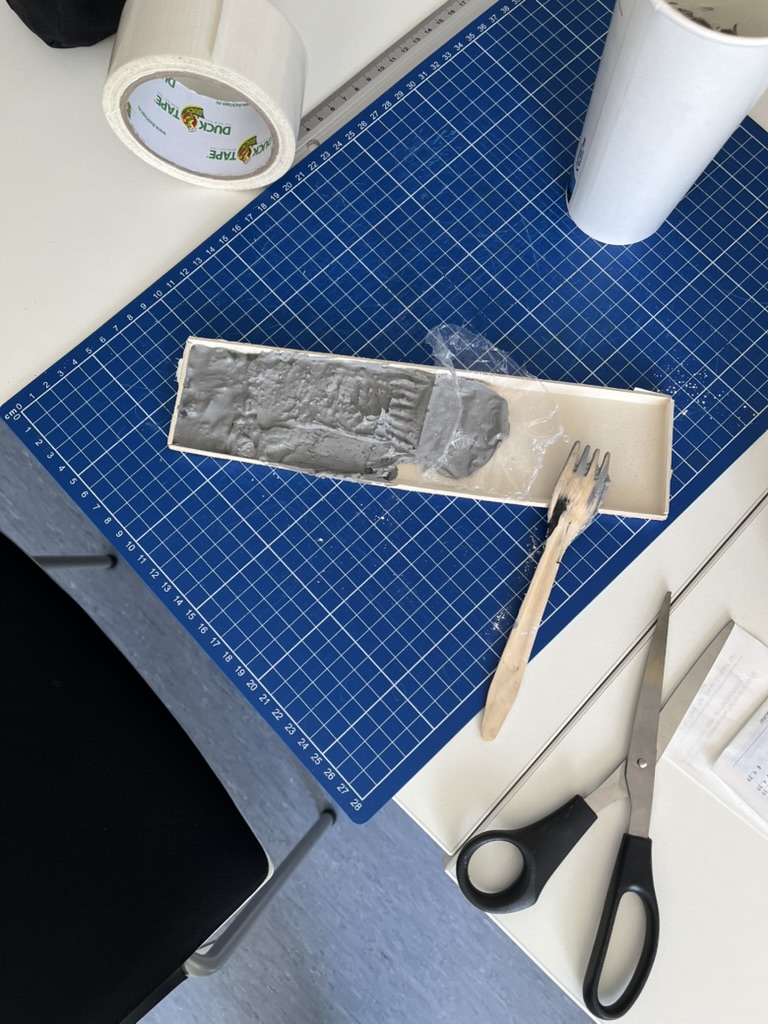
Thirty-Minute Build
- Print → Trace → Cheat Printer died, so I traced the WISA map contours right off my screen onto scrap paper, then onto materials—eyeballing when necessary.
- Knife workQuick, approximate cuts of cardboard, cork, felt, and foam.
- Base & WaterCraft-foam ribbon for the Danube; its cool, slick surface instantly stands out.
- Land UsesFelt for green, cork for sealed areas. Simple rectangles keep the skyline abstract.
- Flood OverlaysRough side of each sponge = HQ 30; soft cellulose side = HQ 100. Cut to match the WISA outlines and glued as over-lays.
Total build time: ~30 minutes.
First Blind Pass
With eyes closed I traced from river outward:
- Foam river – instantly identifiable.
- Rough sponge – HQ 30; its grit jolts the fingertip.
- Soft sponge – HQ 100; squishy, cooler, clearly distinct.
- Felt – forgiving, farmland vibe.
- Cork – rigid and grainy; screams “built-up.”
- Cardboard steps – subtle, but enough curb-height to prove the land does rise.
What I Learned
- At A4 scale every millimetre matters. Flood zones have to be chunky enough to feel but not so thick they dwarf the elevation logic.
- Textures communicate hierarchy if the height difference is consistent. Soft-but-low worked only when the sponge sat at the same level as the surrounding terrain.
- Material memory is powerful. Sandpaper felt “urban” without explanation, reaffirming research on intuitive texture cues.
Further thoughts
- Movable Sponge OverlaysCut each HQ zone as a separate, magnet-backed piece. Users can lift, align, or stack them to see extent differences.
- Sliding FilmPrint HQ 30 and HQ 100 outlines on transparent acetate (raised ink or puff-paint). Slide the film over the base map; tactile bumps show where water spreads further.
- Stackable “Risk Chips”Punch small, uniform discs out of sponge: light-touch discs for HQ 100, rough discs for HQ 30. Drop them into a recessed Danube channel to build a tactile bar-chart of depth along chosen transects.
- Add a braille / raised-symbol legend to the bottom edge.
- Run a short thinking-aloud test with at least three users, including one low-vision participant.
#14 Preparing to build a prototype
After outlining a national-level idea for a tactile map of Austria in my last post, I quickly realized: starting small is smarter. Not only because of time and material constraints, but because detail matters and working at a regional scale allows me to dive deeper into how elevation, infrastructure, and flood risk actually intersect.
So for my next prototype, I’m focusing on the region around Tulln, and potentially Vienna if time allows. This area offers a compelling intersection of topography, hydrology, and urban development all wrapped around the Danube, Austria’s largest and most flood-prone river.
Why Tulln?
- It’s a mid-sized town with both urban and rural textures, making it ideal for mixed-surface representation.
- It lies directly along the Danube, with several documented flood events in recent years.
- Its relatively flat terrain offers subtle elevation changes—challenging but manageable for tactile representation.
- Data is available: flood risk maps, land use info, and elevation contours are easier to source at this scale.
Plus: I have a personal reference point for it living close by, which helps in imagining scale and interpretation.
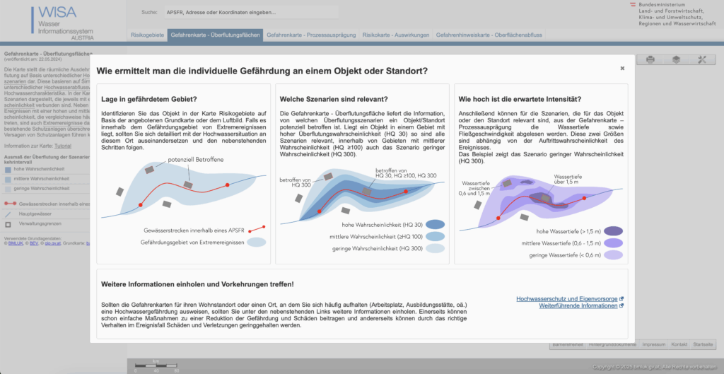
What the Data Says: A Quick WISA Deep-Dive
I spent an evening inside the WISA (WasserInformationsSystem Austria) portal, specifically the second-cycle hazard and risk maps:
https://maps.wisa.bmluk.gv.at/gefahren-und-risikokarten-zweiter-zyklus
Key takeaways:
- Three flood scenarios dominate planning: HQ30, HQ100, HQ300 (30-, 100-, 300-year events).
- Each scenario maps expected water depth and flow velocity—crucial for picking tactile textures.
- In the Tulln/Vienna stretch, HQ100 zones hug both banks, widening dramatically at meander bends.
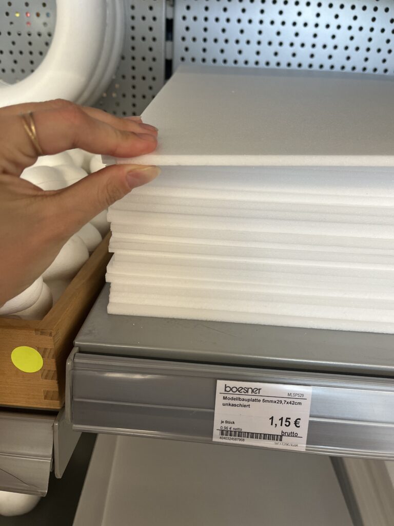
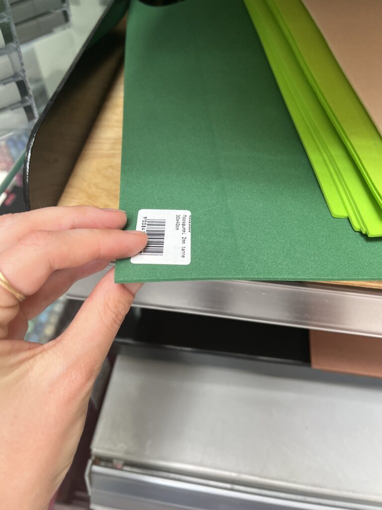
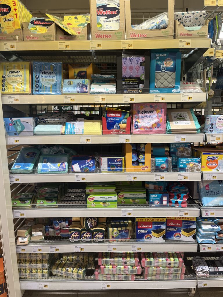
Material Scouting (aka “Foam Feel-Up” Day)
I’ve been to a few shop looking at different materials to see what would work best.


Prototype Blueprint (Version 0.1)
| Layer | Data Source | Tactile Encoding |
|---|---|---|
| Elevation (4 bands) | data.gv.at | cardboard (stacked) |
| HQ100 flood zone | WISA hazard map | Scrub Sponge (Reinigungsschwamm) |
| Sealed land | data.gv.at | compressed cork board |
| Green space | data.gv.at | felt fabric |
| Danube + major tributaries | WISA hazard map | smooth craft foam |
The aesthetic goal isn’t prettiness; it’s readability by hand. Every texture must scream its meaning in under two seconds of fingertip contact.
Scope Check
- Board size: A4 fits on a lap, lowers material costs, easy for the first prototype
- Layers: 3–4 elevation steps + 1 sponge overlay = max 5 tactile heights.
- Geography: Tulln centre + ~5 km buffer on each side; Vienna only if the first build behaves.
Next Up: Cutting, Gluing, (Re-)Cursing
In my next Blog Post I’ll document the messy middle:
- Printing and tracing simplified contours.
- Foam-board surgery (scalpel + podcasts).
- Flood-sponge wrestling: how do you glue something that’s meant to feel like water?
- First blindfold test: can a friend locate “safe ground” by touch alone?
Fingers crossed (and hopefully uncut).
#13 Combining Elevation, Floods, and Touch
After experimenting with spaghetti mountains and 1:10,000 land-consumption patches, I’ve found myself drawn toward a new direction – one that combines topography, climate data, and tactile experience into a single, tangible system. This post is about bringing those earlier experiments together under a more urgent, nationally relevant theme: flood risk in Austria.
Where I’m Coming From
So far, my prototypes have had one foot in playful material exploration and the other in physical data storytelling:
- The Spaghetti Schlossberg turned abstract elevation data into a tactile mountain – wobbly and imperfect, but rich with potential.
- The Land Use Patch made daily land consumption physically touchable, swapping colors for textures to communicate proportion, pressure, and permanence.
While they felt like separate ideas at first, both were really about the same thing: using touch to interpret spatial data in a more embodied way.
A Shift in Focus: Austria, Climate, and Tactile Maps
After researching climate impacts in Austria, especially the floods in 2024 in Vienna and Lower Austria, I began asking a new question:
What would it feel like to touch the places most vulnerable to climate risk?
This led me to the idea of creating a tactile flood risk map of Austria, combining elevation and flood zones into one cohesive, touchable landscape. The concept builds directly on what I’ve done so far: layering materials, mapping by hand, and treating texture as information.
Inspiration: Harrison Cole and Tactile Environmental Mapping
A major turning point came when I watched Harrison Cole’s video on tactile maps. His research for his phd shows how important carefully designed tactile maps are and how they can communicate both geographic and thematic information – not just where things are, but how they relate, change, and affect us.
Especially relevant were:
- Making Flood Maps Accessible: Designing Tactile FIRMs→ Demonstrates how FEMA maps were transformed into raised, texture-coded floodplain guides.
- Feeling the Flood: Evaluating Thematic Tactile Maps→ Offers insight into user testing with blind and low-vision individuals, and how tactile symbols and overlays shaped their understanding.
These examples helped me see that tactile design isn’t just about accessibility, but also about expanding the way everyone can perceive environmental risk – with their hands, not just their eyes.
What I’m Building Next
For my next prototype, I’m sketching out a physical map of Austria that shows both elevation and flood-prone areas. Here’s the plan:
- Stacked cardboard or foam to build elevation in simplified contour layers.
- Flood zones represented using sponge, felt, or soft rubber – anything that feels “wet” or absorbent.
- Possibly include overlays from my land-use prototype (gravel, concrete, grass) to link impermeable surfaces to higher flood risk.
By combining these, I hope to answer:
- Can we physically feel the risk tied to elevation and development?
- How does texture communicate urgency or vulnerability better than visuals alone?
- Could this be used in climate education or planning contexts?
Why Flood Risk?
Austria isn’t immune to climate impacts. The floods in Vienna and along the Danube aren’t isolated events. They’re part of a broader pattern of intensifying risks tied to both urban development and changing weather patterns.
A tactile map could:
- Make climate data more accessible to visually impaired users.
- Create a more memorable experience for general users.
- Encourage reflection and conversation around geography, infrastructure, and preparedness.
Final Thoughts
What began as two strange lo-fi experiments have merged into something more purposeful. This third prototype will be a test of that synthesis: Can elevation, land use, and flood vulnerability live on the same board? Can they tell a story not just visually, but viscerally?
References & Links
- Harrison Cole’s video: https://www.youtube.com/watch?v=-xVnAaXWPFo
- Feeling the Flood: Evaluating Thematic Tactile Maps
- Austrian Flood Risk Map Source: BML – Hochwasserrisikozonenplan
- https://hora.gv.at/#/chwrz:-/bgrau/a-/@47.72463,13.50823,8z
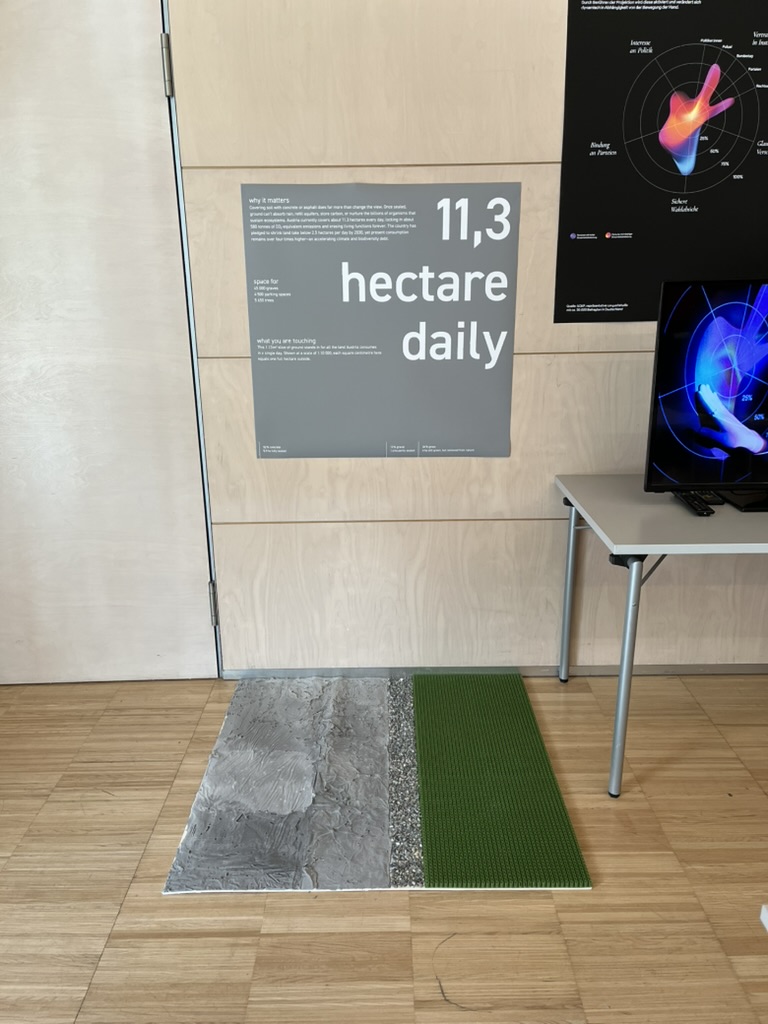
#12 DataVis Workshop
The workshop WS#6 Eva-Maria Heinrich / Bringing the Abstract to Life – Beyond Data Visualisation at the International Design Week was all about pushing my prototype beyond pixels and printouts. Instead of presenting Austria’s daily land consumption as another chart, I set out to build a physical prototype – a 1.13 m² “slice” of ground that stands in for every hectare consumed in a single day. Here’s a rundown of my process, why a hands-on prototype matters, and the production hurdles I encountered along the way.
Why Prototype Matters in Multi-Sensory Data Visualization
Many of my previous posts have explored the theory behind multi-sensory data visualization – how tactile textures, sounds, or spatial arrangements can make numbers resonate more deeply. This time, I wanted to prototype those ideas in a tangible form. By crafting a small landscape that viewers can actually touch, I could test whether the physicality adds insight that a static infographic simply can’t. In other words, this wasn’t a polished art piece – it was a work-in-progress prototype intended to reveal both the strengths and limitations of turning data into material.
Concept: A 1.13 m² “Plot” of Daily Land Use
At a scale of 1:10 000, 1 cm² on my board represents 1 hectare in the real world. To capture Austria’s daily land conversion, the board measures 1.13 m² total, divided into:
- 52 % concrete (fully sealed surfaces like roads and buildings)
- 12 % gravel (partially sealed areas such as construction zones)
- 36 % grass (green spaces cut off from natural ecosystems)
When laid out side by side, these materials form a unified plane that still reveals stark textural differences up close. Walking viewers through each zone gets them thinking: “That gray slab isn’t just a shape – it’s every driveway and parking lot paved over today.”
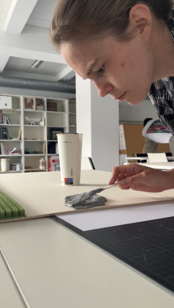
From Sketch to First Prototype
Mapping Out the Layout
I began by sketching on paper, dividing a 1 m × 1.13 m rectangle into proportional zones. Once I had rough percentages, I exported the grid to Illustrator to generate precise outlines. Printing a full-scale template and taping it to plywood helped me trace clean boundaries for concrete, gravel, and grass sections.
Gathering & Testing Materials
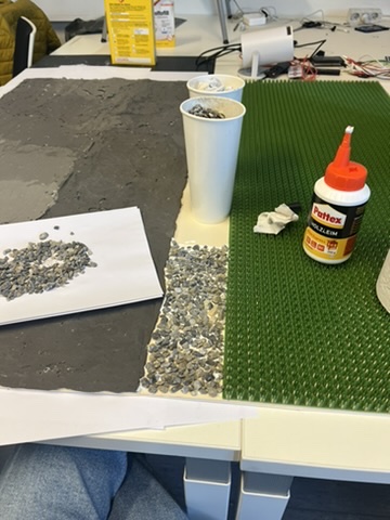
- Concrete mix: I bought a small bag of ready-to-mix putty. My first batch was too smooth, so I added extra pebbles I got on the street to add some texture.
- Gravel: I grabbed some gravel from a construction site. Putting it basically one by one on the surface, I glued them down with normal glue.
- Grass: I had a few ideas for grass but because of time constraint I settled on a doormat I found at the hardware store, knowing I could swap in live grass later.


Building the First Iteration
- Base Preparation: I glued two sheets of thin carton together (hoping for the best).
- Concrete Section: Mixing putty and gravel, I poured it cup by cup each time mixing it again and again.
- Gravel Section: I sprinkled gravel by hand, and gently pressed it in place.
- Grass Section: Cutting the doormat to form was very easy and I just glued it down.
What I learned in the process
Prototyping isn’t a linear path, and my first iteration had plenty of hiccups.
Mainly finding the right material and then finding good substitutes because of the time frame. Then of course finding the right mix for the putty and putting it on the surface.
By the end of the week, the prototype still had a few chips of gravel out of place and some cracks and color difference in the putty, but those imperfections felt authentic – almost like the real world, where land-use boundaries aren’t always neat and tidy.
Why This Prototype Matters
- Tactile Immersion: Viewers can kneel down and feel the roughness of gravel next to the coldness of the putty. That sensorial contrast sparks a more intuitive understanding of how land is consumed.
- Immediate Comparisons: Instead of reading “52 %” on a slide, people see the massive concrete patch in context – ranking it against gravel and grass sizes without needing numbers to guide their eyes.
- Hands-On Research: As a prototype, it’s a learning tool more than a final exhibit. The bumps in production taught me about material properties – knowledge I’ll carry into my next prototype. Each mis-cut or adhesive spill revealed potential adjustments for future iterations.
Final Thoughts
Prototyping this 1.13 m² piece of ground forced me to embrace trial and error. Every spilled drop of glue and cracked chunk of putty helped me understand how to translate data into material form. The end result isn’t a museum-ready installation – it’s a functional prototype that still has rough edges. But those imperfections are part of its story: they remind me (and future viewers) that real-world data isn’t always clean, and neither is the crafting process that brings it to life. Already, this initial version has sparked new ideas for my thesis – especially around combining tactile and auditory layers.
#c Design Patterns for search UX – WebExpo
Another talk I enjoyed was Vitaly Friedman’s. He made a simple claim: if your search box stumbles, the rest of the product never gets a chance. The numbers back him up—on many retail sites, visitors who use on-site search convert up to five times better than those who don’t.
From autocomplete to intent-complete
Typing should feel like a dialogue, not a spelling test. Friedman’s demo grocery app surfaced tiny thumbnails, real-time stock badges, and even “Pick-up in 30 min” promises inside the suggestion list. His rule of thumb: replies in ~100 ms—fast enough to feel psychic, slow enough to spare your API. Anything longer and users feel the lag.
Filters that talk, not shout
Instead of the old left-rail “checkbox wall,” he urged progressive disclosure: show one high-value facet (price, size, seat left) first, then reveal deeper options after the first tap. It mirrors a real conversation and keeps thumbs clear of clutter on narrow screens.
Sort with your cards face-up
Friedman dislikes the vague “Relevance” label. Offer at least three transparent modes (“Lowest price”, “Best reviews”, “Newest”) and badge any business-boosted lineup as “Featured.” Transparency, he stressed, is itself a usability pattern—earning more clicks over time than sneaky boosts ever will.
Results pages that answer
With generative summaries creeping into every SERP, users expect a direct answer card first, classic hits second, and a row of “refine” chips that rewrite the query in one tap. The dreaded zero-result page is no longer acceptable—pivot to synonyms, support, or feedback before letting the trail go cold.
Why speed still trumps cleverness
Chrome’s 2025 guidelines haven’t budged: sub-2-second loads remain the safe zone for e-commerce UX. Friedman framed every interaction budget—autocomplete, facet redraws, thumbnail fades—inside that same limit. “Search is the one area users forgive least for being slow,” he reminded us.
Search is where intent surfaces unfiltered. Nail that moment and the rest of the journey feels effortless; miss it and no banner or carousel can save you.
#b Digital Intimacy – WebExpo
At WebExpo Prague, one of my favorite talks was by Lutz Schmitt’s on “Digital Intimacy: Feeling Human in an Artificial World”. I left the compelling session with plenty to ponder about how we connect online. Schmitt opened by reminding us that we “easily recognise the people we’re closest to—our partners, friends, family—the ones we seek true intimacy with,” but that the internet, while meant to “stay in touch” across distances, often leaves us wondering if the person—or thing—on the other side of the screen is even real. He posed a provocative question: can an interaction with a robot ever feel as intimate as a conversation with a loved one, and do the trust-building challenges in UX design mirror those in human relationships?
Schmitt traced how, in today’s digital landscape, authenticity has become a scarce commodity. He described how social feeds, chat interfaces, and even AI-driven assistants can “raise doubts about authenticity” and make us second-guess if the person typing back is genuine. Drawing on examples of deep-fake profiles and automated chatbots, he emphasized that when users log in, they crave reassurance that there’s a human—or at least a convincingly human-like algorithm—behind the responses. This quest for authenticity mirrors the early days of the internet, when seeing a picture or avatar wasn’t enough; we’ve since demanded richer cues—voice, video, and now emotional response—to sustain digital intimacy.
A particularly striking point in Schmitt’s talk concerned the parallels between building intimacy in human relationships and designing for trust in digital products. He noted that just as partners rely on nonverbal cues—tone of voice, eye contact, subtle facial expressions—digital experiences need their own “signals” that assure users they’re understood and valued. For instance, a well-timed microanimation or a contextually relevant message can mimic the feeling of being “seen,” akin to a friend nodding in agreement. Schmitt argued that these design choices are not mere bells and whistles but foundational to forging a sense of closeness, especially when the “other” could be an AI agent.
Throughout his presentation, Schmitt highlighted real-world examples where companies have successfully crafted digital intimacy. He spoke about chatbot initiatives that go beyond scripted replies to offer genuinely empathetic interactions, referencing recent research into how social chatbots can mirror emotional patterns almost like human companions. One case study involved a mental-health app whose AI check-ins used tailored language based on prior user responses, offering a sense of “being remembered” that’s critical for emotional connection. Schmitt stressed that, from a UX perspective, transparency is key: when users understand how algorithms adapt to their behavior, it fosters trust rather than alienation.
Ethical considerations formed a core undercurrent of the session. Schmitt pointed out that as digital intimacy deepens—through mirrors of our speech patterns, personalized suggestions, and even voice-based AI companions—we risk blurring the line between authentic human relationships and artificial ones. He cautioned that, without guardrails, we could inadvertently encourage parasocial dependencies, a phenomenon where users form one-sided emotional bonds with AI entities. Recent studies warn of these “illusions of intimacy,” showing patterns where users—often vulnerable—may substitute human connection with AI that consistently affirms them. Schmitt urged designers to build feedback loops that encourage healthy real-world interactions alongside digital touchpoints rather than replacing them entirely.
In closing, Schmitt challenged us to consider how to maintain our humanity as technology becomes ever more adept at simulating it. He reminded us that “trust” in a product isn’t just about security or privacy—though those matter—it’s also about emotional reliability. Can we create digital partners, assistants, or communities that respect users’ need for genuine connection? Schmitt proposed that the future of UX lies in crafting experiences that feel “alive” in the right ways: consistent yet transparent, adaptive yet accountable. As I walked away from the Lucerna Great Hall, I couldn’t help but reflect on my own screen interactions—whether I’m truly “seen” by the apps I use daily, or simply speaking into an echo chamber of code. Festivals like WebExpo remind us: while AI can simulate intimacy, it’s up to us as designers and users to preserve the authentic spark of human connection.
#a NIME-Paper Review – Listening to Swarms – Thoughts on “Interactive Sonification of 3D Swarmalators”
The NIME 2024 paper Interactive Sonification of 3D Swarmalators by Pedro Lucas et al.—a project that merges swarm intelligence with sound and music systems in an unusual and intriguing way. Their work explores what happens when coupled oscillators (called “Swarmalators”) move in 3D space and interact through both spatial and phase dynamics, resulting in emergent sonic behavior.
What I Found Fascinating
First, the concept of “sound swarming” is compelling. Each swarmalator acts as a tiny sound generator (an oscillator), and together they form a swarm that evolves over time. As the swarm grows or changes state, the collective sonic output transforms, producing emergent, ambient textures. It’s like a synthetic ecology where sonic patterns ripple through space and time.
I really appreciated the balance between individual control (through the interactive swarmalator) and system-level complexity. The way one agent—controlled by a user—can gently nudge the entire swarm toward a new sound state (syncing phases or shifting spatial positions) reminds me of soft systems thinking, or how small disturbances in dynamic environments can guide large-scale changes. It’s a musical metaphor for influence and emergence.
Also interesting: the decision to use 3D space—not just as visual flair, but as a functional parameter in the sound synthesis. The angle between an agent’s position and the swarm center is mapped to modulation (LFO phase), which adds spatial logic to the sonic texture. This connection between location, rhythm, and pitch expands the expressive range of the system without overwhelming the user with complexity.
Critique or Question…
While I found the system architecture well thought out (especially the modular design between Unity and Max), I do wonder how accessible the musical outcomes really are for performers or audiences who aren’t already embedded in experimental sound practices.
- What does “sound swarming” feel like to someone who isn’t reading the underlying equations?There’s an assumption that emergent sonic behavior is interesting in itself—which is often true—but I’d be curious about perceived musicality or narrative structure. How does the user know when something meaningful is happening?
- How intuitive is the control? The interactive swarmalator is a smart concept, but its influence seems subtle and potentially slow. In a live performance context, would that control feel satisfying? Or would it feel like poking a beehive and waiting to see what happens?
- Sonification or Composition? I’m torn between seeing this as a sonification project (data → sound) or a compositional tool. It seems to sit between both, but I’d love to see clearer articulation on whether the goal is to represent something through sound, or to compose emergent music through interaction.
What I Would Like to Explore Further
This system opens a door to interesting possibilities for multisensory representation, especially when combined with haptics or extended reality (which the authors mention as future work). Imagine if you could feel vibrations from nearby swarmalators, or use your hand in an AR space to guide sound clusters around you.
It also made me think about accessibility: how could this system be made tangible for someone who doesn’t rely on visual interfaces? Could you “hear” the swarm’s shape or “feel” its convergence? Maybe adding another sensory layer could help bridge that gap.
Finally, I’d love to see this concept applied to non-musical data—for example, using environmental or physiological data as inputs to control the swarm behavior. That could transform this into an ambient, perceptual feedback tool rather than just a sound art piece.
This paper definitely broadened how I think about interactive systems, sonic feedback, and emergence. While the sonic aesthetics may lean toward experimental music, the design principles offer insight into how complex systems can be explored through sound—not just explained, but felt.
Reference:
P. Lucas, S. Fasciani, A. Szorkovszky, and K. Glette, “Interactive Sonification of 3D Swarmalators,” in Proc. Int. Conf. New Interfaces for Musical Expression (NIME), Utrecht, The Netherlands, Sep. 2024. [Online]. Available: https://doi.org/10.5281/zenodo.10948289
https://artsengine.engin.umich.edu/previous_projects/unnatural-nature-eco-art/
#11 Prototyping – Trial and Error
Prototyping Multisensory Data – From Spaghetti Mountains to Shadowed Insights
The task was to create three quick lo-fi prototypes related to our Master’s research—ideally 5–10 minutes each, with a maximum of 20. The goal was to sketch out ideas, test tangible concepts, and move away from screen-based representations. I managed to create two prototypes. Neither went exactly as planned—but both taught me something valuable.

Prototype #1 – The Spaghetti Schlossberg
For this prototype, I attempted to reconstruct the topography of Graz’s Schlossberg using spaghetti. I had a map with Höhenlinien (contour lines) and snapped pieces of spaghetti to match the elevation levels. The plan was to poke them through holes in a cardboard base to create a physical, touchable model of the hill.
The idea:
To offer a tactile experience of elevation, allowing users to feel the form of the mountain. My long-term vision included vibration feedback: depending on which level the user touches, the surface could respond with different intensities or patterns of vibration—giving sensory feedback about height, slope, or perhaps historical or environmental data.
What didn’t work:
- The holes had to be the exact right size—too big, and the spaghetti would fall through; too small, and it would snap trying to insert it.
- The spaghetti broke. A lot.
- I only managed about half the model before deciding to stop.
What I learned:
- Spaghetti is a fragile material—not ideal for tactile prototyping.
- Still, the concept of a vibrotactile elevation model is worth pursuing, maybe with more durable materials like wires, foam, or layered acrylic.
- There’s something powerful about physically feeling data—especially when it’s enhanced with feedback.

Prototype #2 – The Cardboard Box of Shadows
This idea was more experimental. I took a cardboard box, cut one side open, and inserted a slot for sliding a sheet of paper inside. I placed a light behind it, allowing shadows to appear on the back wall of the box.
The idea:
To explore how data can be made visible through shadows—revealing patterns not through direct representation, but through effect and contrast. Initially abstract, the idea grew into something more tactile and layered.
I then thought: what if you could slide two pieces of paper inside the box—each with different shapes, data patterns, or cutouts? Their overlapping shadows would form a dynamic visual, representing the interaction between two datasets.
What this could evolve into:
- A lo-fi ambient display where the position and layering of paper affects the final output.
- A metaphor for data complexity—how meaning emerges not from a single source, but from relationships, intersections, and light.
What I learned:
- Sometimes we build without a clear purpose, and ideas emerge through doing.
- Light and layering can be compelling tools in multisensory data design—especially when paired with motion, tactility, or time-based changes.
Reflections
These fast prototypes pushed me to translate data into form—without overthinking or refining too early. Both attempts reminded me that multisensory design is not about perfection—it’s about perception. What does data feel like? Sound like? Look like when it hides, flickers, or resists being seen?
Even though I didn’t finish all three, I left with two ideas I might revisit, refine, or completely rethink—successes in their own right.
#10 Information Aesthetics – Designing Data for Meaning and Emotion
Listen, Hear, Feel the Data
Data is more than numbers and patterns—it holds meaning, tells stories, and can evoke emotions. The concept of information aesthetics explores how data can be visually, sonically, and physically designed to stimulate perception, enhance comprehension, and create emotional engagement.
When we experience information through multiple senses, its impact extends beyond cognition into intuition, memory, and even decision-making. Whether through color, sound, movement, or tactile feedback, aesthetically designed data fosters deeper interaction and stronger connections between people and information.
The Art of Seeing, Hearing, and Feeling Data
We often judge visualizations based on their clarity and efficiency, but aesthetics play a crucial role in guiding what we focus on, how we interpret relationships, and how long we stay engaged. A well-designed data experience is not just informative—it is compelling. Consider how:
- Color Theory Influences Interpretation: A thoughtful color palette can enhance clarity, while poor color contrast can distort perception.
- Rhythmic Sonification Structures Attention: Sounds designed with natural rhythm and progression help listeners identify anomalies and trends.
- Spatial Composition Guides the Eye: The placement of elements determines where users look first, how they navigate data, and what insights they extract.
Just as visual artists and musicians use balance, contrast, and movement to evoke responses, information designers must think beyond efficiency to craft experiences that engage both the analytical and emotional mind.
Aesthetic Principles in Multisensory Data Design
- Minimalism vs. Expressiveness – Some data benefits from minimalist clarity, while other datasets gain meaning through rich, expressive representation. Over-simplification can strip data of nuance, while overly complex displays risk overwhelming users.
- Flow and Rhythm – In interactive data experiences, transitions and animations should mirror the natural way we process information—progressively revealing insights rather than dumping data all at once.
- Contrast as a Communication Tool – Just as bold colors or sharp sound changes draw attention to key insights, subtle variations add layers of meaning without overpowering the primary narrative.
A well-balanced information aesthetic does not compete with understanding—it enhances it.
Multisensory Aesthetics in Action
- Sound-Responsive Data Sculptures: Transforming datasets into physical, auditory installations allows users to walk through and experience information in space.
- Generative Music from Climate Data: Environmental conditions translated into dynamic, evolving compositions make shifting weather patterns tangible.
- Interactive Narrative Dashboards: Rather than static charts, users navigate data as a story unfolding in time, with smooth transitions and layered insights.
Data, when designed aesthetically, is not just understood—it is felt, remembered, and lived.