Kicking off the new year, I visited the National Gallery during my visit to London. The museum visit was a deliberate contrast to my otherwise strongly contemporary design projects.
During my stay in London, I spent several hours at the National Gallery (https://www.nationalgallery.org.uk/). Even though I usually work within contemporary visual contexts, I deliberately approached this museum visit as research (and inspiration ofc!). I wanted to look at classical painting not primarily through an art historical lens, but through a design perspective (kind of getting back to the roots?).
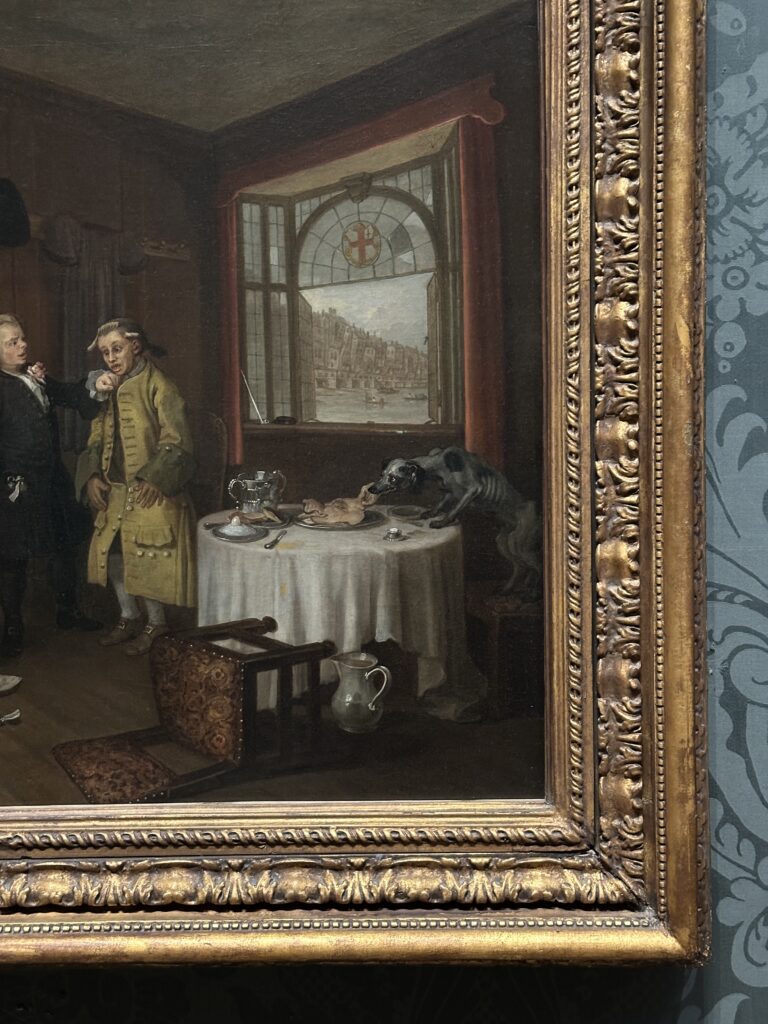
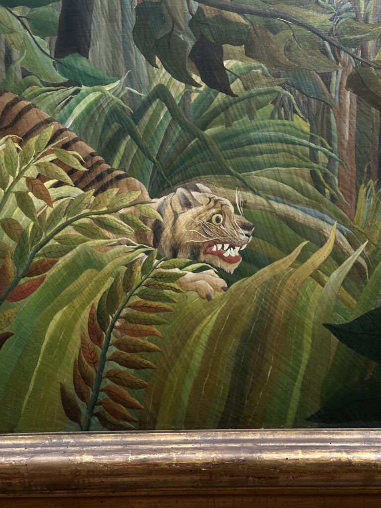
Walking through the gallerie, I became increasingly aware of how strongly classical works rely on compositional clarity. Light, shadow, colour, and spatial arrangement are never accidental. They guide the viewer’s eye with precision. Techniques such as chiaroscuro (https://www.tate.org.uk/art/art-terms/c/chiaroscuro) demonstrate how contrast can create depth, focus, and emotional intensity. Even without reading the descriptions, you can feel how your gaze is directed.
It’s fascinating how timeless these compositions are. Despite working centuries apart from digital interfaces, the artists were already mastering attention guidance, hierarchy, and narrative sequencing. Large shapes lead to smaller details, brightness creates focus, gestures connect figures visually across the canvas, and so on. These are principles we still use in layout design, interface design, and branding systems today.
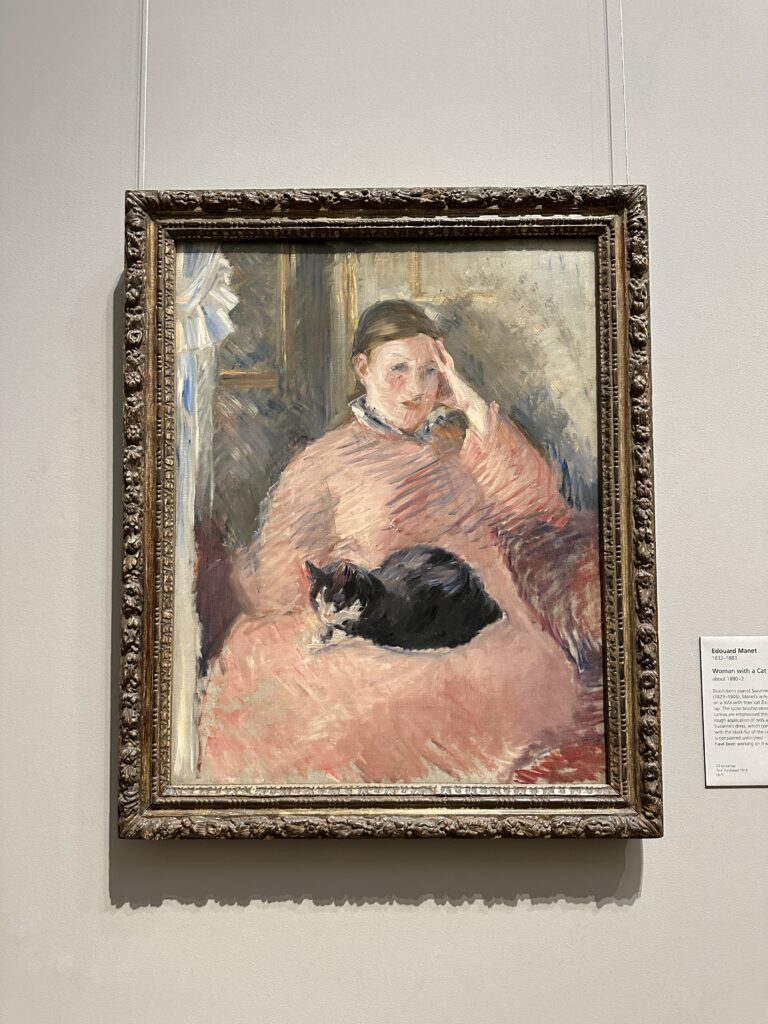
Also important, spending time in front of the paintings slowed me down. In digital design processes, I often move quickly between iterations, adjusting grids, typography, and images. The museum experience reminded me of the power of stillness and intentionality. Every element in these paintings has weight and meaning. Nothing feels random. I also reflected on colour psychology (almost like in the first semester of our master). Before modern design theory formalised these concepts, painters were already using colour strategically to evoke atmosphere, tension, or harmony. Observing how certain tones dominate a scene while others act as accents. And so I kind of came to the conclusion that sometimes “innovation” in design does not mean inventing something new, but understanding the foundations better. Looking at historical works can sharpen your sensitivity for composition, balance, and emotional impact.
This visit also connected me to my (broader) interest in how visual systems influence perception and behaviour. Reading further, I found some cool & short articles about design, written by designers (here about compositional theory and visual hierarchy): https://www.smashingmagazine.com/category/design-principles/ . Its also a good reminder, that while I am interested in a lot of different topics and design fields, all of these areas rely on visual structure and composition.
Disclaimer: This text was refined with the support of AI. The reflections and observations are based on my personal experience of visiting the museum.