Designing for complex UI with Vitaly Friedman
A while ago I worked on a CMS system for an online shop. It was a dense platform with many connections between features. Our Lead Designer created the main structure and I took care of the Design System and new components. The work was very analytical. No banners. No decorative visuals. Every color and spacing value followed strict rules. I handled hundreds of input fields, tables, filters and other parts that needed to stay consistent.
When I started thinking about my master’s thesis last year, one idea was a gamified platform for patients and doctors. Healthcare is known for high complexity and heavy cognitive load. Even though I had worked with CMS systems and dashboards, enterprise UX was still new to me. This is why I became interested in the work of Vitaly Friedman. He speaks often about complex interfaces. I watched his talk for the UX Healthcare community called Designing the complex UI. It helped me understand how to plan such projects and how to measure if a design works.
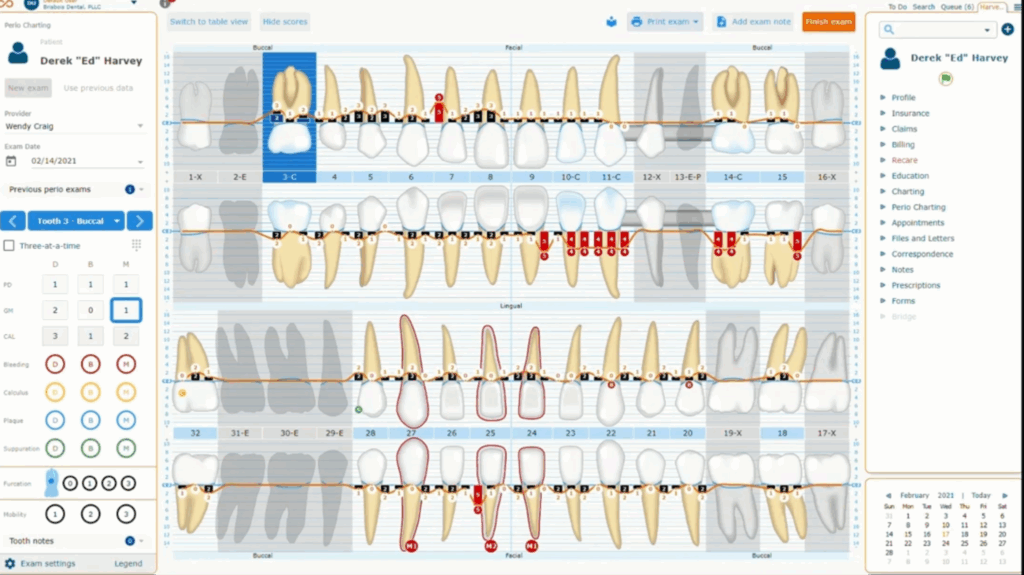
In the talk he explained common problems in healthcare and enterprise systems. They often hold too much data. They contain many layers. They have strict dependencies between features. These systems overwhelm users fast if design is not careful.
His first point was about deciding what matters most inside the product and for it he uses Task Performance Indicators. These metrics show how fast and how successfully users finish important tasks. They help designers move away from guessing.
His second point was about choosing the right user groups. He suggests three user segments. Then he suggests finding 30-40 to participants for testing, cause half of them will likely drop out so a larger pool matters.
Then he talked about creating tasks for each segment. Each user gets ten to twelve short tasks. Every task needs one clear correct answer. Descriptions should stay under thirty words so users understand them without stress.
And when the design is on the production, track these metrics regularly – every 6 to 12 months depending on the speed of the team. This shows if design choices are helping or making things worse. He also suggests bringing the same eighteen participants back when possible. This keeps the comparison fair.
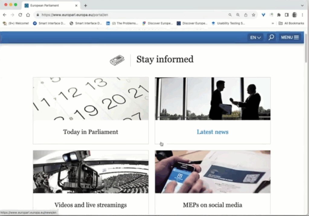
He showed the EU Parliament website as an example of a heavy and well structured system. It supports twenty languages and multiple search engines and several CMS platforms, still it feels simple for the user.
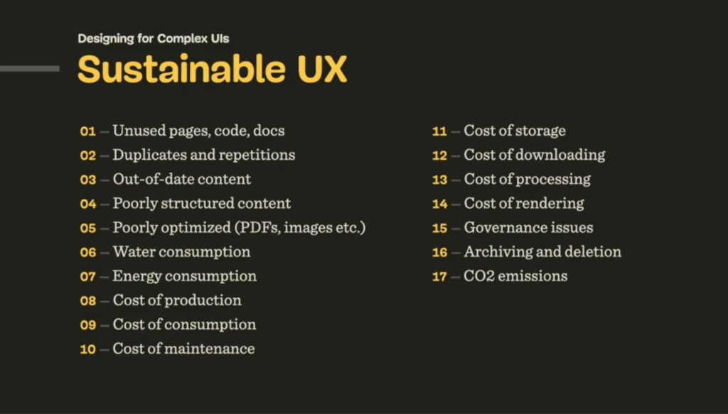
At the end he mentioned sustainable design. It is often viewed as a topic for developers and project managers. Designers still need to stay aware of it. Sustainable UX keeps systems efficient and reduces waste. It is easy to forget about it when we focus only on usability.
This talk helped me understand how large systems work and what to pay attention to when planning my thesis topic.
I used ChatGPT to check the spelling and grammar of this text