I’m thrilled to share that I’ve completed my final prototype! The journey wasn’t without its challenges, especially when connecting my laptop to the projector, but I managed to get everything up and running in the end.
For this prototype, I utilized Zig Sim, Max and Resolume Arena to create an interactive layer. The key feature is that the projection changes color based on the movement of the projector. When you move the projector, the image shifts from full color to black and white, emphasizing the theme of perspective.
My aim was to not only enhances the visual experience but also invites viewers to interact with the projection in a unique way.
I won’t lie, I wasn’t sure if I could implement what I had created in my head. However I’m even more excited to see how this concept evolves.
I finally got a mini beamer and tested it for the first time. Until now, I had been working mainly with candlelight and flashlights to project my cut-out patterns, but having a proper projector opened up an entirely new range of possibilities.
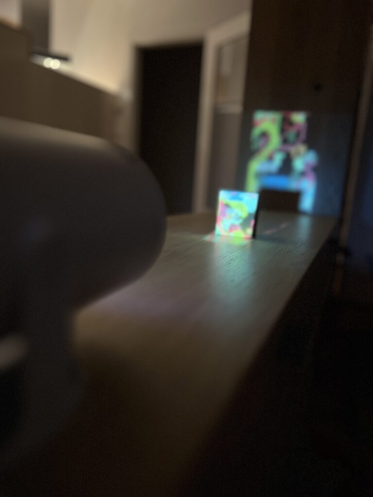
The test went surprisingly well. The beamer worked smoothly, and I was able to project both my digital Illustrator pattern and the physical stencils I had created. What struck me immediately was how powerful the combination of the two approaches can be. The crispness of the digital projection layered with the soft, imperfect shadows from the cut-out patterns created a unique visual depth. At times the two aligned to reinforce one another, while in other moments they clashed, resulting in distortions and unexpected visual tensions.
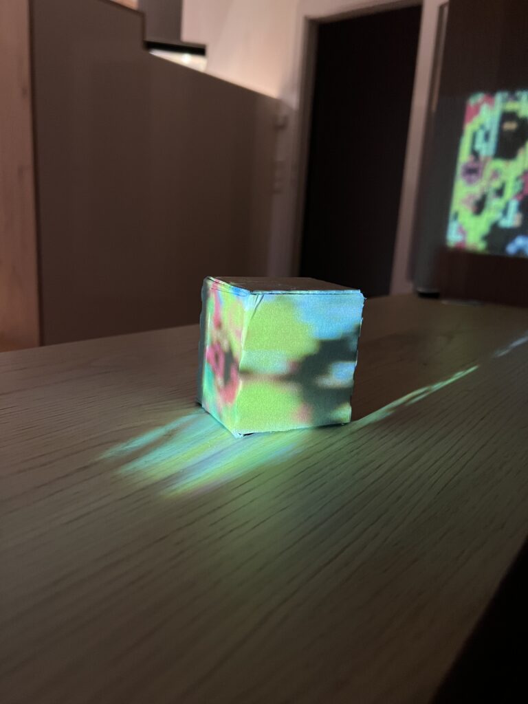
Seeing the religious symbols I had cropped, resized, and transformed behave in this hybrid space was fascinating. Some appeared monumental when enlarged across the cube’s surface, while others dissolved almost completely into abstraction. This play between clarity and fragmentation ties directly back to my concept of questioning authority and representation in the visual language of the Church.
Overall, this first experiment confirmed that working with both analog and digital projection is a promising direction. The interaction of light, shadow, and symbol not only adds complexity but also reinforces the idea that meaning is never fixed—it shifts depending on context, scale, and perspective.
My next step will be to bring in ZIG SIM to explore the interactive dimension. By integrating sensor-based input, I want to see how projection can dynamically respond to movement or touch. The goal is to eventually merge all three elements—the beamer, the stencil projections, and interactivity—into one cohesive experiment.
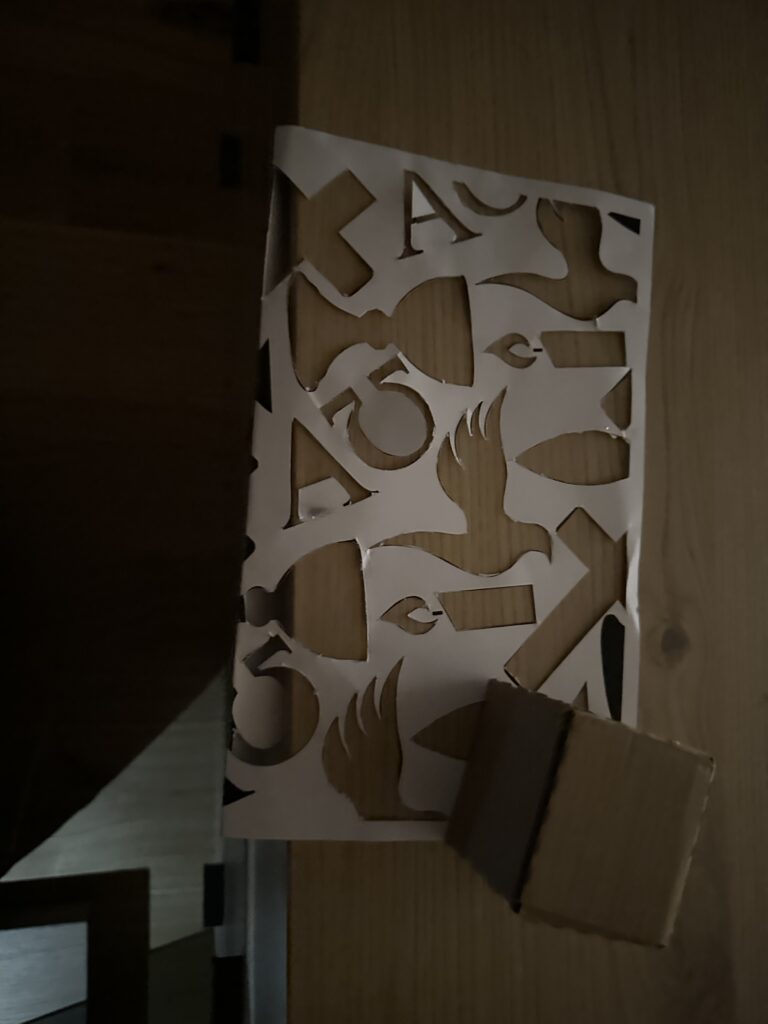
In my latest step, I started to look more closely at the symbols I associate with the Church and Christianity. I didn’t want to only rely on my personal impressions, so I also did some research on Christian iconography. Very quickly, I came across recurring motifs: the cross, a particular style of fish representation, the Alpha and Omega, the dove, and, of course, the candle. These are all powerful, recognizable elements that carry centuries of meaning and interpretation.
I decided to collect these symbols and transform them into a pattern in Illustrator. Instead of keeping them whole and perfectly visible, I chose to crop them in different ways. This meant that some parts of the pattern are cut off, others are enlarged, and some are reduced to fragments. My idea behind this was to create a visual language where not everything is always visible in its entirety. Sometimes the symbols appear distorted, sometimes they seem larger or smaller than expected. This connects to my concept of questioning clarity and authority in religious representation—how symbols are never neutral, but always shaped by context and perception.
While working with the pattern, I also experimented with its size. At first, the motifs were too large, which limited the effect I was aiming for. By reducing them, I was able to create a denser composition that worked better both visually and conceptually.
After finishing the pattern, I cut it out and began experimenting by projecting it onto my cardboard cube. I was curious to see how the cropped symbols would behave on a three-dimensional surface, and what kinds of distortions or new combinations would emerge as the light wrapped around the edges of the cube. Already, the results were interesting: the fragments became more abstract, sometimes unrecognizable, and at other times they gained a new intensity by being enlarged or stretched.
The next step will be to introduce another layer to this experiment. I decided to get a mini-beamer in order to project not just with candlelight or flashlight, but also digitally. This way, I can explore the combination of analog cut-out patterns with digital projections. For example, I could project the Illustrator pattern directly, or use an image, and layer that with the shadows created by the physical stencil. I am especially curious to see how the two techniques interact—whether they will reinforce each other or create unexpected contradictions.
It is amazing to me personally that this talk was almost entirely about introducing one of the most underrated coding language in data viz, D3.js, which is a lang that should be a staple in every team that wants to create bespoke charts and design beautiful yet functional dashboards from scratch and proudly enough my master’s thesis main topic is about a SaaS that has a dashboard that was created entirely by the unpopular D3.js. I was involved in designing all the components needed for the dashboard which is called “Steering” and also in the appropriate research to find out how to develop those components on a web app level which is was done later by a fellow full stack developer.
One of the main reflections that I took from this talk is the fact that search UX patterns are often overlooked and misused, even in very important websites like governmental websites or e-commerce web shops you will struggle to find what you’re looking for and the speaker emphasized something that is really important in fixing this issue which is that searching, filtering and sorting should be treated as one UX pattern both on a design and development level.
Also the notion of selective scanning which is a mental behavior that users use intentially and unintentially to scan interfaces for information relevant to them which highlights the importance of using visual hierarchy along with real usability testing to determine the right UI patterns.
Some of my family members are working at St. Stephen’s Cathedral in Vienna, and recently I had a conversation with my father about my thesis idea. We started imagining what could be possible if one were to use projection mapping inside such a monumental building. Almost immediately, he pointed out the practical challenges: projecting onto the walls would be extremely difficult because they are uneven, full of textures, and far from flat. The ceilings, on the other hand, are breathtakingly high — which makes them impressive but almost impossible to reach with simple projection tools. Even though I found the idea of using the walls fascinating, I had to admit that he was right.
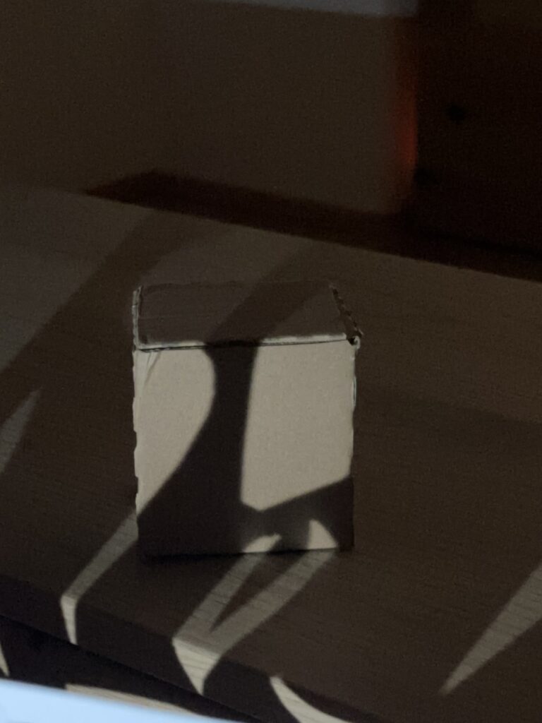
That realization pushed me toward a different approach. I remembered projects by MOYA (Museum of Young Art), where very simple objects were transformed through projection. Inspired by this, I decided to scale things down drastically and experiment with something that was not monumental at all, but rather small and manageable: a cardboard cube. I built one myself, placed it on my desk, and tried projecting a cross onto it.
The first test with a candle surprised me. The edges of the projection were soft, and because of the natural flickering of the flame, the cross gained a kind of living quality. It felt fragile yet atmospheric, as if the symbol was breathing. When I tried the same experiment with a flashlight, the result was quite different. The contours were sharp, the cross was perfectly visible, and I could even project across multiple surfaces of the cube without losing clarity. By moving both the light and the stencil, I was able to create more dynamics and test how the projection shifted across the cube’s surfaces. This gave me a better sense of how light interacts with 3D forms, and how movement can add emotional depth to even the simplest projection. Both versions had their own charm, and I found it interesting how much the choice of light source influences the meaning and mood.
Feeling encouraged, I got a little overconfident. I thought: if it works this well, why not take it a step further and project a video with colors and movement onto the cube? So I tried it with my phone. What can I say… it was late in the evening, and I hadn’t really thought it through. Of course, the phone does not project in a focused, directional way but emits light in all directions. The result was disappointing: in the video you can vaguely see the cross, but only if you already know what to look for.
Still, even this “failed” attempt was an important step. It showed me that not every tool is suitable for creating clear and meaningful projections, and that precision matters a lot when working with light. The candle experiment reminded me of atmosphere and symbolism, while the flashlight proved how technical clarity can support the message. The phone experiment, on the other hand, reminded me that enthusiasm sometimes needs to be balanced with patience and planning.
For my next step, I need to think about what kind of projector or light source could give me more control, and how I can combine simplicity with clarity. Even though I started small, these first tests gave me valuable insights into the relationship between light, object, and symbol — the core elements of projection mapping.