After my first wild prototype about a 1,000‑floor elevator, I realized I really want to stick with mobility. EV charging stations are such a timely, real‑world challenge plus, I’ve experienced the pain myself! My girlfriend’s dad owns an EV, and I’ve helped him charge it only to run into confusing screens and awkward cables. Others I chatted with have plenty of frustrating stories, too. So I decided: let’s start by sketching a super‑simple, button‑based interface and see how two real users feel about it. (User Testing Informationen available in the next Post)
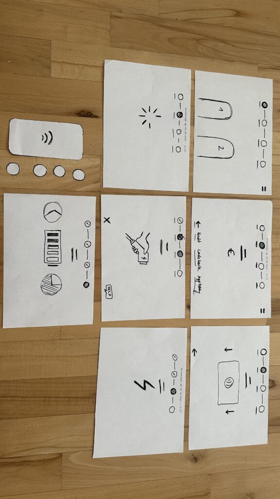
Four Clear Steps
On paper, I drew these low‑fidelity screens, focusing on clarity over bells and whistles:
- Choose Your Charger
- A simple map shows two plugs at a station.
- Green plug: available. Red plug: occupied.
- A progress bar at the top displays “Step 1 of 4”, so you always know where you are.
- Why? Users often fumble for which port is free. Clear colors and a step indicator keep anxiety low.
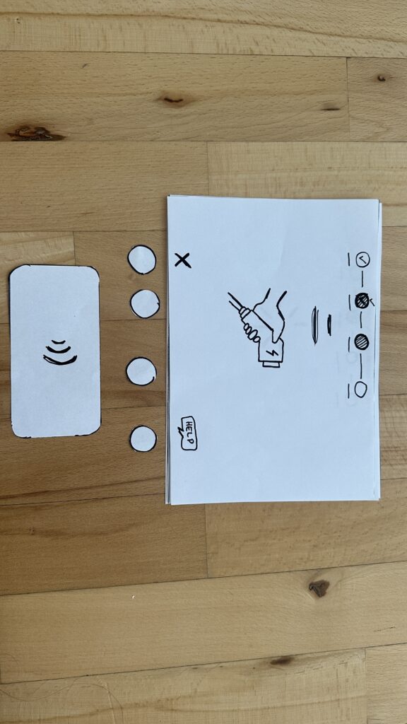
- Verify Payment
- Three big buttons let you pick Credit Card, RFID Charge‑Card, or App‑QR Code.
- A Back button (which lights red if you tap it) lets you switch methods at any time.
- Once you choose, a screen prompts you to hold your card or show the QR code.
- Why? Real stations offer multiple payment options. Lumping them into three buttons matches user expectations and avoids tiny menu lists.
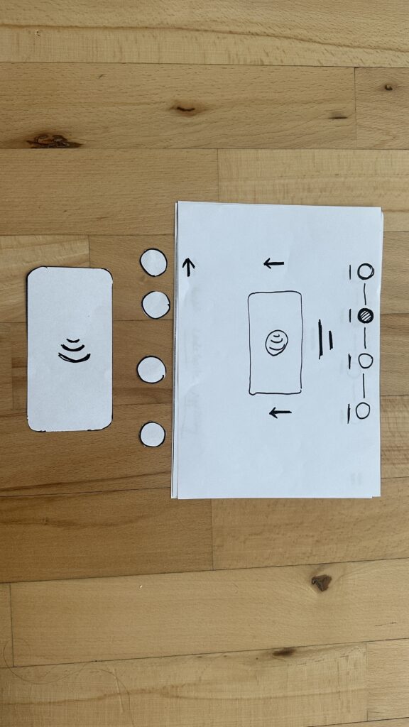
- Plug In Cable
- An animated cable slides out of the station.
- A simple diagram shows “Cable → Car Port.”
- If it clicks in correctly, the station glows green. If it fails, it glows red. A gentle blue pulse means “charging.”
- Why? Physical actions need instant feedback. Color and motion reassure the user that they plugged in correctly.
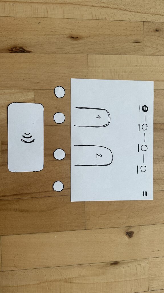
4. Charging Overview - Time Remaining: Counts down so you know when you’re done.
- Battery Icon + Bar: State‑of‑charge advances in real time.
- Power Delivered (kW): Shows exactly how fast you’re charging.
- Big buttons: “End Session,” “Help,” “Info,” and “Language.”
- Why? These are the four most‑asked questions: How long? How full? How fast? And what if I need help or another language?


Design Choices & Future Accessibility
- Physical Buttons vs. Full Touchscreen: Early users can look, press, and go (no searching menus)
- Progress Bar: Keeps people calm by showing exactly where they are in the flow.
- Language Toggle: Always visible in case you need English, German, or any other option.
- Text‑to‑Speech Future: With a long press on a touchscreen button, an image‑to‑speech API could read the label aloud for visually impaired users.
I’ll soon interview blind or wheelchair‑using drivers to see what adaptations they need. In a world of self‑driving cars, everyone should be able to charge their own vehicle of course.
Next: Real‑World User Tests
As a next step, I’ll ask some volunteers to walk through these sketches:
- Where do they pause?
- Which buttons feel unclear?
- Do they spot the back arrow or language switch easily?
- How do they react to red/green/blue feedback?
I’ll refine the flow based on their comments, then build clickable wireframes or maybe a cardboard prototype with LEGO. Iteration will tell me what works best.
Early References & Inspiration
- Intuitive UI example: technagon.de/intuitive-user-interface-laden-kann-so-einfach-sein/
- EV station UX tips: altia.com/2023/08/16/enhancing-ev-charging-station-ux-and-why-it-matters/
- Payment variety today: ekoenergetyka.com/blog/how-do-ev-charging-stations-work/
- Kempower design guide: kempower.com/user-experience-ev-charger-design/
These resources helped me understand real pain points and best practices. I’ll keep updating this blog as I refine the design and test with real users because the journey from sketch to screen is just beginning.