Getting Lost in the Hospital: Why Wayfinding is UX Too.
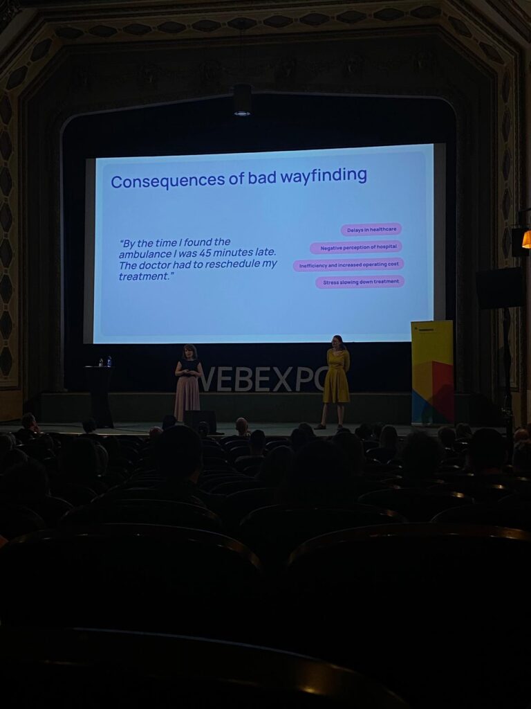
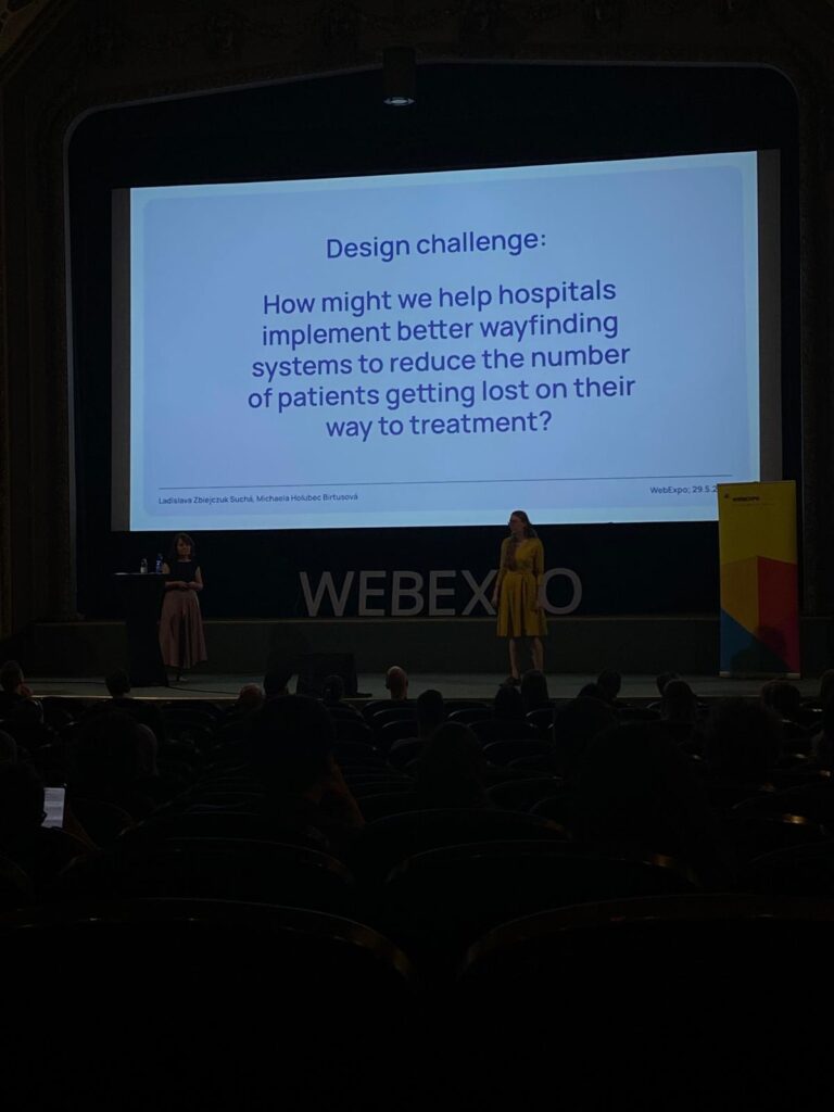
The second day of the WebExpo Conference 2025 left a particularly strong impression on me, especially the talk titled “Lost in the Hospital: How Not to Design Wayfinding for Better CX” presented by Ladislava Zbiejczuk Suchá & Michaela Holubec Birtusová.

Personal Experience Meets Professional Interest
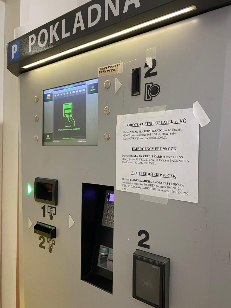
Just a few days before the conference, I was at Bulovka Hospital in Prague, trying to find the emergency department. Despite being a large and well-known hospital, the signage and navigation inside the building were extremely confusing. The experience was stressful, and I felt helpless, even though I’m someone who works with systems and interfaces regularly. That moment made me think: if I’m struggling this much, how difficult must it be for someone who’s older, under stress, or unfamiliar with the language?
So when this talk began and addressed the exact issue I had just experienced, it felt like validation. But it also reminded me of something important: UX design is not just for screens, it’s everywhere.

The photo I took at the Bulovka hospital – the “parking machine” which is used for paying the emergency fee.
Wayfinding as a UX Problem
The speakers framed wayfinding as part of the broader user experience (UX) landscape. A hospital is essentially a high-stakes user journey: people are often navigating it under stress, pain, or confusion. In this environment, clarity and guidance aren’t just “nice to have”, they’re critical.
They explained that many wayfinding systems fail because they’re designed from the perspective of the institution, not the user. Designers often rely on internal logic (like room numbers or departmental hierarchies) instead of thinking through the lens of a visitor who just needs to get to radiology, fast. This disconnect is a classic UX mistake.

Design Thinking in Real Life
This talk demonstrated how design thinking, empathize, define, ideate, prototype, test, can be applied to physical environments just as much as digital ones. From interviews with hospital patients to prototyping new signage and color-coding systems, the speakers illustrated a user-centered approach to solving a tangible, real-world problem. It reminded me of a core UX principle: your design is only as good as its usability in the context it will actually be used.

Final Thoughts
UX design doesn’t stop at the edge of a screen. The “Lost in the Hospital” talk was a powerful reminder that every user experience, whether it’s tapping a button or walking through a corridor, is shaped by intentional or unintentional design choices. As a future UX professional, I want to be someone who makes those choices with empathy, clarity, and accessibility in mind. Because when design fails, people suffer, but when it succeeds, people thrive.