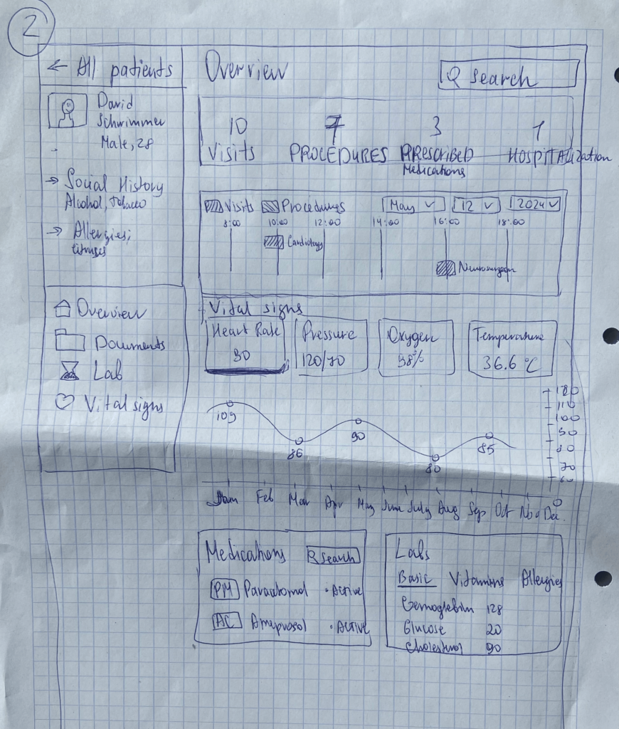
Since my Master’s thesis is connected to medicine, I’ve been exploring how to make traditionally “boring” content more engaging using gamification. In previous blog posts, I shared some early ideas, and now I’ve taken it a step further by sketching out what kind of information should be shown on the platform’s main page—for both patients and doctors.
It only took me about 10 minutes to create a rough sketch, but I focused on highlighting what I think are the most important data points: things like “Number of Procedures” “Number of Visits” “Medications Prescribed” “Appointment Calendar” and vital stats like “Heart Rate” “Blood Pressure” “Oxygen Levels” “Temperature” and etc.
User Feedback:
- All participants understood the layout quickly and found the dashboard structure clear.
- Everyone liked the overall concept and said they’d actually use it.
- Some asked if the platform was just for doctors or also for patients—and if it would be available on Apple Watches in addition to phones and desktops.
- One person even said the idea was TED Talk-worthy and suggested I reach out to medical startups to pitch it.
Final Thoughts & What’s Next:
This session was both fun and super productive. It really helped confirm that the idea has potential—especially from the patient’s perspective. The exciting news is, I already found a startup here in Graz that’s working on something very similar, and I’d love to explore the possibility of collaborating with them. Of course, that kind of process takes time.
In the meantime, I’ve decided to focus on another area of the project: making it easier for non-German speakers to book doctor appointments. In my next blog post, I’ll share more about this idea and how I plan to move forward with it.