Early Prototype: Designing the Home Screen for an Information Scrubbing and Management Tool
From Idea to Prototype
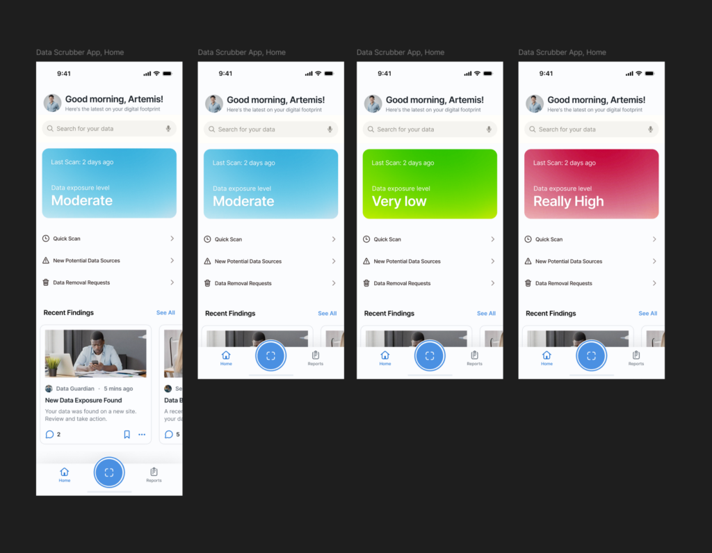
For my latest project work, I started sketching out the home screen/dashboard for an information scrubbing tool, a mobile app designed to help users find and remove their personal data from the internet with ease. For some context, I’m planning on working on a thesis about effectively managing our digital footprints on the internet, and as part of that, I started sketching out the home screen/dashboard for a privacy scrubbing tool—a possible mobile app designed to help users find and remove their personal data from the internet easily. Since privacy management can often feel overwhelming, my goal was to make the interface simple, clean, and user-friendly right from the start.
I created a prototype, exploring the ways users could interact with the tool. Since this is meant to be a mobile app, I focused on layouts that would feel intuitive on a phone screen. The main elements I worked on included:
- A clear status overview (showing how much data has been found and removed).
- A quick action button for immediate scanning.
- Navigation tabs for different privacy tools and settings.
I focused on the layout, content structure, and information hierarchy to see what felt the most natural.
What I Learned from Testing
After creating the prototype, I brought it to class for testing. The feedback was reassuring—most people understood the purpose of the app right away, with very little explanation. That was a good sign that the design was intuitive. There was also curiosity about what additional features could be included in future iterations, which gave me ideas for expanding its functionality.
Speed Dating and Unexpected Insights
During class, we did a fun rapid feedback session where we shared our prototypes in short, fast-paced rounds. Each person I spoke with provided different perspectives, and I got some valuable insights:
- People grasped the concept quickly, meaning the layout and flow were already on the right track.
- They were excited about seeing more features, suggesting that users would appreciate a more in-depth look at what the tool could do beyond just scrubbing data.
- If my project had a “dating personality,” it would be ‘careful’—which makes sense, given that the app is all about privacy and cautious data management!
- We were asked to give the most unexpected feedback on our prototypes and one date gave feedback that the “scan now” button felt like a button to launch the camera for a QR code scanner (this means the icon definitely needs some work🤣🤣)
This session helped me validate the direction I was going while also giving me fresh ideas to improve the user experience. Next, I’ll refine the prototype based on this feedback and start thinking about more detailed interactions.