Few fonts have sparked as much debate as Comic Sans. Once a popular and approachable typeface, it eventually became the subject of ridicule and memes. However, in the context of designing child-friendly reading materials, Comic Sans might just find its redemption. Let’s explore the history of this infamous font and why it could have a renewed purpose in literacy education.
The Rise of Comic Sans
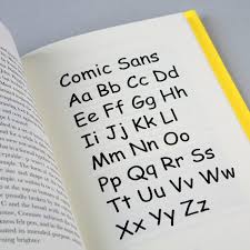
Comic Sans was created in 1994 by Vincent Connare, a typographer at Microsoft. Inspired by comic book lettering, Connare designed the font to be friendly, informal, and approachable. It was originally intended for Microsoft’s “Bob” software but gained traction after being included in Windows 95 and subsequent Microsoft Office programs.
During the late 1990s and early 2000s, Comic Sans became a favorite for a wide range of informal uses—from birthday invitations to school newsletters. Its playful and casual style resonated with many, offering a stark contrast to the rigid formality of Times New Roman or Arial.
The Fall of Comic Sans
As its popularity grew, so did its misuse. Comic Sans began appearing in inappropriate contexts—professional documents, gravestones, and even corporate branding. Critics argued that its whimsical appearance made it unsuitable for serious purposes.
This overuse and perceived lack of sophistication led to widespread backlash. By the mid-2000s, Comic Sans became a cultural punchline, with designers and typographers labeling it as the epitome of bad taste. Websites, memes, and even a movement called “Ban Comic Sans” emerged, cementing its reputation as the most hated font in the world.
The Redemption of Comic Sans
Despite its tarnished reputation, Comic Sans has unique qualities that make it surprisingly effective in specific contexts, particularly for early readers:
Simplified Letterforms
Comic Sans may never shake off its controversial reputation entirely, but in the right context, it has the potential to shine once more. For children learning to read, its clear, accessible, and friendly design can make a meaningful difference. Perhaps it’s time to give Comic Sans the redemption arc it deserves, recognizing its unique qualities as an ally in literacy education.
Dyslexia-Friendly Features
Studies have shown that Comic Sans can be helpful for individuals with dyslexia. Its irregular letter shapes prevent characters from being mirrored or flipped in the mind of the reader. While specialized fonts like OpenDyslexic exist, Comic Sans remains a readily available option for creating accessible materials.
Approachable and Playful Design
For young children, the informal and playful appearance of Comic Sans can make reading feel less intimidating. Its design aligns well with the needs of early literacy materials, such as storybooks, flashcards, and worksheets.
Comic Sans may never shake off its controversial reputation entirely, but in the right context, it has the potential to shine once more. For children learning to read, its clear, accessible, and friendly design can make a meaningful difference. Perhaps it’s time to give Comic Sans the redemption arc it deserves, recognizing its unique qualities as an ally in literacy education.