
Thinking of my project and the first meeting, the main and big problem is how data must be visualized to help people understand it. It seems so simple but most of the data gets lost in the dark because people don’t know what to do with them. Data visualization is another form of visual art that grabs our interest and keeps our eyes on the message. It’s storytelling with a purpose.
Data visualization is the graphical representation of information and data. It uses visual elements like charts, graphs, and maps to provide an accessible way to see and understand trends, outliers, and patterns in data. By presenting data visually, it transforms complex datasets into a more digestible and meaningful format, allowing stakeholders to grasp key insights quickly.
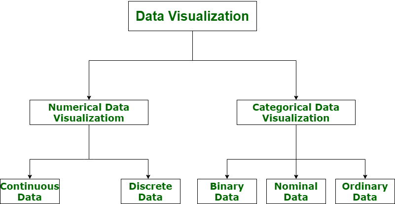
It’s important to visualize data accurately when you’re doing market research. This is because you can visualize both numerical and categorical data, which makes the insights more impactful and reduces the risk of analysis paralysis.
What is the Goal of Data Visualization?
The primary goal of data visualization is to communicate data clearly and efficiently. It aims to make complex data more understandable, uncover hidden insights, and facilitate better decision-making. Visualization bridges the gap between raw data and actionable intelligence, helping users to process information faster and make data-driven decisions.
Why is Data Visualization Important?
In the world of Big Data, it’s really important to be able to see all that data in a way that makes sense in order of being able to make data-driven decisions. The primary goal of data visualization is to communicate data clearly and efficiently. It provides an accessible way to see and understand trends, outliers, and patterns in data and a way for experts in a specific field to present data to non-technical audiences without confusion.
In today’s data-rich environment, data visualization is crucial for several reasons. It enhances understanding by making complex datasets more accessible through visual representation. This improved clarity supports better decision-making, allowing for quicker and more informed choices by highlighting key data points and trends. Additionally, data visualization aids in communication, effectively conveying information to diverse audiences, including non-technical stakeholders. Lastly, it helps identify patterns and trends that might not be immediately apparent in raw data, enabling organizations to uncover valuable insights.
What Types of Data Visualization Are There?
There are various types of data visualizations, each suited to different kinds of data and analysis goals:
- Chart: Displays information in a graphical form with data along two axes. Types include graphs, diagrams, and maps.
- Table: Presents figures in rows and columns, useful for detailed data comparison.
- Graph: A diagram showing relationships between variables, often along two axes.
- Geospatial: Uses maps to show data relationships with specific locations, employing shapes and colors.
- Infographic: Combines visuals and text to represent data, often with charts or diagrams.
- Dashboards: A collection of visualizations for comprehensive data analysis and presentation in one place.
- Area Map: Shows values over geographical locations, such as choropleths and isopleths.
- Bar Chart: Uses bars to represent numerical values for easy comparison.
Choosing the Right Data Visualization

Choosing the right data visualization depends on the type of data and the story you want to tell. Factors to consider include the nature of your data (quantitative vs. qualitative), the relationship between data points, and the key message or insight you want to convey. Charts, graphs, and maps serve different purposes and cater to diverse analytical needs, from showing comparisons and trends to highlighting distributions and relationships.
So the bigger purpose of Data visualization is not just about making data look good; it’s about making data more accessible and actionable. By effectively employing various visualization techniques, professionals can transform how data is interpreted and utilized across industries.
There are a lot of tools to that can help visualization Data like: Google Charts, Tableau, Grafana, Chartist, FusionCharts, Datawrapper, Infogram, and ChartBlocks. In the course of my work with the Risklim team, I will also have to deal with such tools to see how we can work better with the available data.
Reference
https://www.geeksforgeeks.org/data-visualization-and-its-importance 12.01.25, 21:24
https://www.atlassian.com/data/charts/how-to-choose-data-visualization 12.01.25, 21:57