The choice of font plays a crucial role in how effectively and comfortably text can be read, particularly by beginners. For children learning to read, certain typographic features and design principles are essential to support their early literacy journey.
Typographic Characteristics
Serifs vs. Sans-Serifs
Fonts without serifs are often preferred for early readers because they have simpler shapes that are easier to distinguish. Serif fonts, with their small decorative strokes, can sometimes confuse young learners. Clear distinctions between letters such as b and d or p and q help minimize confusion. Fonts designed for early readers should avoid ambiguous letter shapes. For example, the lowercase l should not look like the numeral 1.
x-Height
The x-height, or the height of lowercase letters relative to uppercase letters, significantly affects readability. Fonts with a larger x-height are generally easier for early readers to process, as they provide clear differentiation between similar-looking characters (e.g., a and o).
Letter Spacing
Adequate spacing between letters (kerning) ensures that characters do not blur together. This is particularly important for children who are still developing their visual discrimination skills.
Consistent Stroke Width
Fonts with consistent stroke widths are easier for children to decode compared to fonts with dramatic variations.
Fonts that are visually appealing and tailored to children’s preferences, such as playful or colorful designs, can make reading feel like a fun and engaging activity. Reader-friendly fonts help reduce errors and misunderstandings, boosting children’s confidence and encouraging them to keep practicing.
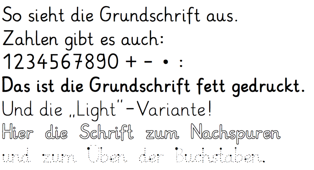
Grundschrift is designed to mimic handwriting, providing children with a natural transition between printed text and their own writing. It features clear, simple letterforms with sufficient spacing and a focus on uniformity.