In a world of fleeting attention spans, visual design is not just a supporting player – it’s the lead actor in guiding user focus. Whether it’s a landing page, an app interface or an online form, the way information is visually presented can make or break user engagement. Let’s explore how visual hierarchy helps capture attention and simplify user interaction.
Why Visual Hierarchy Matters
Visual hierarchy is the arrangement of elements in a way that suggests importance and guides the viewer’s eye. Steve Krug, in his book “Don’t Make Me Think“, emphasizes that users scan web pages, they don’t read them. This means designers must make the most crucial elements stand out immediately, leading users seamlessly through a page or app.
For short attention spans, clarity is key. A cluttered or confusing interface demands too much cognitive load, causing users to disengage. By establishing a clear hierarchy, you can reduce mental effort and keep users focused on what matters.
Techniques for Effective Visual Design
Here are actionable techniques to create visual designs that capture and hold attention:
- Typography: Use font sizes and weights to differentiate headings, subheadings, and body text. A bold headline grabs attention, while smaller, lighter text provides supporting details.
- Color Contrast: Colors are powerful cues. High contrast between text and background improves readability, while accent colors draw attention to CTAs.
- Spacing: Adequate whitespace (or negative space) helps declutter layouts, giving users visual breathing room.
- Iconography and Imagery: Icons and images act as visual shortcuts, instantly conveying meaning. However, ensure they align with the context and don’t overwhelm the design.
- Consistent Alignment: Align elements cleanly to establish order and predictability, making navigation intuitive.

Examples: Good vs. Bad Visual Hierarchy
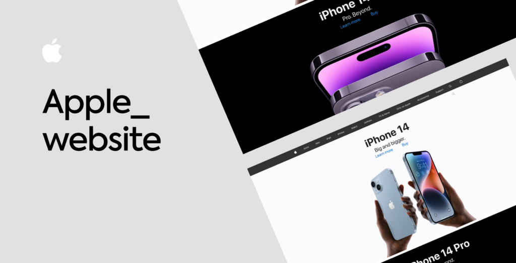
Good Example: Apple’s website showcases excellent visual hierarchy, using bold headlines, simple imagery, and plenty of whitespace to guide attention to its products.
Bad Example: Overloaded landing pages with flashing banners, competing colors, and tiny fonts (think early 2000s design) overwhelm users and make key information hard to find.
A Human-Centered Approach
Ultimately, good visual design isn’t just about aesthetics – it’s about empathy. Understanding how users perceive and process information ensures that your designs meet their needs while respecting their attention.
Literature:
“Don’t Make Me Think” by Steve Krug