Scarcity, Psychology, and Web Design: The Art of Creating Urgency (Without Overdoing It)

Scarcity, in its simplest form, is the condition of being in limited supply. Think of the “last one in stock” sign at your favorite store. You see it, and a little voice inside your head says, “I better grab this NOW, or I’ll regret it for the rest of my life.” But why? It’s a basic human reaction: we crave what we can’t easily have. Economists call this the scarcity principle, and it’s the reason why people will sometimes pay absurd amounts of money for things that are limited or exclusive. The rarer something is, the more we think it’s valuable. Scarcity works-not just for products, but for information, too. We can read about trends in the computer industry online by searching for articles on Google. Or we can subscribe to a pricey series of reports that cost a lot of money and only a relatively few people get. Which source of information will we think is more accurate? More valuable? Which source will we use when it is time to take action? If we think that information is hard to come by, then we see that information as being more valuable.

Now, how does scarcity sneak its way into the digital world of web design? Well, let’s think about your website: You’re trying to catch the attention of your visitors and convert them into loyal customers or users. What better way to do this than to make some information hard to come by? We’re not talking about hiding the entire website behind a paywall (unless you’re feeling especially bold)—we’re talking about strategically creating a sense of urgency and exclusivity. This is where web design meets the brain, and it’s like using magic to trick your visitors into making decisions you want them to make. Using the principles of neuro design, you can tap into people’s subconscious to guide them toward certain actions (like clicking that sweet “Buy Now” button). The sense of neurodesign is not to trick the mind but to use it’s structure to your advantage, if you know it ofcourse. Three principles you can elaborate on when it comes to designing your website could be:

FOMO (Fear of Missing Out): Humans are wired to avoid loss. Scarcity creates a sense of urgency, and urgency triggers action. For example, a countdown timer showing “Only 3 hours left!” on a limited-time offer is like a red flag that says, “Do it now or regret it later.”

Social Proof: When visitors see that a product is scarce, they assume it must be in high demand. Your website could say something like, “500 people have viewed this offer in the last 24 hours.” This combines scarcity with social proof, making the offer even more irresistible.

Contrast: Let’s say you have two subscription plans. One is priced at $10, and the other at $100. The $100 plan offers access to an exclusive service, and it’s the rare one—scarcity kicks in. Suddenly, the $10 plan seems… meh, not as special. The high-priced, scarce option feels like a premium choice, which is exactly what you want your users to think. the task at hand, navigating smoothly through content without being interrupted by unnecessary delays. By optimizing page speed, designers can help users maintain their flow and reduce the cognitive strain caused by waiting.


WHICH COOKIES TASTE BEST?

Worchel, Lee and Adewole (1975) asked people to rate chocolate chip cookies. They put 10 cookies in one jar and two of the same cookies in another jar. The cookies from the two-cookie jar received higher ratings-even though the cookies were exactly the same! Not only that, but if there were a lot of cookies in the jar, and then a short time later most of the cookies were gone, the cookies that were left received an even higher rating than cookies that were in a jar where the number of cookies didn’t change Social validation and scarcity work together (Something we already clarified as: The Power of Social Validation). If we think lot of other people liked the cookies and that there aren’t many cookies left, it creates an even stronger pull to action. the task at hand, navigating smoothly through content without being interrupted by unnecessary delays. By optimizing page speed, designers can help users maintain their flow and reduce the cognitive strain caused by waiting.


ONLY A SELECT FEW KNOW THIS

Iyengar and Lepper (2000) tested the theory that if we’re provided with 100 many choices, we don’t choose at all. Experimenters set up booths at a busy upscale grocery store in California, and posed as store employees. They alternated the product selections on the table. Half of the time, there were six choices of fruit jam for shoppers to taste. Half of the time, there were 24 jars of jam to taste. Did it make a difference how many jars there were? Yes, it did. When there were 24 jars of jam on the table, 60 percent of shoppers passing the table stopped and tasted jam. When there were six jars of jam on the table, only 40 percent stopped to taste. So does that mean that more choices are a good thing? You would think that people would taste more varieties of jam when the table had 24 flavors. But they didn’t. People tasted one to two varieties, whether there were six or 24 choices available. And how did varying the selection influence purchases? Of the shoppers who stopped at the table with six jars, 30 percent actually purchased the brand of jam they had tried. Of those who stopped at the table with 24 jars, only three percent purchased jam.

So what do we learn from this? A bigger selection attracted a bigger crowd, but that crowd purchased fewer products than the group presented with fewer choices. the task at hand, navigating smoothly through content without being interrupted by unnecessary delays. By optimizing page speed, designers can help users maintain their flow and reduce the cognitive strain caused by waiting.


HOW TO RUIN YOUR RELATIONSHIP

Wilson and Kraft (1993) asked couples to analyze their relationships and write lists of why they liked the person they were involved with. Wilson then compared the longevity of the relationship in these couples to the longevity of relationships in a control group that was not asked to logically analyze their relationship. Analyzing the relationships resulted in the relationship ending sooner than the relationships where couples were not asked for an analysis.

Analyzing doesn’t just ruin relationships, but it also seems to ruin your satisfaction with the purchases you make. Wilson (1993) studied individuals buying art posters:

• Group A analyzed why they liked and didn’t like five art posters.

• Group A analyzed why they liked and didn’t like

• Group B did not do any analysis.

Each individual in each group then picked one poster to take home. Two weeks later, researchers contacted them to see how happy they were with their choices. Those in Group B, who didn’t analyze the art they took home, were happier with their choices than those in Group A (who had analyzed their art) Dijksterhuis and van Olden (2005) performed the study again, but they added a few twists. Participants were told the study focused on evaluating art. Everyone in the study was brought in to look at art posters, one at a time, for 15 seconds on a computer screen. Then, after looking at the posters, they were assigned to one of three conditions where they performed more tasks:

• In the Conscious Thought condition, participants looked at each poster one by one on the computer screen and were asked to analyze carefully whether they liked each poster and why or why not. They were given paper and pen to record their analyses. Then all the posters appeared on one screen, and they were asked to pick the one they liked the best.

• In the Unconscious Thought condition, participants engaged in a different task-they worked on anagrams-for the same amount of time. Then they were shown the posters again, all placed on a single screen, and asked which one they liked the best.

• In the Immediate Decision condition, participants were shown a single screen showing all the art posters and asked which poster they liked the most.

At the end of the experiment, the participants could choose a poster to take home. The researchers hypothesized that the Unconscious Thought participants (who worked on anagrams) had made their decisions unconsciously and would be most satisfied with their choices. They were correct. It seems that if we make our choice unconsciously, without conscious processing, then we stick with it over time. If we spend more time and logically analyze why we’re choosing what we’re choosing, we’re less satisfied over time with our choices.

When you strategically use the scarcity principle in webdesign, you’re not only adding value to your content or products, but you’re also tapping into deep-rooted psychological triggers that make visitors want to act fast. Now, before you run off to redesign your entire website with scarcity elements, don’t forget that the trick is to strike a balance. You don’t want to overdo it and turn your site into an endless series of fake urgency signs (looking at you, online stores that have one last item left… for the last three months). Keep it real, keep it genuine, and most importantly, make your visitors feel like they’re stepping into an exclusive club they don’t want to miss. the task at hand, navigating smoothly through content without being interrupted by unnecessary delays. By optimizing page speed, designers can help users maintain their flow and reduce the cognitive strain caused by waiting.


Books and Sources for Your Scarcity Journey:

“Don’t Make Me Think” by Steve Krug – A classic in webdesign, this book explains how to keep your website user-friendly while still using scarcity to drive conversions.

“Influence: The Psychology of Persuasion” by Robert B. Cialdini – This is the bible for understanding psychological principles like scarcity and how they affect decision-making.

“Hooked: How to Build Habit-Forming Products” by Nir Eyal – Learn how scarcity can be used to make your product irresistible. the task at hand, navigating smoothly through content without being interrupted by unnecessary delays. By optimizing page speed, designers can help users maintain their flow and reduce the cognitive strain caused by waiting.


Research Reference:

Cialdini, R. B. (2006). Influence: The psychology of persuasion. Harper Business.

Eyal, N. (2014). Hooked: How to build habit-forming products. Portfolio.

Krug, S. (2000). Don’t make me think: A common sense approach to web usability. New Riders.

Weinschenk, S. (2009). Neuro web design: What makes them click? New Riders.

Iyengar, S. S., & Lepper, M. R. (2000). When choice is demotivating: Can one desire too much of a good thing? Psychological Science, 11(6), 143-146. https://doi.org/10.1111/1467-9280.00208

Wilson, T. D., & Kraft, D. T. (1993). The influence of analysis on the satisfaction of choice. Journal of Personality and Social Psychology, 64(6), 1029-1044. https://doi.org/10.1037/0022-3514.64.6.1029

Dijksterhuis, A., & van Olden, L. (2005). The unconscious thought effect in consumer choice. Psychological Science, 16(3), 282-288. https://doi.org/10.1111/j.0956-7976.2005.01530.x

Worchel, S., Lee, J., & Adewole, B. (1975). The effect of scarcity on the valuation of an item. Journal of Personality and Social Psychology, 31(6), 1038-1043. https://doi.org/10.1037/h0077450
Exploration of Neuropsychology in Webdesign #2

4. Visual Hierarchy: Guiding the User’s Gaze

Another neuropsychological concept critical to web design is visual hierarchy, which refers to the arrangement of elements in order of importance. Humans are naturally inclined to scan a page in a specific pattern, seeking the most relevant information first. This hierarchy is influenced by several factors such as size, color, contrast, alignment, and position. Understanding how these elements guide user behavior allows designers to create pages that not only look good but also lead users seamlessly toward their intended goals.

Why Visual Hierarchy Works: Gibson’s Ecological Approach to Visual Perception

The foundation of visual hierarchy can be traced back to principles of visual perception. One of the key figures in this field is James J. Gibson, whose Ecological Approach to Visual Perception (1979) provided groundbreaking insights into how we perceive our environment. Gibson emphasized the idea that perception is directly shaped by the stimuli present in our surroundings and that humans seek out meaningful information (or affordances) in a dynamic way. Our brains instinctively focus on elements that stand out from their environment, prioritizing objects that seem relevant or important based on context.

In the context of web design, this principle is often employed by manipulating visual weight—essentially making certain elements more prominent by altering their size, using contrasting colors, or positioning them strategically within the page layout. When done effectively, visual weight encourages users to notice and interact with the most important elements first, whether it’s a call-to-action button, a key piece of information, or a navigation link.

Understanding the F-pattern: Jakob Nielsen’s Eye-Tracking Research

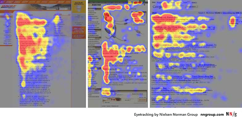
Jakob Nielsen and the Nielsen Norman Group are pioneers in studying how users interact with web pages, particularly through eye-tracking research. One of their most influential findings is the “F-pattern” of reading, which demonstrates how users typically scan web pages. In Western cultures, where reading occurs left-to-right, users often start by scanning horizontally across the top of a page, move down the left-hand side, and occasionally glance horizontally across shorter sections, forming a rough “F” shape.

Here’s how the F-pattern breaks down in practical terms:

  1. Top Horizontal Scan: Users begin by scanning the top part of the page (usually the header or navigation bar) to find high-level information or navigation options. This is why critical navigation links or branding elements should be placed here.
  2. Vertical Scan: As users move down the page, their eyes track along the left side. Designers should place important headings, subheadings, and key links along this vertical path to ensure visibility.
  3. Secondary Horizontal Scans: Occasionally, users will glance across horizontally to investigate shorter lines of content, like summaries or sidebars. Designers can take advantage of this behavior by placing key information in sidebars or using short, punchy blocks of text.

The takeaway for web designers is simple: if your page doesn’t align with the F-pattern, critical content might be missed. Headlines, CTAs (Calls to Action), and important visuals should be placed where users’ eyes naturally gravitate, ensuring that key information is seen quickly and easily. However, not all users follow the F-pattern rigidly—those seeking specific information may scan differently—so visual hierarchy should always prioritize clarity and simplicity.

The Gestalt Principles in Web Design: Grouping and Guiding Attention

Visual hierarchy doesn’t exist in isolation—it is also deeply connected to Gestalt principles, a set of psychological laws explaining how humans naturally perceive patterns and organize visual elements. Let’s delve into two critical Gestalt laws that every designer should have in their toolbox:

  1. The Law of Proximity: This law states that objects that are close to each other tend to be perceived as a group. In web design, proximity is often used to cluster related information, helping users quickly grasp how pieces of content are connected. For example, grouping related navigation links or placing text close to associated images helps users intuitively understand that these elements are connected.
    • Practical Application: Think of a product listing page. By grouping a product image with its description, price, and “Add to Cart” button, users don’t have to mentally connect these pieces of information themselves. Everything is presented as a logical, cohesive unit.
  2. The Law of Continuation: This principle suggests that the human eye prefers to follow a continuous path, particularly along lines or curves, rather than seeing disconnected elements. In web design, this can be used to lead the user’s eye from one section to another, guiding them through a smooth flow of information. For example, designers might use a diagonal line of images or a sequence of steps arranged in a curve to subtly direct attention to the next important point.
    • Practical Application: A common example is a step-by-step checkout process, where each stage (Cart, Shipping Info, Payment) is visually linked, making it clear where users are in the process and where they need to go next. This reduces confusion and cognitive load, increasing the likelihood of completing the transaction.

By leveraging these Gestalt principles, web designers can create clearer visual relationships and ensure that users can process information more efficiently. After all, one of the key goals in web design is to reduce cognitive friction—anything that makes a user stop and think “What am I supposed to do here?” should be avoided.

The Role of Contrast, Size, and Color in Visual Hierarchy

While proximity and continuation guide how elements are grouped, contrast, size, and color are essential tools for making elements stand out, thereby enhancing the visual hierarchy. Contrast can involve differences in brightness, color, shape, or texture, and it’s one of the most powerful ways to draw attention to an element.

Connecting Visual Hierarchy to Cognitive Load Theory

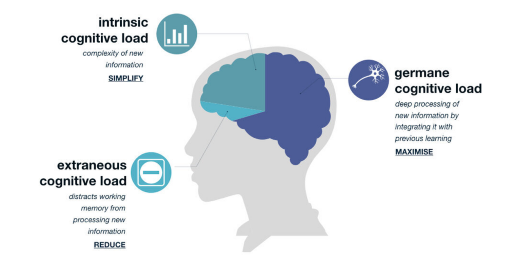
Finally, it’s important to note how visual hierarchy connects with Cognitive Load Theory (CLT), as we discussed in the previous posting. A well-constructed visual hierarchy helps reduce extraneous cognitive load—the mental effort that users expend when trying to figure out how to navigate or find information on a poorly organized page. By guiding users through a clear and intuitive hierarchy, designers can ensure that their mental energy is focused on the content itself, not on figuring out where to look next.

For example, consider a complex form with many fields. If the form is poorly designed (e.g., inconsistent spacing, lack of visual cues), users will expend unnecessary cognitive effort just trying to understand what to do. On the other hand, a well-designed form might use clear headings, grouped fields, and contrasting buttons to create a logical flow. This minimizes cognitive load and allows users to focus on completing the task.

In summary, visual hierarchy is one of the most powerful tools in a web designer’s arsenal. By applying principles from Gibson’s ecological approach, Gestalt laws, and research on visual perception, designers can guide users’ eyes effortlessly through a page, ensuring that the most important information is seen first. Coupled with contrast, size, and color, a well-thought-out visual hierarchy enhances usability, reduces cognitive load, and ultimately improves the user experience.


5. Speed Matters: The Impact of Load Times on Cognition and User Experience

Performance in web design isn’t just a technical issue; it’s a psychological one. Page load time has a significant effect on how users perceive a website, which in turn affects their emotional response and cognitive engagement. In neuroscientific terms, long load times trigger increased levels of cortisol, the stress hormone, which can lead to frustration and negative user experience.

A seminal study by Akamai Technologies and Gomez.com found that 47% of consumers expect a webpage to load in two seconds or less. When a page takes longer, users are not only more likely to abandon it, but they also form negative associations with the website’s brand.

From a cognitive perspective, long delays disrupt the user’s flow state, a concept introduced by psychologist Mihaly Csikszentmihalyi. In web usage, flow occurs when users are fully engaged in the task at hand, navigating smoothly through content without being interrupted by unnecessary delays. By optimizing page speed, designers can help users maintain their flow and reduce the cognitive strain caused by waiting.


Conclusion: Merging Science with Design

In conclusion, the neuropsychological principles that govern human behavior provide invaluable insights for web designers. From reducing cognitive load and optimizing color schemes to applying Fitts’s Law and visual hierarchy, each design decision can be informed by a deep understanding of how the brain processes information. By integrating these principles into the design process, web designers can create experiences that are not only visually appealing but also psychologically attuned to user needs.

Web design is no longer just about making things “look good” – it’s about making things work well with how people think, perceive, and interact. The best designs are those that invisibly guide users through a site, reducing mental friction and creating a seamless, intuitive experience.

the task at hand, navigating smoothly through content without being interrupted by unnecessary delays. By optimizing page speed, designers can help users maintain their flow and reduce the cognitive strain caused by waiting.


Research Reference:
Akamai Technologies. (2017). The State of Online Retail Performance.

Gibson, J. J. (1979). The Ecological Approach to Visual Perception. Boston: Houghton Mifflin.

Nielsen, J., & Pernice, K. (2006). Eyetracking Web Usability. Berkeley: New Riders.

Nielsen, J. (2000). Designing Web Usability: The Practice of Simplicity. Berkeley: New Riders Publishing.

Exploration of Neuropsychology in Webdesign #1

In a world where the average attention span rivals that of a goldfish (an often disproven myth, by the way, but we’ll save that for another time), it’s hardly surprising that web design has become one of the deciding factors in the success of a digital platform. What is often overlooked, however, are the neuropsychological mechanisms behind a functioning design. Welcome to a humorously academic journey into the art and science of web design – or, as we might call it: What does the brain actually think when it looks at a website?


1. Cognitive Load: The Foundation of Simplicity in Design

At the heart of effective web design lies a concept critical to the human brain’s processing power: cognitive load. This principle refers to the amount of mental effort required to absorb and process information. The cognitive load theory, popularized by psychologist John Sweller in the late 1980s, emphasizes that the brain has limited working memory, meaning that designs requiring excessive mental effort can overwhelm users and degrade their experience.

The theory revolves around a simple yet profound idea: our brains, despite all their brilliance, aren’t limitless processors capable of handling endless streams of information. Imagine your brain is a web browser with 50 tabs open—sure, it’s working, but it’s struggling. The more complex the information on each tab, the closer you are to a cognitive meltdown. Sweller proposed that learning, problem-solving, and interacting with any form of information all require cognitive resources, but those resources are finite. At its core, Sweller breaks the cognitive load into three types:

Germane Load – This is the good kind of cognitive load! It refers to the mental effort directed toward constructing useful knowledge and schema. Think of it as your brain’s attempt to make sense of new information by connecting it to what you already know, like remembering that the mitochondria are the powerhouse of the cell (yes, that fact will always stick with you).

Intrinsic Load – This is the unavoidable cognitive effort required by the task itself. If you’re trying to learn quantum physics or navigate a government website (often equally mind-boggling), your brain has no choice but to exert effort.

Extraneous Load – This is the cognitive load introduced by poorly designed instructional materials or distractions. It’s like trying to solve a math problem while someone plays “Baby Shark” on loop in the background. Extraneous load is unnecessary and should be minimized.

Sweller’s interest in cognitive load started with problem-solving research in education. He noticed something peculiar: complex problems often didn’t lead to better learning outcomes. In fact, sometimes the very act of problem-solving was so mentally draining that learners couldn’t retain much information afterward. It was as if their mental energy was entirely spent on juggling too many variables, leaving no capacity to actually understand or store what they’d learned.

Sweller’s work was heavily influenced by working memory research, particularly the famous “magical number seven” concept by George A. Miller.

Proposed by George A. Miller in 1956, this law suggests that the average person can hold about seven (plus or minus two) items in their working memory. This has profound implications for web design. Overly complex websites with too many navigation options, crowded layouts, or large blocks of text can quickly overwhelm users. A good web design reduces cognitive load by simplifying navigation, minimizing distractions, and organizing information into manageable chunks.

The principles of gestalt psychology also offer critical insights here. Gestalt theory, originally developed by psychologists such as Max Wertheimer, Kurt Koffka, and Wolfgang Köhler, focuses on how humans perceive visual stimuli as organized patterns rather than as isolated components. Gestalt laws, such as proximity, similarity, and closure, are essential to web design because they dictate how users naturally group and process information. When applied correctly, they reduce cognitive strain, making interfaces easier to navigate.

Research Reference:
Miller, G. A. (1956). The Magical Number Seven, Plus or Minus Two: Some Limits on Our Capacity for Processing Information. Psychological Review.


2. Color Theory: The Emotional and Cognitive Power of Color

Colors are not just decorative elements in web design; they are powerful psychological tools that evoke emotional and cognitive responses. Color psychology, a subfield of psychological research, explores how different colors affect mood, behavior, and decision-making. For instance, Angela Wright’s Color Affects System connects specific hues with predictable psychological responses. While the exact science of color perception is debated, certain broad patterns are generally accepted.

  • Blue is often associated with calm, trust, and security, which is why it is popular among banks and tech companies (e.g., PayPal, Facebook). It has been shown to enhance focus and is thus ideal for corporate or informational sites.
  • Red, on the other hand, is a color that evokes urgency, excitement, and even danger. It is often used to highlight critical elements like “Buy Now” buttons or warnings. However, red can also increase stress levels if overused.
  • Green is linked to growth, health, and peace. Its calming effect makes it an excellent choice for environmental, wellness, and financial websites.

In addition to individual color effects, complementary colors (those opposite each other on the color wheel) can create dynamic, visually stimulating designs. Analogous colors (those next to each other on the color wheel) provide harmony and can be used for smooth, aesthetically pleasing interfaces.

However, it’s important to note that color perception is also highly contextual and cultural. Eva Heller, a leading scholar in color theory, points out that while colors have universal psychological effects, their interpretation can vary across cultures. For example, white is often associated with purity in Western cultures but can symbolize mourning in some Eastern societies. Web designers should, therefore, consider both the universal and cultural meanings of colors when targeting global audiences.

Research Reference:
Wright, A. (1991). The Beginners Guide to Colour Psychology. Color Affects.


3. The Fitts’s Law: Making Interaction Easy and Intuitive

When it comes to interaction design, few principles are as foundational as Fitts’s Law, named after psychologist Paul Fitts, who formulated it in 1954. Fitts’s Law predicts the time required to move to and select a target, such as a button or link, based on its size and distance. The basic premise is that larger targets are easier and quicker to click, especially when they are positioned closer to the user’s cursor or touchpoint.

This principle is highly relevant for user interface (UI) design, particularly when it comes to call-to-action buttons and navigation links. Fitts’s Law advises designers to make clickable elements large and place them in easily accessible areas, such as the center of the screen or along the edges, where users naturally focus their attention.

  • Large buttons with clear labels are easier to click, reducing user frustration. This is especially critical on mobile devices, where smaller targets can lead to misclicks.
  • Important actions, such as submitting a form or finalizing a purchase, should have prominent buttons that are easy to find and click. Fitts’s Law would suggest making these elements more visible and larger than secondary actions like cancel buttons.

Furthermore, the concept aligns with the law of least effort, which states that users prefer paths of least resistance. By minimizing the effort needed to perform actions, web designers can create more satisfying and efficient user experiences.

Research Reference:
Fitts, P. M. (1954). The Information Capacity of the Human Motor System in Controlling the Amplitude of Movement. Journal of Experimental Psychology.


Bringing Paintings to Life with 3D Printing

3D printing has expanded its applications in the art world, moving beyond sculptures and artifacts to include the replication of paintings. By capturing and recreating not just the colors but also the textures, relief, and even the gloss of original works, this technology opens up transformative possibilities for museum interactions. This post delves into how 3D printing of paintings enhances visitor engagement and interaction.

Tactile Exploration of Paintings

Traditionally, paintings have been viewed from a distance to preserve their integrity. However, 3D printing allows for the creation of touchable replicas that maintain the visual and physical characteristics of the original works. For example, museums can reproduce the brushstrokes, texture, and relief of a Van Gogh painting, enabling visitors to physically feel the intricacies of the artist’s technique.

Close-up of a 3D print of Vincent van Gogh, Flowers in a Blue Vase, 1885, oil on canvas, 61.5 x 28.5 cm. Kröller-Müller Museum, Otterlo. Photo by author.

This tactile approach is particularly beneficial for visually impaired visitors. Being able to touch the contours and textures of a painting offers a unique sensory experience, allowing them to perceive the artwork in ways that were previously inaccessible.

Interactive Exhibits with 3D-Printed Paintings

3D-printed paintings can play a key role in interactive exhibits, making art more engaging and educational. Museums can encourage visitors to compare printed replicas with digital displays or augmented reality overlays to understand artistic techniques and historical context. Workshops could even invite visitors to paint or modify 3D-printed replicas, fostering creativity and deeper connections with the artwork.

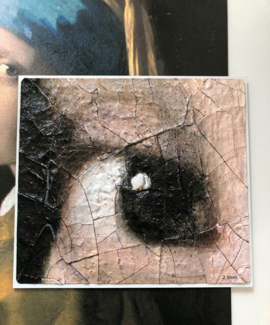
Additionally, in a 3D print aspects of a work can be magnified and physicalized. For example, enlarging the eye of Vermeer’s Girl with a Pearl Earring makes it possible to understand the artist’s technique and the material changes the work has been through (e.g. the cracks on the surface become clearly visible).

10 times enlarged 3D printed eye of Johannes Vermeer’s Girl with a Pearl Earring, 1665, oil on canvas, 44 x 39 cm. Mauritshuis, The Hague. Photo by author.

This technology also allows for recreations of lost or damaged paintings, providing a window into art history that might otherwise remain closed. Visitors can see and touch pieces of art that no longer exist in their original form, enriching their understanding of the artistic and cultural legacy.

Bridging the Gap Between Art and Audience

While curators may worry about the loss of aura associated with original paintings, 3D printing helps bridge the gap between art and audience by making these works more approachable. Replicas can be displayed in high-traffic areas, touched during guided tours, or used in educational settings without the risk of damaging the originals.

By creating interactive and tactile experiences, museums can attract younger audiences, families, and those who might feel intimidated by traditional gallery settings. This approach transforms the museum visit from a passive viewing experience into an active engagement with art.

Ethical Considerations and Challenges

Despite its advantages, 3D printing of paintings raises important ethical questions. How should replicas be labeled to distinguish them from originals? Could the availability of high-fidelity reproductions diminish the value of authentic artworks? Museums must navigate these issues carefully, ensuring transparency and maintaining the integrity of their collections.

Additionally, there is a need for precision and quality in reproductions. Capturing the intricate details of a painting’s texture and gloss requires advanced scanning and printing techniques, which may not always be accessible or cost-effective for smaller institutions.

A New Frontier for Museum Interaction

3D printing is reshaping how museums approach paintings, transforming them into interactive, accessible, and educational experiences. By providing tactile opportunities, fostering creativity, and connecting visitors more deeply with art, this technology brings a new dimension to the museum world. While challenges remain, the potential for innovation and engagement makes 3D printing an invaluable tool for the future of art and cultural heritage.

As museums continue to embrace this technology, they have the chance to redefine the way audiences experience paintings—not just as objects to admire but as pieces to explore and connect with on a profoundly personal level.

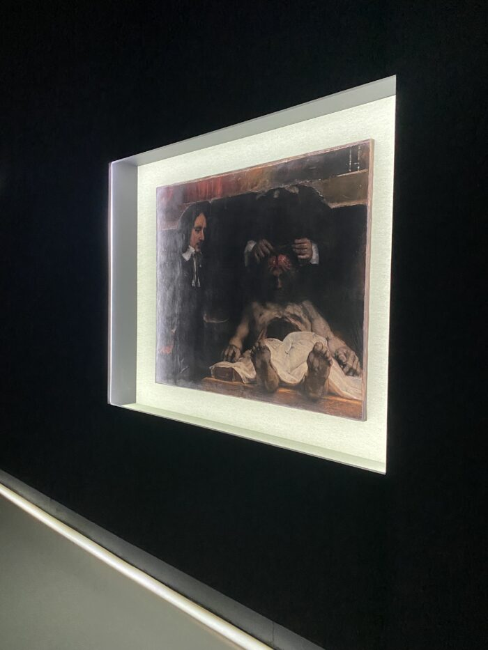
 3D print of Rembrandt van Rijn, The Anatomy Lesson of Dr. Deijman, 1656, oil on canvas, 100 x 134 cm, Amsterdam Museum, Amsterdam
Photo by author, 3D print by Factum Foundation

References:

https://www.codart.nl/feature/museum-affairs/3d-printing-works-of-art-an-opportunity-or-nightmare-for-curators/

https://www.cambridge.org/core/journals/advances-in-archaeological-practice/article/you-can-handle-it-3d-printing-for-museums/5FDE2B8896E09D879B75D77C4530ED1A

https://www.museumnext.com/article/how-museums-are-using-3d-printing/

https://theconversation.com/3d-printing-is-helping-museums-in-repatriation-and-decolonisation-efforts-126449

Reproduction of Gloss, Color and Relief of Paintings using 3DScanning and 3D Printing

The Future of Art Reproduction: Capturing Every Detail with 3D Scanning and Printing

In the realm of art preservation and reproduction, achieving the perfect balance between technology and authenticity is a challenging endeavor. A research from 2017 (W.S. Elkhuizen, T.T.W. Essers, B. Lenseigne, C. Weijkamp, Y. Song, S.C. Pont, J.M.P. Geraedts, and J. Dik) presented in their groundbreaking paper, “Reproduction of Gloss, Color and Relief of Paintings using 3D Scanning and 3D Printing,” offers a revolutionary approach to this challenge. Their work integrates advanced methods to capture and replicate the color, relief, and gloss of paintings.

The Challenge of Authentic Reproductions

High-fidelity reproductions of artworks have long been a goal for museums and cultural institutions. While earlier technologies could reproduce color and surface relief with relative success, replicating gloss—a critical visual component of a painting’s appearance—remained elusive. Gloss plays a pivotal role in how viewers perceive the depth, texture, and overall aesthetic of an artwork. Traditional methods often fell short in accurately capturing the spatially varying gloss, which significantly contributes to a painting’s visual identity.

The Breakthrough: Integrated 3D Scanning and Printing

The research team introduced an innovative system that addresses these limitations. Their approach integrates:

  1. Advanced Gloss Measurement: Using the principles of reflectance polarization, the system measures spatially varying gloss by sampling specular reflection at the Brewster angle. This method provides precise gloss data for every point on a painting’s surface.
  2. Relief and Color Capture: In addition to gloss, the system employs high-resolution 3D scanning to capture the surface relief and advanced imaging techniques to record color details. Together, these components ensure a comprehensive digital representation of the artwork.
  3. Data Processing and Optimization: One of the challenges addressed in this study is the presence of shadows in gloss measurements caused by surface relief. The team devised a technique to mask and interpolate surrounding gloss information, ensuring a seamless and accurate reproduction.

Validating the System

To demonstrate the efficacy of their system, the researchers reproduced a painting titled “Two Wrestling Figures in the Style of Van Gogh.” This reproduction served as a testbed for assessing the accuracy of the gloss, color, and relief measurements. The results showed remarkable fidelity, proving that the system could replicate the nuanced visual properties of the original artwork.

Implications for Museums and Cultural Institutions

This advancement holds transformative potential for art preservation and accessibility:

  1. Preservation: High-quality reproductions reduce the need for handling original artworks, minimizing wear and tear. This is particularly vital for fragile or historically significant pieces.
  2. Accessibility: Reproductions can be shared globally, allowing audiences to experience iconic artworks that might otherwise be inaccessible due to location or conservation concerns.
  3. Educational Opportunities: Museums can use these replicas for educational programs, enabling hands-on interaction without risking damage to the originals.
  4. Exhibitions: Institutions can display reproductions in interactive or immersive environments, enhancing visitor engagement while preserving the original artworks.

Conclusion

This technology stands to redefine how people interact with art in museums. By enabling the creation of high-fidelity reproductions, museums can provide more immersive and interactive experiences. Visitors could touch and closely examine replicas without fear of damaging the originals, fostering a deeper understanding of the artwork’s texture, relief, and gloss. Additionally, this technology can be used to create multisensory exhibits, where audiences engage with art through sight, touch, and even augmented reality overlays. Such innovations make art more accessible to diverse audiences, including those with visual impairments, and enrich the educational value of museum visits.

References:

https://diglib.eg.org/server/api/core/bitstreams/03f416a4-92bd-4a74-9d51-f1724f46994c/content

The technology of 3D Scanning and Printing

Exploring Tim Zaman’s Revolutionary 3D Scanning of Paintings

In 2013, Tim Zaman embarked on a groundbreaking project that bridged the worlds of technology and art, developing a super-high-resolution, large-format 3D scanner tailored to capturing the intricate topography of paintings. This remarkable innovation brought new insights into the materiality of art and how we perceive it, focusing on iconic works by masters such as Rembrandt and Van Gogh.

The Vision Behind the Technology

Paintings, often treated as two-dimensional artworks, are deeply influenced by the physical properties of paint. Late Rembrandt self-portraits, for instance, achieve their dramatic effects through the interplay of light and shadow on textured surfaces. Similarly, Van Gogh’s bold, impasto strokes create a tangible depth. Tim Zaman’s work highlights how paint’s texture, glossiness, and transparency significantly shape a painting’s aesthetic—aspects often overlooked or underappreciated.

The 3D Scanning Process

To capture these details, Zaman’s 3D scanner used a hybrid system combining stereo vision (dual cameras) and fringe projection (a projector). This setup allowed for ultra-high-resolution imaging, capturing 40 million XYZ (3D space) and RGB (color) data points per scan. For large works like The Jewish Bride by Rembrandt, spanning 160×120 cm, the system gathered over a billion data points by merging multiple scans. This unparalleled level of detail was essential for faithfully documenting the subtle undulations and surface features of the paintings.

Scanning Equipment

“The scanning equipment is actually very straightforward, and only consists out of these parts. The rest of the parts is just cables and stuff to make the camera move in X and Y”.

Capture device(2x) Nikon D800E
LensesNikon 80mm PC-E scheimpflug & polarisation filters
ProjectorOptoma PK301 Pico-Projector fitted with a crossed polarisation filter

Zaman’s project also delved into the realm of reproduction. Collaborating with Océ (a Canon Group company), the scanned data was used to create high-fidelity 3D prints of paintings. These reproductions—complete with textured surfaces—represented a significant leap beyond traditional flat posters. While impressive, they underscored the complexity of accurately replicating the originals, particularly when it came to glossiness and transparency—elements that remain elusive even with advanced technology.

Future Directions

Zaman’s work set the stage for ongoing research into the physicality of paintings. While the 3D prints captured the texture and color of the originals, they lacked the dynamic qualities imparted by brushstrokes and the interaction of light with varying paint properties. This gap highlighted the multifaceted nature of paintings, where factors like material reflectivity and translucency play critical roles in their visual impact. Current efforts aim to model glossiness, transparency, and other overlooked elements. By combining cutting-edge technology with a deep respect for artistic heritage, Zaman’s project serves as a powerful reminder of the endless possibilities at the intersection of science and art.

Tim Zaman’s innovative approach continues to inspire researchers and art enthusiasts alike, showcasing how technology can uncover new dimensions of creativity and history.

In the upcoming blog, I will explore the advancements in newer technologies aimed at addressing the missing elements like glossiness and transparency, building upon the foundation of Zaman’s work.

References:

http://www.timzaman.nl/3d-scanning-paintings

https://www.youtube.com/watch?v=NxfNaZ2vUSE&ab_channel=TEDxDelft

https://delta.tudelft.nl/en/article/scanning-paintings-depth

01. #03 Cognitive processes in learning how to read

The process of learning to read is complex and involves a variety of cognitive mechanisms that interact with each other. Key components include phonological awareness, decoding, and the roles of phonological and visual memory. These components are central to many theoretical models, such as the Simple View of Reading by Gough & Tunmer (1986), which describes reading as a combination of decoding and language comprehension.

Phonological awareness
This is the ability to recognize and consciously manipulate the sound structure of language. It includes identifying syllables, rhymes, and individual sounds (phonemes) in spoken words. Children need the ability to break spoken language into its sound components to understand the principle of letter-sound correspondence. Activities like syllable segmentation and phoneme analysis help to foster this ability.

Decoding
Decoding refers to the process of translating written letters (graphemes) into their corresponding sounds (phonemes) to read words. It is one of the first skills acquired when learning how to read. Decoding is essential for reading new and unfamiliar words. It requires precise knowledge of letter-sound correspondences and the automatic application of these rules. Words can be decoded phonologically by decoding individual letter-sound correspondences. Frequently encountered words are recognized as whole units without decoding as they are stored in our memory.

The role of phonological memory
Phonological memory is a component of working memory that allows for the short-term storage and processing of speech sounds. It enables the retention of letters and sounds in working memory to combine them into words. It supports the ability to read longer words and process multi-syllabic words.

The role of visual memory
Visual memory is the ability to store and recall visual information, such as the shapes and structures of letters and words. It plays a crucial role in the automatic recognition of words. Decoding and visual memory go hand in hand. Once the same word has been decoded time and time again, it turns over to visual memory and we start recognizing the words just by the shapes of every letter in the word.

In conclusion: Learning to read requires the collaboration of various cognitive processes: Phonological awareness and decoding are essential for understanding the alphabetic principle, while phonological and visual memory play key roles in processing and storing information

Research on the African events

After intensive research into the selected festivals, I found that it was surprisingly difficult to find detailed information about the individual events. Some of these festivals and events are somewhat more international and commercial due to their size, which makes it easier to find information.

A good example of this is the AFCON, which radiates far beyond the African region due to its long tradition and the popularity of football. The importance of this tournament is also reflected in the extensive availability of information on the logo language and design of the event.
Interestingly, the logos have hardly changed over the decades. They were also rarely adapted to the respective venues. Instead, there was a general logo in which only the name of the host nation was changed, while the design remained unchanged. There was one notable exception in 2010, when the logo was revised and retained in this form until 2023. It was only for the tournament in Côte d’Ivoire that a fresh look was developed, combining the trophy with the national colors. Whether this new logo, like its predecessors, will remain in place in the long term had not yet been officially confirmed in December 2024.

On the other side is the FESTAC, which was only recently revived after a break of almost 50 years. With a completely new logo, which has not yet undergone any variations, it marks a new beginning in its visual identity.

Other events such as the DIFF or the Cape Town Jazz Festival also have logos, but these remain unchanged for each edition. Only the design of the media in which the logo is used – for example on posters or websites – varies.

The other major events listed, such as the Marathon des Sables or AFRIMA, do not change their logo design. The Lake of Stars Festival even uses a simple lettering as its logo, which only appears in a different font depending on the motto.

Imprint of Time: History of Rubber Stamps

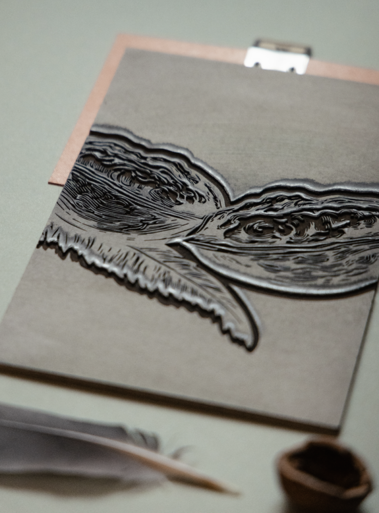
Because I researched possibilities of our laser cutter in the FAB Lab, I now want to dive deeper into the topic of stamps. This is because I experimented with engraving lino sheets which worked out really well.

Long before ink pads and rubber stamps, crafty folk were making their mark with seals. The earliest evidence of this comes from Ancient Mesopotamia (a region of modern-day Iraq) where archaeologists have found examples of clay being embossed with custom seals. Back then, seals were usually carved out of bone or stone.

The First Form of Stamping: Wax Seals

The oldest use of a tool resembling a stamp is an application that commonly didn’t use ink: the seal. Today, seals – usually in wax – are mostly used for decorative purposes, but for millennia they were critical for verifying the authenticity of products, correspondence, and official documents. Signet rings, which allowed a person’s seal to be worn accessibly on his or her hand as jewelry, rose in popularity during the Middle Ages as wax sealing became more common.

The use of wax seals in everyday life was made largely obsolete by two modern day things that we often take for granted: widespread literacy and gummed envelopes. With signatures replacing the seal as a sign of authenticity for everyday documents, and gummed envelopes providing security against contents being read or tampered with, the wax seal has faded into ceremonial and decorative use.

Woodblock printing

Woodblock printing more closely resembles what we now call stamping. It’s believed these early ‘stamps’ probably first originated in China, but were soon used around the whole world. Images and text would be meticulously carved into wooden surfaces by hand, and then stamped with ink onto fabrics or paper. 

In Asia, woodblock printing was used extensively to create both textiles and books. Early samples of multi-colored woodblock printing on silk can be seen as far back as 220 AD in China. Although movable type was known in Asia at that time, it was not easy to apply the technique to the Chinese language, which contains thousands of characters. Instead, entire pages of text were produced as woodblocks as a way to print books. Also the influence of Indian block printing on stamp design epitomizes the enduring legacy of this ancient craft.

The Birth of Rubber Stamps

Although the Mayans and Aztecs had been using rubber for centuries, the rest of the world didn’t catch on until 1736. The invention of stamps began in the 1700s when explorers encountered a sticky, bouncy substance in South America – rubber. An American chemist, Charles Goodyear, developed the first ever vulcanized rubber. According to connecticuthistory.org, Goodyear accidentally discovered this process in 1839 by combining rubber and sulfur upon a hot stove. This allowed rubber to be hardened and made durable, opening the door to various applications. However, it wasn’t until the latter half of the century that the rubber stamp made its debut.

Although the official inventor of rubber stamps is up for debate, officemuseum.com claims they were invented sometime between 1864-1866. In 1866, a patent for a rubber hand stamp was issued to James Woodruff, marking the official birth of rubber stamps as we know them today. These early rubber stamps were made by mounting engraved rubber plates on wooden handles, and they quickly gained popularity for their efficiency and versatility. The original rubber stamp model was a hand stamp made by attaching the rubber to wood. Today we can clearly see the resemblance in our traditional wooden hand stamp bodies.

In 1866, a salesman named J.F.W. Dorman was introduced to the rubber stamp and was the first to successfully commercialize the product. 

The Rubber Stamp Evolution

The late 19th and early 20th centuries witnessed the rubber stamp’s transition from factories to offices. Companies started using rubber stamps for various tasks, including marking invoices, addressing envelopes, and endorsing checks. Customization became increasingly important, allowing businesses to include their names, addresses, and other specific information on stamps. As technology evolved, so did rubber stamp production methods. In the 20th century, photomechanical processes allowed for greater precision in stamp design. This paved the way for more intricate and personalized custom rubber stamps. Additionally, innovations like self-inking stamps reduced the mess associated with traditional ink pads.
Custom rubber stamps also found a place in the world of arts and crafts. From scrapbooking to handmade greeting cards, rubber stamps became an indispensable tool for adding unique and artistic touches to projects.

Stamping Today: The Digital Age & Beyond

In a world where everything is increasingly digital, custom rubber stamps serve as a tangible link to the past, a reminder of simpler times when a simple press of ink on paper carried a powerful message. Their continued popularity is a testament to their versatility and enduring charm.

Whether it’s for marking important documents or adding a personal touch to handmade creations, custom rubber stamps continue to make their mark on history, leaving a lasting impression on the pages of time. It’s our privilege to continue the legacy of custom rubber stamps, offering our customers the means to leave their own unique mark on the world.

With advancements in technology, the last decade has also seen photopolymer stamps rise into overwhelming popularity. Photopolymer stamps, more commonly known as clear acrylic stamps, are stamps made out of photopolymer. They are transparent, coming on plastic sheets, and used with acrylic blocks to add onto desired surfaces. Acrylic stamps have risen in popularity for a couple main reasons. Because they are photopolymer, they are clear, meaning with the use of a clear acrylic block, the stamper can see the exact positioning of his or her stamp, prior to leaving a mark on the page. The second reason is cost. Acrylic stamps are much less expensive to make, making them much more accessible.

Resources

Topic Alternatives: FHJ Arctic Expedition Team

After some new developments, I have been considering to change my research topics, as I will have the opportunity to join the FHJ Arctic Expedition team on its trip to Greenland. As one of two design students, I will be co-responsible for documenting the expedition and provide all-around media, PR and marketing support. Thus, with the following blog posts I will explore the possibilities in terms of possibly integrating this topic into a master’s thesis project.

To gain a better understanding of the foundation of the FH JOANNEUM Arctic Expedition Team, a short overview will be given over the scope of the project, its contents, goals and execution.

Over the course of the next semester, a group consisting of students, researchers and teachers will organize and participate in an expedition to the Sermilik Polar Research Institute in Greenland. The goal of the expedition is to educate the next generation of Arctic experts and researchers, thus participants will gain knowledge of relevant technology and research topics in order to be able to independently lead further arctic expeditions. During the time in Greenland, the team will develop new use cases and prototypes from different files such as aviation, industry, health, and more. The relevance of this kind of expedition is easily explained with its unique environment and the possible research topics it offers. Furthermore, it is rather rare that scientific expeditions take place in the arctic due to the logistical challenges despite it being such a worthwhile research area.

The FH JOANNEUM Arctic Expedition Team is a unique endeavor that will provide not only valuable insight into various research fields, it is also a pristine example for interdisciplinary measures taken by FH JOANNEUM, as it connects students and professionals from different fields and specialities in a completely new setting. The team will come together and plan the expedition within the framework of its very own course „Arctic Technology“. These classes offer a unique approach to mentoring and educating the next generation of researchers with the peak being the implementation of the expedition in August 2025. Each (student) participant had to hand in an individual project/research proposal, which they will be working on implementing for the excursion. The respective research projects are yet to be revealed to the participants and in time, students will then be supporting each other in realizing the plans.

Students are offered professional support by teachers and experts that are joining the team to round up the experience. 

So, in short: The FH JOANNEUM Arctic Expedition Team is an entirely new interdisciplinary approach to connecting students and professionals from different fields of expertise while supporting research endeavors in the unique field of the arctic. 

As mentioned above, the design students will be in charge of documenting the journey and supporting the media output of the expedition. Thus, this could offer a range of possibilities in terms of a topic for a possible master’s thesis. 

The following angles might be worth exploring: 

  • Creation of a multi-platform/multi-channel multimedia and communication  concept for an Arctic Expedition / Arctic Research including planning, theoretical foundation and execution 
  • Media research communication with an emphasis on arctic research 
  • Reaching out with research: communicating science in popular media/social media with storytelling  

These explorations would offer for an opportunity to research the foundations of science communication in various media / channels while at the same time being able to implement the findings into an actual long-term project. 

Current considerations in terms of media documentation / communication include the following:

  • AET Blog -> A blog series that gives regular insights into the contents of the Arctic Expedition Team, including regular updates on the individual participants 
  • AET Podcast -> On-Site recorded podcast with personal stories of the daily events and research findings 
  • AET Social -> Implementation of a Social Media channel that follows the personal stories of the AET with regular personal updates, project insights, interactive content etc. 
  • AET PR Concept -> Development and implementation of a communication strategy and concept
  • AET Documentary -> An allround-documentary covering everything including the planning/classes, introduction of research projects and the eventual implementation over the course of the expedition itself.

Each of these approaches would support the project, as it is planned to establish the Arctic Expedition Team a long-term project, as well as offer the opportunity of interpreting and analyzing the effectiveness of each measure taken after the expedition itself has taken place, making it possible to stretch this project over the course of the next 1-2 years.