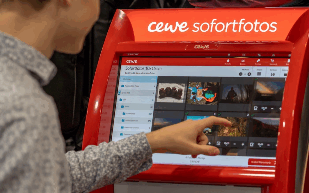
What Happens Inside a Photo Kiosk?
These kiosks allow users to connect their phone or USB stick, select photos, and print them instantly. Technically, they run on Windows operating systems in kiosk mode, and the interface is custom software, likely built on Qt or similar cross-platform UI frameworks. Connections are supported via:
- USB-A / USB-C
- SD cards
- Bluetooth, AirPrint, Huawei Share
- QR code upload via CEWE mobile app
Once connected, the user’s gallery is displayed in a grid of thumbnails, ready to scroll and select.
UX Analysis: What Works, What’s Missing
From a user experience point of view, CEWE kiosks are highly optimized for speed and simplicity:
- Large touchable thumbnails
- Minimalistic, icon-driven steps
- Clear path from selection to printing
However, in the context of memory and emotional engagement:
- Photos are shown without metadata (no date, no location, no description)
- There’s no storytelling layer, you select images, but don’t reflect on them
- Entire galleries are exposed raising privacy concerns
This stripped-down interface is efficient for printing but misses opportunities for personal connection, reflection, or control which are central to my thesis.
The Cewe company also created an App where you can design your photobook layout and then print it.
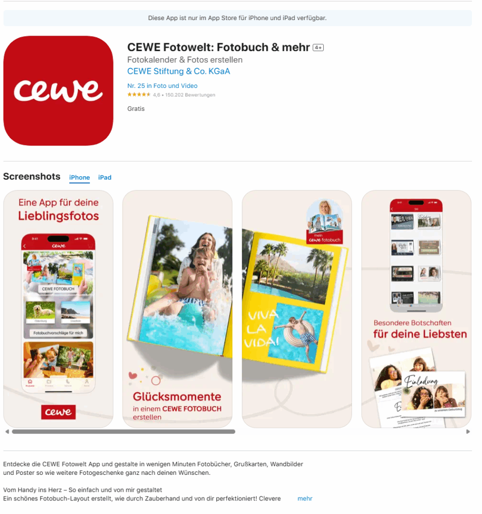
https://apps.apple.com/de/app/cewe-fotowelt-fotobuch-mehr/id583713833
How This Inspires My Prototype Design
These kiosks give me a technical and experiential foundation for what my memory device prototype might be. I want to create something that feels as physical and intuitive as a kiosk, but is emotionally aware and curated, rather than just functional.
Instead of printing, my app and device would allow users to store, browse, and re-experience their photos in a more meaningful way. Here’s what that could look like:
A Custom Photo Archive App: UX Meets Memory
Imagine connecting your phone or SD card to a device, not to print photos, but to curate and store them intentionally. The app would function like a mix between Finder / File Explorer, Photo slideshow, and a memory journal.
Key Features for the App:
- Photo Dashboard: A clean, visual overview where your photos are sorted by year, event, or theme (e.g. “Graduation”, “Summer 2023”, “Family”).
- Filter & Organize: Tag and group memories manually or through AI suggestions (e.g. by faces, dates, or locations).
- Slideshow Mode: Select folders or themes and activate a full-screen, ambient slideshow experience, ideal for reflection or sharing.
- Simple Storage: All files live in a readable system (e.g. SD card or internal storage) so it’s not a locked-in app, but still has an elegant visual layer on top.
- Selective Sync: Inspired by the kiosk, but instead of exposing your whole gallery, only selected folders or albums are shown on screen.
“Minimal surface, deep meaning” like a kiosk, it should be easy to use in public or private settings, but with a sense of control.
Connecting It Back to the Thesis
The CEWE kiosk taught me that:
- People are comfortable interacting with touchscreens and device syncing in physical spaces
- There’s value in ritualizing the photo-selection process
- But there’s a lack of contextual memory architecture
For my thesis project, I aim to build a prototype that bridges technical familiarity (USB, QR code, SD cards) with UX depth (filters, tagging, curated playback). It’s not just about decluttering photos, it’s about transforming them into accessible, emotional archives.