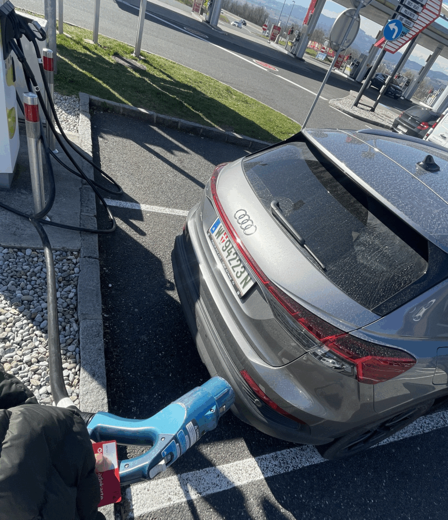
For this impulse I finally left my laptop and went outside. I borrowed a friend’s Audi Q4 e‑tron for two weeks and tried to live like a “real” EV driver. I drove between Graz and Vienna, searched for chargers on the road and in the city, and tried to feel what first‑time users feel. It was exciting, but also often very frustrating.
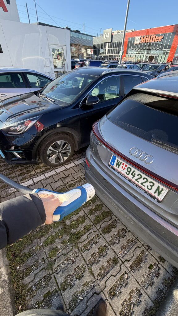
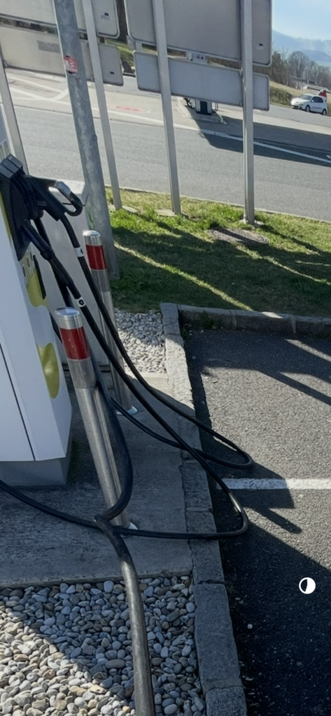
The first big problem was something very simple: cable length and parking. Two times I could not charge because the cable was way too short. The cars next to me were parked very close and very wide, so I could not place the Audi in a position where the plug reached the port. I stood there with the fast‑charging cable in my hand and could only laugh and be angry at the same time. It felt so stupid: the charger was free, my battery was low, but the physical layout made it impossible to start the session.
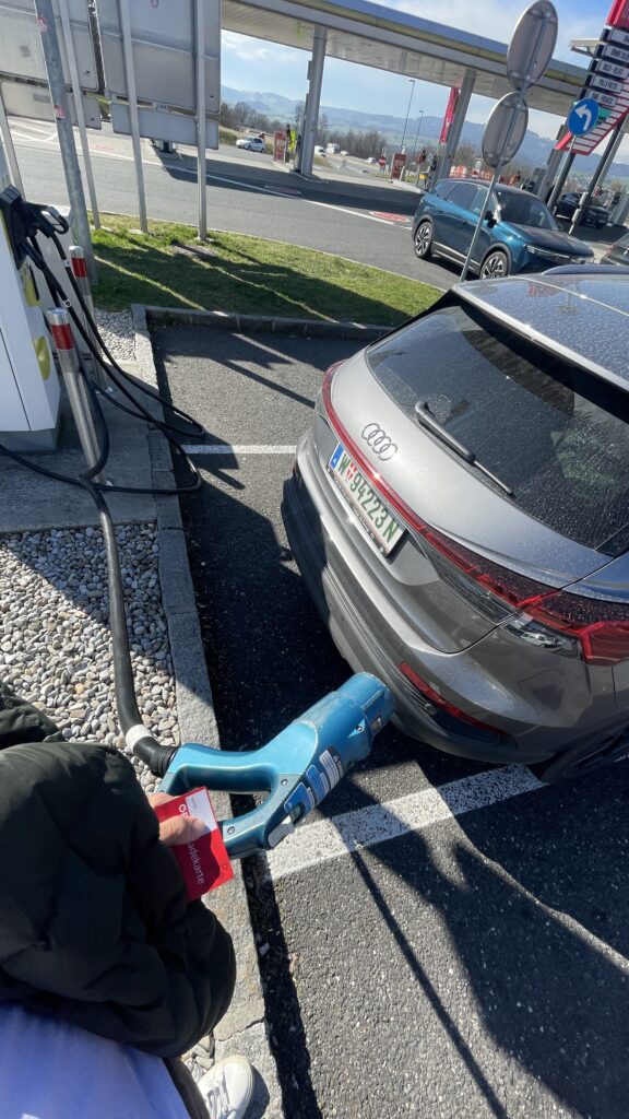
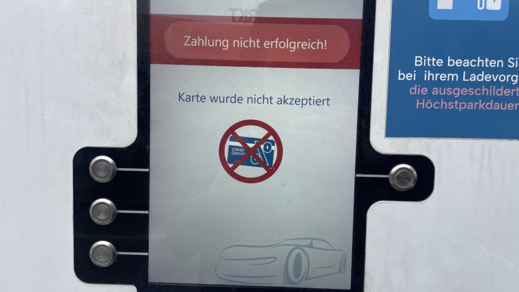
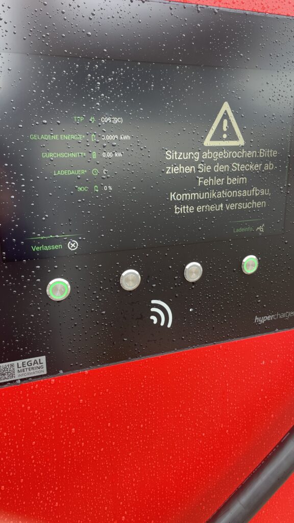
The second repeating problem was payment. My main charging card was sometimes not accepted at all. I had to try other cards and apps until something finally worked. Each time I stood there thinking: “If I was a total beginner, this would be the moment i give up.” I felt my own frustration rise, but at the same time I thought, this is good for my research. Now I do not just read about these pain points – I experience them with my own hands.
Route planning also showed interesting gaps. On the trip from Graz to Vienna I had some clear wishes. I wanted a charger with more than 300 kW so I do not have to wait too long. I wanted something with food nearby, because I was hungry. And I wanted a provider that is not SMATRICS, because I already had problems with them before. I thought these are basic, logical filters. But in the Audi system I could not filter for any of this. The car offers a nice tool that estimates how far I can still drive and suggests chargers on the way. Technically, this is very smart. But I could not set my own preferences. I could not select only “high‑power” chargers, or exclude specific networks, or search for stations with restaurants. I had to check everything manually, station by station.
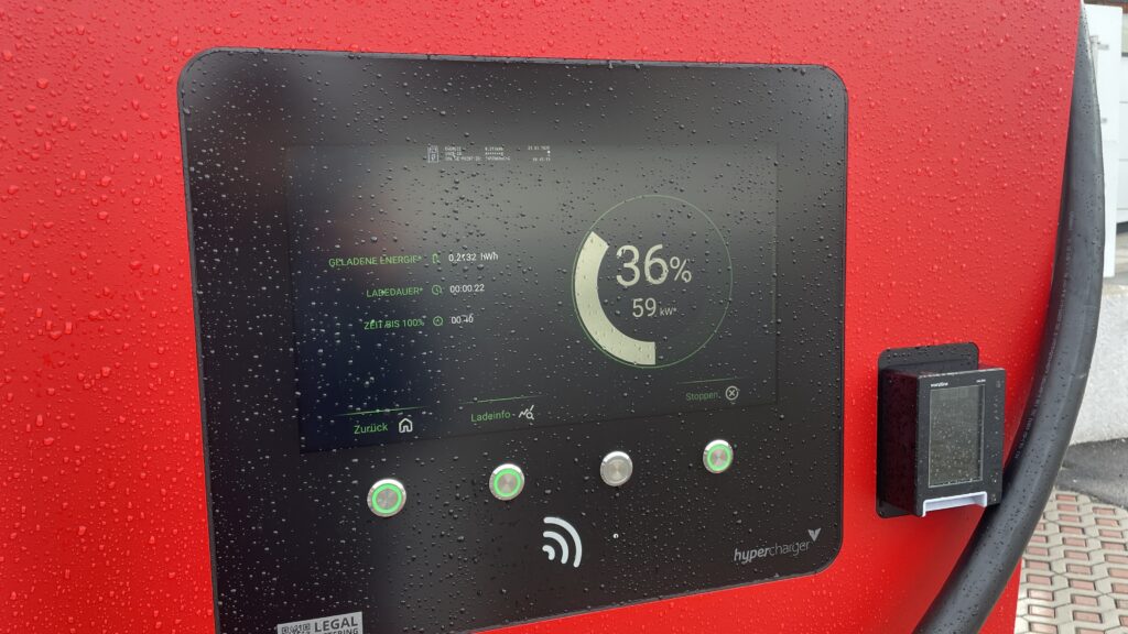
Another missing detail was live information. Often it was not clear in the interface if a charger was free or busy. Sometimes I did not even see how many plugs the station had in total. For confidence this is important: if I drive ten minutes off the highway, I want to know if I really have a chance to plug in.
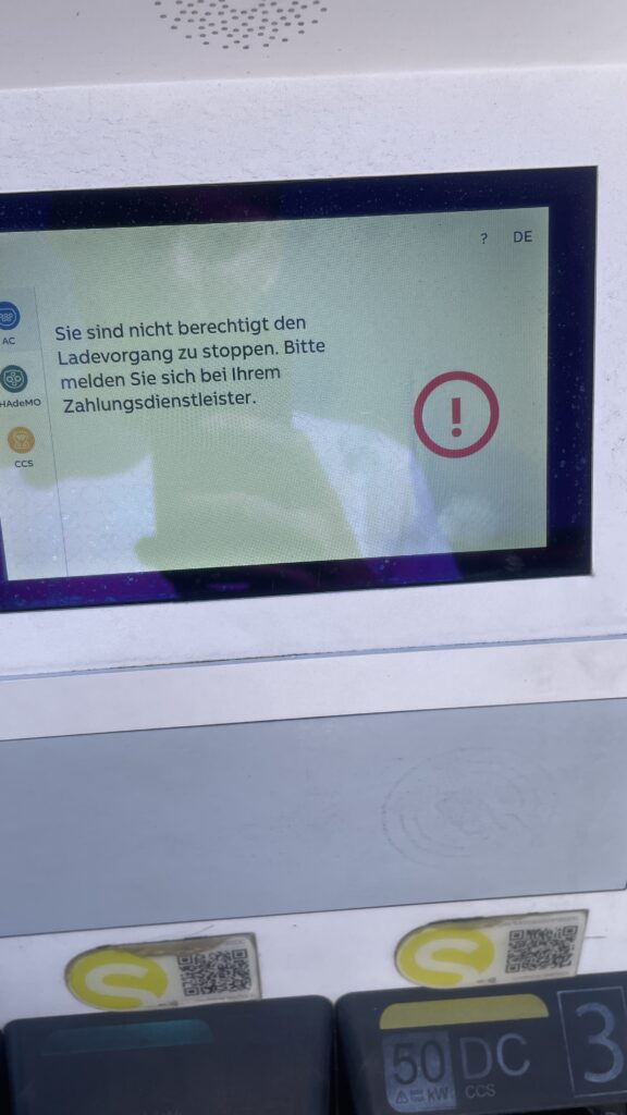
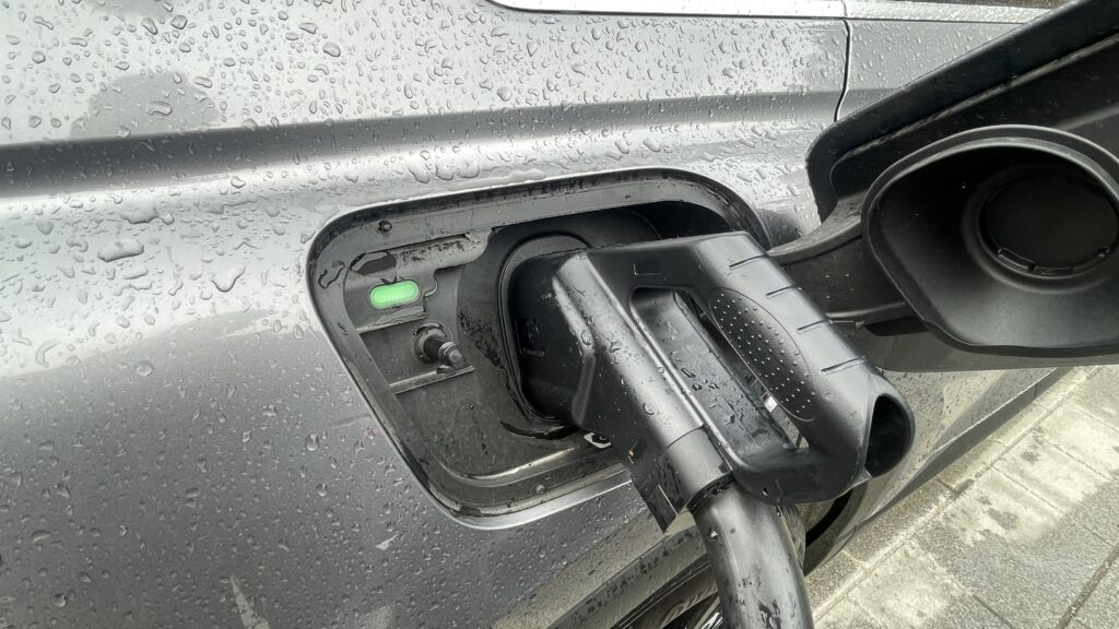
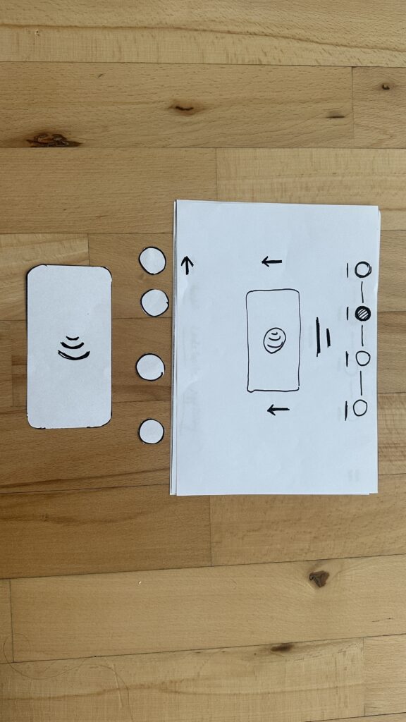
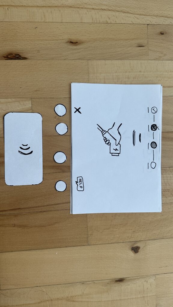
One of the most stressful moments happened when I came back to the car after charging. I wanted to unplug and continue my trip, but the connector was stuck and did not want to come out. The card did nothing anymore. I locked and unlocked the car several times and tried to pull with more and more force. After some minutes it finally released, but I never really understood which action solved it. For onboarding this is a nightmare: if something goes wrong, the system should clearly tell the user what to do, step by step. Here I had only trial and error.
Emotionally, these two weeks were a mix of curiosity, anger, and calm observation. In some moments I was really mad – especially when three small problems (finding a station, cable too short, card not accepted) came together. In other moments I felt almost grateful, because now I know these issues are not abstract. They really happen in everyday life, even with a premium car like an Audi Q4 e‑tron.
For my master thesis this impulse is very valuable. It helps me see how many barriers are not just software problems, but also physical design and service design problems: parking layout, cable reach, live status, contract jungle. It also shows how important personal preferences are. A good onboarding should not only explain “how to plug in”, but also support users in choosing the right charger for their needs: power, price, nearby services, and trust in the operator. These two weeks in the car gave me a much richer picture of what “first‑time public EV charging” really feels like – messy, fragile, but full of opportunities for better design. And I know imagine how a person that is less tech-savvier then me would do all these tasks. Crazy…


