There’s been a resurgence in Riso over the past few years, with a new wave of printmakers relying on a trusty Risograph to bring their illustrations to life.
The relevancy for communication design includes publishing magazines, illustrations, patterns, making limited editions, and introducing the general public to the wonders of this accessible technique.
My Featured Artists
While Risography has gained popularity among artists, it is generally used as a medium rather than a defining aspect of an artist’s fame. Many contemporary illustrators and designers leverage Risography to create distinct works, but they are often celebrated for their broader artistic style rather than the technique alone. Here are a few notable artists and studios associated with Risography:
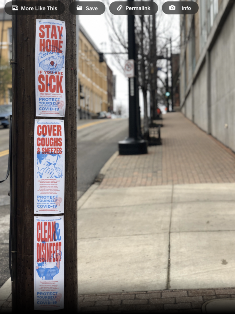
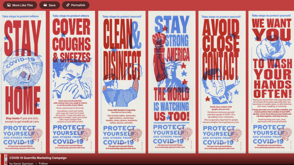
Using the power of Risograph printing to self publish a poster series using design for good. Copy points are from the CDC.gov website at the time of publishing. All of these precautions were necessary in the beginning of the outbreaks before the public knew how the corona virus was transmitted. Subsequent variants caused additional confusion and vaccine resistance by certain groups further compounded the herd immunity goals of the CDC. These posters were “Wild postings” in Kansas City, Missouri during the initial phases of the COVID-19 global pandemic.
Joe Maccarone
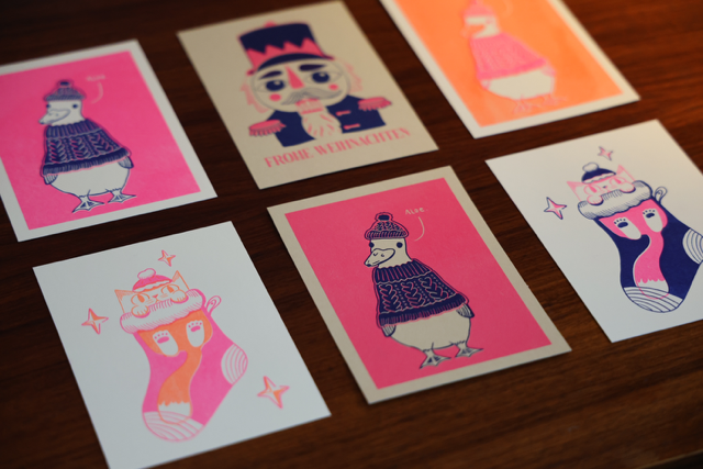
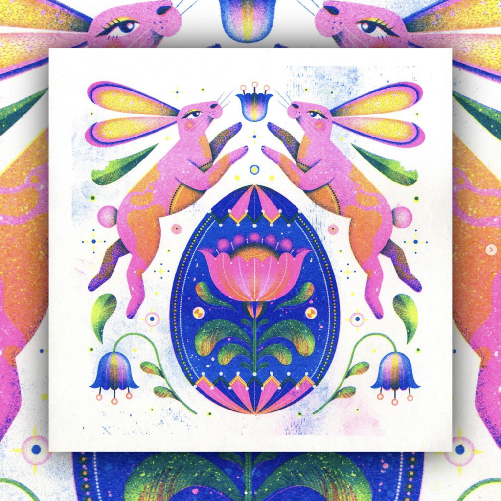
Joe Maccarone is an illustrator living and working in Pittsburgh, with a BFA in illustration from Maryland Institute College of Art. He’s really into slime, ooze, and goo, and would like to live on top of a mountain one day. He currently draws green owls at Duolingo. He’s collaborated with The New York Times, The New Yorker, VICE, Buck, and Bleacher Report.
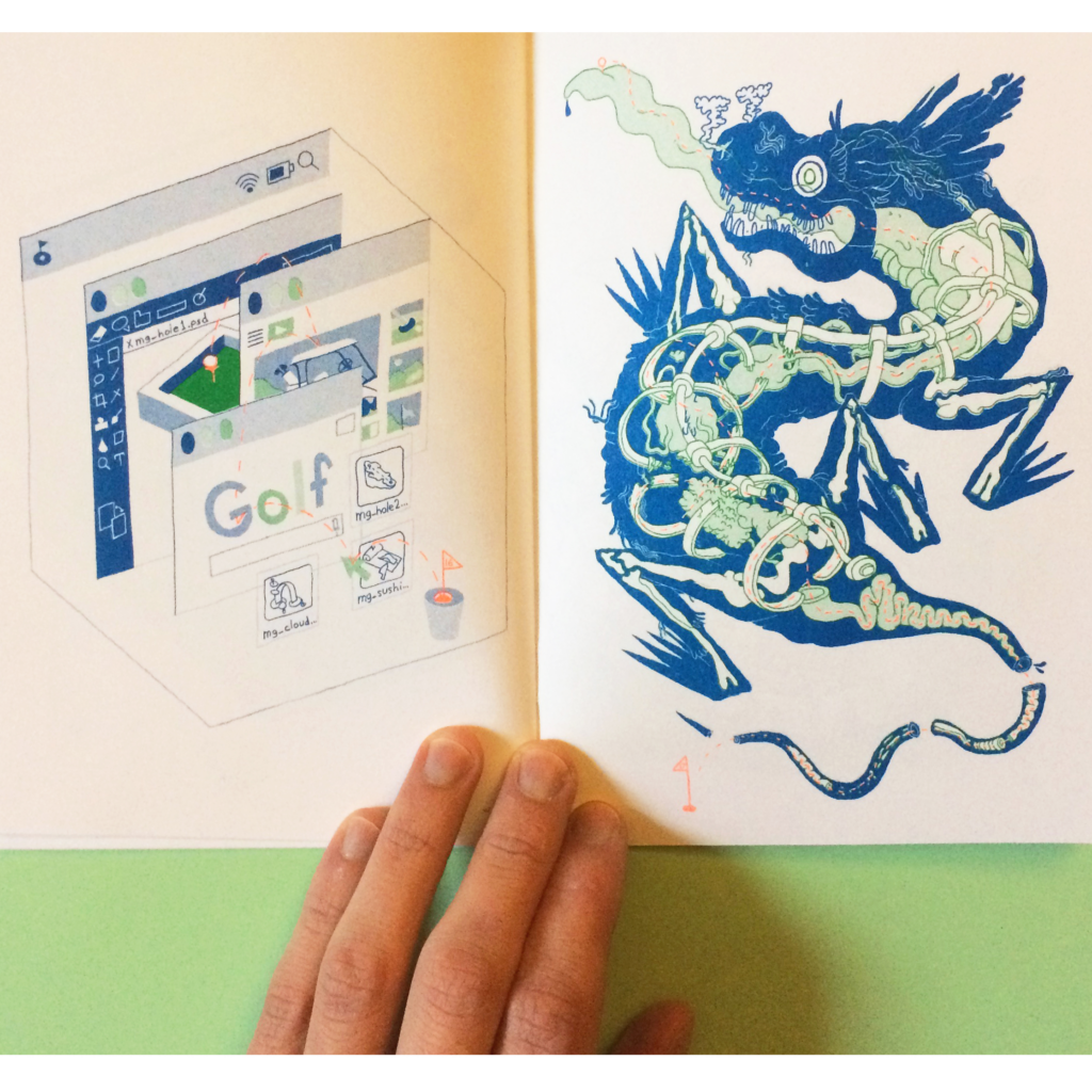
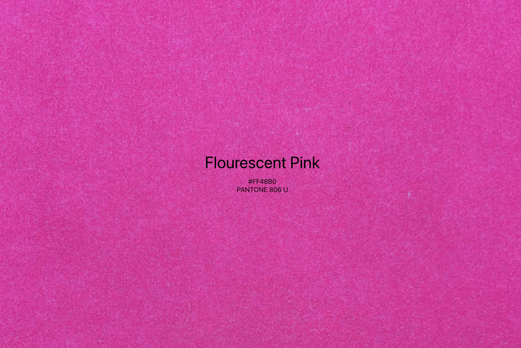
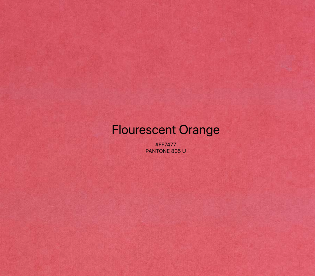
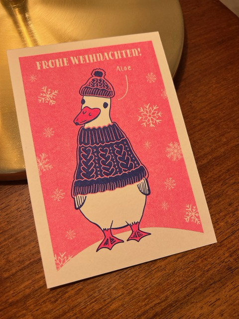
This zine is risograph printed in green, blue, and fluorescent orange in collaboration with Colour Code in Toronto.
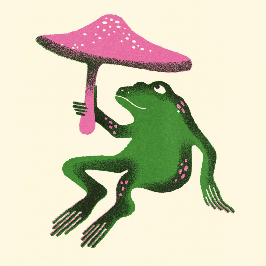
Becky Mann
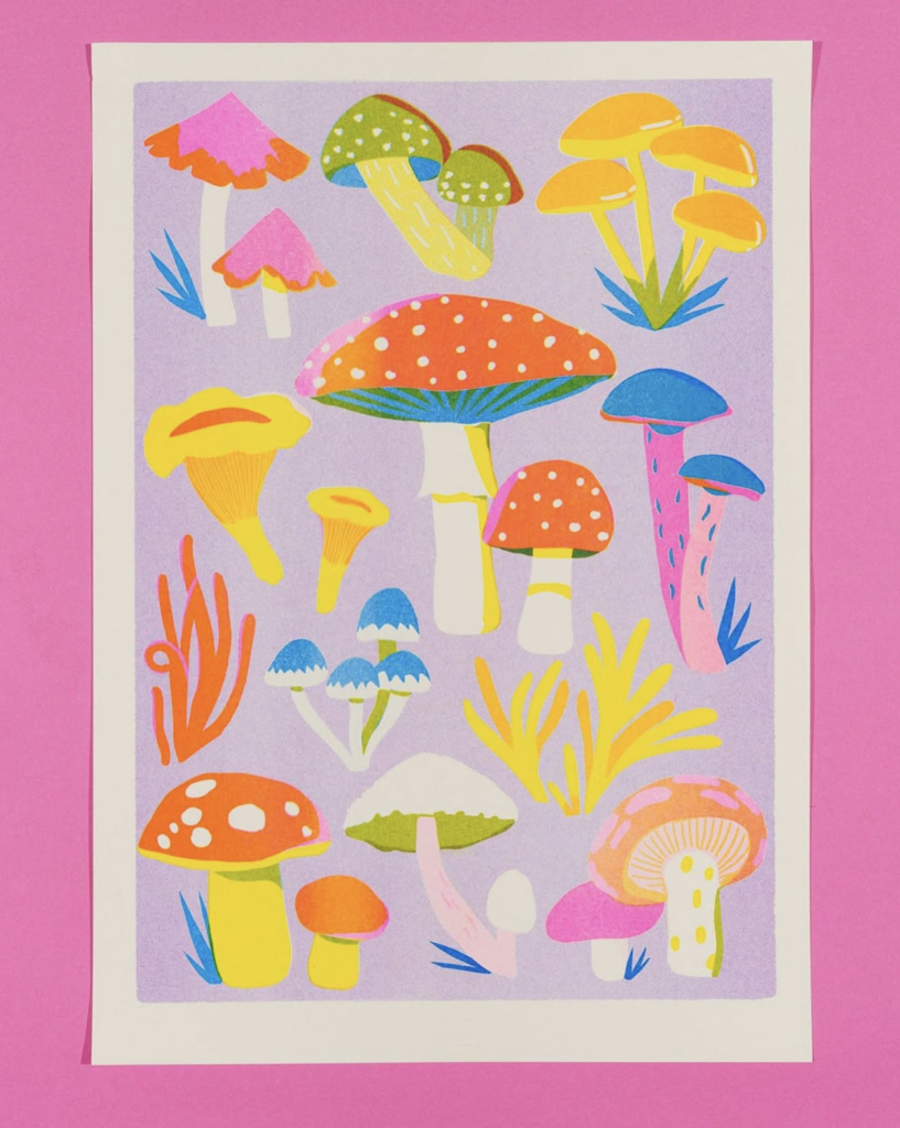
Becky is a freelance illustrator based in Leeds. She uses overlapping colours and shapes in her illustrations, often in the style of risograph. Becky’s influences include favourite foods and meals, animals and nature, music and film.
Conclusion
Concluding this research, it became evident that Risography is not widely utilized in contemporary marketing or communication strategies by major brands as part of their branding efforts. Instead, it remains predominantly within the realm of illustrators and artistic communities, where it is celebrated for its unique aesthetic and used primarily to create limited edition prints, posters, and zines.
Risography has become a creative tool in communication design, offering a unique aesthetic that combines bold colors, texture, and the imperfections of manual printing. This makes it particularly appealing for projects where originality, artistic expression, and tactile qualities are valued. But it remains to be a niche.
More Inspiration
Wild Press in Glasgow https://www.instagram.com/wild__press/
Naomi Wilkinson
https://www.naomiwilkinson.co.uk/
Duplikat • Risograph Studio https://www.instagram.com/duplikatpress/?hl=en
Resources
- https://www.printmag.com/graphic-design/top-five-risograph-artists-to-follow-on-instagram/
- https://inkygoodness.com/features/risograph-tips-illustrator-joe-maccarone/
- https://www.tigersarebetterlooking.com/p/the-rise-of-riso
- https://www.printerjohnson.com/blogs/our-artists
- https://www.mdonnestudio.com/