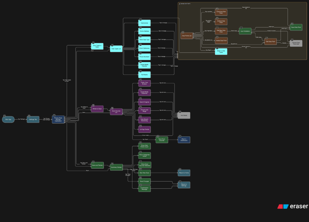
After sketching out how users would scan their data and review the results, I knew it was time to focus on something deeper. If someone’s trusting this tool to find their personal data online, they should be able to control exactly what it’s looking for and how it behaves. That’s where the Settings tab comes in, specifically, the part that lets people manage the data points the app scans for.
This is more than just a list of preferences. It’s the part of the app that decides how useful the tool really is. If it can’t scan for the right things or look in the right places, then it doesn’t matter how nice the interface looks. So I started thinking through the user journey here. What does it feel like to set this up for the first time? How easy is it to update your info later? What happens when someone wants to remove or change something?
I broke it down into a few simple flows. When someone taps into this section, they see a list of data types like full names, email addresses, phone numbers, home addresses, usernames, and social media handles. Each one has a toggle, so they can decide which categories they want the app to track. Tapping into a category opens a list of actual data points. For example, under “email addresses,” you might see:
- johndoe@gmail.com (active)
- j.doe@oldmail.com (archived)
Users can add new entries, remove old ones, or give them a label like “Work” or “Personal” to keep things organized. It should feel simple, like updating a contacts list.


Another part of this section is where the app should scan. Some people might want full control, while others may prefer a more hands-off setup. So I imagined a second area where users can select the types of platforms the app should search, like:
- Public data brokers
- Social media sites
- Search engines
- Forums or blogs
- Data breach records
By default, the app could suggest a recommended setup, but users who want to go deeper can switch things on or off based on what they care about.
I also wanted to give users a quick summary before they leave this section. Something that says, “You’re scanning for 6 data points across 4 categories.” Just a simple, reassuring message that confirms everything’s set up the way they want. From there, they can either save changes or jump straight into a new scan.
This part of the tool gives people full control over what they’re sharing with the app and what the app is doing for them. It also needs to feel like something they can come back to anytime. Maybe they changed their email or want to track a new phone number. It should be easy to update without starting from scratch.


