After figuring out the broader structure of the tool, the next step was to zoom in and really understand what should happen on the Home tab. This is where everything begins. It’s the screen someone sees the moment they open the app, so it needs to be clear, simple, and useful right away.
I started thinking through the experience from a user’s point of view. What would they be trying to do here? Most likely, they just want to know how exposed their personal data is and what they can do about it. They’re not coming in to explore every setting or dig through past reports. They want a quick answer to a big question: “Am I okay online?”
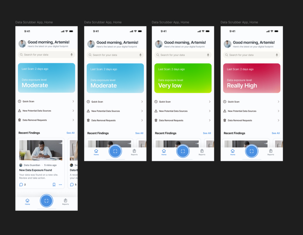
So I mapped out the user flow for this part. It starts with a clean welcome screen that gives a clear privacy status. This might say something like “You have 3 data exposures found” or “You’re all clear.” Just enough to give the user a sense of where things stand. From there, the most important action is the Scan Now button. This is the main thing the app offers, and it needs to be obvious and easy to tap.
Once the user hits that button, the app begins scanning for their data across different online sources. I imagined a simple progress indicator, maybe a friendly loading animation or a visual scan bar. No need for too many details yet. Just a sense that the app is working quietly in the background to find their information.
After the scan is complete, the user is taken to a short summary. This is where the tone really matters. It shouldn’t feel scary or overwhelming. It should feel clear and in control. Something like
“We found 4 pieces of your personal data online. Tap to review and take action.”

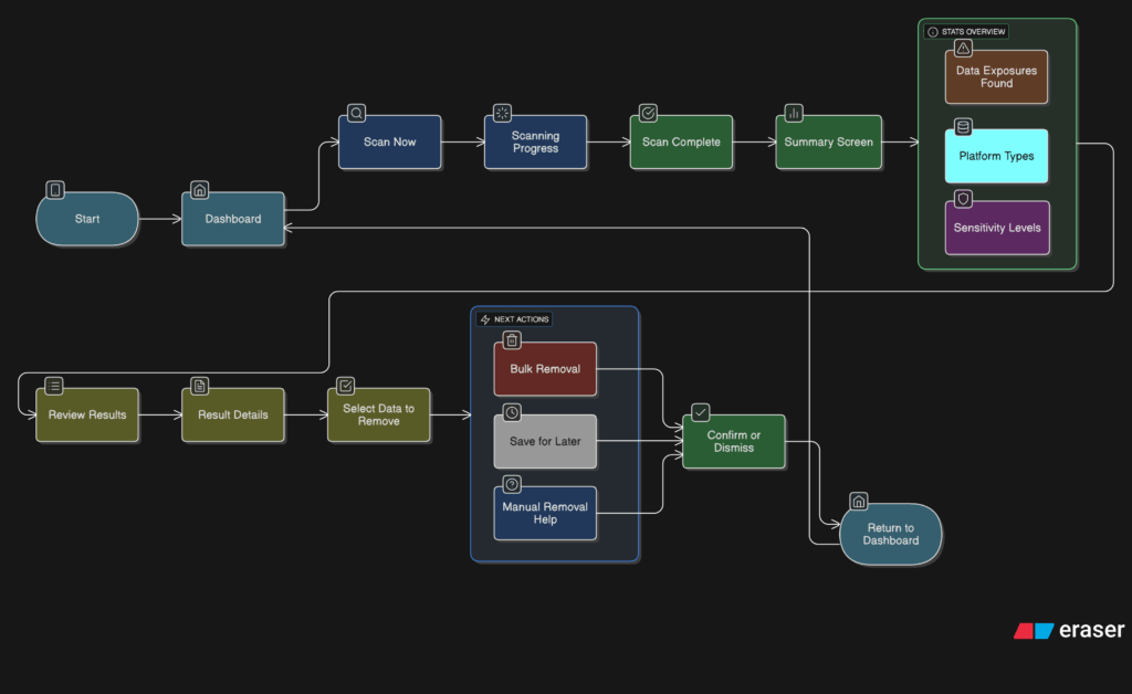
I also had to think about smaller touches. What if the user has never scanned before? Do we show an empty state with a short message that explains the tool? What about returning users? Should they see their last scan result or a prompt to scan again?
These are the kinds of small questions that start to stack up once you begin thinking through a full user journey. The challenge is to give people just the right amount of information without making things feel too heavy.
At this stage, I’m keeping things flexible. The layout will probably change as I move on, but the flow feels right. Welcome the user, show them where things stand, let them take action quickly, and offer a calm, clear summary when the scan is done.