2.4. First Test with Bare Conductive’s Touch Board

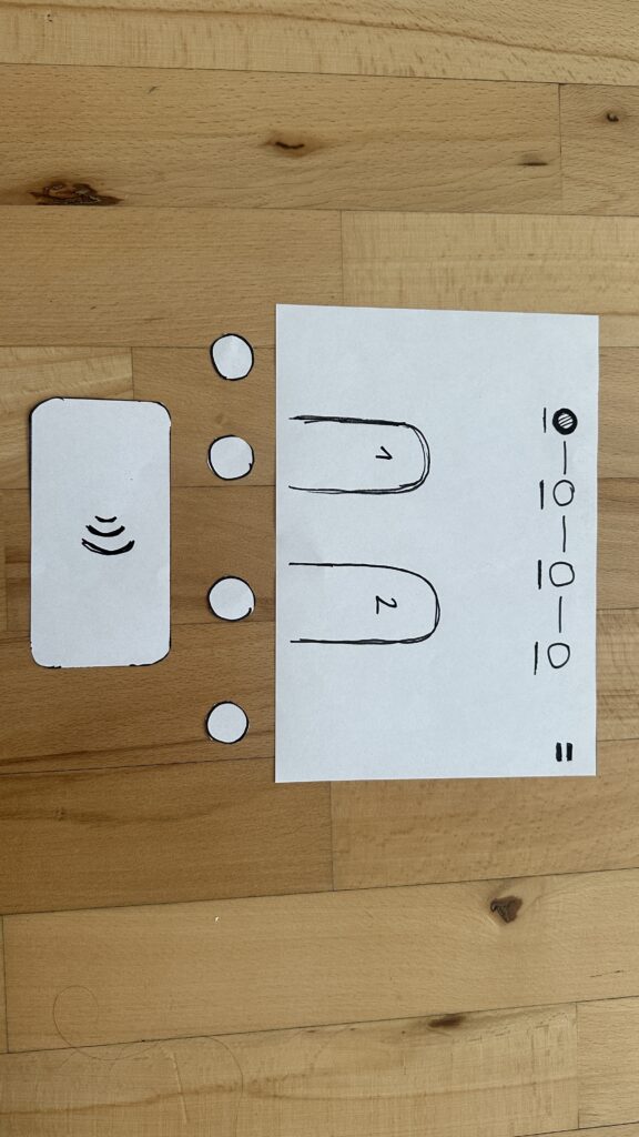
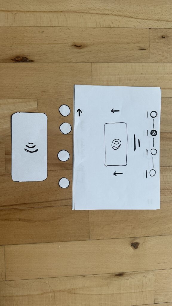
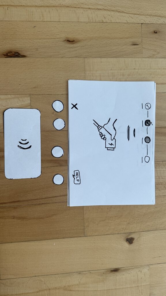
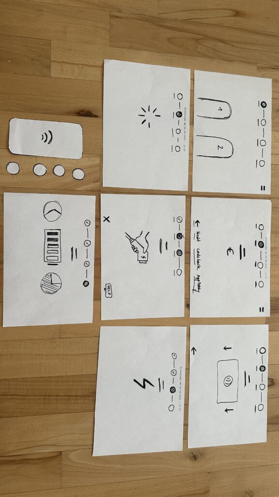
In this post, I’m documenting my first hands-on test with the Touch Board by Bare Conductive. After choosing it for its built-in capacitive touch sensors and MP3 playback, I wanted to validate whether this microcontroller could support the kind of screen-free, tactile storytelling I’m imagining, where visitors trigger audio simply by touching a point on a surface.

The Touch Board is basically an Arduino-compatible microcontroller designed for sound-based interactions.

It comes with:

  • 12 capacitive touch electrodes (E0-E11)
  • Built-in microSD card slot for MP3s
  • Audio jack and speaker terminal
  • Micro-USB for power and programming
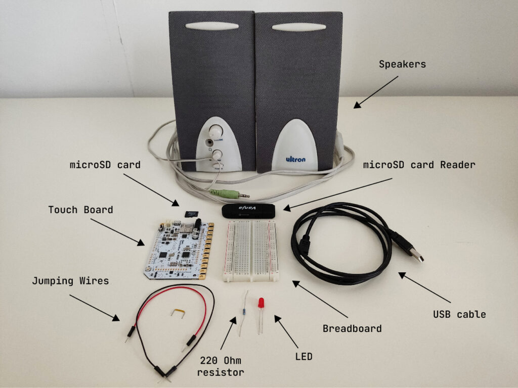
What I Used

  • 1x Touch Board
  • 1x microSD card
  • 1x microSD card reader
  • 1x Speaker
  • 1x USB cable (for power and code upload)
  • 1x LED (for basic feedback)
  • 1x 220 Ohm resistor
  • 1x Breadboard
  • 3x Jumping Wires
  • Bare Conductive’s “Touch MP3 with LEDs” example code

Basic Wiring

The Touch Board’s default “Touch MP3” code links each of the 12 electrodes (E0-E11) to a corresponding MP3 file on the microSD card. When you touch an electrode, it plays the matching audio clip.

To make the interaction more multisensory and responsive, I added a simple LED feedback: when a sound plays, the LED lights up.

Here’s how I wired it:

  • Connected Touch Board’s GND to the breadboard’s ground rail using a jumper wire.
  • Placed a red LED on the breadboard.
  • Connected the long leg (anode) of the LED to a 220Ω resistor.
  • Connected the short leg (cathode)  to the breadboard’s ground rail using a jumper wire.
  • Connected the other end of the resistor to one of the Touch Board’s pins using a jumper wire.

For more detailed instructions, check out this helpful tutorial: https://www.instructables.com/Touch-Board-and-LEDs/

First Test

Touching one of the electrodes triggered a short sound from the speaker. At the same time, the LED lit up, confirming that the interaction was happening.

Here’s a short video testing this simple interaction.

Observations

  • Responsiveness: Very fast, almost too sensitive. Occasionally triggered by nearby touches or objects.
  • Satisfaction: The sound + light combo made the interaction feel clear and complete.
  • Compactness: Everything fit neatly on one board. No need for additional modules at this stage.

Next Steps

For wrapping up this lo-fi prototype, I will:

  • Add more electrodes and connect multiple LEDs
  • Try using conductive ink or custom-designed graphics as touchpoints
  • Test a portable setup powered by a USB power bank
  • Design audio content that reflects unusual or hidden stories from Graz

Reflections

This first test confirmed that the Touch Board is a great fit for early-stage, lo-fi prototyping. It’s easy to set up, intuitive to work with, and lets me focus on designing interactions, not just solving hardware problems. More importantly, it opened up space for experimenting with storytelling, mapping emotion, sound, and place onto physical interaction. I’m excited to continue developing this idea and exploring how each touchpoint might reveal a different layer of the city.

Blog 4: Sketching an Intuitive EV Charging Interface

After my first wild prototype about a 1,000‑floor elevator, I realized I really want to stick with mobility. EV charging stations are such a timely, real‑world challenge plus, I’ve experienced the pain myself! My girlfriend’s dad owns an EV, and I’ve helped him charge it only to run into confusing screens and awkward cables. Others I chatted with have plenty of frustrating stories, too. So I decided: let’s start by sketching a super‑simple, button‑based interface and see how two real users feel about it. (User Testing Informationen available in the next Post)

Four Clear Steps

On paper, I drew these low‑fidelity screens, focusing on clarity over bells and whistles:

  1. Choose Your Charger
    • A simple map shows two plugs at a station.
    • Green plug: available. Red plug: occupied.
    • A progress bar at the top displays “Step 1 of 4”, so you always know where you are.
    • Why? Users often fumble for which port is free. Clear colors and a step indicator keep anxiety low.
  2. Verify Payment
    • Three big buttons let you pick Credit Card, RFID Charge‑Card, or App‑QR Code.
    • A Back button (which lights red if you tap it) lets you switch methods at any time.
    • Once you choose, a screen prompts you to hold your card or show the QR code.
    • Why? Real stations offer multiple payment options. Lumping them into three buttons matches user expectations and avoids tiny menu lists.
  3. Plug In Cable
  • An animated cable slides out of the station.
  • A simple diagram shows “Cable → Car Port.”
  • If it clicks in correctly, the station glows green. If it fails, it glows red. A gentle blue pulse means “charging.”
  • Why? Physical actions need instant feedback. Color and motion reassure the user that they plugged in correctly.

    4. Charging Overview
  • Time Remaining: Counts down so you know when you’re done.
  • Battery Icon + Bar: State‑of‑charge advances in real time.
  • Power Delivered (kW): Shows exactly how fast you’re charging.
  • Big buttons: “End Session,” “Help,” “Info,” and “Language.”
  • Why? These are the four most‑asked questions: How long? How full? How fast? And what if I need help or another language?

Design Choices & Future Accessibility

  • Physical Buttons vs. Full Touchscreen: Early users can look, press, and go (no searching menus)
  • Progress Bar: Keeps people calm by showing exactly where they are in the flow.
  • Language Toggle: Always visible in case you need English, German, or any other option.
  • Text‑to‑Speech Future: With a long press on a touchscreen button, an image‑to‑speech API could read the label aloud for visually impaired users.

I’ll soon interview blind or wheelchair‑using drivers to see what adaptations they need. In a world of self‑driving cars, everyone should be able to charge their own vehicle of course.

Next: Real‑World User Tests

As a next step, I’ll ask some volunteers to walk through these sketches:

  • Where do they pause?
  • Which buttons feel unclear?
  • Do they spot the back arrow or language switch easily?
  • How do they react to red/green/blue feedback?

I’ll refine the flow based on their comments, then build clickable wireframes or maybe a cardboard prototype with LEGO. Iteration will tell me what works best.

Early References & Inspiration

  • Intuitive UI example: technagon.de/intuitive-user-interface-laden-kann-so-einfach-sein/
  • EV station UX tips: altia.com/2023/08/16/enhancing-ev-charging-station-ux-and-why-it-matters/
  • Payment variety today: ekoenergetyka.com/blog/how-do-ev-charging-stations-work/
  • Kempower design guide: kempower.com/user-experience-ev-charger-design/

These resources helped me understand real pain points and best practices. I’ll keep updating this blog as I refine the design and test with real users because the journey from sketch to screen is just beginning.