What Real Users Say About Public EV Charging
Last week I spent hours scrolling through Reddit, Trustpilot and German EV forums like GoingElectric. I was looking for honest user stories about public charging, not this polished marketing stuff, but real frustration, real emotions. what I found is exactly what my master thesis needs to understand.
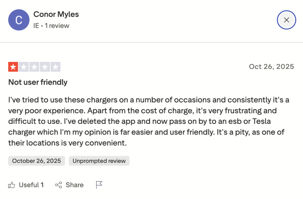
The most striking thing is not just that things break. It is the feeling behind it. One user on Reddit wrote something like: “I used to have range anxiety. Now I have charger anxiety.” Another person mentioned they estimate 25 to 50 percent of their public charging sessions go wrong somehow – either the charger does not start, the cable gets stuck, or the app crashes. One user tried four times to charge at an Ionity station, typing in their credit card each time. Nothing worked. They called the hotline and were told “Your car is broken.” It was not. https://www.trustpilot.com/review/ionity.eu
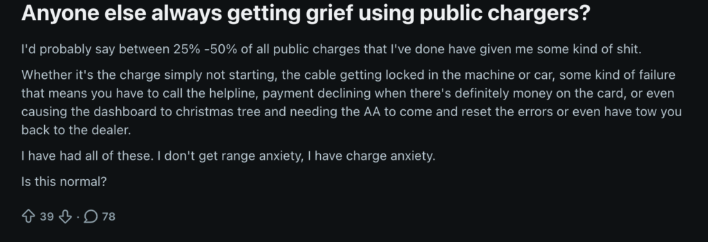
What surprised me most is how stressed people feel before they even arrive at a station. They do not know if it will work. They do not know what it will cost. On Trustpilot, someone paid 73€ to charge from 2% to 70% battery and then the support person told them this was normal. Normal! One person wrote: “Why does it have to be 10 times more complicated than buying diesel?”
I noticed a pattern of main problems:
- Payment chaos
Different cards, different apps, unclear pricing. Pre-authorizations that get stuck and take weeks to refund. One person had 40 pounds taken from their account three times and then had to wait seven days for each refund.
- Technical failures
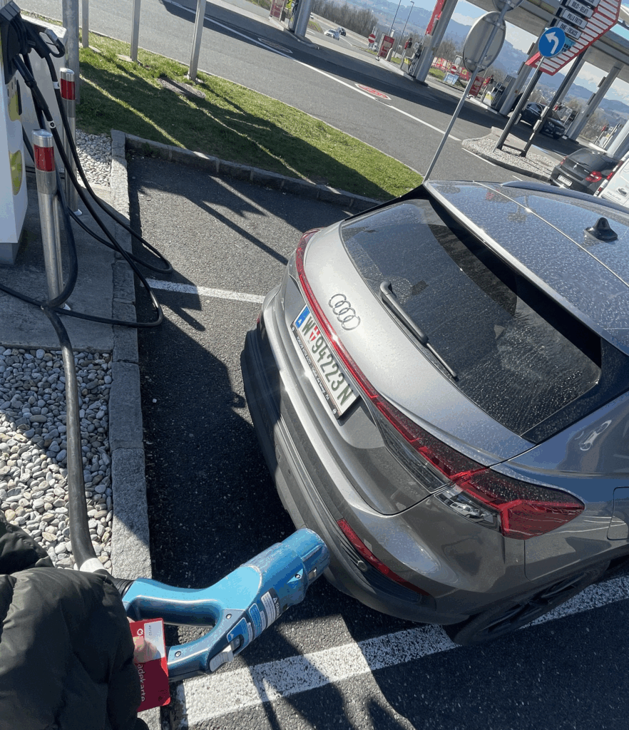
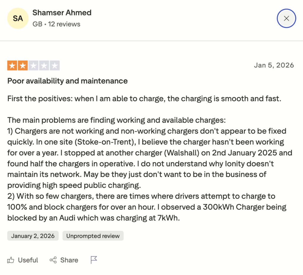
Chargers that start but stop after one minute. Cables that lock and won’t unlock. Had this problem also often by myself! Really frustrating when the cable is stuck and locked. App screens that freeze for 30 seconds. About 25% of payment readers broken. Half of the remaining chargers “freeze up” at least once.
- No clear instructions
People write things like “I wasted 15 minutes trying to figure out how to start charging. No step-by-step. Just… chaos.” One person said nobody explains what order to do things in – lock the car first, or plug in first? Nobody knows.
- Emotional states
The feeling is stressed, frustrated, sometimes angry. One comment said “beyond frustrating.” Others use words like “rip-off” and “scandal.” I also noticed something interesting: people who figured out a workaround share it like a secret tip. One person discovered you have to turn off your car, exit, lock it, unlock it again, THEN plug in. This should not be a secret. This should be obvious. https://www.reddit.com/r/ElectricVehiclesUK/comments/1q35bo8/if_range_anxiety_isnt_the_real_issue_whats/
For my thesis, this is gold. These are real first-time users (or experienced ones still struggling) describing exactly what breaks down in their mental model and confidence. They did not expect charging to be so complicated. They expected it to work like gasoline – simple, clear, fast.
I also found that Austria is not special in this problem. The same complaints come from the UK, Germany, Netherlands. It is a European-wide issue.
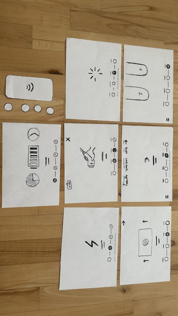
What does this mean now for my own research? It tells me that onboarding is not just about the touchpoint where the user stands at the station. It starts with trust. Will this station work? What will it cost? How do I do this? The first-time user is already anxious before they arrive. My job is to design away that anxiety, as i often mention through clear guidance, transparent pricing, and step-by-step help across all touchpoints: the app, the car, the station, the website.
These user voices of these forums was really worth reading through and gave me new pain points i havent thought about yet and will definetly help me for the thesis. They are reminding me: design for the stressed, confused person. Not for someone who has charged 100 times.
Disclaimer: This blog post uses real quotes and themes paraphrased from public Reddit discussions, Trustpilot reviews and forum posts. No direct copy-paste was used, but the emotional tone and pain points are taken directly from user experiences shared online. AI (Perplexity) was used to better and faster find these forums in the internet.