#12 DataVis Workshop

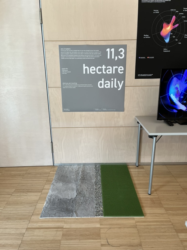
The workshop WS#6 Eva-Maria Heinrich / Bringing the Abstract to Life – Beyond Data Visualisation at the International Design Week was all about pushing my prototype beyond pixels and printouts. Instead of presenting Austria’s daily land consumption as another chart, I set out to build a physical prototype – a 1.13 m² “slice” of ground that stands in for every hectare consumed in a single day. Here’s a rundown of my process, why a hands-on prototype matters, and the production hurdles I encountered along the way.


Why Prototype Matters in Multi-Sensory Data Visualization

Many of my previous posts have explored the theory behind multi-sensory data visualization – how tactile textures, sounds, or spatial arrangements can make numbers resonate more deeply. This time, I wanted to prototype those ideas in a tangible form. By crafting a small landscape that viewers can actually touch, I could test whether the physicality adds insight that a static infographic simply can’t. In other words, this wasn’t a polished art piece – it was a work-in-progress prototype intended to reveal both the strengths and limitations of turning data into material.


Concept: A 1.13 m² “Plot” of Daily Land Use

At a scale of 1:10 000, 1 cm² on my board represents 1 hectare in the real world. To capture Austria’s daily land conversion, the board measures 1.13 m² total, divided into:

  • 52 % concrete (fully sealed surfaces like roads and buildings)
  • 12 % gravel (partially sealed areas such as construction zones)
  • 36 % grass (green spaces cut off from natural ecosystems)

When laid out side by side, these materials form a unified plane that still reveals stark textural differences up close. Walking viewers through each zone gets them thinking: “That gray slab isn’t just a shape – it’s every driveway and parking lot paved over today.”


From Sketch to First Prototype

Mapping Out the Layout

I began by sketching on paper, dividing a 1 m × 1.13 m rectangle into proportional zones. Once I had rough percentages, I exported the grid to Illustrator to generate precise outlines. Printing a full-scale template and taping it to plywood helped me trace clean boundaries for concrete, gravel, and grass sections.

Gathering & Testing Materials

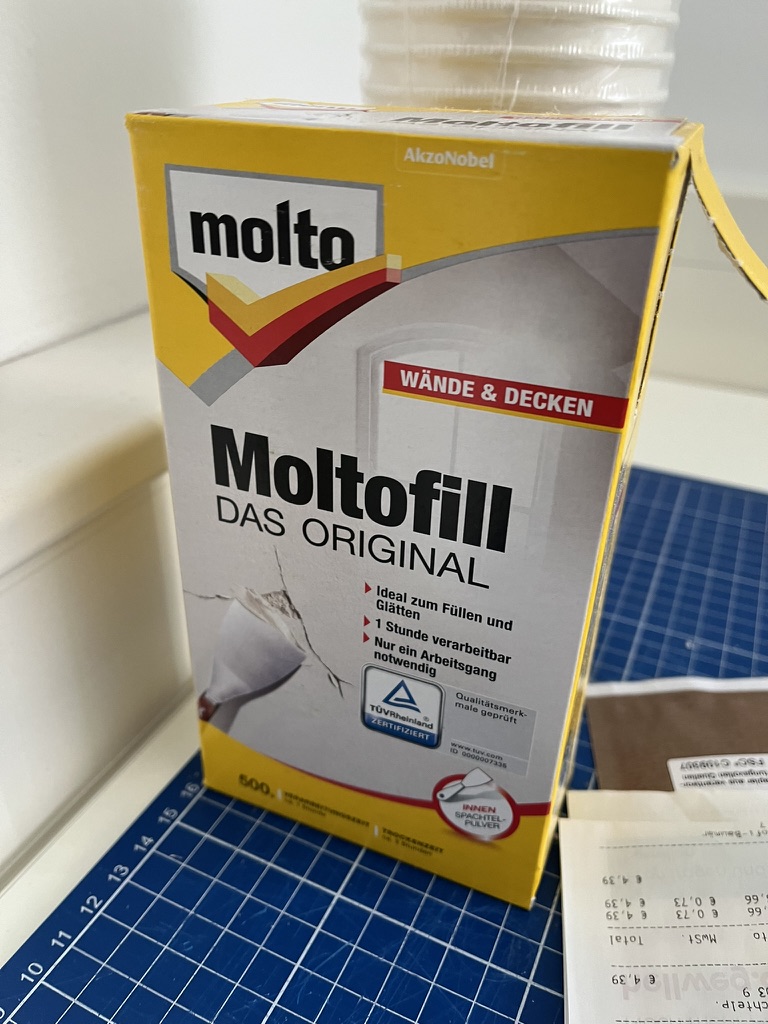
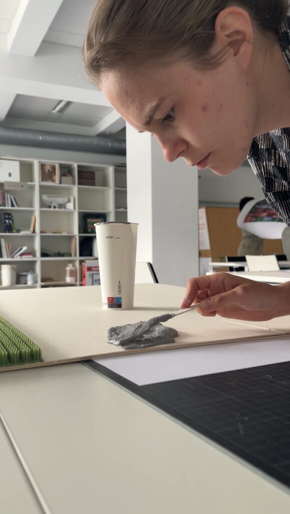
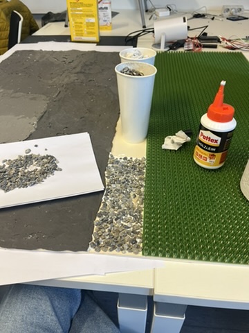
  • Concrete mix: I bought a small bag of ready-to-mix putty. My first batch was too smooth, so I added extra pebbles I got on the street to add some texture.
  • Gravel: I grabbed some gravel from a construction site. Putting it basically one by one on the surface, I glued them down with normal glue.
  • Grass: I had a few ideas for grass but because of time constraint I settled on a doormat I found at the hardware store, knowing I could swap in live grass later.

Building the First Iteration

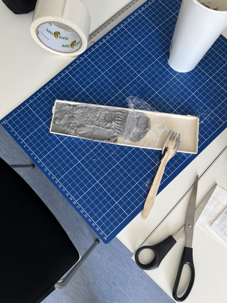
  1. Base Preparation: I glued two sheets of thin carton together (hoping for the best).
  2. Concrete Section: Mixing putty and gravel, I poured it cup by cup each time mixing it again and again.
  3. Gravel Section: I sprinkled gravel by hand, and gently pressed it in place.
  4. Grass Section: Cutting the doormat to form was very easy and I just glued it down.

What I learned in the process

Prototyping isn’t a linear path, and my first iteration had plenty of hiccups.

Mainly finding the right material and then finding good substitutes because of the time frame. Then of course finding the right mix for the putty and putting it on the surface.

By the end of the week, the prototype still had a few chips of gravel out of place and some cracks and color difference in the putty, but those imperfections felt authentic – almost like the real world, where land-use boundaries aren’t always neat and tidy.


Why This Prototype Matters

  • Tactile Immersion: Viewers can kneel down and feel the roughness of gravel next to the coldness of the putty. That sensorial contrast sparks a more intuitive understanding of how land is consumed.
  • Immediate Comparisons: Instead of reading “52 %” on a slide, people see the massive concrete patch in context – ranking it against gravel and grass sizes without needing numbers to guide their eyes.
  • Hands-On Research: As a prototype, it’s a learning tool more than a final exhibit. The bumps in production taught me about material properties – knowledge I’ll carry into my next prototype. Each mis-cut or adhesive spill revealed potential adjustments for future iterations.

Final Thoughts

Prototyping this 1.13 m² piece of ground forced me to embrace trial and error. Every spilled drop of glue and cracked chunk of putty helped me understand how to translate data into material form. The end result isn’t a museum-ready installation – it’s a functional prototype that still has rough edges. But those imperfections are part of its story: they remind me (and future viewers) that real-world data isn’t always clean, and neither is the crafting process that brings it to life. Already, this initial version has sparked new ideas for my thesis – especially around combining tactile and auditory layers.

#06 Kinesthetic Design and Embodiment

In the realm of data visualisation, understanding complex relationships often requires more than just seeing or hearing the data. Kinesthetic design—grounded in physical interaction and body movement—offers a compelling way to connect with information. By engaging the body, this approach transforms abstract datasets into tangible, interactive experiences, fostering deeper understanding, creativity, and even emotional resonance.

What Is Kinesthetic Design?

Kinesthetic design focuses on using physical movements and gestures to explore and interpret data. This interaction creates a loop between the user’s actions and the feedback they receive, making the experience both intuitive and memorable.

For instance, imagine interacting with a 3D map where moving your hand across a surface changes the terrain display or simulates wind patterns. By physically engaging with the data, you can better grasp its spatial and temporal dimensions—concepts that are often difficult to capture in static visualisations.


The Power of Embodiment

Embodied interaction, a cornerstone of kinesthetic design, bridges the gap between abstract data and physical experience. As researchers like Dourish have pointed out, interacting with physical objects enhances cognition by embedding data into the world being manipulated. This principle applies across various contexts, from tangible interfaces to immersive virtual environments.

Key benefits of embodied interaction include:

Enhanced Comprehension: Physical movement aligns with natural learning processes, helping users better understand spatial relationships.

Reflective Practice: Physical interactions encourage experimentation and exploration, often leading to insights that might be missed in purely visual or auditory systems.

Emotional Engagement: The tactile nature of kinesthetic design fosters a stronger connection to the data, making the experience more meaningful.


Applications of Kinesthetic Design

1. Interactive Data Sculptures:

Physical objects that represent data, such as 3D-printed models, allow users to “feel” the peaks, troughs, and connections within datasets. For example, a sculpture representing temperature fluctuations over time might use varying textures to highlight extreme weather events.

2. Sports and Motion Simulators:

In sports training, simulators that replicate real-world actions—like swinging a golf club or rowing—merge physical motion with data feedback. These systems use real-time haptic and auditory cues to refine movements and improve performance.

3. Collaborative Platforms:

Tools like the Campfire platform allow teams to interact with data through 3D projections. Participants can move around the environment, using gestures to manipulate variables and explore relationships from multiple angles.


Designing for Kinesthetic Interaction

Creating effective kinesthetic experiences requires careful attention to user behavior and sensory feedback.

Physical Intuition: Design interactions that align with natural movements, such as rotating, pushing, or pulling.

Sensory Feedback: Integrate tactile cues (e.g. vibration, pressure) or auditory signals to reinforce actions and provide guidance.

Collaborative Dynamics: In group settings, ensure interactions encourage communication and shared decision-making.


References

M. N. Folkmann, “The Aesthetics of Digital Objects,” in Design and Semantics of Form and Movement, final published version, 2015.

P. Search, “Multisensory Physical Environments for Data Representation,” in Design, User Experience, and Usability: Technological Contexts. DUXU 2016. Lecture Notes in Computer Science, vol. 9748, A. Marcus, Ed. Cham, Switzerland: Springer, 2016, doi: 10.1007/978-3-319-40406-6_19.
https://link.springer.com/chapter/10.1007/978-3-319-40406-6_19

https://instructionaldesign.com.au/different-strokes-for-different-folks-learning-styles

Importance of (UX-) Design in Risk communication  

Introduction 

Last September, Austria experienced a devastating flood event, highlighting the growing impact of simultaneous and systemic crises like climate change, armed conflicts, and pandemics. These events cause massive damage and disrupt lives, yet understanding and utilizing technical data to prepare for such crises often remains a significant challenge. 

To address this, the “RiskLIM” project, spearheaded by the Safety and Disaster Studies working group at Montanuniversität Leoben, aims to optimize cross-border climate services. By collaborating with organizations such as GeoSphere Austria, the German Weather Service, and the Avalanche Warning Centre, this EU-funded initiative focuses on creating actionable risk impact assessments, particularly for avalanches and snow loads. The project emphasizes bridging the gap between technical data and effective communication to better equip society for short-term hazards and long-term climate adaptation. 


Personal motivation 

As a graphic designer and content creator at the Montanuniversität Leoben, I’ve had the privilege of exploring diverse research fields, gaining valuable insights into how visual communication can simplify complex concepts. My interest in safety and disaster studies was piqued early on, particularly through discussions with the program coordinator. These conversations opened the door to integrating design into risk communication, shaping the idea of developing a master’s thesis around this critical topic. 

This intersection of research and design is incredibly compelling to me. Visual communication isn’t just about aesthetics; it’s a tool to make technical information understandable and actionable, especially in high-stress situations where clarity and usability can save lives. 


Design relevance  

Effective risk communication is more than just disseminating information; it’s about ensuring the right message reaches the right audience in a manner they can understand and act upon. Interaction design offers powerful tools to achieve this goal by simplifying interfaces, prioritizing critical information, and addressing the user’s state of mind during crises. 

For example, interactive maps can visualize real-time risk data, helping individuals and organizations make informed decisions. By employing principles of user experience (UX) design—such as clarity, accessibility, and user-centered design—these tools can transform how communities respond to emergencies. This approach aligns seamlessly with the objectives of the RiskLIM project, providing a unique opportunity to enhance risk communication through design. 


Possible Research Questions 

Since I haven’t yet gained much insight into the project and don’t know exactly in which direction it is developing, it is difficult to formulate a precise research question. That’s why I thought very generally and asked myself the following questions: 

  • How can visual design improve the accessibility and comprehension of technical data in risk communication? 
  • What role does interactive design play in facilitating community preparedness for natural hazards? 
  • How can user experience principles be adapted to meet the challenges of high-stress scenarios in risk communication? 

Expected Challenges 

Working with scientific experts: Collaboration with experts from technical fields who may not fully understand the potential of design could pose challenges. Bridging this gap will require careful communication and showcasing how design complements their expertise. Additionally, gathering feedback from diverse user groups to create universally accessible tools might demand extensive testing and iteration. 

Knowledge Gap: Gaining in-depth understanding of risk communication and technical aspects of the project may require extensive self-study. 


Next steps  

My plan to move forward: 

  1. Deepen my understanding of risk communication and its existing methodologies. 
  1. Engage with the RiskLIM project team to identify key areas where design can add value. 
  1. Develop prototypes, such as interactive maps, to demonstrate how UX design can enhance risk communication. 

Links 

The project: https://www.sds-unileoben.at/risklim-2/ 

A. Cleaveland, G. Gordon, J. Newman and S. Weber, “Designing Risk Communications,” University of California, Berkeley, Dec. 2020, doi: https://cltc.berkeley.edu/wp-content/uploads/2020/12/Designing_Risk_Communications.pdf 

#05 Visualization Impacts: How Data and Gamification Drive Eco-Consciousness

In a world saturated with information, visualization and gamification have emerged as powerful tools to simplify complex ideas, improve learning, and influence behavior. When it comes to sustainability, presenting data visually—through tools like infographics, interactive apps, or gamified experiences—can significantly boost awareness and motivate eco-conscious actions or promoting digital sustainability.

The Power of Data Visualization

Data visualization transforms abstract numbers into meaningful insights. Studies show that:

90% of information transmitted to the brain is visual, and people process visuals 60,000 times faster than text. Infographics, charts, and other visual tools increase the likelihood of remembering information , this means that carbon emissions, energy usage, or waste statistics—often hidden in dense reports—become instantly understandable when visualized. For example, seeing a pie chart that breaks down carbon emissions by activity makes it easier to grasp where one’s biggest impacts lie.

Gamification Makes Learning Stick

Gamification—adding game-like elements such as goals, rewards, or challenges—enhances engagement and motivates users to take action.

  • Gamified apps like eco2log, which track and reward users for reducing their carbon footprint, turn data into a journey of self-improvement.
  • Users are more likely to retain information and build habits when feedback is interactive and rewarding.

For example, an app might visualize a user’s digital energy use (like GB streamed) as a tree. The tree thrives when they make sustainable choices, such as streaming in lower resolutions or reducing data usage.

Successful Examples of Visualization in Action

UN’s Carbon Footprint Calculator
The United Nations’ online tool uses interactive sliders and graphs to show how choices in transport, food, and housing affect emissions. It’s an excellent example of visualizing complex data in an engaging, accessible way.

https://peggada.com/en/4-apps-to-help-you-calculate-and-reduce-your-carbon-footprint/

Chasing Ice Documentary
This film used stunning time-lapse visuals of melting glaciers to drive awareness of climate change. The emotional impact of visuals was a key factor in its success.

Piktochart Campaigns
Infographics created with platforms like Piktochart have simplified sustainability statistics, making them widely shareable on social media and accessible to non-expert audiences .

Visualization has the potential to transform how we understand and act on sustainability. When data is clear, engaging, and actionable, it sticks with us—and motivates change.

Resources:
https://www.tiny.cloud/blog/content-visual-imagery-guide/#stk-2-6

https://piktochart.com/blog/data-visualization-statistics/#the-effectiveness-of-data-visualization