Before deploying the system in ocean conditions, a controlled test was performed using a surf skate on land in order to structure the synchronization part of the different media in advance. Therefore, the simulation served multiple purposes:
- First, to test the stability and functionality of the hardware setup under strong movements
- To collect and analyze motion data from surfing-like movements like the cutback using the ximu3 sensor
- To test and evaluate the contact microphone’s responsiveness to board interaction and different movement patterns
- To practice audiovisual synchronization between footage an external camera setup, the Zoom H4n recorder, the contact microphone and the x-IMU3 motion data.
Therefore, the surf skate was chosen because of its closely representation of the body movement and board rotation then surfing. Especially the cutback movement can be imitated by using a skate ramp.

This testing setup consists of the following tools:
- A Carver-style surf skateboard
- The x-IMU3 sensor mounted on the bottom of the board to capture movement dynamics
- The Piezo contact microphone taped next to the motion sensor on the bottom of the board. After testing the microphone was placed in the middle of the skateboard deck in order to capture the movement of both axes of the board at the same amount of loudness. Placing the microphone closer to the wheels of the board would result in much more noise in the recording due to the internal rotation of the axes.
- The Zoom H4n recorder was help in the hand of the skater and was connected to closed over ear headphones.
- Using the external film camera Sony Alpha 7iii the whole test was captured. This additional recording was helpful later in the synchronization part.
The board was ridden in a skate ramp simulating the composition of the wave. ON the top of the ramp the cutback movement can be executed.
At the start of the recording session, all devices were synchronized through a short impulse sound (hitting on the board) recorded on all three devices: Zoom, GoPro, and x-IMU3. The single surf skate tackes lasted approximately 2 minutes of recording and were repeated multiple times.
The data recorded consists of:
- accelerometer, gyroscope, orientation from the x-IMU3
- Mono WAV audio from the contact mic
- 1080p video footage from the external camera
The files were transferred and loaded into the respective analysis environments:
The x-IMU3 data was decoded using the official GUI and exported as CSV files;
The WAV audio was imported into REAPER and cross-referenced with the GoPro’s audio to align the sync impulse;
Motion data was plotted using Python and matched frame-by-frame to movement events in the video.
The result was a perfectly aligned audio-motion-video composite, usable both for analysis and composition.
The contact mic successfully captured vibrational data including surface noise, carving intensity, and road texture;
The x-IMU3 data revealed clear peaks in angular velocity during simulated cutbacks and sharp turns;
The GoPro footage confirmed that movement gestures correlated well with sonic and motion data markers;
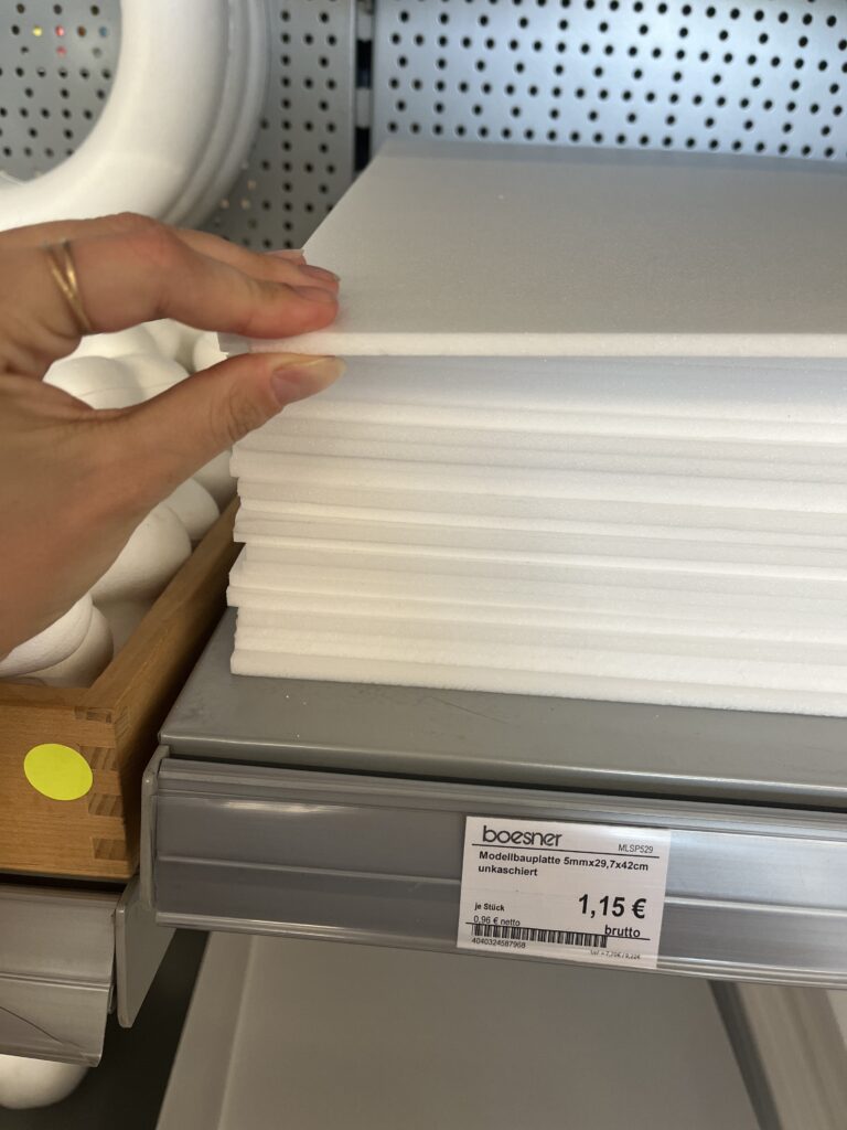
The Pelican case and foam provided sufficient shock insulation and no overheating or component failure occurred;
The synchronization method using a single impulse sound proved highly reliable.
The surf skate test validated the concept and highlighted important considerations:
Movement-based sonic gestures are highly expressive and usable for composition;
Vibration sensitivity of the contact mic is sufficient for detailed sound capture;
The sync strategy will work equally well in ocean sessions with minor adjustments;
Battery and storage life are adequate for short-to-medium-length surf sessions;
Cable insulation and structural mounting are durable under stress.
This test confirmed the system’s readiness for its full application in Morocco, where ocean sessions will build upon the structure and learnings of this simulation.
