As part of the ongoing series on spatial mixing approaches in practice, this post continues the analysis of Alter Me. After examining spatial width and impact, the focus now shifts to vocal arrangement and spatial density as key compositional tools in immersive mixing.
Vocal Arrangement and Spatial Density
Vocal production played a central role in my spatial productions and mixes. The lead vocal remains dry and clearly localized in the center channel, providing a stable perceptual anchor throughout the song. Reverberation and delay are routed to the other channels.
In the verses, vocal processing is kept relatively restrained, using slapback delay and reduced reverb to maintain focus. In the chorus, longer delay throws and increased reverberation are introduced to enhance perceived size.
Backing vocals are treated as a spatial and structural element rather than as additional layers only. In the verses, they are reduced in number, less widely distributed, and processed with minimal reverb. In the chorus, backing vocals become more numerous, more saturated, spatially wider, and more reverberant. This increase in spatial density contributes significantly to the perceived size of the chorus while maintaining a clearly localized lead vocal.
The following blog posts focus on selected spatial mixing approaches applied in practice during the production of this EP. Rather than providing complete production breakdowns, the emphasis lies on specific spatial decisions that were consciously made to support musical structure, narrative development, and listener perception.
The series begins with Alter Me and examines how spatial width, focus, and contrast were used as compositional tools within an immersive mixing context. Subsequent posts will expand on these ideas by exploring additional spatial strategies applied in other tracks of the project.
Alter Me – Spatial Mixing Decisions
Song Context and Narrative Function
Alter Me is conceived as a dialog with one’s own addiction. The song portrays addiction as an internal voice that initially appears supportive and reassuring, but gradually reveals its manipulative and destructive nature. As the song progresses, this internal conflict becomes more explicit, culminating in an emotional outburst during the chorus.
The spatial design of the track was used to support this narrative by differentiating between internal and external perspectives and by reinforcing contrasts between sections.
Spatial Width and Impact
The introduction of Alter Me consists of a single guitar, a snare roll, and several sustained E-bow layers. These E-bow sounds are spatially distributed and move around the listener, creating a highly immersive and enveloping sound field. The intention was to represent the intrusive and surrounding nature of the “addiction voice” before the band enters.
When the full band enters, the spatial strategy changes noticeably. Drums, bass, and guitars are deliberately focused toward the front, and the overall spatial width is reduced. During production, it became clear that an extremely wide and immersive intro can reduce the perceived impact of the band entry. By slightly narrowing the spatial image before the entry, the contrast between intro and chorus is increased, resulting in a stronger sense of impact and energy.
This observation was particularly noticeable during studio monitoring and binaural listening. Interestingly, playback in the Cube emphasized different aspects of this contrast, highlighting how playback environments can influence spatial perception.
Additionally, spatial width is further enhanced by adding multiple, largely uncorrelated signals. Different performances, variations in timing, timbre, and spatial position contribute to a wider and more complex spatial image.
After the first drum recording session laid the foundation for Standby, a second session was planned with a stronger focus on experimentation and refinement.
In total, two major drum recording sessions were conducted during the project. The first session, which formed the basis for Standby, has already been described in previous blog entries. The second session took place in September 2025 and involved significantly more preparation time, setup complexity, and experimental testing.
This second session was characterized by an increased focus on exploration and critical listening. Considerable time was spent finding suitable microphone positions and evaluating their sound, resulting in a much more intensive and hands-on recording process.
Experimental Room Microphone Approaches
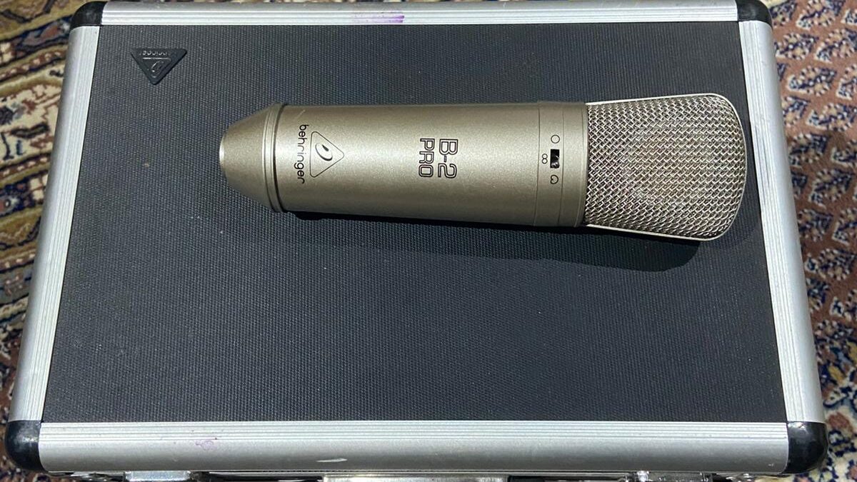
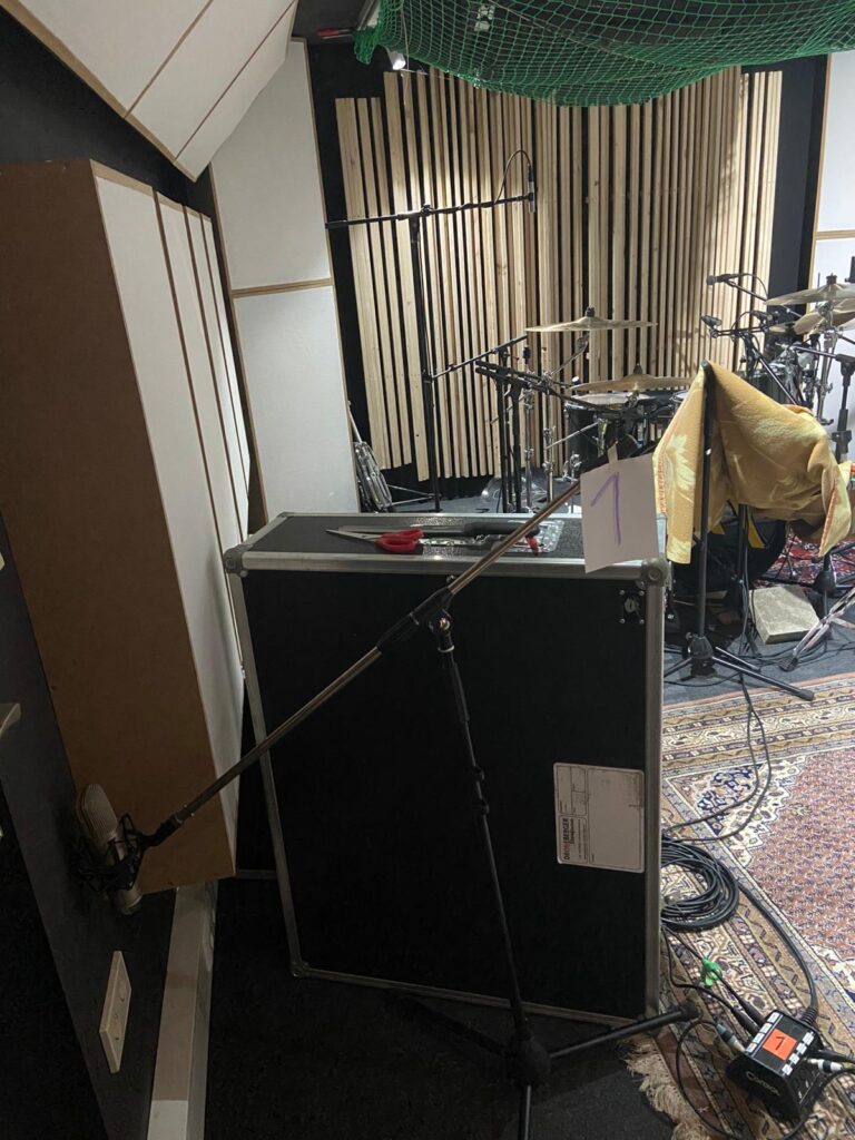
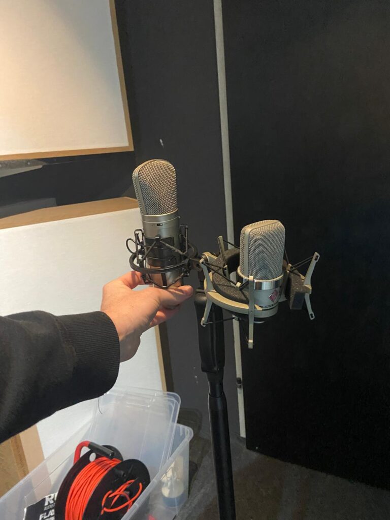
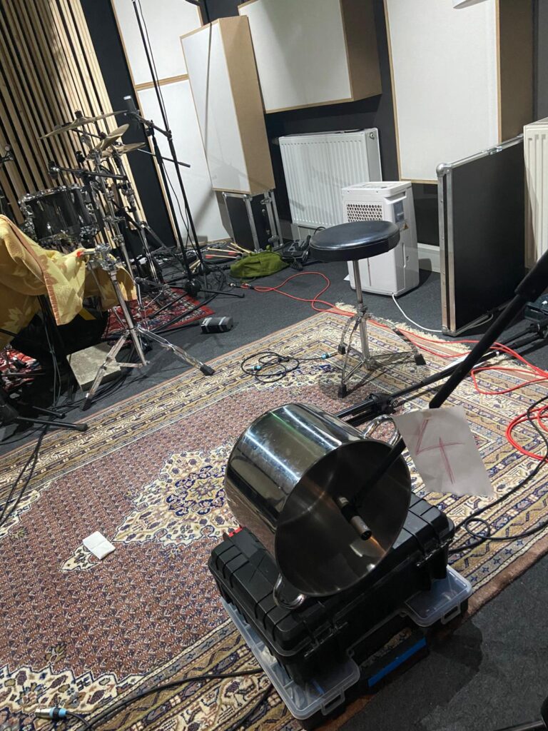
During the second recording session, a wide range of unconventional room microphone techniques were tested. For this purpose, several older Behringer B2 large-diaphragm condenser microphones were used, which I was able to borrow from a friend for the session.
Various microphone constellations were explored, often with the intention of minimizing direct sound capture and emphasizing early reflections and reverberant components instead.
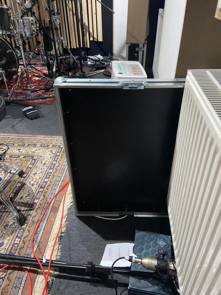
Due to the limited room size, achieving a clean separation between direct sound and room response proved challenging. Nevertheless, multiple strategies were tested, including shielding direct sound and placing microphones in acoustically reactive positions. Additional experiments were conducted by capturing resonant objects within the room, such as a large metal pot or a radiator, in order to introduce controlled resonances—through postproduction, the so-called “dirt”—into the drum sound.
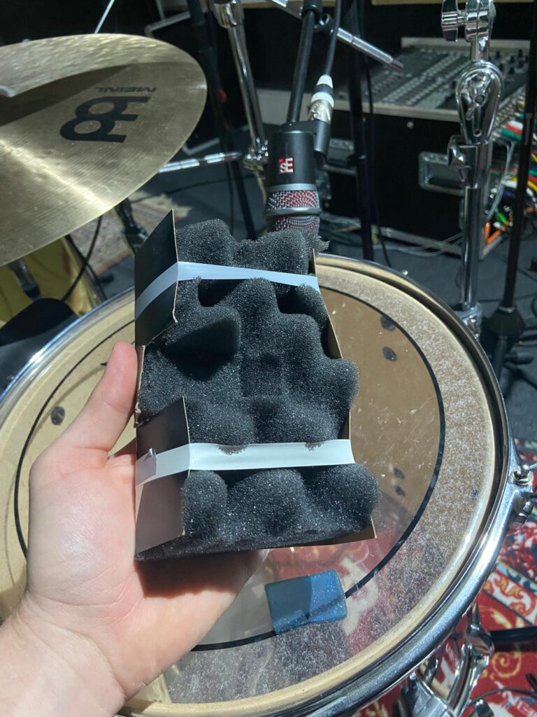
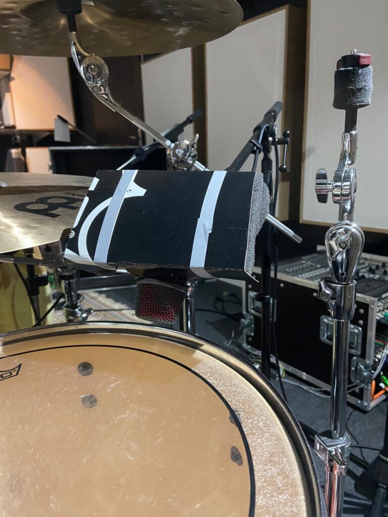
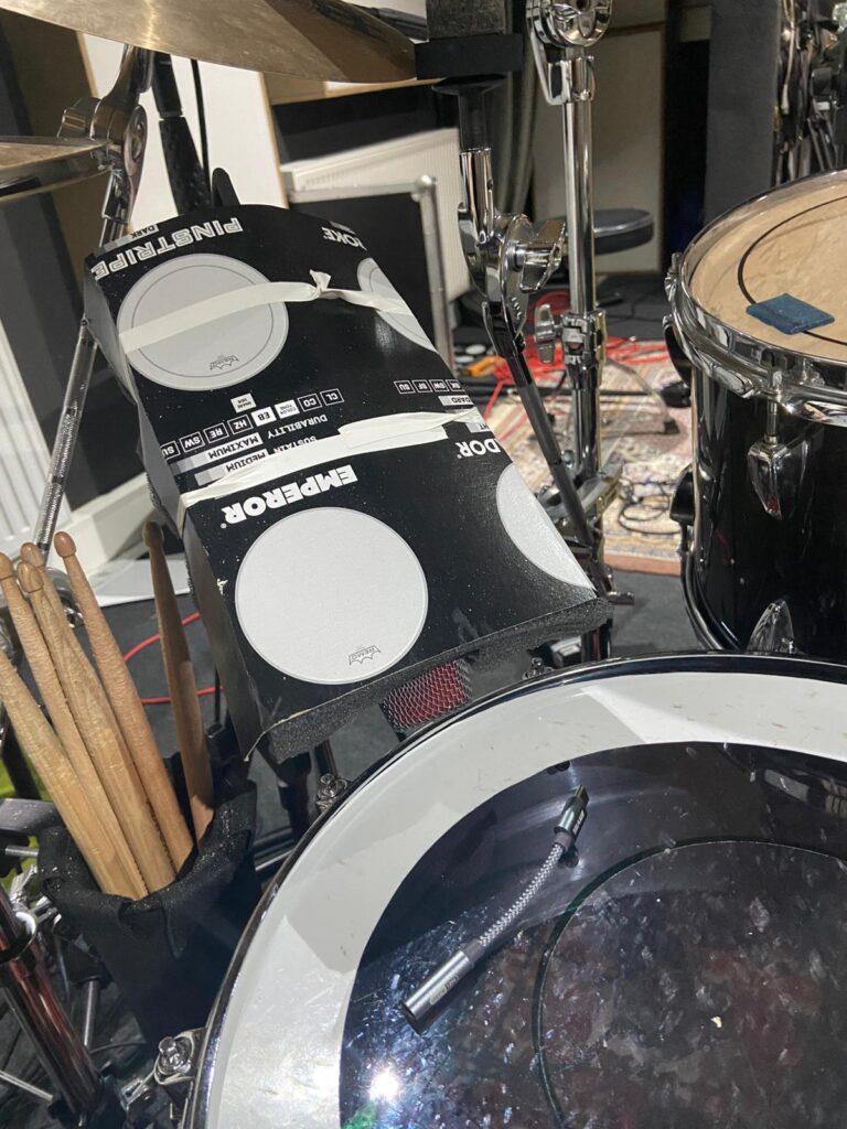
We also built temporary drum shields to reduce cymbal bleed, particularly for the snare and tom microphones.
Evaluation and Consequences
In practice, many of these experimental approaches resulted in signals that were perceived as overly diffuse or lacking clarity. Even after phase alignment and corrective processing, the room microphones often introduced a smeared or unstable drum image. Within an immersive context, this effect was further amplified, as spatial placement of these signals tended to pull the perceived drum position away from a stable frontal image.
As a result, the use of room microphones was significantly reduced. The most effective and reliable solution proved to be the “Droom” microphone setup (A/B stereo placement) positioned directly in front of the drum kit. This configuration provided a coherent spatial impression of the room while maintaining a clear and stable drum image. The “Droom” signal was spatially distributed behind the listener to increase envelopment and, in some cases, dynamically automated—for example, becoming more prominent during choruses. This technique proved highly successful and is considered a valuable approach for future productions.
The refined recording strategies directly influenced the production of the following tracks Alter Me and Caught In Dreams.
After completing the first recording, production and mixing phase, my interest in increasing our production quality got higher. I especially wanted to gain more knowledge in the field of mixing and recording — particularly drum recording.
Having “caught the bug” during the initial sessions, I became increasingly curious about unconventional approaches to capturing drum sound, especially in the context of immersive music production. Influences from producers and engineers such as Moses Schneider and Hans-Martin Buff encouraged me to further explore alternative recording strategies and to actively test the potential of non-standard microphone placements.
Für meinen siebenten Impuls möchte ich endlich einmal etwas über die schier endlosen Weisheiten des WanderingDP mit euch teilen. Seit einigen Monaten schaue ich nun seine Pay-per-View Videos und bin nämlich echt schwer davon beeindruckt, wie genau und praktisch er auf Dinge eingeht. Als erstes möchte ich daher sein “Framework” zusammenfassen, das ist eine sechsteilige Videoserie, in denen er quasi die wichtigsten Aspekte moderner Kameraarbeit erklärt.
1. Upstage Lighting
Als ersten Punkt führt er hier sogenanntes Upstage Lighting ein. Dabei geht es im Grunde darum, wenn möglich, Kamera und Key auf unterschiedliche Seiten der Line of Action zu legen. Das führt automatisch dazu, dass die Kamera immer auf der Schattenseite des Subjekts ist und bietet daher einfach maximalen Kontrast. Laut O´Sullivan kreiert diese eine Sache bereits automatisch 80% eines kontrastreichen Looks.1
2. Der Point-of-Control
Seine Vorgehensweise beim Einleuchten einer Szene ist dabei quasi zu einhundert Prozent vom sogenannten Point-of-Control abhängig, also dem Licht in einer Szene, das man nicht oder nur sehr schwer kontrollieren kann. Draußen ist das klassischerweise die Sonne oder der Himmel an sich, aber auch Reflektionen oder heiße Spots im Hintergrund sind möglich. Drinnen liegt der Point-of-Control eigentlich fast immer in den Fenstern oder manchmal auch im ambient light. Das erste was ich also gemacht habe, wenn ich die Schauspieler im Raum platziert und den Frame gesetzt habe, ist ich suche diese Punkt und belichte dann für genau diesen, sodass mir eben der Himmel, das Fenster, die Spiegelung etc. nicht ausbrennt, sondern dass dieser Punkt genau richtig belichtet ist, da ich ihn ja nicht kontrollieren kann. Erst dann versuche ich die Szene mit dem restlichen mir verfügbaren Licht zu balancen.2
3. The Lighting Triad
Unter der Lighting Triad versteht O´Sullivan quasi seine Art des klassischen Dreipunktlichts. Damit beginnt er die Szene quasi wirklich zu leuchten, nachdem er zuerst den Frame gesetzt und auf den Point-of-Control belichtet hat. Die Triade besteht dabei aus dem Key (auf der gegenüberliegenden Seite der line of action von der Kamera), einer Menge negative fill statt klassischem fill light (auf der selben Seite wie der Kamera) und einem Kicker, ebenfalls auf der Kameraseite. Der große Unterschied zum klassischen Dreipunktlicht ist also, dass er auf der Fill-Seite immer versucht maximal viel Licht durch neg wegzunehmen, statt mit Lampen hinzuzufügen. Dies führt zu maximaler Kontrolle und maximalem Kontrast.3
4. Room Tone
Bei Room Tone geht is im Grunde um das Level der Umgebung, des Hintergrunds oder auch Ambientes. Heißt: Schon alle Lichter, die wir schon gesetzte haben bzw. die schon da sind: das Key, Kicker, die Fenster etc. beleuchten automatisch ja nicht nur das Subjekt, sondern die ganze Szene. Dabei muss man aber sichergehen, dass zum Beispiel der Hintergrund auch genug Licht abbekommt, gerade wenn er zum Beispiel weit weg vom Subjekt ist, weil es mitten im Raum steht. Denn während wir beim Point-of-Control extra auf diesen Belichten um sicherzugehen, dass er nicht clipped, möchten wir natürlich auch nicht, dass der Hintergrund zu dunkel ist und absäuft. Was O´Sullivan also macht ist, er bringt eine vierte Lichtquelle (Triad +1) ins Spiel, die so groß und so stark diffused wie möglich ist. Zum Beispiel eine große overhead Softbox, deren einziger Sinn ist, dem gesamten Raum eine schattenlose durchgängige Illumination zu geben, um zu verhindern, dass einzelne Elemente zu dunkel sind und Strukturen erkennbar bleiben. Ist der Room Tone bereits schon zu stark, stopped er in der Kamera beispielsweise durch ND oder Blende runter, und verstärkt die Kraft von Key und Kicker, bis das Verhältnis zwischen Vorder- und Hintergrund passt.4
5. The L of the Room
Eigentlich hätte dieses Kapitel wohl ganz an den Anfang gehört, denn beim L of the Room definiert O´Sullivan seine Vorgehensweise, wenn er aufs Set oder beim Recce auf die Location kommt. Dort sollte nämlich geklärt werden, wohin man die Subjekte der Szene stellt/setzt und von wo die Kamera das ganze filmt. Das L des Raums hilft dabei, genau diesen optimalen Spot zu finden, nämlich den, der am meisten Tiefe im Bild erzeugt. Für maximale Tiefe ist einmal eines klar, das Subjekt sollte nie direkt vor einer Wand stehen, da das im Grunde das flachste Bild ergeben würde, stattdessen sind die Ecken des Raumes immer besser geeignet. Und die beste Ecke findet man, indem man sich die zwei angrenzenden Wände einer Ecke immer als L vorstellt, da bei rechteckigen Räumen ja eine immer länger sein wird als die andere. Die perfekte Ecke ist dabei jene, in der die lange Seite des L´s die Wand mit den Fenstern ist und die kurze Seite keine Fenster hat. Diese Ecke macht es am einfachsten Tiefe zu erzeugen und gleichzeitig Upstage Lighting (von draußen durchs Fenster) zu praktizieren und ist damit vielleicht nicht der einzige, aber der einfachste Ort für ein gutes Bild.5
6. Salt and Pepper
Als wirklich letzten Schritt, bevor auf Rec gedrückt wird versucht O´Sullivan dann noch die letzten 1-2% aus dem Bild rauszuholen, deshalb die Analogie zu Salz und Pfeffer. Im Grunde, und das ist ja nicht nur sein Grundsatz, geht es ihm dabei so viele Iterationen zwischen Hell und Dunkel wie möglich zu schaffen – also so viel Kontrast wie möglich. Dafür arbeitet er in den letzten Minuten, wenn Subjekt, Kamera, Key, Roomtone usw bereits stehen, noch daran irgendwo kleine Highlights zu platzieren um das Bild interessanter zu machen. Also zum Beispiel noch einmal Licht von draußen durch ein Fenster zu bringen und auf die Wand fallen zu lassen, oder mit einem Spotlight Mount so etwas noch einmal zu imitieren. Auch die letzte Ausrichtung, also dass die Kamera noch einmal einen Grad nach links oder rechts geht, damit sich Schatten und Lichter in Hinter- und Vordergrund nicht überlappen, sondern abwechseln, zählt noch in diese letzten Steps.6
Fazit
Ich finde O´Sullivan ist eine wahnsinnig gute Ressource für gut und praktikabel vermitteltes Wissen. Ich weiß nicht inwiefern seine Videos geeignet als Quellen für die Masterarbeit sein können, gerade jene Inhalte hinter der Paywall, die ja dann nur schwer von Prüfer oder Begutachter nachvollziehbar sind. Falls nicht, werde ich versuchen ähnliche Theorien in publizierter Literatur zu finden. Fürs Verständnis sind seine Ansätze aber einfach unersetzbar.
Augmented Reality (AR) in retail is often presented as complex and expensive. However, effective AR solutions do not always require advanced hardware or fully immersive systems. One of the most realistic and accessible approaches is the use of QR codes and image-based recognition to connect physical retail spaces with digital content.
This blog post explores how simple AR entry points can have a strong impact on customer comfort, decision-making, and user experience.
What “Low-Cost AR” Means in Retail Design
In this context, low-cost AR refers to systems that do not require special devices such as AR glasses or smart mirrors. Customers can use their own smartphones, which lowers both technical and financial barriers.
Low-cost AR solutions include:
QR codes placed in the store
image recognition based on existing visuals
web-based AR instead of custom apps
This approach follows early AR research, which defines AR as a technology that adds digital information to the real world, not replaces it (Augmented Reality).
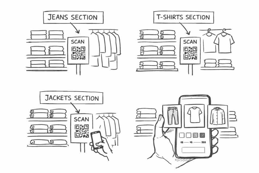
Store Concept: Section-Based QR Codes That Support Physical Movement
The core idea behind this concept is to support physical shopping, not replace it.
Instead of attaching QR codes to every single product, QR code stickers are placed by store sections, for example:
one QR code for the jeans section
one QR code for the T-shirt section
one QR code for the jacket section
This design choice encourages customers to walk through the store, browse physically, and stay engaged with the space.
After scanning the QR code, the customer would see:
images of all available items in that section
simple filters (size, color, cut, price range)
visual previews instead of long text
This keeps the store experience active while adding a calm digital support layer.
Beyond QR Codes: Adaptive AR Using Image Recognition
Importantly, this system does not need to rely only on QR codes.
Based on older blogpost we realized that computer vision and image recognition, modern applications are already able to:
recognize images or objects through the camera
match them with stored visual databases
“remember” or identify visual patterns
This means that instead of scanning a QR code, a customer could:
point the camera at a section sign, poster, or product image
let the system recognize the image
automatically open the related digital content
Research presented in Computer Vision shows that image recognition systems can reliably identify visual features and link them to stored information. These methods are already used in retail apps, museums, and navigation systems.
From a design perspective, this makes the system adaptive:
QR codes can be used as a clear entry point
image recognition can work as a more seamless alternative
both systems can coexist
This flexibility allows designers to choose the level of visibility and interaction that best fits the store atmosphere.
Reducing Cognitive Load with Structured Visual Information
Cognitive load means the amount of mental effort required to process information and make decisions. Presenting information only when it is needed helps reduce extraneous cognitive load and prevents users from feeling overwhelmed.
Retail environments can easily overwhelm customers through:
visual clutter
too many options
unclear organization
Research summarized in The Cambridge Handbook of Multimedia Learning shows that users process information better when it is:
structured
optional
visually supported
Section-based AR helps reduce cognitive load by:
grouping items logically
showing only relevant products
allowing filtering instead of searching
This supports clearer and calmer decision-making.
Why This Approach Matters for Retail Design
This QR- and image-based AR concept is effective because it is:
low-cost – no special hardware required
adaptive – QR codes and image recognition can be combined
inclusive – supports different user personalities
emotionally supportive – reduces pressure and overstimulation
As discussed in Digital Consumer Management, modern retail success depends on understanding how digital tools affect emotions, comfort, and consumer confidence, not only efficiency.
Conclusion
QR codes and image recognition show that meaningful AR in retail does not require complex systems. By placing digital entry points at the section level and allowing customers to filter and explore visually, retailers can support autonomy while preserving the physical shopping experience.
According to multimedia learning theory, users process information more effectively when content is presented in a structured and segmented manner rather than all at once.
In this approach, AR becomes a quiet, adaptive assistant that respects emotional comfort, cognitive limits, and personal space.
Sources
Norman, D. A. (2004). Emotional Design: Why We Love (or Hate) Everyday Things. Basic Books.
Mayer, R. E. (Ed.). (2005). The Cambridge Handbook of Multimedia Learning. Cambridge University Press.
Mogaji, E. (2024). Digital Consumer Management: Understanding and Managing Consumer Engagement in the Digital Environment. Routledge.
Disclosure (as requested): In the development of this blogpost, AI (ChatGPT) was used as a supportive writing and structuring tool. I provided the conceptual content, research direction, theoretical preferences, and methodological decisions, while the AI assisted in translating it to English, refining the wording, organising the material and generating coherent academic formulations based on my input. The AI did not produce research or arguments but helped transform my ideas into a clear and well-structured text draft.
Als letzten großen Input von John Alton habe ich mir heute seine ausführlichen Erklärungen zur Close-Up-Illumination angesehen. Soviel voraus: Ich finde hier merkt man noch am ehesten das Alter des Buches, und viele seiner Tips und Ratschläge, würden so wohl heute nicht mehr verwendet werden. Dennoch möchte ich mit diesem Kapitel “Painting with Light” abschließen, da es das dritte und letzte mal im Buch ist, an dem er wirklich konkrete Vorschläge gibt. Ich habe fast die ganzen 200 Seiten zumindest überflogen und bin dabei wirklich nur auf diese drei Kapitel gekommen, in denen er nicht seitenlang nur philosophiert, sondern wirklich praktikable Tipps abgibt. Deshalb möchte ich mit der folgenden Zusammenfassung schließen, bevor es ans Fazit dieser Blogposts geht.
Grundregeln für Close-Ups
Anfangs definiert Alton ein paar Grundregeln, bleibt dabei aber sehr vage und überlässt viel der Intuition. Klassiker wie “always film the shadow side”, was ich jetzt eigentlich als ultimative Grundregel der modernen Close-Up Cinematografie bezeichnen würde, sucht man hier vergeblich. Beim Kamerawinkel verlässt er sich etwa darauf immer die, ich nenne es mal Schokoladenseite, des Models zu filmen, was ich jetzt nicht als richtige Regel ansehen würde, mit der man viel anfangen kann. Viel definitiver geht er mit Vordergrund-Elementen um: Diese müssten nämlich schon wirklich einen guten Grund haben, um zu existieren, da sie sonst viel zu sehr vom eigentlichen Motiv ablenken. Und auch beim Zusammenstellen des Bildes gibt es einige kleine Tipps: Zuallererst filmt er Close-Ups immer mit sehr engen Linsen, er spricht von 75-100mm, so minimiert er die Umgebung und konzentriert sich wirklich auf Gesicht und Gesichtsausdruck. Außerdem sei es wichtig die Augenpartie immer in der oberen Bildhälfte zu halten, auch wenn der Charakter beispielsweise einen großen Hut tragen würde, da der Mensch die Augen immer zuerst oben sucht. Und auch Diffusion ist bereits ein Thema. Da Alton grundsätzlich bei Close-Ups von Frauen immer nur auf die maximale Schönheit achtet (er meint Licht sei so etwas wie das beste Make-Up), versucht er in allen seinen Setups Falten, Poren oder alles unästhetische verschwinden zu lassen.1
Eight-Light-Rule und Orangen als Modelle
Für all seine Erklärungen nutzt Alton eigentlich immer Orangen als Modelle. Scheinbar waren ansprechend hübsche Modelle zu seiner Zeit so teuer (sagt er zumindest), dass der Beginner Cinematographer lieber an einer Orange üben sollte, um Geld zu sparen. Vor allem weil die Orange mit ihren Poren, Farben und Formen sehr an ein Gesicht erinnere.
Sein Modell für das Ausleuchten von Close-Ups besteht aus insgesamt 8 Lampen, die er in drei Ebenen aufstellt. Entweder auf Höhe der Kamera, auf Höhe des Modells oder hinter dem Modell. Er startet mit dem Key, oder Fill Light (wobei sich dieses heute eher als Room Tone bezeichnen lassen würde, da es dafür da ist, dass die gesamte Szene ausreichend geleuchtet ist und nichts absäuft). Für maximale Beauty-Ästhetik platziert er das Key eigentlich fast immer frontal von oben, um so wenige Schatten wie möglich zu werfen. Und die wenigen Schatten, die durch die PLatzierung von oben kommen, also zum Beispiel unter Augen und Nase, füllt er dann noch mit Filler light von unten auf. Dies widerspricht so gut wie allem, was ich jemals über die Beleuchtung von Gesichtern gelernt habe, da (zwar ein sehr sehr softes, gutmütiges) aber im Grunde komplett flaches Licht entsteht. Die Form (und den Kontrast) bringt er dann über andere Lichter, zum Beispiel über Backlight und Kicker, was auf seinen Illustrationen aber definitiv besser funktioniert als in der echten Welt (ich habs ausprobiert). Zusätzlich verwendet er noch ein Licht nur für die Kleidung, dessen Sinn sich mir beim Lesen gleich wenig erschlossen hat, wie im Grunde das ganze System, da es nicht wie in seiner Theory of Illumination weiterhin darum geht maximal viele Kontrastbereiche zu schaffen und ein Bild so interessant zu machen (wie er es bei long shots ja so genial erklärt), sondern rein nur mehr darum die Haut der Charaktere so weich wie möglich aussehen zu lassen, ohne dass das Bild irgendwie interessant wäre. Das hat mich wirklich enttäuscht.2
Eyelight
Wo ich Alton aber wieder einiges abgewinnen kann, ist bei seinem Ansatz zum Eyelight. Laut Alton sind die Augen nämlich das, was einen Charakter strahlen lässt: “Be it day or night, in real life the human eye always shines, sparkles.”3 Exakt dieses Gefühl müsse man auch im Film vermitteln können. Ohne Eyelight hätten Menschen einen “[…] expressionless cold look of a statue.”4 Deshalb geht der letzte Blick, nachdem alles geleuchtet wurde, immer ins Auge. Steht das Key bereits im richtigen Winkel zur Kamera, so dass es sich spiegelt, ist nichts weiter zu tun. Falls nicht, implementiert Alton ein letztes, ganz schwaches und mehrfach diffundiertes Licht (damit es nicht die gesamte Szene wieder zerstört, weil es zu stark ist) und setzt es genau in die Spiegelung der Augen, um seinem Charakter leben zu verleihen.5
vgl. Alton, John: Painting with Light. Berkely und Los Angeles: University of California Press 2013. S. 80-91. ↩︎
vgl. Alton, John: Painting with Light. Berkely und Los Angeles: University of California Press 2013. S. 93-103. ↩︎
Alton, John: Painting with Light. Berkely und Los Angeles: University of California Press 2013. S. 104. ↩︎
Alton, John: Painting with Light. Berkely und Los Angeles: University of California Press 2013. S. 104. ↩︎
vgl. Alton, John: Painting with Light. Berkely und Los Angeles: University of California Press 2013. S. 104. ↩︎
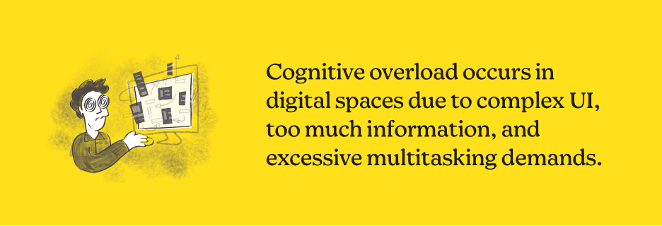
While researching Cognitive Load Theory, I confirmed again how strongly mental overload influences decision-making. I came across this page that explained it pretty well and also got little more information from wikipedia.
wikipedia:
Cognitive load refers to the amount of mental effort a person needs to process information at a given moment. According to Cognitive Load Theory, when too much information is presented simultaneously, people feel overwhelmed, stressed, and less confident in their decisions. Instead of supporting users, the environment becomes exhausting.
In physical retail environments, cognitive load is often unintentionally high. Customers must process multiple layers of information at once: product details, prices, sizes, spatial layout, lighting, background music, social interaction with staff, and sometimes even time pressure. For many users—especially introverted or socially sensitive individuals—this combination can quickly lead to discomfort and decision fatigue.
AR-based retail interfaces offer a way to reduce this mental overload rather than adding to it. Instead of requiring users to search, compare, and ask questions simultaneously, AR can and should present information in a structured and gradual way. Users receive only the information they need at a specific moment, such as visualising a product’s size, fit, or placement, without being exposed to unnecessary stimuli.
This approach shifts AR from being a novelty feature to a cognitive support tool. By filtering complexity and guiding attention, AR helps users focus on one decision at a time. This is particularly relevant for users who prefer calm, self-directed exploration and who may feel uncomfortable navigating crowded or socially demanding retail spaces.
From a UX perspective, this means that successful AR design should aim to lower cognitive load, not increase it through excessive animations, pop-ups, or interaction steps. Minimal interfaces, predictable interactions, and clear visual hierarchy become essential design principles.
For my master’s research, this insight reinforces a central idea: AR in retail should be designed not for maximum stimulation, but for mental clarity, emotional comfort, and confident decision-making. Reducing cognitive load can ultimately lead to a more inclusive and humane shopping experience—one that respects different user needs and emotional thresholds.
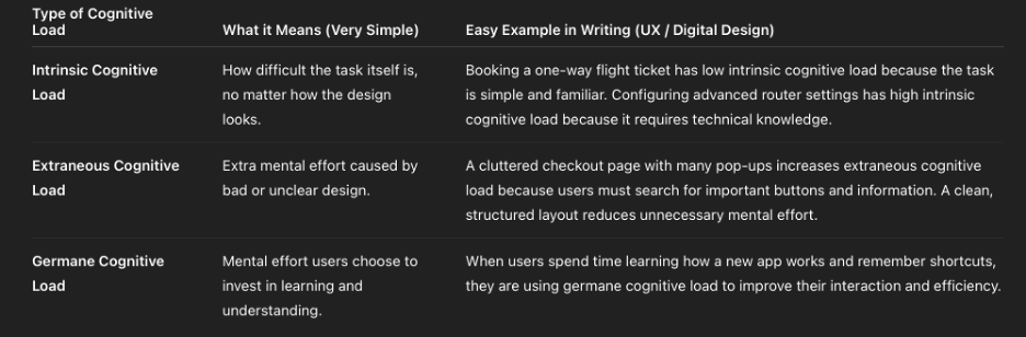
This image is the clear and short explanation of type of Cognitive Load based on wikipedia and Page: ( https://mailchimp.com)
When Design Thinks Too Much for the User
Sometimes digital products don’t fail because they are useless — they fail because they ask users to think too much.
so as a summary: cognitive overload is when a person receives more information than their brain can comfortably process at one time. Instead of feeling supported, the user feels stressed, confused, or tired.
In digital design, this often looks very familiar: too many buttons, too many messages, pop-ups everywhere, or long explanations that appear all at once. Even if every element is “useful,” together they can become overwhelming.
The problem is not intelligence. The problem is mental capacity.
When users feel overloaded, they don’t explore more they just leave. They stop reading, stop clicking, or postpone decisions.
Good design does not show everything at once. It guides attention, reduces unnecessary choices, and respects how people actually think and feel.
This is especially important in areas like online shopping or AR-based experiences, where users already need to make decisions. If design adds extra pressure, it breaks trust instead of building it.
Sometimes, the best design decision is not adding a new feature — but removing one.
(In the development of this blogpost, AI (ChatGPT) was used as a supportive writing and structuring tool. I provided the conceptual content, research direction, theoretical preferences, and methodological decisions, while the AI assisted in translating it to English, refining the wording, organising the material and generating coherent academic formulations based on my input. The AI did not produce research or arguments but helped transform my ideas into a clear and well-structured text draft.)
The installation was presented on February 22 at ESC Medien Kunst Labor as part of the master’s exhibition “Overlays” (CMS, FH Joanneum).
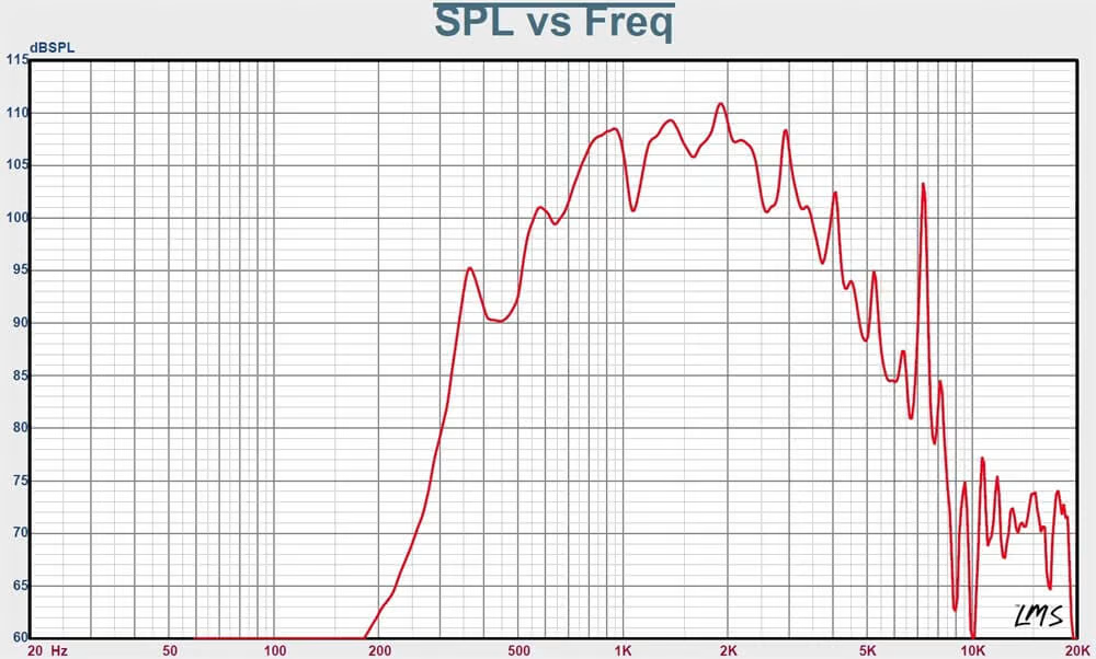
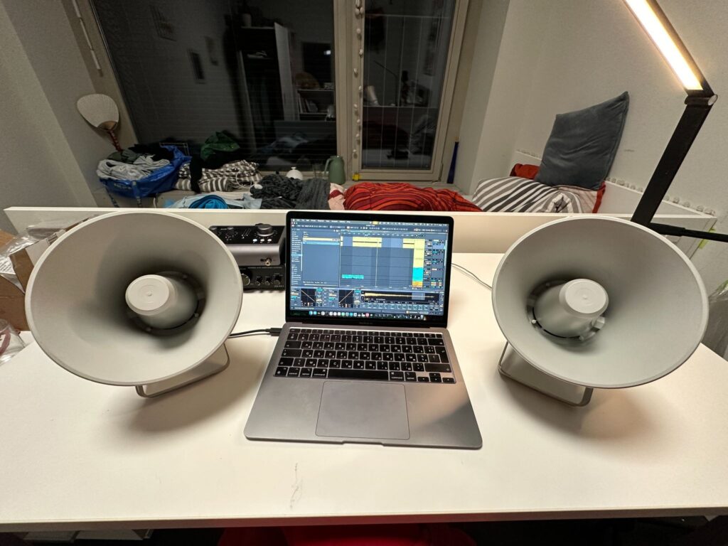
To strengthen the conceptual layer of the work, I deliberately chose not to use headphones or conventional loudspeakers. Instead, I used two horn loudspeakers (model shown in the figures). Such speakers are commonly used in stadiums or public announcement systems and strongly resemble urban warning sirens. In addition to their visual reference, these speakers have very specific timbral characteristics: they do not reproduce frequencies below approximately 300 Hz and are highly directional, which significantly shaped the listening experience.
Frequency response (SPL vs. frequency) of the horn loudspeaker.
With the help of my supervisor Winfried Ritsch, who carefully calculated the required voltage, it was possible to safely connect the horn speakers to a standard OR.M CS-PA1 amplifier.
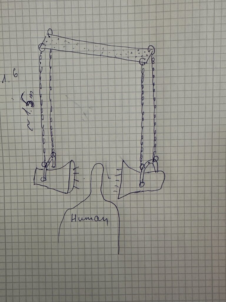
The speakers were suspended from the ceiling using metal chains attached to a metal truss structure, with a distance of approximately 120 cm between them. This spatial arrangement allowed visitors to physically enter the installation and stand between the speakers, experiencing the sound directly and bodily.
Installation layout sketches and spatial arrangement of sound sources and projection
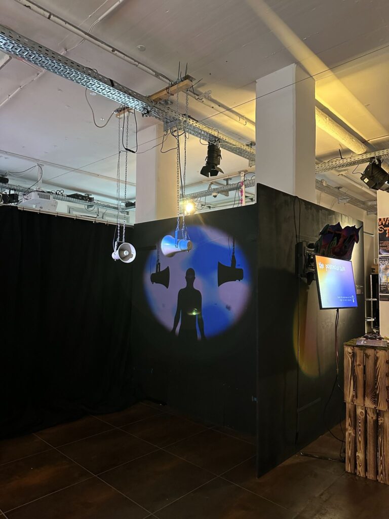
The visual and spatial elements were arranged so that the light from a projector was directed toward the wall and the speakers in a way that their shadows became visible. The projected human silhouette was positioned between the shadows of the speakers, creating a layered visual composition that added a poetic and symbolic dimension to the installation.
Installation in the exhibition space.
For playback, a simple media player was used, running a pre-rendered video file that already contained the synchronized audio. This decision significantly simplified the technical setup and ensured stable operation throughout the exhibition.
I would like to express special thanks to Gregor Schmitz, who assembled and installed the work. During the installation days, I was ill with influenza and had a high fever, which made it impossible for me to be physically present. Thanks to his persistence and careful work, the installation functioned reliably for the entire duration of the exhibition.
Conclusions
This project successfully combined physiological data analysis, sound design, and spatial installation into a coherent artistic system. One of its strongest aspects was the conceptual consistency between data, sound, and visual form. The use of HRV parameters as a driving force for both audio and visual processes created a clear and readable connection between bodily states and their artistic representation. The choice of horn speakers, their spatial placement, and their strong directional and timbral characteristics effectively reinforced the conceptual reference to sirens and public warning systems, adding both physical presence and symbolic weight to the installation. The decision to render audio and video together into a single media file also proved practical and reliable for exhibition conditions, significantly simplifying setup and playback.
At the same time, several limitations became apparent, primarily related to data collection. While the overall data-processing and mapping workflow functioned as intended, the preparation phase for recording physiological data could have been more rigorous. The number of recordings was relatively limited, which reduced the robustness and representativeness of the dataset. In addition, recording conditions were not always fully controlled or stable, leading to inconsistencies and, in some cases, unusable data (such as the GSR measurements). These issues directly affected the range and reliability of parameters available for mapping and constrained the expressive potential of the system.
For future iterations, the most important improvement would be a more structured and controlled data-recording phase. This includes conducting a larger number of recordings, ensuring consistent environmental conditions, and clearly defining recording protocols in advance. More stable sensor placement, longer-term recordings, and repeated sessions under comparable conditions would significantly improve data quality and allow for deeper comparative analysis. With a more robust dataset, the mapping strategies could also be refined further, enabling more nuanced and complex relationships between physiological states, sound, and visuals. Overall, the project demonstrates strong artistic and technical foundations, while also clearly indicating directions for methodological refinement and expansion in future work.
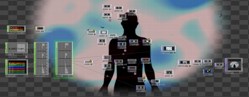
During the preparation of the installation, I decided to extend the project with a visual layer that supports and reinforces the sound. The visual component was conceived as a minimal, data-driven system that mirrors the same physiological dynamics shaping the audio, rather than functioning as an independent narrative. For this purpose, I used TouchDesigner, where I created a relatively simple visual patch controlled by HRV-derived parameters. Instead of implementing real-time data streaming, I reused the MIDI files generated during the sound design stage. These MIDI signals were imported into TouchDesigner, normalized from the MIDI range (0–127) to values between 0 and 1, and used to drive visual modulation.
TouchDesigner patch for HRV-driven visual modulation.
The patch is structured around two parallel visual layers based on the same source footage: a video of the sky with birds flying through the frame. Each video layer undergoes a similar processing chain, including the addition of procedural noise, displacement, conversion to monochrome, and subsequent color mapping.
As in the sound design, the two visual layers differ primarily in their color treatment. One layer is tinted in cool blue tones, while the other is dominated by red hues. Switching between these layers is controlled by the LF/HF ratio, which acts as a high-level indicator of autonomic balance. When the LF/HF value increases, corresponding to a stressed physiological state, the red-toned layer becomes dominant.
In addition to color changes, the patch applies displacement effects that are also influenced by HR. During moments of increased stress, the displacement intensity rises, causing the image to warp and fragment more strongly.
A human silhouette is layered on top of the background video. Under calm conditions, the silhouette remains stable and clearly defined. As stress increases, the silhouette becomes progressively distorted through displacement and noise-based modulation. This distortion visually emphasizes bodily tension and loss of internal stability, reinforcing the embodied dimension of the work.