WebExpo Conference 2: Design Patterns for Search UX in 2025

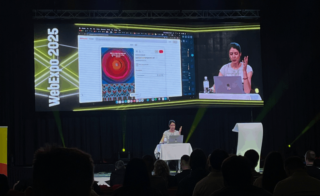
There were several interesting talks on the second day of WebExpo, but I chose “Design Patterns for Search UX in 2025.” As a UX/UI designer, I often design websites across various fields, and most of them include a search function.

At the very beginning of my career, I used to carefully research the usability of each feature a website might offer, starting with search. But over time, I shifted focus to other components and gradually overlooked search. So I was pleasantly surprised when Vitaly brought attention back to this seemingly ordinary but incredibly important topic.

He began by showing the different types of search, and there are 22 of them, to be exact! Honestly, I didn’t even realize there were so many. Also he shared insights about reading behavior:

“A person can read 250 words per minute in their native language, but very few actually choose to do so online. On average, reading 150 words takes about 30 seconds. That’s a realistic time budget.”

According to Vitaly, the most effective approach on both mobile and desktop is to keep the search box visible on the main page, not hidden behind an icon. This alone can lead to a major boost in engagement. In fact, his team improved search usage by 40% simply by doing that. Impressive!

However, it’s not just about visuals. Preparing solid metadata is just as critical. Metadata should be clean, organized, and free from duplicates. If users spend too much time trying to find what they need, engagement drops and on top of that, every unnecessary search adds to digital carbon emissions, so making a bad search is harmful for climate

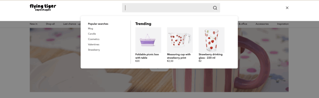
Another smart tip: show suggestions after a user clicks into the search bar, not while they’re still typing. Most people look at their keyboard when typing, so early suggestions often go unnoticed. A great example is Flying Tiger. Their search bar immediately displays popular searches and relevant products right after being clicked.

Galaxus is another strong example, they provide an extensive set of filters, from basic categories to specific product features like “Gaming capabilities.” Adding product reviews into suggestions is another enhancement worth considering.

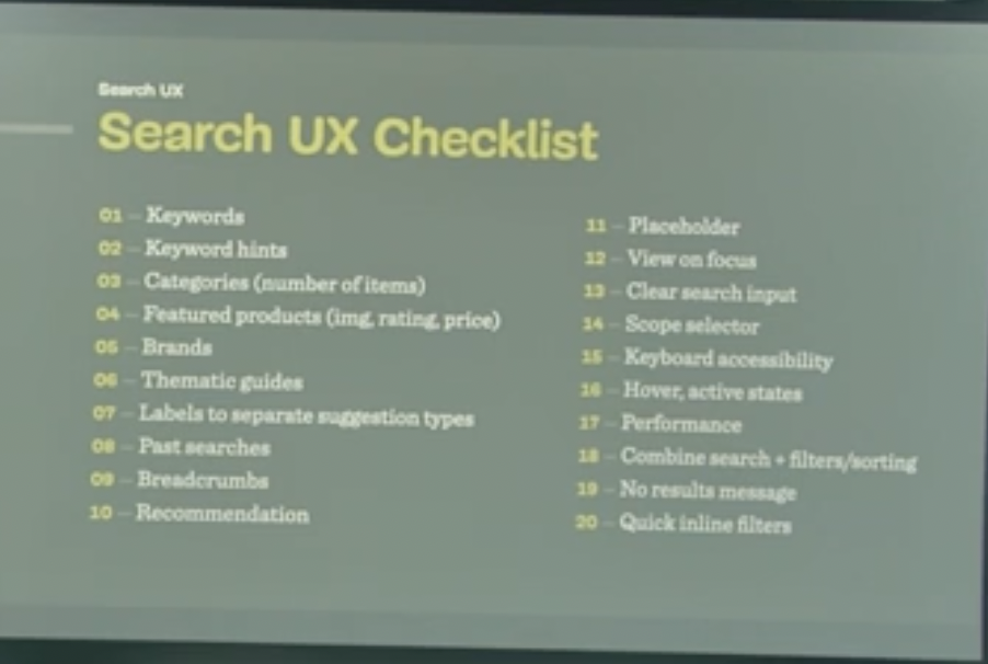
I found this topic so engaging that I looked up a video of Vitaly presenting the same theme two years ago. Much of the content was similar, but this time he wrapped up with a comprehensive Search UX Checklist with 20 things to keep in mind when designing search and a list of 75 questions (!) for UX designers to discuss with developers. I’m pretty sure developers won’t love that part, but I bet it will spark some much-needed conversations.


Overall, I was genuinely impressed by the depth and practicality of the information shared. I’ll definitely keep these principles in mind when designing the next search experience in my upcoming projects.

WebExpo Talk #2: Elis Laasik

Beyond Design Tools: Prototyping in code

In this second post, I want to recap the talk of Elis Laasik at WebExpo 25, where she discussed the topic of design prototyping in code. Elis, with her extensive experience in the field, explained how prototyping using basic HTML, CSS, and JavaScript—along with some JavaScript frameworks—can be an efficient way to approach web development. She highlighted that this method is especially valuable in professional contexts, where prototyping plays a crucial role in shaping the user experience, testing ideas, and ensuring that the final product aligns with business goals.

One of the main points that Elis emphasized was that these prototypes don’t require a backend or a database. Instead, the focus is entirely on the front-end elements, like the user interface and customer journey. This approach allows teams to test how the website or app behaves in real time, which can be much more useful than static design mockups. Since the prototype is coded directly, it is much closer to the finished product, giving stakeholders a more accurate sense of how the final product will look and function. The fact that it’s interactive and responsive adds another layer of realism to the process, which can be especially valuable in understanding the user experience.

This approach to prototyping really stood out to me, as it closely mirrors the way I work on personal projects. When I’m building a website on my own, I tend to start coding right away, rather than creating a design in tools like Figma first. I find that coding a prototype feels more “real” because I can see the project develop as I work on it. It also allows me to directly address how the website will behave, rather than just looking at a static design. I could relate to what Elis was saying because, for me, starting to code early gives a more authentic sense of the project’s progress and helps me figure out how the website will work from a functional perspective.

Elis also mentioned that prototyping in code can be particularly useful when dealing with complex user interactions or when there is no shared vision across the team. By coding the prototype, it’s easier to explore different solutions and test how users will actually engage with the site or app. This kind of flexibility and control can be crucial in situations where the design needs to be flexible or constantly evolving.

That said, Elis pointed out that there are certain scenarios where using code for prototyping might not be the best approach. For smaller projects or when branding design is a significant focus, she suggested it might be better to start with a traditional design tool like Figma. In these cases, the need for high-fidelity visuals or design accuracy might take precedence over functionality in the early stages. I completely understand this perspective, especially when the main goal is to define the visual identity of a brand before diving into the technical aspects.

In conclusion, Elis’ talk provided a lot of valuable insights into the practical use of code-based prototypes. It was interesting to see how this approach is applied in professional environments and how it can be a useful tool for creating realistic, interactive designs. For me, it reinforced the idea that prototyping with code isn’t just about creating something functional—it’s about exploring possibilities, improving user experience, and aligning the product with business objectives.

WebExpo Talk #1: Nadieh Bremer

Creating an effective & beautiful data visualisation from scratch

The field trip to Prague is over, and I’ve been thinking about the really interesting talk by Nadieh Bremer. Nadieh is a freelance data visualization designer from the Netherlands, and her work focuses on turning raw data into interactive and static visual art. It was fascinating to see how she approaches data, especially since my interest in data visualization started a few years ago during my bachelor’s in graphic and information design. This talk made me think in new ways about the potential of visualizing data, and I’m excited to dive deeper into it.

One of the things that stood out to me the most during the talk was how Nadieh works with D3.js, a JavaScript library for creating (interactive) data visualizations. I was amazed by how quickly she could take raw data—just numbers—and turn them into beautiful, meaningful visualizations. She made it look so easy, and the fact that she could transform the data into something visually stunning in such a short amount of time really caught my attention. I had heard about D3.js before and had been meaning to check it out, but like most people, I never had the time. So, this talk came at the perfect moment for me, and it made me realize just how powerful and useful this tool is for working with data.

As someone who has mainly worked with data in print media, I’ve always focused on static visualizations. Most of the techniques I’ve learned are for creating things like printed charts, posters, or other fixed formats. But seeing how Nadieh used D3.js to create interactive, dynamic visualizations opened up a whole new world for me. The idea that data can be more than just something to look at on paper—that it can be experienced and interacted with—was something I hadn’t fully considered before. With D3.js, the data is not just displayed; it’s alive and engaging. You can hover over elements to get more information, zoom in to explore trends, and see the data change in real-time. This is something you simply can’t do with traditional print media, and I’m excited to explore how I could bring this kind of interactivity to my own work.

What I also found really interesting was how data can be art. Nadieh’s visualizations weren’t just about presenting data clearly; they were also about making the data visually appealing and impactful. She showed that data visualization doesn’t have to be cold or purely functional—it can be something beautiful. This idea was a bit of an eye-opener for me, as I’d always thought of data as something to be communicated in a straightforward, no-frills way. But seeing her work made me realize that data can be both informative and artistic, and it’s something I want to try in my own designs.

The talk really showed me the potential of D3.js and how it can take data visualization to a whole new level. It’s not just about making a chart or graph anymore. It’s about telling a story through data, using color, motion, and interactivity to make the information more engaging and easier to understand. This is something that I think would take much longer to achieve using traditional print techniques, and it’s a huge opportunity for people like me who are interested in graphic design and information design.

Overall, I’m really glad I got to experience Nadieh’s talk. It made me realize just how much more there is to data visualization and how powerful tools like D3.js can be for creating engaging, interactive, and even artistic visualizations. I’m excited to start experimenting with D3.js myself and see where it takes me. I’ve learned that data doesn’t have to be static and technical—it can be creative and expressive, even be used in an artistic sense. And that’s a new perspective I learned and will keep in mind as I continue to work with data.

Shifting Focus to EV Charging Station Experience

After some reflection I realized my original idea (How to design an Elevator for a 1000-Story Building) was a bit unrealistic obviously. Instead, I am now focusing on the user experience at Electric Vehicle (EV) Charging Stations, a practical and urgent issue. Charging is widely reported as a major pain point for EV drivers (info from literature -> pdf footnote). For example, one study notes that EV owners often complain about broken chargers, long charging times, confusing locations and high costs. These issues make charging frustrating. This topic matters because as EV adoption grows, smooth charging experiences are essential to keep drivers confident and satisfied.

I should note I don’t own an EV myself, but I have tried charging one a couple of times, in fact the dad of my girldriend owns one. I remember fumbling with the cable and wondering, how do I actually start charging? When it didn’t begin at first, I panicked a bit. There were also other issues with the paying method because you have like 4 different cards to pay at the station which is really confusing. In Austria there are more then 8 different types of Charging Stations all designed differently from different company’s.
Talking to other EV users confirmed my gut feeling: nearly everyone has stories of confusing chargers or unexpected problems. Many complained about chargers not starting properly and so on. Hearing these firsthand, common pain points jumped out: unclear signage, cables that are too short or heavy, crowded stations, and unfamiliar payment apps. These conversations have only made me more eager to dive into this problem.
When I talk about cables that are too short I once experienced this exact situatuion. This frustrating experience was when I had to wait around 10 minutes because both cables at the station were in use. When one car finally left, I parked and got ready to charge—but then realized the cable didn’t reach my car’s charging port. It was simply too short. The port was on the right side of the car, and there was no way to reposition it to make it work. Luckily, there was another cable available that did reach, but this situation felt like a clear UX fail. I took a photo afterward to remember it.

To deepen my understanding, I’m planning some field research. I’ll visit a few public EV charging stations in person, watching how real users plug in and charge their cars. I’ll sit nearby and take notes (from a respectful distance), then do short interviews with drivers. I have a list of questions ready: How do you find this station? Did everything work as expected? What (if anything) was frustrating about the screen, cable, or payment process? By observing and asking, I hope to catch issues I might not have thought of alone. (For instance, reviews often mention problems categorized as “Finding a charger” or “Starting a charge” like inaccurate locations or broken components, I’ll see if these come up in real life.)

I’m also thinking a lot about accessibility and inclusion. A WebExpo talk on inclusive design reminded me that about one in six people has some form of disability and even temporary injuries or age can affect how someone uses technology. Charging stations aren’t just digital screens, they are physical setups too. So I’ll pay attention to questions like: Are the screens and plugs at a good height? Is text large and clear enough? Is there space for a wheelchair or a stroller? I’m not there yet, but it’s exciting to consider how this research could eventually help all users.

Next steps in the design process: I’m laying out a clear path forward.

  • Research: Finish the site visits and interviews to gather real pain points. I’ll compare my findings to published research (for example, a thesis on first-time EV users confirms that “charging and range” are where beginners struggle the mostfile-vtpiq6sngdvzfiz8n25kdp).
  • Define Problems: Make a list of the key issues we’ve uncovered (e.g. broken hardware, confusing UIs, long wait timesfile-hum5jgwhy7zfzamxlwtuf6file-hum5jgwhy7zfzamxlwtuf6, and any accessibility gaps).
  • Ideation: Brainstorm solutions with sketches and discussion. This might include simple ideas like clearer signage or better instructions, or more novel ones like an app that shows available chargers and reserves a spot to avoid wait linesecharge4drivers.eu.
  • Prototyping: Build quick, low-fidelity models. For digital screens I’ll draw wireframes. For the physical station itself I might use cardboard or LEGO to mock up the layout. Sometimes a little hands-on model sparks insights you don’t get on paper. I’ll also consider user-friendly features suggested by others, like large integrated info screens that guide you “before, during and after” chargingecharge4drivers.eu, plug-and-charge authentication, and multiple plug types for different vehiclesecharge4drivers.eu.

I’ve leaned on three helpful documents to guide this direction. The first highlights that new EV drivers often “struggle with learning about charging”. The second (a deep review analysis) categorizes common charger pain points, things like chargers that are offline or blocked, slow charging, and poor safety/comfort (dark, dirty areas). The third (an EU project report) emphasizes making charging user-friendly: offering varied plug types and levels, large info displays, and even booking features to minimize wait times. These insights support focusing on the actual charging experience and informed my plans.

All in all, this has become a bit of a learning adventure for me. I’m curious and reflective about each step. And of course, this direction may still evolve as I gather more feedback. New insights could shift the focus again, for now, though, understanding real users frustrations at charging stations feels like a solid, people-centered research path.

Bibliography:

Martin Treiber and Arne Kesting, User Experience at EV Charging Stations: Empirical Findings and Design Recommendations (Journal of Artificial Intelligence Research, 2023), PDF

Steffen Lepa, Understanding the EV Charging Journey: A Multi-Method Study of First-Time Users (Social Science Research Network, 2024), PDF

eCharge4Drivers Consortium, Apriori Users Concerns and Expectations Relevant to EV Charging (2021), PDF

WebExpo Conference Talk #2 – Digital Intimacy: Feeling Human in an Artificial World

I have identified „Digital Intimacy-Feeling Human in an Artificial World“ as the second talk I want to discuss here because I have previously worked on two projects during my bachelors degree that dealt with the same topic and similar questions as the ones Lutz Schmitt presented at the Expo. Especially in one of my projects about long distance relationships my team and I asked ourselves how we could create a sense of closeness through media and technology. Closeness especially meaning emotional intimacy – through rituals shared experiences and time spent doing things together, but also asked ourselves if we should mimic physical intimacy and proximity in some way and more importantly how to do that with technology. 


Lutz Schmitt’s talk investigates how feelings of closeness and connection can be created in digital and artificial contexts (through robots, AI-driven systems, or designed experiences). He explores whether digital interactions can offer a genuine sense of intimacy and how we can distinguish meaningful connection from simulation. He brings up key questions: Can people form real emotional bonds with non-human objects? What role do trust and vulnerability play in creating such connections? And what ethical responsibilities arise when we design digital interactions?


From a UX and interaction design perspective, this talk is very relevant. In both projects I worked on, we looked into creating interfaces that go beyond typical communication(tools). Ones that encourage presence and emotional involvement. For example, instead of simply allowing users to send messages, we explored designing rituals: synchronized activities, and interfaces that created a sense of “co-being” rather than just „back and forth“ communication. These approaches align with Schmitt’s idea that intimacy is not just about frequency of contact, but about quality of interaction and the emotional context.

He also challenges the trend of creating frictionless, overly polished digital experiences. In reality, human relationships are full of imperfection and effort. Transferring that to UI/UX means intentionally designing for slowness and emotional nuance which is something we often avoid in tech but is deeply engrained in us and an inherent part of the human experience. For example, what if the interface was affected by emotional tone? Or what if moments of silence or waiting became part of the interaction, signaling care or presence instead of emptiness?

What I also found to be a really interesting and relevant aspect he brought up in his talk, was the consideration of privacy. This is much harder to maintain when introducing a technological component/product into a situation, since it’s almost impossible to not have a third party involved. It raises the ethical question of how to handle the very private data that is collected responsibly. As someone who designs these kinds of products this is something I hadn’t given much thought before but really need to take into consideration.

In conclusion the talk reminded me that designing for emotional intimacy is not just about what technology to use but a much deeper emotional and ethical problem that requires understanding the essence of human intimacy and how technology can support that, instead of substituting or mimicking it. It’s a complex but deeply relevant area for interaction design, that requires sensitivity, creativity, and critical thinking.

WebExpo Conference Talk #1 – Data Visualization

As someone who is very interested in visual design, data visualization and interdisciplinary topics, mixing design and science or values and aesthetics, I was really curious about Nadieh Bremers talk „Creating an Effective & Beautiful Data Visualisation from Scratch”. I wasn’t sure what to expect, since I have found that „beautiful data visualization“ often just means clear and structured, but I was more that positively surprised to see how much artistic creativity she was able to incorporate into her visualizations while still maintaining the data to communicate. What I was also surprised by and really broadened my view on the topic was her approach and angle to how she creates her visualizations. I had never heard of the tool she uses (coding it in D3.js) and thought it was so cool to create truly interactive pieces with the actual data in the background instead of using visual tools like Illustrator, which I was more used to when it comes to creatively visualizing data.

What I also thought was a great starting point was her emphasis on storytelling through data. Rather than beginning with tools or templates, she encouraged designers to start with the narrative: what is the data trying to say? This approach really aligns with interaction design principles, where the goal is not just functionality but clarity, emotion, and user connection. Sketching ideas before coding is sort of like prototyping in UX or any other visually creative field, reminding us that visual thinking is critical to problem solving. I really enjoyed that she considered aesthetic and emotional engagement. I feel like many visualizations aim for neutrality or objectivity, but in her case the work also aims to be expressive, and fun. She challenged the idea that beauty is just decoration. Instead, she argued that beauty and clarity are not mutually exclusive, and that well-designed visuals can help users stay curious, linger longer, and feel more connected to the data. This view aligns with interaction design’s attention to emotional and engaging user experiences and human centered design.

As mentioned her use of D3.js was also very interesting for me. By building a data visualization from scratch in a live coding session, she nicely demonstrated what a workflow can look like, which I found really helpful. What made this talk especially valuable was watching her iterative process. Trying something to see what happens, then continuing from there, changing things along the way and making mistakes. Her process reminded me of the iterative prototyping cycles in interaction design: test, tweak, refine. Even a small change in data structure or layout can significantly shift the meaning of a visualization. It was a really eyeopening creative process and a reminder that you don’t need a perfect or exact vision to start and then go through with, but rather develop an idea of what works along the way. This process also showed me how D3 (and coding in general) can empower designers to go beyond their visual tools and create more immersive and interactive experiences while still maintaining the aesthetics.

WebExpo Conference 2025 Day 2: “Digital Intimacy – Feeling Human in an Artificial World” by Lutz Schmitt

One of the most thought-provoking talks I attended at this year’s WebExpo Conference was by Lutz Schmitt, titled “Digital Intimacy: Feeling Human in an Artificial World.” It made me reflect on how we approach emotional connection in digital design, something that often gets overlooked when we’re focused on functionality or aesthetics.

The Main Message: Making Technology Feel More Human

Lutz Schmitt’s talk focused on an important point: even though digital tools are getting better at copying how people behave, they don’t always create real emotional connections. He warned that we often design for speed, accuracy, and logic, but real human feelings are often slow, messy, and complicated. Just because a chatbot answers quickly doesn’t mean it feels caring. Just because a dating app matches people doesn’t mean it builds real connections. This really made me think. It reminded me that designing how things work isn’t enough. We need to ask: Does this feel human? Schmitt suggested a new way to think about emotional design. Instead of adding emotions as a last step, it should be part of the main design process. He gave examples like adding pauses in conversations, using less perfect language, or choosing a warm tone to make people feel like they are talking to a real person, not a machine. The goal isn’t to copy humans exactly but to understand what makes people feel seen and cared for, and design for that feeling. Emotional design needs attention and care, just like any other part of good design.

What Was Helpful for My Work

This talk was especially meaningful for me as someone working at the intersection of physical and digital experiences. Schmitt’s perspective made me reflect on how emotional connection often gets lost when we focus too much on the technical side of digital design.

In projects where I blend physical materials with digital interactions, whether it’s sensors, projections, or screen-based interfaces, it’s easy to prioritize what the technology can do over what it feels like to use. Schmitt’s talk reminded me that technology should serve the emotional goals of an experience, not just the functional ones.

He challenged me to think more critically about how digital responses, like lighting, sound, or interface feedback, can be designed to feel more human, warm, or even vulnerable. It’s not just about impressing users with innovation, but about creating a moment that feels real and meaningful. That mindset shift will definitely shape how I approach future projects that aim to engage people on both a sensory and emotional level.

Final Thoughts

This talk didn’t introduce any new technologies or visual trends, but it provided something more profound: a reminder that effective digital design is experienced emotionally, not just visually. To create experiences that resonate with people, we must go beyond mere logic and efficiency. We need to design with emotional intention.

13 Adding UDP/OSC to Arduino

If you have read my previous blog post, the next step comes pretty natural. Just having one device creating and displaying morse code, defeats the purpose of this early way of communication. So I sat down, to set up a network communication between the Arduino and my laptop, which sounded easier than it was.

Since I had used OSC messages in countless classes before, I wanted to come up with a sketch, that could send those messages. Searching for a possibility to send this messages over WiFi, I started by looking at the examples, that were already provided by Arduino and I found something! Part of the WifiS3 library, there was a sketch, that showed how to send & receive UDP messages. Great! I uploaded the sketch and tried sending a message to the Arduino, using a simple Max patch. The message was received, although the response message wasn’t.

As you can see on the screenshot above, Max received a message, but it wouldn’t display its contents, since I had no idea what went wrong, I tried to adjust the message, so it would be a multiple of four, just like Max asked. But I just got another error message:

Still no idea what this error message was supposed to mean, but I kept trying. I reduced the length of the “message name string”, but without any success. I still got the same error message, as before, even though an even shorter message name wouldn’t have made any sense.

Defeated, I went to class the next day and talked about my problem with a fellow student. He brought to my attention, that Daniel Fabry had shared an example for the same thing last semester, which I knew worked, since I tried it in class, I just had forgotten about it. So I took a look at his sketch, which used an entirely different library. The code syntax was early identical, but the library was different. With my new knowledge, I adapted my code again and this time, it worked!

Now my Max patch could receive strings from the Arduino, great! As a next step, I updated my patch to actually replay the received morse code message. And my new version was done! Now messages could actually be sent wirelessly to other devices making actual communication possible.

This little detour into OSC & WiFi with Arduino really got me interested to explore this topic further. I am excited to find out the things that are possible using this technology.

Instructions

For the second version, you need:

  • an Arduino (capable of using Modulinos)
  • the three button Modulino
  • a Laptop with Max

Before uploading the sketch to the Arduino, you need to go into the “secrets.h” tab and enter your WiFi SSID (Name) and password. After this, go to the “sendIP” variable and change the Ip Address, to target your laptop. After applying these changes, upload the patch & build a simple UDP receive logic in Max, similar to the one you can see on my screenshots.

Jobs To Be Done (Workshop) – WebExpo Day 2

On day one, I visited a lot of different talks, one of them was “What is the ‘Jobs To Be Done’ framework and why should you care?” by Martina Klimesová. Looking back, this was a pretty biased talk about this framework, for beginners, still a great way to get to know the framework better. It actually got me so interested, that I joined her short workshop the next day, to try working with Jobs To Be Done myself.

In short, what is JTBD? The framework is based on the assumption, that people don’t simply buy products. They hire them, to get a job done, for example: People don’t want a drill, they want to hang a picture. The goal is to stop focusing on solutions. Depending, on the scope and context, there is hundreds of different jobs, a person wants or needs to do, to achieve a certain goal. But how do you get there?

The JTBD framework consists of five steps:

  1. Define the focus/scope of your project (start small)
  2. Talk to users – conduct interviews
  3. Analyse & Cluster your insight
  4. Define Jobs
  5. Create a Job Map

Defining the focus/ scope – During the workshop we focused on a small coffee stand, in front of a huge office building. The end goal was, to raise the profits of said stands to do that, we needed to conduct some research, to find out which jobs people need to do, on their way to work. Assuming, they would pass the coffee stand on their way to the office. So our focus was set, we wanted to analyse peoples “get to work routine”, from the moment they get up, to when they start work. In reality, you would base that decision, on business requirements, collected data or just gut feel.

Conducting Interviews – Next is to interview between six to twelve people, or better yet until you can see certain patterns repeating themselves. The focus of those interviews are the feeling of people, in a certain situation and their processes they go through, to achieve their end goal, in this case, getting form home to their workplace. Martina advised us, to take notes of our insights on sticky notes, since they were easy to rearrange in the later stages of the process. One Insight per sticky note. She even handed out a cheat sheet, to help with the process.

Analysis & Clustering – After conducting your interviews, you should end up with a bunch of sticky notes, with a lot of insights. The next step, is to cluster those insights in different groups, try to find a headline for each of the groups. For the coffee stand example those groups were: How people commute to work, what they eat, when they have their first coffee, how they deal with the weather and a few more, I can’t remember. Try to keep the clusters small and separate them into smaller groups, if they get too big.

Defining Jobs – After clustering your insights, try to find job statements for each cluster, this could be just one or multiple. The statements can be very specific like “Buying a coffee” to very abstract like “not feeling sleepy”. This is the hardest part of the process and it will take a while to get all the jobs down.

Creating a Job Map – This is the last part of the process and probably the most fun. After creating job statements and writing them down on sticky notes, now you put it all together. The goal is to create a timeline of jobs, people need to do to reach their end goal. The time line can be separated into multiple milestones, like “leaving the house”, “commuting to work” & “sitting down in the office”- You put down the sticky notes according to the point in time, the users have to fulfil them. Additionally you should separate abstract from specific jobs, you could create a scale, having the most abstract jobs at the top and the very specific ones at the bottom. This map should then be shared with your whole team.

If you want to know more, here is a link to the book Martina kept recommending (both during the workshop & her talk): https://www.amazon.com/Jobs-Be-Done-Playbook-Organization/dp/1933820683

WebExpo – Digital intimacy: Feeling human in an artificial world

Last semester, I explored how interaction design can combat loneliness – or more optimistically, how it can foster meaningful connection. With that in mind, I was particularly looking forward to the talk “Digital Intimacy: Feeling Human in an Artificial World” by Lutz Schmitt. It turned out to be a deeply thought-provoking session that challenged not only how I think about technology and intimacy, but also how I view my role as a designer.

Schmitt began by unpacking the idea of intimacy. Often, we associate intimacy with physical closeness or romantic relationships, but he broadened the concept: intimacy is really about emotional presence, trust, and vulnerability. With that foundation, he posed a compelling question: how can we design for that kind of closeness when people are physically apart?

To answer this, Schmitt presented a range of tools aimed at bridging emotional distance. These included connected sex toys, wearable devices like vibrating wristbands that signal touch or presence, and products like PillowTalk, which lets you hear your partner’s heartbeat remotely. What struck me was the emphasis on “small intimacies” – a gentle reminder that sometimes it’s the subtle gestures, that carry the deepest emotional weight.

One of the most impactful moments was Schmitt’s discussion of the “privacy paradox.” He pointed out that while these technologies can feel deeply personal, they also involve the sharing of incredibly sensitive data. In our pursuit of emotional closeness through digital means, we may be compromising privacy in ways we don’t fully understand. As designers, it’s tempting to focus on what’s emotionally compelling without fully considering the ethical implications. Schmitt’s reminder was clear: emotional design isn’t just about connection – it’s about responsibility.

A particularly complex and concerning topic was the growing use of AI companions. Schmitt described how people, especially those feeling isolated, are increasingly forming bonds with AI agents such as Replika. These tools are designed to feel responsive, empathetic, and emotionally supportive – and in many cases, users begin to treat them as if they were real relationships. While this might provide short-term comfort or serve as a form of accessible mental health support, I find this trend deeply problematic. These interactions can lead to a kind of emotional dependency, where users withdraw from real-world relationships and instead engage with systems that at the end of the day serve corporate interests, not human well-being.

What I appreciated most was the balanced tone of the talk and its honesty. Schmitt didn’t romanticize technology, but he didn’t dismiss it either. Instead, he encouraged us to reflect more deeply: how do our tools make people feel – not just functionally, but emotionally, physically, and psychologically? For me, the talk was both inspiring and unsettling. It highlighted the immense power designers have to shape human connection, while also reminding us of the ethical terrain we’re navigating. In short, “Digital Intimacy” wasn’t just about tools or interfaces – it was a call to design with empathy, with care, and with a clear-eyed view of the trade-offs we ask users to make.