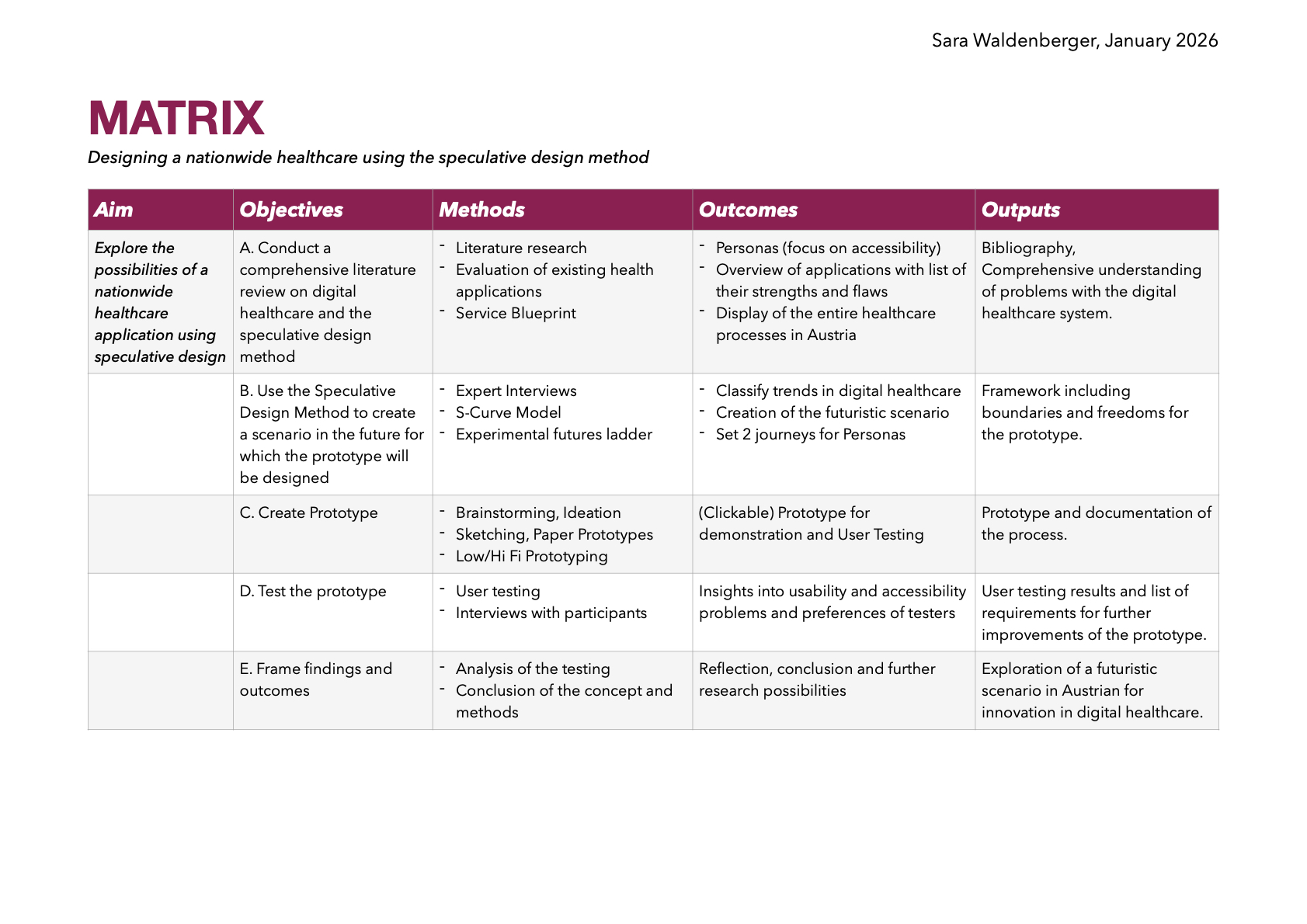
Research Matrix
In this talk Dr. Avi Mehra an IBM associate partner shared valuable insights on the critical intersection of design and clinical safety in digital health. Avi and his college Flora, a design director at IBM discuss how to create safer healthcare solutions through thoughtful collaboration and user-centered design principles.
The presentation begins with a personal story from the speaker’s early days in an intensive care unit, highlighting a serious patient safety incident caused by miscommunication and outdated information. This story set the stage for the central theme: safety must always be at the forefront of healthcare design. The speakers emphasized that digital health technologies hold immense potential to improve patient experiences but can also introduce significant risks if not carefully managed.
Flora then introduced four key principles for designing with safety in mind:
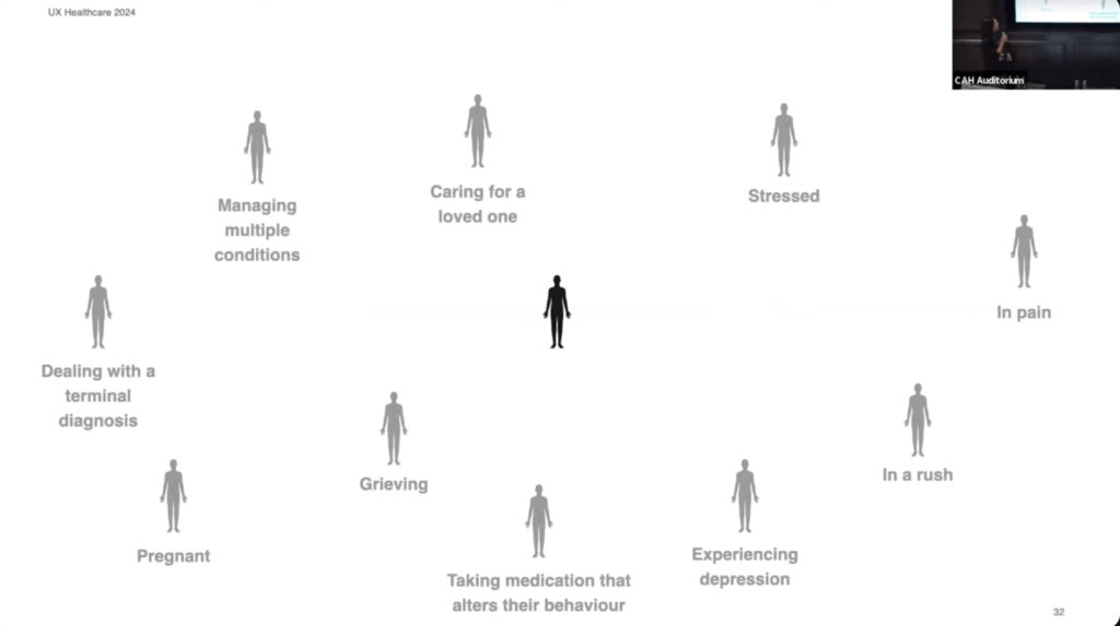
I really appreciate Flora’s perspective on designing for the edges of the population. She highlights that individuals often face multiple challenges simultaneously, rather than just one. This is something I was not considering yet and is something I want to keep in mind as I develop my personas.
Link to video: https://www.youtube.com/watch?v=g9ku7Xane6w
AI was used to rephrase my thoughts.
Yesterday I listend to the episode Innovating healthcare by the Service Design Podcast. It features Brian Desplinter and Jurgen De Klerck who are collaborating at AZ Groningen, a hospital in Belgium, about healthcare innovation, with a focus on the use of 5G technology for advancements.
They mention that co-creation of solutions for challenges across hospitals and industries are vital for innovations. In health care the potential of messing something up is extremely risky. Especially in highly stressful environments like the hospital.
Something that was super interesting to me was that Brian was asked to shadow medical departments. Over the course of a year he watched the daily activities of the doctors and nurses in different departments to see where there were problems and to come up with new ideas. I’m curious to find out if this innovation center of the hospital in Belgium is comparable to anything here in Austria.
The challenges in healthcare are evident worldwide due to the eldering society which leads to the shortage of staff. This calls for innovative ideas to make processes in health care more efficient. The guests on the podcast mention that innovation is not only about technology. Its how you integrate the technology into the system.
Nowadays the demands and standards from patients are much higher than 10 years ago. People want to have seamless experiences but innovation is slower in healthcare because the bureaucracy that is tied to healthcare is always a problem.
The podcast touches on the use of VR in healthcare, such as in speech and aggresion therapy, highlighting the potential for creating optimal, controlled environments. The future of healthcare, they suggest, will likely be heavily influenced by wearable and on-demand technology.
Looking at the current state and future of healthcare, the speakers articulate the need for a more preventative approach, maintaining health rather than treating disease. They believe the way forward lies in closer collaboration between service designers, healthcare professionals, and patients.
The episode ends with Jurgen stating that people interested should send him a message and he can give them insights of their work of the hospital over a coffee. I’m kind of intrigued to see if he can stand up to this offer. Maybe I will travel to Belgium soon…
Link to the episode: https://open.spotify.com/episode/6Te3pgrvYndt1KEr0l7BlV?si=c55b231243e94747
No AI was used to create this blog post.
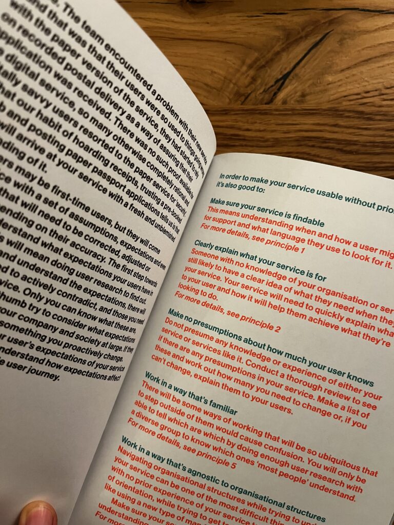
When think about how often we interact with services it really is shocking how poorly designed a lot of them are. Good service design, a book by Lou Downe, the former Director of Design for the UK Government. She was involved with the design https://www.gov.uk/. In her book, Downe gives a guideline of 15 points of what to look out for when designing a service.
Short answer: A service helps us do something we want to do
A service can range from something as tiny as buying a bottle of water to something huge like registering to get married. What makes a service a service is that it combines multiple organizations into one (hopefully) seamless experience for the user to get to their desired goal.
I haven’t read the entire book yet but I would like to point out what really stuck with me and that I want to focus on in my thesis.
In chapter 7 Be agnostic of organizational structures, Downe mentions that it is vital to a service must not show the hidden structures of the organizations it’s combining. She uses the term “siloed” a lot, which basically means that parts of organistations are isolated so much and don’t share data efficiently between each other. It’s less collaboration and more work for the user. I think this is extremely true for health care in Austria because the transfer of data and knowledge relies on so many different tools that it’s confusing and overwhelming to deal with.
Downe believes that the sub-organizations need to agree on a common goal in order to work together seamlessly. Once this foundation is set it can help to create a permissive environment for collaboration.
I really enjoy how effectively this book conveys the most important aspects of service design and I’m sure it will provide lots of guidance when writing my thesis.
Random side note: Even though the overall design of this book is really pleasing I was extremely irritated by the bold font they used for the body text. This is not relevant to the content but it’s something that bothered and reminded me of the importance of visual hierarchy once again.
Link to the book: https://good.services/home
No AI was used to write this blog post
For this blog post I would like to share some thoughts about a talk about accessibility and neurodiversity and add some personal observations I made spending time with my sister.
Side info: My sister (25) is neurodivergent and struggles to use digital interfaces. Because they are part of every day life she has learnt to deal with the difficulties in her own way but often requires help by my parents, me or my brother.
In October we visited the World Usability Congress (WUC) where I attended the talk by Alide von Bornhaupt about designing for neurodivergent people.
In my experience the term “accessibility” the context of digital design is a highly relevant topic in Design Conferences (as it should be). But the talks usually focus more on physical restrictions or disabilities and less on psychological accessibility. Thankfully, in recent years neurodivergence is talked about more openly and resources are more widely spread.
This is why Alide’s talk stood out to me in the agenda of WUC. She started out her talk with telling her audience why keeping neurodivergent people in mind when designing with some numbers:
A tram ticket in Graz is 3,50 €. If buying a tram ticket is not possible / challenging for this group of people this could mean more than 213 000 € loss in revenue for the tram company.
I’m aware that Alide used this example to put the whole topic into a business perspective, especially for people that need to convince stakeholders to shine a light on neurodiverse people. Nevertheless I found this example kind of hilarious because buying tickets for public transport is something my sister struggles with a lot. Taking the train to visit me in Graz and going on the tram to my appartement has been challenging every time she visited me in the last year. But because she she has no other option than to buy the ticket, nobody is losing money.
Neurodiversity can be many different things like ADHD, autism, dyslexia. Neurodivergent people often struggle with energy because they mask certain behavioral patterns to not seem different. My sister particularly struggles with reading and comprehending patterns that seem straight forward to allistic patterns. She gets overwhelmed with the “simple” task of buying a ticket and has to seek help from her family. This makes her less independent of her own life and reliant on help from others.
Of course the ideal solution would be to have testing pool of neurodiverse people to evaluate their struggles and needs. But this can be challenging because half of neurodivergent adults are not diagnosed and neurodiversity is so individual. This is why Alide emphasises to test digital products with lots of people. Because the more people you test with, the more neurodiverse people you test with.

As mentioned in previous blog posts, my research topic (nationwide eHealth tool) needs to be something that is designed for everyone. In my thesis I really want to focus on the aspect of designing for neurodiversity. Because technology is evolving so rapidly and even allistic (neurotypical) people are struggling to keep up I really hope to meet the needs of people like my sister when designing tools to make everyday life simpler to navigate through.
No AI was used to create this blog post.
Title: Design System as a Service
Author: Qianfei Gu
University: Aalto University, School of Arts, Design and Architecture
Year: 2021
Link to thesis: https://aaltodoc.aalto.fi/items/dd9f4b4b-f9f7-4f46-90d5-3d8db8ae0040
This thesis examines the evolution and current offerings of design systems in various organizations, highlighting their role in creating better digital products through reusable designs and guidelines. The thesis includes case study of the ABB CommonUX Design System, using qualitative and quantitative data gathered from user and creator interviews. Findings suggest that the complexity of an organization’s product portfolio and its design maturity significantly influence the services offered by design systems.
This thesis used a clear structure that was easy to follow. The reader is guided from surface-level general information to in depth and practical research.
By conducting their own research the author proved a high grade of innovation. All findings and
The author showed their independence clearly by referencing literature but also working together with the ABB CommonUX Team. By conducting clearly structured interviews and making
In general the thesis was clearly structured. The page numbers were not noted in the table of contents. Especially for people that want to browse the thesis (like me) this was unfortunate. Having the table of figures and images at the start of the thesis irritated me.
The author used professional language, simple and effective structure, tables and figures when appropriate.
The work ranges over 150 pages. This is suitable when considering the spaced out formatting of the thesis. All research questions are answered in depth throughout the thesis and summarized accurately in the summary.
Tables and figures are labeled consistently. Unfortunately there are some page numbers missing.
The choses literature offers a broad spectrum from print to online media both very recent (from the time the thesis was published) to classic renowned relevant works from the start of service design.
No AI was used to write this text.
Today I went to donate blood for the first time. It was honestly so quick and super chill. I even made a playlist filled with songs about blood to accompany me: https://open.spotify.com/playlist/1Q2EIZ1ihrMW9sj9FfyFrH?si=3fcc2c980e81433c
I even met Richard Dank (DesCode) while donating. He gave me lots of expert insights since he has donated over 100 times already. One of his ideas was to incorporate a system for experienced donors to guide them to choose appointments in times when the blood donations are statistically low. I thought this was a great idea and I’m kind of imagining it like something similar to when you choose travel dates and red and green indicating which days are cheapest to travel.
Check out the video to see the process of my prototype!
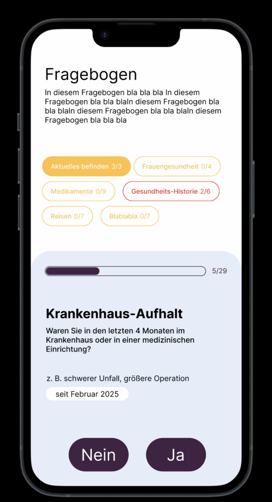
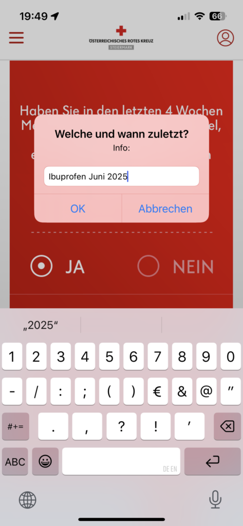
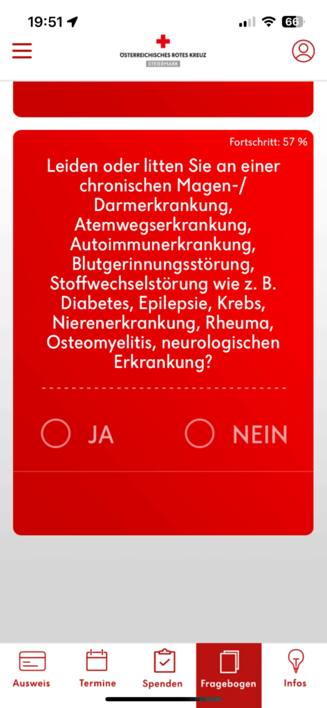
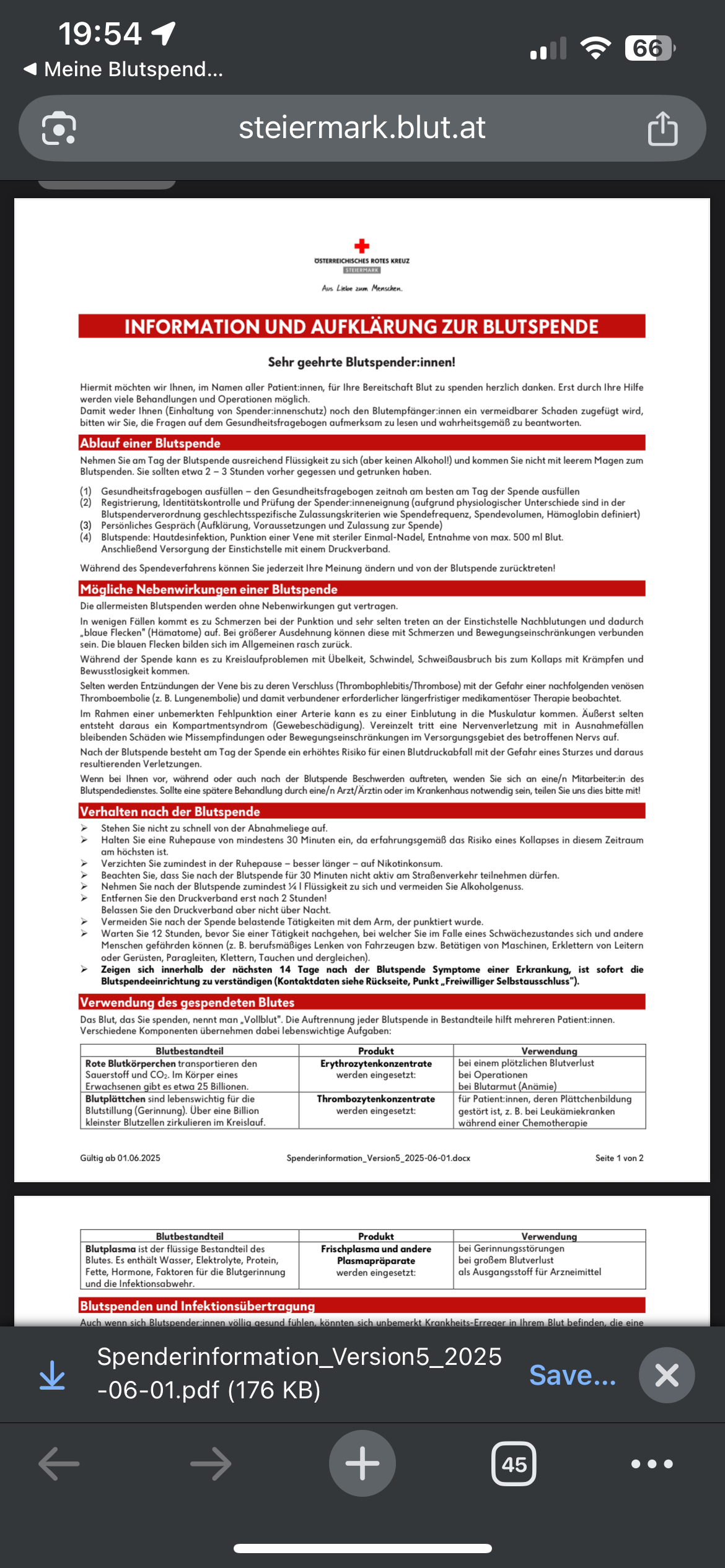
Creating a user-friendly questionnaire is essential for gathering valuable insights while ensuring a smooth experience for respondents. In my recent experience with the “Meine Blutspende” app, I encountered significant pain points that highlighted the importance of effective design in questionnaire development. This is why I want to specifically focus on the questionnaire part for my final prototype.
One of the main issues was the terrible formatting of the questionnaire. The red background combined with poorly chosen font colors made the text difficult to read. This lack of readability can lead to frustration and disengagement, causing users to abandon the questionnaire before completion. Proper contrast between text and background is crucial to ensure clarity and maintain user attention.
Additionally, the center-aligned text contributed to the readability problem. Left-aligned text is generally easier for users to follow, as it allows for a more natural reading flow. When designing questionnaires, it’s vital to consider typography choices and alignment to enhance user comprehension.
Another critical aspect of questionnaire design is the clarity of the questions themselves. Users should be able to quickly understand what is being asked without ambiguity. This can be achieved by using straightforward language, avoiding jargon, and breaking down complex questions into simpler, more digestible parts. Providing examples or context can also help clarify what is being asked.
I’ve created a checklist for my final prototype to help me focus on the main points of creating a clear questionnaire.
https://dribbble.com/shots/25655004-Personalized-Nutrition-Questionnaire-UI
https://dribbble.com/shots/25655004-Personalized-Nutrition-Questionnaire-UI
https://dribbble.com/shots/22995446-Form-progress-pills
https://dribbble.com/shots/9985976-Questionnaire
My experience with the “Meine Blutspende” app underscored these points, demonstrating how poor design can hinder user engagement. Ignore the colors please. I’m also not sure about the category pills.
Anyway… tomorrow is my donation appointment. Let’s see how that goes. I know my last post will be late but at least I’m donating blood, what about you???
Now that I’m starting to get deeper into the prototyping process I have decided to create a mind map using physical post-its to visualize the user flow. While I typically rely on digital tools like Miro or Figma for convenience, trying out physical post-its offered a refreshing change. I found that having something tangible in my hands, even if it was just paper and pen, helped boost my creative flow. Within just 10 minutes, I was able to outline the most important aspects of my app.
However, I still prefer digital methods because I enjoy drawing arrows to illustrate connections between different flows, which wasn’t feasible with post-its. For future projects, I might consider using a large sheet of paper to combine the tactile experience with the ability to create more detailed visual connections.

Something that came to mind while thinking through the process was the aspect of gamifying the donation process a little bit. I want to incorporate some statistics and maybe a point system for inviting friends to donate.
I have a confession: I have never donated blood in my life. I have donated plasma around 4 times during my early 20s but my main motivation here was the 40€ that were offered after the donation. I have wanted to donate blood often but it always seemed like a lot of work. There was never the time, the places were too far away or I had just recently got a piercing or tattoo which forbid me to donate…the usual excuses. But I never really actively tried to book an appointment or go to a donation campaign when i was eligible to do so.
In my dream world where there is an e-health application for all things medical, blood donation would be an easy and accessible process where you get a notification every couple of months to remind you to donate blood at a place near you. Not an extra app, website or random instagram post you see and then forget it exists.
In a quick google search “blut spenden graz” I was directed to the website of the Red Cross. Overall I was pleasantly surprised by how simple it was to book the appointment via the browser. The only thing that was annoying was that the initial page to see available appointments was all appointments in Styria and not filtered by Graz. I would also have loved to have a map and see my location to see where exactly the locations were because I don’t know my way around Graz that well jet. But apart from the fact that the design was a little outdated the process was pretty simple and within 5 minutes I had my appointment booked.


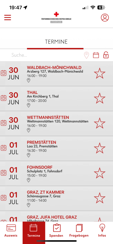
Next I downloaded two apps from the Red Cross. I was a little confused that there were two apps and I still don’t really know whats the difference but more on the other one later. The Mein Blut app downloaded faster so thats the one I tried first. I quickly created an account and was onboarded into the app. I really liked that different sections were highlighted.
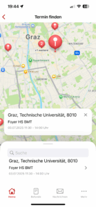

I liked the map feature so I could choose the closest location to me. But even though i granted permission to the app to use my location, I wasn’t able to see my location in the app and had to find my closest location by zooming in from the entirety of the whole Austrian map.
Overall the app had a simple design and was easy to navigate through. Booking an appointment was straightforward but unfortunately I was not able to fill out the questionnaire in this app. I was directed to the “Meine Blutspende” app. Annoying!
I’m guessing that this is the more “official” app. At first glance it seems more outdated. “Mein Blut” is much more modern but I’m assuming that it’s not available in Styria.


QR Code after completing the questionnare revealed that this is only valid for one day. I was not aware of this and now I will have to do the whole thing again the day before my appointment. Annoying!
After testing the different ways for booking donation appointments I can conclude that there is lots of room for improvement with the booking process. Let’s see what I will come up with in my next blog post.