Designing for Connection: The Impact of Social Validation in the Digital Age

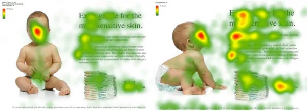
Since we’ve been exploring a lot of cognitive- and neuro-basics, that are important to understand the principle behind Neurodesign, I wanted to highlight another very important part, which is important to consider while working on any project. As designers we focus on the creative work, but still our work envolves humans, to understand how to communicate with them through our work is crucial. Hence why I decided to research more on the topic of human behaviour and social structures.

Have you ever attended a church or religious service that was not one that you were used to? It might have gone something like this. You weren’t sure what was going to happen next, people were responding or praying or singing of chanting in what seemed like a foreign language. They seemed to be sitting or standing of kneeling at cues. You surreptitiously stole glances at everyone around you and tried to imitate what they were doing. If everyone stood up and put a paper bag on their heads and turned around three times, you probably would’ve looked to see where your paper bag was.

The question is simple: Why is the behavior of others so compelling to us? Why do we pay attention to and copy what others do? It’s called social validation. An instinctive and biological human need our society has become to guilt trip.

Because most people view themselves as independent thinkers, meaning that they like to think they are unique individuals with their own opinion and thoughts. The truth, however, is, that the need to fit in and belong is wired into our brains and our biology. We want to fit in, because evolutionary we were dependent on our social grouping. This is such a strong drive, that when people are in a unknown social situations, they will look to others to see how to behave. It’s not conscious process we don’t know that we’re doing it. 

THE BYSTANDER EFFECT

In a study from Latane and Darley (1968), participants sat in a room and completed questionnaires. While they completed their paperwork, smoke was released into the room from a vent. The experimental conditions varied:

• In one experimental condition, there was only one subject in the room, and that subject was not aware of the study.

• In another, there were three individuals in the room, but two were aware of the experiment. Those two were instructed to act unconcerned and continue to fill out their questionnaires while smoke filled the room.

• In a third experimental condition, there were three subjects in the room, all of whom were entirely unaware of the experiment.

So what did the people do? Did anyone take action by leaving the room and reporting the smoke? In the first condition, 75 percent of the subjects left the room and reported the smoke. In the second condition, only 10 percent of the subjects left the room and reported the smoke. In the third experiment, 38 percent left the room and reported the smoke. This research supports the notion that we look to others to validate what our behavior should be. The research shows that this is especially true when we’re uncertain about what to do.

In a more recent study on the bystander effect (Markey, 2000), Markey asked whether the bystander effect would also work in chat groups:

• If you asked a question in a chat group, would your sex determine how long it would take to get an answer?

• Would the number of other people (bystanders) in the chat room affect the time it would take to get help?

• Finally, if you asked for help from a specific person and addressed him by name, would you receive help faster?

The results? Gender didn’t have an effect, but the more people who were present in the chat group, the longer it took for someone to get help. Each additional person added to the chat group added about three seconds to the time it took to get help. For example, with only two people in the chat room, it took 30 seconds to get a response. With 19 people in the chat room, it took over 65 seconds to get a response. If you addressed a particular person, then it was as though no one else were in the room, and it took only 30 seconds to get a response.

WHY WOULD YOU LISTEN TO TOTAL STRANGERS?

Imagine you’re at a chain superstore looking for an HD flat-screen television. You stand there and stare at the large wall of HD televisions showing NASCA races. An innocent bystander walks by and you grab him and say “What do you think of this TV? Did you buy one? Would you buy it again if you had to do it all over?” He tells you his opinion and walks away. You grab the next person you see and say, “Hey there, do you have this TV? What do you think of it?” She tells you her opinion and walks away. You are at the store for 13 hours gathering opinions. This goes on until you feel secure in a decision. Sounds absurd? In the “real world,” it is absurd. Online, it’s not so absurd However, you won’t need 13 hours to browse products on a Web site. The online version of consumer feedback is faster. You can gather data by reading ratings and reviews. We will avidly read reviews from total strangers, and these reviews will sway our decision on whether, what, and when to buy. Why? We don’t know who the people reviewing the product are, where they come from, their likes and dislikes, or if they are anything like us-and yet, we trust them. If we see that a product has received only one out of five stars, we don’t even take a closer look. It’s social validation at work. What do others think?

How does social validation affect how we use websites?

Online ratings and reviews influence us greatly-most powerfully at a non-conscious level. There are lots of ways to use ratings. Some are more effective than others. For example, the site that follows doesn’t put any rating information on the first page. We have to click on a specific product before the rating appears. This means they aren’t using social validation as effectively as they could. By waiting until a later screen to show rating information, they risk losing our attention. We may never get to the next screen to even see the ratings.

RECENT RESEARCH ON WEB SITE RECOMMENDATIONS FOR PRODUCTS VERSUS “EXPERIENCES”

Website visitors’ decisions when buying digital cameras (Product Condition) and choosing tourist destinations (Experiences Condition). The researchers were interested in whether recommendations would be equally influential for both products and experiences. When recommendations were provided for a particular item, that item sold 20 percent more volume than an item for which there were no recommendations. If recommendations were provided for a particular travel destination, that destination was selected 10 percent more often than a destination for which there was no recommendation. If a photo of the person accompanied the travel recommendation, the travel experience condition increased to 20 percent. What did others do? Another effective variation is to show what other people actually ended up buying. When the conscious mind kicks in. There is one way the conscious mind might kick in to the conversation. Sometimes (but it’s rare), we start to get suspicious. This usually happens only if we have information that leads us to doubt ratings. For example, a friend of mine used to work at a company that hired people to post positive product ratings. “What if they’re all fake?” she asked. Now her cortex (new brain) is disagreeing with her old brain. Her old brain says, “I want to be like everyone else,” even when she’s not aware it’s saying that. But her new brain says, “Maybe this isn’t accurate data.” The old brain will probably win in the end. If she reads some reviews that are not 100 percent positive, and if the people writing those reviews seem like a “real” person who actually used the product, then the new brain’s objections can be squelched fairly easily.

“Listen to others? Not me, I’m logical”

Ratings and reviews work unconsciously to activate our need for social validation. But they also give us the rationalization we need or want after we have made our decision unconsciously. Data, charts, graphs, and statistics allow us to tell ourselves we are making the wise choice.

TELL ME A STORY

The most powerful ratings and reviews involve narratives and storytelling. Reviewer feedback is most powerful when we know more about the reviewers than just their names and the dates their feedback was posted. We listen more closely to people we know and trust. If we are listening to someone we don’t know, then we will try to (unconsciously) determine if the person is like us. We are also very influenced by stories. Taking this into account, what kinds of ratings and reviews will influence us the most? Were most influenced (in this order) when:

We are most influenced when we know the person and the person is telling a story. It is unlikely that we will be reading a review online by someone we actually know. That brings us then to #2. We are somewhat less influenced when we don’t necessarily know the person, but it’s still someone we can imagine because there is a persona, a name (or company name). Again, it always helps if the person is telling a story. We’re even less influenced when we don’t know the person, and we can’t imagine them, but we are provided with a story. We are least influenced when we don’t know the person, and we’re provided with only a rating.

CONCLUSION

Social validation not only influences our purchase decisions, but it also affects other behavior, such as how we might experience a Website. For example, a highly-rated video might influence us to watch the video ourselves, thereby influencing our behavior. Showing how many people performed a particular action at the Website is powerful. We’re called to act when we know what others have experienced with a product, or we know what they’re doing at a Website, or we even know what they are doing right now. We will do what others are doing. We will be drawn to belong.

Incorporating an understanding of social validation into the education of designers is crucial because it deepens their ability to create meaningful, user-centered designs. As we’ve seen, human behavior is strongly influenced by social dynamics—whether in physical environments or digital spaces. When designers grasp the innate need for connection and the unconscious drive for social validation, they can create experiences that resonate more deeply with users. This insight helps designers craft not only visually appealing projects but also emotionally compelling ones that guide user behavior and engagement. Recognizing that people are drawn to what others are doing, thinking, or experiencing allows designers to predict and influence how their work will be received. By learning these cognitive and social patterns, designers can move beyond aesthetics and build designs that foster community, trust, and a sense of belonging. This approach not only enhances user satisfaction but also drives more effective, purposeful design outcomes. Therefore, integrating these principles into design education ensures that future designers are equipped to create experiences that connect, engage, and ultimately, succeed.

Neuroheuristics for Designers

Let’s rewind

In order to understand how neurodesign can enrich creative work, it is important to build a foundation of understanding. It should be mentioned here again that such a young discipline is constantly evolving and that any knowledge can constantly expand.

Our minds seem limitless; to this day they remain a mystery of research. The way people think involves a variety of closely linked processes, including attention, memory and emotions. This chapter introduces a number of heuristics that, when used deliberately, improve the usability of products, convey emotions such as pleasure and inspire action. Based on the groundwork of pioneers such as Jacon Neilsen, Ben Shneiderman, Alex F. Osborn. Like many designers, my go-to heuristic evaluation approach is Jakob Nielsen’s 10 Usability Heuristics for User Interface Design, first published in 1994 and updated in 2020. The essence is basically that design should always keep users informed about what is going on, through appropriate feedback within a reasonable amount of time. Their work can be summarized in the following guidelines for neurodesigners:

  • Users should not be forced to memorize information
  • Users should be given shortcuts
  • The interface used for communication should be clearly understandable
  • It should be possible for users to undo decisions
  • There should be consistency in the use of systems on which the interface is used
  • Simplicity
  • Assistance should be offered and focus on solving users’ problems efficiently
  • It should always be written for the user, not the system or the individual
  • Visual design should enhance, not obfuscate
  • The context of the user should always be considered
  • User unpredictability must be taken into account

Neurodesign Heuristics

Essentially, six neurodesign heuristics can be derived that promote creative work. Contrary to the conventional scientific approach, there is no consistent answer in creativity research as to how these heuristics should be applied due to the need for flexibility and openness when it comes to designing and creative work in general. Understanding one’s own user goes beyond generalized design rules. The limited capacity of the human brain to process information requires designers to avoid interfaces that require users to memorize information. Designs should be tailored to the user in order to have a positive user experience. Using these heuristics, designers can test, optimize and observe within the design process. The application is dynamic and can therefore only serve as a catalog of questions and answers for the designer.

Whitespace

Only necessary information that is relevant to the user should be presented. The guiding principle “Design is art with meaning” is one of the guiding principles in the creativity industry:

“Design is art in the second power. You have to multiply aesthetics with fulfillment of purpose. This removes it from the dimension of art. Art pursues aesthetics for the sake of aesthetics. It is one-dimensional.”

Otl Aicher, from “Die Welt als Entwurf”, Ernst & Sohn, 1991

The limbic system (emotional brain) should therefore be relieved of the decision as far as possible. As already mentioned, humans are exposed to a constant flood of stimuli. This limits perception due to our limbic system. Designers could therefore ask themselves the following questions:


Are there competing colors, luminosity, textures?
Is good readability and harmony of typography guaranteed?
Can the text be shortened to improve the reading flow?
Is there a clear visual hierarchy?
Is the formal language supportive and clear?
Should elements be separated by color?
Would a repetitive layout support or hinder perception?

Faces

Images are the main content of human thoughts. Images are processed when we read. Words are broken down into letters and letters into patterns and shapes. Methods that are taught in every first semester of a competent design school. These shapes are processed in the brain, then transformed into the meaning of the words and finally the words are transformed into images. Basic knowledge that can be of great importance when using visual materials in the design process. Neurodesigners can direct human attention with images of human faces and evoke the desired emotions.

  • Are images of people used?
  • Do the emotions of the people match the customer and the concept?
  • Where does it direct the user’s gaze?
  • Is the focus on call-to-actions (CTA) or important information?

One way to check these questions is to overlay designs with heatmaps during the design process. Heatmaps are used to graphically represent complex data for visualization with the help of colors. Typically, heat maps are used to analyze user behavior after it has already taken place – a website heat map can provide information about which area is clicked on most often, where users stop scrolling, how users behave when visiting a website, where they look and how they navigate.

One of the earliest heat maps was used to depict the population of Parisian districts, as you can see here. Heatmaps originated in the 19th century when they were drawn manually in a grid system in grayscale.

Heatmaps use a colour spectrum from red to blue to visualize data points. The warmer tones indicate higher data values and the cooler tones represent lower data values.By analyzing with the help of a heat map, designers can understand which elements get the most attention and which are overlooked. What do users look at most often? But the confusion of elements should also be examined. Multiple designs and layouts should be tested to create a smoother experience. Design changes should then be applied that are supported by the data collected.

Colors

The moment the eye perceives color, it connects to the brain, which sends signals to the endocrine system and releases hormones responsible for mood and emotion. The correctly selected colors help to put recipients in a mood that compels them to act. Research by Colorcom has shown that it only takes 90 seconds for people to make a subconscious judgment about a product, and that between 62% and 90% of this judgment is based on color alone.

Basic knowledge of color psychology can therefore be useful for designers on the road to improved conversion. Each person’s visual perception is very individual. Designers should bear in mind that the effect of color can vary due to factors such as age, culture and gender, e.g. children like the color yellow very much. Adults, on the other hand, usually find it less attractive. Faber Birren explains this in his work Color Psychology and Color Therapy: “With increasing maturity, the preference for hues with shorter wavelengths (blue, green, violet) increases compared to hues with longer wavelengths (red, orange and yellow). Another difference between the perception of children and adults is that children can change their favorite colors quickly, while the color preferences of adults are usually not changeable. However, color psychology can become an effective tool in the hands of designers to help them understand users and their needs. Within the design process, designers could ask themselves the following questions:

  • Are the colors appropriate and thoughtfully chosen for the target audience?
  • Are colors consistent with the cultural environment?
  • Are there competing bright elements?
  • Do the colors convey the right message and mood?
  • Are there color preferences and meanings? L
  • Should different colors be tested with target group representatives if they are undecided?
  • How can color combinations best ensure user perception?
  • Are CTAs brighter than other elements in the design?

Gestalt

The brain uses Gestalt principles, psychological patterns, to group and recognize visual stimuli. These principles include. They are the framework for how our brain perceives and organizes visual information. Complex images and content are organized into concrete, meaningful patterns. In the early 1920s, the German psychologist May Wertheimer and two other colleagues founded this theory. The application of these principles is an essential tool that designers can use to emphasize and communicate visual contexts if the recipient’s interpretation is understood.

Emergence: The entire form of the object is understood before its individual parts.
Reification: The eye tends to fill in gaps and create shapes even without explicit details. Negative space, for example, is about creating shapes from gaps, like the hidden arrow in the FedEx logo.
Invariance: People recognize similar shapes even if they vary in color, size, orientation or weight.
Multistable perception: If there is more than one possible interpretation of an ambiguous shape, the eye will perceive each interpretation simultaneously. Thus, the eye always tries to resolve unstable shapes, and in the case where there are multiple options for stability, the eye will jump back and forth between multiple interpretations. This often occurs with optical illusions such as Rubin’s vase. Basic figure perception: The eye organizes shapes in three-dimensional space and separates elements into background and foreground. This also applies if the foreground element is completely flat: the eye sees everything surrounding the motif as background.
Past experience: Subjective or cultural experiences influence how a form is interpreted.

In conjunction with empirical values, this principle can be used effectively with the simplest methods. Through the tendency of the mind to perceive a complete form, even if only a few overlapping coils are visible, as in the example of uncoil.io, the missing connections are supplemented by the closedness.Although designers are taught the basic psychological insights in their training, they usually lack a deeper understanding of how the viewer’s perception can be consciously guided instead of relying on gut feelings, as mentioned at the beginning of this work. The Gestalt principles presented describe the psychology and application methods of how visual information is interpreted. Applying these principles can enable designers to produce targeted content without leaving questions unanswered. Questions that could be asked during the application would be:

  • Are related content and functions grouped together in clusters?
  • Is a consistent tone of voice used?
  • Is there a clear foreground and background?
  • Are related design objects visually and uniformly connected?
  • Can the logo be broken down?
  • Can an invisible grid/lines be recognized?
  • Can associations or experiences be translated into the design language?
  • Are common areas used to summarize information?
  • Can content be simplified?
  • Is symmetry used to unify elements?
  • Is dissymmetry used to create emphasis?
  • Can a strong hierarchy be perceived by the eye?
  • Can color groupings be used?

Movement

The human mind and eye perceive movement first. (QUELE). This fundamental insight can be used as an advantage by designers in particular. Especially in UX design, movements can be used to bring content to the forefront of the eye. Excessive use should be avoided as it can dampen the effect. As already stated, the human mind is in a constant state of sensory overload and should therefore also be taken into account:

  • Does the design have a few minimal micro-interactions to attract attention?
  • Can content be emphasized by slight movements?
  • Do the microinteractions compete with each other or with the design?
  • Do the microinteractions convey feedback or the intention of a function?

Feedback
Users should be motivated because the human mind loves “rewards” far more than solving problems. Therefore, users should receive positive, incremental and timely feedback to motivate their perseverance:

  • Is validation provided in real time?
  • Is the feedback helpful?
  • Is the feedback negative or concise?
  • Should improvements be made to the feedback?
  • Is there a need for feedback on unknown interfaces?
  • How easy is it for users to complete basic tasks when they first see the design?
  • How quickly can users complete tasks once they have learned the design?
  • How many errors do users make, how serious are these errors, and how easily can they fix the errors?
  • If users return to the design after a period of non-use, how easily can they recover their knowledge?

Based on findings from psychology, color theory and biology, designers can use these neurodesign heuristics to check their work with well-founded methods and apply them using the previous list of questions. Both the creative industry and research are mainly concerned with creative intuition, which has undoubtedly led to a large proportion of successful innovations, but can also distort designs. As has been established, one’s own perception is subjective and therefore not always the most reliable guide. With the heuristics presented, the design process can be tailored much more closely to the target group.

Resources:

  • Greene, Bell, and Boyer’s (1983) Greene, Bell, and Boyer’s (1983). Coloring the environment: Hue, arousal, and boredom. Bulletin of the Psychonomic Society, 21 (4), 253-‐‑254.  
  • Birren, 2013 – https://www.morawa.at/detail/ISBN-9781639231331/Faber-Birren/Color-Psychology-And-Color-Therapy?CSPCHD=026000000000IRAss3Gnfodt$q9nVhOMJLK$nZKQP0O98_2fiQ
  • https://www.helpscout.com/blog/psychology-of-color/
  • Baddeley, A. Working memory: looking back and looking forward. Nat Rev Neurosci 4, 829–839 (2003). https://doi.org/10.1038/nrn1201
  • Baddeley, A., Eysenck, M. W., & Anderson, M. C. (2009). Memory. Psychology Press. 

Neuro what? How Neurodesign can revolutionize graphic design

We cannot solve problems with the same thinking we used when we created them.

Albert Einstein