Who would’ve thought, but this is almost the last entry in this blogging journey! Drawing from months of exploring research and literature, this post offers the Ten Commandments for Neurodesign—guidelines based on cognitive science, visual perception, and usability research. These “commandments” provide actionable insights for designers seeking to create engaging, high-performing online content. In the fast-paced world of digital content creation, designers often face the challenge of capturing attention, holding interest, and guiding users to take specific actions. This blog post aims to synthesize my existing research on neurodesign and distill key principles that graphic designers could (should) follow when crafting online content. As we enter an era where web design isn’t just about aesthetics but also about optimizing user experience (UX) based on how our brains work, it’s essential to look at preexisting research to guide best practices. The insights shared in this post represent a draft framework for how graphic designers can approach creating online content that truly resonates with users on a cognitive level. In the age of information overload, web design is more than just aesthetics—it’s about understanding human psychology and crafting an experience that aligns with how our brains process, react, and decide. The digital landscape is crowded, and users are often just a click away from moving on to the next distraction. So, how can we capture attention and keep users engaged?
1. Thou Shalt Prioritize Simplicity and Clarity
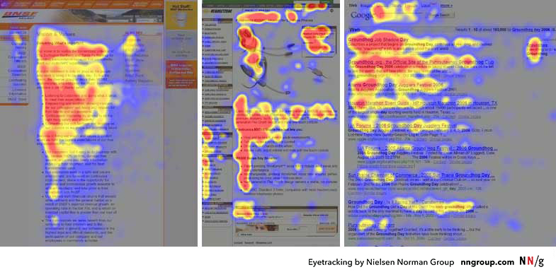
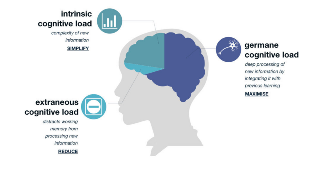
The first rule of web design is one of the most important: don’t overwhelm your users. Our brains are wired to avoid confusion and unnecessary complexity. A site full of clutter doesn’t just look bad; it increases cognitive load and causes visitors to disengage. Remember Miller’s Law, which suggests the average person can hold only 7 (plus or minus 2) pieces of information in short-term memory. Simplify your layout, streamline your content, and use Gestalt principles to guide the eye. Less really is more. Our brains love simplicity because it requires less mental effort. Cognitive load theory suggests that when there are too many choices or visual distractions, our brains can become overwhelmed, leading to reduced decision-making efficiency. The use of Gestalt principles—like proximity, similarity, and closure—helps create a sense of order in design, making it easier for users to process information.
Future Outlook:
As we move into a world where augmented reality (AR) and virtual reality (VR) are more commonplace, the need for simplicity will only grow. Designers will need to create intuitive, minimal interfaces that allow for seamless transitions between the physical and digital worlds. Neurodesign will play an even more pivotal role in helping users process complex information without feeling overwhelmed, especially in these immersive environments. Expect the rise of spatial UI design, where clarity and simplicity will be paramount in user interactions.
2. Thou Shalt Create Urgency, But With Subtlety
Scarcity is a powerful psychological tool, but using it too aggressively can backfire. People are driven by the fear of missing out (FOMO), and this fear can be used to encourage quick action. Limited-time offers, countdowns, or highlighting low stock levels (e.g., “Only 3 left!”) create urgency. However, authenticity matters—overdoing it makes you look desperate. Use urgency to guide behavior, but avoid the trap of making every product feel scarce. This balance keeps the experience genuine while still motivating action. Urgency is rooted in our primal instincts—fear of missing out taps directly into our fight-or-flight response. The scarcity principle triggers the release of dopamine, creating excitement and motivating action. When used correctly, countdown timers or low stock indicators can create a feeling of limited opportunity, pushing users toward making quicker decision
Future Outlook:
In the future, artificial intelligence (AI) could take this to the next level. AI-driven systems may analyze a user’s browsing behavior and personalize urgency notifications based on their preferences and actions in real-time. Imagine a scenario where your site dynamically adjusts the urgency messaging depending on how much time a user has spent considering a product or how many similar items they’ve viewed elsewhere. The balance will lie in personalizing urgency without overloading the user with too much pressure, making it feel like an organic nudge rather than a forced action.
3. Thou Shalt Utilize Social Proof to Build Trust
Humans are social creatures, and our decisions are often influenced by the actions of others. This is where social proof comes in. Displaying testimonials, user reviews, or metrics like “500 people bought this today” taps into the herd mentality. Worchel, Lee, and Adewole (1975) demonstrated that when something is perceived as scarce, its value increases. This concept can be applied not just to products but also to information. If it’s popular, it must be valuable. So, don’t be shy—let your visitors see that others trust your brand or product. Social proof works because our brains are wired to trust the actions of others as indicators of quality. This behavior is driven by mirror neurons, which mimic the actions of others. Seeing others engage with your content or product activates these neurons, making users feel more comfortable and confident in their own decision-making. Worchel’s research shows that when we see something as rare or popular, it increases its perceived value.
Future Outlook:
With machine learning and data-driven personalization, social proof could become even more dynamic. Instead of generic testimonials, we might see personalized social proof in the form of user-generated content, like seeing what your friends or similar users are purchasing in real-time. This can enhance the feeling of connectedness and further validate choices. In the future, augmented reality could even let users “try on” or visualize products in their environment, where social proof elements could be overlaid to show how many people have made similar choices nearby.
4. Thou Shalt Focus on the User’s Journey, Not Just the Design
It’s easy to get caught up in making things look visually appealing, but web design isn’t just about aesthetics. It’s about creating a smooth user journey. Cognitive load theory tells us that the more mental effort a user needs to expend, the less likely they are to engage fully with content. Minimize distractions, optimize page speed, and ensure your layout flows logically from one section to the next. The fewer barriers you create, the more likely your visitors will complete their journey—whether it’s making a purchase, subscribing, or exploring more content. The user journey should feel seamless, almost invisible. Flow theory explains that people are most engaged when they’re fully immersed in an experience that matches their skill level and challenges them just enough. When users experience flow, their brains release feel-good chemicals like dopamine, keeping them motivated and engaged. Cognitive ease—the feeling that something is effortless—promotes this state, which is why minimizing obstacles in the user journey is so important.
Future Outlook:
In the coming years, voice interfaces and gesture controls will likely change how we navigate websites. Instead of relying on the standard point-and-click method, the user journey may be driven by voice commands or physical gestures, which will require a complete rethinking of intuitive design. Additionally, the integration of neurofeedback could allow websites to adjust in real-time based on users’ emotional states or cognitive load, ensuring that users stay in a state of flow without overexerting themselves.
5. Thou Shalt Use Contrast Wisely
In design, contrast is more than just making things look different—it’s about guiding the user’s focus. The concept of contrast comes into play when presenting choices, as we see in pricing models or options. When you show two products—one standard, the other premium—make the premium option stand out. The contrast principle suggests that scarcity can make something seem more valuable simply by positioning it against something less exclusive. By strategically highlighting features or price points, you create a sense of exclusivity and value.Contrast doesn’t just draw the eye; it also facilitates decision-making. The contrast principle creates a relative sense of value and importance. This works well with pricing, product options, and features. When we perceive something as scarce or premium, our brains assign it greater value. This is why the decoy effect works—when you add a high-priced option next to a mid-priced one, the mid-priced one suddenly looks more reasonable.
Future Outlook:
In the future, dynamic contrast could become more personalized. AI could adjust contrast and visual emphasis based on user behavior or even emotions. For example, if a user is hesitating between two options, a website could subtly emphasize one over the other to steer them toward a choice. With the rise of dark mode, designers may experiment with different contrast strategies, where the traditional visual cues of light-on-dark versus dark-on-light are reimagined to create a more personalized user experience.
6. Thou Shalt Be Transparent with Your Offers
Transparency is key in building trust. Iyengar and Lepper’s (2000) research on choice shows that when we’re given too many options, we feel overwhelmed and may walk away entirely. But when presented with a curated selection, we’re more likely to make a decision and stick with it. Offering a limited number of clear, straightforward choices on your site reduces decision fatigue. Ensure that pricing, features, and availability are crystal clear, without hidden fees or misleading terms. Transparency makes users feel more comfortable and confident in their decisions. Transparency builds trust, which is crucial in the decision-making process. When users feel that they are being presented with clear and honest information, it reduces their cognitive dissonance and aligns with our brain’s natural preference for predictability and certainty. The mere exposure effect suggests that the more familiar we are with something, the more we tend to like it, so transparency helps in building familiarity.
Future Outlook:
In the future, blockchain technology may be used to offer absolute transparency, especially in e-commerce. Blockchain could provide users with immutable proof of pricing history, product origin, and even customer feedback. This would further reduce skepticism and enhance decision-making by offering not just transparency but also verifiable authenticity in ways we can’t even imagine today. Additionally, AR might be used to overlay transparent pricing and feature comparisons directly onto products, creating an immersive transparency experience.
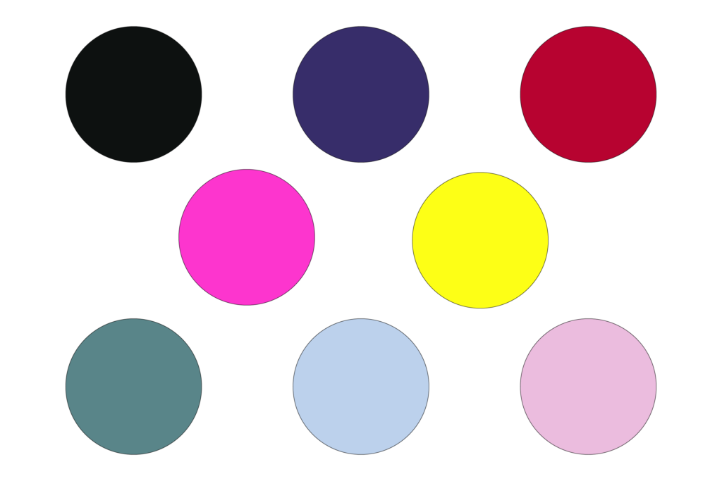
7. Thou Shalt Use Colors to Evoke Emotion
Color isn’t just for decoration—it plays a key role in shaping emotions and decisions. Research on color psychology has shown that colors can influence everything from trust (blue) to urgency (red) and calm (green). Choose your color palette wisely to evoke the right emotions at the right moments. A well-designed site leverages these associations subtly, guiding users to feel comfortable, excited, or ready to act without overwhelming them with too many bold or jarring colors. Color is one of the most powerful tools in neurodesign because it can trigger emotional responses that drive action. For example, red increases urgency, blue builds trust, and green suggests calmness. These responses are based on our evolutionary history and cultural associations. Color also impacts attention—bright colors can attract attention, while muted tones can calm it.
Future Outlook:
With the advent of emotion-sensing technology, designers could tailor color schemes to the individual user’s emotional state. If a user’s face or voice indicates frustration or confusion, the site could change the color scheme to one that induces calmness or clarity. Similarly, AI-driven color palettes could evolve to match the user’s aesthetic preferences and emotional responses in real-time, offering an even more personalized experience.
8. Thou Shalt Provide Clear Calls to Action (CTAs)
A call to action (CTA) is the ultimate goal of any web page—whether you want users to subscribe, buy, or learn more. But simply placing a CTA on a page isn’t enough; it needs to be compelling and easy to find. Fitts’s Law tells us that the closer and larger a target is, the easier it is to click. So, place your CTAs strategically in areas that make sense (think above the fold), and make sure they stand out with contrasting colors and action-oriented language like “Join Now” or “Get Started.” A clear call to action (CTA) triggers the brain’s decision-making system by creating a direct path for the user to follow. Fitts’s Law tells us that the easier it is to target and select a CTA, the more likely users are to act. The brain favors clarity and ease, so a CTA should be visually prominent and use action-oriented language that creates a sense of urgency or importance.
Future Outlook:
The future could bring interactive CTAs that evolve based on user actions or emotions. Imagine a CTA that changes dynamically as you approach it or that offers a personalized nudge based on user data. Voice-activated CTAs could also become more common, allowing users to make purchases or take actions simply by speaking their intent. These innovations will make CTAs even more intuitive and less intrusive, further enhancing the user experience.
9. Thou Shalt Limit Choices to Improve Decision-Making
One of the key insights from Iyengar and Lepper’s (2000) research is that too many choices can lead to decision paralysis. Shoppers faced with 24 jam options are less likely to purchase than those with only 6 choices. The same principle applies to web design—don’t overwhelm users with endless options. Instead, focus on a smaller, well-curated selection to guide decisions and ensure users are more likely to follow through. It’s not just about providing options—it’s about guiding them toward the best one for their needs.
Decision paralysis is real, and too many choices can overwhelm users. The paradox of choice shows that when we’re faced with too many options, our brains often shut down. By limiting options, you make the decision process easier and more satisfying. Cognitive ease helps users feel confident in their choice, and when the experience is too complex, users may simply leave without choosing anything.
Future Outlook:
In the future, AI-powered recommendation systems will likely become more accurate at predicting and limiting choices for users. Instead of presenting all available options, your website could analyze a user’s preferences and show a much smaller subset of options—those that have the highest likelihood of being chosen. Personalization will take this a step further by predicting what the user wants before they even realize it, leading to a more streamlined and intuitive experience.
10. Thou Shalt Keep the User in Flow
The experience of browsing your website should feel seamless. Users don’t want to be interrupted by slow load times, confusing navigation, or excessive pop-ups. Optimize your page speed, reduce unnecessary distractions, and ensure your site works across all devices. Neurodesign principles suggest that when users encounter smooth, frictionless experiences, they’re more likely to stay engaged and take the actions you want. A good user experience isn’t just nice to have—it’s essential for achieving your design goals.
Final Thoughts
Webdesign is not just about making things look pretty—it’s also about creating a psychological experience that makes users want to engage, stay, and act. By following these 10 commandments, you can craft websites that perform well in terms of user engagement and conversion. Designing with psychology in mind isn’t about manipulation—it’s about guiding users toward decisions that feel natural, satisfying, and rewarding. By following these Ten Commandments for Neurodesign, you could leverage the insights provided by cognitive science and visual perception research to create more engaging, effective online content. While design trends may evolve, these principles are rooted in timeless human psychology and provide a solid foundation for improving the user experience.
References
Hick, W. E., & Hyman, R. (1952). Response Times in Human Information Processing. Journal of Experimental Psychology.
Albers, J. (1963). Interaction of Color. New Haven: Yale University Press.
Bruce, V., & Young, A. (1998). In the Eye of the Beholder: The Science of Face Perception. Oxford: Oxford University Press.
Damasio, A. (1994). Descartes’ Error: Emotion, Reason, and the Human Brain. New York: Putnam.
Gibson, J. J. (1979). The Ecological Approach to Visual Perception. Boston: Houghton Mifflin.
Nielsen, J., & Pernice, K. (2006). Eyetracking Web Usability. Berkeley: New Riders.
Sweller, J., Ayres, P., & Kalyuga, S. (2011). Cognitive Load Theory. New York: Springer.
Tullis, T. (1983). The Effects of Presentation Format and White Space on Performance in a Complex Display Task. Proceedings of the Human Factors Society Annual Meeting, 27(2), 139–142.
Wertheimer, M. (1923). Laws of Organization in Perceptual Forms. In Ellis, W. (1938), A Sourcebook of Gestalt Psychology. London: Routledge.