This is my last blog post of the semester, and it feels like a good moment to pause, look back, and then look ahead. In my previous posts, I mostly focused on the challenges of shaping a full concept and understanding where my project could go. Now, instead of diving deeper into problems, I want to write about my next steps and how my thinking has started to shift.
In blog post number six, I wrote about the technical challenges I faced, especially around building and connecting digital and physical elements. During my final critique, Mr. Martin Kaltenbrunner gave me a piece of advice that really stayed with me. He encouraged me to step back and look at my project from above, instead of zooming in too early on one solution. He suggested focusing more on challenges in the physical world and thinking about how making them playful or digital could improve user engagement and traction. That comment helped me realize that I was sometimes too focused on making my concept work, instead of asking why people would enjoy using it in the first place.
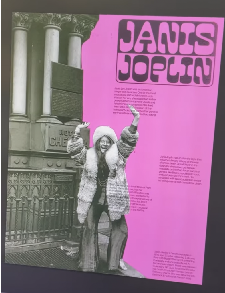
Interestingly, around the same time, social media algorithms started doing their thing. I kept getting videos related to my topic, and instead of ignoring them, I leaned into it. I discovered beautiful examples of 3D-printed jewelry, and then I found a YouTube video showing a 3D ring with a small RFID chip embedded inside. After that, I came across several experiments and even failures involving NFC inside jewelry. Seeing both successful and unsuccessful attempts was incredibly valuable, because it made the process feel more realistic and approachable.
One example that really stuck with me was a blogger who turned her bus pass into a ring. It was such a simple idea, yet it perfectly showed how a boring everyday physical experience could be transformed into something playful and personal. That example made everything click. It was not just about technology, but about how design can shift the emotional experience of an action we do every day without thinking.
This also made me reflect on how digital solutions already help us transmit emotions across distance. Small things like animated text messages on Instagram or automatically generated video memories in the iOS gallery may seem simple, but they add emotional value. They make digital interactions feel warmer and more human. Seeing these examples helped me think beyond my original concept and reminded me that emotional design often lives in details.
Another important influence was a talk by Jared Friedman called How to Get and Evaluate Startup Ideas. Watching it helped me widen my perspective even more. It made me realize some mistakes I was close to making, especially trying to solve too many things at once or falling in love with a solution too early. The talk reminded me that strong ideas usually start with clear problems and grow through testing, feedback, and iteration.
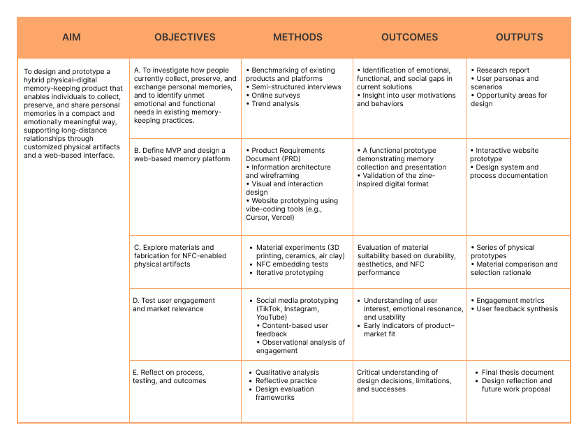
Looking forward, my next steps are about exploration rather than final answers. I want to experiment more with physical objects, playful interactions, and emotional triggers. I want to test ideas quickly, observe how people react, and stay open to changing direction. This semester taught me that uncertainty is not a weakness in the process, but a necessary part of it.
I used ChatGPT to check the spelling and grammar of this text