#4 Can Design Fail on Purpose?

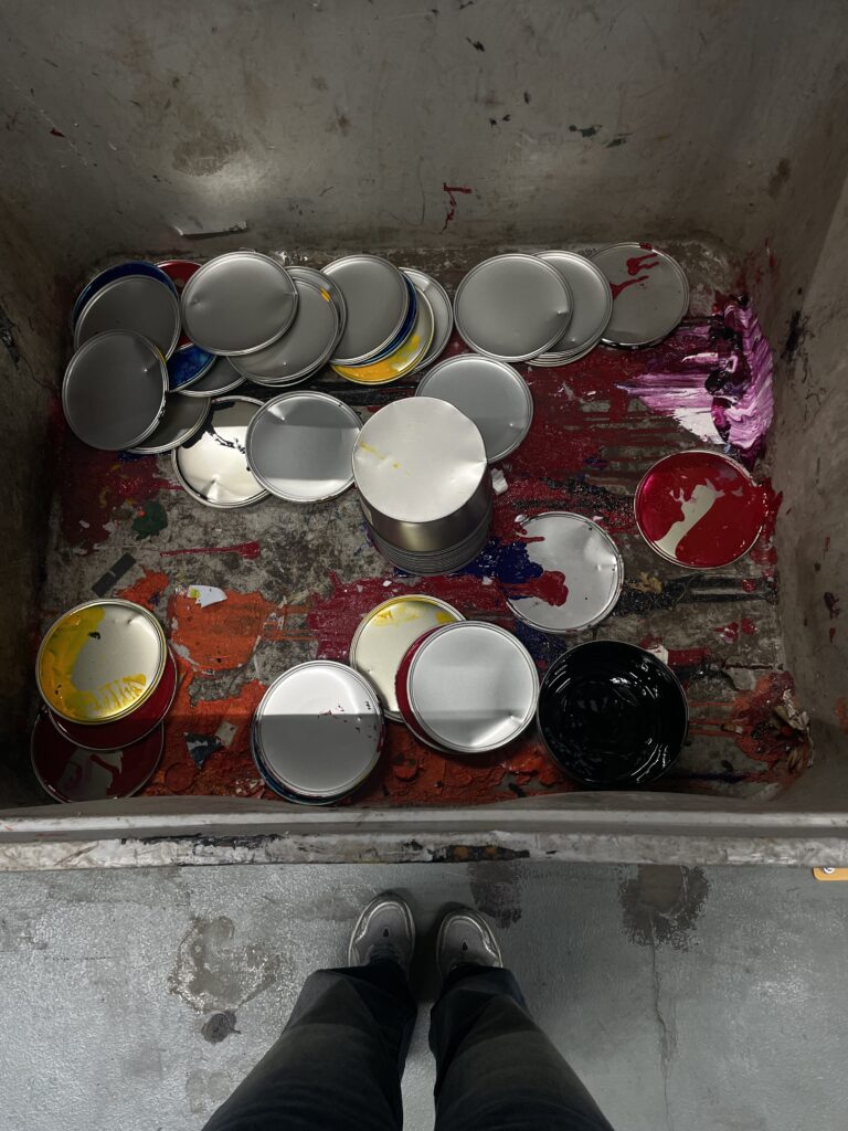
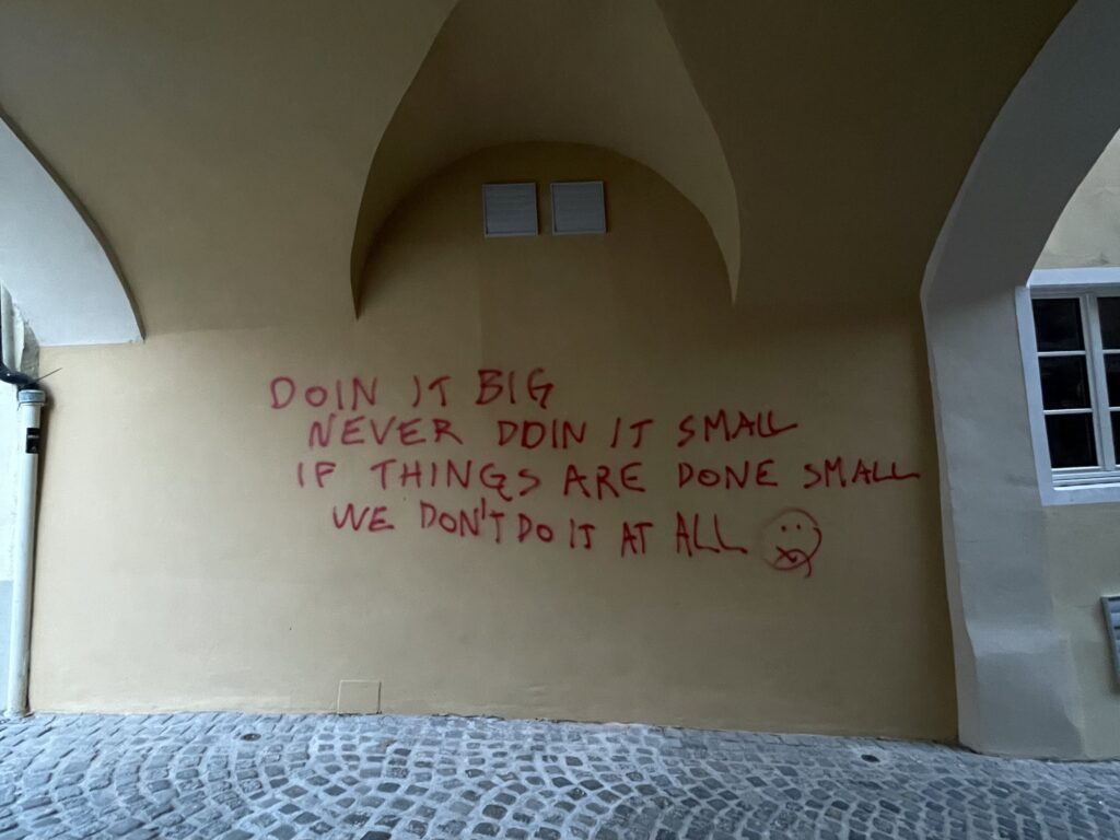
Sometimes I scroll past something like a blurry flyer, a crooked layout, a typo on a poster and instead of seeing it as a mistake, I pause. Not because it’s “good” design, but because it feels real. I keep coming back to this question: can a design fail on purpose? And even more what if that failure is what makes it memorable? Text misaligned, color combinations that clash, images pixelated beyond recognition. But somehow, it sticks.

We’re taught that good design should be functional and clean. But in the wild, in cities, on street corners, and walls layered with years of posters, we see something else. We see communication that’s chaotic, emotional, confusing but also honest. It doesn’t always follow the rules. And maybe that’s exactly why it sticks with us.

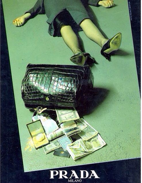
There’s a term in music called “perfect mistake”, when something technically wrong sounds better than what was planned. Maybe design works the same way. Maybe a clashing color combination or awkward composition leaves a stronger impression than the perfectly aligned, grid-locked poster.
When design tries to be too perfect, it often blends into everything else.

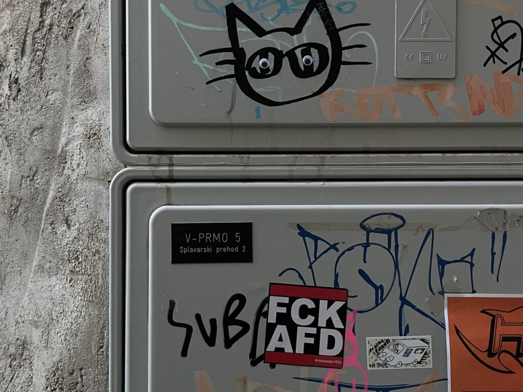
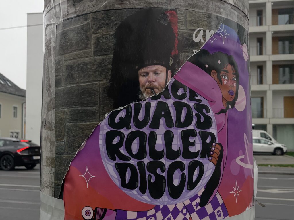
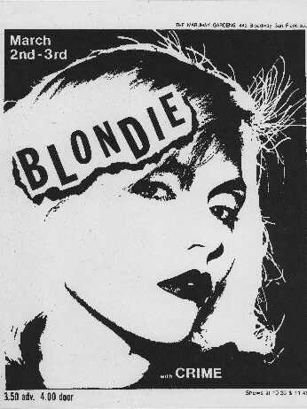
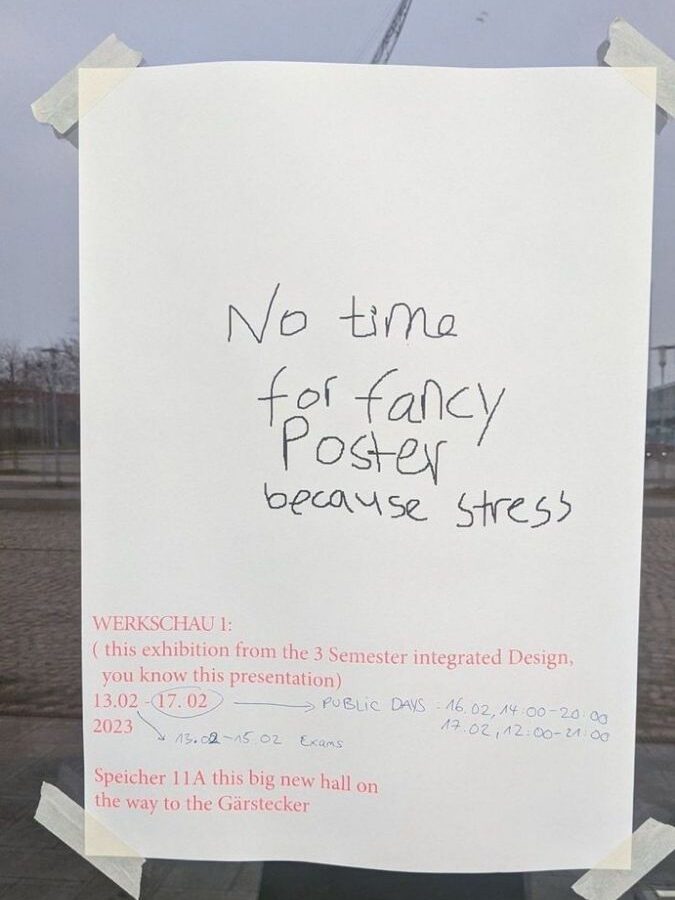
I started thinking about this as “visual noise”, a layer of design pollution that feels out of place in clean visual systems. But what if that noise is actually part of the city’s memory? What if that sticker someone made at home on Word and slapped onto a pole at Südtirolerplatz is part of the design culture here, even if no designer approved it?

So what does it mean to intentionally design something that’s not “right”? Can failure be a method? Some artists and graphic designers already work this way, playing with bad spacing, clashing type, broken printing processes. The point isn’t to be anti-design, it’s to reframe our idea of what visual communication can be.

Reading “The Shape of Things” by Vilém Flusser, I came across this:

“Design is a trick — a way to make function appear as form, and form as intention.”
Flusser argues that design is always somewhat misleading. It guides us while pretending to be neutral. But once you notice the trick, the illusion breaks. That’s where broken design or “anti-design” becomes interesting. When it refuses to play by the rules, it draws attention.

That’s also what Brückner explores in “Rough: Anti-Design”. How glitch aesthetics, misprints, raw textures, or visual overload became part of a new graphic language. Especially in an age where everything is optimised and polished, this type of chaos feels honest. These “failures” remind us that a person was there and not a content strategy.

What happens when design stops performing efficiency and instead creates space for emotion? What if “bad” design is a more accurate reflection of our overstimulated world?

#3 Things That Weren’t Meant to Stay

This week I started noticing how many things in public spaces feel temporary. Not in a poetic way, just… actually temporary. A handwritten sign taped to a bakery window that says “Komme gleich zurück :)”, an empty coffee cup balanced on a railing like it’s been placed there intentionally, a pair of gloves tucked into a fence near Jakominiplatz.

You can’t really design these things, but they still speak. They carry small stories, even if we don’t know what they are. They’re not meant to be part of the city, yet somehow they are and maybe they say more about the people living here than any campaign or billboard ever could. These objects and gestures weren’t made to last, but they still communicate something. A kind of honesty that polished design often loses. No branding, no grid system, no aesthetic filter. Just real people leaving traces, often without even knowing it. In design, we’re often told to think long-term and build clarity or make things clean and usable. But a lot of the things I actually remember are the ones that were sloppy, quick, emotional. A missing cat flyer with a smiley face. A badly photocopied note on a lamp post. A weird sticker that just says “mehr lasagne.”

I’m starting to wonder: what if we stopped measuring the value of design by how long it lasts, or how “good” it looks? What if we made more room for short-lived communication, for things that are meant to disappear, but still leave an impression? Not everything has to be permanent to be meaningful. And no, I don’t mean this as just another side effect of our throwaway culture. We already live in a world obsessed with speed, we scroll past images before we even process them, trends change weekly, and content disappears in 24 hours. But the kind of temporary design I’m thinking about is not the same as fast design. It’s not about producing more or doing things quickly just to keep up.

Fast content often feels empty because it’s created to fill space, to keep the algorithm running. But the temporary moments I’m drawn to are different, they happen slowly, or by accident, they’re personal and don’t ask for attention. A note someone wrote in a rush and left behind. A message taped to a broken mailbox. A protest sticker fading in the sun. These things aren’t chasing virality. They exist in the background, but they speak to us on a human level, precisely because they’re not trying too hard.

So when I talk about designing the temporary or embracing what isn’t made to last, I don’t mean more noise. I mean less pressure, less control. I mean making room for slowness, for mess, for the unnoticed things that carry meaning in a different way. Not by shouting, but by simply being there for a moment and then fading.

#2 The Art of Noticing

Lately, I’ve realized that I’m always collecting. Not with intention or purpose, but with a quiet pull toward the things no one else seems to care about. My camera roll is full of crumpled posters, broken signs, strange textures on walls or spilled paint. I never really questioned it. I just took the pictures.
But now, as I think about my semester of experimentation, I’m starting to see it as a tool to be more present and maybe even as my own way of creating designs that don’t follow.

We live in a culture of overstimulation, where everything is trying to grab our attention like ads, feeds, headlines, polished portfolios. But there’s a different kind of awareness that lives in the cracks. It’s quieter. Slower. More personal.

This week, I’ve been thinking about how noticing could be a form of resistance. A refusal to only look at what’s designed to be looked at. A refusal to be impressed only by what’s been curated, filtered, finished. Noticing is not about finding beauty. It’s about being present enough to see what’s already there. And that’s something design often forgets. We’re trained to create impact. To control the narrative. To arrange every element with intention. But what happens when we just observe? When we gather fragments, traces, leftovers and let them lead us somewhere? I’ve started going on walks with no destination during covid and it kind of became my version of therapy. Just me, my headphones, and an openness to what I might find.

A bent fence, casting a perfect accidental grid on the pavement. A half-painted wall where the tape lines remain like scars. A sticker with only one letter left. Things no one made, but that somehow say something. I’m thinking of this as a kind of visual journal. Not even a moodboard or inspiration source yet. Just proof that the world is already designing without us.

These images might become the texture of a future poster. Or a layout experiment. Or maybe nothing at all. But the act of noticing itself feels valuable. It’s a practice in being present. It’s also a way to challenge the perfectionism I keep wrestling with. Because when I notice things that are broken or unfinished or random and still feel drawn to them, it reminds me that I don’t always have to fix or perfect everything I create.

This project might be about randomness but at the moment, it’s really about paying attention.
Noticing things that don’t scream for it. Stuff that exists on the edges. Messy details. Accidents. Layered posters. Things that feel like they have a story even if I don’t know what it is yet.

I like that I’m not trying to make anything final right now. There’s no pressure to solve anything. I’m just observing. Letting things unfold a bit. Saving images, making notes, trying to figure out what all this could turn into.

#1 Designed to Break

There’s something about the broken that feels alive.
This week, I kept noticing the city peeling. A sticker half-removed. Posters fighting for space on a crumbling wall. A screen glitching in the tram. I started to wonder: what if this is the real visual language of now? Not the polished but the layered, interrupted, half-finished?

I’ve been thinking about how design disciplines often work against chaos. We clean things up. We retouch. We organize. But the world doesn’t follow those rules. Meaning emerges in noise, identity reveals itself through mess.

So this semester, I want to work with mess. I want to make space for things to go wrong and I want to create systems that welcome interruption, layering, and decay. Maybe that means printing something over and over until it becomes unreadable or maybe it means designing posters meant to be torn or overwritten. I don’t have a roadmap yet. But I know I’m tired of things that try to be perfect. Let’s see what happens when design begins to fall apart.

I’m interested in what randomness reveals and what emerges when we step back. How does it look like when systems slip, or when time and weather and humans intervene. I’m thinking about how urban spaces speak through their textures, graffiti half-washed away, signs layered on signs, windows reflecting windows. These are not mistakes. They are living surfaces. I’m thinking about how software glitches and compression artifacts create their own strange beauty. Not despite their errors but because of them. I’m even thinking about my own process. How often do I delete something before it has the chance to surprise me?

As someone who struggles with perfectionism in my design work, maybe the most important thing I can do is let go of control and see what happens. I’m so used to polishing every detail, aligning every element, making sure everything feels intentional. But what if the most honest, exciting parts of our work happen after we stop trying to perfect it? What if allowing for mess, interruption, or even failure opens the door to something more human and more meaningful? This semester, I want to challenge my instinct to over-edit and instead trust the process, even when it feels uncomfortable.

I’ve always been drawn to the unnoticed, the random, the imperfect. I take more photos of peeling paint, crooked signs, or strange coincidences on the street than I do of sunsets or famous landmarks. This semester, I want to lean into that instinct. I want to start collecting randomness, not just as inspiration, but as material. Scrolling through my camera roll, it’s clear I’ve been unconsciously collecting randomness for years, fleeting textures, strange compositions, unnoticed corners of daily life and now, those quiet observations are becoming the raw material for a more intentional design experiment.

The goal is to create a zine or digital page that reads and feels like a visual protest against overdesigned perfection. A messy, layered, expressive response to a world that often values control over authenticity. I’m interested in what happens when I break design rules on purpose, in typography, layout, composition, and print and how that affects the way we read, feel, and interpret visual information. I also want to experiment with AI-generated randomness and compare it to my own analog or spontaneous processes. While AI can mimic randomness, it lacks the intuitive, emotional, and visual judgment that humans bring to chaos. I want to test that gap.

This isn’t a fully fixed concept it’s more of a manifesto in the making. Something I will build through experimentation, reflection, and collecting overlooked moments of randomness in the world around me.

Between What Is and What Could Be

When I started this research, I wasn’t looking for a specific topic, I was chasing a feeling. Something felt missing in design, in media, in the way we experience the world. I was drawn to the in-between, the fleeting, unnoticed, overlooked moments that shape us without us even realizing.

I explored the simple concept of waiting, non-places, liminal spaces, randomness, imperfection trying to understand why certain moments feel soulless and disconnected while others feel deeply human. I found myself coming back to the same question:

“How can design capture these in-between moments and use them to create meaning?”

Designing for What We Don’t See

Most design focuses on what’s visible like logos, posters, polished branding. But what about what’s not seen? What about the things we pass by every day, the torn posters, the scribbled notes, the things left behind? What if design didn’t just fill space, but instead highlighted what was already there?

Some of the most powerful design projects aren’t the ones that impose meaning, but the ones that reveal it. Candy Chang’s “Before I Die” walls, where people publicly write their hopes and regrets, aren’t about permanence, they’re about capturing a fleeting moment of honesty. Krzysztof Wodiczko’s projections on public buildings, giving marginalized voices a platform, use impermanence as a tool to make people stop and pay attention.

Maybe good design isn’t about creating something new, but about amplifying what already exists.

The Imperfect, the Unfinished, the Fleeting

Throughout this research, I realized that the most human experiences are imperfect, unfinished, and fleeting. Whether it’s the randomness of a photo dump, the nostalgia for something we can’t quite place, or the quiet intimacy of a shared waiting space, these moments matter.

But we rarely design for them. We design for function, efficiency, longevity. Maybe it’s time to rethink that. What if design embraced imperfection, transience, and randomness? What if, instead of creating perfect spaces, we designed for serendipity, interaction, and human presence?

Designing for the In-Between

At its core, design is about shaping experiences, not just through what is seen, but also through what is felt, passed by, and sometimes even ignored. The challenge isn’t just to create something visually appealing, but to design in a way that acknowledges human presence, interaction, and imperfection. We see this in branding shifting toward raw, unpolished aesthetics, in urban spaces that encourage spontaneous participation, and in digital design that prioritizes authenticity over perfection. The in-between moments whether in public spaces, media, or digital interfaces are where connection happens. Instead of filling every gap with content, design has the power to highlight what already exists, giving meaning to what was once overlooked. The question is: how can we, as designers, create spaces, both physical and digital that make people pause, notice, and feel something real?

What Comes Next?

I don’t have all the answers yet, and that’s the point. This research wasn’t about finding a conclusion, it was about opening a conversation. Maybe the most meaningful design isn’t the loudest, the biggest, or the most perfectly curated. Maybe it’s the quietest the thing that makes you stop for a second, notice what’s been there all along, and feel connected, even if just for a moment. Because sometimes, meaning isn’t in the final design. It’s in the spaces in between.

Unintentionally Intentional

Not everything we encounter is designed with intention. Some things just happen, a misplaced sticker on a street sign, a torn ad revealing layers of past posters, or a scribbled note left on a café table. These accidental compositions, often more visually striking than purposefully designed elements, remind us that meaning isn’t always created, it emerges.

In design, there’s a long history of embracing the unintentional. The Dadaists used chance as a creative tool, cutting up newspapers and rearranging words randomly. The punk movement layered photocopied textures and type without precision, rejecting polish in favor of raw expression. Today, we see echoes of this in the chaotic collages of Y2K-inspired graphic design, the resurgence of DIY aesthetics, and even in social media trends that celebrate visual spontaneity.

But beyond nostalgia, there’s a bigger reason why randomness and imperfection feel refreshing: we are overwhelmed by control. In a world where algorithms dictate what we see, where AI can generate the “perfect” design in seconds, where branding follows rigid aesthetic guidelines, the accidental feels like a breath of fresh air.

Think about urban design and public spaces. Graffiti, layered posters, stickers covering street poles—these things were never meant to be compositions, yet they tell stories of a city’s identity. The way sun-faded billboards accidentally create new images, or how a café’s window reflections distort the view inside, these are all unintentional moments of design that shape our visual world.

So, what if we started designing with imperfection in mind? Not as an afterthought, but as an active part of the process? What if a poster was meant to tear and reveal something underneath? What if digital design allowed for unexpected, unplanned disruptions?

Maybe the future of design isn’t about control, it’s about making room for what happens naturally. Because sometimes, the most compelling things are the ones no one planned at all.

Designing the In-Between: Imperfection and Randomness

In a hyper-curated world where content is planned, polished, and algorithmically optimized, there’s a growing fascination with what feels raw, imperfect, and fleeting. We see it in the rise of Instagram photo dumps, the adoption of grainy, retro-inspired visuals, and even in how brands have begun to embrace a sense of randomness in their storytelling. This cultural shift is not just a stylistic trend but a broader reflection of our need to reconnect with the in-between moments of human experience—those small, often overlooked fragments of life that feel authentic and unfiltered.

From Nostalgia to the Present Moment

Nostalgia plays a role in this shift, but it’s not the end goal it’s the gateway. As explored previously, nostalgia offers comfort in a disconnected world, but what’s more interesting is how it has evolved into a tool for reclaiming presence and celebrating imperfection. Today’s creators and designers aren’t just looking to the past; they’re using nostalgia-inspired aesthetics to elevate the in-between moments of everyday life, making the ordinary feel extraordinary.

This shift reflects a broader cultural fatigue with perfection. From Instagram’s carefully curated grids to the rise of AI-generated content, the overly polished has begun to feel soulless. In response, creators and designers are leaning into imperfection not as a rejection of design, but as a rethinking of its role in fostering connection and meaning.

The Photo Dump: A Study in Randomness

One of the most visible manifestations of this new aesthetic is the photo dump. These collections of random, loosely connected images have redefined how we share our lives online. Unlike the hyper-curated grids that dominated social media in the mid-2010s, photo dumps embrace imperfection and spontaneity. A single post might include a blurry shot of a sunset, a close-up of a coffee cup, a candid of friends laughing, and a seemingly unrelated image of a wrinkled shirt on a chair.

What makes photo dumps so compelling is their unpredictability and intimacy. They feel less like a performance for an audience and more like flipping through a friend’s camera roll—messy, eclectic, and personal.

Randomness Feels Human

There’s something inherently human about randomness. It resists optimization and rejects the calculated perfection that AI and algorithms are so adept at producing. Take Rhode, Hailey Bieber’s skincare brand, as an example: their campaign visuals mix glossy lip products with playful, unscripted imagery like a piece of toast dripping with honey or sticky fingers holding a donut. Similarly, Jacquemus, known for its innovative campaigns, once used a slab of butter as a prop, adding an unexpected, almost absurd twist to their fashion storytelling. These pairings feel spontaneous and alive qualities that resonate in a world increasingly dominated by automation and artificiality.

This kind of storytelling feels genuine because it mirrors the way we naturally navigate our surroundings. It’s imperfect, chaotic, and often surprising. In contrast to the overly polished, hyper-aestheticized visuals that dominated platforms like Instagram during the late 2010s, this new approach doesn’t strive for unattainable perfection. Instead, it embraces the beauty of imperfection, making the experience feel more grounded and relatable.

The photo dump aesthetic and the broader embrace of randomness in design is about more than just style. It’s a reaction to a cultural moment defined by disconnection and overstimulation. In an age of AI-generated content, endless scrolling, and hyper-curated branding, we’re yearning for something that feels real. Randomness, with its unpolished edges and unexpected connections, offers that sense of authenticity.

For designers, this is an opportunity to rethink how we create and communicate. How can we use design to capture the fleeting, in-between moments that make life meaningful? How can we embrace imperfection and randomness as tools to foster connection in a disconnected world? It’s about finding beauty in the messiness of life and using design to highlight those moments. In a world where perfection is easy to replicate, imperfection becomes the ultimate mark of authenticity. The in-between spaces of our lives, the random, fleeting moments we rarely stop to notice are where meaning resides.

Nostalgia as a Coping Mechanism

The in-between moments of life whether waiting at a train station or scrolling aimlessly through our phones often feel hollow, like pauses in a song that never quite resolve. These spaces, both physical and emotional, are markers of our supermodern world, a concept that philosopher Marc Augé describes as defined by non-places, spaces of transience and anonymity where human connection feels incidental.

In this landscape of fleeting interactions and relentless motion, a curious phenomenon has emerged: an overwhelming yearning for the past. Nostalgia has become more than a wistful longing for simpler times, it’s a response to the alienation of modern life, a coping mechanism for the loss of grounding.

Why Nostalgia Now?

The rise of nostalgia is not random. Moments of uncertainty like the pandemic disrupt our sense of continuity, leaving us detached. When the present feels unstable and the future overwhelming, the past becomes a refuge. We turn to it not just for comfort but for clarity, a reminder of who we are and where we come from.

But this surge in nostalgia isn’t just personal; it’s cultural. It’s reflected in the return of vinyl records, the revival of 90s fashion, and the rise of retro aesthetics in branding and media. Even the way we consume content has shifted: the grainy, imperfect visuals of film photography are back, standing in stark contrast to the high-definition polish of digital life.

Nostalgia in the Age of Supermodernity

Supermodernity surrounds us with spaces and experiences designed for function, not connection. The clean, efficient lines of minimalism, the ubiquity of algorithmically curated feeds, the soulless sprawl of urban planning, they all prioritize performance over personality. In this environment, nostalgia reintroduces warmth, texture, and humanity into a world that can feel sterile and detached.

Consider the design of non-places like airports, shopping malls, and chain hotels. They are spaces without memory, where individual stories blur into the background of globalized sameness. Nostalgia offers a counterbalance, grounding us in the precision of memory and the uniqueness of our personal histories. It asks us to pause and notice the details—the handwritten note, the faded poster, the uneven cobblestones—that make us feel rooted.

The Role of Design in Nostalgia

Design has always played a key role in shaping how we experience the world, and nostalgia is no exception. Today, brands are tapping into this sentiment, not just through retro aesthetics but by embracing imperfection. Consider the resurgence of “wabi-sabi” in design, a Japanese philosophy that celebrates the beauty of impermanence and the incomplete. Or the trend of “photo dumps” on social media, where casual, uncurated snapshots resonate more deeply than polished, posed images.

These movements reflect a growing fatigue with perfection and a desire for authenticity. Nostalgia helps fill this void by reminding us of a time when things felt more real, when objects had weight, spaces had character, and connections felt tangible.

Nostalgia as a Guide

Rather than viewing nostalgia as escapism, we can see it as a guide, a way to reimagine how we design for connection in an increasingly disconnected world. By understanding what draws us to the past, we can begin to apply those principles to the present. This might mean designing spaces that encourage lingering instead of rushing, embracing imperfections instead of hiding them, or creating systems that prioritize people over efficiency.

The in-betweens of life both physical and emotional can be places of profound meaning if we allow them to be. Nostalgia teaches us to pause, to notice, and to find value in what we often overlook. In doing so, it offers us a way to reclaim our humanity in a world that too often feels impersonal.

As we continue to explore these ideas, let’s consider: How can we design not just for function, but for emotion? How can we create spaces digital or physical that honor the past while embracing the present?

Lost in Transition: The Eerie Design of Liminal Spaces

There’s a strange, almost haunting allure to liminal spaces. These are the empty hallways, deserted office corridors, and endless parking garages that feel frozen in time, places that seem familiar but lack the warmth of human presence. The internet phenomenon of “the backrooms” captures this perfectly: infinite, fluorescent-lit spaces that feel uncanny and unsettling.

But why do these spaces affect us so deeply? And how can this eerie, detached quality inspire design?

What Makes Liminal Spaces Feel Eerie?

Liminal spaces are defined by their “in-between” nature. They exist in transition zones neither fully occupied nor abandoned. The sense of eeriness comes from their detachment from human purpose. These are places meant for passing through, not staying, and when devoid of people, they lose their intended function and feel unnervingly off.

Liminal spaces often share distinct characteristics that contribute to their unsettling aura. Uniformity is a key feature, with repetitive patterns, identical rooms, and featureless designs that evoke a suffocating monotony. Harsh fluorescent lighting adds to the unease, bathing everything in an unnatural, sterile glow that feels alien and cold. Finally, these spaces are marked by an unsettling emptiness devoid of personal touches, warmth, or signs of life creating an uncanny void that leaves viewers feeling disconnected and adrift.

Liminal Spaces in Art


Designing the Uncanny

In design, certain elements can evoke an atmosphere of unease or intrigue, challenging the viewer’s comfort while sparking curiosity. Repetition and uniformity, for example, create visual tension. Grids or patterns that repeat endlessly can feel hypnotic yet slightly disorienting, keeping the viewer caught between fascination and discomfort. Similarly, hyper-clean, over-processed aesthetics can feel detached and impersonal; while visually striking, they risk losing warmth and connection, leaving an impression of sterility. Muted color palettes and flat lighting can further heighten this effect, washing designs in tones that feel distant or overly neutral, evoking stillness or even lifelessness.

Typography can also play a role, with stretched letters, misaligned kerning, or unconventional placements subtly disrupting the norm, creating a feeling of dissonance. These elements, while not inherently eerie, tap into the same sense of ambiguity and unease that draws us to the unfamiliar and the imperfect.

What’s fascinating is how the eerie feeling of liminal spaces parallels the direction modern design is heading, especially with the rise of AI. While AI-generated designs excel in precision and efficiency, they often lack the human touch that makes design feel alive. Like liminal spaces, these creations can feel too perfect, too detached, and ultimately soulless.

The Role of Supermodernity in Liminal Design

The eerie feeling of liminal spaces is deeply tied to the concept of supermodernity, a world obsessed with speed, efficiency, and transient experiences. In supermodern environments, spaces like airports, hotel lobbies, and highway rest stops prioritize functionality over identity. These are “non-places,” devoid of history or emotional connection.

In design, supermodernity’s influence can be seen in the rise of templates, algorithms, and hyper-efficiency. This has led to a flood of designs that, while functional, often feel detached or impersonal. Interestingly, the aesthetics of liminal spaces highlight this very tension. They reflect the soullessness of mass-produced environments and challenge us to think critically about the designs we create. Are we leaning too heavily into efficiency at the expense of meaning?

Why Liminality Resonates

There’s a reason why images of liminal spaces go viral. They capture a shared, almost primal unease, a reminder of what’s lost when spaces or designs lack humanity. For designers, this eerie aesthetic offers a powerful way to provoke thought and engage emotions.

By borrowing elements from liminal spaces, we can create work that taps into this sense of unease. Whether it’s through uniformity, emptiness, or a deliberate lack of “soul,” these designs challenge the viewer to confront feelings of isolation and detachment.

Edward Hopper – Office in a Small City

Liminal spaces, both physical and digital, are unsettling reminders of a world increasingly defined by transitions and non-places. In design, they force us to confront the consequences of detachment and explore how we can create meaning within the eerie and the unfamiliar.

By embracing the unease of liminal aesthetics, designers have the opportunity to craft work that lingers in the mind: haunting, thought-provoking, and eerily beautiful. However, as we explore this visual language, we must also recognize the broader concerns of soullessness and detachment already present in contemporary design. The challenge lies in balancing these eerie, intriguing elements with a sense of humanity and connection, ensuring that our creations evoke emotion and meaning rather than reinforcing the cold, impersonal trends that risk alienating us further.

Are We Living in Non-Places?

In the rush of daily life, we rarely stop to think about the spaces we inhabit. Yet, our cities are filled with what Marc Augé describes as non-places like airports, malls, highways, and waiting rooms. These are not destinations but places of transit, designed to be functional rather than meaningful.

Augé’s concept of non-places is rooted in supermodernity, a world defined by excess: too much information, too many choices, and too little time to reflect. In this environment, spaces become stripped of identity and connection. They exist only to move people along efficiently, anonymously, and often in isolation.

The Decline of Third Places

In contrast to non-places, sociologist Ray Oldenburg introduced the idea of third places: informal gathering spots like cafés, parks, or community centers. These spaces foster relationships, spark conversations, and create a sense of belonging.

But as cities expand and modernize, third places are disappearing. Public spaces are increasingly privatized, and social hubs are replaced by commercial zones. Where people once gathered to share stories, we now find sprawling malls or cookie-cutter cafés designed more for profit than community. The result? A sense of isolation that permeates our everyday lives.

Supermodernity and the Human Disconnect

Supermodernity doesn’t just shape the spaces we move through; it’s also reshaping the way we design. In our quest for efficiency and innovation, we often lose sight of the human element. Think about the rise of AI-generated art and design. While these tools are undeniably powerful, they sometimes lack the warmth, imperfection, and emotion that make human creations resonate.

Take the design of a campaign, for example. Comparing two Prada posters: one generated by AI and one created in the 1990s. The AI poster might flawlessly follow current trends, optimizing composition and color for maximum engagement. But the 90s poster carries a distinct cultural context, emotional depth, and an imperfect charm that resonates on a personal level. Supermodernity prioritizes speed and scalability, but at what cost?

What We’re Losing

The loss of third places and the rise of non-places highlight a deeper issue: the erosion of shared experiences and community. Third places like lively cafes, local libraries, and neighborhood parks once fostered connection and creativity. They weren’t just physical spaces but cultural hubs where people exchanged ideas and found belonging. Design in these spaces reflected the communities they served, with typography, posters, and art carrying personal and local meaning.

Today’s minimalist coffee shops, with their sterile aesthetics, often feel transactional rather than inviting, completely unlike the vibrant, conversational spaces of the past. Public squares, laundromats, community centers, and traditional marketplaces have largely been replaced by services focused on speed and convenience.

These losses aren’t just physical. The mental well-being tied to spontaneous connection and shared experiences has also diminished. Without true third places, design risks becoming generic and disconnected, shaped more by algorithms than human insight, losing the vibrancy that once made it meaningful.

Reclaiming the Human Element

So how do we push back against this trend? How can designers, especially communication designers, bring humanity back into their work?

One way is by focusing on storytelling. Every non-place has a story waiting to be told whether it’s the history of a train station, the hidden lives of workers in a shopping mall, or the personal journeys of travelers in an airport. Through typography, visuals, and interactive media, designers can turn these spaces into places of connection and meaning.

Another approach is to embrace imperfection. Hand-drawn illustrations, experimental layouts, or unexpected textures can remind audiences of the human touch behind the design. Instead of striving for sleek, AI-perfected results, we can celebrate the messy, emotional side of creativity.

Supermodernity in Design

Designers also need to critically examine their role in a supermodern world. Are we creating for convenience, or are we creating for connection? The rise of AI and automated systems has its benefits, but we must ensure these tools enhance, rather than replace, the human aspect of design.

For instance, an AI can generate a visually stunning ad campaign, but it’s up to the designer to ensure that campaign resonates on a deeper level tapping into cultural symbols, emotions, and shared experiences.

In a world dominated by non-places, designers have the power to make people pause, reflect, and connect. By reclaiming the human element in design, we can transform even the most impersonal spaces into meaningful experiences. It’s not just about making something look good, it’s about making it feel alive.