Over the semester, I built a simple Arduino-based Morse code prototype. It started with just three buttons to create Morse code messages, which were then turned into sound. I quickly realized that keeping it on one device didn’t make much sense, so I connected the Arduino to Wi-Fi and used OSC to send messages to my laptop. From there, I added a decoding function that translated Morse into readable text. In the final step, I built a basic web interface where you could type a message, send it to the Arduino, and see it displayed on an LED matrix. My idea is to use this setup to teach kids about encryption in a playful way. Along the way, I learned a lot about Arduino syntax, using libraries, and how to build Wi-Fi and web-based interfaces—opening up tons of new creative possibilities for me.
Like I have teased in the last blog post, I came across a YouTube video, that showed, how to create a web interface for an Arduino. This has a number of use cases, live sensor monitoring, remote control, live system feedback or interactive installations. This makes it possible to control how the user can interact with an Arduino, using a platform, that they already know.
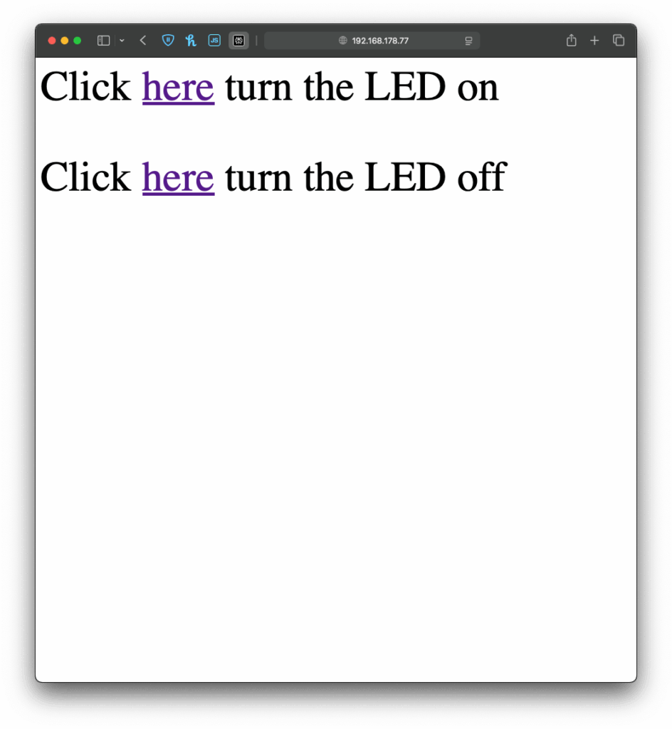
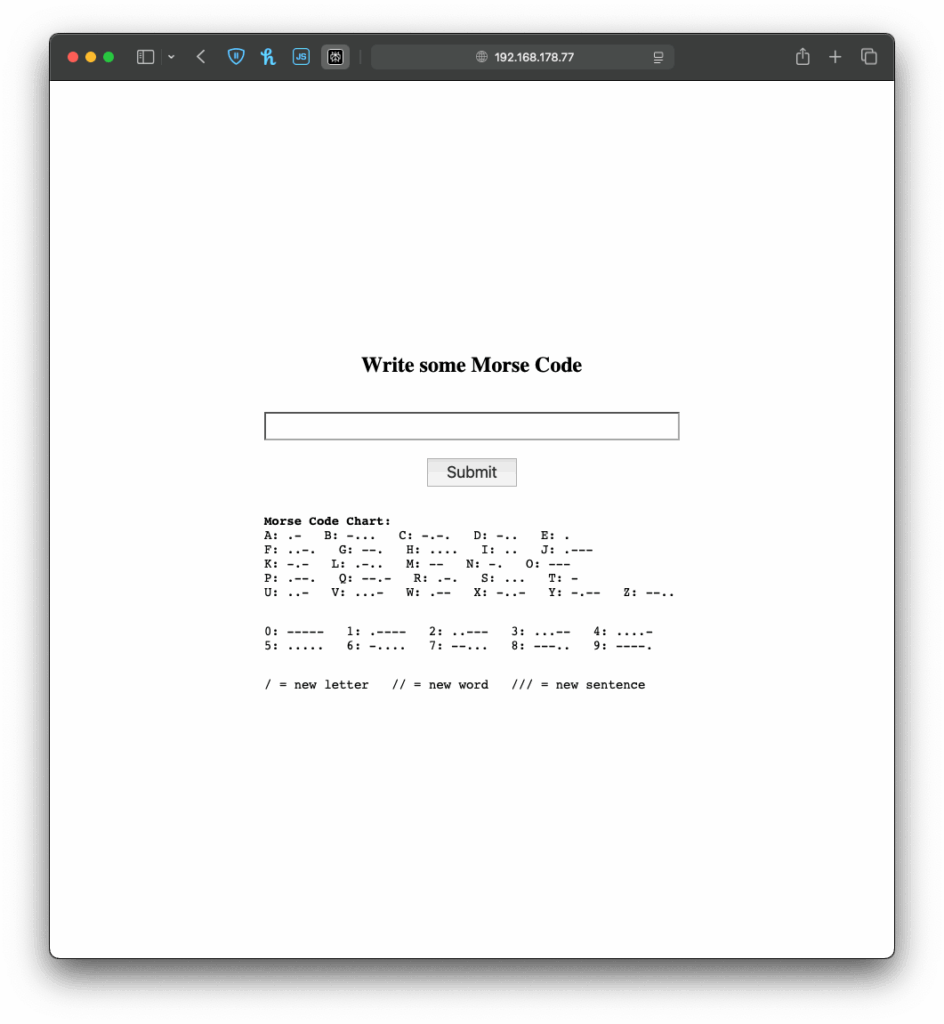
When the Arduino connects to a WiFi network, it gets an IP address and starts a tiny web server that can talk to web browsers. When you open that IP address in your browser, the browser sends a request to the Arduino. The Arduino responds with a simple web page, in my case a form in which you can write morse code. If you type something and click “Submit,” the browser sends the text back to the Arduino. The Arduino reads and understands the send information and can react accordingly. This way, the Arduino works like a tiny website, letting you interact with it through any browser.
I once again started with an example, I found in the WiFiS3 library of Arduino, “SimpleWebServerWiFi”. This code generated a very simple website with which you could turn on and off an LED on the Arduino. Using this as my starting point, I first wanted to expand the web interface, which took a little longer than it would usually take to build, since I had to upload the code multiple times and change it so it finally looked “good enough” for this prototype. But doing the interface it self was just the easy part.
BeforeAfter
Next I wanted to give my simple interface some functionality, there for the form I created on the Arduino needed to send the data input by the user back to the Arduino, so it could understand and for now translate it. And I have to be honest, I really tried to understand the code but just couldn’t figure out, how it worked, so I asked ChatGPT to help me out. Using its infinite wisdom it created a short piece of code, that converted the users input into a string, that could be understood by the code, I had written before.
The next step was easy, I added the code for decoding the message, I created last week and explained in the last blog post. Now I just needed the Arduino to display the message, after it received one, which was easy enough by just adding an “if” statement, that would only add extra content to the website, if a message had been received before. And like that, I finished the next version of my chaotic morse code prototype.
Now that I’ve built this basic version, I’ve been thinking about how this kind of setup could be used in different contexts. For example, it could be adapted for interactive museum exhibits, where visitors can type a message into a browser on their phone and trigger lights, sounds, or physical movements in an installation. It could also be used for DIY home automation, like controlling lights. Or it might become a learning tool for kids, where they can experiment with inputs and immediately see results, helping them understand communication systems like Morse code in a playful, hands-on way.
Instructions
If you wanted to try it out yourself, here was what you needed:
An Arduino
a Laptop or any other device that can use a Browser ;D
This time it is even simpler, plugin the Arduino, change the SSID & Password to fit your home WiFi network and upload the sketch. In the Serial Monitor you will then see the Arduinos IP address, now open a browser and type in the shown IP address. Now you should see the simple interface I created, the only thing to do now is to write some morse code and let the Arduino decode it.
After getting the Arduino to encode Morse messages and send them to a connected Max patch (see the last blogpost), I took the next step. So far, I built a way to create messages, and a way to transmit them, but not everyone was able to simply read and understand morse code, so the next step was obvious: build a way the messages could be read in clear text. The idea was simple: after every message got “sent”, the Arduino would take the Morse code string and convert it into readable text.
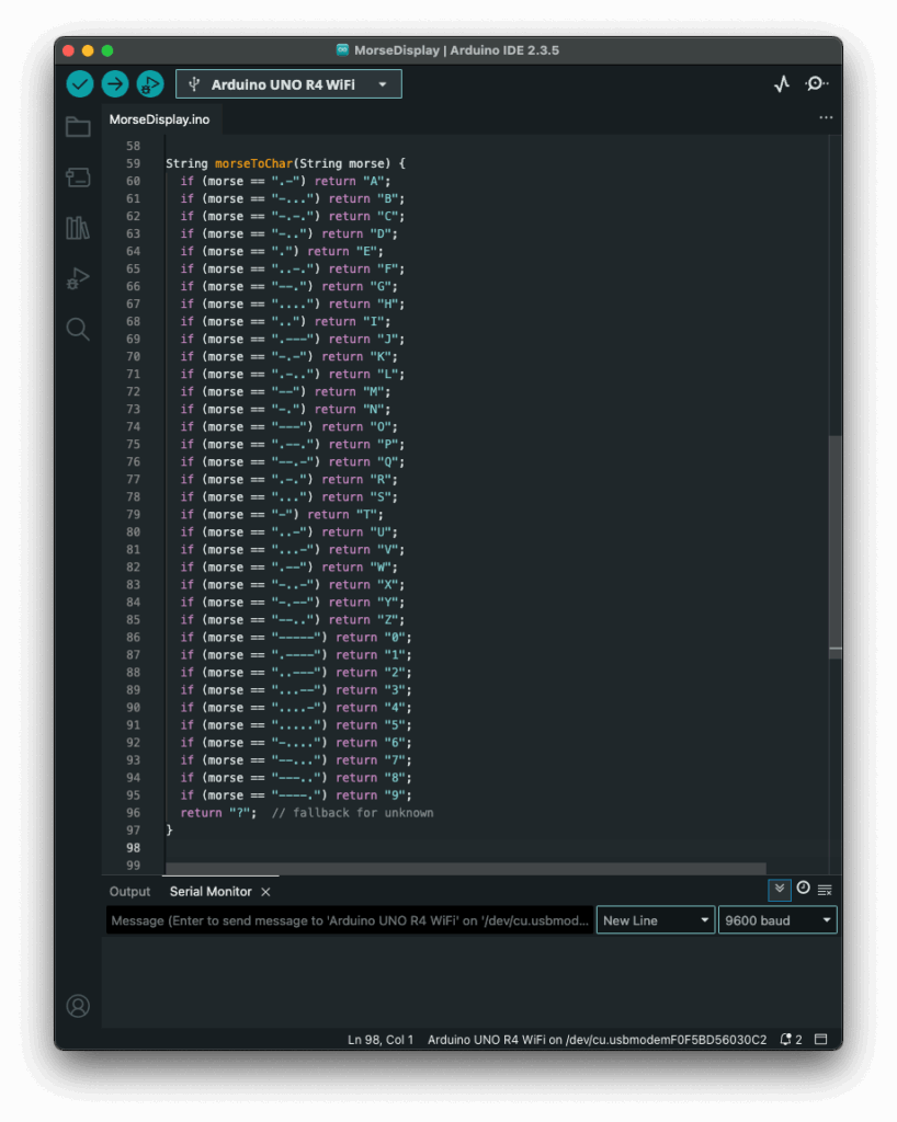
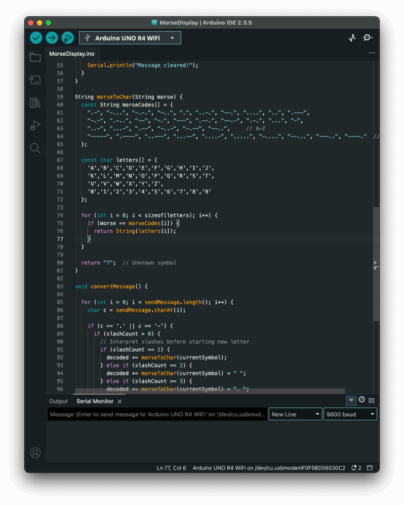
My first attempt was a long list of if statements, which worked, but I had hoped for an easier way to add and administrate different dot & dash combinations. Next I thought of using a switch statement to iterate through the combinations, but Arduino doesn’t support those, so I had to come up with a new idea. After searching on the internet, I came across a different solution, using arrays. So I rewrote it using arrays that mapped Morse code strings to letters. That gave me something that felt like a switch statement. It was now much cleaner, and easier to add custom combinations later.
Before:
After:
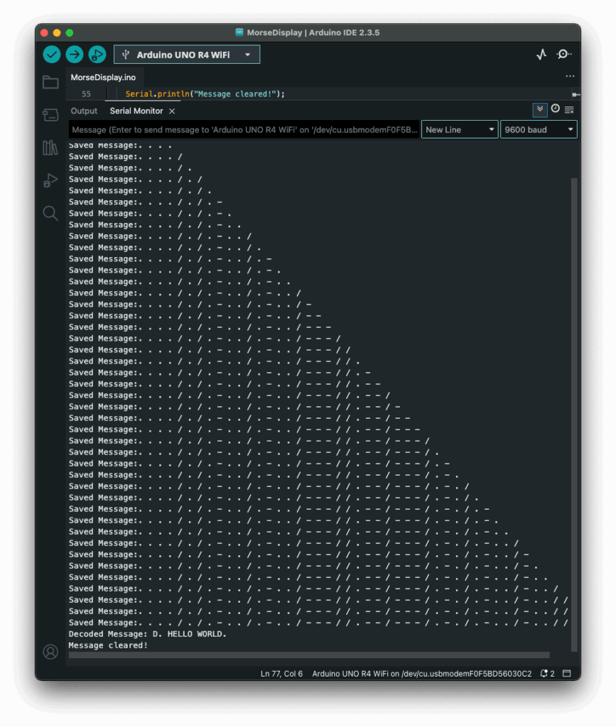
The decoding worked like this: one array was filled with all the Morse code symbols, and one with the matching letters. The code then iterated through the Morse message character by character, building a temporary substring that represented a single Morse symbol (like “.-” or “–“). Whenever it hit a slash (/), the program knew it had reached the end of one symbol. It then compared the collected substring to all entries in the Morse array. When it found a match, it took the corresponding index in the letter array to find the translation. That translated letter got added to the final decoded message string.
To figure out how many slashes were pressed, the code counted how many consecutive / characters appeared in the string. Each time it found a slash, it increased a counter. When a non-slash character came next (or the message ended), it used the number of counted slashes to determine the type of break:
One slash (/) meant a new letter started.
Two slashes (//) meant a new word started.
Three slashes (///) meant the start of a new sentence.
Four slashes (////) marked the end of the message.
This system worked surprisingly well and gave me more control over formatting the final message. By using these simple separators, I could organise the output clearly and logically. Here is how the full print would look like with the translation.
The result? A very basic but fully functional Morse communication device: input, output, transmission, and now decoding. Currently it is just displaying the message in the serial monitor, but I plan to make the message be displayed on the LED Matrix, on the Arduino, that way the message is readable to the user immediately. I also read online, that an Arduino can be connected to a web server, so I will probably test that out, since this way I could create smart devices for my room on my own.
Instructions
If you wanted to try it out yourself, here was what you needed:
An Arduino (compatible with Modulinos)
The three button Modulino
The latest sketch with decoding logic (I could share this if you were interested)
Not a lot to do, except plugging in the three button Modulino and uploading this sketch:
If you have read my previous blog post, the next step comes pretty natural. Just having one device creating and displaying morse code, defeats the purpose of this early way of communication. So I sat down, to set up a network communication between the Arduino and my laptop, which sounded easier than it was.
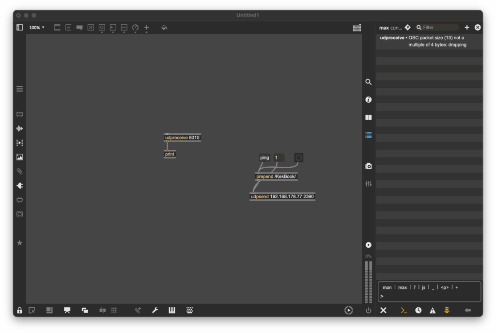
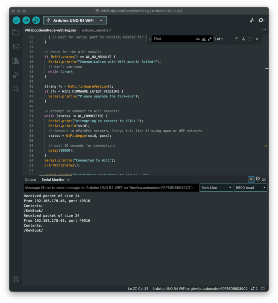
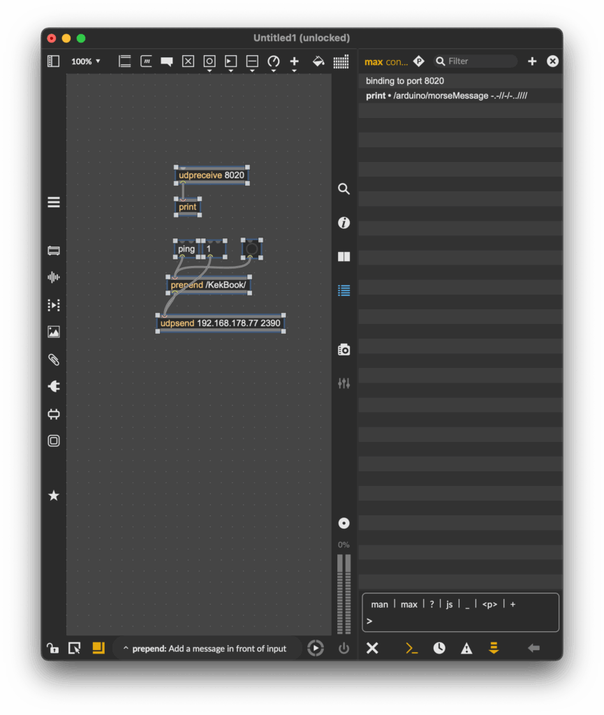
Since I had used OSC messages in countless classes before, I wanted to come up with a sketch, that could send those messages. Searching for a possibility to send this messages over WiFi, I started by looking at the examples, that were already provided by Arduino and I found something! Part of the WifiS3 library, there was a sketch, that showed how to send & receive UDP messages. Great! I uploaded the sketch and tried sending a message to the Arduino, using a simple Max patch. The message was received, although the response message wasn’t.
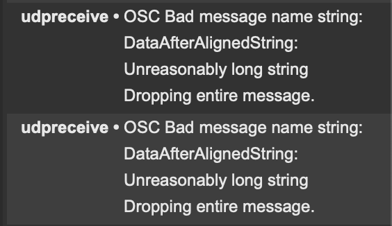
As you can see on the screenshot above, Max received a message, but it wouldn’t display its contents, since I had no idea what went wrong, I tried to adjust the message, so it would be a multiple of four, just like Max asked. But I just got another error message:
Still no idea what this error message was supposed to mean, but I kept trying. I reduced the length of the “message name string”, but without any success. I still got the same error message, as before, even though an even shorter message name wouldn’t have made any sense.
Defeated, I went to class the next day and talked about my problem with a fellow student. He brought to my attention, that Daniel Fabry had shared an example for the same thing last semester, which I knew worked, since I tried it in class, I just had forgotten about it. So I took a look at his sketch, which used an entirely different library. The code syntax was early identical, but the library was different. With my new knowledge, I adapted my code again and this time, it worked!
Now my Max patch could receive strings from the Arduino, great! As a next step, I updated my patch to actually replay the received morse code message. And my new version was done! Now messages could actually be sent wirelessly to other devices making actual communication possible.
This little detour into OSC & WiFi with Arduino really got me interested to explore this topic further. I am excited to find out the things that are possible using this technology.
Before uploading the sketch to the Arduino, you need to go into the “secrets.h” tab and enter your WiFi SSID (Name) and password. After this, go to the “sendIP” variable and change the Ip Address, to target your laptop. After applying these changes, upload the patch & build a simple UDP receive logic in Max, similar to the one you can see on my screenshots.
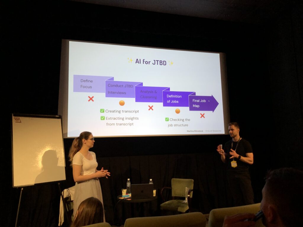
On day one, I visited a lot of different talks, one of them was “What is the ‘Jobs To Be Done’ framework and why should you care?” by Martina Klimesová. Looking back, this was a pretty biased talk about this framework, for beginners, still a great way to get to know the framework better. It actually got me so interested, that I joined her short workshop the next day, to try working with Jobs To Be Done myself.
In short, what is JTBD? The framework is based on the assumption, that people don’t simply buy products. They hire them, to get a job done, for example: People don’t want a drill, they want to hang a picture. The goal is to stop focusing on solutions. Depending, on the scope and context, there is hundreds of different jobs, a person wants or needs to do, to achieve a certain goal. But how do you get there?
The JTBD framework consists of five steps:
Define the focus/scope of your project (start small)
Talk to users – conduct interviews
Analyse & Cluster your insight
Define Jobs
Create a Job Map
Defining the focus/ scope – During the workshop we focused on a small coffee stand, in front of a huge office building. The end goal was, to raise the profits of said stands to do that, we needed to conduct some research, to find out which jobs people need to do, on their way to work. Assuming, they would pass the coffee stand on their way to the office. So our focus was set, we wanted to analyse peoples “get to work routine”, from the moment they get up, to when they start work. In reality, you would base that decision, on business requirements, collected data or just gut feel.
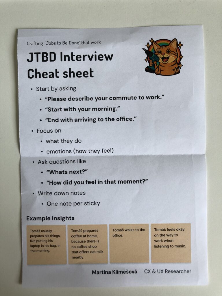
Conducting Interviews – Next is to interview between six to twelve people, or better yet until you can see certain patterns repeating themselves. The focus of those interviews are the feeling of people, in a certain situation and their processes they go through, to achieve their end goal, in this case, getting form home to their workplace. Martina advised us, to take notes of our insights on sticky notes, since they were easy to rearrange in the later stages of the process. One Insight per sticky note. She even handed out a cheat sheet, to help with the process.
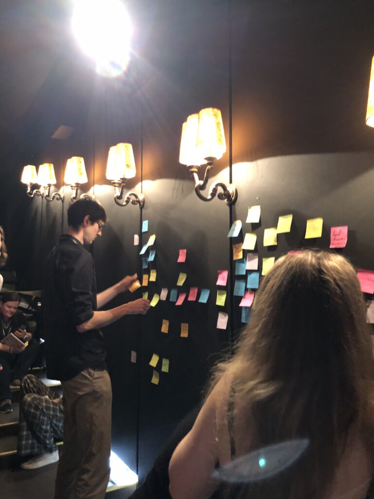
Analysis & Clustering – After conducting your interviews, you should end up with a bunch of sticky notes, with a lot of insights. The next step, is to cluster those insights in different groups, try to find a headline for each of the groups. For the coffee stand example those groups were: How people commute to work, what they eat, when they have their first coffee, how they deal with the weather and a few more, I can’t remember. Try to keep the clusters small and separate them into smaller groups, if they get too big.
Defining Jobs – After clustering your insights, try to find job statements for each cluster, this could be just one or multiple. The statements can be very specific like “Buying a coffee” to very abstract like “not feeling sleepy”. This is the hardest part of the process and it will take a while to get all the jobs down.
Creating a Job Map – This is the last part of the process and probably the most fun. After creating job statements and writing them down on sticky notes, now you put it all together. The goal is to create a timeline of jobs, people need to do to reach their end goal. The time line can be separated into multiple milestones, like “leaving the house”, “commuting to work” & “sitting down in the office”- You put down the sticky notes according to the point in time, the users have to fulfil them. Additionally you should separate abstract from specific jobs, you could create a scale, having the most abstract jobs at the top and the very specific ones at the bottom. This map should then be shared with your whole team.
One the first day of WebExpo 2025, I listened to a talk from Tejas Kumar named “From GenAI to GenUI – Codify your UI on the fly”, during his live demo he went through the history of adding Ai to webpages, from 2022 to 2025 and beyond.
Starting with the basics, he showed how Ai chatbots were created, back when ChatGPT was still new and people didn’t know, how to best use it yet. Interfaces were simple, just a textfield to write a query into and a search button, afterwards, one would have to wait (in the dem it was about 15 seconds) until the answer arrived. As we all know, waiting, especially if its longer than ten seconds, sucks.
To combat this he implemented streaming, which means instead of waiting for the whole message before it is displayed, small parts of the Ais reply are shown, which makes the user experience much better. In addition, he parsed through the response to display different objects in a list. Making not only the wait time shorter, but also the readability better. But wait, there is more! If text can be streamed, so can html or css, since it is just a stream if text, converted into images by your browser.
He proceeded to show how asking an Ai to display a list of movies with a strong female lead could change, by adding generative UI. Instead of displaying just a list of movies, the Ai could display Netflix like panels, that are interactive and which take you directly to a page about the movie. The Ai could even embed trailers directly into the chat and not just provide a link. Last, he asked the Air Force to show him where he could watch the movie, the Ai asked for his location via a popup and then embedded a map with the correct rout right into the chat room. Amazing! Additionally all created Ui can be created by designers, which adds a layer of control about what the Ai actually generates, since it could also generate bad things.
He proceeded to demo, how he gave tools to an Ai, which would get information from an API (in this case an API containing all WebExpo talks), understand it and interact with it. “You don’t have to browse the web, it comes to you.” Using this he can now ask the Ai about the schedule of the conference, but not searching for specific things, asking the Ai about certain topics. Last he incorporated his own google calendar into the Ai model, enabling it to understand his calendar and even add events. This way he could tell the Ai to all an event to his calendar at the time of his friends talk at WebExpo, and it did. It even provided additional information about the talk.
If you got interested in the talk, here is a recording of it: (Use the slider to increase & decrease the size of the video/Screen recording)
It’s not knowing that drives you mad. ~ Jenny Valentine
I read this quote somewhere on the internet and thought, this would be a great start to a new blog post, since it describes my struggles to start doing prototypes. I had no idea, where I should start or what I should do. With no clear direction in mind, I just started doing something. Since the start of this semester I have gotten really interested in Arduino. After the Arduino was introduced to us during class, I took one home and I have been wanting to create/ do something with it.
Developing a first Idea
Being a scout for over a decade, I have encountered multiple ways of encoding a message, mainly as riddles though. So the first idea I had was to create a device, that lets you encode a message. And the easiest one I thought of was morse code. I started, by attaching Modulino modules, pre-built circuit components like sensors or displays, to an Arduino. I used a three button module and the “pixel”, a board housing eight LEDs, one at first.
The idea was simple, by pressing the first button, the Arduino would receive a dot. Pressing the last one would send a dash and the middle one would be used to stand a slash, which is used in written morse code to communicate a break between letters, words and sentences. The first part was very simple, I created a sketch, that wrote the received button pushes as symbols into a string. I created this very easy and very fast.
Since I could write messages now, I needed a way to actually send the message and clear the message, so people could send a new one. First I tested if the Arduino would recognise multiple buttons being pressed at the same time, but it doesn’t. So I came up with the idea of incorporating an end signal, in my case, sending four consecutive pauses would result in the message being “send” or for now displayed and cleared.
Next, I wanted to be able to also display the message, at first I tried to attach the pixel Modulino and use its LEDs to display the message. This would make it easy to decipher between dots, dashes and breaks since each sign could be displayed clearly. Sadly, I couldn’t figure out, how to make the LEDs light up in the way I wanted them to. During most of the tests, they wouldn’t turn on at all or all of them would show the same color, with no difference between dot and dash. So I turned to a different solution, the buzzer, a Modulino that makes buzzing sound, with varying frequencies. Using the buzzer to output the message was much easier and I didn’t have any problems implementing it.
Current State
This was a lot of text now, since I forgot to take pictures I could attach here, but to showcase the first prototype, her is a short video showing the functionality of the current model. The video is in german but I think it will help illustrate, what I did and what the prototype does.
What’s next?
Developing this simple concept further I would want to make use of the wifi capabilities that the Arduino board I am using provides. This way a wireless connection between two Arduinos could be used to send and receive message. As an extra the LED Matrix of the Arduino could display the received letters in clear text so the person receiving doesn’t even have to know morse code, to decipher it.
A setup like this could be used in an escape room, in which two teams of kids have to work together, to open the door, but their only way of communication is to use morse code and send it using the two Arduinos. That way they could share information and complete the next riddle.
Instructions
For this first version, you don’t need a lot, for hardware you would need:
an Arduino (capable of using Modulinos)
the three button Modulino
the buzzer Modulino
After attaching the Modulinos tho the Arduino, you would just have to plug it into a computer and upload this sketch:
Lastly, I wanted to share some takeaways from my first “prototype”. Just starting to do something, with no clear goal in mind at first really sparked my motivation, to develop other little projects using the Arduino. Furthermore, I made small “prototypes” of code, that I test before incorporating them into the real thing. Aiming to understand how something works first, before using it. Lastly, I really need to take more pictures, so future blogposts are more interesting. ;D
During the interaction design classes with Josef “Seppo” Gründler, we discovered different ways of creating sound. Put simply, we explored how interactions can shape sounds. As part of the course, we were tasked to deepen our knowledge in this domain and check out one NIME Project Paper plus write a review.
What’s NIME?
NIME (New Interfaces for Musical Expression) is a research community exploring innovative ways to create and interact with sound. It brings together artists, designers, engineers, and researchers who develop new musical instruments, interactive sound systems, and experimental performance tools. They blend technology, interaction design, and artistic expression, often incorporating DIY hardware, software, and unconventional interfaces to push the boundaries of musical experience.
The Magical Music Mat (MMM)
The paper I read was about the Magical Music Mat (MMM), a prototype of two yoga mats, lined with foil, that are connected to an Arduino, which sends MIDI signals to a laptop. The laptop then plays pre determined sound samples or generates sound waves. The idea is, to have two dancers perform on top of the mats, which generates sound, if they touch each other. This way unique performances, connecting sound creation and choreography together, can be created. (see picture below)
To make it easier to understand and comprehend, what the two dancers actually did using the MMM, check out the video below.
The two dancers were given complete freedom when “playing” with the mats and sound. They didn’t know each other nor the sound samples, that were played, beforehand. They made up everything on the spot, letting the sound influence their ideas on how to work with the sounds, they created them selves. The researchers highlighted four key themes:
Choreographer as Composer – Dancers take on a compositional role, treating movement and sound as intertwined creative expressions.For example one dancer played the MMM while the another moved outside.
Playfulness – Play becomes a tool for exploration, breaking rigid structures. The dancers engaged in playful activities like a thumb war or feigning surprise at static sounds, which allows them to discover new movement qualities.
Finding Origins of Movement – Instead of seeking predetermined movements, dancers explore how movement emerges naturally from contact. One dancer positions another’s limbs by touching joints, while another example involves dancers shifting their bodies away from contact points.
Partnering – Interaction and connection between dancers are key. Mirroring movements and communicating through touch (even with closed eyes) deepens their sense of collaboration.
If you want to learn more, her is the link to the Project.
Considerations
In the video it seems like the prototype of the MMM functions more like a button, basically stopping and starting the playback of different sound samples or playing a one shot sound effect. For a performance, that includes dancers influencing sound and being influenced by sound, this should be more “responsive”. Like different levels of sound depending where on the mat a performer stands or how many touch points there are. In the video you can see a performer brushing along the foil, which doesn’t seem to influence the sound that is being generated. Additionally the zig-zag pattern of foil on the mat lead to the performers stepping on a non conductive spot, not creating a sound. For further exploration, this would have to be addressed. Since this is a prototype after all, those “problems” can be surely be fixed.
Thinking about possible uses for this technology I consider this to be an excellent pice of tech to use during a dance performance. I could imagine a whole floor made from MMMs with different connections between performers make different sounds. This could even be used as a new form of instrument to create a new type of orchestra, that uses them selves as instruments. Also this could be incorporated into an acrobatic choreography, with multiple people creating a connection across a long distance, by stacking on top of each other. This could also enable people, who aren’t able to make music with their hands, to make music just using their feet.
Th first new task I got this semester was to write six more blog posts and create (3) prototypes, of a possible project for my masters thesis. So naturally I asked myself, what could be a possible masters thesis and four different possible themes came to mind: 1. I could continue my bachelors thesis about digital mental health support programs. 2. I recently got into workshop facilitation & meeting facilitation, I thought the combination of being able to run workshops could be a great asset to every designer. 3. I could continue my research from last semester and deepen my knowledge in the understanding of biases. 4. Lastly I may get the opportunity to work together with a company to write about Design Systems.
Brainstorming
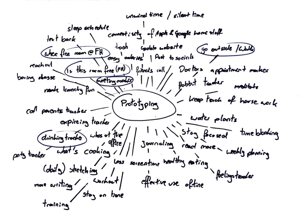
Naturally I couldn’t figure all of this out in one week, so I just started brainstorming, to figure out what problems I could solve with a quick prototype. On the picture below, you can see my ideas.
Four topics stuck with me: An app or similar digital solution that reminds you to go for a walk and motivate you to go outside. A drinking tracker, so you know how much you drank last night. A meeting maker, to help make meetings less confusing and draining. Lastly a solution for not finding a room at FH that is not occupied, to eat and work in.
Prototype 1
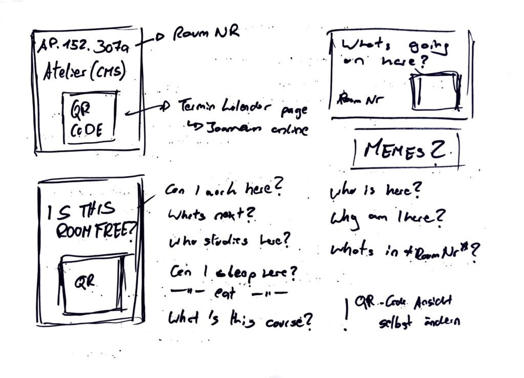
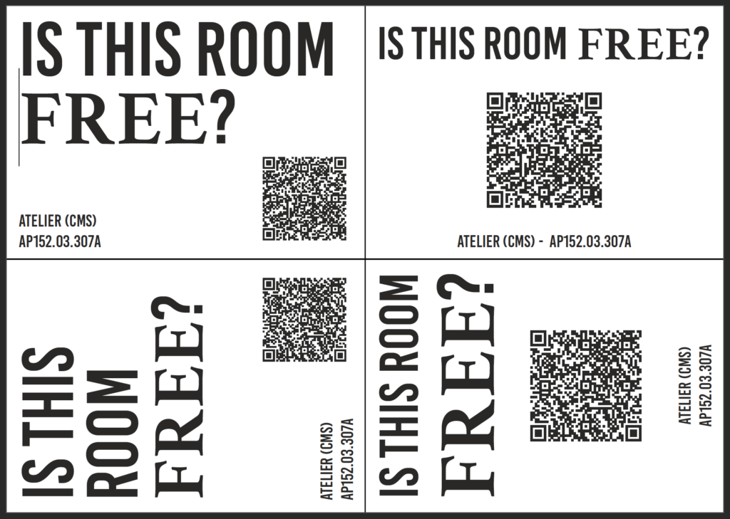
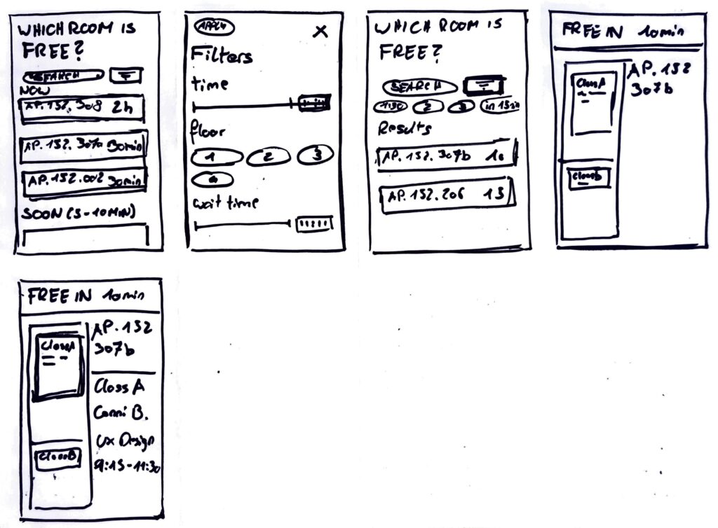
The last topic really stuck with me so I started a 20 minute timer and started sketching. After a quick research I found a way to see unoccupied rooms using Joanneum Online, but it’s confusing. So I tried a new approach, what if the process of checking a rooms schedule could be easier. My idea was to stick QR codes, next to every rooms sign, that lead to the rooms schedule. I started by sketching first ideas, of the signs and had just enough time to also create a first “mockup” of a sign. Later funny quotes or memes could be added to the signs, to make them more interesting.
Prototype 2
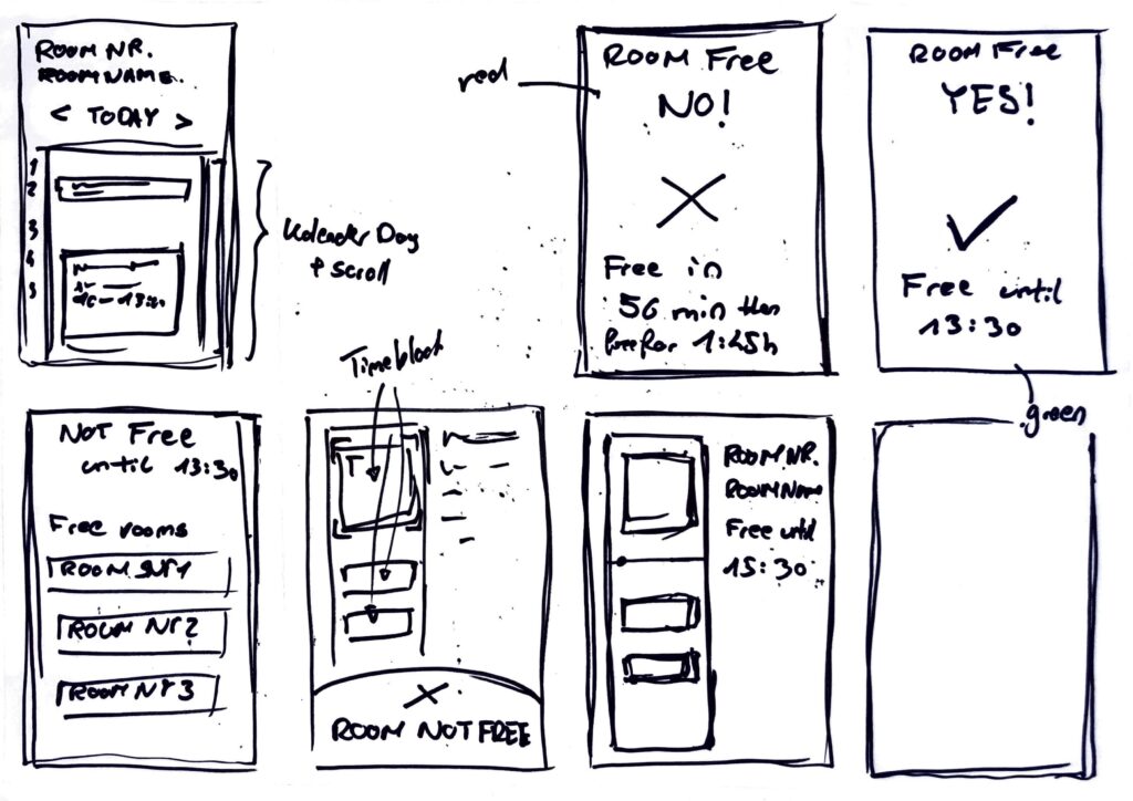
After creating the first prototype I got stuck on the idea of having an easy way to check for free rooms at our FH building. So continuing with the previous idea, I started another timer and started to generate first ideas for a website, that could display the desired information in a better way. Faster and easier to understand for the users. Since I love the crazy eight method, I used it to create this prototype
Prototype 3
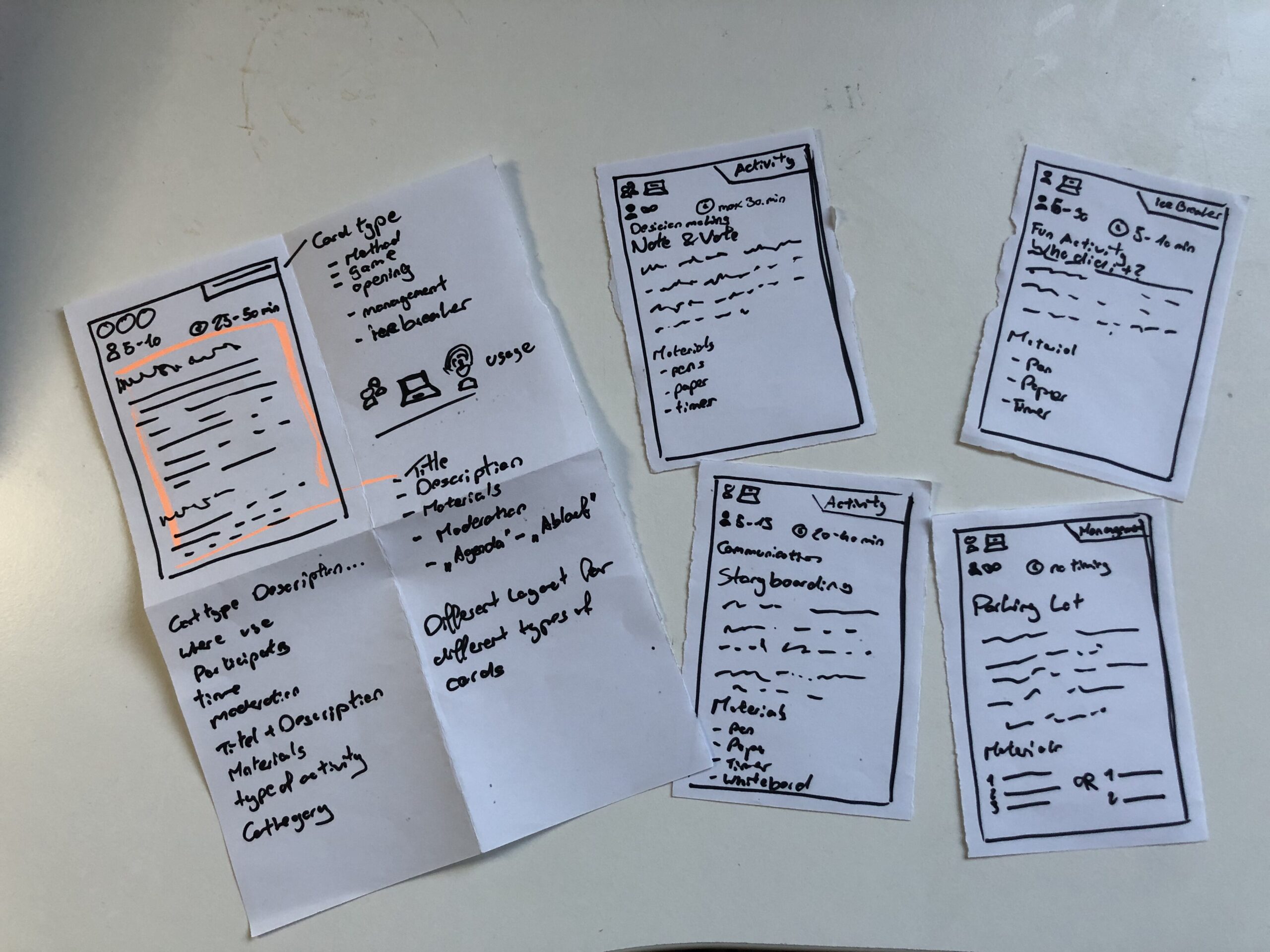
The last prototype went into a whole different direction, I still wanted to create something, that I could use for my masters thesis. So I just sat in my room thinking and then I had an idea. I could create a prototype for a card deck, that informs its owner about different work shop facilitation techniques. (Theoretically a card deck can be created for any topic, so I could also do one for biases and how to combat them) This is also the prototype I then brought to class, to discuss with my class mates. The cards show what type of method you hold in your hands, if it can be used online or only live, how many people Ould participate, how long each activity takes, what you need to run it and of course the name and description of the method.
Speed Dating
So with my Prototype I headed to class, no clue, what was going to happen. In class we sat together, one on one and were given a task. Five rounds, each round with a new person and a new tasks. First we let the other person take a wild guess and describe the prototype to us. Next the partner had to give an idea for a new feature, without knowing the full potential of the prototype. This, was to create a dating profile for each prototype. Fourth, thinking big about the future and your prototype, maybe you are hosting a TED talk. Lastly we talked about the most unexpected feedback about our prototype. A very fun and insightful session, next I want to share my takeaways.
Almost all of my “dates” mistook my playing cards, as wireframes for an app. Maybe, we all are a little biased towards digital solutions. But thinking about it makes something clear, my playing card prototype, doesn’t look like playing cards. Maybe it’s the size, the material or the way I drew on the paper.
When I didn’t explain the prototype all of my partners needed the “instructions” to understand what the prototype was about and for what it could be used. This was also feedback I received, to add more and better instructions. ;D
Additionally, most of them didn’t know, what to do with these flimsy pieces of paper. I figured, they didn’t want to break it.
One “date” suggested to add QR codes to make the instructions on each card more accessible.
I saved the best for last: When talking about the future of the prototype, I said I would have sold or given out a lot of decks and would be holding a TED Talk about a second version. Everything would be Creative Commons and open source, for everyone to use. The Interview partner then called me “the new Mark Zuckerberg, but with a conscious mind”.
After one semester of bias research, I want to do a short recap, on everything I came across. So here is a condensed version, of all things, I found out:
What is a Bias?
Bias refers to a tendency to favor or oppose something based on personal opinions rather than objective reasoning. While biases can be explicit (conscious and intentional) or implicit (unconscious and automatic), they often stem from cognitive shortcuts known as heuristics. These shortcuts help our brains process information efficiently but can also lead to misinterpretations and irrational decisions. Cognitive biases, in particular, shape how we perceive reality, causing individuals to interpret the same facts differently. They develop early in life through personal experiences, societal influences, and media exposure, reinforcing both positive and negative associations.
Bias subtly affects decision-making in various aspects of life, from personal interactions to professional settings. Research shows that even trained professionals, such as scientists and hiring managers, exhibit unconscious biases, leading to disparities in employment opportunities. Implicit biases influence perceptions of competence, trustworthiness, and fairness, often without individuals realizing it. Acknowledging these biases is essential for reducing their impact and fostering more objective and equitable decision-making.
The Cognitive Bias Codex
The Cognitive Bias Codex by Buster Benson provides a comprehensive overview of over 200 cognitive biases, grouped into four categories to help us understand how our brains process information. One bias worth highlighting is the Bias Blind Spot, which refers to our tendency to think we’re less biased than others. This is especially relevant for UX design, where designers might overlook their own biases and assume their design decisions are universally valid. Other biases like Confirmation Bias, which makes us favor information that supports our existing beliefs, and Availability Heuristic, which makes us judge the likelihood of events based on what comes to mind most easily, can also influence how users engage with design elements.
In addition to these, biases such as the Mere-Exposure Effect, where familiarity breeds preference, and Anchoring, where initial information anchors subsequent judgments, can significantly shape how users make decisions. These mental shortcuts help us navigate the world more efficiently, but they can also distort our thinking. By understanding these biases, we can better design user experiences that acknowledge these cognitive filters, creating interfaces that allow for more informed, balanced decision-making. Ultimately, the Codex is a reminder that recognizing our biases is the first step towards making better choices—both in design and in life.
Common Biases in (UX) Design
Biases in UX design can subtly influence how designers create, research, and test products. Common biases include Confirmation Bias (seeking data that aligns with assumptions), False-Consensus Effect (assuming users think like designers), and Recency Bias (overweighting recent feedback). Anchoring Bias occurs when initial information overly influences decisions, while Social Desirability Bias can distort user research, and Sunk Cost Fallacy keeps designers committed to failing ideas.
To spot biases, review your assumptions and ensure decisions are based on data, not personal opinion. Involve diverse perspectives and conduct usability tests with varied users to uncover blind spots. Documenting your reasoning can also help identify biases. By recognizing and addressing these biases, designers can create more inclusive, user-centered designs.
Advantages of Biases
Biases are often seen as negative, but they serve important cognitive functions. They help us make quick decisions by filtering information efficiently, improving focus, and enhancing productivity in work and learning. Biases also support social connections by fostering trust and teamwork, aid in pattern recognition for faster learning, and boost motivation by reinforcing commitment to long-term goals. Additionally, they play a key role in survival, helping individuals assess risks and stay cautious in uncertain situations.
While biases can lead to errors, they also provide valuable benefits. By enabling efficient decision-making, strengthening social bonds, enhancing learning, and ensuring safety, they function as essential mental shortcuts. Recognizing their advantages allows for a more balanced perspective on their role in daily life.
Bias in Ai
AI is transforming industries, including UX design, by automating processes, analyzing user data, and enhancing efficiency. However, AI is only as unbiased as the data it learns from. If datasets contain historical biases, AI models can perpetuate them, influencing critical decisions in areas such as healthcare, hiring, and search engine results. For example, algorithms have been found to favor certain demographics in medical treatment recommendations, reinforce gender stereotypes in search results, and discriminate against female job applicants. These biases stem from underrepresentation in training data, flawed problem framing, and algorithmic design choices that prioritize overall accuracy over subgroup fairness.
Addressing AI bias requires proactive governance, ethical oversight, and diverse, representative training data. Organizations must implement fairness-focused frameworks, employ transparency practices, and incorporate human oversight to refine AI-generated outputs. Ethical considerations should also be integrated into science and technology education, ensuring interdisciplinary collaboration and regulatory measures to promote accountability. While technical solutions can mitigate bias, broader societal discussions are necessary to address the ethical implications of AI-driven decision-making.
Examples of Bias in Design
“Life can only be understood backwards, but it must be lived forwards.” ~ Soren Kierkegaard. This applies to biases in design—often, they’re only recognized after decisions are made. Here are a few examples:
Spotify Shuffle Button: A Reddit user pointed out that the shuffle button was hard for colorblind users to distinguish. About 8% of men have red-green color blindness, and a simple design tweak could improve accessibility.
Cars and Seat Belts: In the 1960s, crash tests used male-bodied dummies, neglecting the safety of women and children. This is sampling bias, where the sample didn’t represent the full population.
Facebook’s “Year in Review”: Facebook’s 2014 feature, which showcased popular posts, sometimes included painful memories for users, due to optimism bias—assuming all top moments are joyful.
These examples show how majority bias—focusing on the majority and neglecting minorities—can shape designs that overlook important user needs.
How to combat Bias
The first step in addressing unconscious bias is recognizing it exists. Tools like the Designing for Worldview Framework by Emi Kolawole or Harvard’s Project Implicit tests can help identify biases. Understanding your biases is key to overcoming them and making design more inclusive. Once biases are spotted, the next step is to take action. Consciously designing with diverse users in mind and using tools like Perspective Cards can guide you to consider various experiences. Listening to clients and users, while letting go of assumptions, is essential to create designs that truly meet everyone’s needs.
Building diverse teams is critical to fostering inclusive design. Teams with varied backgrounds bring fresh perspectives, which are essential in a profession that thrives on challenging existing ideas. Overcoming bias is a lifelong commitment, so keep learning and remain open to feedback. Reflect on who might be left out and seek ways to make your designs more inclusive. Additionally, don’t just focus on the “happy path” in design; consider unhappy paths to address potential issues early on. Finally, when creating personas, challenge assumptions by focusing on real user experiences rather than demographic stereotypes. Designing for a global audience requires understanding diverse cultural insights, ensuring that inclusion is integrated into every step of the design process.