Blogpost 6: How to measure trust in UX

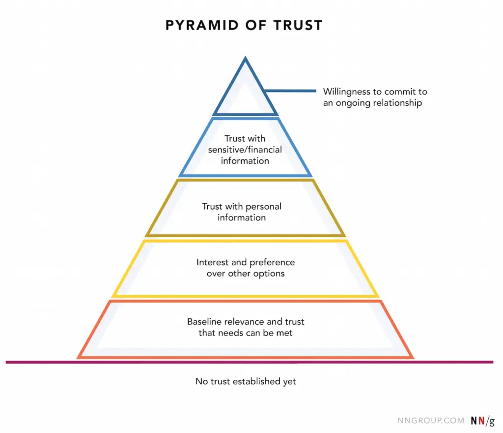
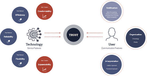
Trust is a cornerstone of user experience, influencing how users interact with digital products and services. However, unlike metrics such as load time or click-through rates, trust is intangible and multifaceted, making it challenging to quantify. Yet, understanding and measuring trust is essential for creating user-centric designs that foster loyalty and satisfaction. In UX design, trust refers to a user’s confidence in a product’s reliability, integrity, and ability to meet their needs. It’s built over time through consistent, transparent, and user-friendly interactions. Factors influencing trust include usability, visual design, content clarity, and perceived security.

(Source: http://hyunah-kim.com/project/designing-trust-into-ux)

To effectively measure trust, a combination of qualitative and quantitative methods is recommended:

1. Surveys and Questionnaires

Structured surveys can capture users’ perceptions of trust. Tools like the System Usability Scale (SUS) or custom Likert-scale questions assess aspects such as reliability and credibility. For instance, the SUPR-Q (Standardized User Experience Percentile Rank Questionnaire) includes trust-related items to evaluate website credibility. 

2. User Interviews and Feedback

Conducting interviews allows for in-depth exploration of users’ trust-related experiences. Open-ended questions can uncover specific design elements that enhance or hinder trust. This qualitative data provides context to quantitative findings.

3. Behavioral Analytics

Analyzing user behavior offers indirect insights into trust levels. Metrics such as bounce rates, session durations, and return visits can indicate trustworthiness. For example, a high bounce rate may suggest users don’t find the site credible or relevant.

4. Usability Testing

Observing users as they interact with a product can reveal trust issues. Hesitations, errors, or reliance on help features may indicate areas where trust is lacking. Usability tests help identify and rectify these pain points.

5. Physiological Measurements

Advanced methods like eye-tracking or facial expression analysis can detect unconscious reactions to design elements.These insights help understand users’ emotional responses, which are closely tied to trust.

Implementing Trust Measurements in Design

  • Incorporating trust measurement into the design process involves:
  • Setting clear objectives: Defining what aspects of trust are most relevant to the product.
  • Choosing appropriate methods: Selecting measurement techniques that align with the objectives and resources
  • Iterative testing: Regularly assessing trust throughout the design lifecycle to identify and address issues promptly.
  • Stakeholder collaboration: Sharing findings with stakeholders to inform design decisions and prioritise trust-building features.

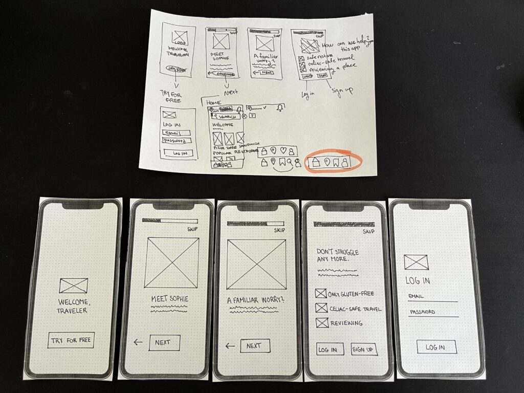
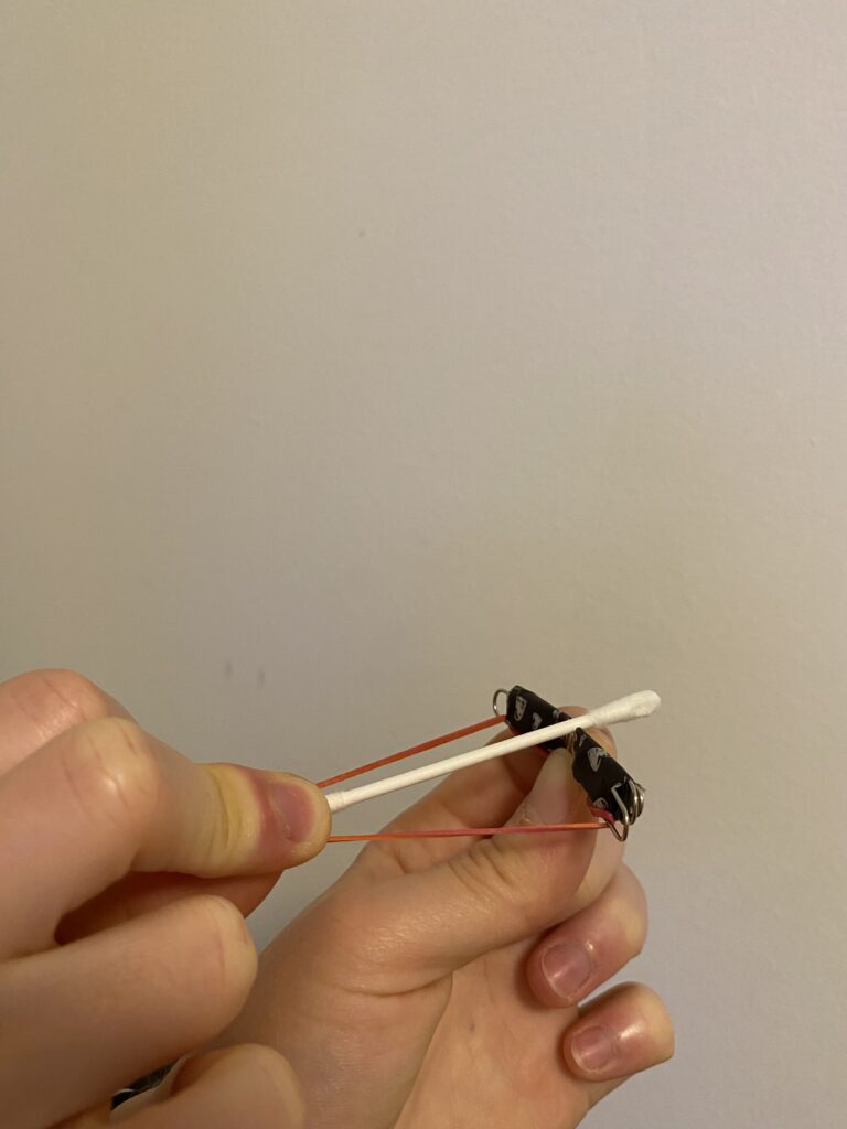
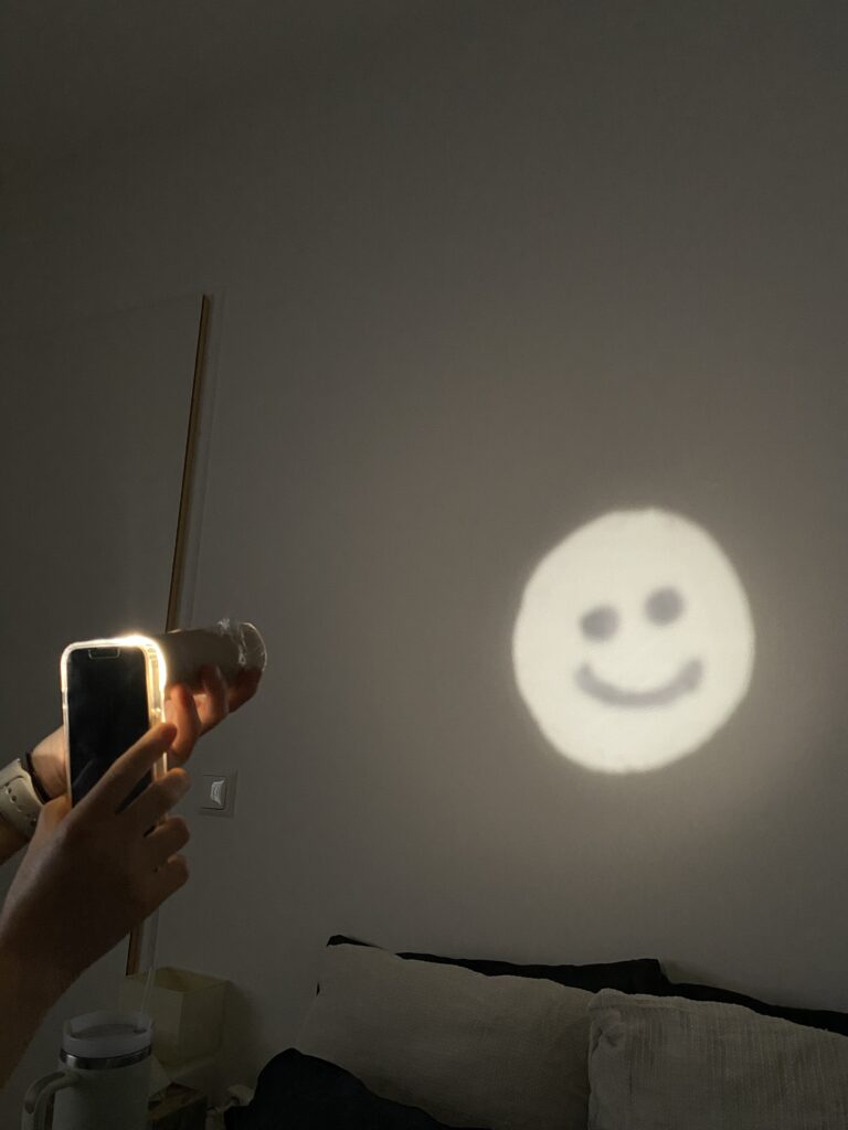
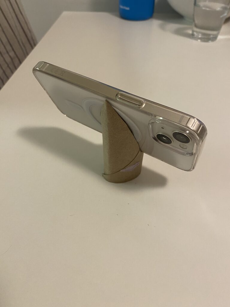
Final Video Prototype

Source:

https://www.uxstudioteam.com/ux-blog/increase-trust-through-ux-design

https://www.youtube.com/watch?v=BWqTuNO4Epk

https://medium.com/@thefinchdesignagency/building-user-trust-in-ux-design-proven-strategies-for-better-engagement-c975aa381516

https://articles.ux-primer.com/the-hidden-power-of-emotion-and-trust-in-ux-design-5ae3d286d57e?gi=a9243f2f3c4b

https://www.stan.vision/journal/building-trust-in-saas-ux-ui-design

Blogpost 5: Designing for Both Sides of the Experience

In the landscape of UX design, we often prioritise the end user = the customer tapping on the app, making a reservation, or reading a restaurant review. But in service contexts like dining, the experience is co-created. Behind every safe and satisfying gluten-free meal is a team of restaurant staff managing food prep, communication, and customer care.

For individuals with celiac disease, eating out is a high-stress situation. The stakes are medical, not just personal. Users rely heavily on restaurant staff to understand and accommodate their needs. But the staff, in turn, must navigate complex orders, time pressure, and varying levels of knowledge – all while delivering consistent, empathetic service.

So, how can UX design empower both groups?

By designing systems that are intuitive, informative, and motivating, we can bridge this empathy gap and create experiences that feel safe, human, and trustworthy – for everyone involved.

Dual empathy in UX

Human-centered design isn’t just about the end user, it’s about every person who interacts with the system.

In a restaurant context, that includes:

  • Kitchen staff interpreting special orders
  • Waiters translating customer needs
  • Customers navigating digital menus and allergy filters

This shared ecosystem requires tools that are mutually supportive, rather than one-sided.

(Source: https://medium.com/@mis9385/ux-design-research-part-2-week-9-restaurant-design-function-af5407866d5b)

Empowering staff through UX features

Designers have an opportunity to reduce friction and boost trust by building restaurant-facing features that support communication and clarity.

  • Live dietary alerts and preferences: for example a tablet in the kitchen or at the waiter station that instantly shows: “Table 4: Gluten-Free. Cross-contamination alert enabled.”
  • Customer preference profiles: Frequent diners could have optional saved settings that flag dietary needs early in the booking or ordering process.
  • Smart checklists for order confirmation: A visual checklist (“Separate cutting board used? Dedicated fryer confirmed?”) reinforces habits without slowing the workflow.

These features don’t just protect the user. They lighten the cognitive load for staff and create a system of shared responsibility.

(Source: https://www.eleken.co/blog-posts/14-impressive-ux-statistics-to-prove-the-value-of-great-design)

Designing the interface between two humans

At its core, this is about facilitating human connection through design. The app is the medium, but the real exchange happens between diner and staff.

  • If the app provides transparency, both sides feel informed.
  • If the system feels empathic, both sides feel heard.
  • If the training is engaging, both sides benefit from better service and reduced anxiety.

This kind of design (dual-perspective UX) is where real inclusivity happens.

Creating safe, enjoyable restaurant experiences for celiac diners doesn’t stop at user interfaces. It extends to the tools, training, and touchpoints that staff rely on to deliver those experiences. When designers design for both diners and providers, they reinforce trust, reduce risk, and elevate hospitality from a transaction to a shared act of care. Good design doesn’t just protect the user, it equips the provider. And when both feel supported, the result is an experience that’s not just functional, but truly human.

Source:

https://uxdesign.cc/what-is-service-design-and-why-it-matters-e1ed3fc86e7b

https://www.broworks.net/blog/design-for-business-designing-for-a-real-users

https://uxdesign.cc/a-guide-to-business-driven-ux-connecting-business-strategy-with-user-needs-19b74e2cba42

https://www.kioskbuddy.app/blog/human-centered-design

https://codenomad.net/blog/how-to-design-a-user-friendly-restaurant-app-interface/

Blogpost 4: UX Designing for Trust

For individuals living with celiac disease, everyday activities such as dining out or traveling often involve many decisions. Choosing a restaurant isn’t just a matter of taste or location – it’s a high-stakes choice where a single mistake could trigger a serious autoimmune response. The fear of gluten cross-contamination, inaccurate labeling, or staff miscommunication creates anxiety and can lead to avoidance behaviors.

In these emotionally charged contexts, trust becomes the most critical design currency. It’s not enough for an app or website to simply “work.” The interface must communicate safety, offer reassurance, and build confidence. The tools that help accomplish this come from emotional design, a UX approach that creates positive emotional responses while addressing users’ deep-seated fears and needs.

(Source: https://uxplanet.org/the-design-of-trust-13d68df6e52f)

Key trust-building strategies in UX/UI Design

Warm, Human-Centered UI

Trust begins at first glance. Visual design plays a subtle yet powerful role in signaling safety. Warm colour palettes (like soft greens and blues), rounded shapes, and friendly typography (e.g., sans-serif fonts with balanced kerning) make interfaces feel approachable and calm. It is important to avoid stark, sterile layouts – these may seem clinical and uninviting.

Images that reflect diverse, real-world diners with dietary needs, or inclusive illustrations, can build emotional rapport.

Community-driven verification

Trust is social. Many users rely on others’ experiences before making their own decisions, especially when safety is involved. User-submitted reviews, gluten-free ratings, or crowdsourced verification tools (e.g., “5 celiac users confirmed this restaurant”) can add layers of trust that go beyond the brand.

This also makes the interface emotionally participatory. Users don’t feel like passive consumers. They feel like contributors to a shared mission of safety.

Clear and calming messaging

When alerts or warnings are necessary, how they are phrased and delivered matters greatly. Alarming, fear-based messages (“Warning: You might get sick here!”) can overwhelm users and create distrust in the platform.

Instead, using calm, empowering messages is a better solution:
“We couldn’t verify gluten-free practices at this location. Consider choosing a nearby verified spot.”
“This restaurant has a dedicated gluten-free menu, confirmed by multiple users.”

Tone of voice should be empathetic, not mechanical. Speaking like a friend who understands the user’s needs.

Transparent data and certifications

Showing how the data was gathered is the key. If a restaurant is marked gluten-free, it is good to clarify if the information came from the restaurant itself, a third-party certification, or user verification. Transparency in labeling reduces guesswork and helps users feel in control.

A good example: “Verified by Gluten-Free Food Program (GFFP), last updated May 2025.”

(Source: https://www.uxstudioteam.com/ux-blog/increase-trust-through-ux-design)

Emotional trust as a UX metric

Traditional UX metrics like time-on-task or conversion rates don’t capture the full picture in emotionally sensitive situations. In these contexts, trust, reassurance, and confidence become key success indicators.

It could be measured through:

In-app feedback surveys after bookings (“Did you feel confident in your choice?”)

Emotional sentiment analysis of reviews

User return rate for safety-verified features

For users with celiac disease, digital trust isn’t a luxury, it’s a necessity. Interfaces must go beyond usability and tap into empathy, comfort, and shared values. Emotional design is the bridge between fear and freedom.

Designers have the power to transform digital platforms into safe, emotionally intelligent spaces, where users don’t just complete tasks, but feel heard, protected, and empowered.

Sources:

https://www.interaction-design.org/literature/article/trust-building-the-bridge-to-our-users?srsltid=AfmBOoqwQbSdcqbM2LcoZvx0fZRmBXgi1mKs0qCGJF9w9YppYST-oT6T

https://www.codebridge.tech/articles/emotional-design-in-ui-ux-creating-memorable-user-experiences

https://www.uxdesigninstitute.com/blog/role-of-emotion-in-ux-design/

(Source: https://www.interaction-design.org/literature/article/trust-building-the-bridge-to-our-users)

Blogpost 3: The Power of Emotional Decision Points in UX

Micro-interactions are those tiny, often subconscious moments of feedback. It is a play of a surprisingly large role in shaping how users feel when engaging with a digital product. Whether it’s a small animation after clicking a button, a soft vibration after completing a form, or a sound that signals success, these interactions offer reassurance, guidance, and delight.

But what happens when the user’s experience is layered with heightened emotional stakes, such as when managing a medical condition like celiac disease while traveling?

For many celiac travelers, the simple act of choosing a restaurant becomes a complex, emotionally charged decision. The fear of gluten cross-contamination, misunderstandings with staff, and lack of reliable information can lead to anxiety and hesitation. In these scenarios, micro-interactions must evolve beyond aesthetics and usability – they must become emotional decision points that build trust and provide comfort.

Micro-Interactions as emotional anchors

Micro-interactions are traditionally used to provide feedback or indicate progress, but when reframed as emotional decision points, they take on a deeper role. These are the moments when users need reassurance, not just that a button was clicked, but that a decision they’re making is safe, validated, and understood.

For example a user booking a table at a restaurant labeled gluten-free. A simple message saying “Reservation confirmed” is informative, but emotionally neutral. Comparing this to: “You’re all set! This place is 100% gluten-free certified—dine with confidence!“.

That message acknowledges the user’s concerns and offers emotional validation as a small, powerful shift in tone and intent that can ease anxiety and enhance trust.

(Source: https://www.uxdesigninstitute.com/blog/microinteractions-in-ui-design/)

Emotional design and empathy in UX

The concept of Emotional Design, introduced by Donald Norman, outlines how products evoke emotions through three levels of experience:

Visceral: What we see and feel instantly. For example, clean visual design and friendly icons that suggest safety.

Behavioral: How well the product works. Is the app intuitive, and does it answer the user’s needs – like finding gluten-free restaurants nearby?

Reflective: How the product aligns with our values and identity. For celiac users, a product that respects their condition and supports their lifestyle reflects empathy and shared understanding.

In practice, this means designing with:

Clear feedback: Messages like “This meal is prepared in a dedicated gluten-free kitchen” reduce doubt and increase user confidence.

Calming UX language: Words matter. Using reassuring phrases like “You’re in safe hands” or “We’ve got your back” adds a human tone that speaks to the user’s emotional state.

Affirmative confirmations: Simple, positive reinforcements “You’ve successfully reserved a celiac-safe meal” turn transactions into trust-building moments.

Consistency across touchpoints: Whether it’s during onboarding, navigation, or checkout, emotional design should remain present. Repeated positive interactions reinforce the app’s reliability.

(Source: https://medium.muz.li/the-art-of-emotion-normans-3-levels-of-emotional-design-88a1fb495b1d)

Designing for high-stress use cases

The empathy gap – the disconnect between what designers assume and what users actually feel can be especially wide in health-related or stress-inducing use cases. Closing this gap requires more than good visuals or flawless functionality. It means designing for how users feel in critical moments.

For instance, if a user is traveling in a foreign country, unsure of the local language or food labeling laws, they need an interface that goes beyond “working” – they need one that soothes, educates, and protects.

Examples of emotional UX features for celiac users could be:

Verified restaurant badges with explanations and visual indicators.

A “safe zone” color palette (greens and blues) used during confirmation steps.

Optional peer reviews specifically from other celiac travelers.

Emergency cards with translated gluten-free phrases that can be generated and saved.

(Source: https://www.justinmind.com/web-design/micro-interactions)

When designing UX for high-sensitivity scenarios like celiac travel, every micro-interaction becomes a chance to support the user emotionally. By turning these moments into emotional decision points, infused with clarity, empathy, and trust, designers can create not only functional products but emotionally intelligent ones. In a world full of decisions, it is important to help the users feel that every choice they make is the right one.

Sources:

Norman, D. A. (2004). Emotional Design: Why We Love (or Hate) Everyday Things. Basic Books.

https://medium.muz.li/the-art-of-emotion-normans-3-levels-of-emotional-design-88a1fb495b1d

https://medium.com/uxcentury/the-three-levels-of-emotional-design-0f7ff723af04

https://medium.com/swlh/three-levels-of-design-donald-a-norman-4f36a8db82d6

https://www.veroke.com/micro-interactions-in-ui-ux-small-details-big-user-impact/

Blogpost 2: Designing for Empathy

Understanding the empathy gap

Designers often aim to create inclusive, human-centered products, but there’s a subtle challenge that’s harder to overcome than accessibility or UI polish: the empathy gap. This term refers to the cognitive and emotional distance between people who have direct experience with a problem and those who don’t.

In UX design, the empathy gap becomes especially problematic when building products for people with disabilities, like for example celiac disease. While a user without celiac might casually browse for places to eat, someone with celiac approaches every food decision with caution, emotional tension, and risk assessment. Unfortunately, many restaurant apps and travel platforms fail to reflect this difference in urgency and vulnerability.

Storytelling and personas as empathy tools

Personas are more than just user archetypes. They act as bridges to lived experiences. When backed by emotional storytelling, personas help designers and stakeholders temporarily “step into someone else’s shoes,” fostering a deeper understanding of motivations, fears, and mental models. According to Cooper et al. (2014), personas are “a powerful design tool for communication and empathy-building” when they reflect real emotional contexts and not just demographics or goals.

Storytelling in UX amplifies this effect. Stories engage the emotional centers of our brains, making information more memorable and decisions more thoughtful (Norman, 2004). When personas are introduced within narrative frameworks, such as onboarding sequences that follow their journey, designers can simulate real-life decision-making environments. This helps foster emotional alignment with users, especially those whose needs are often overlooked.

For travelers with celiac disease, this emotional alignment is important. It’s not just about finding gluten-free options – it’s about feeling safe and understood in a world where a simple breadcrumb can cause days of illness.

Sources:

Norman, D. A. (2004). Emotional Design: Why We Love (or Hate) Everyday Things

Cooper, A., Reimann, R., Cronin, D., & Noessel, C. (2014). About Face: The Essentials of Interaction Design

Persona & User journey

For this prototype, my goal is to create a low-fidelity paper app to help travellers with gluten intolerance find safe places to eat and enjoy local cuisine.

To help me achieve this, I created a persona and user journey.

Anne – Celiac solo traveler

Name: Anne Bauer
Age: 29
Occupation: Freelance photographer
Location: Berlin, currently traveling through Italy
Health Context: Diagnosed with celiac disease 5 years ago
Tech Use: Heavy smartphone user, relies on travel and food apps
Personality: Curious, independent, sometimes anxious about eating out


Goals:

  • Find places to eat safely while traveling abroad
  • Avoid cross-contamination and gluten exposure
  • Feel confident and supported in unfamiliar food cultures

Pain Points:

  • Unclear menus and gluten-free claims
  • Language barriers when asking staff about food safety
  • Anxiety when eating in new places
  • Lack of trust in unfamiliar restaurants

Emotional Triggers:

  • Relief and happiness when finding verified safe spots
  • Frustration when apps show “gluten-free” without proof
  • Appreciation when her needs are clearly understood

User journey: Anne arrives in Bologna and needs dinner

  1. Trigger: Anne arrives in Bologna and feels hungry.
  2. Goal: She wants to find a celiac-safe restaurant nearby.
  3. Problem: She’s unsure which places are safe and trustworthy.
  4. Action: Opens the app and starts onboarding → begins search → filters results → reads restaurant details → picks a trusted place.
  5. Success: Finds a restaurant with verified reviews and clear allergen info.

The first part of my work on the paper prototype involved creating an onboarding process for the application:

Blogpost 1: Prototyping-Speed-Dating-Session

Having my prototype shared as part of a speed date was a great way to get quick and varied feedback. Presenting the ideas in a short amount of time forced me to focus on the core functionality of each prototype, which helped me clarify my design decisions. It was interesting to see how different people interpreted my creations – some saw new possibilities that I hadn’t considered – like using a paper roll as a kaleidoscope.

One of the most valuable insights was realising how simple materials can lead to innovative solutions if approached creatively. The projection device helped me think about possible improvements, especially in terms of usability.

All in all, this session highlighted the importance of developing ideas, open discussion and looking at designs from multiple perspectives, key aspects of a strong prototyping process.

Here are my all three prototypes:

Crossbow from a paper clip

The first prototype I created is a tiny but functional crossbow, made primarily from a paper clip, a rubber band, and a small piece of paper or a toothpick as an arrow. I bent the paper clip into a crossbow shape and secured a rubber band to provide the necessary tension for launching the projectile.

This small crossbow demonstrates basic mechanical principles, particularly elasticity and tension. The rubber band stores energy, and when I release it, the projectile shoots forward. It was a fun experiment in leveraging small-scale mechanics to achieve movement and functionality.

Projection from a paper roll

For my second prototype, I explored light and shadow projection using a paper roll. I drew specific shapes into the roll and placed a light source behind it to create simple projections on a surface. The concept is similar to shadow puppetry or projectors, relying on light diffusion and obstruction to form visible patterns.

This experiment helped me better understand basic optical principles, like how light travels in straight lines and how different materials can block or diffuse it. By playing with shapes, angles, and distances, I was able to adjust the clarity and size of the projection. This could even be a starting point for interactive light installations or custom lamp designs.

Phone stand from a paper roll

For my third prototype, I wanted to make something practical, a DIY phone stand using a paper roll. By cutting slots into the roll, I created a stand that holds my phone at the perfect viewing angle.

I like this prototype because it’s both eco-friendly and functional. Instead of buying a phone stand, I repurposed a simple household item into something useful. This small project made me think about ergonomics and accessibility, as well as how design can make everyday tasks more convenient.

These three prototypes showed me how creativity and problem-solving can lead to functional designs using basic materials. Each one shows different aspects of design – from mechanics (crossbow) and optics (projection) to usability and ergonomics (phone stand). Prototyping with limited resources pushed me to reuse materials and find innovative solutions.

WebExpo Conference

Day 1: Jobs to Be Done (JTBD)

In field of UX design, the “Jobs to Be Done” (JTBD) framework stands out as a profoundly useful tool that redefines how we think about users and their needs. Rather than focusing on static demographics or surface-level desires, JTBD digs deeper. It asks, what is the user trying to accomplish in their life? This talk introduced a perspective shift that is not just intellectually stimulating but practically transformative in how products should be designed and improved.

The central idea is that people “hire” products or services to do specific jobs. For example, people don’t just buy a drill, they buy a hole in the wall. This simple but powerful idea redirects our design focus from the product itself to the underlying problem it solves. For me, as a UX designer, this approach aligns well with user-centered methodologies but adds more clarity, structure, and empathy to the discovery phase.

What made the talk especially helpful was its practical breakdown of how to apply the framework in real-life product development. The speaker outlined actionable steps, such as conducting user interviews to discover “job stories” and replacing traditional user personas with “job personas” – which help uncover unmet needs or pain points users are actively trying to resolve. These job stories follow the format: “When I (situation), I want to (motivation), so I can (expected outcome).” This format goes beyond generic use cases and instead targets design interventions where they matter most.

Another valuable point from the talk was the idea that jobs can be both functional and emotional. This duality resonates with my work, especially in emotional UX design, where users’ feelings, expectations, and anxieties can play as large a role in product success as usability. For example, when designing a smart navigation system, understanding that a user hires the app not just to get from point A to B, but also to feel in control or less anxious in unfamiliar cities, leads to better, more humane design decisions.

Overall, the JTBD framework pushes designers to ask better questions and design more purposefully. It’s not just about usability anymore. It’s about usefulness in the context of a user’s real-world goals. From a professional perspective, this talk didn’t just teach a methodology; it challenged the default UX mindset and offered a more holistic way to understand and serve users. I now see myself using this lens regularly during research and ideation phases, often discovering richer, more actionable insights that might have been missed using more conventional methods.

Day 2: Dark patterns: Where does motivation end and illegal manipulation begin?

Dark patterns are deceptive design choices that push users toward actions they may not have chosen freely, such as hidden unsubscribe buttons or misleading consent forms. This talk critically explored where motivation ends and manipulation begins, making it highly relevant to ethical UX practice.

This talk was a wake-up call and a vital ethical checkpoint for anyone involved in UX/UI design. Dark patterns, those design tactics that manipulate users into taking actions they might not otherwise choose, are disturbingly prevalent in digital products. From sneaky pre-checked boxes to guilt-tripping copy (“Are you sure you want to miss this opportunity?”), these techniques challenge the very principles of ethical design.

What made this talk so impactful was how clearly it illustrated the fine line between motivation and manipulation. While designers naturally aim to guide users toward certain actions 8signing up, subscribing, completing a task) doing so without informed consent or user clarity turns motivation into coercion. This blurred line is not just a design concern, it’s a legal and moral one, too.

The speaker provided real-world examples from well-known companies and broke them down by intent, impact, and legal implications.The European Union’s Digital Services Act and consumer protection laws are discussed as growing forces that aim to curb these manipulative practices, suggesting that legality is finally catching up with unethical design.

As a UX/UI designer, this talk encouraged critical self-reflection. Have I, even unintentionally, contributed to dark pattern design in past projects? Where does my motivation to create a seamless user journey cross into manipulation? These are questions I believe every designer should continuously ask.

Clarity- Is the user fully informed?

Consent- Is the action truly voluntary?

Control- Can the user easily reverse or change decisions?

    Integrating this checklist into design reviews, we not only protect users but also safeguard our professional integrity and the long-term trust in our products.

    What I took away from the talk is the importance of designing with users, not at them. Transparency, simplicity, and respect for autonomy aren’t just buzzwords. They are foundational principles that separate persuasive UX from predatory practices. 

    One key takeaway was a simple framework to assess ethical design: ensure clarity, require informed consent, and preserve user control. These principles help us stay on the right side of both user trust and the law.

    This talk reminded me that great design isn’t just persuasive, it’s honest. Moving forward, I’ll carry this mindset into all stages of the design process.

    The Psychology of Perception in HUD Design

    Head-Up Display (HUD) design requires a deep understanding of human perception in order to create interfaces that are intuitive, easy to see, and minimally distracting. This blog post explores key human factors – visibility, colour psychology and motion dynamics – that influence effective HUD design.

    Visibility: Reducing cognitive load

    The ability of a driver to quickly and effortlessly take in information from a display is referred to as ‘viewability’. As prolonged focus on HUDs can increase the risk of accidents, designers need to ensure that vital information such as speed, navigation and warnings are readable at a glance. Strategies to improve readability include

    Minimalist design: Avoiding clutter by displaying only the most important information.

    Consistent layouts: Using predictable positioning for recurring elements to increase familiarity and speed recognition.

    (source: https://www.researchgate.net/publication/324803628_Augmented_RealityAR_Head-Up_DisplayHUD_Design_Study_for_Prevention_of_Car_Accident_Based_on_Graphical_Design_Sensitivity_and_Conveyance_of_Meaning)

    Colour Psychology: Effectively communicating meaning

    Colours have a significant impact on how information is perceived and processed. Designers should use colour psychology to communicate meaning effectively:

    Red for warnings: Red is universally associated with danger or urgency, making it ideal for critical warnings.

    Green for safe conditions: Green is calming and associated with safety, suitable for indicators such as cruise control.

    Avoid Overuse: Overloading the display with too many colours can confuse the driver; a limited palette improves clarity.

    (source: https://x3.xbimmers.com/forums/showthread.php?t=1676121)

    Motion dynamics: Capturing attention without distraction

    Motion can draw attention to important information, but it must be used judiciously to avoid distraction. Best practices include:

    Subtle animations: Using smooth transitions and subtle animations to focus the driver’s attention without overwhelming them.

    Directional cues: Using motion to highlight changes, such as an approaching curve or an impending collision warning.

    (source: https://www.azooptics.com/Article.aspx?ArticleID=1878)

    Real world applications

    Leading car manufacturers have incorporated human factors into their HUD designs. For example, some manufacturers use simple layouts and colour-coded warnings to ensure visibility, while others use smooth animations to guide the driver’s attention without distracting.

    Understanding human cognitive and perceptual limitations is critical to designing effective HUDs. By focusing on visibility, using colour psychology, and thoughtfully incorporating motion dynamics, designers can create interfaces that enhance safety and usability. As HUD technology evolves, the application of these psychological principles will remain key to minimising driver distraction.

    (source: https://altia.com/de/2021/06/01/the-future-of-head-up-displays/)

    References:

    https://www.azooptics.com/Article.aspx?ArticleID=1878

    https://wedesignmotion.com/blog/design/the-psychology-of-color-in-motion-design/

    https://www.faa.gov/sites/faa.gov/files/data_research/research/med_humanfacs/oamtechreports/0117.pdf

    https://www.tandfonline.com/doi/full/10.1080/00140139.2020.1758348

    https://www.researchgate.net/publication/278008185_Human_factors_aspects_of_using_head_up_displays_in_automobiles_a_review_of_the_literature

    Optimising HUDs for Different Lighting Conditions

    Head-Up Displays (HUDs) are becoming an essential tool in modern vehicles, providing essential driving information without requiring the driver to look away from the road. However, designing HUDs that work seamlessly in both bright daylight and dim nighttime conditions presents significant challenges. To ensure optimal visibility and usability, designers must consider adaptive brightness, contrast and colour schemes tailored to different lighting environments.

    The challenges of lighting

    Driving environments can change dramatically between day and night, affecting how information is perceived on HUDs. In bright sunlight, glare and reflections can wash out display elements, making them difficult to read. Conversely, at night, overly bright HUD elements can cause eye strain and distract the driver from concentrating on the road.

    (source: https://ackodrive.com/car-guide/head-up-displays/)

    Adaptive brightness

    An effective solution to lighting challenges is adaptive brightness. Using ambient light sensors, HUDs can automatically adjust their brightness levels to suit the environment. For example, during the day the display can increase in brightness to reduce glare from sunlight, while at night it can be lowered to reduce strain on the driver’s eyes.

    (source: https://www.3m.com/3M/en_US/oem-tier-us/applications/human-machine-interface-solutions/head-up-display/jim-sax-hud-article/)

    Contrast settings

    High contrast between HUD elements and their backgrounds is critical for readability, especially in difficult lighting conditions. Designers can use bold, high-contrast text and symbols to ensure clarity. For example, white or light-coloured text on a dark background works well at night, while dark text on a lighter background improves visibility during the day.

    (source:https://www.motortrend.com/features/head-up-display/)

    Colour schemes

    Appropriate colour schemes can improve readability and reduce cognitive load. During the day, bright colours such as green, blue or orange can help highlight important information, while at night, softer tones such as muted blues and greys prevent excessive brightness. Red should also be avoided at night, as it can impair night vision.

    Real-world implementations

    Automotive manufacturers are developing advanced HUD systems with lighting adaptability. For example, some systems use micro-mirror technology to dynamically adjust brightness based on ambient conditions, while others integrate multiple layers of colour and contrast to enhance visibility.

    Designing HUDs that perform well in all lighting conditions is essential for safety and usability. By incorporating adaptive brightness, optimising contrast and carefully selecting colour schemes, designers can create HUDs that are effective and comfortable to use both day and night. As automotive technology continues to evolve, addressing these lighting challenges will remain a critical aspect of HUD design.

    References:

    https://caradas.com/understanding-adas-automotive-heads-up-display-hud/

    https://www.researchgate.net/publication/364897281_Color_Visibility_Evaluation_of_In-Vehicle_AR-HUD_Under_Different_Illuminance

    https://www.fic.com.tw/automotive/ar-hud/

    https://www.fic.com.tw/safety-with-ar-hud/

    Visual Hierarchy and Information Prioritisation in HUD Design

    Head-Up Displays (HUDs) have revolutionised the way drivers access key information without taking their eyes off the road. However, with data such as speed, navigation and incoming calls competing for attention, ensuring clarity and usability is critical. The key to achieving this balance is to master the visual hierarchy and effectively prioritise information.

    (source: https://www.researchgate.net/figure/How-a-Head-up-display-works_fig5_301776934)

    Understanding visual hierarchy

    Visual hierarchy refers to the arrangement and presentation of elements in a way that reflects their importance. In HUDs, critical information such as speed, navigation cues and safety alerts need to be immediately recognisable, while secondary details – such as media controls or environmental data – should remain accessible but less prominent.

    Key strategies for creating visual hierarchy

    1. Size and placement: Larger and centrally placed elements attract attention first. For example, displaying speed prominently in the centre of the HUD ensures immediate visibility, while positioning navigation arrows slightly offset can direct the driver’s attention as needed.
    2. Contrast and colour: The use of bright or contrasting colours can highlight important information. For example, a red warning symbol will stand out against a neutral background and attract immediate attention.
    3. Grouping and spacing: Organising related data into clusters reduces cognitive load. Grouping metrics such as speed, fuel level and engine alerts together creates logical associations, making it easier for drivers to process information quickly.
    4. Typography: Choosing legible fonts and appropriate sizes ensures quick readability. Key metrics such as speed should be in bold, large type, while less critical details can use smaller, more subtle typography.

    (source: https://magic-holo.com/en/all-about-head-up-display-hud/)

    Balancing critical and supplemental data

    A key challenge in HUD design is to present critical data without cluttering the display. Designers should limit the amount of information displayed at any one time and use progressive display to show additional data only when necessary. For example, navigation directions might only appear when a turn is approaching, reducing unnecessary distractions.

    (source: https://www.nuvisionautoglass.com/guide/what-is-a-heads-up-display-in-a-car-windshield/)

    Avoiding cognitive overload

    To avoid overwhelming the driver, simplicity is key. Studies show that humans can only process a limited amount of information at one time. By focusing on key metrics and minimising distractions, HUDs can improve safety and usability.

    Real world examples

    Car manufacturers such as BMW have implemented an effective visual hierarchy in their HUDs. BMW’s augmented reality HUD integrates navigation cues directly onto the windscreen, allowing the driver to follow directions without shifting focus.

    (source: https://www.becker-tiemann.de/faq/bmw-head-up-display/)