Impulse #8: The Last Supper

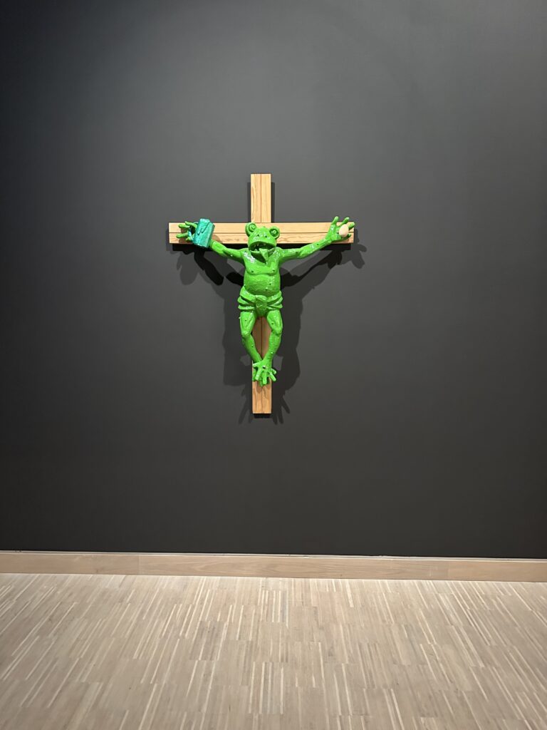
The Last Supper is one of the most iconic images of Christianity and the Catholic Church. Leonardo da Vinci’s painting is not only deeply embedded in religious visual culture, but also loaded with symbolic gestures, spatial hierarchies, power relations and narratives of belonging and exclusion. Over centuries, this image has been reproduced, cited and reinterpreted countless times, becoming almost untouchable in its status. Precisely because of this strong visual and symbolic charge, contemporary artistic reinterpretations of the Last Supper are particularly revealing when viewed through the lens of interaction and participation.

In the exhibition DU SOLLST DIR EIN BILD MACHEN at Künstlerhaus Vienna, the works of Timm Ulrichs and Irene Andessner stood out as a powerful impulse for my design and research process. Rather than creating another static image, both artists transform the Last Supper into a performative act — a lived, temporal situation that unfolds through human presence, roles and interaction.

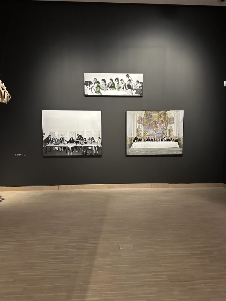
In 1976, Timm Ulrichs staged the Last Supper as a reenactment with students and friends. He placed himself in the role of Jesus, while in front of him lay a cake shaped like an open book. A piece of it had already been eaten, and the inscription “Take, eat, this is my body. Timm Ulrichs” was still visible. This small but deliberate detail shifts the meaning of the ritual: the sacred act becomes simultaneously personal, ironic and bodily. Consumption, authorship and belief collapse into one gesture. The work is not primarily about provocation, but about making visible how meaning is produced through action and participation.

Thirty-five years later, Irene Andessner revisited Ulrichs’ approach in a series of performances. Her intervention is subtle yet radical: she reverses the gender roles of the table. Andessner herself takes the place of Jesus, Ulrichs occupies the role traditionally associated with John or Mary Magdalene, and the apostles are portrayed by women from the art and cultural field. What remains visually recognizable as “The Last Supper” is transformed conceptually into a commentary on power, hierarchy and exclusion within religious traditions.

From an interaction design perspective, these works can be understood as the transformation of a religious image into a social interface. Roles function as interaction rules, the table as a shared space, the bodies as carriers of meaning. The audience does not merely observe; it witnesses a reconfiguration of a deeply familiar ritual. Meaning emerges not from explanation, but from participation, presence and subtle deviations from expectation.

What makes these reenactments particularly compelling are the small details: the cut cake, the visible children, the exchanged roles. These elements invite closer observation and interpretation, encouraging viewers to engage more deeply with the ritual rather than passively consuming its image. In contrast to institutionalized liturgical settings, where participation is often clearly defined and limited, these artistic approaches open up space for reflection, identification and critique.

For my master’s research, these works highlight the potential of performative and interactive reinterpretations of religious rituals. They demonstrate how interaction does not need to rely on digital interfaces alone, but can emerge through social constellations, embodied participation and symbolic shifts. In a context where many people feel distanced from the Church as an institution, such approaches suggest alternative ways of engaging with spiritual themes — not by simplifying or commodifying them, but by allowing ambiguity, complexity and shared experience.

The Last Supper, reimagined as an interactive performance, becomes less a fixed symbol and more a living process. This shift from image to interaction is a crucial impulse for exploring how contemporary media and design practices might support critical, reflective and inclusive forms of spiritual experience today.


Links:

https://kaernten.orf.at/v2/news/stories/2510367

https://www.kuenstlerhaus.at/besuch/kalender/ausstellung/475/du-sollst-dir-ein-bild-machen.html

Impulse #7: Contemporary Art and Religious Experience

I visited the exhibition “DU SOLLST DIR EIN BILD MACHEN – Contemporary Art and the Religious Experience” at the Künstlerhaus in Vienna with a certain expectation: to encounter contemporary artistic positions that critically engage with religion without falling into pure provocation. What I found was a carefully curated exhibition that neither defends nor attacks religion outright, but instead opens up a complex space for reflection, ambiguity, humor, and critique.

The exhibition brings together works by 42 contemporary artists who approach Christian iconography from different perspectives—critical, loving, feminist, ironic, and deeply personal. Rather than aiming for scandal or shock, the exhibition focuses on dialogue: between past and present, faith and doubt, institution and individual experience. This approach resonated strongly with my own research interests, which revolve around distance, reflection, and the role of mediation in religious experience.

The exhibition is structured into seven thematic chapters—Icon, (False) Holiness, Cross, Resurrection, Divinity, Madonna, and The Last Supper—each framing how traditional religious motifs are reinterpreted today. What becomes immediately clear is that religious imagery still holds immense imaginative power, even in a largely secularized context. Art, much like religion, deals with fundamental questions of existence, meaning, and uncertainty. While religion often seeks to make the unfamiliar familiar, contemporary art does the opposite: it destabilizes what we think we know.

I was actually visited it on the recommendation of Martin Kaltenbrunner with whom I talked about my Master Thesis. One work I was particularly interested in seeing was Deus in Machina (2024/2025) by Philipp Haslbauer, Marco Schmid, and Aljosa Smolic—an AI-based installation that invites visitors to engage in a dialogue with a digital Jesus. Unfortunately, the installation was out of order during my visit. Still, its conceptual framing alone is highly relevant to my research. The work raises the question of whether artificial intelligence can become a spiritual interlocutor—not as a gimmick, but as a serious conversational partner. This idea sits uncomfortably between curiosity and unease, echoing many of my concerns about digital mediation of spirituality: Where does support end and simulation begin?

Seeing Himmelsleiter again—originally created for St. Stephen’s Cathedral—reinforced my sense of how strongly site, context, and memory shape religious experience. Removed from its original location, the work still carried symbolic weight, but its meaning shifted. This highlighted how religious and spiritual experiences are not fixed, but deeply relational and contextual.

Perhaps the most striking moment of the exhibition was encountering Martin Kippenberger’s Fred the Frog Rings the Bell (1990), the infamous crucified frog. Knowing its history—the public outrage, accusations of blasphemy, political pressure, and even papal commentary—added another layer to the experience. What fascinated me was not the provocation itself, but the failure of mediation. The scandal revealed less about the artwork and more about the inability of institutions to foster dialogue. Instead of enabling theological or cultural discussion, the work was hidden, relocated, and silenced. This reaction mirrors many of the mechanisms that contribute to people distancing themselves from the Church: defensiveness, lack of dialogue, and fear of ambiguity.

Other works, such as Deborah Sengl’s Of Sheep and Wolves, critically examine hierarchy, power, and institutional structures within the Church. These pieces do not reject faith outright but question authority and obedience—issues that are central to contemporary critiques of organized religion.

Markus Wilfling’s minimalist sculpture O.T. (God Does Not Play Dice) offered a quieter, more contemplative counterpoint. Referencing Albert Einstein, the work balances order and randomness, belief and doubt. The dice-cross simultaneously suggests structure and mystery, reminding viewers that faith is not about certainty, but about navigating the unknown.

This exhibition was a powerful impulse for my master’s research. It demonstrated how religious themes can be addressed critically without cynicism, and how distance itself can become a productive space for reflection. Most importantly, it showed that engagement with religion does not require affirmation or rejection—it can exist in between. As an interaction designer, this reinforces my interest in creating spaces that allow for ambiguity, critique, and personal interpretation, rather than clear answers or prescribed meanings.


Links:
https://www.nitsch-foundation.com/exhibition/du-sollst-dir-ein-bild-machen
https://religion.orf.at/stories/3232748

Dissclaimer: AI was used here for a better wording and structuring

Impulse #6: Praying by Design? A Critical Look at Prayer Apps

As part of my ongoing research into how digital and interactive media intersect with spiritual and liturgical experiences, I recently took a closer look at contemporary prayer apps. In particular, I explored Hallow, one of the most prominent Catholic prayer apps internationally, as well as the Austrian project einfach beten. Both platforms aim to support spiritual practice through digital means—yet they approach this goal in very different ways.

At first glance, Hallow stands out through its highly polished design. The visual language feels modern, minimal, and clearly targeted at a younger audience. Navigation is intuitive, typography is clean, and the overall aesthetic would not immediately be associated with religious or church-related content. From a purely interface-driven perspective, this neutrality is a strength: it lowers the threshold for entry and avoids overt religious symbolism that might deter hesitant users.

However, the longer I spent with the platform, the more ambivalent my perception became. The absence of real people is striking. Instead, the app relies heavily on illustrations—human figures without faces, stylized and distant. While this may be a deliberate attempt to remain inclusive or universal, it also creates a sense of emotional detachment. The interface feels curated but strangely cold, almost sterile. In some moments, this abstraction even felt unsettling, as if spirituality were being removed from lived human experience and translated into a controlled, aestheticized environment.

A major limitation of Hallow is its strict access model. Without registering—and, in many cases, subscribing—very little content is available. This raises questions about accessibility and inclusivity. Prayer, traditionally understood as a freely accessible spiritual practice, becomes gated behind logins, data collection, and payment models. As several critical articles point out, this creates tension between spiritual support and commercial interests. When prayer becomes a product, the line between guidance and manipulation becomes blurred.

These concerns are echoed in media coverage questioning whether Hallow functions primarily as a spiritual companion or as a tool of subtle influence. The use of persuasive design strategies—such as streaks, reminders, and emotionally framed audio content—can foster dependency rather than reflection. From an interaction design standpoint, this raises ethical questions: When does “supporting spiritual practice” turn into behavioral steering?

In contrast, einfach beten presents a very different approach. Visually, the platform is far less refined. The design feels dated and lacks the clarity and appeal of more contemporary apps. However, what it lacks in aesthetic sophistication, it partially compensates for through openness. Access to audio prayers is fast and uncomplicated, and users can engage with content without immediate registration. This simplicity aligns more closely with traditional understandings of prayer as something accessible, personal, and non-exclusive.

That said, einfach beten also reveals the challenges of translating spiritual practice into digital form. The lack of thoughtful interaction design limits engagement, especially for users accustomed to high-quality digital experiences. While the content may be meaningful, the interface does little to invite reflection or sustained use. This highlights a central tension: accessibility alone does not guarantee meaningful interaction.

Comparing these two platforms has been highly relevant for my master’s thesis. Both apps demonstrate that digital tools can support spiritual practices—but they also show how easily technology can reshape, frame, or even distort them. Neither solution feels fully convincing. One prioritizes design and branding at the risk of commercialization and emotional distance; the other prioritizes content while neglecting experiential quality.

For my research, this comparison reinforces the importance of critical, reflective interaction design in religious contexts. Digital tools should not aim to replace liturgical or spiritual experiences, nor should they instrumentalize them. Instead, they should create spaces that allow for openness, ambiguity, and personal interpretation—qualities that are central to spiritual experience but often difficult to translate into digital systems.

Ultimately, prayer apps reveal less about technology itself and more about the values embedded in their design decisions. They force us to ask: What does it mean to “support” spirituality digitally? Who defines what a good spiritual experience looks like? And how much control should technology exert over practices that are deeply personal and reflective by nature?


Links:

https://religion.orf.at/stories/3232866

https://www.katholisch.at/aktuelles/152900/einfach-beten-app-bietet-neue-gebetsformen-fuer-den-alltag

https://hallow.com/de

https://einfachbeten.app

https://www.br.de/nachrichten/kultur/katholische-gebets-app-hallow-segen-oder-manipulations-werkzeug,UWjjuBo

Impulse #5: Attending the episcopal consecration

Last Saturday, I attended the episcopal ordination in Vienna — a liturgical ceremony that unexpectedly felt closer to a large-scale public event than to what many people would associate with a “typical” church service. More than 3,000 people gathered inside the cathedral, while security measures, police controls, media crews, and a precisely choreographed procession shaped the overall experience. The ceremony lasted over two hours and was accompanied by music, live broadcasts, and extensive technical infrastructure. What struck me most was not only the scale of the event, but the atmosphere it created: excitement, anticipation, and even moments of collective jubilation.

Experiencing this ordination made me reflect deeply on the paradox that currently surrounds the Catholic Church. On the one hand, there is a widely discussed and very real distance between the institution of the Church and many people in everyday life. Regular church attendance is declining, and the Church is often perceived as outdated, rigid, or disconnected from contemporary realities. On the other hand, events like this episcopal ordination demonstrate that, under certain circumstances, the Church is still capable of mobilizing large crowds and generating strong emotional engagement.

During the ceremony, the liturgy was carefully structured and staged. The procession, spatial arrangements, musical interventions, and transitions between ritual moments were highly orchestrated. From an interaction design perspective, this revealed how strongly experience design is already embedded within liturgical processes — even if it is rarely framed in those terms. The event felt immersive: attention was guided, emotions were amplified, and a sense of shared significance was created through rhythm, sound, movement, and symbolism.

What made this impulse particularly relevant for my master’s research was the contrast between this intense, collective experience and the everyday distance many people feel toward the Church. It raised an important question for me: why do people who may otherwise feel disconnected from institutional religion still show up for such events and even experience them as meaningful or moving? The ordination functioned almost like a “threshold moment,” temporarily lowering barriers and allowing people to participate without requiring long-term commitment or regular practice.

The strong presence of technology also played a key role. Camera cranes, live streams, microphones, lighting, and coordinated media coverage transformed the ceremony into something that extended beyond the physical space of the cathedral. The liturgy was not only performed for those present, but also for an unseen, remote audience. This hybrid physical-digital setting made the ritual accessible in new ways and highlighted how contemporary liturgical experiences already rely on interactive and mediating systems.

For my master’s thesis, which explores how interactive media can support spiritual or liturgical experiences, this event served as a powerful real-world reference. It showed that interaction does not necessarily mean screens, apps, or explicit user interfaces. Interaction can also be temporal, spatial, embodied, and emotional. The way people moved, stood, watched, listened, and responded collectively was itself a form of interaction — carefully enabled through design decisions.

At the same time, the event raised critical questions. If the Church is capable of creating such impactful experiences on special occasions, why does this not translate into everyday liturgical life? Is it the scale, the rarity, the performative aspect, or the sense of collective importance that makes the difference? And how could interactive media help bridge this gap — not by turning liturgy into spectacle, but by supporting participation, reflection, and personal meaning?

This impulse reinforced my intention not to approach my research from a didactic or missionary perspective. Instead, it encouraged me to observe, analyze, and learn from existing practices. The episcopal ordination made visible how carefully designed processes can shape spiritual experiences — and how interaction design already operates within religious contexts, often implicitly. Understanding these dynamics will be crucial for developing thoughtful, respectful, and meaningful interactive interventions within liturgical or spiritual settings.


Links:  

Dissclaimer: AI was used here for a better wording and structuring

Research Matrix

AimsObjectivesMethodsOutcomesOutputs
Untersuchen, wie interaktive Medien liturgische Prozesse und spirituelle Erfahrungen innerhalb der katholischen Kirche unterstützen können – für Menschen mit unterschiedlicher Nähe zur Kirche.Analyse bestehender liturgischer und spiritueller Praktiken sowie ihrer Wahrnehmung durch Personen mit unterschiedlicher kirchlicher Bindung.Literatur- & Kontextanalyse Theoretisch fundiertes Verständnis von Ritual, Resonanz und Interaktion im kirchlichen Kontext.Theoretischer Rahmen im schriftlichen Teil der Masterarbeit.

Erheben subjektiver Erfahrungen, Bedürfnisse und Spannungen im Erleben von Liturgie und Kirche.Qualitative, semi-strukturierte Interviews mit Personen aus kirchlicher Praxis und unterschiedlichen Nähegraden zur Kirche.Verdichtete qualitative Erkenntnisse zu emotionalen, körperlichen und räumlichen Aspekten spiritueller Erfahrung.Interviewtranskripte, qualitative Inhaltsanalyse, Insight-Clustern.

Ableiten zentraler Gestaltungspotenziale für interaktive Medien im religiösen Kontext.Qualitative Inhaltsanalyse Zentrale Design-Prinzipien und Spannungsfelder (z. B. Nähe/Distanz, Ritual/Alltag, Körper/Medien).Analysekapitel + visuelle Synthesen (Maps, Modelle).
Entwickeln eines forschungsgeleiteten interaktiven Design-Outputs, der spirituelle Erfahrungen zugänglich macht.Übersetzen der Forschungsergebnisse in erste Konzepte und Szenarien.Research through Design, Concept Sketching, Szenarien, Moodboards.Konzeptionelle Klarheit über mögliche Interaktionsformen und Sinnesmodalitäten.Konzeptdokumentation, Szenarienbeschreibungen.

Experimentieren mit unterschiedlichen medialen Ausprägungen ohne Vorfestlegung auf ein Artefakt.Experience Prototyping, Material- & Medienexperimente (Audio, Raum, Haptik, etc.).Erkenntnisse über die Wirkung unterschiedlicher Interaktionsformen im spirituellen Kontext.Low-Fi-Prototypen, audiovisuelle Tests, dokumentierte Experimente.

Iteratives Testen und Reflektieren der entworfenen Konzepte.Expert*innen-Feedback, iterative Tests, gestalterische Reflexion.Reflektierte Bewertung der gestalterischen Ansätze und ihrer Angemessenheit.Weiterentwickeltes finales Workpiece.
Evaluation der entworfenen Interaktionsansätze.Überprüfung der Wirkung und Verständlichkeit der Konzepte.Testings, Feedbackgespräche, qualitative Evaluation.Erkenntnisse zur Wirkung interaktiver Medien auf liturgische/spirituelle Erfahrung.Iterierte Konzepte, reflektierte Designentscheidungen.
Reflektieren, welchen Beitrag Interaction Design zu liturgischen und spirituellen Erfahrungsräumen leisten kann.Kritische Einordnung des Design-Outputs in Theorie und Praxis.Designkritik, Reflexion, Vergleich mit bestehender Forschung.Erkenntnisgewinn für Designforschung im religiösen Kontext.Masterarbeit, Design-Dokumentation.

Impulse #4: Reflections on the “Wir und die Autonomie” Exhibition in Bolzano 

On a recent trip to Bolzano, I visited the permanent exhibition “Wir und die Autonomie” at Silvius-Magnago-Platz — an immersive public installation exploring the history, meaning, and everyday impact of autonomy in South Tyrol. What fascinated me most was not only the content, but how the entire exhibition was designed to be interactive, multisensory, and deeply human. It blended architecture, sound, reflection, and data visualization so naturally that the experience felt less like reading history, and more like stepping into a living narrative. 

The exhibition is organized into a parcours of nine stations — each one representing a letter in the word “AUTONOMIE”. This clever structure immediately signals that autonomy is not a single concept, but a composition of many parts, each contributing to the region’s unique identity. As I moved from station to station, I could listen to different local dialects through audio installations, read statistics that were visualized through engaging and clear diagrams, and interact with mirrored screens that reflected both information and my own presence back at me. 

The use of mirrored surfaces was particularly striking. They served as a reminder that autonomy is not just a political framework — it is personal. It involves human perspectives, lived experiences, and emotional connections. Standing in front of the screens, seeing myself within this historical and cultural context, I felt the exhibition quietly ask: What is your position within this story? What is your relationship to identity, language, and belonging? 

South Tyrol’s autonomy is deeply intertwined with questions of cultural preservation, multilingualism, and political negotiation. The exhibition made clear how autonomy protects minority languages such as German and Ladin, while balancing coexistence with Italian-speaking communities. It also reflected on the struggles that led to today’s agreements and on how autonomy continues to evolve. 

What impressed me was how the exhibition managed to translate these complex historical and political layers into forms that were easy to engage with: emotional storytelling, sound, spatial design, and accessible data. It is a reminder that design can make even heavy subjects feel approachable, that facts and feelings can co-exist without contradiction.

This experience influenced how I think about my own master’s thesis. My topic revolves around understanding why younger generations increasingly distance themselves from religion and the Church. 

But I have been struggling with one part of my thesis: How can I translate this topic into interaction design? 

I see fragments of possibilities: narrative spaces, reflective installations, projections, sound — but I still don’t have a fully developed concept. The connection between research and interactive output is not yet clear to me. 

Visiting the autonomy exhibition helped me recognize what might be missing. It showed me how data, personal stories, emotion, and design can be merged into an interactive experience without becoming overwhelming or didactic. It demonstrated how abstract topics — identity, history, political agreements — can be made tangible through sensory engagement. And it reminded me that interactivity doesn’t always need to be loud or playful; it can also invite reflection, self-awareness, and dialogue. 

Seeing how the exhibition translated complex themes into accessible formats gave me confidence that my own topic, too, can be transformed into an interactive installation. Perhaps not through literal symbols or religious imagery, but through emotions, perspectives, and the invisible distance people feel. 

The “Wir und die Autonomie” exhibition started as a normal cultural visit, but ended to be a small design lesson for me. It showed me how identity, data, and personal experience can coexist in one space, and how interactivity can help visitors engage with delicate or complex topics. It also reminded me that good design doesn’t deliver answers; it opens space for questions. 

This insight is something I will carry into my thesis process. Even though I’m still searching for the right interactive form, I now see more clearly how design can help make intangible issues visible — and how experiences can spark reflection where words alone sometimes fail. 


Links:  

https://autonomie.provinz.bz.it/de/dauerausstellung-wir-und-die-autonomie

https://www.uibk.ac.at/media/filer_public/05/55/05550982-9ba9-4aa1-8167-246071537252/texte_mit_luecken_und_schraegen_interpretationen.pdf

https://www.meinbezirk.at/wieden/c-politik/eine-stele-erzaehlt-die-geschichte-der-suedtiroler-autonomie_a7736332

Dissclaimer: AI was used here for a better wording 

Impulse #3: Reflections on Vertigo 

In the end of october, we had the opportunity to take part at the Klanglicht festival. Very interesting for me thinking of my master theses, because it is an art installation, addressing the theme “rush” inside sacred architecture. I thought: Is this even accept or does it offend people because of the architecture that hold already layers of meaning, history, and emotions? 

I think it’s a great way of letting young artists have the opportunity of showing their artwork in a place that is mostly unused. Maybe also a way to let people rethink their relationships with the church overall. 

Until now/then, I had been circling around themes connected to religion, especially the visual world that surrounds it. But the more I worked on my Klanglicht installation, the clearer it became that my real interest lies somewhere deeper: in the growing distance between younger generations and the Church, and in the complex reasons behind this shift. 

My team installation explored the theme of the forest and the ongoing tension between city and nature. So: how can we visualize the conflict between these two worlds? How can we make people feel the push and pull between the natural and the constructed, between chaos and control, stillness and noise?  

During our design phase, we had mainly positive reactions to our concept. Our idea explored the conflict between city and nature, movement and stillness, and how shifting perspectives can create emotional resonance. We used light, color, distortion, and distance to communicate that tension. For a long time, we felt confident in our approach, but during the preparation phase, we received critiques which were notably more critical. The comments weren’t unkind — just different. They challenged our assumptions about what the piece was communicating and how viewers might interpret it differently than we intended. 

At first, I must admit, it felt unsettling. After so much encouraging feedback, it’s easy to fall into a kind of creative comfort zone. You start to believe your concept is clear, your visuals strong, your message consistent. This moment reminded me how every perspective is shaped by personal experience, values, and expectations.  

It reminded me that design and art are never universal — every viewer, every participant, brings their own background, experiences, and beliefs into the interpretation. Especially in our context, showing our work inside a church, the meaning of light, distance, and color becomes even more layered. What might seem purely aesthetic to one person can carry deep symbolic or emotional connotations for another. 

The idea of conflict — not just between city and nature, but also between perception and intention — became something I kept thinking about afterward. It directly connected to the questions I’m exploring in my master’s thesis, where I deal with religion, faith, and representation. 

I came to the conclusion that I wasn’t interested in analyzing religious symbols themselves. What truly fascinates me is the underlying emotional and cultural distance that so many people my age experience toward religion have. I have noticed this in conversations with friends, in social debates, even in how faith is portrayed in media. Many young people seem to separate belief from institution, or they turn away completely. 

The contrast in feedback during our Klanglicht process helped me understand why this topic resonates so strongly with me. It showed me how multiple interpretations can coexist — none of them inherently right or wrong, but all influenced by lived experiences. This insight connects directly to my thesis: if I want to understand why young people distance themselves from religion, I need to approach the subject through dialogue, reflection, and openness, rather than fixed assumptions. 

Looking back, I’m actually grateful for that critical feedback. It disrupted my confidence just enough to make me think deeper. I could re-examine my intentions and had the reminder that no creative work will ever be interpreted the same way by everyone. Understanding these and the dynamics is essential for my thesis. Rather than studying religious symbols, my work will investigate the inner landscapes of young people today: their doubts, their values, their frustrations, and their hopes. Just like in the installation, the goal for me now is not to provide definitive answers, but to create space for reflection. 

Dissclaimer: AI was used here for a better wording 

Evaluation Academic theses

Autor: Marius Lessiak 
Titel: Interaktionsdesign in Webapplikationen 
Jahr: 2007 
Institution: Technische Universität Wien, Fakultät für Informatik 
Betreuung: Ao. Univ.-Prof. Dr. Gerald Steinhardt, Univ.-Ass. Dipl.-Ing. Dr. Hilda Tellioglu 
Typ: Diplomarbeit 

Zugänglichkeit: Original in der Hauptbibliothek der TU Wien 

Oder 

https://repositum.tuwien.at/bitstream/20.500.12708/14588/2/Lessiak%20Marius%20-%202007%20-%20Interaktionsdesign%20in%20Webapplikationen.pdf

Struktur: 

  1. Einleitung 
  1. Usability 
  1. Interface & Interaktion 
  1. Entwicklung des Interaktionsmodells 
  1. Implementierung 
  1. Evaluierung 
  1. Zusammenfassung & Ausblick 

Artefakt: 

Die Arbeit enthält ein eigenständig entwickeltes Interaktionsmodell für Webapplikationen, das mithilfe aktueller Webtechnologien (AJAX, DOM, JavaScript) in einer funktionierenden Anwendung („Zeitspur“) umgesetzt und technisch evaluiert wurde. 

1. Overall Presentation Quality 

Die Arbeit ist klar gegliedert, sauber formatiert und sprachlich konsistent. Tabellen, Abbildungen sowie Diagramme werden sorgfältig eingesetzt und mit Quellen belegt. Grundsätzlich eine gute wissenschaftliche Aufbereitung, wenn auch mit älterem Layout-Standard. 

2. Degree of Innovation 

Wenn meine Recherche richtig ist, war zum Zeitpunkt der Verfassung (2007) AJAX ein relativ neues Paradigma. Die Verbindung von Interaction Design Principles mit der technischen Realisierung einer Webapplikation ist innovativ und interdisziplinär gedacht. Eine Arbeit die einen hohen Innovationsgrad durch theoretisch fundierte Modellbildung und experimentelle Umsetzung aufweist.  

3. Independence 

Marius Lessiak zeigt deutlich Eigenständigkeit in der Entwicklung des Interaktionsmodells und seiner technischen Umsetzung. Die Arbeit geht über eine reine Literaturstudie hinaus und verbindet Theorie mit einem realen Prototyp. 

4. Organization and Structure 

Die Arbeit folgt einer klaren, nachvollziehbaren Logik: Von den theoretischen Grundlagen über Usability und HCI bis zur Entwicklung und Evaluation. Querverbindungen zwischen Theorie und Praxis sind deutlich erkennbar, wenn auch stellenweise etwas textlastig. 

5. Communication 

Sprache und Stil sind präzise und sachlich, mit hohem wissenschaftlichem Anspruch. Englischsprachige Fachliteratur wird korrekt eingebunden. Die Formulierungen sind klar, teilweise etwas technisch-nüchtern. 

6. Scope 

Die Arbeit bewegt sich in einem angemessenen Umfang (~65 Seiten Text + Visualisierungen). Sie deckt sowohl theoretische Tiefe (HCI, Design Patterns) als auch praktische Breite (AJAX, DOM) ab. 

7. Accuracy and Attention to Detail 

Quellen sind sorgfältig zitiert, Fachbegriffe korrekt verwendet, Diagramme (UML, Hypertext-Strukturmodelle etc.) präzise ausgeführt. 

8. Literature 

Die Literaturbasis umfasst zentrale Arbeiten aus der HCI-Forschung (Cooper, Shneiderman, Beaudouin-Lafon) und relevante technische Quellen (AJAX, DOM, W3C). Für 2007 ist der Stand aktuell und wissenschaftlich solide. 

Beurteilung des Artefakts 

Dokumentation: 

Das Artefakt („Zeitspur“) ist detailliert beschrieben, mit Diagrammen. Die Dokumentation erlaubt ein gutes Verständnis der Funktionsweise. 

Zugänglichkeit: 

Das System war als funktionsfähige Webapplikation umgesetzt, die Interaktionsprinzipien konkret veranschaulicht. Zugang erfolgt theoretisch über TU Wien-Bibliothek (kein Link zu Live-System). 

Theorie–Praxis-Verknüpfung: 

Sehr stark. Das entwickelte Modell wird nicht nur theoretisch erläutert, sondern praktisch umgesetzt und technisch evaluiert. 

Qualität des Artefakts: 

Für mich wirkt es sehr anspruchvoll, sowohl technisch als auch gestalterisch niveauvoll für den damaligen Stand. 

Gesamturteil 

Stärken: 

  • Exzellente theoretische Fundierung (Verbindung HCI ↔ Webtechnologie) 
  • Eigenständiges Interaktionsmodell 
  • Klare, logische Struktur 
  • Fundierte Evaluation 
  • Solide wissenschaftliche Sprache 

Schwächen: 

  • Begrenzte empirische Evaluation (Fokus auf technische, nicht auf Nutzerstudien) 
  • Text teilweise zu detailverliebt in technische Aspekte 
  • Gestaltung/Visualität des Artefakts könnte stärker diskutiert werden 

Marius Lessiak liefert eine inhaltlich und methodisch überzeugende Diplomarbeit, die den Stand der Webentwicklung Anfang der 2000er-Jahre reflektiert und ihn mit HCI-Theorien verbindet. Das Werk zeigt, wie Interaktionsdesign strategisch und technisch zusammengedacht werden kann. Ein Beitrag, aus dem man heute noch methodisch relevantes Wissen beziehen kann. 

Impulse #2: Inclusive Design 

At the World Usability Congress, I attended the talk “When Responsibility Meets Reality: Strategies for Making Inclusive Design Happen” by Nina Hundhausen. The talk explored an issue that feels very relevant. It’s not only a think in designing products but also in how we design experiences, visuals, and even conversations around complex social topics. 

Hundhausen spoke about the gap between responsibility and reality. In theory, we all want to create inclusive, responsible, and sustainable solutions , the thing all call “Design for All.” But in practice, daily pressures, business KPIs, and limited resources often win. What struck me most was how she framed inclusion not only as an ethical demand but also as a strategic one: inclusion is not just “the right thing to do,” it’s also a smart investment in the long term. 

Listening to this, I started thinking about what “inclusive design” could mean within the context of religion, specifically, in relation to my master’s thesis. Religion is often about belonging, but it can also be deeply exclusionary. Visual and spatial expressions of faith (like churches, rituals, or symbols) are powerful, but they can also send subtle messages about who is welcome, and who is not. 

Therefore I asked myself what an inclusive design approach to religion would look like?Maybe it’s about creating spaces — physical or digital — where belief and doubt can coexist. Maybe it’s about representing religious symbols in ways that invite dialogue rather than define boundaries. And maybe it’s about acknowledging the non-believers, those who still seek meaning and connection outside traditional institutions. 

Inclusive design asks us to look closely at who we design for — and who we might be leaving out. Applying that to my work means asking: who am I designing for? What do I want to achieve? How can I use projection and light to open up conversation, not close it down? 

Hundhausen’s talk reminded me that inclusion doesn’t happen automatically. And that maybe, the most responsible form of design is one that leaves room for everyone — even those who don’t fit neatly within the frame. 

Dissclaimer: AI was used here for a better wording 

IMPULSE #1: 7 Minutes of Writing

Yesterday in class, we did a simple, yet for me, annoying exercise: write continuously for seven minutes, starting with the phrase “I am writing my master’s thesis about…” No stopping, no editing, no thinking too much … just writing. 

What began as a stream of random thoughts quickly turned into something more revealing. I switched from English to German almost instantly, because it felt more natural — and maybe also because the topic touches something personal. I found myself writing about how religion, especially Catholicism, still influences me, and how my relationship with it has changed over time. 

I realized that my thesis isn’t just about “religion and millennials” in an abstract sense. It’s about the tension between belief and institution, between faith and church. I wrote about how many of my friends have turned away from religion, how the Church has lost credibility, and yet how my personal faith still gives me strength. That contradiction — being supported by something that many reject — feels like the heart of what I want to explore. 

During those seven minutes, I also wrote about my uncertainty: How can I make this topic interactive? How can I visualize something as internal and emotional as belief? I imagined a projection inside St. Stephen’s Cathedral, a space that already carries so much symbolic weight. But what would I actually project? What is the question behind the light? 

By the end of the exercise, I was exhausted and a little frustrated. Seven minutes can feel endless when you’re forced to confront your own thoughts without a filter.  The writing helped me see that I don’t need to have all the answers yet.  

This small exercise reminded me that creative research isn’t only about collecting data or designing interfaces. It’s also about listening to yourself, about noticing what questions keep returning, even when I tried to avoid them. Question like: Can faith exist without the institution of the Church? But my topic includes the topic of distance as well. Maybe something i should focus more on and something i can work with in my interactive part. 

Dissclaimer: AI was used here for a better wording