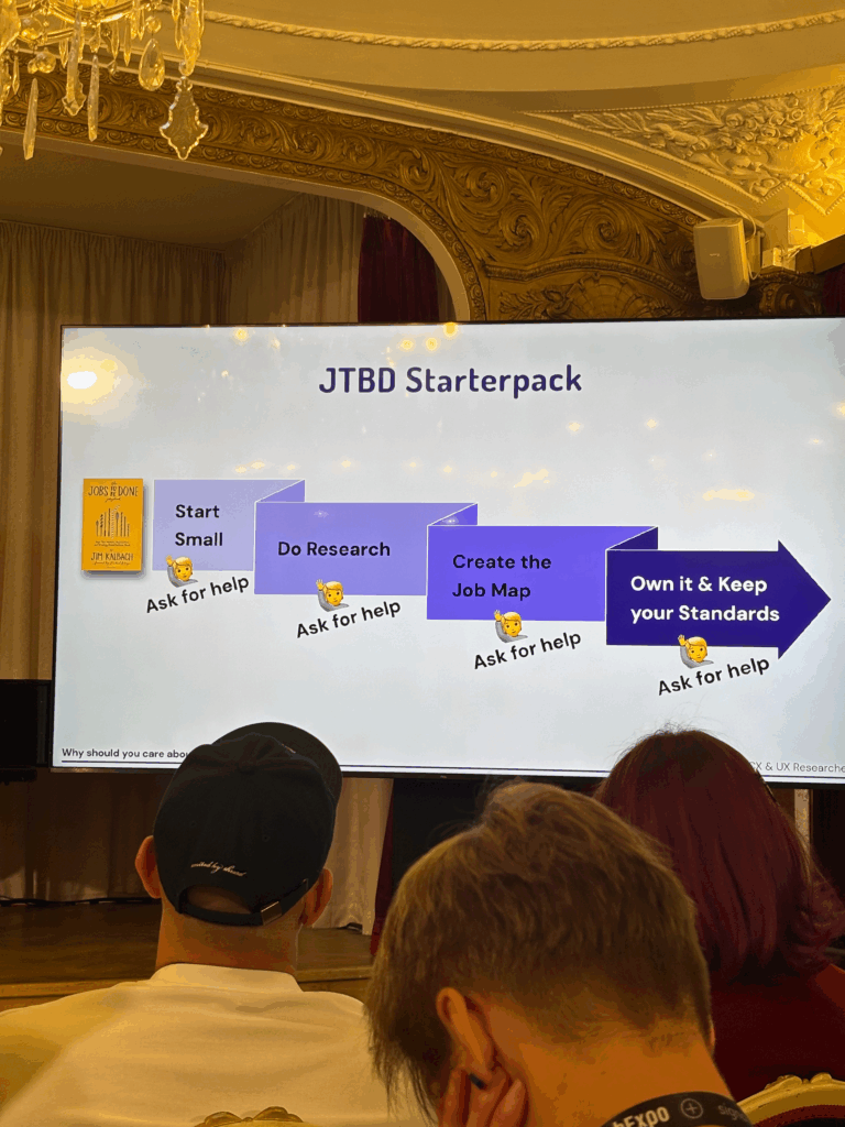
I’ve been reflecting a lot since the speed dating session. The feedback was clear: people grasped the purpose of the prototype almost instantly, which was uber-good. I didn’t have to over-explain, and that felt like a win, though I knew it needed more structure. The project was described as having a “careful” personality, which I really appreciated. It aligns perfectly with the tone I’m aiming for: clear, intentional, and respectful of people’s data.
So I took a step back to think more about how the privacy scrubbing tool should actually work as a whole. Since I’m building this as a mobile app or possibly a mobile-first web app, I needed to start mapping out how the experience would feel from the first moment someone opens it. Rather than focusing only on how the home screen looks, I started thinking about how all the different parts of the app connect and what role each one plays.
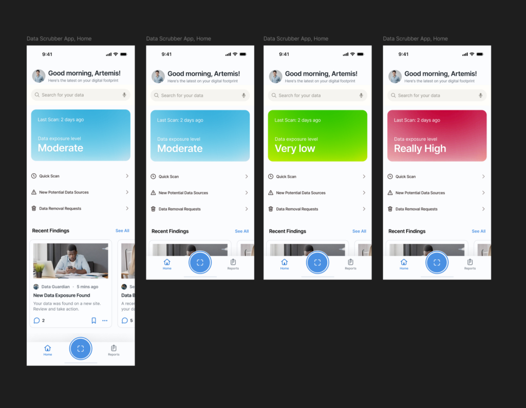
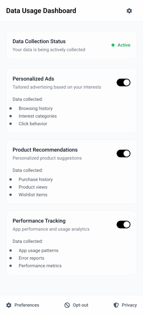
The idea was to shape a full user journey, not just a set of screens. I wanted the app to feel like it had a clear rhythm, starting on the Home tab where you get a quick view of your privacy status and can run a scan right away. That screen would offer a calm summary, like “We found this much of your data online,” along with a clear suggestion for what to do next. The one-tap scan button would live here too, ready when needed. From there, I thought about how the app should guide the user. Should the tabs always be visible? How do we help users understand where they are and what to do next? How do we balance helpful information with simplicity?
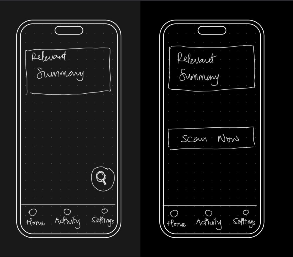
The big realization was that the entire experience could be organized around three core areas: the Home, Activity, and Settings tabs. Each one would represent a different phase of the user’s interaction with the app — starting, reviewing, and customizing. It seems simple now, but this framing helped everything start to click into place.
So I began from scratch, just trying to map out what each section really needed to do.
- Home would be where everything starts. It’s where the user gets a quick status update and triggers a scan.
- Activity would give access to deeper insights about past scans and new discoveries.
- Settings would let the user control everything else, especially what the tool is scanning for in the first place.
This new framing gave me something solid to work with. I was no longer thinking screen by screen or feature by feature. I was thinking system-wide. What kind of flow did I want someone to experience? What should feel immediate? What should feel controllable? What should feel private? I started writing down questions like:
- What’s the first thing someone wants to know when they open a tool like this?
- What’s the minimum information they need to feel informed, but not overwhelmed?
- How do I make it feel helpful, but not invasive?
The answers pointed toward simplicity and calm. Not a flashy dashboard. Not a scary privacy alert system. Just a clear, steady interface that makes you feel like someone’s helping you take care of something that’s long overdue.