Tesla has long been a leader in transforming the way we think about cars, especially when it comes to technology and user experience. The company’s bold design decisions, such as the large touch interface, have revolutionised the automotive industry. But with innovation comes both praise and criticism. Here’s a closer look at what Tesla’s UX/UI design has done well – and where it could improve.
(Source: https://ecomento.de/2019/09/02/tesla-model-3-interieur-jetzt-ohne-leder/)
What Tesla has done well:
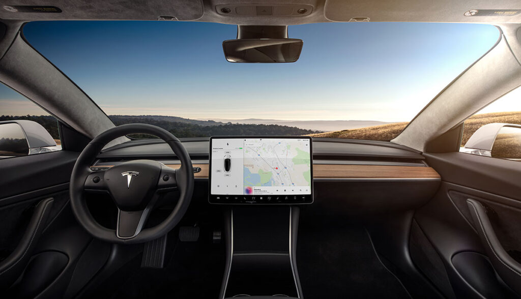
One of Tesla’s most notable contributions to the automotive world is its minimalist design, especially in the dashboard of its vehicles. The central touchscreen of the Tesla Model S and Model 3 is sleek and streamlined, allowing users to interact with many of the car’s features through an intuitive digital interface. The move has eliminated the need for many physical buttons, simplifying the driving experience and creating a more modern, technically advanced feel.
Tesla also stands out by integrating software updates through an over-the-air (OTA) system. This means that, even after purchase, a Tesla car is continually upgraded with new features and bug fixes delivered directly to the vehicle, similar to how smartphones are updated. This user experience flexibility is a game changer in automotive design.
What Tesla did wrong:
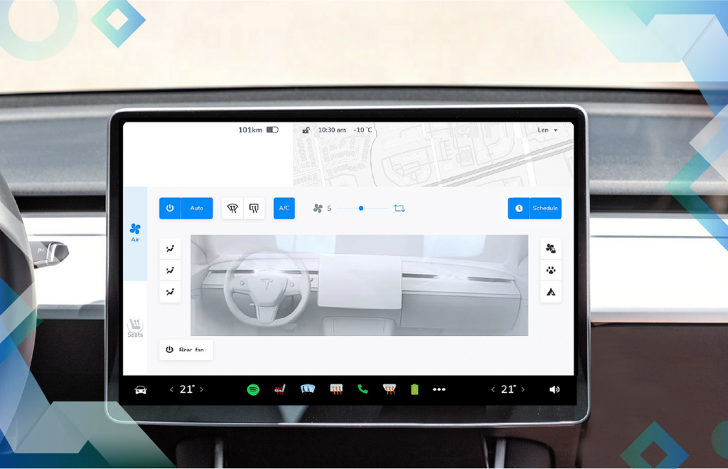
However, not all aspects of Tesla’s UX/UI have been widely complimented. One of the most common criticisms is the size and placement of some of the buttons on the touchscreen. Many users find that adjusting basic functions like the HVAC system or wipers while driving can be frustrating. These controls are often small and not always intuitively located, making it difficult for drivers to access them quickly and safely.
Another common complaint is the lack of customisation of Tesla’s infotainment system. Unlike some competitors, Tesla does not offer Apple CarPlay or Android Auto, which could provide users with additional navigation options, such as Waze integration. While Tesla’s large map display is much appreciated, the system lacks route planning for multiple destinations, which can be a significant annoyance for users who rely on complex navigation for their trips.
(Source: https://uxplanet.org/analyzing-the-new-tesla-ui-2020-48-26-8dccd52dd594)
Opinion:
Overall, Tesla has pushed the boundaries of automotive UX/UI design, making cars more like smartphones on wheels. The integration of cutting-edge technologies like touchscreen interfaces and OTA updates has changed the face of the industry. However, the company needs to continue to refine its design, especially when it comes to usability during active driving. As Tesla and other manufacturers continue to innovate, it will be interesting to see how they manage to balance futuristic design with practical and user-friendly interfaces that keep safety and ease of use in mind.
References:
https://www.invisionapp.com/inside-design/tesla-ui-design/