Children who are introduced to reading in school first learn to recognize and differentiate individual letters, as well as the sounds associated with each letter in language use. Through the sequential linking of sounds, words—and eventually complete sentences—are formed.
Children process visual information differently from adults, which is why specific typographic features should be tailored to their needs. This topic explores how critical the choice of font is for the reading experience of children who are just beginning to read.
An important aspect of this is the readability of typography for beginning readers. Factors such as the choice between sans-serif and serif fonts, stroke thickness, and especially font size play a central role here. A comparison of common fonts in children’s books could provide insights into which are best suited for learning. Additionally, the spacing between individual letters (kerning) and line spacing (leading) can impact letter recognition and reading flow. Larger font sizes are often more suitable for younger children as they make it easier to distinguish letter shapes. However, this requires balanced page design to ensure a harmonious relationship between text and other design elements.
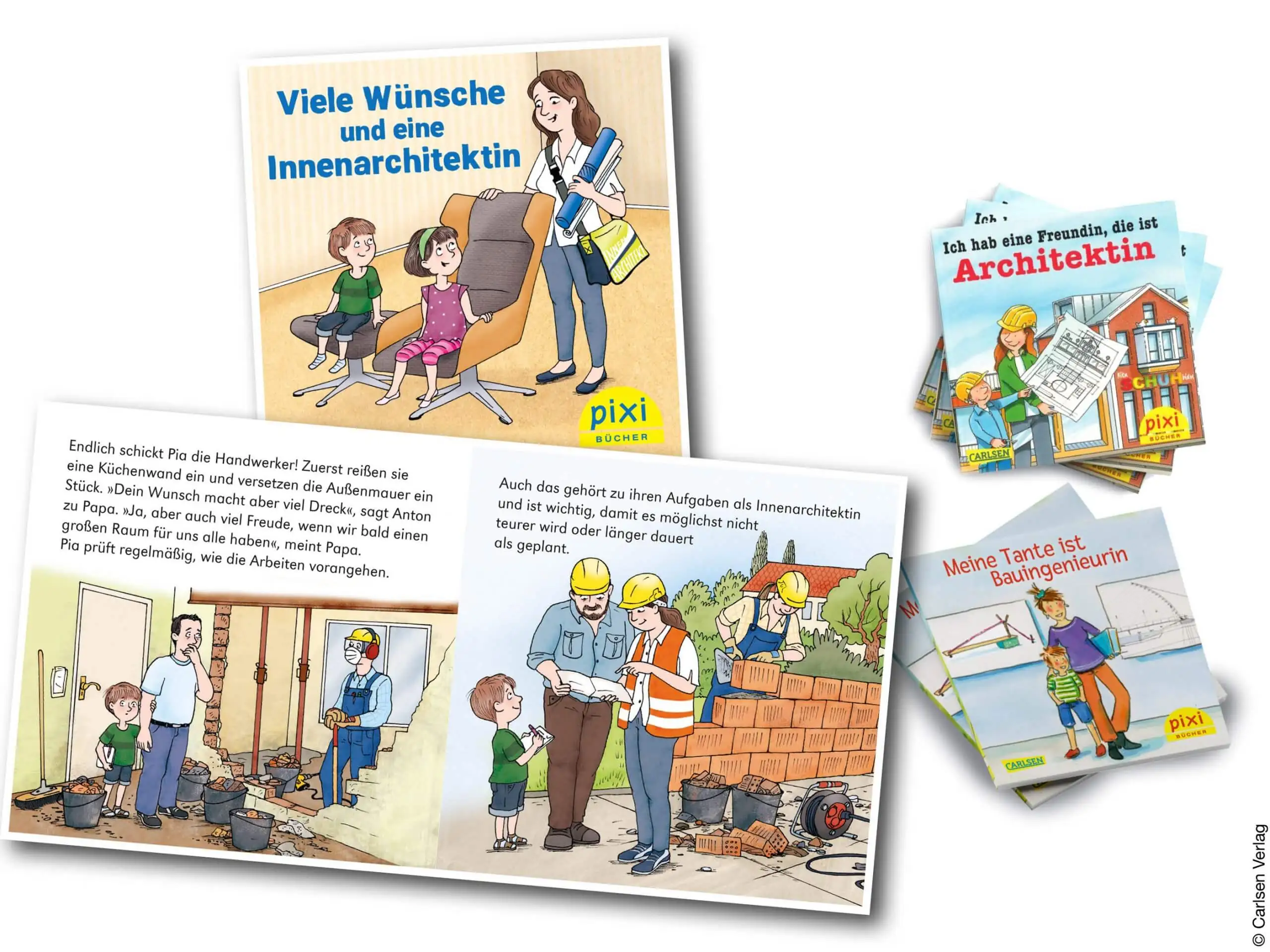
The interplay between typography and images in children‘s books should generally not be overlooked. This raises the question of whether the font should support the style of the illustrations—playful and colorful to capture the child’s attention—or whether readability and clarity should be prioritized to facilitate the reading process.
Digitalization also offers new possibilities in multisensory learning methods and interactive typography. Especially in digital children’s books and apps, typography can be animated or interactive. Letters or words could respond to touch, promoting learning through interactivity and further enhancing children‘s attention.
In my research, I will be focusing on the following questions: How do children actually learn to read? How does the brain of our youngest learners work? Which fonts help with clearer understanding of letters and language? How can learning to read be effectively designed?
