A Japanese printing process, similar to screen printing. Riso is never perfect, which is precisely what makes it so exciting, as colour applications and offsets are special characteristics. There is one print pass per colour. The colours are therefore not mixed, but applied in layers.
This also means stencils are designed especially for each drum and cannot be used on another drum. Multicolored prints are produced by switching out the drums, overprinting, and again running the paper through the RISO!
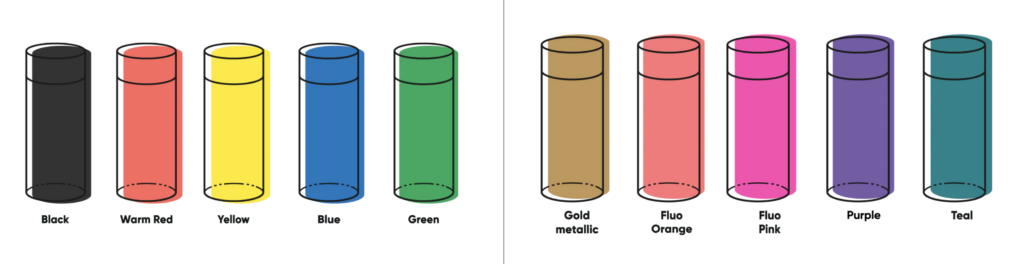
Colors
Riso colours are applied to the paper one after the other, similar to screen printing. Each colour is printed separately. Riso inks appear translucent in the overprint and this transparent effect can be used to create mixed colours. The advantage compared to CMYK printers is that special colors like neon or metallic can be printed.
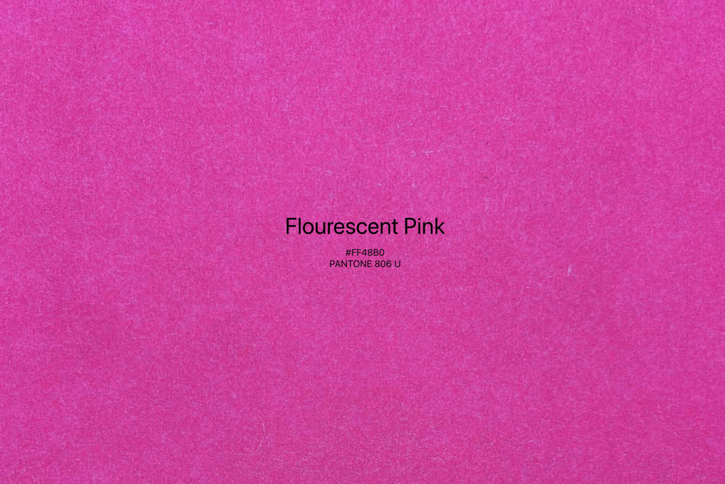
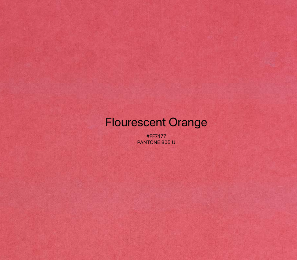
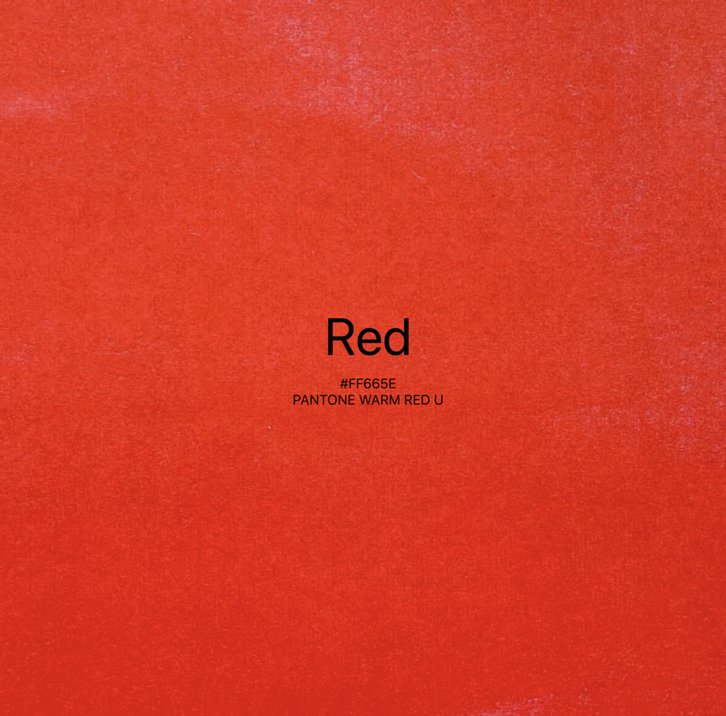
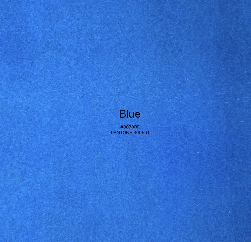
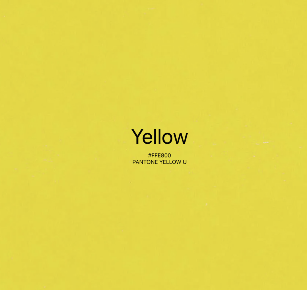
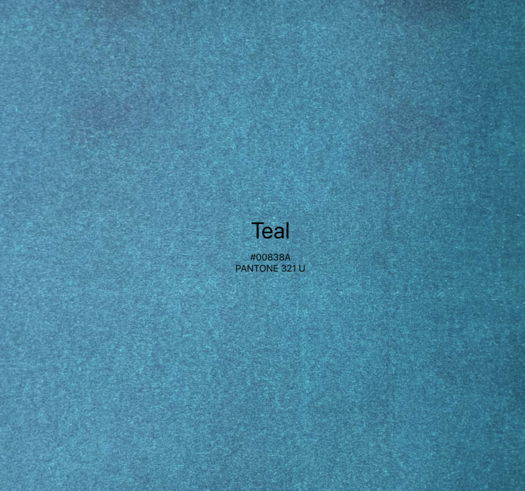
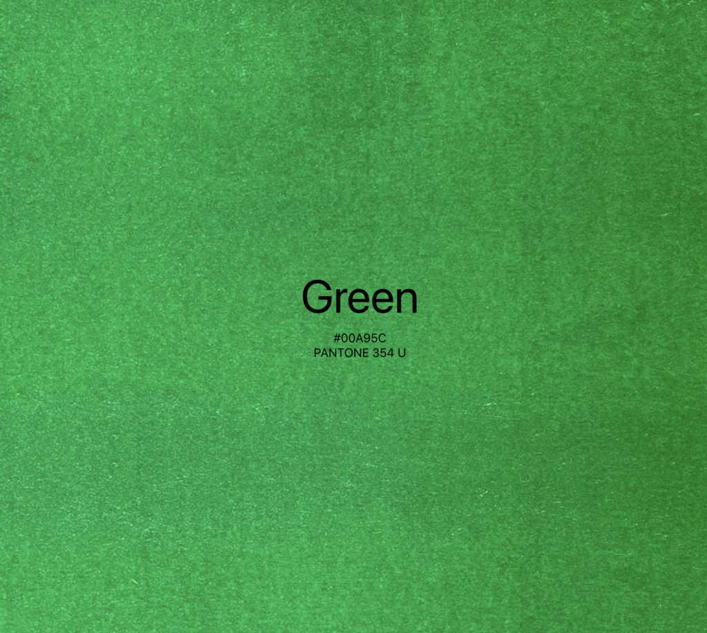
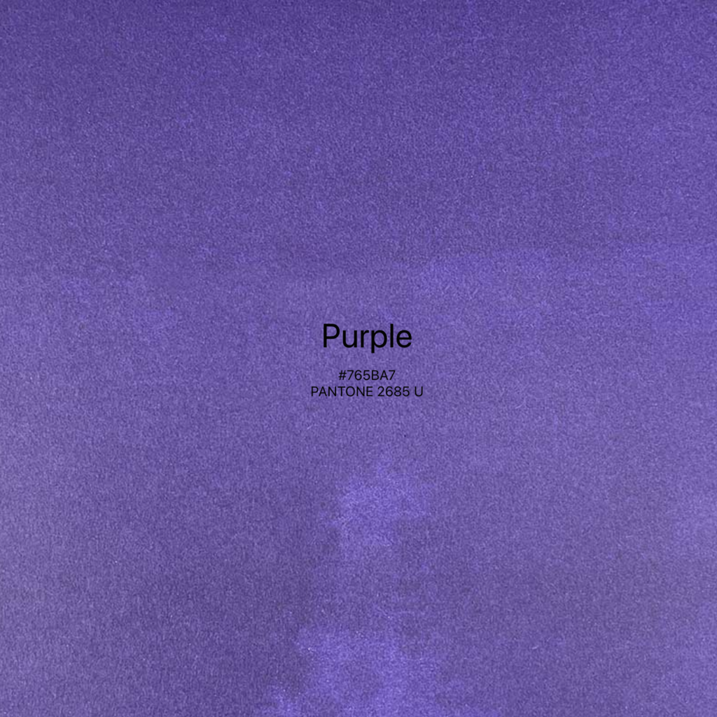
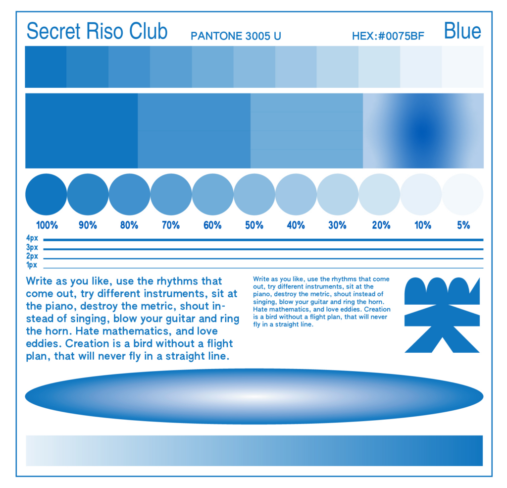
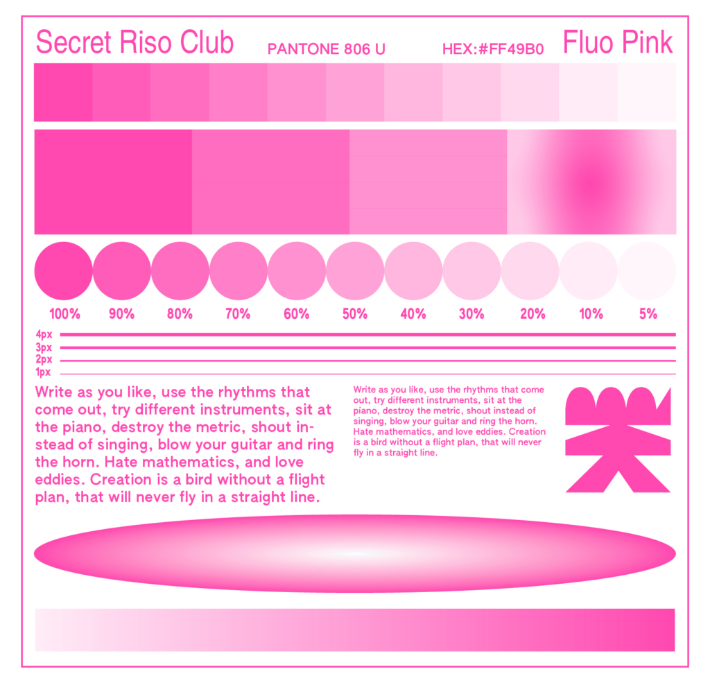
Our FabLab has an assortment of four colors. Black, blue, fluo orange and fluo pink. These colors can be used in the following shades and can be blended to make new colors by layering and altering % of opacity.
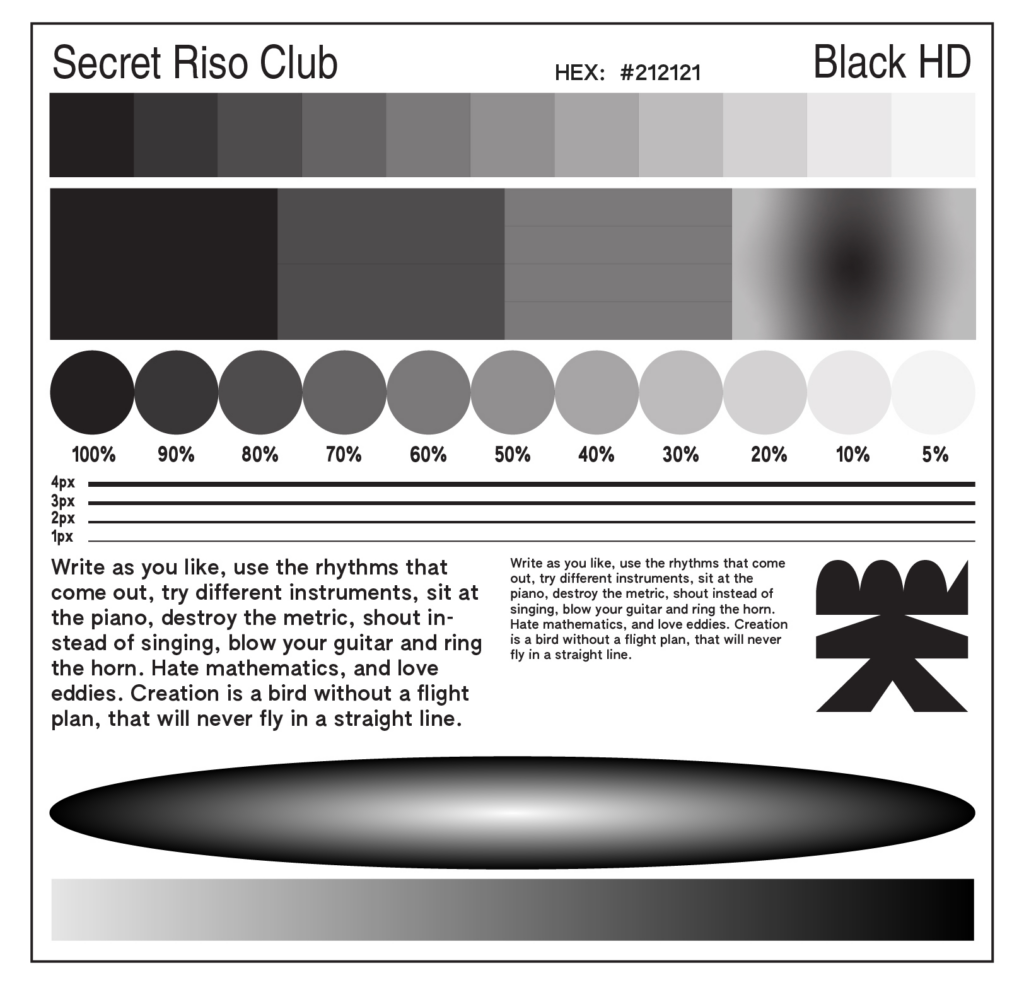
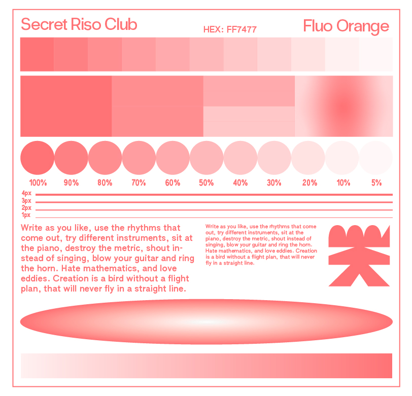
To prepare your artwork for printing, you need to save each color layer as a separate grayscale file. All solid shapes, type and images should be set to Black (from 5% to 100% opacity). Fonts cannot be smaller than 7pt and lines .5pt minimum.
Color Seperation
In addition to solid colour areas, it is also possible to print halftone screens on the Risograph. If multi-coloured images are to be reproduced, similar to offset or digital printing, this can be done in various ways. These colour layers are usually called separations, positives or plates, depending on the printing process, substrate or context. For example, it is possible to create a three-colour print with three colours in the Risograph, provided that three masters are created and printed one after the other on the same substrate.
If image areas are overprinted in two or more image areas, new colours are created as the colours on the risograph are translucent and mix where they overlap with others. These colour separations are to be regarded as greyscale images, which can have a respective colour application between 0 and 100 %. An area of an image coloured in full tone therefore has 100% of the respective colour, whereas lighter areas of the image also have lighter colour tones. It should be pointed out once again that the Risograph does not have the colours of the four-colour Euroscale, cyan, magenta, yellow and black.
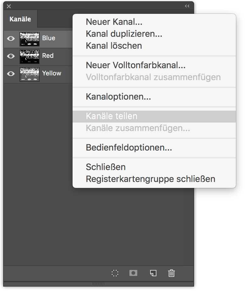
Once the image has been converted into the multicolour profile, it is divided into the channels. This can be done in Adobe Photoshop in the [Channels] window. The [Channels] window is a list-like overview of the channels contained in the image file and can be found in the top programme bar under Window > Channels. On the right-hand side of this window is a button for activating a drop-down menu. Here, the [Split channels] command splits the image into the respective number of primary colour channels.
Paper
It’s important to use open pored paper, as the ink will be soaking into the paper better. 60lb-100lb – 80lb Preferred and Uncoated paper – Vellum or “Offset” finish preferred, because Riso can’t print glossi or coated paper.
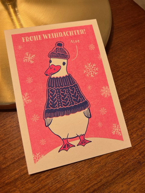
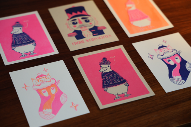
For this reason I bougth different paper types and colors and tried them out in our FabLab. Here is a sneak peek into the results:
Resources
- https://studiorosi.de/blogs/risographie?srsltid=AfmBOoqiFMNi2CiZwg_gCtrHXoLi6DyUKhGOeo2ITe-ZpUEhfNt2oZgb
- https://de.exploriso.info/exploriso/farbe/tiefenreinigung-eines-farbzylinders/
- https://de.exploriso.info/exploriso/farbe/separationen/
- https://de.exploriso.info/exploriso/
- https://secretrisoclub.com/RISO-BASICS