4. Visual Hierarchy: Guiding the User’s Gaze
Another neuropsychological concept critical to web design is visual hierarchy, which refers to the arrangement of elements in order of importance. Humans are naturally inclined to scan a page in a specific pattern, seeking the most relevant information first. This hierarchy is influenced by several factors such as size, color, contrast, alignment, and position. Understanding how these elements guide user behavior allows designers to create pages that not only look good but also lead users seamlessly toward their intended goals.
Why Visual Hierarchy Works: Gibson’s Ecological Approach to Visual Perception
The foundation of visual hierarchy can be traced back to principles of visual perception. One of the key figures in this field is James J. Gibson, whose Ecological Approach to Visual Perception (1979) provided groundbreaking insights into how we perceive our environment. Gibson emphasized the idea that perception is directly shaped by the stimuli present in our surroundings and that humans seek out meaningful information (or affordances) in a dynamic way. Our brains instinctively focus on elements that stand out from their environment, prioritizing objects that seem relevant or important based on context.
In the context of web design, this principle is often employed by manipulating visual weight—essentially making certain elements more prominent by altering their size, using contrasting colors, or positioning them strategically within the page layout. When done effectively, visual weight encourages users to notice and interact with the most important elements first, whether it’s a call-to-action button, a key piece of information, or a navigation link.
Understanding the F-pattern: Jakob Nielsen’s Eye-Tracking Research
Jakob Nielsen and the Nielsen Norman Group are pioneers in studying how users interact with web pages, particularly through eye-tracking research. One of their most influential findings is the “F-pattern” of reading, which demonstrates how users typically scan web pages. In Western cultures, where reading occurs left-to-right, users often start by scanning horizontally across the top of a page, move down the left-hand side, and occasionally glance horizontally across shorter sections, forming a rough “F” shape.
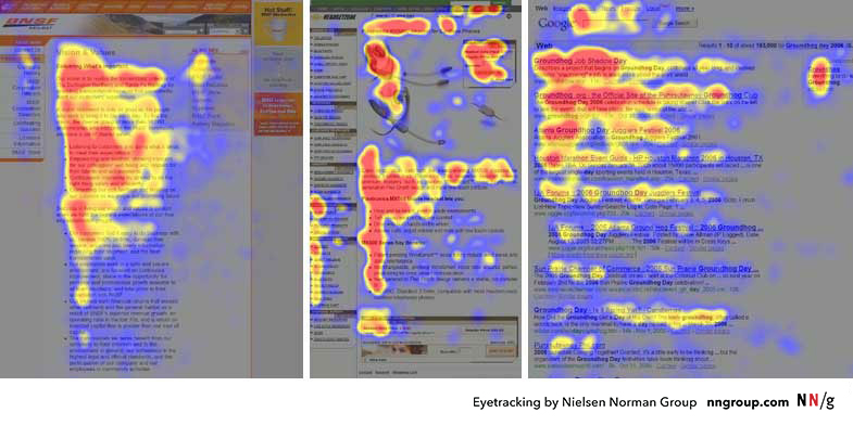
Here’s how the F-pattern breaks down in practical terms:
- Top Horizontal Scan: Users begin by scanning the top part of the page (usually the header or navigation bar) to find high-level information or navigation options. This is why critical navigation links or branding elements should be placed here.
- Vertical Scan: As users move down the page, their eyes track along the left side. Designers should place important headings, subheadings, and key links along this vertical path to ensure visibility.
- Secondary Horizontal Scans: Occasionally, users will glance across horizontally to investigate shorter lines of content, like summaries or sidebars. Designers can take advantage of this behavior by placing key information in sidebars or using short, punchy blocks of text.
The takeaway for web designers is simple: if your page doesn’t align with the F-pattern, critical content might be missed. Headlines, CTAs (Calls to Action), and important visuals should be placed where users’ eyes naturally gravitate, ensuring that key information is seen quickly and easily. However, not all users follow the F-pattern rigidly—those seeking specific information may scan differently—so visual hierarchy should always prioritize clarity and simplicity.
The Gestalt Principles in Web Design: Grouping and Guiding Attention
Visual hierarchy doesn’t exist in isolation—it is also deeply connected to Gestalt principles, a set of psychological laws explaining how humans naturally perceive patterns and organize visual elements. Let’s delve into two critical Gestalt laws that every designer should have in their toolbox:
- The Law of Proximity: This law states that objects that are close to each other tend to be perceived as a group. In web design, proximity is often used to cluster related information, helping users quickly grasp how pieces of content are connected. For example, grouping related navigation links or placing text close to associated images helps users intuitively understand that these elements are connected.
- Practical Application: Think of a product listing page. By grouping a product image with its description, price, and “Add to Cart” button, users don’t have to mentally connect these pieces of information themselves. Everything is presented as a logical, cohesive unit.
- The Law of Continuation: This principle suggests that the human eye prefers to follow a continuous path, particularly along lines or curves, rather than seeing disconnected elements. In web design, this can be used to lead the user’s eye from one section to another, guiding them through a smooth flow of information. For example, designers might use a diagonal line of images or a sequence of steps arranged in a curve to subtly direct attention to the next important point.
- Practical Application: A common example is a step-by-step checkout process, where each stage (Cart, Shipping Info, Payment) is visually linked, making it clear where users are in the process and where they need to go next. This reduces confusion and cognitive load, increasing the likelihood of completing the transaction.
By leveraging these Gestalt principles, web designers can create clearer visual relationships and ensure that users can process information more efficiently. After all, one of the key goals in web design is to reduce cognitive friction—anything that makes a user stop and think “What am I supposed to do here?” should be avoided.
The Role of Contrast, Size, and Color in Visual Hierarchy
While proximity and continuation guide how elements are grouped, contrast, size, and color are essential tools for making elements stand out, thereby enhancing the visual hierarchy. Contrast can involve differences in brightness, color, shape, or texture, and it’s one of the most powerful ways to draw attention to an element.
Connecting Visual Hierarchy to Cognitive Load Theory
Finally, it’s important to note how visual hierarchy connects with Cognitive Load Theory (CLT), as we discussed in the previous posting. A well-constructed visual hierarchy helps reduce extraneous cognitive load—the mental effort that users expend when trying to figure out how to navigate or find information on a poorly organized page. By guiding users through a clear and intuitive hierarchy, designers can ensure that their mental energy is focused on the content itself, not on figuring out where to look next.
For example, consider a complex form with many fields. If the form is poorly designed (e.g., inconsistent spacing, lack of visual cues), users will expend unnecessary cognitive effort just trying to understand what to do. On the other hand, a well-designed form might use clear headings, grouped fields, and contrasting buttons to create a logical flow. This minimizes cognitive load and allows users to focus on completing the task.
In summary, visual hierarchy is one of the most powerful tools in a web designer’s arsenal. By applying principles from Gibson’s ecological approach, Gestalt laws, and research on visual perception, designers can guide users’ eyes effortlessly through a page, ensuring that the most important information is seen first. Coupled with contrast, size, and color, a well-thought-out visual hierarchy enhances usability, reduces cognitive load, and ultimately improves the user experience.
5. Speed Matters: The Impact of Load Times on Cognition and User Experience
Performance in web design isn’t just a technical issue; it’s a psychological one. Page load time has a significant effect on how users perceive a website, which in turn affects their emotional response and cognitive engagement. In neuroscientific terms, long load times trigger increased levels of cortisol, the stress hormone, which can lead to frustration and negative user experience.
A seminal study by Akamai Technologies and Gomez.com found that 47% of consumers expect a webpage to load in two seconds or less. When a page takes longer, users are not only more likely to abandon it, but they also form negative associations with the website’s brand.
From a cognitive perspective, long delays disrupt the user’s flow state, a concept introduced by psychologist Mihaly Csikszentmihalyi. In web usage, flow occurs when users are fully engaged in the task at hand, navigating smoothly through content without being interrupted by unnecessary delays. By optimizing page speed, designers can help users maintain their flow and reduce the cognitive strain caused by waiting.
Conclusion: Merging Science with Design
In conclusion, the neuropsychological principles that govern human behavior provide invaluable insights for web designers. From reducing cognitive load and optimizing color schemes to applying Fitts’s Law and visual hierarchy, each design decision can be informed by a deep understanding of how the brain processes information. By integrating these principles into the design process, web designers can create experiences that are not only visually appealing but also psychologically attuned to user needs.
Web design is no longer just about making things “look good” – it’s about making things work well with how people think, perceive, and interact. The best designs are those that invisibly guide users through a site, reducing mental friction and creating a seamless, intuitive experience.
the task at hand, navigating smoothly through content without being interrupted by unnecessary delays. By optimizing page speed, designers can help users maintain their flow and reduce the cognitive strain caused by waiting.
Research Reference:
Akamai Technologies. (2017). The State of Online Retail Performance.
Gibson, J. J. (1979). The Ecological Approach to Visual Perception. Boston: Houghton Mifflin.
Nielsen, J., & Pernice, K. (2006). Eyetracking Web Usability. Berkeley: New Riders.
Nielsen, J. (2000). Designing Web Usability: The Practice of Simplicity. Berkeley: New Riders Publishing.